RSS
 

Posts Tagged ‘Toning’

How to Rescue an Image in Lightroom With Split Toning

17 Feb

Split toning is one of the most overlooked features in Lightroom (or any post-processing program for that matter). It’s a technique used mostly in the film industry and is apparent in just about any action movie poster. You know the ones, where the skin tones are super warm, while the background and shadows are cool and blue.

That’s all split toning is: adding a hue to your highlights and an opposing (but complementary) hue to your shadows. Most of the time, the best colors to stick with are an orange tone for your highlights and a blue tone for your shadows, although there are certainly exceptions.

How to Rescue an Image in Lightroom With Split Toning

Before processing.

How to Rescue an Image in Lightroom With Split Toning

After processing and split toning added.

Great location, less than ideal lighting conditions

The location was Ke’e Beach, an incredible spot on Kauai that is literally at the end of the road on the north side of the island. I was there with my workshop students and we had realized earlier on in the day that shooting conditions were going to be tough.

A think layer of vog (volcanic fog) had blown over all the way from the Big Island. It covered all of Kauai’s north side in a thick, desaturated haze. This made shooting conditions quite challenging. On top of all that, the ocean was quite angry that day! A rough sea is normal in the winter on Kauai, but this was something else.

Our goal at Ke’e Beach was to photograph the waves that exploded out of the sea and then fanned out, almost like seashells. But because of the conditions, the waves were just getting obliterated before they could fan out. Still, we didn’t give up. We focused on capturing the anger and drama of the ocean and everyone walked away with some great shots.

Split toning to the rescue

In the video below, I process an image from that evening from start to finish inside of Adobe Lightroom Classic CC. The problem with the shot is that it came out of the camera looking quite dull. Because of the thick haze and everything in the shot being backlit, the resulting RAW file looked almost monochromatic. The sky was grey and looked overcast, the rocks and water were dark, and it just looked uninspiring.

?

A common technique that a lot of photographers reach for in these situations is just embracing it and converting the image to black and white. But, if you’re looking for something new to add to your bag of tricks, split-toning can be quite effective at saving images as well.

For this image, I started out by doing what I could in the Basic module to bring out details, add contrast, and make the image pop. After a few other adjustments, I made my way down to the Split Toning module, adding a warm orange tone to the sky (the highlights) and a cool blue/teal tone to the rocks and water (the shadows).

Here are the settings I used in the Basic panel.

These are the Split Toning settings I applied.

The result is a dramatic looking shot that both effectively shows the power of the ocean that evening and also gives the impression of a warm, vibrant sunset.

After

Conclusion

Split toning is a powerful and fun technique. It can be used both to enhance already great images or save otherwise dull ones. When you discover this technique for the first time, you’ll have a blast going through your images and trying it out in different situations. And, just a heads up, it can be used on either color or black and white images. Regardless of the image type, you’re simply adding one hue to the highlights and another to the shadows.

Have you used split toning in Lightroom before or is this completely new to you? If you have done it, please share your favorite split toned image in the comments below. If not, give it a go and share your results.

The post How to Rescue an Image in Lightroom With Split Toning by James Brandon appeared first on Digital Photography School.


Digital Photography School

 
Comments Off on How to Rescue an Image in Lightroom With Split Toning

Posted in Photography


Major Update: Adobe adds tone curve, split toning and more to Lightroom CC

13 Dec
The tone curve, one of the most important features missing from Lightroom CC 1.0, is finally being added. Photo: Adobe

Adobe has launched a major update to the entirely Lightroom CC ecosystem today, releasing major updates for Lightroom CC on Mac, Windows, iOS, Android, and the web, in addition to a few updates for Lightroom Classic CC and Adobe Camera Raw. If you’re a Creative Cloud subscriber, you’ll want to update ASAP.

Here’s what Adobe has in store for you with this latest Lightroom update.

Tone Curve and Split Toning

Two of the most useful and conspicuously absent features in Lightroom CC 1.0 were the Tone Curve and Split Toning. Well, there’s no longer any reason to hop back into Lightroom Classic CC to take advantage of these: they’re coming to Lightroom CC.

You’ll find the Tone Curve next to the Auto button in the Light panel, where you can choose between Parametric Curve or Point Curve modes, as well as the Red, Green, and Blue channels.

Split Toning lives in the Effects panel, where you can … well … split tone.

Adobe Sensei Auto Mode

Another major feature improvement coming with the December update is Auto mode, which is now much more intelligent thanks to Adobe Sensei artificial intelligence platform. From Adobe’s blog post about the update:

Using an advanced neural network powered by Adobe Sensei, our artificial intelligence (AI) and machine learning platform, the new Auto Settings creates a better photo by analyzing your photo and comparing to tens of thousands of professionally edited photos to create a beautiful, pleasing image.

This new Auto mode is launching ecosystem wide—you’ll find it in Lightroom CC, Lightroom CC for iOS, Lightroom CC for Android, Lightroom CC on the web, Lightroom Classic, and Adobe Camera Raw (ACR).

Everything Else

The three updates above are the most impactful, but the December update comes with a bit more to enjoy.

  • Lightroom CC now lets you change the capture time of an image or batch of images (“providing relief for those times that you forgot to change your camera’s time or time zone settings.”).
  • Lightroom CC for Android received several bug fixes and the ability to launch directly into popular modes from the home screen by pressing and holding the app icon.
  • Lightroom CC for iOS now lets you create and customize a text based watermark for your images on export, and HDR capture has been improved.
  • Lightroom Classic CC and Adobe Camera RAW are seeing some ‘refinements’ to the Color Range Masking tool.
  • And, finally, Adobe has added support for new cameras and lenses, including the Sony a7R III, Leica CL, iPhone X, and Google Pixel 2 among others.

You can read more about the December update on Adobe’s blog. CC subscribers just have to update their copy to the latest version to take advantage of all the features described above.

Articles: Digital Photography Review (dpreview.com)

 
Comments Off on Major Update: Adobe adds tone curve, split toning and more to Lightroom CC

Posted in Uncategorized


How to Use Split Toning to Make Your Photos Stand Out

10 Aug

Have you ever taken a picture and then been disappointed, because it didn’t capture the moment? Maybe it looked exactly like what you saw, but when you viewed the image afterwards it was lacking something.

This is one of the greatest challenges photographers face, to express a feeling or vision in a two-dimensional medium. One of the most overlooked tools in the photographer’s processing kit is color.

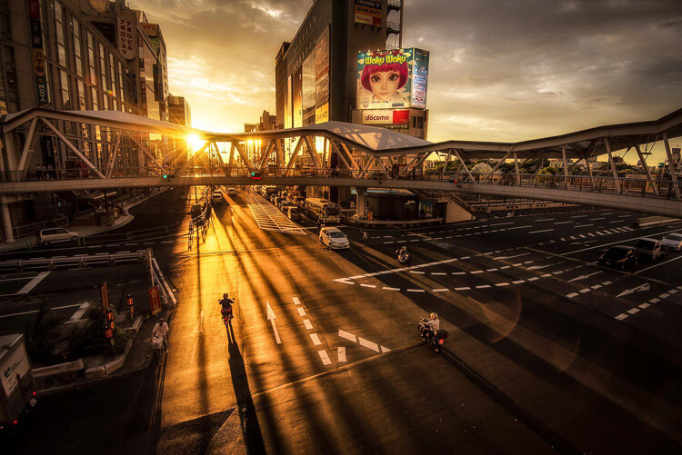
Osaka Sunset

Example of a warm split tone.

I’m not talking about the color of the things in your photograph, like a red car or yellow dress. I mean the overall color cast, the tone of your image, is important too.

Colors affect the way people feel, so much so that there is a whole body of science around it. Even some basic knowledge of color theory can help improve your photography.

Beyond White Balance

The first place to head when you want to change the tone is white balance. For instance, if it’s a gray cloudy day you might want to move the temperature slider towards the warmer side, making your image appear more yellow-orange, or sunny. Move it in the opposite direction, and your image will get cooler or more blue.

Fisherman in Xingping China

Example of a cool split tone.

Although changing the white balance of an image is helpful, it is still a global adjustment – it affects the entire image. In other words, editing the tone of your image with just the white balance is like a mechanic trying to fix an engine with a sledgehammer. It may not be the right tool for the job.

To make more fine-tuned adjustments, and thus have greater control on the overall mood of your images, you may want to have a look at Split Toning.

Penang Sunrise at Fisherman Jetty

Magenta and warm tones.

A Bit of History of Toning

Toning first started as a way to change the color of black and white photographs. For instance, in the past, chemicals were added to the development process to give prints a sepia tone. Later on, other chemicals toners were used to give images two different tones like red and blue.

It may sound complicated, but in today’s digital darkroom, all split toning really means is that you add color to the shadows, highlights, or both. There are a number of ways you can split tone an image. One of the most common is to make the highlights yellow and shadows blue or vice versa. However, let’s take a look at how you can also adjust a single color, to create a particular mood in Adobe Lightroom (also possible in Photoshop and Bridge).

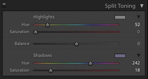
Split Tone Window in Adobe Lightroom

This is what the Split Toning slider looks like in Adobe Lightroom.

Magenta Zen

My favorite color cast to add to my images is magenta. Like a yin and yang varnish, this color (a purplish-red) represents harmony, balance, love, and personal growth. It has a calming effect that stimulates creativity and happiness.

When split toning for magenta, I usually make my adjustments to either the shadows or highlights. I rarely make changes to both, as it tends to be overkill. More often than not, I adjust the shadows, as it’s usually the underexposed darker parts of the image I am trying to bring out. If the image is very bright then I edit for the highlights.

Dubai Cityscape

There is no rule as to how far you should move the sliders. However, I tend to move the hue slider somewhere between 230-250 and the saturation slider between 10-20. It all depends on the image and the intensity of the colors, shadows, and highlights. You can also use the eyedropper to choose the color.

Another added bonus to adding some magenta is that it tends to take off the rough color edges. Browns, greens, and yellows are smoothed out, giving your photos a softer tone.

Pudong Shanghai Cityscape

Split Toning Keyboard Shortcuts for Lightroom

There are a couple of shortcuts in the Lightroom Split Toning panel you’ll want to know about.

First, it can be difficult to to choose the right color when the saturation strength is low. To briefly boost the hue up to %100 saturation, just press and hold Option on Mac (or Alt on Windows), then move the hue slider to either side. This will show the color at full strength so you can select it more easily.

Second, to more easily view the colors split in the image, hold down Option/Alt and then drag the Balance slider in the Split Toning panel.

Experiment

Split Toning is much more than just magenta. Try adjusting the warmth or coolness in your photographs in the split toning panel, instead of using white balance for something different. You can also give your photos a cinematic feel, old film look, and more by split toning. Have fun, get creative, and find what works for you.

Sunset at Sheikh Zayed Mosque in Abu Dhabi

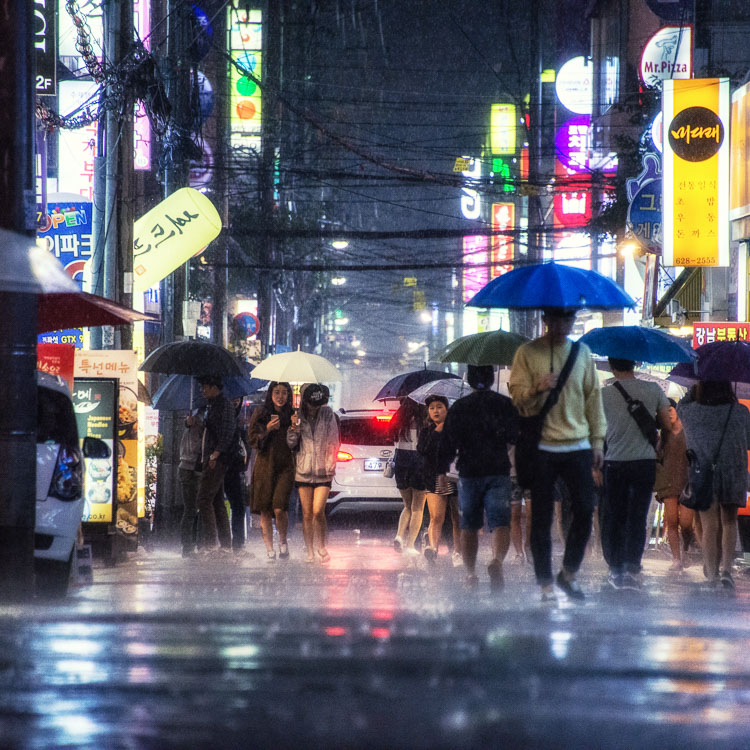
Umbrellas in Busan Rain

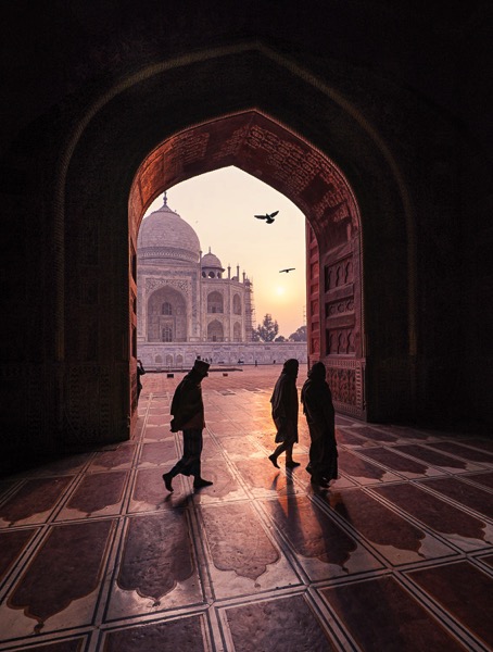
Sunrise at Taj Majal

googletag.cmd.push(function() {
tablet_slots.push( googletag.defineSlot( “/1005424/_dPSv4_tab-all-article-bottom_(300×250)”, [300, 250], “pb-ad-78623” ).addService( googletag.pubads() ) ); } );

googletag.cmd.push(function() {
mobile_slots.push( googletag.defineSlot( “/1005424/_dPSv4_mob-all-article-bottom_(300×250)”, [300, 250], “pb-ad-78158” ).addService( googletag.pubads() ) ); } );

The post How to Use Split Toning to Make Your Photos Stand Out by Pete DeMarco appeared first on Digital Photography School.


Digital Photography School

 
Comments Off on How to Use Split Toning to Make Your Photos Stand Out

Posted in Photography


Split Toning Black and White Images in Lightroom

18 Aug

It can at times seem difficult to make our images unique, or at the very least more interesting. During our workflow we sometimes even discard photos because we feel they aren’t interesting, or that we have failed at an exposure or composition. What we often forget is that we can actually make our images stand out from the rest, and become less mundane, just by being slightly creative with our editing. Sometimes we can even go so far as to salvage an image that might otherwise have been introduced to the delete button. Just by using some powerful, yet simple, post-processing techniques we can discover hidden gems within our images.
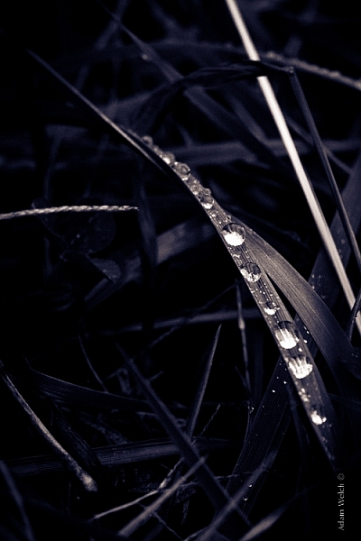
Rain-on-Grass.jpgIntroducing split toning

One such technique which can add uniqueness and strength to an image, is the process of split toning. Most likely, you have already viewed many images that were split toned, even if you didn’t know anything about it. Many of the vintage looking photographs, that seem to be trending at the moment, almost always employ split tone processing to some extent. That’s not to say that split tone images are something new, in reality, the situation is actually quite the opposite. Split toning has its roots in film photography and dark-room printing. Before we begin to learn just how easily you can convert your images to split tone, let’s first take a brief look at what split toned images are, and examine (even more briefly) a little bit of the history behind the process.

What is split toning?

Split toning is quite simply a process by which color tone is added to the highlight and shadow areas of an otherwise monochromatic photograph. Traditionally, the photo being processed with split tones begins its life as a black and white image capture. After the print has been fully made and developed, it is then introduced to other chemicals, which affect the image tones in different ways, depending on the relative compositions of the chemistry involved. In our world today, digital darkrooms now allow us to carry-over this technique of selective toning to our color prints. Color split tone images are quite possible and are often very pleasing. However, for our purposes here, we will keep the discussion limited to the process of using split toning as it relates to black and white photos exclusively.

History of split toning
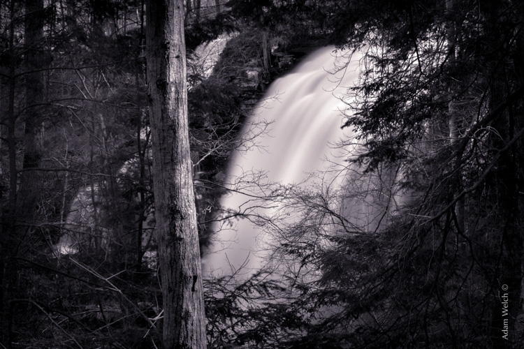
Virgin Falls

It all started with the birth of the photographic process itself in the mid 1800s. The images produced during that era of early experimentation into the medium were very delicate, and extremely susceptible to degradation from physical touch, atmospheric conditions, as well as exposure to light post-development. As photography evolved, the pioneers of the art found they needed a way to make their finished prints more durable and longer lasting. This lead to the introduction of toners in the darkroom printing process. Essentially, most toners replace the metallic silver present in the print with a more stable silver compound.

The finished print tone of course depended on the type of toner used. A readily identifiable example of this is sepia tone. We’ve all seen them before; the warm and golden hues that look predominately old fashioned and can lend a sense of nostalgia to an image. Originally, sepia toned photographs were a result of a chemical process in the darkroom. The process involved treating the finished print with chemical compounds that converted the silver present into a silver compound called silver sulfide, which made for a much longer lasting finished print.

The split toning processes came about by using different toning agents in different stages, in different proportions. A photographer might treat a photo with one type of toner and then stop the process at a desired stage, leaving only the highlights unreacted. Then, another and different type of toner might be introduced, which would react with the remaining silver present in the shadows left over from the previous treatment. Thusly, the tones visible within the image would be split – hence split toning.
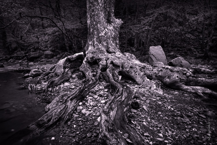
Roots

Ansel Adams, one of the most influential photo makers of the our time, also employed the use of split toning in his masterworks. This in itself is quite interesting since Adam’s was a realist in all ways. Meaning that he promoted straight photography with minimal manipulations in the darkroom aside from his own adjustments, using mostly dodging and burning. Ansel choose primarily selenium based toning agents for his work, which added a very slight blue hue to the shadows of most of his prints. He called the color tones eggplant, and indeed the coolness of bluish blacks produced images that are still counted among some of the most magnificent examples of photographic art ever made.

How to apply split toning in Lightroom

Now that you have an understanding of what the split tone processing is all about, we can move on to the fun stuff. Let’s take a look at how you can easily make your black and white images really stand out using split toning feature in Adobe Lightroom 6 (the split toning feature is also available in other image processing software including LR CC, Photoshop and ACR).

Let’s begin with a color image that we feel would benefit from being converted to black and white. Photos which transition well to black and white more often than not possess stark contrasts between the light and shadow areas, and have great texture within the subject matter.

This is quick snapshot of my dog Leia. The bright light coming through the door casts her profile nearly in silhouette and the high ISO made for a slightly grainy image, but really no remarkable color of which to speak. So I chose to convert it to black and white and use the grain in order to produce a gritty, and spontaneous look to the photo.

Leia Original

Original color image

Leia Original BW

This is the image after converting to black and white.

But, I still wanted more than just a black and white photo, so I decided to apply some slight split toning. Here we have the same photo of Leia opened in LR 6. The Split Tone panel is highlighted.
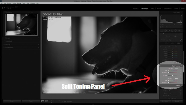
Split Tone Panel

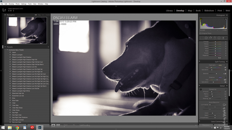
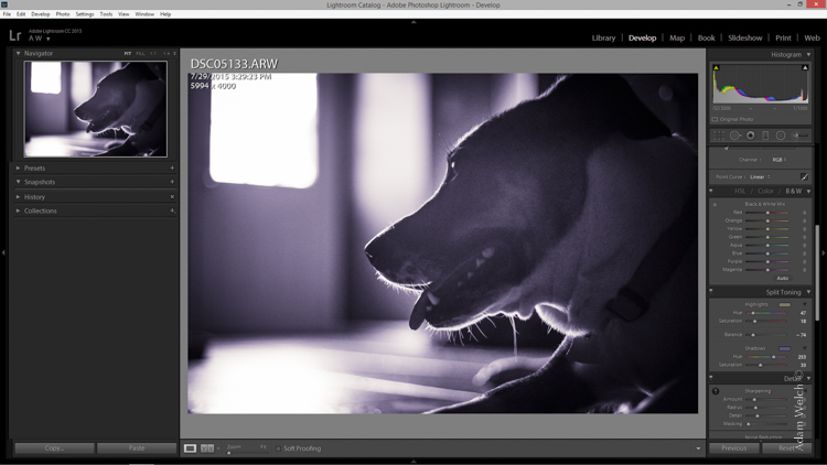
You’ll see a few options for controlling the highlight and shadow tonality, along with a hue and saturation slider for each. There is also a balance slider. The balance slider controls how the color tones are applied in relation to one another.
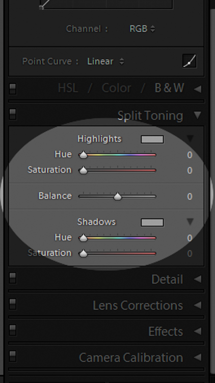
Split Tone Panel 2

I adjusted the tones to make the highlights into a yellow hue, while the shadows I changed to a bluish-purple. I simply kept adjusting each slider until I achieved the look I wanted for the image.
Split Highlights

Here is the edit with the balance slider favoring the highlights.
Split Shadows

Here we see it balanced to favor the shadows.

Leia Split Tone

Here is the finished image after split toning. From beginning to end the processing took less than five minutes.

Applying split toning to your black and white photographs can be an easy way to move beyond merely converting your photo to black and white. It adds interest to your shot, and helps to make it stand out from the ordinary. Luckily, digital photography has given us enormous range to experiment with our images, apply edits, and see the effects in real-time.

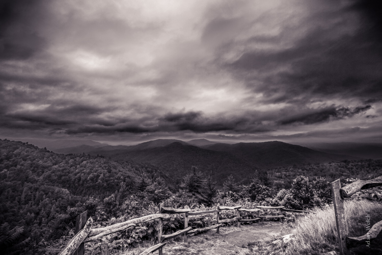
Here is another example of an image which has been processed using split toning (see others throughout the article as well). Try some split tone processing techniques for yourself and see what your black and white photos can become!
Cataloochee Valley Overlook

Editor’s Note: This is one of a series of articles this week featuring black and white photography tips. Look for earlier ones below and more daily over the next few days.

  • 5 Simple Ways to Create Expressive Photos in Black and White
  • Tips for Black and White Wildlife Photography
  • 7 Tips for Black and White Portrait Photography
  • 28 Images with Strong Black and White Compositions
  • Weekly Photography Challenge – Black and White Techniques
  • Tips for Black and White Wildlife Photography
  • How to Convert Images to Black and White and Add a Color Tint in Photoshop
  • Shooting all Black and White for a Day to Improve Your Photographic Eye

googletag.cmd.push(function() {
tablet_slots.push( googletag.defineSlot( “/1005424/_dPSv4_tab-all-article-bottom_(300×250)”, [300, 250], “pb-ad-78623” ).addService( googletag.pubads() ) ); } );

googletag.cmd.push(function() {
mobile_slots.push( googletag.defineSlot( “/1005424/_dPSv4_mob-all-article-bottom_(300×250)”, [300, 250], “pb-ad-78158” ).addService( googletag.pubads() ) ); } );

The post Split Toning Black and White Images in Lightroom by Adam Welch appeared first on Digital Photography School.


Digital Photography School

 
Comments Off on Split Toning Black and White Images in Lightroom

Posted in Photography


Creative Color Processing (Part 2/3 – Split Toning)

21 Dec

This is Part 2 of a 3-part series on creative color effects using Lightroom 4. In Part 1 of the series, I discussed shifting White Balance either warmer or cooler for creative effect. In this article I will explain Split Toning, and also give you some ideas for using creative white balance and split toning together for even more color control.

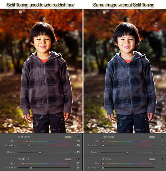
For this image, I used split toning to complement the autumn foliage by adding red to the shadow areas:

Split toning used to add a warm reddish hue

Example of Split Toning used to add a reddish hue

While white balance affects the entire image, split toning allows you to treat the shadows and highlights differently. You can add one color to the shadows and a different color to the highlights, and also control the balance between the two.

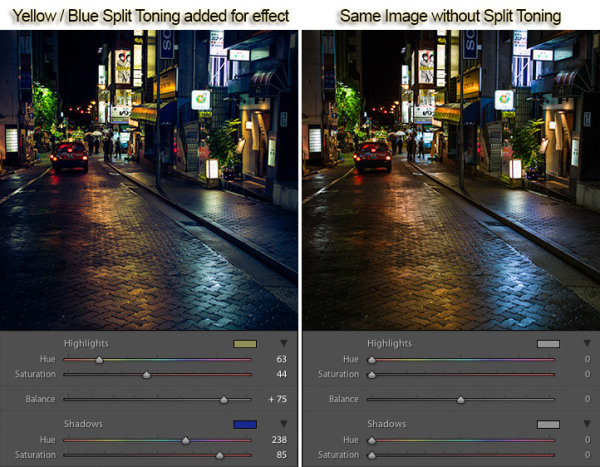
In processing this scene of a street in Tokyo I used split toning to add blue to the shadows and yellow to the highlights:

Example of Split Toning

Example of Yellow / Blue Split Toning

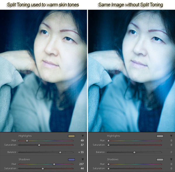
Split Toning can also be combined with white balance for creative effect. In the photo below I used a cool 3500 kelvin white balance, and then used split toning to warm the skin tones by adding yellow to the highlights. The result is cool-toned image, without unnaturally bluish skin tones. In this way, white balance and split toning can be used together to create an effect that would not be possible with either tool on its own.

Split toning to warm skin tones

Using Split Toning to warm skin tones

Creative color processing is very subject, and ultimately comes down to personal preference. Even if you don’t really like the editing decisions I’ve made in these sample photos, I hope I’ve inspired you to try some new techniques for creatively processing your photos. I appreciate feedback, please comment below or feel free to connect with me through Facebook or Google+.

This concludes Part 2 of my Creative Color Processing series. In Part 3, I will show you how to use the Tone Curve tool to control the red, green, and blue color channels separately.

Post originally from: Digital Photography Tips.

Check out our more Photography Tips at Photography Tips for Beginners, Portrait Photography Tips and Wedding Photography Tips.

Creative Color Processing (Part 2/3 – Split Toning)


Digital Photography School

 
Comments Off on Creative Color Processing (Part 2/3 – Split Toning)

Posted in Photography


Adobe Lightroom – Split Toning + Black and White

26 Oct

*Simply giving this video a ‘Like’ helps my channel grow 🙂 T-Shirt Design: aleksparx.deviantart.com My DeviantART: infuzedmedia.deviantart.com Enhancing Preset Download bit.ly Soft Colour Preset Download: bit.ly Soft Colour Tutorial: www.youtube.com Colour Enhance Tutorial: www.youtube.com Landscape Editing Tutorial: www.youtube.com In this tutorial I’ll be showing you how you can add split toning to your black and white photos. I hope this is helpful and you all enjoy the tutorial 🙂 Thanks.
Video Rating: 4 / 5

 
Comments Off on Adobe Lightroom – Split Toning + Black and White

Posted in Retouching in Photoshop