RSS
 

Posts Tagged ‘tone’

How to Use Photo Studio Ultimate 2021’s Color and Tone Wheels for Amazing Results

04 Dec

The post How to Use Photo Studio Ultimate 2021’s Color and Tone Wheels for Amazing Results appeared first on Digital Photography School. It was authored by Jaymes Dempsey.

ACDSee Photo Studio Ultimate Color and Tone Wheels

Color editing is an essential part of nearly every great photo.

Unfortunately, adjusting the colors in most post-processing programs is difficult – or downright impossible.

One impressive exception to this, however, is ACDSee Photo Studio Ultimate 2021, which offers two powerful tools for color editing:

  1. The Color Wheel
  2. The Tone Wheels
ACDSee Photo Studio Ultimate 2021 Tone Wheels

And that’s what this article is all about. I’m going to show you how to use the Color Wheel and Tone Wheels to apply gorgeous color adjustments to your photos. You’ll discover how the Wheels work, what they can do, and how to get a professional look in your own images.

Let’s dive right in.

The Color and Tone Wheels: overview

ACDSee Photo Studio Ultimate 2021

The Color and Tone Wheels come as part of Photo Studio Ultimate 2021, a recently updated, all-in-one photo editor that you can grab on ACDSee’s website for $ 8.90/month (you also have the option to purchase a lifetime license for $ 149.99).

ACDSee pricing

While Photo Studio Ultimate 2021 offers a lot of upgrades over its predecessor (including some major speed improvements that you’ll want to see for yourself), one of the biggest features for amateur and professional photographers is the set of color editing tools: the Color Wheel and the Tone Wheels.

Here’s a quick peek at the Color Wheel:

Color Wheel

And here is the Tone Wheels panel:

Tone Wheels

Together, these two tools can revolutionize your photo editing workflow.

And here’s why:

With the Color and Tone Wheels, you can make both broad and targeted adjustments to the colors in your images. You can shift, brighten, and saturate colors selectively, you can push colors into the shadows, highlights, and midtones separately, and so much more – all with a few easy-to-use wheels and sliders.

As someone who’s a bit color-obsessed, I’ve used quite a few color adjustment tools in many different post-processing programs. But I can honestly say that Photo Studio Ultimate’s version is one of the best implementations I’ve ever seen (if not the best). Yes, the wheels are amazingly powerful, and they should offer any amateur or professional all the color adjustment power they need. But they’re also just so fun and intuitive to work with, which is what’s really sold me on this program.

ACDSee Photo Studio Ultimate 2021 sample

Now let’s take a look at how you can actually use the Color and Tone Wheels for great results (and if you’re feeling intimidated, don’t be – I’ll give you simple, easy-to-follow instructions!).

How to use the Color Wheel to selectively adjust colors in your photos

You’ll find the Color Wheel in Photo Studio Ultimate 2021’s Develop mode, which you can select in the top-right corner of the screen:

the Develop mode in ACDSee Photo Studio Ultimate 2021

Then open the Color Wheel panel on the left-hand side, and you’ll see a color wheel with a series of sliders below it:

Color Wheel panel

Here’s what you need to know:

The color wheel itself lets you select the colors you’re targeting in the photo.

And the sliders below it allow you to adjust the targeted colors.

So once you have your Color Wheel panel open, here’s what I recommend you do:

Step 1: Select the colors you want to adjust

Selecting the colors you’d like to adjust pretty easy, and there are a couple of methods you can use.

First, you can simply hover your cursor over different parts of your photo, and watch as it turns into a dropper icon:

dropper tool

Then, by clicking once on the photo, you’ll select that color for adjustment.

So if you click on a pinkish-purple part of your photo, you’ll select all the pink-purple colors:

dropper example

And if you click on a yellow part of your photo, you’ll select all the yellow colors:

dropper example

Now, as soon as you click on a part of your photo, you’ll see the color wheel change. This is to show you the color range you’ve selected.

You can also use the display on the color wheel to either select colors (instead of the eyedropper), or to refine your color selection.

To select colors, just click on the relevant part of the wheel:

selecting a color on the color wheel

And to fine-tune the color selection, just narrow the range of colors on the color wheel – by dragging the edges of the selection inward or outward. That way, the adjustments you make via the sliders will affect a narrower or broader range of colors in your photo.

Here, I’ve narrowed the color selection:

narrow selection on the color wheel

And here I’ve broadened it:

broad selection on the color wheel

Also, if you want to get really picky with your selection, you can drag your color range upward from the center of the wheel:

selecting only saturated areas

And this will ensure you only select the more saturated colors.

You can also drag downward from the rim of the wheel to select only the less-saturated colors:

selecting only desaturated colors

By the way, if you want to see the areas you’ve selected displayed on your photo, just hit the Auto preview the selected range checkbox:

previewing the selection

Your selected colors will be highlighted on the image, while everything else will be grayed out:

previewing the selection

Cool, right?

Step 2: Adjust the colors using the sliders

Now comes the fun part:

Actually adjusting the colors.

While there are a number of sliders, I recommend you focus on three key options:

Hue.

Saturation.

And Brightness.

hue, saturation, and brightness sliders in ACDSee Photo Studio Ultimate 2021

These are the main adjustments you’ll want to make (I use them on almost every photo I edit).

By shifting the Hue slider, you shift the hue of your selected color range. So if I select the pink colors in this flower photo and want to make them more purple, I can just push the Hue slider to the left:

shifting the hue

I can also make them more red by pushing the Hue slider to the right:

shifting the hue

Speaking more generally, the Hue slider is useful for situations where you want to separate colors to create contrast, or where you want to make colors more similar to add harmony.

(How do you know what creates contrast and what creates harmony? Look at the color wheel! Colors that are opposite one another are contrasting/complementary colors, whereas colors next to one another are analogous colors.)

While color contrast will generally create a more powerful, in-your-face photo, analogous colors can result in a more peaceful final image.

Anyway, once you’ve adjusted the hue, I recommend turning to the Saturation slider. This works the way it sounds: It lets you selectively boost or reduce the saturation of your selected color range.

So by selecting the yellows in the image below, then adjusting the Saturation slider, you can boost the yellow intensity:

shifting the saturation

Or you can dial it back:

shifting the saturation

In general, boosting the saturation of your main colors looks pretty good, as long as you don’t overdo it. That way, a few colors in your photo will stand out and keep the viewer interested.

However, it can also be helpful to reduce the saturation of colors that distract from the main subject. So if your photo includes a red “Exit” sign in the background, you might reduce the saturation of those reds to keep the viewer focused on the foreground.

Finally, I recommend experimenting with the Brightness slider. This allows you to adjust the brightness of your selected color range. So you can brighten up your selection to make it pop:

shifting the brightness

Or you can darken the selection down to make it less impactful:

shifting the brightness

Step 3: Create additional color wheels for further adjustments

While one color adjustment may sometimes be enough, you also have the option to create more.

Simply click the Plus icon:

adding color wheels

Then follow the previous steps all over again!

Also, to toggle the effects of the color wheels on and off, you can just check and uncheck the box above each color wheel icon:

viewing the effects of color wheels

How to use the Tone Wheels to produce beautiful color grading

The Tone Wheels panel is located just below the Color Wheel panel in the Develop mode of Photo Studio Ultimate 2021:

using the tone wheels in ACDSee Photo Studio Ultimate 2021

Now, unlike the Color Wheel panel, you cannot select individual colors to adjust.

Instead, each of the three wheels corresponds to a different tonal range of your photo:

  • The top wheel corresponds to the highlights (the brightest tones)
  • The middle wheel corresponds to the midtones (the middle tones)
  • The bottom wheel corresponds to the shadows (the darkest tones)

And by adjusting the tone wheels, you change the color in the corresponding area of the image.

So by setting the Highlights wheel to yellow, your photo’s highlights will be tinted yellow:

adding yellow highlights

And by setting the Shadows wheel to green, your photo’s shadows will be tinted green:

adding green shadows

This is a fantastic way to add different looks to your images. For instance, you can create blue shadows and yellow highlights, which is a popular look on Instagram. Or you can make the highlights orange and the shadows teal, for a cinematic, movie-type result.

Now, the tone wheels themselves only allow you to select the hue and saturation of the color you’d like to add.

But by shifting the Brightness slider – found to the right of each wheel – you can also make the highlights, midtones, and shadows brighter or darker.

the brightness sliders

So how do you get great results using the Color Wheel panel? How should you approach this color adjustment tool?

Here’s what I recommend:

Step 1: Adjust the shadows

I like to start by adjusting the shadows in my images.

Now, you can choose your shadow color a few different ways:

One method is to select the Shadows eyedropper:

the shadows eyedropper

Then you can click on a part of your photo and the Shadows wheel will select its hue:

picking a shadow color

Alternatively, you can click around the wheel to select different colors:

clicking on the wheel

And you can further fine-tune the saturation with the left-hand slider:

using the saturation slider

Plus you can change the brightness of the shadows with the right-hand slider:

using the brightness slider

Personally, my favorite way to select colors is to use the wheel, but start by pushing the Saturation slider all the way up:

saturation pushed all the way to its maximum

That way, you can clearly see the effects of your color grade – and once you’ve chosen the right color, you can dial it back.

Also, while it’s always a good idea to experiment, the best shadow colors are generally cool – blues, greens, and purples.

I’d also recommend paying careful attention to the colors already present in your shadows – by matching the shadow color with already-existing colors, you can unify the darker parts of your photo and make it even stronger.

For this flower photo, I like blue-green shadows:

blue-green shadows example

Step 2: Adjust the highlights

Selecting a color for the Highlights wheel is just like selecting a color for the Shadows wheel.

You can use the eyedropper tool:

the highlights eyedropper

Or you can click on the wheel directly.

Of course, you can also fine-tune with the Saturation slider and the Brightness slider:

the brightness slider

Generally, you’ll want a warmer color for the highlights: an orange, yellow, or red.

It’s also a good idea to pay attention to your existing highlight colors. For instance, if your photo has a lot of warm sunlight, such as in the shot of the Black-eyed Susan flowers, you might want to accentuate the yellows with some nice golden highlights:

warmer highlights example

I’d also recommend looking at your shadow colors even when adjusting the Highlights wheel. For a nice result, you might choose a color that contrasts with the shadows to create a complementary color pair (as I discussed in the Color Wheel section, above).

Step 3: Adjust the midtones

Adjusting the midtones is a bit less common than adjusting the highlights and the shadows.

For one, if you adjust the midtones, your photo will often take on a more obvious tinted look, because we humans expect midtones to be more neutral compared to colder shadows and warmer highlights.

Plus, the midtones can correspond to skin tones, which you (generally) want to keep as natural as possible.

So I recommend you be careful when experimenting with the Midtones color wheel. If you do decide you want to make changes, I’d recommend keeping things closely aligned with the highlights, because too many colors in your scene will start to look messy.

Make sense?

As you’d expect, adjusting the midtones is just like adjusting the highlights and shadows. You have the Midtone color wheel that you can click on:

midtones color wheel

Plus your eyedropper:

midtones eyedropper

Which you can use to give your midtones a slight color grade!

ACDSee’s Color and Tone Wheels: the next steps

Now that you’ve finished this article, you know how to make pro-level color adjustments.

And with Photo Studio Ultimate 2021’s Color Wheel and Tone Wheels tools, you have everything you need to take your color editing to the next level.

So make sure you grab ACDSee Photo Studio Ultimate 2021. It’s currently available for just $ 8.90 per month, or you can get a lifetime license for $ 149.99. And if you’re just interested in trying out the software, you can get a free trial right here.

ACDSee is a paid partner of dPS.

The post How to Use Photo Studio Ultimate 2021’s Color and Tone Wheels for Amazing Results appeared first on Digital Photography School. It was authored by Jaymes Dempsey.


Digital Photography School

 
Comments Off on How to Use Photo Studio Ultimate 2021’s Color and Tone Wheels for Amazing Results

Posted in Photography


How to Use a Split Tone Style in Lightroom Mobile for a Consistent Instagram Feed

09 Sep

The post How to Use a Split Tone Style in Lightroom Mobile for a Consistent Instagram Feed appeared first on Digital Photography School. It was authored by Ana Mireles.

Have you ever seen an image and immediately known who took it? That’s because the photographer has a unique style.

If you want to make your own images recognizable for your clients and followers, you might want to try a split tone style.

Keep reading to learn how this works.

Create a split tone style
Snapshot taken with the default camera app on a Redmi Note 8.

Style

You can create your own style through many different elements, from lighting and composition to a particular way of post-processing.

This last one is where a split tone style fits.

Introduction to split toning style
Canon 50D | Sigma 28-300mm | 28mm | 1/800 sec | f/3.5 | ISO 100

Using this technique, you can keep your images consistent. That way, the viewer feels like all your images belong together and associates the images with you and your brand. This works for your portfolio, your website, and your Instagram feed.

Split tone

When you assign a certain tone to the shadows and a different tone to the highlights, it’s known as a split tone. The full white and full black will always remain untouched. But the highlights will be cool while the shadows will be warm.

Let me show you what I mean with this gradient:

Split tone gradient

You can also change the ratio between highlights and shadows. On these next gradients, see how the same split tone colors give a different effect when you adjust the split tone balance:

Split tone changing balance

This is just an example, but you can use any combination of colors that suits your style and brand. For that, you can create a color palette.

Choose a color palette

A color palette is a range of colors used in a particular context. These colors need to work well together and reinforce your style.

There are different theories you can use to create your color palette. You can go for a monochromatic scheme or a complementary one. If you’re not sure, there are some great tools to help you. You can check out Adobe Color or Color Hexa.

Adobe Color Website

Just like a filter, different split tones may look better on some images than others. Having a color scheme gives you the flexibility to apply different split tone combinations while maintaining your style.

Split tone style

Almost every program has a feature or a way to do split toning: ACR, Capture One, Photoshop, Luminar, Lightroom, etc. Also, many apps allow you to do split toning on your phone: Photoshop Express, Lightroom Mobile, and VSCO Cam. Choose whichever fits best into your workflow.

In most cases, the split toning interface is similar from program to program. You’ll have two gradients: one for the highlights and one for the shadows. You’ll also have a balance slider.

I’m going to show you how to split tone in Lightroom Mobile, because it’s the program I find most comfortable. Also, because Lightroom Mobile allows you to save your split tone effect as a preset.

Both split toning and preset functionality are included in the free version of Lightroom Mobile, so you can follow along without getting a subscription.

Split toning in Lightroom Mobile

When you have your image open in Lightroom Mobile, you can see the menu at the bottom. Scroll to the right until you find Effects.

Once you open the Effects tab, on the top right you can find Split Tone. This will open the gradients for the highlights and shadows. Below these gradients, you’ll find a slider to control the split tone balance.

Move the highlights, shadows, and balance values until you’re satisfied.

Split tone style in Lightroom Mobile

In the color palette section of this article, I was telling you that there are different ways to split tone. Here you can see an example of split toning using a monochromatic scheme (the center photo), and another that uses complementary colors (the right photo).

Make it a preset

To keep your split tone style consistent without having to remember the specific values every time, you can create a split tone preset. That way it becomes a one-touch edit you can apply to every photo.

To do this, click on the three dots in the top right. This will open a menu; from there choose Create Preset. Make sure that only the Split Toning option that you find inside Effects is checked. Otherwise, the preset will save additional edits that you might not want to replicate in other photos.

Then name the preset and tap on the check icon (in the top right) to save.

Lightroom Mobile Presets

Next time you want to apply the split tone effect to a photo, just open it in Lightroom Mobile, go to Presets, then User Presets, and find the split tone preset you want.

You can also create different split tone presets that use variations from your color palette. That way, you can use the preset that fits each image best while maintaining the overall aesthetic.

Conclusion

Using a split tone style will help you maintain a consistent look in your images. This will make your account recognizable to your followers and let your clients know what they can expect from your brand.

It doesn’t matter which app or program you use; the important thing is that it’s easy to incorporate into your workflow.

Share your recommendations and experiences in the comments section.

The post How to Use a Split Tone Style in Lightroom Mobile for a Consistent Instagram Feed appeared first on Digital Photography School. It was authored by Ana Mireles.


Digital Photography School

 
Comments Off on How to Use a Split Tone Style in Lightroom Mobile for a Consistent Instagram Feed

Posted in Photography


How to Make Color Adjustments Using Tone Curves in Lightroom

14 Jul

In this article, you’ll learn how to use tone curves in Lightroom to make color adjustments to your images and bring your visions to life.

Color and RAW format

If you photograph in RAW file format, you know that the images straight out of the camera are often a bit flat compared to photographing in JPEG format. Most RAW images require some sort of editing to make them look close to how you envision the scene when you took the shot.

Adjusting color in an image is a very powerful component in editing and can really make an image go from okay to wow when done correctly. Of course, it goes without saying that too much color and the image will appear unreal.

Color Adjustment Bread Still Life Photo - How to Make Color Adjustments Using Tone Curves in Lightroom

Lightroom color adjustment options

Whether you photograph in RAW or JPEG, Lightroom is one of the many editing software you can use to bring out the color in your images. Even within Lightroom, there are multiple ways to edit your image based on the look you want to create.

To understand how to edit the color, you need to first understand color in an image and how it is affected. One of the main things that impacts color in an image is the quality of the exposure. Apart from the exposure, there are other factors that can be adjusted to affect the color.

  • White Balance (read Adjusting White Balance in Lightroom)
  • Color Profile
  • HSL Panel (read Understanding the HSL Panel in Lightroom for Beginners)
  • Color Curves
  • Split-toning (read How to Rescue an Image in Lightroom With Split Toning)
Color Adjustment in Lightroom Blueberries in a bowl Still Life Photo - How to Make Color Adjustments Using Tone Curves in Lightroom

This image was straight out of the camera. You can see on the histogram that the image was slightly overexposed and the color temperature is that of a warm day.

You don’t need to adjust each and every one of these editing elements, but understanding how they work will help you figure out which one to use based on the desired outcome of your editing skills.

Color Adjustment Blueberries in a bowl photo still life image

The same image edited to my specific style and brand aesthetics – light, bright and airy – with some Tone Curve adjustments to the red and green channels applied.

I want to focus on the Color Curves Panel for the purpose of this article. I recently stumbled upon this panel and once I understood all of its capabilities, it quickly became one of my favorites in terms of experimenting with different colors to get the look and feel I wanted for my images.

Now, I am not saying that you have to use only the color panel for your images. But it is simply one of the tools you can use to edit your images.

What are Color Curves?

Color Adjustments in Lightroom Tone Curve Adjustments

Color Curves are located within the Tone Curve Panel in the Develop Module in Lightroom. The Tone Curve is one of Lightroom’s more powerful panels and it represents all the tones of your image.

The bottom of the Tone Curve is the Tone axis that represents the Shadows on the left and Highlights on the right. In the middle, you have mid-tones, which are then further split into darker mid-tones, called Darks, and brighter mid-tones, called Lights. The left axis represents the brightness or darkness of the specific tonal regions. The further up the left axis you go, the brighter the tones get.

Now within the Tone Curve, you can select RGB (all the colors) or you can select the curve for each specific color individually (Red, Green, and Blue).

When you adjust the RGB curve, you will find that your image starts to have a lot of depth. I typically adjust the RGB Curve first when I use Curves in my editing workflow.

Adjusting the Curves

To adjust the Tone Curve you can move the sliders or directly drag the line of the curve itself up or down to get the desired effect by changing the shape of the curve. To do this, you must first click the box in the lower right corner of the tone curve so that the sliders go away.

One of the most commonly used techniques for adjusting images is called an S-curve where the graph actually looks like the letter S. You can do this by dragging the lower third of the line down a bit and raising the upper third just slightly. The S-curve deepens the shadows and brightens the lighter portions (adding contrast), really helping the image pop.

Color Adjustments in Lightroom Public Transportation in Rural India Photo

Using Color Curves

The Color Curves in Lightroom can be used to fine-tune the color in specific regions of your image. For example, you can adjust the blues in your shadows or the greens in your mid-tones. You don’t have to adjust all three tone curves for every image.

When deciding what direction to adjust your Color Curve remember:

  • Red is the opposite of cyan.
  • Green is the opposite of magenta.
  • Blue is the opposite of yellow.

Reducing any one of those colors using Color Curves, increases that color’s opposite.

One of the most common reasons for using Color Curves is when correcting skin tones in images with people. Yes, you can adjust the skin tones by adjusting the White Balance. But if you want to adjust it even further if you’re not quite getting you the look you want, you can use Color Curves.

Color Adjustments in Lightroom Girl eating summer ice cream

An exaggerated example of using the Red tone curve to add a warm summer glow to an image and enhance the skin tones.

Applications

With Color Curves, you can adjust the color in a limited part of the tonal range versus the global adjustment (the whole image) you get with the temperature slider. For example, if your shadows are overly red you can reduce the red in the shadows through the Color Curve without impacting red globally.

Save your Color Curves as presets

Adjusting Color Curves can take a lot of time. So when you find a Color Curve combination that really works for you, you can save it as a preset. You can then use this as a starting point for your images and fine-tune the curve as each individual image necessitates.

To do this, click on the “+” button at the top of your Presets Panel on the left side of Lightroom. When the preset box pops up, just make sure you only check “Tone Curve” so that when you use this on other images, your preset is adjusting only the Tone Curve.

Not many people use the Tone Curve as an essential part of every edit. Most people just stick to the basics panel and make global edits to the image and call it done. I use the color panel when I want to elevate my image and/or when the basic adjustments are really not giving me the look I want for my image.

Another way to get acclimated to the tone curve is to study the tone curve adjustments for presets you already own and use. This gives you more insight into how to use the tone curve for subtle and specific changes.

Conclusion

There is no right or wrong way to edit color in an image. Each photo shoot has its own unique feel, and accordingly, will have its own unique color edit as well. There are multiple ways to achieve similar editing results in Lightroom. But what is most important is that you understand all the tools available to you within Lightroom so that you can take full creative control over the direction of your edits.

How do you use Color Curves? Please share in the comments below.

The post How to Make Color Adjustments Using Tone Curves in Lightroom appeared first on Digital Photography School.


Digital Photography School

 
Comments Off on How to Make Color Adjustments Using Tone Curves in Lightroom

Posted in Photography


Major Update: Adobe adds tone curve, split toning and more to Lightroom CC

13 Dec
The tone curve, one of the most important features missing from Lightroom CC 1.0, is finally being added. Photo: Adobe

Adobe has launched a major update to the entirely Lightroom CC ecosystem today, releasing major updates for Lightroom CC on Mac, Windows, iOS, Android, and the web, in addition to a few updates for Lightroom Classic CC and Adobe Camera Raw. If you’re a Creative Cloud subscriber, you’ll want to update ASAP.

Here’s what Adobe has in store for you with this latest Lightroom update.

Tone Curve and Split Toning

Two of the most useful and conspicuously absent features in Lightroom CC 1.0 were the Tone Curve and Split Toning. Well, there’s no longer any reason to hop back into Lightroom Classic CC to take advantage of these: they’re coming to Lightroom CC.

You’ll find the Tone Curve next to the Auto button in the Light panel, where you can choose between Parametric Curve or Point Curve modes, as well as the Red, Green, and Blue channels.

Split Toning lives in the Effects panel, where you can … well … split tone.

Adobe Sensei Auto Mode

Another major feature improvement coming with the December update is Auto mode, which is now much more intelligent thanks to Adobe Sensei artificial intelligence platform. From Adobe’s blog post about the update:

Using an advanced neural network powered by Adobe Sensei, our artificial intelligence (AI) and machine learning platform, the new Auto Settings creates a better photo by analyzing your photo and comparing to tens of thousands of professionally edited photos to create a beautiful, pleasing image.

This new Auto mode is launching ecosystem wide—you’ll find it in Lightroom CC, Lightroom CC for iOS, Lightroom CC for Android, Lightroom CC on the web, Lightroom Classic, and Adobe Camera Raw (ACR).

Everything Else

The three updates above are the most impactful, but the December update comes with a bit more to enjoy.

  • Lightroom CC now lets you change the capture time of an image or batch of images (“providing relief for those times that you forgot to change your camera’s time or time zone settings.”).
  • Lightroom CC for Android received several bug fixes and the ability to launch directly into popular modes from the home screen by pressing and holding the app icon.
  • Lightroom CC for iOS now lets you create and customize a text based watermark for your images on export, and HDR capture has been improved.
  • Lightroom Classic CC and Adobe Camera RAW are seeing some ‘refinements’ to the Color Range Masking tool.
  • And, finally, Adobe has added support for new cameras and lenses, including the Sony a7R III, Leica CL, iPhone X, and Google Pixel 2 among others.

You can read more about the December update on Adobe’s blog. CC subscribers just have to update their copy to the latest version to take advantage of all the features described above.

Articles: Digital Photography Review (dpreview.com)

 
Comments Off on Major Update: Adobe adds tone curve, split toning and more to Lightroom CC

Posted in Uncategorized


Video: Using the RGB tone curves in Photoshop, a crash course

02 Dec

Photographer Conner Turmon has put together a quick video tutorial that will get you up to speed on using the RGB tone curves to post-process your photos in either Lightroom or Photoshop (although this info will work with any photo editing program that gives you access to the tone curve).

The video will only take up eight minutes of your time, so definitely give it a go if you want to see tone curve editing in action, but the key takeaways can be summarized in two points:

1. Know your color wheel. This way, you understand what tones you’re ‘adding’ and ‘subtracting’ when you pull or push any particular combination of Red, Blue and Green.

and

2. Focus only on the area you’re editing. If you’re editing in the shadows, look only at the shadows while you’re doing it; if you’re editing the highlights, same thing, look only at the highlights.

As far as how you should approach each individual photo, Turmon shared a solid tip on Reddit:

I find it super helpful to either do complementary colors (e.g., Purple-Yellow, Red-Green, Blue-Orange) or emulate a film type that you like! For example, Fuji is notorious for green shadows and blue highlights (at least I think).

Another good tip: download photographs you like (tone-wise), pull them into Photoshop, and use the eye dropper tool to inspect the shadows, midtones, and highlights to see how they’ve been edited. This will give you a better idea of how you might approach editing your own work.

But before you do any of that, check out the video above to get a quick breakdown of how RGB curves work; and if you like what you see, check out Turmon’s website, Instagram, and YouTube channel for more.

Articles: Digital Photography Review (dpreview.com)

 
Comments Off on Video: Using the RGB tone curves in Photoshop, a crash course

Posted in Uncategorized


How to Understand the Lightroom Tone Curve

20 Feb

With all the editing options available in the Lightroom Develop module it can be tough to know where to start when you pull up a picture and start making changes. The Basic panel covers elementary adjustments like exposure and white balance; Detail lets you adjust sharpness and noise reduction; Effects allows you to add a vignette, and so on. The Tone Curve panel seems downright strange at first, with a light gray histogram and a diagonal line going right through the middle of it. But this panel can actually be used to tweak and enhance your images quite a lot if you know how it works.

It won’t give you the same level of finely-tuned control you may want for individual colors, and can’t help you remove spots or blemishes. But it does give you a huge amount of power to change the overall visual impact of a picture and with a few clicks of the mouse can take it from average to awesome.

How to Understand the Lightroom Tone Curve

What is the Tone Curve?

The Tone Curve panel can be thought of almost like the contrast slider on steroids. Most photographers use it to add a sense of punchiness or vibrancy to their pictures. You can also do the opposite and make the overall exposure a bit more even-handed by bringing down the highlights while bringing up the shadows.

How you use the Tone Curve is going to depend on your editing style and the pictures you are working with, but suffice it to say that if you’ve been using the contrast slider you may find yourself quite pleased with the editing power offered by the tone curve. To understand how it works I’m going to use the following image as an example and apply a few simple edits using only the tone curve.

Using the Tone Curve

How to Understand the Lightroom Tone Curve

Straight out of the camera, with no edits.

This picture is an unedited RAW file straight from my camera, but with a few tweaks of the Lightroom Tone Curve, it can be transformed into a much more vibrant photo. To get started with these edits on any picture, enter the Develop module of Lightroom and click the Tone Curve panel (on the right side) which brings up a grayscale graph with a diagonal line going from one corner to the other (as shown below).

How to Understand the Lightroom Tone Curve

Look carefully in the background of the graph and you will see a histogram which is the exact same as the one at the top of the Lightroom Develop module. This shows you where the color values are in your image and whether you have a lot of colors that are very bright, very dark, or somewhere in the middle.

What the diagonal line and the sliders below it allow you to do is change the intensity of various parts of your picture. You can make the light parts lighter or the dark parts darker. For instance, here is the original image with a bit of adjustment to the lights.

Adjusting the curve

How to Understand the Lightroom Tone Curve

This adjustment has taken the lighter portions of the image (mostly the blue sky in the background) and made them even brighter while leaving the darker portions of the image alone. Now I’ll take the editing process a bit further by clicking on the bottom-left part of the diagonal line and dragging it down instead of up.

With just two simple edits on the Tone Curve, the image is now much more pleasing than the initial version, and things are just getting started. In making the bright portions lighter and the dark portions darker it has given the picture an improved sense of contrast and vibrancy. The same thing can happen with your images too.

Using the sliders

You may also notice if you do these edits on your own that the adjustments you make to the tone curve are also quantified in the sliders below the graph, as you can see below.

How to Understand the Lightroom Tone Curve

You can also use these sliders to adjust the values of the tone curve if you choose, and you may also notice that there are more than just two sliders, one each for lights and darks. The highlights are the very brightest portion of the image, whereas the shadows are the very darkest portions, and as you adjust these sliders (or the tone curve itself) you will see the colorful histogram at the top of the Develop module change accordingly.

If you lower the numerical value of the shadows or darks (or simply drag that portion of the line down) you will notice the histogram creep towards the left which is another visual illustration of the edits you are performing. The same holds true for the highlights and lights.

Use in moderation

I recommend that if you are using the tone curve to enhance your pictures, that you are careful not to push the histogram too far to the right or the left. Ideally, you want the darkest parts of your image to be pure black, but not so much more that whole sections of your photo get muddied in the process. The same goes for the lighter portions, as you can see in the following example.

How to Understand the Lightroom Tone Curve

There are a couple of things to note in the above image, so I want to break it down a bit.

First, you will see that the picture of the leaf is vastly different from its original incarnation at the top of this article. It has much more contrast and is in my opinion, too heavily edited. Some people like this look though, and using the tone curve is a good way to achieve it.

Second, if you look carefully at the bottom portion of the diagonal line in the tone curve you will see that it flatlines until after it starts to overlap part of the shadowy gray histogram behind it. This means that much of the color in the darker portions of the image has been crushed to be completely black, and the same thing has happened to the lighter portions. You can see this at the top of the S-shaped curve where it hits the top of the graph while there is still gray histogram data left on the right-hand side. All that color data has been discarded, which is why huge swaths of the bright blue sky in the picture now show up as completely white.

Finally, the colorful histogram on the right side shows that instead of a well-exposed picture, much of the data is now extremely bright or extremely dark which is a sign that the picture is very high contrast.

Curve presets

You can also use two built-in presets by clicking on the “Point Curve” options in the lower-left portion of the panel for a medium or high contrast image, but I generally don’t use those. Normally when making adjustments to the tone curve I keep things subtle and avoid such high contrast situations. Because many photographers prefer this style, Adobe has limited the way in which the tone curve can be edited by default.

When you click and drag on the white line it affects a rather large swath of the whole line, which is a nice way of making sure your adjustments are evenly reflected across much of the image. However, you can have a bit more fine-tuned control over your edits by clicking the small little mini-graph icon in the lower right corner of the tone curve panel.

The Point Curve

Using the Point Curve to make adjustments gives you much more control over your image, but if you’re not careful things can quickly get out of hand. It’s always a good idea to try things out, especially in a program like Lightroom where all your edits are nondestructive. But generally, I like to stick with the default tone curve adjustment because it’s a bit more forgiving in its edits.

How to Understand the Lightroom Tone Curve

I wouldn’t normally edit a picture to look like this, but I wanted to illustrate how the point curve can give you much different results from the traditional tone curve.

RGB Curves

You might notice the “RGB” option in the lower-right portion of the point curve as well, which gives you even greater control over your edits. Click this to edit the individual Red, Green, and Blue channels of your image and perform the same types of adjustments (i.e. adjust the brightness and darkness) but on each individual color separately.

I rarely use it, but this can be quite useful if you want to give your pictures a certain type of color cast or edit a single color (e.g. blue skies, green grass) to have more impact. If you find yourself going a little overboard while editing the point curve and want to remove some of your edits, just double-click on a point to delete it.

Targeted adjustments

Finally, another way to edit the tone curve that some people find useful is to click the little circle (targeted adjustment tool) in the top-left corner of the tone curve panel. Then you can click and drag on specific parts of your image (say, a bright sky or a dark river) to make them lighter or darker. It’s an easy way to make targeted adjustments right on the image itself without trying to guess at which part of the tone curve graph to edit.

Conclusion

I hope this gives you a bit more understanding as to what the tone curve does. If you’ve never tried it before I highly recommend giving it a chance. If you want to add just a little bit of punch to your pictures, whether portraits, landscapes, sports, wildlife, or just about anything else, click over to the Tone Curve and try a couple of adjustments. You can’t really go wrong with a little bit of a classic S-curve, where you raise the highlights and lower the shadows, but you might find other types of edits that work well for specific pictures too.

Do you have any tips that work for you when using the Lightroom Tone Curve? Any secrets that you want to share that I forgot to mention here? Please leave your thoughts in the comments below.

googletag.cmd.push(function() {
tablet_slots.push( googletag.defineSlot( “/1005424/_dPSv4_tab-all-article-bottom_(300×250)”, [300, 250], “pb-ad-78623” ).addService( googletag.pubads() ) ); } );

googletag.cmd.push(function() {
mobile_slots.push( googletag.defineSlot( “/1005424/_dPSv4_mob-all-article-bottom_(300×250)”, [300, 250], “pb-ad-78158” ).addService( googletag.pubads() ) ); } );

The post How to Understand the Lightroom Tone Curve by Simon Ringsmuth appeared first on Digital Photography School.


Digital Photography School

 
Comments Off on How to Understand the Lightroom Tone Curve

Posted in Photography


How to use Color Grading for Effect and Tone Control in Photoshop

07 Nov

Photoshop is a massive tool that can be used to do just about anything on your images. But, knowing how and when to use which tool can be daunting.

In these two videos you can see how to use color grading with adjustments layers to make special effects and add or control color and tone in your images.

This one from Clay Cook shows you how to “Color Grade like a Pro” as he walks you through two portraits as he processes them in Photoshop:

In this second one from SLR lounge photographer, Lauri Laukkanen, goes through how it takes one image from camera to a fashion look using color grading:

Lastly if you really want to put this information to use here’s an in-depth tutorial on using color grading to make a cinematic poster look to an image:

Have you tried color grading before? Please show us your results below in the comments if you follow along and give it a go.

googletag.cmd.push(function() {
tablet_slots.push( googletag.defineSlot( “/1005424/_dPSv4_tab-all-article-bottom_(300×250)”, [300, 250], “pb-ad-78623” ).addService( googletag.pubads() ) ); } );

googletag.cmd.push(function() {
mobile_slots.push( googletag.defineSlot( “/1005424/_dPSv4_mob-all-article-bottom_(300×250)”, [300, 250], “pb-ad-78158” ).addService( googletag.pubads() ) ); } );

The post How to use Color Grading for Effect and Tone Control in Photoshop by Darlene Hildebrandt appeared first on Digital Photography School.


Digital Photography School

 
Comments Off on How to use Color Grading for Effect and Tone Control in Photoshop

Posted in Photography


Tone Tunnels: Huge Forest Megaphones Amplify Sounds of Nature

25 Sep

[ By WebUrbanist in Art & Installation & Sound. ]

tone tunnel art installatoin

Large enough for visitors to enter and sit within, three gigantic wooden megaphones constructed in the forests of Estonia amplify ambient sounds of the environment.

forest huge megaphone

forest stage hiker

Nearly ten feet in diameter each, huge cones render quiet sounds of rustling leaves and birds chirping remarkably audible.

forest wood projection sounds

forest megaphone design

The Tõnu Tunnel installation was conceived of by interior architecture and design students from the Estonian Academy of Arts and implemented with advice from B210 Architects

forest sound project

forest megaphones

Thanks to their size and shape, the megaphones double as seating and shelter as well with space enough for a few hikers to spend the night.

forest musician

Each space can also be used in reverse as well by musical or other (small groups of) stage performers wishing to project sounds outward, or can double as seating for shows in the round.

forest wood construction project

student construction project

Construction of the megaphones was financed by RMK and the interior architecture department of the EAA. Each was built offsite and carefully transported into place.

truck students construction project

forest student construction

According to Valdur Mikita, a writer and semiotician involved in the project, “The trademark of Estonia is both the abundance of sounds in our forest as well as the silence there. In the megaphones, thoughts can be heard. It is a place for browsing the ‘book of nature,’ for listening to and reading the forest through sound.” 

Share on Facebook


[ By WebUrbanist in Art & Installation & Sound. ]

[ WebUrbanist | Archives | Galleries | Privacy | TOS ]


WebUrbanist

 
Comments Off on Tone Tunnels: Huge Forest Megaphones Amplify Sounds of Nature

Posted in Creativity


How to Split Tone Black and White Photos in Lightroom

04 Jan

Split toning in Lightroom

Toning originated as a darkroom process designed to extend the longevity of black and white prints. Photographers did so using chemical toners such as sepia, selenium and gold. Toners work by removing silver from the print and replacing it with another element with a longer life span.

A side effect of toning is that it adds colour. Sepia toned prints range from light yellow to deep brown, selenium is a subtle blue or purple, and gold anything from blue to deep red (if applied to a photo that has already been sepia toned). For many photographers the colours were just as important as the archival benefits because of the emotional values they added to the monochrome print.

Another, more unfortunate side effect of darkroom toning is that many of the chemicals are hazardous. Luckily, in the digital age, there is no need to use them. Toning is much quicker, and you can create any colour tone you like, using Lightroom’s Split Toning panel.

Furthermore you can use Virtual Copies to create several different versions of the same image, each with a different tone. It makes experimenting easy, and you can compare them afterwards to see which you prefer. You can even turn your favourite toning effects into Develop Presets so you can use them again whenever you want.

Emotional value of toning

Before we start, let’s look why you would tone a black and white photo. With digital, there is no need to tone for archival purposes, that leaves two reasons. The first is simply because you want to add some colour. Toning is a good way to do that and can really lift your images. The second reason is to add emotional value to the photo. For example, sepia toning both flatters the model and adds a sense of nostalgia and warmth. Blue toning, on the other hand, adds a cold feel.

Split toning in Lightroom

These four photos are processed identically apart from the toning treatment. The colour makes a huge difference to the appearance and emotional impact of each image.

It should be noted at this point that not all black and white photos take well to toning. The best images to use are those with lots of dark tones (plus some highlights for contrast – my article about tonal contrast goes into this more). Black and white photos with lots of light tones don’t seem to tone as well as those with lots of shadows.

How to use the Split Toning panel

Split toning in Lightroom

The Split Toning panel

The Split Toning panel is simple to use. The first pair of Hue and Saturation sliders sets the colour that is applied to the photo’s highlights. The second pair sets the colour that is applied to the shadows. The Balance slider is used to give precedence to either the highlight or the shadow colour.

If you hold the Alt key down while moving the Hue slider, Lightroom displays the Hue at 100% saturation, helping you judge the colour accurately.

Here are some examples. Most black and white split toning combinations are a variation of the following.

Split toning in Lightroom

Highlights: Hue 0/Saturation 0 | Shadows: Hue 0/Saturation 0

Untoned black and white image.

Split toning in Lightroom

Highlights: Hue 0/Saturation 0 | Shadows: Hue 45/Saturation 13

 Sepia tone applied to shadows only, leaving highlights unchanged.

Split toning in Lightroom

Highlights: Hue 46/Saturation 17 | Shadows: Hue 45/Saturation 15

 Sepia tone applied to shadows and highlights.

Split toning in Lightroom

Highlights: Hue 0/Saturation 0 | Shadows: Hue 234/Saturation 26

 Blue tone applied to shadows only, leaving highlights unchanged.

Split toning in Lightroom

Highlights: Hue 39/Saturation 30 | Shadows: Hue 234/Saturation 26

Blue tone applied to shadows, sepia tone applied to highlights. This is the classic split tone look. Split toning like this helps create a sense of depth. Basic colour theory tells us that warm colours appear to be closer to the viewer and that cool colours recede. Applying a cool tone to the shadows and a warm one to the highlights helps reinforces a similar sense of depth created by the effective use of tonal contrast.

Split toning in Lightroom

Highlights: Hue 0/Saturation 47 | Shadows: Hue 234/Saturation 31

Blue tone applied to shadows, copper tone applied to highlights. This imitates the blue and copper split tone effect that was possible to achieve in the chemical darkroom.

Split toning in Lightroom

Highlights: Hue 47/Saturation 52 | Shadows: Hue 36/Saturation 23

Sepia tone applied to shadows, gold tone applied to highlights. This imitates the sepia and gold split tone effect it was also possible to achieve in the chemical darkroom.

Those combinations should be enough to get you going, and of course you can experiment as much as you like with the sliders in the Split Toning panel to see what you can achieve.

Please share some of your split toning creations in the comments below.


Mastering Lightroom: Book Three – Black & White

Masterlng Lightroom: Book Three – Black & White by Andrew S Gibson
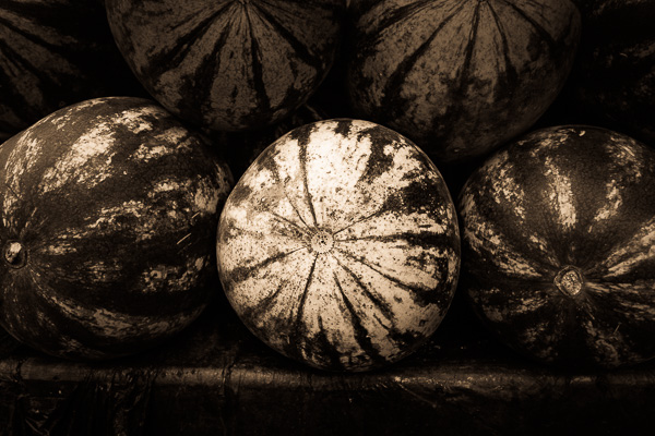
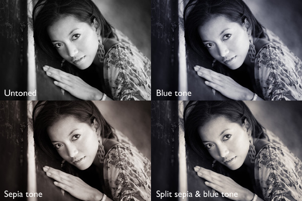
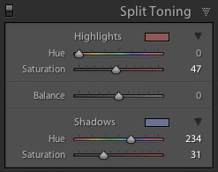
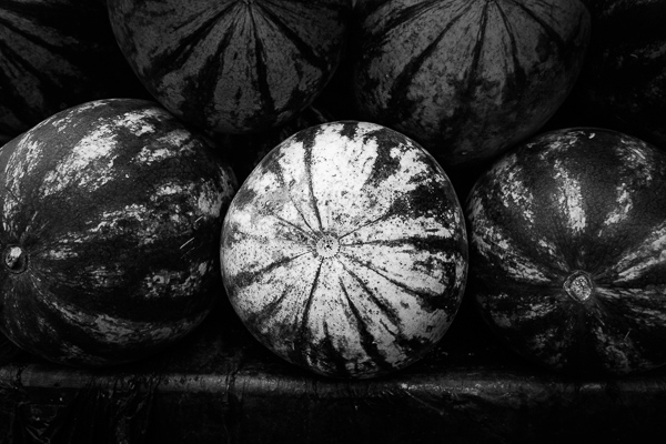
My ebook Mastering Lightroom: Book Three – Black & White goes into the topic of black and white in depth. It explains everything you need to know to make dramatic and beautiful monochrome conversions in Lightroom, including how to use the most popular black and white plug-ins. Click the link to visit my website and learn more.

googletag.cmd.push(function() {
tablet_slots.push( googletag.defineSlot( “/1005424/_dPSv4_tab-all-article-bottom_(300×250)”, [300, 250], “pb-ad-78623” ).addService( googletag.pubads() ) ); } );

googletag.cmd.push(function() {
mobile_slots.push( googletag.defineSlot( “/1005424/_dPSv4_mob-all-article-bottom_(300×250)”, [300, 250], “pb-ad-78158” ).addService( googletag.pubads() ) ); } );

The post How to Split Tone Black and White Photos in Lightroom by Andrew S. Gibson appeared first on Digital Photography School.


Digital Photography School

 
Comments Off on How to Split Tone Black and White Photos in Lightroom

Posted in Photography


37 Relaxing Cool Tone Images To Chill Out With

29 Nov

This week’s image set is all about relaxing and getting to your zen place. Often cool tones relay that message really well as they feel less stressed and calming than warmer colors. Cool tones include blue, purple and even green. See how you feel after viewing these images:

Relaxing cool tone images

Photograph Misty Mono.... by Jay Sabapathy on 500px

Misty Mono…. by Jay Sabapathy on 500px

Photograph Arctic Symphony by Mikko Lagerstedt on 500px

Arctic Symphony by Mikko Lagerstedt on 500px

Photograph Nallo Night by Sander van der Werf on 500px

Nallo Night by Sander van der Werf on 500px

Photograph Feather-Light by Becky Fuller-Phillips on 500px

Feather-Light by Becky Fuller-Phillips on 500px

Photograph New buds by Allen Adnan on 500px

New buds by Allen Adnan on 500px

Photograph Beautiful Borage by kreativgrund on 500px

Beautiful Borage by kreativgrund on 500px

Photograph Wintery by Macro Marcie on 500px

Wintery by Macro Marcie on 500px

Photograph Taming the Storm by Kah Kit Yoong on 500px

Taming the Storm by Kah Kit Yoong on 500px

Photograph Forest Glow by John Center on 500px

Forest Glow by John Center on 500px

Photograph Joshua Tree - Hidden Valley by Steve Sieren on 500px

Joshua Tree – Hidden Valley by Steve Sieren on 500px

Photograph Blue Flowers by Rachel Friedman on 500px

Blue Flowers by Rachel Friedman on 500px

Photograph Split-Tone Chilling Rhino by Simon P on 500px

Split-Tone Chilling Rhino by Simon P on 500px

Photograph Cool Tone by Tony Haddow on 500px

Cool Tone by Tony Haddow on 500px

Photograph feeling cool by one2_three on 500px

feeling cool by one2_three on 500px

Photograph BREATHE by Joel Sossa on 500px

BREATHE by Joel Sossa on 500px

Photograph Frozen by Kumarov(Amkote) Michael on 500px

Frozen by Kumarov(Amkote) Michael on 500px

Photograph Possession by Sébastien DEL GROSSO on 500px

Possession by Sébastien DEL GROSSO on 500px

Photograph Italy – Piccoli Spiriti Blu by Fabrizio Fenoglio on 500px

Italy – Piccoli Spiriti Blu by Fabrizio Fenoglio on 500px

Photograph The Stairs by Frederic Ansermoz on 500px

The Stairs by Frederic Ansermoz on 500px

Photograph "the blue chapel" by Thomas Windisch on 500px

"the blue chapel" by Thomas Windisch on 500px

Photograph Way to Heaven. by Recesvintus Rex Gothorum on 500px

Way to Heaven. by Recesvintus Rex Gothorum on 500px

Photograph In the forest by Evans Lazar on 500px

In the forest by Evans Lazar on 500px

Photograph Ferragudo at dusk by Luis Mata on 500px

Ferragudo at dusk by Luis Mata on 500px

Photograph The Blue Temple by Conor MacNeill on 500px

The Blue Temple by Conor MacNeill on 500px

Photograph Blue Wall by Hesham Alhumaid on 500px

Blue Wall by Hesham Alhumaid on 500px

Photograph Blue on Blue by Roy Cheung on 500px

Blue on Blue by Roy Cheung on 500px

Photograph Going upstairs by Giannis Papanikos on 500px

Going upstairs by Giannis Papanikos on 500px

Photograph Newspaper relax by Carlo Cattani on 500px

Newspaper relax by Carlo Cattani on 500px

Photograph Blue Chefchaouen by Khanh Nguyen on 500px

Blue Chefchaouen by Khanh Nguyen on 500px

Photograph Light at the end of the tunnel by 911  on 500px

Light at the end of the tunnel by 911 on 500px

Photograph The Purple Hour by Tom Keller on 500px

The Purple Hour by Tom Keller on 500px

Photograph High Voltage by Michael Woloszynowicz on 500px

High Voltage by Michael Woloszynowicz on 500px

Photograph Fortress of Solitude by Dustin LeFevre on 500px

Fortress of Solitude by Dustin LeFevre on 500px

Photograph your mirror by neriman ozder on 500px

your mirror by neriman ozder on 500px

Photograph Refuge du Lac Blanc by Sven Müller on 500px

Refuge du Lac Blanc by Sven Müller on 500px

Photograph Gently Snuggle by Shihya Kowatari on 500px

Gently Snuggle by Shihya Kowatari on 500px

Photograph Talbot by Paul Marcellini on 500px

Talbot by Paul Marcellini on 500px

The post 37 Relaxing Cool Tone Images To Chill Out With by Darlene Hildebrandt appeared first on Digital Photography School.


Digital Photography School

 
Comments Off on 37 Relaxing Cool Tone Images To Chill Out With

Posted in Photography