What is it that makes one picture appear dull and another more striking? What is it that makes some tones appear detailed and others smooth and transient? The answer to both of these questions involves the issues of color hue, color purity, and tone distribution.

This street scene in Prague is the original underexposed camera image.

The same image after tonal and color adjustments have been applied.
The science of color and tone
All color detail is determined by these three elements. In the Photoshop/Lightroom world, you’ll recognize these terms as HSL or Hue, Saturation, and Luminance. The world of photography is both an art and a science. The science part is filled with graphs, measurements, and strange words that most people don’t encounter every day.
These terms come from the scientific vocabulary of engineers, chemists, and mathematicians in the photographic trade. When digital cameras were introduced to the general public years ago, suddenly everybody could push around the colors and tonal range in their own pictures. While Adobe Photoshop provided a serious workshop, it showed up with a boatload of technical color science terms.
Unfortunately, if you don’t fully understand the terms, you may not be taking full advantage of the controls they provide. In this article, I’ll do my best to bring these terms down to Earth and make them understandable. We’ll get past the technical jargon and get into the practical application of these terms.
Hue, Saturation, and Lightness
Hue, Saturation, Lightness (luminance) are the irreducible minimum building blocks involved in good color editing and reproduction. While there are many more issues to be addressed in the processing of an image, these three are the make-or-break elements that must be understood and adjusted if you want your color images to catch a viewer’s eye.
Incidentally, when editing your images, these elements should be addressed in that very order; value (hue), intensity (saturation), and tonality (luminance). While hue and saturation concern color, luminance refers to the tonal structure of an image; pretty much an issue of dark versus light.
The Saturation slider affects the intensity of the color in an image. This is a powerful tool; exercise restraint.

The Saturation effect on a Genoa Italy cathedral – normal saturation levels.


None.


Oversaturated.

A Primer on Image Detail
Contrast usually refers to the overall light-to-dark extremes of an image but the real power of post-production editing is in pushing the tonal values around inside the overall range.
But if you really want to make the detail in your image stand out, you must adjust the internal contrast of the image. The biggest difference-maker adjustment should be the middle tones of your images; tones in-between the lightest and the darkest in your image.


The middle slider in Photoshop’s Levels dialog is referred to as the gamma slider. Gamma is another one of those legacy scientific terms that you can think of as a “mid-tone” adjustment. Moving this elementary slider from left to right actually shifts the entire middle range of tones from lighter to darker.

This picture of the King Charles statue in London’s Trafalgar Square is backlit and was dark, but a simple middle tone adjustment opened up the shadows and revealed hidden detail.

Photoshop’s Levels tool is the most basic of tonal controls. There are actually several much more effective tonal shaping tools available in Photoshop and even more comprehensive controls in Adobe Camera Raw and Lightroom. We won’t get into a thorough discussion of these tone adjustment tools and workflow recommendations in this article (perhaps at a later time).


This picture of winter leaves was fairly well exposed but required both tonal and color adjustments to reveal the rich colors in the original scene.

Editing for Tonality
There’s a reason why tone adjustment should be your number one issue in image preparation; even more critical than color accuracy.
Your eyesight has tonal perception and interpretation capabilities that far exceed the dynamic range of any digital camera. Make no mistake, capturing seven stops of light range is an amazing feat. But capturing this wide range of tones doesn’t automatically translate into detail, image definition, or good tonal distinction.
Properly reassigning those internal tones to more closely match what your eyes see is where the real editing magic happens. Hang with me here because this will get a bit involved, but I think it will definitely be worth your time.

This chart shows the difference between the way your eye registers light and how your camera records it.
Camera View – Human View
Your camera’s image sensor records light quite differently than your eye perceives it. The camera actually records a lot of data from the lighter portion of the scene and very little data from the darker portion. The image sensors capture light in a linear fashion. Unfortunately, humans view the lighting in scenes in a logarithmic fashion.
You might say that original camera files usually benefit from a “fashion” adjustment, generally lightening the middle tones. Camera images that don’t get their tonal values adjusted almost always lose detail in the darker areas of the image. Virtually all camera images benefit from internal adjustments.
Chrominance and Luminance Explained

Chrominance deals with the color component of an image while luminance deals with the contrast or tonality component of an image.
Chroma refers to the color in an image while luma describes the non-color or tonal part. Achromatic is a fancy scientific word that is pretty simple to understand. Remember your high school English… the prefix “a” means “without,” so a-chromatic literally means without color.
In the HSL model of color, hue, and saturation fall in the chrominance column while tonality and contrast are on the luminance column (the structural or tonal backbone of an image).
Basic Luminosity Adjustments
Where does the term “luminance” come from? Light is measured in lumens. A lumen is the smallest measurable unit of light visible to the human eye. Luminosity then is the measure of lumens reflecting from (or transmitted through) a light source and perceived by your eye. The more lumens, the brighter the light. Light measurements are also made in increments called candelas. A candela is roughly the value of light produced by a single household candle.

Photo by Akshay Paatil on Unsplash
Just as “horsepower” is a carryover index of a measurement of power (relating to the pulling strength of multiple horses) candelas is an index of the cumulative light emitted from multiple candles. These legacy terms are sometimes confusing, and it would be nice if photographic color science terminology were simplified for those just entering the process, but until then, you’ll have to get acclimated.
I’ll take it slow, as you can easily drown in the scientific terminology minutia. I’ll keep the terminology on a basic digital imaging level so that you can make practical use of what you learn.
Basic Color Science

As stated before, all color is composed of three elements; value, intensity, and luminosity. Value (or hue) refers to the “color” of color, or what differentiates red from orange or purple. Intensity (or saturation) refers to the purity color, distinguishing pastels to pungent colors (the more white light is combined with pure color, the more the color strength is diluted). Luminosity is the measure of the brightness and relates to the image’s lightness or darkness.

Hue (value) differentiates one color from another. Saturation (intensity) determines the purity of color. Luminosity (brightness) determines tonality.
The detail in digital imaging terminology is the degree to which colors and tones distinguish themselves from each other. While hue, saturation, and luminance all play a significant role in detailing an image, the heavy lifting of detail is done by luminance or the shaping of the internal tones in an image. Detail is a product of contrast, and contrast is almost completely controlled by the luminance element. This is why post-production professionals perform all their sharpening adjustments in the luminance channel exclusively.

Photoshop’s Highlight/Shadow dialog box

Adobe Camera Raw main dialog.
Shaping Light
Contrast, like audio equalization, cannot be effectively accomplished by using a linear (bass-treble) type control such is the luminance slider in the HSL panel which simply lightens or darkens an image. The effective shaping of an image requires the individual adjustment of five specific tonal regions of an image; highlight, quarter-tone, mid-tone, three-quarter tone and shadow. I use a variety of controls to shape my tonal contrast.
Ansel Adams once stated, “Half the image is created in the camera, the other half is created in the darkroom.” Though you may never use a darkroom to produce a photographic image, the essence of his statement is still true. Capturing pixels with your camera is only your first step in producing a good picture, what you do with the image that comes out of your camera will determine your skills as a photographer.
Digital photography provides almost limitless avenues for personal expression. Shaping the color and tonality in your images is the backbone of great photography. Determine to learn something new about this fabulous art form every day. Push pixels around and stay focused.
The post How to Understand the Science of Photography and Technical Terms for Mastering Image Tonality by Herb Paynter appeared first on Digital Photography School.

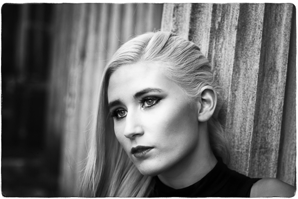


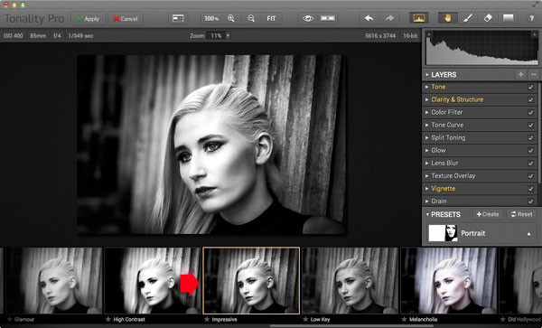
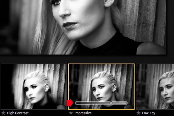
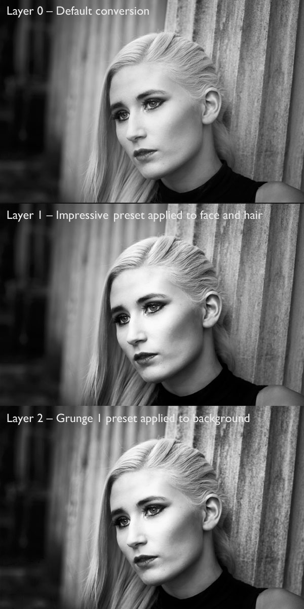
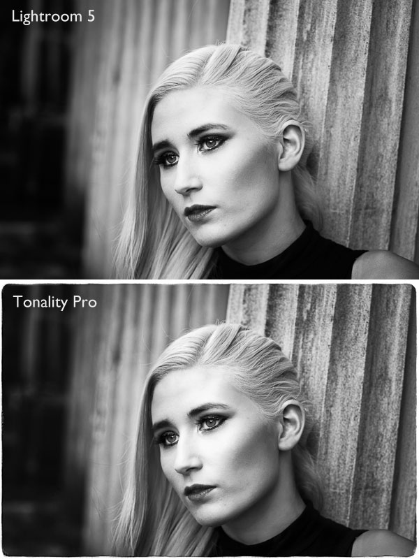
 My ebook Mastering Lightroom: Book Three – Black & White goes into the topic of black and white in depth. It explains everything you need to know to make dramatic and beautiful monochrome conversions in Lightroom, including how to use the most popular black and white plug-ins. Click the link to visit my website and learn more.
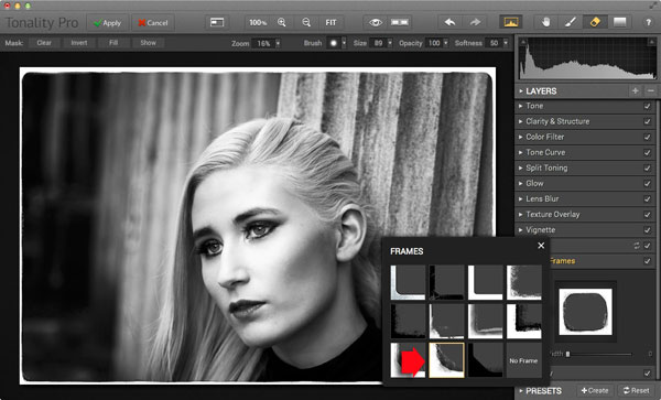
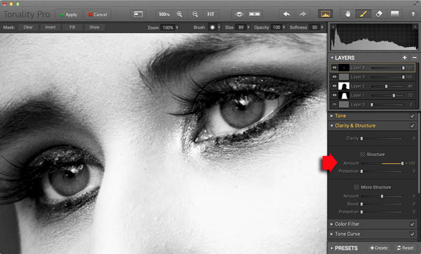
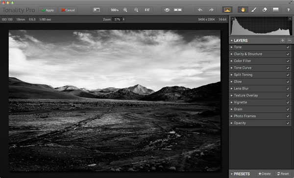
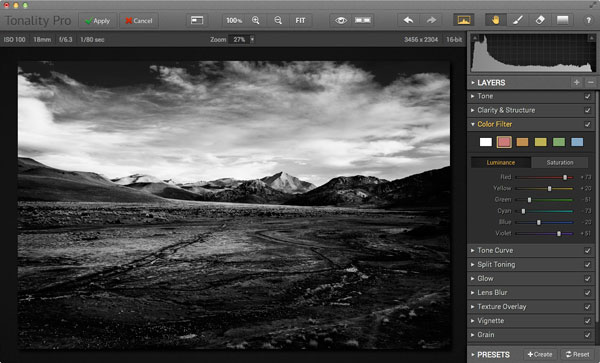
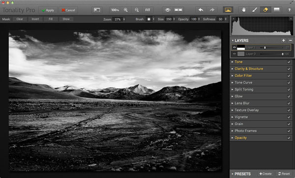
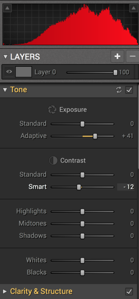 Tonality is easy to pick up right away if you are familiar with Lightroom or Photoshop RAW editing tools. The designers intentionally created an editing panel on the right hand side of your viewing window that looks almost exactly like Lightroom’s editing panel. It includes familiar tools like Exposure, Tone Curve, Split Toning, and Vignetting.


You must be logged in to post a comment.