RSS
 

Posts Tagged ‘Thinking’

5 Tips for Thinking Out of the Box to Inspire Your Photography at Home

05 May

Have you ever felt like the inspiration well is running dry ?

You carry your camera with you everywhere you go, day in and day out, but you just don’t see Kodak moments any more? If you know that feeling, than you must have been around shutters and lenses for some time now, and can’t wait to see something new.

Wait no more! here are some ideas that will inspire you, and help you get rolling again.

Istanbul railway station

1 – Understanding the box in order to think out of it

Photography can be a very technical act; operating your camera in a scientific way, following exact rules that will bring the wanted results. Or it can be the act of an instant emotional reaction to the world, you see a moment and click, you grabbed just it before it’s gone forever, thinking can be done afterwards. Both ways are good and every photographer is captivated by a different mix of both.

Thinking out of the box requires a box to begin. If you find yourself uninterested in doing things that you already know and have done, that is your box. Underneath it is the magic that made you grab the camera for the first time, the thing that got you excited when you held your eye to the viewfinder. On your first encounters with the camera you fell in love with a simple magic that the camera can do, it is now the time to go back to that magic and do it all over again.

The hunt for an interesting texture photo while on a short brake from computer work, led me to this photo out of my studio’s window.

texture out of the window at home

2 – The routine dichotomy

Routine is often thought to be a major enemy of creativity. You walk by the same corner every day for years, and you get used to it so much that you stop seeing its potential to make great photos. On the other hand, routine is the frame in which you create. Once you get used to the background noise, you can pay attention to the little changes in light, color, and small details that are never the same as the day before.

Make routine your friend by focusing your attention on smaller details every time you walk by the same scene. Look out of your window at different hours of the day, over and over again until new details start popping up in your viewfinder.

look for details out of your window

3 – Shoot without a camera

You may put the blame for the drought on your camera, and go look for the latest pixel beast to get you all excited again, or you can try something new, you can try seeing pictures without a camera.

As you do things during your day, try to imagine what they would look like in different photos, with different focal lengths or different exposure values. You may also look at things through a paper cut frame. Hold the frame at a different distance from your eye to zoom in and out, think of your composition, and move on.

Using your imagination instead of a camera will ignite a new spark in the way you see photography. Then, next time that you want to take a photo, you will see it before even having the camera up to your eye.

think-out-of-the-box-photo

4 – The Dead End

Back in the days before smartphone and GPS, you had to find your way around when driving in a new place, and once you faced a dead end street, you had to u-turn and find a new way. That’s when you had to be creative and come up with an inventive solution. That leads to thinking out of the box.

That survival skill is still there and can be kicked in by defining small boundaries in which you photograph, limiting yourself to taking pictures in uncomfortable conditions. For example, do portraits with just a wide angle lens, or look for triangle shapes only with a telephoto lens. Creating dead ends for your photography will force you to find creative solutions, which will lead to new and exciting photographs of the same old world.

The Fuji X100's fixed lens has made me cross the street to get closer to this group of boys and created a strong feeling of speed. Photo by Ouria Tadmor

The Fuji X100’s fixed lens has made me cross the street to get closer to this group of boys and created a strong feeling of speed.

5 – Experiment with home made light

In your home there are many different light sources that would make a good starting point for a photo session, they can be the subject of your photo and the light source at the same time. When you start from the light source and challenge yourself to see where you can go with it, you challenge your creative mind to take a different path than the more common way of seeing something you want to photograph, and thinking how to light it. Mastering this thinking technique can be of use later when you might need to photograph a subject that is not talking to you, just go for the light.
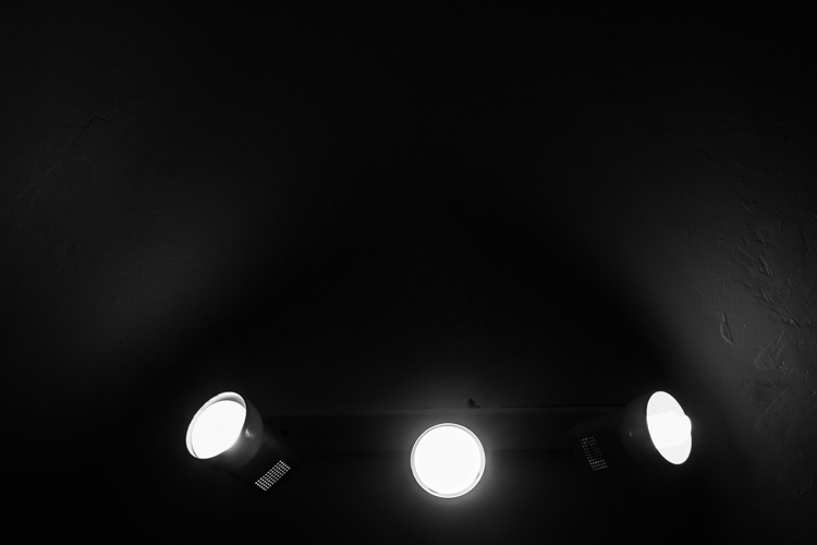
Home lights as photo inspiration

Conclusion

It is not always possible to stay creative and inspired in photography, but the innovative side of your brain can be kept in shape by repeating these small exercises regularly, at home with any type of camera. Do so and you are promised to come home with better photos next time you go on a photographic vacation.

googletag.cmd.push(function() {
tablet_slots.push( googletag.defineSlot( “/1005424/_dPSv4_tab-all-article-bottom_(300×250)”, [300, 250], “pb-ad-78623” ).addService( googletag.pubads() ) ); } );

googletag.cmd.push(function() {
mobile_slots.push( googletag.defineSlot( “/1005424/_dPSv4_mob-all-article-bottom_(300×250)”, [300, 250], “pb-ad-78158” ).addService( googletag.pubads() ) ); } );

The post 5 Tips for Thinking Out of the Box to Inspire Your Photography at Home by Ouria Tadmor appeared first on Digital Photography School.


Digital Photography School

 
Comments Off on 5 Tips for Thinking Out of the Box to Inspire Your Photography at Home

Posted in Photography


How Thinking Film and Shooting Digital Can Improve Your Photography

27 Mar

Film is not dead. But since the advent of digital photography, about 20 years ago, film has certainly taken a back seat. Since just over a decade ago, when digital cameras were widely available to the masses, film has almost been completely replaced. However, there’s a lot to be learned from the disciplines of analog days, before the ability to take photos so instantly, and at a phenomenal rate and remarkable quality, was made accessible to everyone with a digital camera.

think film shoot digital creative project_0000

Back in film days, we only had a limited amount of frames we could shoot on one roll. Often the camera sat for days and weeks until we had shot all the frames on the roll of film. We then carefully rewound the film and packaged it off to the film developers, then we wait…hours, days, weeks before we even saw the images we shot. Shooting film was no doubt a methodical exercise in process and patience.

think film shoot digital creative project

But, film has made a comeback in recent years. Many professional digital photographers have added film to their arsenal, others have made the complete switch back to film, and there are those who never made the switch to digital in the first place. Exciting days for analog in this predominantly digital age!

One way to learn from the disciplines of shooting film is to think in film mode.

think film shoot digital creative project

Go out with your camera with the following restraints:

  1. Set yourself an imaginary film roll number. Limit the number of frames you can shoot to 12, 24, or 36.
  2. Keep your ISO to a set number like 100, 200, 400, or 800 – which are the common film speeds from those days.
  3. Use only one lens. I’m sure not many of us, unless we were professionals then, walked around with an array of lenses in hand. Often we just used one lens, carried no back up film, or batteries, or external flash!

think film shoot digital creative project

Now shoot like you have a film camera in your hand and adopt these mindsets:

1.Don’t spray and pray!

When you take a photo, bear in mind how many frames you have left, and think carefully before you press the shutter. You cannot spray and pray with film, therefore have to exercise restraint. Look at things carefully, with an intentional eye, and imagine what the scene might look like before you take the shot. This helps you compose the frame more meticulously, and look at the light and dark contrast of the scene with more discernment.

think film shoot digital creative project

2. Think of a story or theme, or limit yourself to one place.

Boundaries are always helpful, they stretch you to think outside the box, more than when you have all the freedom in the world to photograph anything you please. It also helps make a cohesive story at the end, should you wish to collate your photos together on a blog or in an album.

think film shoot digital creative project

3. Don’t fear deep darkness or the raging midday sun.

Film is so good at retaining details in highlight and shadow areas of a photograph, that the dynamic range of the image is miles better compared to the digital camera image. Film also has a very forgiving nature when it comes to underexposure and overexposure over a wide range of stops. So with your film brain on, don’t fear extreme brightness or deep darkness. However bear in mind the settings to use that could help you in such circumstances.

When your subject is in bright daylight, and you don’t have a light meter handy, adopt the sunny f/16 rule. This means you use the following settings: aperture f/16 and your shutter speed set to the reciprocal of your ISO, or film speed. For example, if you have set your ISO to 100, this means your aperture will be f/16 and your shutter speed to the closest of 100 which is 1/125 (or any equivalent exposure value such as f/11 at 1/250, or f/8 at 1/500).

think film shoot digital creative project

4. Go where the light is

Whether it be natural light or any other available light, whether under the brightness of the sun or just candelight in a room, find the light. Film is extremely sensitive to light and if you adjust your shutter speeds in low light accordingly, you will be surprised at how well film can capture ambient light. Remember when shooting in low light, steady yourself or your camera, lower your shutter speed and adjust your aperture (open it wide). Your ISO cannot be changed; with film you only have two sides of the exposure triangle to play with.

think film shoot digital creative project

5. Edit for a film look

Nowadays there is a plethora of Lightroom presets, and Photoshop actions, that replicate the film look. If you are a dab hand at Photoshop, you can probably do it yourself from scratch. The main elements you are after to replicate the general film look are: pastel tones, creamy highlights, soft shadows, low and controlled contrast, reduced saturation, matte look (reduced black output), creamy skin tones, and some grain. Of course the actual overall look depends of the type of film used, but this list would encompass the general look and feel that film gives to an image.

think film shoot digital creative project

The photos I have used in this article were taken with a D700 and a 35mm f/1.4G, captured one day in London when I went out thinking film and shooting digital. I shot 22 frames out of 24 in three hours, nailed 19, botched two and fixed one in Photoshop.

think film shoot digital creative project

I hope you try this exercise and have fun with it. Share below in the comments how many frames you managed to shoot under great restraint, and then celebrate!

think film shoot digital creative project

amzn_assoc_placement = “adunit0”;
amzn_assoc_enable_interest_ads = “true”;
amzn_assoc_tracking_id = “dpsgeneral-20”;
amzn_assoc_ad_mode = “auto”;
amzn_assoc_ad_type = “smart”;
amzn_assoc_marketplace = “amazon”;
amzn_assoc_region = “US”;
amzn_assoc_linkid = “6710d26f550e9793f41475ee806fee9e”;
amzn_assoc_emphasize_categories = “13900861”;
amzn_assoc_fallback_mode = {“type”:”search”,”value”:”digital cameras”};
amzn_assoc_default_category = “Photo”;

googletag.cmd.push(function() {
tablet_slots.push( googletag.defineSlot( “/1005424/_dPSv4_tab-all-article-bottom_(300×250)”, [300, 250], “pb-ad-78623” ).addService( googletag.pubads() ) ); } );

googletag.cmd.push(function() {
mobile_slots.push( googletag.defineSlot( “/1005424/_dPSv4_mob-all-article-bottom_(300×250)”, [300, 250], “pb-ad-78158” ).addService( googletag.pubads() ) ); } );

The post How Thinking Film and Shooting Digital Can Improve Your Photography by Lily Sawyer appeared first on Digital Photography School.

Digital Photography School

 
Comments Off on How Thinking Film and Shooting Digital Can Improve Your Photography

Posted in Photography


Cities of Tomorrow: Refugee Camps Require Longer-Term Thinking

02 Dec

[ By WebUrbanist in Architecture & Cities & Urbanism. ]

refugeeeee

Former mayor of the world’s second-largest refugee camp, humanitarian Kilian Kleinschmidt notes that the average life of a refugee camp is 17 years, “a generation,” and these places need to be recognized as what they are: “cities of tomorrow,” not the temporary spaces we like to imagine. “In the Middle East, we were building camps: storage facilities for people. But the refugees were building a city,” Kleinschmidt told Dezeen in an interview. Short-term thinking on camp infrastructure leads to perpetually poor conditions, all based on myopic optimism regarding the intended lifespan of these places.

kilian kleinschmidt

Many refugees may never be able return home, and that reality needs to be realized and incorporated into solutions. Treating their situation as temporary or reversible puts people into a kind of existential limbo; inhabitants of these interstitial places can neither return to their normal routines nor move forward with their lives.. On the one hand, assert experts like Kleinschmidt, planners need build up refugee camps to be durable and sufficient places in their own right. On the other, they also need to move refugee migrants toward countries and regions where they will end up virtuously integrated into struggling economies, including (though controversially): areas of nearby Europe with unused housing and high labor needs.

refugee housing

Beyond providing more thoroughly for essentials, Kleinschmidt sees additional opportunities to enable refugees with new technologies: “With a [3D-printing] Fab Lab people could produce anything they need – a house, a car, a bicycle, generating their own energy, whatever,” he said. Unfortunately, governmental bureaucracies and aid organizations are reluctant to push boundaries and try new approaches. More fundamentally: they frequently fail to recognize the need for robust solutions that help facilitate refugees who are themselves working hard to create real places for living.

refugee housing ikea

“I think we have reached the dead end almost where the humanitarian agencies cannot cope with the crisis,” he said. “We’re doing humanitarian aid as we did 70 years ago after the second world war. Nothing has changed.” Kleinschmidt worked with the United Nations and their High Commission for Refugees for 25 years before starting an independent consultancy that continues to address humanitarian issues around the globe.

His previous senior roles included deputy humanitarian coordinator for Somalia, deputy special envoy for assistance to Pakistan, acting director for communities and minorities in the U.N. administration in Kosovo, executive secretary for the Migration and Refugee Initiative (MARRI) in the Stability Pact for South Eastern Europe, and many field-based functions with U.N.H.C.R., U.N.D.P. and W.F.P. He worked extensively in Africa, Southeastern Europe, Pakistan and Sri Lanka.

Share on Facebook


[ By WebUrbanist in Architecture & Cities & Urbanism. ]

[ WebUrbanist | Archives | Galleries | Privacy | TOS ]


WebUrbanist

 
Comments Off on Cities of Tomorrow: Refugee Camps Require Longer-Term Thinking

Posted in Creativity


The Magic of Thinking Big in Photography

05 Mar

R0130233

You want to be the best photographer you can. You’re constantly trying to educate yourself, improve, and take your photography to the next level. But how can you take your photography to new heights, and stand out from the crowd?
The secret is thinking big.

If you look at successful individuals outside of photography such as Elon Musk, Jeff Bezos, Richard Branson, and Larry Page – what do these leaders have in common? How were they able to leverage their strengths, continuously add value to the world, and become successful at what they do?

In the book “Bold”, author Peter Diamandis shared the three attributes he thought they all had in common:

  1. Passion
  2. Purpose
  3. Curiosity

In this article you will learn how you can better leverage passion, purpose, and curiosity to take your photography to the next level.

1. Passion

Passion is having this fire burning inside yourself — that you would do something (even if it didn’t earn you any money). You are passionate about doing things by which you feel intrinsically motivated (rather than extrinsically).

For example, let’s do a thought experiment – if you were suddenly given one billion dollars, and didn’t have to work another day in your life, what would you do with the rest of your life?

Personally for me, I am insanely passionate about street photography, education, and sharing knowledge. Even before I was able to do street photography workshops full-time to support myself, I was running a blog out of the pure joy of it (in order to help others), while I was working a full-time job.

R0130194

So what are you passionate about?

I assume if you’re reading this article, you are passionate about photography. But what kind of photography really turns you on? Is it street photography? Is it landscape photography? Is it portrait photography? What really gets you up in the morning and calls you to be photographed?

To be frank, passion is something you can’t fake. You either have it, or you don’t. But we all have things we are passionate about, especially when it comes to photography. So don’t ask others what they think would make an interesting photograph, just follow what you are passionate about, and photograph whatever inspires you.

2. Purpose

It isn’t enough to simply be passionate about what you do. If you want to be persistent with your work and your art, you need to have a strong sense of purpose. So how can you apply the concept of purpose to your photography?

R0130128

Well, you’ve got to make photos that aren’t just for yourself, but photos that you hope will influence, move, and change others.

So for example, the reason I am drawn to street photography is because I feel that the images I make are purposeful. The images I make try to explore the human condition — how people feel and interact with the world. I wish to make images that my viewers can empathize with on an emotional level.

Even if you’re not into street photography, let’s say you’re into landscape photography, how do you find landscape photography meaningful? Ansel Adams was passionate about nature, but also felt that he had a purpose to protect and conserve it. So the purpose of his photography was to connect with nature on an almost spiritual level, to show the world how beautiful these national parks were, and how they needed to be protected.

So think to yourself — how are your photographs meaningful to you, and how do they serve a purpose by inspiring others?

At the end of the day, if your photos serve a purpose to make you happy, that is good enough. But then again, you may also wish to make photographs that have a social purpose that will help inspire, influence, and move others.

3. Curiosity

R0130163 2 R0130091

The sad thing is that when we are children we are infinitely curious, but that curiosity dies off when we are adults. You can be as passionate and purposeful with your photography as you want, but unless you are curious, you won’t continue breaking new ground and evolving as a photographer.

Curiosity is following your intuition, your gut. Curiosity is following whatever you find interesting. Curiosity is like a bottomless pit — the more you feed it, the more curious you become (which in my opinion is a good thing).

So if you currently shoot flowers and are curious to try out street photography — follow your curiosity and check it out. If you currently shoot street photography but want to get into fashion — follow your curiosity and check that out. If you shoot digital and want to try film, ask your parents or your friends for an old film camera and give it a go.

Curiosity is the only thing in life worth following, to keep us alive creatively as artists and visual poets.

Conclusion

R0130115

I can guarantee you if you follow these three things (passion, purpose, curiosity) — your work will excel. You will continue to make more photographs, they will be meaningful, and your work will become more complex and advanced as time goes on.

The secret to becoming a great photographer comes down to hard work, putting in the time, and making more images that continue to challenge you.

But at the same time, you want to be like a child in following your curiosity and not taking yourself too seriously.

Try to find a mix of hustling hard in photography, and having a good time. Stick with this recipe, you will really become the best photographer you can, and achieve all your dreams.

googletag.cmd.push(function() {
tablet_slots.push( googletag.defineSlot( “/1005424/_dPSv4_tab-all-article-bottom_(300×250)”, [300, 250], “pb-ad-78623” ).addService( googletag.pubads() ) ); } );

googletag.cmd.push(function() {
mobile_slots.push( googletag.defineSlot( “/1005424/_dPSv4_mob-all-article-bottom_(300×250)”, [300, 250], “pb-ad-78158” ).addService( googletag.pubads() ) ); } );

The post The Magic of Thinking Big in Photography by Eric Kim appeared first on Digital Photography School.


Digital Photography School

 
Comments Off on The Magic of Thinking Big in Photography

Posted in Photography


The Peeling Project: Thinking Outside The Big Box Store

10 Aug

[ By Steve in Architecture & Offices & Commercial. ]

BEST Products The Peeling Project 1a
What happened when an edgy architecture firm met an open-minded chain of big box retail stores? The very appealing Peeling Project, that’s what.

BEST Products The Peeling Project 1

We’ll leave it for others to document the startling and unlikely history of The Peeling Project in detail; our task at hand here is to display, in chronological order, the unique and individual extreme makeovers given to nine Best Products catalog showroom stores between 1971 and 1984. We’ll also show, if possible, the fate of these bold experiments in retail architecture following Best Products’ demise in 1998. We’ll begin where it all began: the Best Products store at 5400 Midlothian Turnpike in Richmond, VA.

BEST Products The Peeling Project 1c

BEST Products The Peeling Project 1d

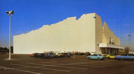
Designed (as were all of the Project’s, er, projects) by architecture firm SITE Inc. (“Sculpture In The Environment”), the initial installation featuring a front facade that appears to be peeling away from the building ended up giving its name to the entire series of nine works. Built with safety in mind, the surrealistically embellished front facade was constructed with care and at obvious expense. Even so, that didn’t prevent new owners the Daily Pawn Shop from reverting the building to its original boring boxy look shortly after acquiring it.

Indeterminate Façade

BEST Products Indeterminate Facade 2a

BEST Products Indeterminate Facade 2b

Built in 1974-75, Indeterminate Façade was the second of SITE’s collaborations with Best Products and over time has emerged as the most famous. Located at 10765 Kingspoint Road in Houston, TX, the store started out as a standard large building but SITE artists then extended the outside walls unevenly to evoke a “distressed” appearance – the highlight of which was a waterfall of brick and masonry spilling onto the front awning.

BEST Products Indeterminate Facade 2c

BEST Products Indeterminate Facade 2d

Perhaps due to its notoriety, Indeterminate Façade remained unchanged through at least one change of ownership after Best Products declared bankruptcy for the final time. Sometime in 2003, however, the artistic extensions suddenly and mysteriously vanished. Some say the building’s owner heard rumors the City of Houston was about to declare the structure to be of historical significance and feared losing the freedom to alter the building at will in the future.

The Notch Project

BEST Products Notch Project 1a

BEST Products Notch Project 1b

BEST Products Notch Project 1c

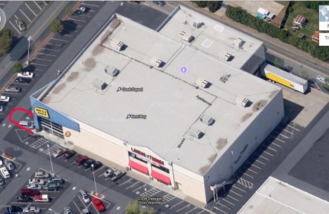
When a Best Products store at 1901 Arden Way in Sacramento, CA known as The Notch Project opened in 1977, balloons poured out of the gaping “notch” that appeared when the building’s 14ft high, 45-ton front corner wedge slid aside to reveal the main entrance. Each morning thereafter, the corner piece would slide aside and each day at closing time it would slide back into position – sans balloons, mind you.

BEST Products Notch Project 1d

After Best Products sold off its bricks & mortar assets, the former Notch Project building was bought by Best Buy – an infamously non-innovative corporation who’s directors dictated all its stores must conform to the corporate look. We’re sure you’ll agree that when it came to imaginative branding, Best Products bested Best Buy by far.

Next Page – Click Below to Read More:
The Peeling Project Thinking Outside The Big Box Store

Share on Facebook


[ By Steve in Architecture & Offices & Commercial. ]

[ WebUrbanist | Archives | Galleries | Privacy | TOS ]


WebUrbanist

 
Comments Off on The Peeling Project: Thinking Outside The Big Box Store

Posted in Creativity


Inspiration Pad: Lined Notebook for Thinking Outside the Box

09 Jun

[ By WebUrbanist in Design & Products & Packaging. ]

inspiration pad contours

Made for those who like to color outside lines and jot outside boxes, each page of this bound pad provides a unique source of inspiration and different framework for drawing, sketching and writing out ideas.

inspiration pad detail

inspiration pad shifty

Available from tmsprl, the minimalist brown-bound notebooks show traditional lines on the front and back but playing on and warping the horizontal blue-on-white (with red verticals) convention within.

inspiration pad building angle

inspiration pad geographic contours

inspiration pad thick lines

Some pages sport twisting topographic lines while others thin, thicken, curl, loop, twist and spiral, encouraging the user to put pencil or pen to paper in different ways throughout.

inspiration pad cover

inspiration pad lined up

inspiraiton pad trending curve

inspiration pad stair steps

inspiration pad wavy blue

The deeper you delve the more surprises you find, starting with upward-swooping lines and culminating in crazy abstract patterns and strangely whimsical shapes.

inspiration pad infinity symbol

inspiration pad outward spiral

inspiration pad wrapped swirl

inspiration pad back cover

A few notes from its creator: “If you’re in search of inspiration, this notepad might help. Second edition. 48 pages, dimensions 165 x 210 mm, softcover. Printed on sustainable paper in Belgium.”

Share on Facebook


[ By WebUrbanist in Design & Products & Packaging. ]

[ WebUrbanist | Archives | Galleries | Privacy | TOS ]


WebUrbanist

 
Comments Off on Inspiration Pad: Lined Notebook for Thinking Outside the Box

Posted in Creativity


2 May, 2014 – Sony a7R Wishful Thinking

03 May


Today we feature an article by Rick Kattlemann.  Rick has done an extensive article on the lens options for Sony’s popular a7r camera, specifically focusing on the wide angle options.  When Sony launched this camera their offering of dedicated lenses was minimal to say the least.  Rick looks at what is available to use with adapters.  If you are considering a purchase of a Sony or are looking for wide angle lenses then this is a must read.  Read  Sony a7R Wishful Thinking


There aren’t too many places to slow your photography down and to work the landscape as the Isle Of Skye. Come join Kevin Raber, Steve Gosling and Joe Cornish on an remarkable photographic adventure.  

It gets even better.  This workshop is being done in partnership with Phase One as a PODAS workshop, and each participant will receive a Phase One camera system to use for the duration. 

Spaces will go quickly.  Your fee provides an all expenses paid, worry-free trip. All you need do is get to the Inverness airport.  Learn more about this amazing week of photography HERE.

If you can’t make this workshop check out our other workshops.  We have an special small ship cruise in July to The Land Of The Polar Bear.  We have only select berths left for this trip so please inquire.   And our August Palouse Harvest Workshop is filling fast. There are also still a few berths left for our second Antarctica Workshop next January. 


Mark your calendars for December of this year in New Zealand, details coming soon and a most remarkable adventure next April aboard the True North sailing the Kimberley region of Western Australia.


The Luminous Landscape – What’s New

 
Comments Off on 2 May, 2014 – Sony a7R Wishful Thinking

Posted in News


These impressive photos will trick you into thinking they’re paintings

16 Sep

painting30.jpg

Photography, as an art form, can be quite elastic. It can be used to capture the ‘decisive moment’ or a once-in-a-lifetime split-second shot. Or, the form expands into more studied, careful, fine art approaches. These photos fall into the second category. Their use of color and lines, artificial lighting and repetition give them a lot in common with paintings – so much so that they might just trick you at first glance. 

News: Digital Photography Review (dpreview.com)

 
Comments Off on These impressive photos will trick you into thinking they’re paintings

Posted in Uncategorized


Sharp thinking: Nikon creates selectable strength low-pass filter

30 Aug

shared:NikonLogo.png

Nikon has patented a technology that can adjust a camera’s low-pass (AA) filter based on the situation. By using an electronically controlled liquid crystal panel, the AA filter can either be turned on and off, or set to ‘normal’ or ‘high’ intensity. The first design would allow for a D800 that become a D800E at the push of a button. The second design would have a mild anti-aliasing effect for stills, and a stronger effect to reduce moiré in movies. More details on this exciting development after the link.

News: Digital Photography Review (dpreview.com)

 
Comments Off on Sharp thinking: Nikon creates selectable strength low-pass filter

Posted in Uncategorized


Thinking of Starting a Photo Community on the Web? Should You Do It on Flickr or Google+?

15 Dec

Google+ Communities vs Flickr Groups

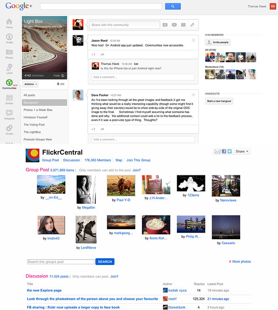
Google+ launched their new communities last week and I’ve spent a lot of time exploring how they work since launch. I’ve also spent quite a bit of time super active over the past eight years in Flickr groups. Google+ communities are a lot like Flickr groups, but there are key differences, advantages and disadvantages to both. I thought I’d write a post comparing the two. I’ve long held that Flickr groups represent Yahoo’s best chance for social going forward.

So here’s the smackdown.

1. Thread bumping. Flickr wins. Probably the most significant problem with G+ communities is that they do not bump threads. With Google+’s new communities discussion topics are only shown by most recent post. Unfortunately the most recent post is not always the most interesting/engaging post. What’s more, because threads are not bumped upon a new comment, almost every thread over 24 hours in an active community on Google+ dies. Good conversations should last more than 24 hours. Flickr solves this problem by simply bumping each thread back to the top of the discussion forum anytime someone makes a comment on it. This is a far better way to keep a discussion forum active and engaged.

2. Muting discussions. Google+ wins. One of the problem with Flickr is that there is no way to screen out discussions that you are not interested in. If I don’t care about football, why should I have to see a thread about football in my favorite photography forum. At Google+ the answer is simple. Just go to the thread and choose to “mute this post.”

3. Photo pools. Flickr wins. At G+ you are forced to try to use typical discussion threads to post photos. Flickr, by contrast has a group photo pool that is associated with each group. Although it’s tempting to see photo pools as more of a photography niche feature, I’d argue that every community potentially has photos to share. Even if the photos are not artistic oriented photography, every group of people will potentially want to share photos with each other. Ideally, a group/community should be allowed to have more than one photo pool/album with settings to allow how content can be shared in those pools.

4. Community activity. Google+ wins. Even less than two weeks old, communities on Google+ are far more active than Flickr. Individuals are far more engaged and the rate of velocity around community conversations is much higher at Google+.

I started a new community called Light Box on Google+. It’s based on a voting game similar to voting groups I’d created on Flickr in the past. On Google+ the group already has over 4,000 members in less than a week. At Flickr it would take me months to build a group up that large. The G+ community is already 20x more active than any voting group/game I’ve ever seen on Flickr. When it comes to community velocity there is simply no comparison. Google+ communities are some of the most active I’ve ever seen anywhere on the web.

5. Invite process. Google+ wins. Google allows you to invite participants in circles up to around 195 people max. Sending out one invitation to 195 people is a lot easier than the way that Flickr allows you to invite people. On Flickr you can only invite a single member one by one by one by typing their individual name — wayyyyy too much work.

6. Sticky threads. Flickr wins. One of the thing Flickr allows a group owner/moderator to do is to make certain threads sticky so that they always stay at the top of the discussion threads. This is helpful if you have a group/community FAQ or other material that is important to stay prominent to the membership. At present you cannot make sticky threads at Google+.

7. Adult oriented communities. Flickr wins. Although there are some deep underground private communities on G+ focusing on nudes, G+ by TOS doesn’t allow nudity and this content is subject to being removed. On Flickr, they do allow nudity as long as it is properly flagged as nudity. In Flickr’s case this has resulted in both communities discussing artistic fine art nudes, but also a pretty seedy amateur underground porn network as well. Flickr routinely deletes many of the most offensive adult oriented communities, but if fine art nudes are your thing, you’re probably more likely to find these communities on Flickr than G+.

8. Moderating community membership. Flickr wins. It’s much easier to moderate community members in Flickr groups than in Google+ communities. On G+ you must scroll through an entire list of community members in order to find the person you wish upgrade to moderator or ban from your community — page after page after page after page. With any large community on G+ this is a very cumbersome process. Flickr by contrast has a powerful search tool which allows you to search for a member my name to upgrade or ban them.

9. Blocking members. Google+ wins. It cannot be overstated how important a good blocking tool is to community management. Inevitably some community members will not get along. Especially since Flickr allows obvious anonymous troll accounts to inhabit communities, users need some way to immediately protect themselves against bullying and harassment. Flickr’s community blocking tools are weak and non-existent. By contrast Google+ provides users a powerful blocking tool which turns anyone invisible that you choose to block.

Even more important than this user option is the tone that is set in communities because of it. When you know that you can be blocked by other people you are nicer and more polite. I wrote a post a while back about how Google+ is the nicer community for photographers on the web. Flickr groups are routinely full of trolls, jerks and assholes. Even the ones who are tolerable oftentime pride themselves on abusing other community members with their snide, disparaging comments. They think it’s cool to be “snarky.” On Google+ these people are routinely dismissed and blocked and the overall tone is far more positive.

10. Mobile tools. Google+ wins Earlier this week Flickr rolled out a new version of their iPhone app that has a simple thread reader for Flickr groups. The app is AWESOME by the way. When Google+ rolled out communities last week they did not have support for mobile, but today they added it for both iPhone AND Android. I would suspect that a group thread reader will be coming to a future Android app for Flickr.

11. Group/Community recommendation. Google+ wins. On Flickr I am recommended groups that are years old, super dead and with zero activity in them. These are old groups that some Flickr employee chose to highlight years ago. By contrast on G+ I’m recommended communities that really are personally directed and targeted towards me. These are communities that are thriving and active. I’m guessing that there may be some Google curation of these recommendations, but what I’m seeing feels much more algorithmically based and the algorithm recommending communities on G+ feels super smart and personalized to me.

12. Hangouts. Google+ wins. From time to time you will want to get more involved with the members of your community than just discussion threads. With Google+ you can hold a hangout and do live video/voice interaction with other members through Google’s hangout feature. Flickr doesn’t have anything like this.

13. SEO. Google+ wins. While both Google+ and Flickr offer you private communities with an option to not index the community for the web, both also allow public communities that can be indexed for the web. With any public community you will want to have your community index well in search on the web. Google promotes Google+ posts by the people that you follow — if you are searching for a group on the web, there is a much better chance that you will find groups by your friends on Google+. Already my new Light Box group indexes for the first page search results for Light Box when I search regular Google and am logged in. Personalized search gives your group an advantage for being found on Google by your contacts and friends.

The final verdict? Google+ communities win. In my opinion Google+ communities are far more engaging, active, positive places to hang out than Flickr groups. As much as I enjoyed Flickr groups in the past, I think all of my community time going forward will be happening on Google+ instead. While I’m optimistic that team Flickr can/should create a better group experience for users, it may be too little too late at this point.

While Flickr does have Google+ beat on some important features like thread bumping and photo pools, these features are not enough to make up for the current velocity and dynamic advantage that Google+ communities have. Social photographers have been leaving Flickr groups over the past few years as they’ve been setting up camp at G+. Now G+ gives them the one thing that they missed from Flickr, a solid community experience. I suspect that communities on G+ will only get better and better in the weeks ahead. Google+ tends to release things in beta form, bugs and all, and then iterate very rapidly. I’m confident that some of their limitations today will be improved in the future. Hopefully they even give us thread bumping and photo pools like Flickr. :)


Thomas Hawk Digital Connection

 
Comments Off on Thinking of Starting a Photo Community on the Web? Should You Do It on Flickr or Google+?

Posted in Photography