RSS
 

Posts Tagged ‘There’

There can be only one: why isn’t the EOS R3 an EOS R1?

20 Jun
Something is beginning to make me think Canon intends the EOS R3 to be a full-on pro sports camera.

Time has a habit of eroding certainty like the sea lapping at the foreshore; something like that, anyway. The point being that opinions and predictions have a horrible habit of being rendered outdated, and even downright ridiculous, by events. Which is my roundabout way of saying that I’m having second thoughts about the EOS R3.

When Canon first announced its development, I opined that it was going to be an intermediate model between the EOS R5 and a forthcoming EOS R1, just as the EOS 3 had been, back in the colloidal swamp of the film era. But the latest droplet of attention-sustaining PR from Canon about its forthcoming model has left me wondering: might I have been… how can I say this? Wrong?

Making something from the latest morsels

The latest tranche of specs released by Canon makes the EOS R3 look much more like a mirrorless EOS-1D series camera than I’d previously assumed, based on the original announcement. Canon had already revealed that the R3 will exceed the 1D X Mark III’s maximum burst rate, but the model name and talk of eye-directed AF (a feature I wouldn’t assume to be pro-ready in its first iteration) made me conclude that the new camera would be designed for high-end users, but not necessarily ready to become the default choice of the most demanding sideline sports shooters.

The confirmation of 1D X III-style Smart Controllers in the EOS R3 may not have been as eye-catching as the promised Eye Tracking AF system, but it suggests the R3 will try to match the DSLR’s speed of AF point control

But Canon’s announcement that the R3 will have an Ethernet port and a host of wired and wireless means of sending images quickly from the camera makes me question my assumptions. The provision of the smart controllers, previously seen on the 1D X Mark III, but not the more lowly EOS R5 also point towards the R3 being more pro-focused. And, perhaps because I spend far too much of my life thinking about these things, the use of the same LP-E19 battery as used by the 1D series tells me that Canon expects the R3 to sit alongside 1D X cameras: not just because a large battery suggests a high level of endurance or dependability, but also because it will lend the R3 cross-compatibility for people already using LP-E19s.

So why isn’t it called the EOS R1?

If, as it appears, the R3 is going to be a camera that aims to do pretty much everything a 1D X III can do, why isn’t Canon just calling it the EOS R1? To my mind there are three possibilities:

Theory #1: The EOS-1D X III is still too new

The EOS-1D X Mark III hasn’t yet had its chance to shine. Canon has historically released its top-end sports cameras just before the Olympic Games, with the expectation that they’ll be the primary tool of photographers covering the event. But, with the 2020 Tokyo games still yet to take place, the EOS-1D X III is a camera that hasn’t yet had its day in the sun. The R3’s development will have continued, despite the delay to the sporting calendar, and hence it’s arrived before 1D X III buyers have had a chance to make good use of their investments.

This is probably the theory I’m least convinced by, but there’s always been an implicit compact between Canon and the professionals and agencies that buy 1 series cameras: that they can make the investment with some confidence that it won’t be replaced or usurped for several years. Introducing a ‘mirrorless 1 series’ before most 1D X III buyers have run their cameras in would undermine that, leaving buyers to agonize over whether to write-off their 1D investment and switch to a mirrorless equivalent.

I know I’m reading a lot into the choice of battery Canon has made for the R3, but I wonder whether the LP-E19 is being used so that photographers using the new camera side-by-side with EOS 1D X cameras won’t need to mess around with multiple chargers.

The argument against this theory is that Canon doesn’t exist in a bubble. Canon is likely to be keenly aware of what Sony and Nikon are doing, so would it dare risk under-selling its mirrorless capabilities by down-branding a camera, just to protect sales of an older model?

Theory #2: The R3 is the fast camera, the R1 will be high-res

The second possibility is that the R1 will be a high-resolution model, to the R3’s high-speed one. This would fit with Canon’s former approach, in which it offered a full-frame 1Ds model for professionals needing high resolution and a high-speed APS-H 1D model for sports. These appeared to merge with the EOS 1D X, which offered relatively high resolution, high speed and a full-frame sensor, but perhaps Canon has decided a two-camera strategy makes more sense, in an era where the definition of ‘high-res’ is being pushed so much higher than fast cameras can match.

Sony’s a1 offers an unprecedented combination of speed and resolution, but still doesn’t come close to the comparably priced GFX 100S for photographers needing maximum detail

Theory #3: The R3 might look good but an ‘R1’ would need to be perfect

The third possibility, then, is simply that Canon doesn’t want to use its ‘1 series’ designation for a mirrorless camera until it can unarguably out-perform the EOS-1D cameras in every regard. All the specs released so far suggest the R3 should be a match for the EOS-1D X Mark III, but the ultimate test of that will be whether professional 1D X users find they can work with and depend upon the R3 to the same degree. Given Canon’s historical reticence to over-claim what its cameras are capable of, this seems plausible to me (and the no-doubt bruising experience surrounding the R5 and R6’s video capabilities may well have left the company erring on the side of caution).

Ultimately, it’s impossible to be sure, based on what Canon has publicly said. We’re hoping the EOS R3 is released soon, so we can find out for ourselves, but with the rescheduled 2020 2021 Tokyo Olympics just over a month away, it seems likely that the camera will be put to the test soon enough. Maybe then we’ll begin to see what, if anything, separates it from a 1-series camera.

Articles: Digital Photography Review (dpreview.com)

 
Comments Off on There can be only one: why isn’t the EOS R3 an EOS R1?

Posted in Uncategorized


Is There a Right and a Wrong Way To Expose Your Photos?

27 Aug

The post Is There a Right and a Wrong Way To Expose Your Photos? appeared first on Digital Photography School. It was authored by Kevin Landwer-Johan.

I have never liked the term ‘correct exposure.’ I don’t believe there’s often a single right way to expose your photos. There’s always room for artistic interpretation depending on:

  • Light
  • Subject
  • Camera
  • Lens
  • Exposure setting choices
  • Composition choices
  • Intent

All these will have some influence on the way a photograph will appear. One of the most important aspects of achieving a pleasing exposure is your intent. This cannot be measured by an exposure meter.

Buddha statue for Expose your photos
© Kevin Landwer-Johan. Nikon D800 | 35mm | 1/8000 sec | f/2.8 | ISO 400.

Choose how you expose your photos

How you expose your photos is a key choice when working with your camera. Most photos you take will display variation in tone from the brightest point to the darkest. You won’t often photograph subjects that are the same tone throughout.

The quality of light and how it reflects off the surfaces in your composition will help determine the exposure value for each tone. Sometimes the range of tones in a composition means your camera will not be able to render them all with visible detail.

Young Chinese woman on a white background
© Kevin Landwer-Johan. Nikon D800 | 35mm | 1/200 sec | f/1.4 | ISO 100.

When the level of contrast is beyond what your camera’s sensor can capture in a single exposure, you have to choose how to expose your photos. What is the most important part of the composition you want to expose correctly? Often this will be the middle tones. Other times it will be either the highlights or the darkest parts of your composition.

Particularly with high contrast lighting, you must choose how you want to expose your photograph. This is where the intent you have for how the photo will look comes into play. Do you want a bright, energetic image, or a more somber and moody one? What look will best suit your subject?

With a more monotone subject, the tonal range will not be large, especially when what you are photographing is not highly reflective. It was very easy to make a nice, even exposure of this dusty little dog lying in the dirt. This was because of the limited tonal range, low-contrast light, and overall beige color.

looking down at a dog on the dirt for expose your photos
© Kevin Landwer-Johan. Nikon D800 | 50mm |1/1000 sec | f/4.5 | ISO 400.

Think like a film photographer

The dynamic range of film is far narrower than that of modern camera sensors. Our digital cameras are far more capable of recording a broader tonal range in a single image than any film. When you take photos with film, you need to be more precise about how you expose your photos. This is more vital in high contrast situations.

Because the tonal range of film is much narrower, you’re more likely to lose detail in the shadows and/or highlights than when you work with a digital camera. Imagining that you are using film can help you be more aware of what part of your composition you want to expose well.

Novice Buddhist monk in the dark
© Kevin Landwer-Johan. Nikon D800 | 35mm | 1/125 sec | f/3.2 | ISO 1000.

For example, when I photographed this novice monk (above), he was in a dark space with light coming through a window. The contrast was significant. I knew that if I let my camera decide the exposure, it would mean the light area of the boy’s face would be overexposed. This is because most of the composition was in shadow.

I used my spot meter to take an exposure reading from the light reflecting off the monk’s face and set my exposure accordingly. In my original file, there is some detail visible in the shadows. I have boosted the contrast during post-processing to eliminate it.

The bell-shaped histogram myth

The notion that a correctly exposed image will produce a bell-shaped histogram is nonsense. You can’t rely on a histogram to provide useful information about exposure.

Histograms are a graphical representation of the tones present in a photo. When the photo is mostly middle tones, you’ll see the histogram as a bell shape: high in the middle section and low toward the left and the right.

The tonal range of the scene you are photographing has an influence on what the histogram will look like. This is why you cannot gauge exposure by looking at the histogram. Some people may find it helpful, but it’s not good practice to rely on it to help you choose your exposure settings. Don’t aim to make your histogram a bell shape.

Old Karen woman against a black background for expose your photos
© Kevin Landwer-Johan. Nikon D800 | 85mm | 1/640 sec | f/2.8 | ISO 400.

For example, portraits made against a black background will never display a bell-shaped histogram. The graph will always spike on the left because there are more dark tones in the image than midtones or light tones. Depending on what a person is wearing, such a histogram may be very flat.

For the image above, the grandma’s face is where I wanted the correct exposure. It would not be possible, even if I wanted it, to set my exposure so that detail in both the background and the headscarf was visible.

Expose your photos with intent

Know what you want before you press the shutter release.

Often, you have chosen your subject. You’ve composed carefully. Then you take a photo with no real regard for the lighting or your exposure setting.

Letting the camera take care of the exposure using averaged metering and an automatic setting is the way many people take pictures. The results of such exposures are relatively predictable. This is because of how cameras are designed and calibrated. To obtain the best exposure each time you take a photograph, you must match it to your intent.

How do you want the light on your subject to look? What is the mood you want your photo to convey? Are you capable of achieving this with the current lighting? These things must be considered before you press the shutter release.

Be in control of your exposure settings. Read your meter as a guide. Rather than ensuring that your meter is reading zero for every photo, adjust your settings to where you can capture the photo that matches your intent.

Buddhist nun at a temple for expose your photos
© Kevin Landwer-Johan. Nikon D800 | 35mm | 1/100 sec | f/2.8 | ISO 400.

Conclusion

I do not believe there is a right or wrong exposure choice for any photo. You can take into account all the technical aspects, but while this approach may produce technically correct images, they will often lack expression and feeling of any kind.

Not being intentional when you expose your photos often produces bland results.

The post Is There a Right and a Wrong Way To Expose Your Photos? appeared first on Digital Photography School. It was authored by Kevin Landwer-Johan.


Digital Photography School

 
Comments Off on Is There a Right and a Wrong Way To Expose Your Photos?

Posted in Photography


Why There are 6 Types of Lightroom Previews and How to Use Them

13 May

Previews are an essential part of the Lightroom workflow. But with so many different types of Lightroom previews, it’s easy to get confused. For example, do you know the difference between minimal, standard and 1:1 previews? Or what a Smart Preview does? Or why 1:1 previews are useless in the Develop module?

The differences are more than academic. The way you use previews makes a big difference to Lightroom’s speed and efficiency. If you want Lightroom to run at optimal speed, you need to build the right previews. Let’s take a look at how to do that.

Lightroom Previews

Why does Lightroom build previews?

If you open a photo in Photoshop, there is no preview. You are looking at the photo itself. So why does Lightroom need previews? The answer lies in the fact that Photoshop and Lightroom edit photos in different ways.

Photoshop is a pixel editor. It changes the pixels of your photo and saves those changes in the file. Lightroom is a parametric editor. It doesn’t change the original photo file in any way. Instead, it keeps a record of any changes made to the photo in the Catalog. As the original photo is unchanged, Lightroom needs to use previews to show you how your photos look after you have edited them.

Let’s take a look at each of the different types of Lightroom previews.

Library module previews

There are several types of preview you can build in the Library module. Previews are used by Lightroom to display your photos in the Library module. They help you view, zoom, rate, and flag photos – all the organizational stuff you want to do in this section.

Whenever you import photos into Lightroom it gives you the option of selecting the type of preview to build. There are four choices. The first two (Minimal and Embedded & Sidecar) are relevant if you want to import photos quickly and are happy with a low-resolution preview.

Lightroom previews

Minimal previews:

These are the smallest previews possible. Minimal previews save space and time but don’t give you a high-quality Library module preview.

Embedded & Sidecar previews:

This option uses the preview built into the Raw file if there is one.

Minimal and Embedded & Sidecar previews are temporary. If you choose either of these options Lightroom builds its own better quality previews as soon as it can. This slows down the browsing process in the Library module. For this reason, I only recommend selecting Minimal or Embedded & Sidecar previews when you need to import photos rapidly.

The next two options are ones you are most likely to use. They give you good quality previews that you can use to view photos.

Standard previews

Builds a preview for viewing images in Loupe View, but without zooming in. You can set the size of standard previews in the Catalog Settings. The best option to pick is Auto. With Auto, Lightroom builds previews that match your monitor resolution.

Lightroom takes longer to build Standard previews than it does to create Minimal or Embedded & Sidecar previews. But the benefit is that the Library module runs much faster.

Lightroom previews

The only problem with Standard previews is that they are not designed for zooming into your photos. When you zoom in, Lightroom has to build a 1:1 preview. So there’s a delay that slows the Library module down in displaying your image full size.

1:1 previews

The best quality previews of all are 1:1, but it’s the one that takes longest to build. This is a full-size preview that lets you zoom into your photos at 100% when looking at them in Loupe view. With 1:1 previews there is no delay when you zoom into a photo.

The only drawback of 1:1 previews is that they take up a lot of hard drive space. Lightroom handles that by discarding 1:1 previews after a set amount of time. The default is 30 days, but you can change that in the Catalog settings if you need to.

Lightroom previews

Smart Previews

Adobe introduced Smart Previews in Lightroom 5. A Smart Preview is a high-quality, highly compressed preview that measures 2540 pixels along the longest edge. Smart Previews are used by Lightroom CC to synchronize with Lightroom mobile and Lightroom web.

The option to create Smart Previews is available in the Import window.

Lightroom previews

Smart Previews are different from the other Library module previews because they can also be used in the Develop module. The advantage of this is that you can develop photos using Smart Previews when the hard drive containing your original photo files isn’t connected to your hard drive.

This feature lets you use Smart Previews to develop photos while you are traveling. All you need is a laptop, a copy of your Lightroom Catalog and the preview files containing Library module previews (1:1, standard, etc.) and Smart Previews. So you don’t have to take the hard drive containing the original photos and worry about losing it while on the road.

If you’re a Lightroom CC subscriber Smart Previews also let you use Lightroom mobile and Lightroom web.

Lightroom previews

The Lightroom folder contains the Lightroom Catalog and the preview folders you need to run Lightroom on any computer.

Smart previews save space and can be built later as well

Earlier I said that Smart Previews are both highly compressed and high-quality. This sounds like a contradiction but it’s true. I don’t know how Adobe have done it but the result is that you can’t tell a Smart Preview apart from a full-size preview in terms of image quality. The only difference is that a Smart Preview is smaller.

You can build Standard, 1:1, or Smart Previews at any time in the Library module by selecting the images and going to Library > Previews and selecting the preview type required. The option to build Minimal or Embedded & Sidecar previews only appears in the Import window.

Lightroom previews

Develop module previews

When you switch from the Library module to the Develop module the preview Lightroom uses to display your photos changes. Lightroom renders high-quality previews that let you see the result of actions like adding sharpening, applying noise reduction, and retouching images.

These previews are cached rather than saved in a preview file, otherwise, they would rapidly eat up most of your hard drive space.

Creating 1:1 previews in the Library module makes no difference to the speed at which Lightroom renders previews in the Develop module. But if a Smart Preview exists for the photo Lightroom uses the Smart Preview instead of rendering a Develop module preview under one of two conditions.

a. The hard drive containing the original photo file is disconnected from the computer.

b. You have Lightroom CC 2015.7 or Lightroom 6.7 or later, the hard drive containing the original photo file is connected to the computer, and you have the Use Smart Previews instead of Original for image editing preference enabled in Preferences (see below). Note that if you zoom into 1:1 Lightroom stops using the Smart Preview and renders a full-size preview instead.

Lightroom previews

Smart Previews are smaller than full-size previews. That enables Lightroom to run faster when Smart Previews are used in the Develop module. The speed increase can be quite significant. If you don’t need to zoom into your photos at 100% magnification then the benefits are considerable.

Conclusion

Lightroom previews are somewhat confusing, especially for newcomers to the software. This is hardly surprising considering there are six types of them! So let’s keep things simple. These are my recommended previews to use.

When you import images into Lightroom, choose either Standard or 1:1 previews. If you intend to zoom into your images while viewing them in Loupe view, you definitely want to pick 1:1 previews. Otherwise, pick Standard.

If you’re a Lightroom CC subscriber and you want to view the images in Lightroom mobile or Lightroom web then tick the Build Smart Previews box. Do the same if you intend to use Smart Previews in the Develop module.

Any questions? Let me know in the comments section below.


If you’d like to learn more about Lightroom, then please check out my popular Mastering Lightroom ebooks.

The post Why There are 6 Types of Lightroom Previews and How to Use Them by Andrew S. Gibson appeared first on Digital Photography School.


Digital Photography School

 
Comments Off on Why There are 6 Types of Lightroom Previews and How to Use Them

Posted in Photography


Winning images from the Weather Channel’s 2016 It’s Amazing Out There contest

17 Sep

2016 It’s Amazing Out There winners

Grand Prize winner. Photo by Greg Gulbransen

The Weather Channel recently announced winners of its annual It’s Amazing Out There photo contest, awarding $ 15,000 to the grand prize winner. Second and third place winners took home cash prizes as well, and a total of 64 finalists were recognized for their photos celebrating fantastic weather, wildlife and adventure. Take a look at a few favorites here, including one from a familiar face.

2016 It’s Amazing Out There winners

Grand Prize winner. Photo by Greg Gulbransen

Greg Gulbransen captured this photo of a polar bear on the frozen Hudson Bay in Manitoba, Canada when a rapid temperature drop at sunrise created the mist in this image.

‘I said to myself, “I hope a bear walks into this scene’ and sure enough this bear just walked into the scene,” he says. ‘The bear walked out there with his head down. I was so cold, I couldn’t feel my fingertips and I was praying my battery wouldn’t freeze and I said, “bear, would you just lift your head about 8 inches?” And sure enough, it lifted its head and that’s when I got the shot. I knew it was a special moment when I took it.’

If only nature was always so cooperative for photos.

2016 It’s Amazing Out There winners

Second place. Jomblang (Grubug) Cave, Indonesia. Photo by Dale Johnson

We featured Dale Johnson’s work last year as part of our Readers’ Showcase series and since then he’s continued to gain recognition for his photos. He describes this shot from a trip inside Jomblang Cave in Indonesia as ‘the toughest selfie I’ve ever taken.’ If Instagram selfies were half as good as this one, we’d generally like them a whole lot more.

2016 It’s Amazing Out There winners

Third place. Photo by Derek Burdney

Derek Burdney’s photo of a Texas thunderstorm earns him the contest’s third place prize. Based in Omaha, Neb. Burdney says of this storm ‘The [weather] models looked good, so we got in position and watched this thing develop. It was a beautiful storm and everything was good for tornado production. It was really rotating. It never threw a tornado down, but it was really photogenic.’

2016 It’s Amazing Out There winners

Finalist. ‘Walking in the clouds.’ Midway Geyser at Yellowstone National Park. Photo by Derek Burdney

2016 It’s Amazing Out There winners

Finalist. ‘Playtime.’ Photo by Jimmy Marz

2016 It’s Amazing Out There winners

Finalist. ‘Galactic Rainbow.’ Stargazing on top of Maui’s Haleakala Volcano. Photo by Michael Trofimov

2016 It’s Amazing Out There winners

Finalist. ‘Sunset gallop through the marshes.’ A herd of Camargue White Horses galloping through a marshy area in the Camargue region, southern France. Photo by Steve Lange

2016 It’s Amazing Out There winners

Finalist. ‘Fisherman on the Dam.’ Three fly fisherman crossing the dam on a small creek in Tennessee. Photo by Shane Durrance

2016 It’s Amazing Out There winners

Finalist. ‘Step of rice terrace at Chiangmai, Thailand.’ Rice terrace at Chiangmai, Thailand, before rain. Photo by Sarawut Intarob

2016 It’s Amazing Out There winners

Finalist. ‘Weeki Wachee Springs.’ A bird’s eye view of the Weeki Wachee River in the Tampa Bay Area of Florida. Photo by David Underwood

Articles: Digital Photography Review (dpreview.com)

 
Comments Off on Winning images from the Weather Channel’s 2016 It’s Amazing Out There contest

Posted in Uncategorized


Let there be light: Photographing Yosemite’s elusive ‘Firefall’

27 Feb

$ (document).ready(function() { SampleGalleryV2({“containerId”:”embeddedSampleGallery_8698705739″,”galleryId”:”8698705739″,”isEmbeddedWidget”:true,”standalone”:false,”selectedImageIndex”:0,”startInCommentsView”:false,”isMobile”:false}) });

Once a year, photographers turn their lenses toward Yosemite’s Horsetail Fall and hope for the best. If the conditions are right, the waterfall will be transformed into a spectacle known as ‘Firefall’ as the mid-to-late February sun casts a blazing orange glow on the water – that is, if the water is flowing, and if the horizon isn’t too cloudy. And that’s not to mention the difficulty of nabbing a coveted spot in view of the falls, as well-informed photographers claim their spaces early in the day.

After years of drought, the falls in Yosemite are finally flowing this month and photographers like Taylor Gray have been able to capture the event with a lot of patience and a little luck. It’s quite the effort to put in to get the shot, but the results are truly spectacular. Read Gray’s recounting of capturing the magic moment at the falls over at Resource Travel. You might just want to book a trip to Yosemite this time next year…

Articles: Digital Photography Review (dpreview.com)

 
Comments Off on Let there be light: Photographing Yosemite’s elusive ‘Firefall’

Posted in Uncategorized


Should you Study Photography at College or are There Better Options Now?

30 Jan

If someone were to ask me whether it’s worth going to college or university to study for a degree in photography I would find that a difficult question to answer. I don’t think there is much value in studying photography at college, yet I don’t want to destroy anyone’s dreams (the good news is that there are plenty of other less expensive paths to a photography career).

If you are thinking about studying photography at tertiary level, these are the two most important questions to ask:

  1. What will you learn during your course?
  2. How much will it cost you?
photography education

You can learn a lot about photography by going to Amazon and spending a few hundred dollars on photography books, or purchase ebooks like on offer here on dPS. I’ve learned far more from books than I ever did from my photography degree.

What will you learn?

The first is important because, incredible as it may seem, you may not actually learn much while taking a photography degree. I know this is true because I studied photography at what was supposedly the UK’s top photography college, only to find that the level of teaching was so low, that I made my way through the three year degree learning next to nothing.

Let me give you an example. In our third year, the tutor gave a single one hour class per week. After a few weeks he gave up on doing that because only five or six students (out of a total of around 30) were turning up. The reason for the low turnout? Most of the others were so worried about writing the required thesis that they couldn’t concentrate on photography. And the reason they were so worried? The same tutor had spent weeks explaining how the thesis would be one of the most difficult things they had ever done, without giving any practical support or solutions to us.
Another example (bear in mind that I took my course between 1996 and 1999). We had one computer between 90 students, with an out of date version of Photoshop installed on it. The college had identified digital photography as an important trend – yet didn’t support the students enough to learn it.

GotCredit

By GotCredit

The truth is that degree courses are a tremendously inefficient way to learn. Whereas a typical working week is filled with 40 odd hours of work, a typical week in our course only had a few hours work. The rest of the time was wasted.

Plus, you may have the additional living costs of moving to another part of the country to study, and the loss of income from not being able to work a full time job while you are at college.

My theory is that our course was caught in bit of a time warp – the tutors probably came from an era when it was normal for arts courses to take a relaxed approach to education. University education was free in the UK at that time, and there was little concept of students paying for an education and expecting to receive value for money in return. Whether that has changed since then I have no way of knowing – I hope so.

The world of education has changed tremendously since I was at college. You can go online and learn by reading the blogs of some of the top names in the business. You can buy books, ebooks and video courses for just about any aspect of photography you care to learn about. Computers are much cheaper, and almost every student would have one.

You can also learn by taking workshops with some of the best photographers in your field. They may seem expensive, but it is a pittance in relation to the cost of obtaining a degree.

photography education

dPS writer Valerie Jardin runs photography workshops in the United States, Australia and Europe.

If you were going to study a photography degree today, the main question you have to ask is, what value does it give you over and above what you can learn from books, online resources, and workshops? Here are some ideas.

Interaction with other photography students: If you struggle to find like-minded people to talk about photography with, then this may be an attraction.

Industry experience: Does your course give you actual experience working in the area of photography that you want to get into?

Industry contacts: Very important, as these contacts will help you when you leave college to embark on your career.

Solid business training: Most photographers are self-employed, so it is essential to know the basics of self-employment and running a business. If your chosen course doesn’t teach these, then don’t even consider it. You won’t be prepared for the practical side of a career in photography.

An understanding of the newer ways of earning money from photography: Do the tutors on your course understand the emerging world of the business of workshops, and creating ebooks and video courses to sell online? This is important because these are all ways you can bring income into your business. One day there may be more money to be made from teaching photography, than from doing commercial photography assignments, and you need to be ready for that possibility.

The quality of your tutor:. Is there a highly regarded tutor at your college who can help you get started on your journey as a professional?

Another important factor is that drive and determination, combined with some innate creative talent, good business sense, and a willingness to learn are the primary characteristics you need for a successful career in photography. How many of these are taught at college?

photography education

Digital Photography School has a fine selection of photography ebooks for you to learn from.

How much will your course cost?

How much will your photography course cost you to study? The answer varies widely because it depends on where you live, and where you’d like to study. Bear in mind that graduating from college with lots of debt is a financial handicap that may hold you back for many years to come. Don’t forget to factor in living costs, and loss of income, as well as the cost of the course itself.

A good exercise is to calculate how much your course is going to cost you each week. Then, once you know how much you will learn during each week, you get a true idea of value.

In my opinion, the only reason that you should get into debt for an education is if you are studying something such as medicine, engineering or law which holds the promise of a lucrative career path at the end of it.

GotCredit

By GotCredit

Photography doesn’t have that lucrative career path. Some photographers make lots of money, some don’t. Lots of photography students (including some from my course) end up in careers other than photography. There are no guarantees in this business, and you need to be aware of that.

In the book The Millionaire Next Door the authors take in-depth look at the characteristics of the typical American millionaire. Most of them leave school early, start a successful business, and build it up. Very few millionaires have a college education. Why? The years spent studying (and therefore not working or building up a business) and the debt built up during that time prevents most people, regardless of qualifications or earning potential, from building up enough income or assets to become millionaires.

The solution

If you have a burning desire to make a living from photography, then look at these learning opportunities first.

  • Books and ebooks
  • Video courses provided by photographers and organizations like Lynda.com

    photography education

    DPS has two video courses for photographers. There are countless others available online.

  • Workshops (half-day and full-day)
  • Longer workshops (two days to a fortnight)
  • Part-time courses provided by local schools and colleges
  • Online courses provided by organizations like the New York Institute of Photography (I have no experience of these courses and no idea whether they are any good, so do your research).

All of these will be significantly less expensive than a photography degree, and can be carried out in your spare time while you have a full-time job.

Another approach is to look for a job in the industry. While you might not immediately be able to get a position that you really want (such as an assistant for a prestigious advertising photographer) you may be able to work in a related position.

For example, you might get a job working for a picture agency, a job as a receptionist in a portrait studio, a position working for a photography magazine, a job as a picture editor somewhere – you get the idea. There are lots of possibilities, and working as closely as you can to the area you want to end up will give you the opportunity to learn from established professionals and make the contacts you need to develop your career.

Given my experiences I would never advise anyone to study photography at college or university. However, I appreciate that there must be courses that are far better than the one I took. If you had a positive experience studying photography at college I’d love to hear about it, please post your comments below and let’s discuss it.


Mastering Photography

Mastering Photography ebook by Andrew S Gibson

My ebook Mastering Photography: A Beginner’s Guide to Using Digital Cameras introduces you to photography and helps you make the most out of your digital camera. It’s aimed at beginners and will teach you how to take your camera off automatic and start creating the photos you see in your mind’s eye. Click the link to learn more or buy.

googletag.cmd.push(function() {
tablet_slots.push( googletag.defineSlot( “/1005424/_dPSv4_tab-all-article-bottom_(300×250)”, [300, 250], “pb-ad-78623” ).addService( googletag.pubads() ) ); } );

googletag.cmd.push(function() {
mobile_slots.push( googletag.defineSlot( “/1005424/_dPSv4_mob-all-article-bottom_(300×250)”, [300, 250], “pb-ad-78158” ).addService( googletag.pubads() ) ); } );

The post Should you Study Photography at College or are There Better Options Now? by Andrew S. Gibson appeared first on Digital Photography School.


Digital Photography School

 
Comments Off on Should you Study Photography at College or are There Better Options Now?

Posted in Photography


RV There Yet? Abandoned Trailers Of The Salton Sea Shore

05 Oct

[ By Steve in Culture & History & Travel. ]

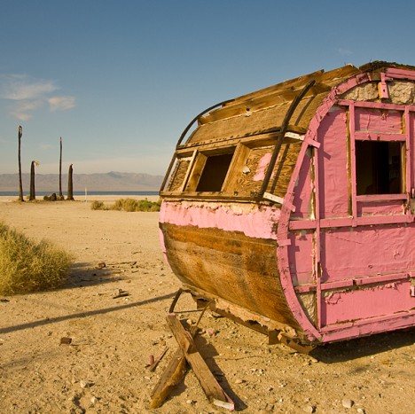
salton-sea-trailer-pink-6
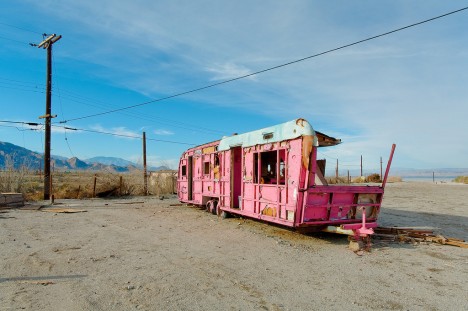
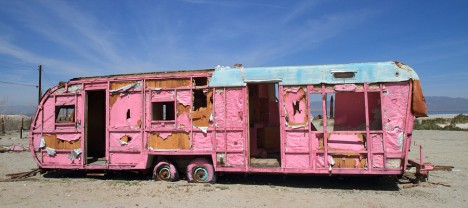
California’s Salton Sea was once a sparkling desert oasis, attracting vacationers in mobile homes and RVs. The people have gone but their trailers remain.

salton-sea-trailer-pink-2

salton-sea-trailer-pink-0

Located in Southern California’s Colorado Desert, the Salton Sea was created inadvertently in 1905 when a “perfect storm” of heavy rains and ill-advised construction of irrigation canals allowed the mighty Colorado River to divert into the bone-dry Salton Sink. Though saltier than the Pacific Ocean, the resulting below-sea-level lake sparked a development boom that included resorts, marinas and trailer parks.

salton-sea-trailer-pink-5

salton-sea-trailer-pink-4

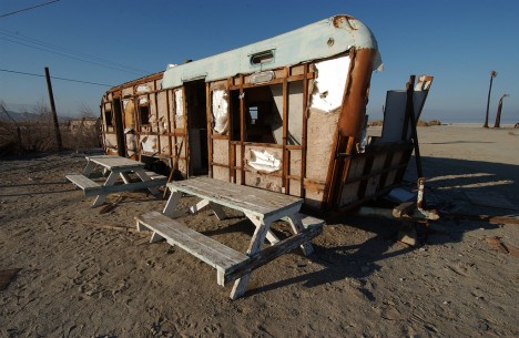
By the late 1950s, however, increasing pollution and a series of massive (and massively smelly) fish die-offs took the bloom off the rose – the number of visitors and residents dropped while many of those who left the area left their unwieldy trailers behind. Some of these long-abandoned trailers have achieved an unlikely sort of fame as photographic subjects – as symbols of post-apocalyptic failed consumerism, they can’t be beat! One of the most well-known abandoned Salton Sea motor homes is the very pink (even the kitchen sink is pink!) trailer photo-documented above by Flickr users nate2b and jawbox57.

Gone, Fishin’

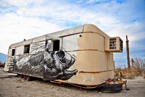
salton-sea-trailer-tilapia-1

salton-sea-trailer-tilapia-2

There are dozens – possibly several hundred – abandoned trailers scattered around the receding shores of the Salton Sea though very few are as artistically decorated as the rather “fishy” example above. Flickr users Jamie Valenta (Jamie V Photography) snapped the Tilapia Trailer in February of 2011 while Erin Yamagata captured one of many possible inspirations on a salt-encrusted beach in January of 2010.

Skinned Game

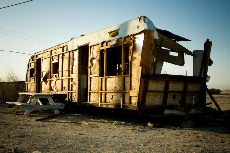
salton-sea-trailer-skinned-1

salton-sea-trailer-skinned-2

salton-sea-trailer-skinned-3

You won’t see much graffiti of any type on these abandoned Salton sea trailers but that’s not to say they’ve never been tagged. In recent times, metal scavengers and scrappers have been busily stripping away the siding from countless old trailers including the once-impressive RV above. Meth: it’s a hell of a drug. Kudos to Flickr users Hans Proppe (shadowplay), Brent (brentus69), and Patrick Maloney (analog_chainsaw) for stopping to snap instead of strip.

Next Page – Click Below to Read More:
Rv There Yet Abandoned Trailers Of The Salton Sea Shore

Share on Facebook


[ By Steve in Culture & History & Travel. ]

[ WebUrbanist | Archives | Galleries | Privacy | TOS ]


WebUrbanist

 
Comments Off on RV There Yet? Abandoned Trailers Of The Salton Sea Shore

Posted in Creativity


There is No Bad Light for Street Photography

12 Mar

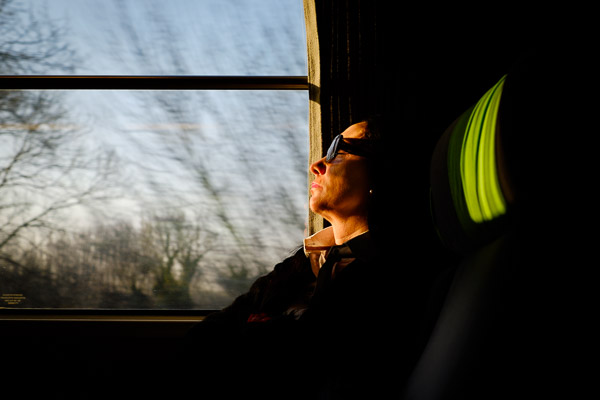
One of the advantages of being a street photographer is that you certainly don’t need to get up before dawn to catch the good light. Harsh sunlight, nighttime and rainy days are only a few of the most desired situations on the streets. Getting up too early, before people are out and about, may actually be counter-productive in your search for the decisive moment.

The key is to use light, any light, to your advantage

Any time of day or night, be aware of the quality and quantity of light, and look for interesting light sources and subjects.

©Valérie Jardin

©Valérie Jardin

Nighttime photography

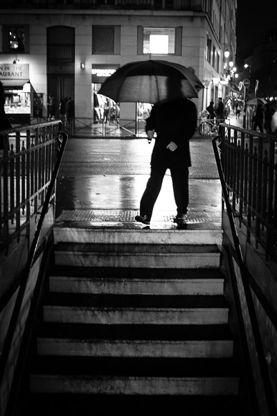
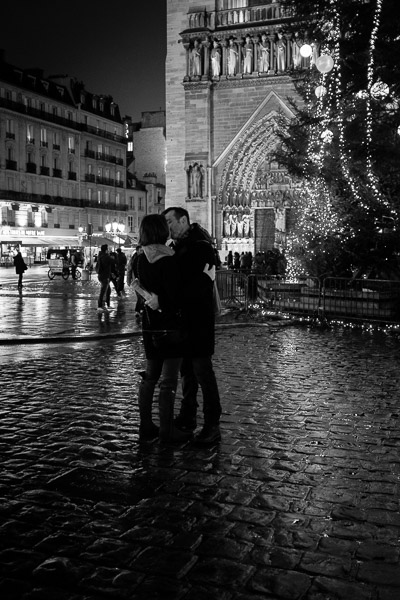
The night adds a new dimension to your street photography. There are so many interesting light sources to work with such as street lights, traffic lights, car lights, neon signs, etc. Even bright Smartphone screens illuminating people’s faces can make for a fun shot. Learn to focus manually for night photography. Even if the auto focus works in most conditions, practice switching to manual focus rapidly, it may save the shot!

It’s true that a simple slider action in post-processing can bring out details from the shadows, but that doesn’t mean that you should always use it. This is a common mistake that I see too often when the night scene starts to look like it was shot in the daytime. Let the shadows fall where they do and embrace the atmosphere and mystery of the night.

©Valérie Jardin

©Valérie Jardin

Don’t worry about noise, especially if you shoot black and white. First, you can now push the ISO of most cameras to very high numbers with very little noise. Second, the little bit of grain in your pictures will enhance the mood and atmosphere. Likewise, embrace the motion blur and the slightly out of focus shots. Who says that a good image has to be tack sharp? What’s the point of technical perfection if your subject is boring, or the story non-existent?

©Valérie Jardin

©Valérie Jardin

Silhouettes

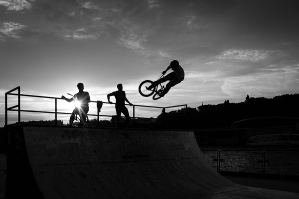
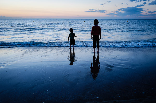
The key to successful silhouette photography is to find a well-defined subject. Remember that not everyone makes an interesting street photography subject and the same principle applies to silhouettes. The shape of the body should be well defined, capturing the right gesture is even more important to achieving a strong image. Many elements can add interest as well, such as umbrellas, bicycles, hats, etc. Watch for obstructions in front of and behind your subject, and if they are moving, make sure you don’t catch them in between steps. Setting your camera in burst mode will increase your chances of getting the right gesture. Remember that your subject is not the background, which can act as a distraction, so do not be afraid to blow out the highlights behind your silhouettes unless it is an integral part of the story.

In order to shoot successful silhouettes, you need to take control of your camera first. Instead to going through all the steps here, check out: How to Photograph Silhouettes in 8 Easy Steps.

Shooting into the bright sun

Shooting into the sun when it’s low in the sky can create some dramatic shots. Add a sunburst effect when possible. The starburst effect is best achieved by setting your camera at a small aperture and hiding the sun partially behind a structure or person. Experiment with exposure compensation to get a nice dark silhouette and once you’re happy with the result, wait for the right subject to enter your frame, or the right action to happen.

©Valérie Jardin

©Valérie Jardin

Strong shadows

Street photographers love shadows. Similarly to silhouettes, not every shadow works. It should be really dark and well defined. The surface on which it shows will also play a part in the result. It’s important to strategize and position yourself to get the best possible shot, the shadow may hit a wall next to the subject for instance. Long shadows are also really interesting when shot from a higher vantage point. Sometimes it’s all about the shadow, and the subject casting it does not even need to be fully included. This method, if well executed, will add an element of mystery.

©Valérie Jardin

©Valérie Jardin

Reflections

Sunlight can create some really cool reflections in windows, puddles, or other surfaces and add interest to your street photography. Don’t be afraid to experiment!

©Valérie Jardin

©Valérie Jardin

High contrast situations

Harsh sunlight and deep shadows can create ideal situations for the discerning street photographer.  The sun comes out after the rain? Even better! The wet pavement will add yet another dimension and interest.

©Valérie Jardin

©Valérie Jardin

Dappled light

One of my favorite daylight situations in street photography is when I find a nice source of dappled light. Remember that even if the situation is ideal, not every person walking down the street will make an interesting subject. It’s often a game of patience…

©Valérie Jardin

©Valérie Jardin

Rainy days

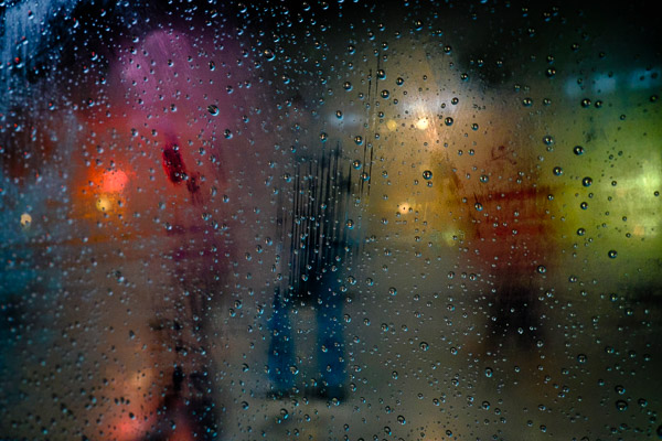
As long as you protect your gear (and yourself), rainy days can provide some of the best street photography opportunities. People on the streets will behave very differently when it’s raining, creating some interesting situations. Umbrellas also make for good props. There are also ways to embrace the rain by focussing selectively through windows, car windshields, etc.

©Valérie Jardin

©Valérie Jardin

Open shade for street portraits

If you enjoy doing street portraits, then the same simple rules that you apply for any other portrait will help you achieve the best result. Once you’ve asked your subject for a portrait, you might as well go the extra step and ask them to move slightly, or even cross the street for the most flattering light. Look for open shade to avoid harsh shadows on their face.

Golden and blue hour

Of course, there are also beautiful photographs of people to be made in the early morning and late evening hours, but always remember that there is no bad light!

©Valérie Jardin

©Valérie Jardin

Conclusion

Never use the quality of light as an excuse not to hit the streets. Making any light work in your favor is part of the fun and also the best way to improve your skills and get some cool shots. Have fun!

googletag.cmd.push(function() {
tablet_slots.push( googletag.defineSlot( “/1005424/_dPSv4_tab-all-article-bottom_(300×250)”, [300, 250], “pb-ad-78623” ).addService( googletag.pubads() ) ); } );

googletag.cmd.push(function() {
mobile_slots.push( googletag.defineSlot( “/1005424/_dPSv4_mob-all-article-bottom_(300×250)”, [300, 250], “pb-ad-78158” ).addService( googletag.pubads() ) ); } );

The post There is No Bad Light for Street Photography by Valerie Jardin appeared first on Digital Photography School.


Digital Photography School

 
Comments Off on There is No Bad Light for Street Photography

Posted in Photography


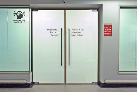
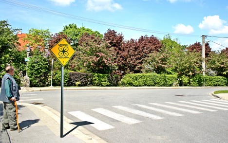
Almost There: Signs from the Near Future May Blow Your Mind

13 Jun

[ By WebUrbanist in Conceptual & Futuristic & Technology. ]

no synthetic biology allowed

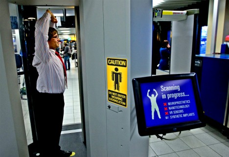
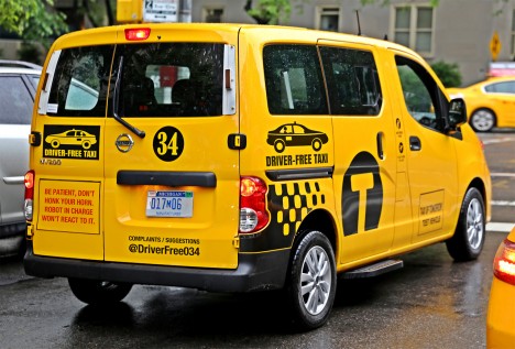
A few are far-fetched, but most of these notices are shocking in part because they are nearly believable – some may be an accepted reality within the next few years (click to enlarge).

contact lens selfie alert

disable your holographic companion

exoskeleton scanning in progress

driver free taxi cab

Collected on signsfromthenearfuture, a Tumblr blog, their subjects range from driverless cars and solar roadways to cryogenic stations and hyperloop trains.

jetpack station future sign

oversharing cell phone alert

preconition training classroom sign

drones watching alert

Some are clearly tongue-in-cheek commentary on current social behavior and perceived threats to privacy, or based on science-fiction principles unlikely to materialize, but who knows. Others you may be seeing very soon on streets and in other public places (alas, probably not the one about jetpack rentals).

Share on Facebook


[ By WebUrbanist in Conceptual & Futuristic & Technology. ]

[ WebUrbanist | Archives | Galleries | Privacy | TOS ]


WebUrbanist

 
Comments Off on Almost There: Signs from the Near Future May Blow Your Mind

Posted in Creativity


Perspective in Photography – Don’t just stand there move your feet!

21 Jan

Photographers often fall into the bad habit of shooting everything we see from eye-level. We are walking around, something catches our eye, and we take a picture right from where we are standing. If you want to make an immediate impact in your photography, you need to get out of your eye-level (or tripod-level) rut. You need a change in perspective.

McEnaney road

Sure, you can change your composition by zooming in or out with your lens, but if you want to change your perspective, you are going to need to move. Don’t let your feet, or your tripod, root you to the spot: get ready for some bending, turning, walking, and climbing. Start working with perspective in photography, your images will thank you for it.

Get Low

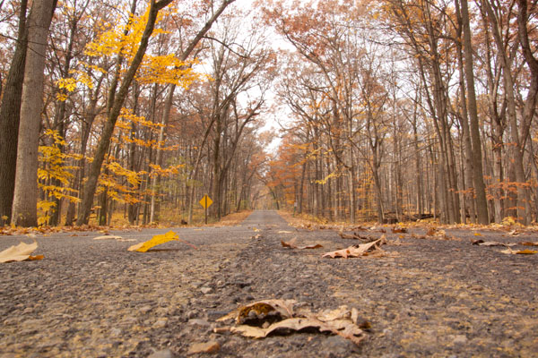
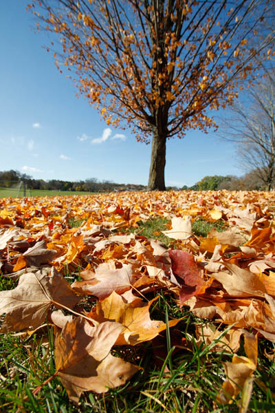
Get your camera down towards ground level, and see how it impacts your perspective. Getting down low allows you to feature the foreground of your composition, and gives your viewer context for the rest of the photograph. Use a wide angle lens to feature the foreground, while pulling the viewer into the image, as below.

McEnaney wide angle leaves

Getting down low can change the way your viewer feels or reacts to your subject. Getting low can make your subject appear taller or more imposing. Subjects viewed from below can look commanding and powerful. Even a simple sunflower can be seen to tower above its surroundings.

McEnaney sunflower

Getting low can also completely disorient your viewer. This near water-level view becomes a study in colour and texture, as the water and the fallen autumn leaves interact with each other. From eye level, this would simply have been a photograph looking down into a storm gutter. Getting low simplifies the composition and puts the viewer into a different, and unique perspective than their everyday viewpoint.

McEnaney gutter

Get Up High or Look Up High

You can get low and look at subjects from their level, but you can also get up high and take in your subject from above. Getting well above your normal line-of-sight will certainly give you a new perspective. In the photograph below, the other tourists on the decks below give context to the passing iceberg, as seen from the cruise ship. This higher-up view also provides a sense of scale for the large size of the ice berg and hints at the size of the ship.

McEnaney iceberg

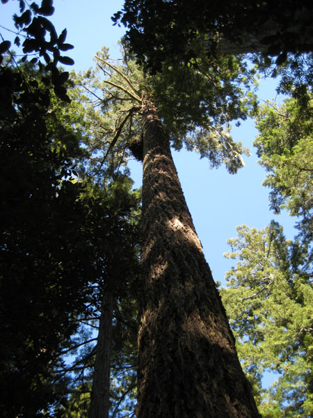
If you do not want to physically get up high, standing and shooting does not mean you only have to shoot straight ahead. Spend some time looking up, and you will find plenty to improve your compositions and your perspective. With very tall subjects, looking up from below will accentuate their height and size. The power and immensity of these redwood trees are best emphasized by looking up, from directly below.

McEnaney redwood

Go for the Lateral

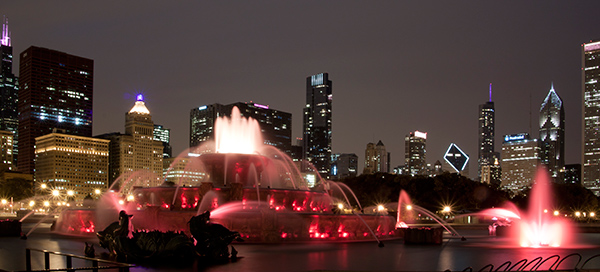
Finally, do not forget to think laterally. Beyond just changing your stance or your direction of shooting, you also need to remember to move yourself. Talk the time to walk around your subject, to consider the background and foreground. Think about how all the pieces of your final composition fit together. Your first view and your first angle are often not the best available, but you cannot be sure until you have taken the time to investigate others. Walking all the way around Buckingham Fountain allowed me to choose this final composition and perspective featuring the downtown Chicago skyline. I also made the choice to position the spray from the fountain directly in front of a building to make it more visible.

McEnaney fountain 600

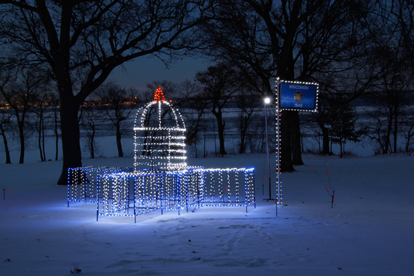
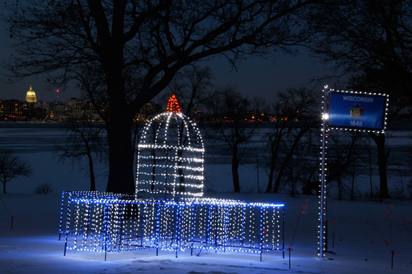
Moving your feet can change the way that different objects in your photograph interact with each other. While the top photograph of the Wisconsin Capitol in lights was an adequate shot, moving just a few feet to the right and squatting down allowed me to feature the lit outline in the foreground with the actual Capitol building in the background. This juxtaposition of elements improves the story-telling ability of the photograph.

McEnaney lit capitol

McEnaney double capitol

Summary

Do not fall into the trap of shooting everything you see at eye-level, just as you see it. Take the time to explore your subject, and considering changing your perspective. Get low and see what changes, get up high and explore a new view, or move laterally and watch different interactions occur and disappear between objects.

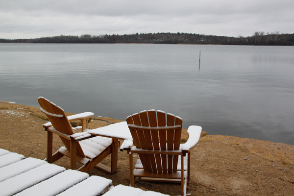
McEnaney chairs from above

McEnaney chairs get low

You may have a hard time choosing a favourite view: from above to emphasize the view of the foreground lake, or get low to show the expanded context and the threatening winter sky? Share your thoughts or your own perspective images in the comments below!

The post Perspective in Photography – Don’t just stand there move your feet! by Katie McEnaney appeared first on Digital Photography School.


Digital Photography School

 
Comments Off on Perspective in Photography – Don’t just stand there move your feet!

Posted in Photography