RSS
 

Posts Tagged ‘Theme’

Create a Theme to Step Up Your Travel Photography

23 Oct

One of the things that always drew me to travel photography is the endless variety. Every place on earth is unique. The people, the landscape, the culture, the wildlife, the architecture. Even with neighboring cities, no two places are the same.

create a travel photography theme 01

So, why is it that we tend to photograph them all the same way? When I look back through my archives from all over the world, most of my images have a similar look. If I didn’t remember the location of a photo, I likely couldn’t guess where I took it.

As photographers, we develop our own unique approach to our craft. It’s not a bad thing – it helps to develop our own style. Although, sometimes it’s worth taking a different approach for a specific location or trip. Choosing a travel photography theme for a trip can help focus and guide your photography, as well as give you a unique collection of images.

surfers create a travel photography theme

Coming Up With Your Photography Theme

I’m not talking about changing your style or learning a whole new genre, necessarily. Just taking some time to think about how you could create a theme for your next photography trip. Here are a few things to consider that could help to give your collection of images a unique photography theme.

Genre

You likely already have an idea of what genre of photography you’ll be using. This will largely come down to what you like to photograph. It will also depend partly on the location you’re going to and the gear you have available.

However, you may be tempted to photograph everything. It’s easy to fall for this temptation, I know. You’re in a new, exciting place and may never go there again. You don’t want to miss a thing. Go crazy, if you must, but try to think of a specific genre that suits the location and spend most of your time on that.

noah create a travel photography theme

You don’t want to pick a genre that won’t give you many options. Trying to photograph the milky way in New York isn’t going to happen. Neither is photographing architecture in Yosemite. Come up with something that will give you a lot of material to work with and that you will actually enjoy.

Travel photography conjures images of epic landscapes or cityscapes. You really are only limited by your imagination. Try making the local people your theme with portraiture. Spend your days practicing street photography if you’re visiting an urban location. Maybe even try your hand at wildlife photography if there’s any around.

Subject

So, you’ve picked a genre. What are you going to point your camera at? It’s time to spend some time thinking about the subject of your theme. Again, it may be an easy decision. What’s unique about the location you’re visiting? What’s it known for?

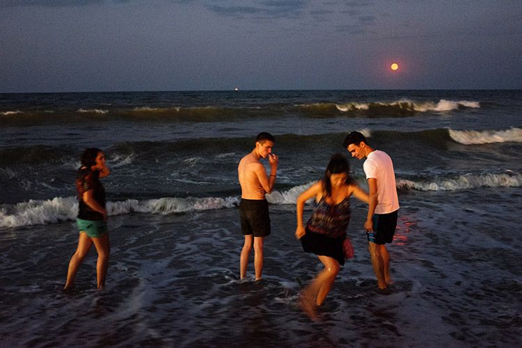
On my recent road trip up the coast of Queensland, Australia, I followed a coastal theme. If there’s one thing Australia is known for, it’s incredible beaches. It was an obvious choice.

jetty create a travel photography theme

You don’t need to go with the obvious, though. Something less obvious can actually make a more engaging collection of photos. If you’re visiting a big, concrete jungle, you could create a contrasting theme by photographing the flowers you find. Think outside the box and get more out of the location.

Of course, there’s nothing wrong with photographing the cliche. There are some incredible collections of photos that follow an obvious subject – lakes of Canada, waterfalls of Iceland, Humans of New York.

Style

The style of your photography is one of the most powerful elements in creating a photography theme. The way you choose to photograph the subject you’ve chosen can vary a lot. You may have already developed your own style. You don’t need to throw that out the window.

sand create a travel photography theme

If your photographic style suits the genre and subject that you’ve chosen, feel free to stick with it. You’ve likely worked hard to develop it. You could adapt it for this trip by turning up the volume or trying something slightly different.

If your theme uses long-exposures, you could try creating super-long exposures. If you’re doing astrophotography, maybe give star-trail photography a go. Creating an aerial theme? How about shooting panoramas with your drone?

A big factor in creating a style is focal length. A 50mm lens will create a very different image to a telephoto. As will a wide-angle or fish-eye lens. You might have a dozen lenses to choose from, or you might have one. Either way, try choosing one lens for your theme. You could even take it a step further and stick to just one focal length.

create a travel photography theme

A photography trip could be a good opportunity to try something new. Have you been wanting to get a drone and have some fun with aerial photography? Maybe it’s an opportunity to try your hand at macro photography? Travel is expensive, so buying new gear for a trip usually isn’t possible. Renting is a great option, as is borrowing gear off other local photographers.

Color

If there’s one thing that can create a consistent theme within a collection of images, it’s color. This can be both in the colors that you capture in-camera and the way you edit them in post-production. A combination of both can really bring a bunch of photos together.

shipwreck create a travel photography theme

It’s not always the case, but you may find there are certain colors that are consistent in the locations you’re photographing. Certain landscapes, for example, will have dominant colors. Green hills, blue water, yellow sand.

There are opportunities to create color themes everywhere, though. You could create a color theme in a city by photographing doors, flowers, dresses, signs, etc, that are all that color.

palm create a travel photography theme

When you import your photos to your computer, the options for editing your photos with a color theme are endless. Try playing around with the white balance and saturation sliders. Experiment with HSL and split-toning. Do something different to what you usually do, and when you find something you like, save it as a preset for your theme.

Creating a color theme doesn’t need to include advanced color grading or anything technical. Your theme might just be bright, vivid colors. It could also be the opposite. Maybe a desaturated look, or even go monotone. Black and white photography can create a very strong theme.

create a travel photography theme

As a colorblind photographer, I’ve avoided advanced color editing in the past and played it safe. Taking risks and learning to create color themes for my travel photography really helped me take my photos from mundane to unique.

Summary

Whether your trip is a family vacation, business travel, or a photography adventure, try thinking about a photography theme. Ask yourself what you could do to come home with a more cohesive collection of images that represent the location well. You might even end up with a few side-by-side on the wall someday.

Do you have any photography theme tips? If so, let us know in the comments below.

The post Create a Theme to Step Up Your Travel Photography appeared first on Digital Photography School.
Digital Photography School

 
Comments Off on Create a Theme to Step Up Your Travel Photography

Posted in Photography


How Shooting Photos Based on a Theme Can Improve Your Work

05 Dec

In this article we’re going to talk about how having a theme before you go out to shoot can improve your images.

I used to go out on the street, in order to find the perfect shot. Months in a row I did that. I knew that I loved this lack of control, but something didn’t match. I wasn’t as excited as I thought and even my images weren’t good enough, I couldn’t understand why.

So, I took a small break from hunting beautiful images and I started to watch how others worked. I looked at many professional photographers, to find what makes them click.

Image 001

That was when I realized my big mistake. My problem was that every time I went out, I had nothing to focus on. My eyes were looking for pictures everywhere, but my mind wasn’t able to sort out all these images. Something was missing, and that was a theme.

Taking pictures based on a theme has a lot of benefits and it can change your shooting approach in a very positive way. That’s why many photographers work like this because it makes their life much more easy and practical.

Elimination is the key

Imagine yourself in a very crowded place, let’s say a musical festival. The possibilities for images and angles are infinite. You may take pictures of the whole crowd, of a couple spending time together, or a detail on someone’s jacket. Or maybe you can take pictures of the musicians only. How can you do all these things and not get tired or confused?

Image 002

You need to remove the things that are not important for your ideas or style of shooting. Therefore, you have to know what you’re looking for before you go out to shoot.

Let’s say you decide that your theme at that music festival should be about ladies dancing. Now, you will focus all your attention only on them, taking pictures of details on their hands, clothes, etc., and mix it up with portraits and action shots. Try different angles and perspectives, because now you have something to focus on. As a result, you eliminate all the things that might get you disorganized, such as big crowds, couples, general landscapes of the festival, etc.

Elimination is the key.

You will save time

Before working on themes in my photography, I spent many hours searching for wonderful movements and scenes to capture with my camera. On an average day, I would walk in the city for eight to nine hours and shoot for only a half hour. Why? Because I didn’t know what I was looking for.

Image 003

By choosing a specific theme or subject before you go out, you will know where to look. For example, if you want to take portraits of dog owners, as a first step you can try going to the park where people walk their dogs and ask them to pose for you. On the next day, you may go at a dog grooming place, and so on.

Working on themes is a very good time-saving habit that can help you remove the gap between finding the perfect shot and actually doing it.

Targeting specific clients

Regarding the topics you may choose, your interest can grow in time. You will start to understand more about what you’re photographing and after few months, you may find yourself with a strong body of work.

Image 004

Image 005

Image 006

For example, if you have a passion for street fashion and you build a portfolio with great images on that theme, you can use that portfolio to find your future clients. You may try fashion magazines, agencies, or even online publications. Also, you can enter those images in a competition to see if they are good enough to grant you some recognition or a prize. But I don’t suggest you take pictures only for getting recognition because then you could end up working on things you may not like that much.

Theme shooting helps style development

We all think about style, it’s an artist’s signature. We want people to recognize our pictures just by looking at them and say, “These are John’s images because they look this specific way.” We want our name out there in the best way possible.

Image 007

Developing a style is a matter of time. You don’t have to fight for it because it will come by itself after years of hard work.

By working on themes and the things you care about, you’ll start to notice what things you like to photograph and how you like to do it. You will begin to understand and see yourself in your work. In this growing process, your style will evolve. It’s not a matter of conscious decision, but of knowing yourself.

If you are in a hurry to stamp your work with your style, then find a theme you are interested in and photograph that. You can’t go wrong.

Conclusion

So if you feel like your work isn’t progressing and you’re stuck, try shooting around a theme for a while. See how it helps you focus, improve your style and in the end become a better photographer.

Please share your thoughts and questions in the comments below.

googletag.cmd.push(function() {
tablet_slots.push( googletag.defineSlot( “/1005424/_dPSv4_tab-all-article-bottom_(300×250)”, [300, 250], “pb-ad-78623” ).addService( googletag.pubads() ) ); } );

googletag.cmd.push(function() {
mobile_slots.push( googletag.defineSlot( “/1005424/_dPSv4_mob-all-article-bottom_(300×250)”, [300, 250], “pb-ad-78158” ).addService( googletag.pubads() ) ); } );

The post How Shooting Photos Based on a Theme Can Improve Your Work by Cosmin Cimil appeared first on Digital Photography School.


Digital Photography School

 
Comments Off on How Shooting Photos Based on a Theme Can Improve Your Work

Posted in Photography


Noah’s Ark: Creationist Theme Park Opens Amidst Regional Flooding

11 Jul

[ By WebUrbanist in Destinations & Sights & Travel. ]

great ark

A biblical theme park contained within a huge ark (the largest timber-framed structure in the world) has opened in Kentucky, just as the region was hit hard by heavy rains and flash floods. Expecting an initial rush of visitors, the ark will have extended hours of operation for 40 days and 40 nights, coinciding with duration of the biblical fable of the great flood.

ark opening

Built by Amish carpenters to dimensions described in the Bible, the main Ark Encounter structure is close to 500 feet long, 100 feet wide and a 50 feet tall. It was created by Answers in Genesis, a fundamentalist Christian organization, close to their existing Creation Museum. The megastructure is meant to serve as an education center as well as adventure playground.

ark interior

ark base

The original ark, as the story goes, was designed to save Noah, his family and pairs of animals from a great flood that swept the world clean of sinners. “In a world that is becoming increasingly secularised and biased, it’s time for Christians to do something of this size and this magnitude,” said Answers in Genesis chief executive Ken Ham. The new version employs somewhat more contemporary materials and construction techniques, connecting large timber logs with steel braces.

ark dinosaurs

The modern-day complex is designed to be accessible to all Americans, located less than a day’s drive from most of the country. In addition to scenes of dinosaurs living on the ark alongside humans, it features zip lines, petting zoos and camel rides.

arkitecture

ark grounds

Controversially, the $ 100,000,000 project was made possible in part through sales tax incentives, a fact that does not sit well with all residents of the state. Alas, anyone seeking to survive the next great global purge will find that the ark itself does not float, though it may provide some high ground in a storm.

Share on Facebook


[ By WebUrbanist in Destinations & Sights & Travel. ]

[ WebUrbanist | Archives | Galleries | Privacy | TOS ]


WebUrbanist

 
Comments Off on Noah’s Ark: Creationist Theme Park Opens Amidst Regional Flooding

Posted in Creativity


Lights on! White theme extended to forums, now default for new visitors

25 Jun

You may have already noticed that following a few weeks of tweaking and bug squashing we’ve extended the new ‘light’ theme to the forums and deployed a new unified header that is shared between both dark and light versions of the site. The beta pop-up has been banished from the site and a new permanent ‘Reading Mode’ switch placed at the top right corner of the site.

Use the ‘Reading mode’ switch (top right of every page) to switch between black and white themes. Your choice is remembered.

White is the new black

As of the today the ‘light’ reading mode will be the default. If you want to switch to black and forget this ever happened, go ahead – your choice will be remembered.

DPR has had the same basic ‘look’ since it launched in 1998, and there’s no doubt that the white-on-black design has always been an instantly recognizable part of our identity – our brand. And we know – because you’ve told us through polls and comments – that many of our regular visitors and forum pros are very happy with the current design and have no appetite for change, hence the decision to offer this as an option, forever.

If you want to switch to black and forget this ever happened, go ahead – your choice will be remembered.

But we also know that a large number of our visitors found the old design visually off-putting and hard to read, and a switch to a more conventional ‘black on white’ design has been the single most requested change seen via our feedback system for at least ten years. So we decided to see if we could, in relatively short order, knock together a quick alternative with the emphasis on readability for those that struggle with white text on a black background. What you see today is the outcome of that experiment. Not a lot has changed – we flipped the colors and made the body font a little larger, but this is a new coat of paint, not a foundation-up rebuild.

White theme forum index White theme post view

We asked, you answered…

For those of you that managed to get this far down the page before scrolling straight to the comment section, I’d like to take this opportunity to thank the thousands of visitors who took the time to give us feedback on the new theme during the beta. I personally read every single feedback email, all the comments on the original news story announcing the beta, and as many forum posts as I could find. 

The feedback (after filtering out all the complaints about the pop-up asking for feedback and those that took the time to tell us they had no opinion) pretty much all fell into one of four buckets: those that loved the new design (most common words: ‘thanks!!’ and ‘finally!!’), those that prefer the old design (most common phrase ‘don’t fix what ain’t broke’), those that didn’t like either and had their own suggestions for background colors, and a few who hadn’t read the story or the pop up and were under the impression that we were going to replace the old design with the new one, which made them angry. Like, really angry.

I’m not complaining – we were really appreciative of ALL the feedback, and it informed many of the decisions we made and will make in future design changes. 

..and the results are in

Overall the feedback was split 63:37 in favor of the lighter theme, though in the last two weeks the gap widened to about 70:30 as we finessed the design and annoyed more people into giving us feedback (thanks Mr Pop-up!).

The most common themes we saw in favor of the darker theme were

  • The original color scheme sets DPR apart from most sites on the internet and is a fundamental part of our identity.
  • The new theme is too bright and is hard to read (quite a few people claimed it ‘burns my eyes’)
  • Photos look better on black and photo apps such as Lightroom have a similar theme.

We agree that generally color images look better on a dark background, so we didn’t re-skin galleries, challenges, slideshows or the expanded image view in forums.

Just to reiterate…we may be defaulting to the white theme… but the dark theme is not going away. Ever.

It’s probably worth mentioning too, that in the month or so that we ran the beta we saw a significant difference between those using the white and black versions of the site, with those opting for the lighter theme spending almost twice as long and reading almost twice as many pages as those who stayed with the black theme. This is not conclusive proof (for reasons too longwinded to go into here), but it did confirm our long-held belief that the old theme was actually putting people off reading our content.

I hope you give the new ‘Reading mode’ a try – especially the forums, which we just launched. Please share your opinion of how we might make it better below.

Desktop users wondering where the switch for the ‘classic’ (yellow on gray) forum skin went – it’s at the bottom of every forum page (below the index of threads). Again, this setting is remembered between sessions (as long as you retain our cookies).

Just to reiterate, we may – for now – be defaulting to the white theme (because based on the feedback and the data it’s the right choice), but the dark theme is not going away. Ever*.

That’s all, folks.

*OK, it’s been pointed out to me that saying the black theme won’t ‘ever’ go away is quite a commitment, and maybe I should say ‘until no one is using it, or until the dying Sun consumes our planet, whichever comes sooner’.

Articles: Digital Photography Review (dpreview.com)

 
Comments Off on Lights on! White theme extended to forums, now default for new visitors

Posted in Uncategorized


We Are Not Amused: 15 Creepy Abandoned Theme Parks

30 May

abandoned-theme-park-1a
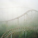
Once delightful domains of sight and sound, these creepy abandoned theme parks now moulder away in silence attended only by shadows and memories.

abandoned-theme-park-1b

What a dump… er, no, not this charmingly manicured abominable snowman in particular but the entire abandoned Miracle Strip Amusement Park in Panama City Beach, Florida.

abandoned-theme-park-1c

abandoned-theme-park-1d

The park closed in 2004 and “enjoyed” a whole half-decade of unhindered deterioration until the site was finally demolished in 2009, as disturbingly documented by Flickr user Steve Sobczuk. You’ve gotta admit, the Dante’s Inferno ride never looked spookier than it did in its dying days.

No Hue

abandoned-theme-park-2a

abandoned-theme-park-2b

abandoned-theme-park-2c

Ho Thuy Tien is an abandoned water park and aquarium located in Huong Thuy, a district of Hue, Vietnam. Urbex explorers like Courtney Lambert of A Great Perhaps had best navigate those slimy water slides with care – the park’s aquarium once housed a trio of very hungry crocodiles who were abandoned along with the rest of the park in 2013. Fear not, animal lovers: thanks to Lambert alerting PETA and the WWF, the crocs were moved to a wildlife park in northern Vietnam.

Petrified

abandoned-theme-park-3d

abandoned-theme-park-3c

abandoned-theme-park-3b

Prehistoric Forest Amusement Park in Michigan’s otherwise pleasant Irish Hills opened in 1963 but by the 1980’s, changing trends in recreation and tourism saw visitors and revenues enter an irreversible slide. We’d like to say an asteroid gave the struggling tourist trap its death blow but the truth is far less dramatic – the park was sold by its original owners in 1997 and closed for good in 1999.

abandoned-theme-park-3e

abandoned-theme-park-3g

abandoned-theme-park-3f

In Prehistoric Forest Amusement Park’s heyday, as many as 70 fiberglass statues of dinosaurs, mammoths and the odd Neanderthal Man (kidnapped by students in 1985 and deposited in front of Saline High School) dotted the park’s forested grounds. A few still stand today; most have been damaged or destroyed by vandals. Kudos to KE Photography & Video (whose video of the abandoned park in winter can be viewed here) and Flickr user Wolly Shambler for capturing and posting the images above.

Darkest & Disturbingest Africa

abandoned-theme-park-5b

abandoned-theme-park-5a

The former Umoja Children’s Park is located in Chake-Chake, a town on the Tanzanian island of Pemba, just north of Zanzibar in the Indian Ocean. If the eerie, rusty caterpillar ride looks familiar, it’s the same kind of “Happy Worm” kiddy ride as one reputed to be in the infamous Pripyat amusement park near Chernobyl, Ukraine. You know the one… THIS one:

abandoned-theme-park-16

Joyless

abandoned-theme-park-6a

abandoned-theme-park-6b

One of six Joylands in the USA, the former Joyland Amusement Park in Wichita, Kansas, operated from June 12th, 1949 through 2004, and then again for a short time under new ownership in 2006. The park suffered extensive vandalism during almost a decade of neglected abandonment, a sad fact reflected in the images above.

abandoned-theme-park-6c

abandoned-theme-park-6d

By the summer of 2015, the park’s last remnants (the roller coaster, to be exact) had been dismantled and the site bulldozed flat as the Kansas prairie. Flickr user Krisi Metzen snapped these scenes of a joyless Joyland in October of 2013.


WebUrbanist

 
Comments Off on We Are Not Amused: 15 Creepy Abandoned Theme Parks

Posted in Creativity


The Void: World’s First Virtual Reality Theme Park Coming Soon

14 May

[ By Steph in Gaming & Computing & Technology. ]

The Void 1

“Why play a game when you can live it?” ask the creators of The Void, the world’s first virtual reality theme park slated to open in Utah in summer 2016. Gamers will soon be able to immerse themselves in 4D environments, with all sorts of eye-popping effects layered onto real spaces. Imagine: first-person shooters meet paintball or laser tag – this is the future of gaming.

Screen Shot 2015-05-13 at 1.07.31 PM

The flagship Pleasant Grove location will feature sixteen 60-by-60-foot rooms with different themes for different experiences, and they even plan to change these virtual stages every three months so repeat players never get bored.

Want to find out what it feels like to wander around in the jungle during the Jurassic age, or explore a truly terrifying haunted house? Zoom around skyscrapers in a flying car? The Void basically enables you to star in your own action movie, alone or with a group of friends, in a VR experience that far surpasses anything you could do with a headset on your couch.

Screen Shot 2015-05-13 at 1.06.30 PM

Each stage not only has custom architecture and sculptures to make it feel more real – you’ll also feel blasts of air and shifts in temperature, take in scents and strap yourself into motion simulators for activities like flying. Individual rooms hold up to 10 gamers at a time who can work as a team or play against each other. The Void has created a virtual reality headset of its own design, called Rapture HMD.

Screen Shot 2015-05-13 at 1.07.04 PM

Screen Shot 2015-05-13 at 1.06.49 PM

You won’t necessarily have to fly to Utah to experience it, either – they’re planning on opening other locations around the world.

Share on Facebook


[ By Steph in Gaming & Computing & Technology. ]

[ WebUrbanist | Archives | Galleries | Privacy | TOS ]


WebUrbanist

 
Comments Off on The Void: World’s First Virtual Reality Theme Park Coming Soon

Posted in Creativity


Yellow Brick Ode: The Mainly Abandoned Land Of Oz Theme Park

03 Nov

[ By Steve in Travel & Urban Exploration. ]

Land of Oz 1
Closed since 1980, the Land of Oz theme park only opens for one October weekend annually. The rest of the time it looks like it’s been abandoned 35 years.

Land of Oz 2

Joel Handwerk of Lithium Photo visited the “Creepy Land of Oz” and if anything, he’s understating the oppressive atmosphere of doom and decay that permeates the former theme park. One wonders how the park’s skeleton staff manages to freshen up the place so visitors arriving on the first weekend of October each year don’t immediately turn their cars around and burn rubber in a frenzied effort to escape!

Land of Oz 3

While Handwerk may be better known for his infrared images – what his friends refer to as “those nuclear winter photos” – this choice selection of shots definitely casts the mainly abandoned Land of Oz theme park in a stark and uncritical light.

Land of Oz 4

You read that right: “mainly abandoned”… time for some backstory goodness. The Land of Oz theme park was planned, built and opened in 1970 by Grover Robbins and was situated in the North Carolina ski resort town of Beech Mountain. In related news, North Carolina has (or had) a ski resort. Who knew?

Next Page – Click Below to Read More:
Yellow Brick Ode The Mainly Abandoned Land Of Oz Theme Park

Share on Facebook


[ By Steve in Travel & Urban Exploration. ]

[ WebUrbanist | Archives | Galleries | Privacy | TOS ]


WebUrbanist

 
Comments Off on Yellow Brick Ode: The Mainly Abandoned Land Of Oz Theme Park

Posted in Creativity


A Selection of Photos with a Green Theme

08 Aug

Last week I shared a collection of golden images so to continue on the theme of colors today I present:

A selection of photos with a green theme

Quite fitting for summer in my part of the world. What else do you think of when I say green? Here are a few ideas:

Photograph Sunbathing Gekko on Leaf by Leon Dafonte Fernandez on 500px

Sunbathing Gekko on Leaf by Leon Dafonte Fernandez on 500px

Photograph Green tea field by Jaewoon U on 500px

Green tea field by Jaewoon U on 500px

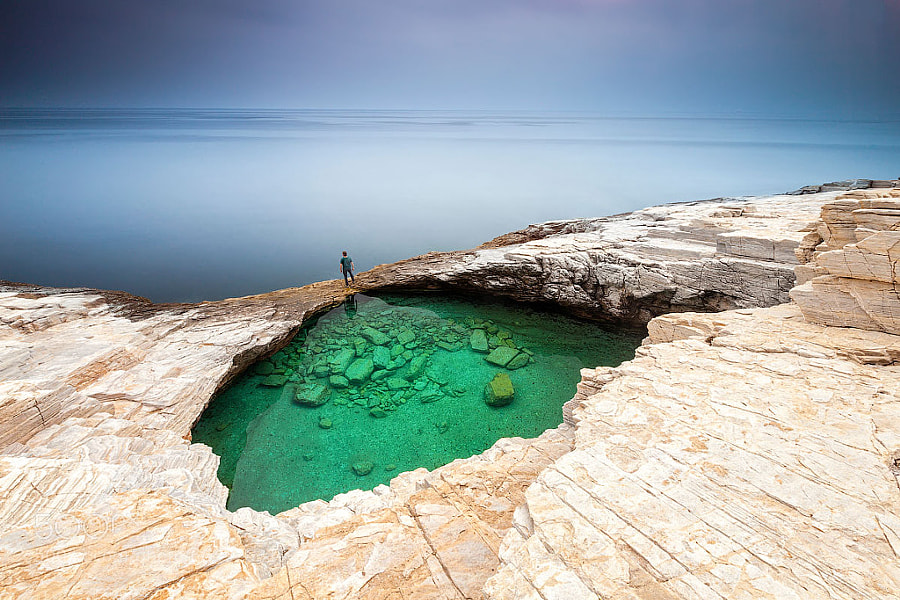
Photograph Green Hole by Evgeni Dinev on 500px

Green Hole by Evgeni Dinev on 500px

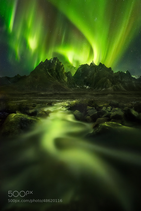
Photograph Peaks of the Lights by Marc  Adamus on 500px

Peaks of the Lights by Marc Adamus on 500px

Photograph *** by Dmitry Marchenko on 500px

*** by Dmitry Marchenko on 500px

Photograph *** by Laura Pashkevich on 500px

*** by Laura Pashkevich on 500px

Photograph Portrait of An Alien 1 by Nhut Pham on 500px

Portrait of An Alien 1 by Nhut Pham on 500px

Photograph Hidden Waterfall by Danny Seidman on 500px

Hidden Waterfall by Danny Seidman on 500px

Photograph Light Beams by Javier Acosta on 500px

Light Beams by Javier Acosta on 500px

Photograph .... by ????????  ??????? on 500px

…. by ???????? ??????? on 500px

Photograph Night bamboo by Ryusuke Komori on 500px

Night bamboo by Ryusuke Komori on 500px

Photograph Path of life by Janek Sedlar on 500px

Path of life by Janek Sedlar on 500px

Photograph well wrapped by Sonja Probst on 500px

well wrapped by Sonja Probst on 500px

Photograph The Green Lantern by Nagesh Mahadev on 500px

The Green Lantern by Nagesh Mahadev on 500px

Photograph fighting !!! by Itamar Campos on 500px

fighting !!! by Itamar Campos on 500px

Photograph kiwi bubbly by Tommy Gamboa Flores on 500px

kiwi bubbly by Tommy Gamboa Flores on 500px

Photograph 90/365  How Many Ways Can You Slice a Kiwi? by Monika Bigelow on 500px

90/365 How Many Ways Can You Slice a Kiwi? by Monika Bigelow on 500px

Photograph Grasshopper Green by Lorraine Hudgins on 500px

Grasshopper Green by Lorraine Hudgins on 500px

Photograph Little Green Tree Frog by Lorraine Hudgins on 500px

Little Green Tree Frog by Lorraine Hudgins on 500px

Photograph Gorging On Grasshopper by Lorraine Hudgins on 500px

Gorging On Grasshopper by Lorraine Hudgins on 500px

Photograph Rose-ringed Parakeet by Doron Hoffman on 500px

Rose-ringed Parakeet by Doron Hoffman on 500px

Photograph Hidden Mode by Suradej Chuephanich on 500px

Hidden Mode by Suradej Chuephanich on 500px

Photograph Mojito by Natasha Breen on 500px

Mojito by Natasha Breen on 500px

Photograph Green apple by Alex Koloskov on 500px

Green apple by Alex Koloskov on 500px

Photograph Green Apple by Alexander Zachen on 500px

Green Apple by Alexander Zachen on 500px

Photograph Self shadow | Laser by Xavier Paillard on 500px

Self shadow | Laser by Xavier Paillard on 500px

Photograph Jagermeister Shot by Andrew Jack on 500px

Jagermeister Shot by Andrew Jack on 500px

Photograph Laser through a glass  by Emil Eddie Andersen on 500px

Laser through a glass by Emil Eddie Andersen on 500px

Photograph My Greeny Eyes..... by Vincent Budi Darmawan Sinaga on 500px

My Greeny Eyes….. by Vincent Budi Darmawan Sinaga on 500px

Photograph I'm Lucky Because I Have You by Niko Vass on 500px

I’m Lucky Because I Have You by Niko Vass on 500px

Photograph Clovers by Redcup2 on 500px

Clovers by Redcup2 on 500px

Photograph Denisa by Vladimir  Dumbrava on 500px

Denisa by Vladimir Dumbrava on 500px

Photograph Al otro lado. / The other side. by Miguel Ángel Sánchez-Guerrero Ros on 500px

Al otro lado. / The other side. by Miguel Ángel Sánchez-Guerrero Ros on 500px

Photograph ## bicycle | | by Paolo Giraudo on 500px

## bicycle | | by Paolo Giraudo on 500px

Photograph Door by Maria Muhtarova on 500px

Door by Maria Muhtarova on 500px

The post A Selection of Photos with a Green Theme by Darlene Hildebrandt appeared first on Digital Photography School.


Digital Photography School

 
Comments Off on A Selection of Photos with a Green Theme

Posted in Photography


30 Ideas to Jump-start Your Photo Theme Project

26 Mar

Variety, not only the spice of life, is also one of the most beautiful things about the art form of photography; the number of possible subjects for a photo is almost limitless.  There are formats, within forms and within disciplines, and all we need to create a work of art is an idea, which can come to us at any Continue Reading

The post 30 Ideas to Jump-start Your Photo Theme Project appeared first on Photodoto.


Photodoto

 
Comments Off on 30 Ideas to Jump-start Your Photo Theme Project

Posted in Photography


Abandoned Land of Oz Theme Park Opens for Two Days

04 Oct

[ By Steph in Abandoned Places & Architecture. ]

Abandoned Land of Oz Park 1
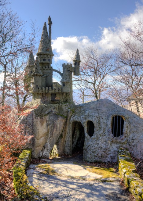
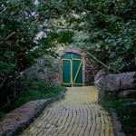
At the top of a mountain, a crumbling Yellow Brick Road winds around forests filled with creepy anthropomorphic trees, Dorothy’s dilapidated house and an Emerald Castle made of stone. The Land of Oz has been abandoned for thirty-three years, and it hasn’t seen much restoration during that time, but it opens to the public October 5th for an annual event called ‘Autumn at Oz,’ enabling visitors to see it in all its sad, derelict glory.

Abandoned Land of Oz Park 3

Abandoned Land of Oz Park 2

(images via: rockinfree)

Located at Beech Mountain, a ski resort in Western North Carolina, the Land of Oz saw over 20,000 visitors on its opening day in 1970. A ski lift was modified to resemble a balloon ride, taking guests on an aerial tour of the park with views of the mountain scenery. The park design was based on the book rather than the film, and the visitor was intended to experience it from Dorothy’s point of view.

Abandoned Land of Oz 4

Abandoned Land of Oz 5

(images via: rockinfree)

Despite a 1975 fire that destroyed some artifacts, including the dress worn by Judy Garland in the movie, the Land of Oz was fully operational until 1980. Once it was closed, many items were stolen, vandalized or destroyed, and those that weren’t were given over to the elements. A few pieces remain in storage at Appalachian State University.

Abandoned Land of Oz Park 6

(images via: emerald mountain)

The park was partially restored in 1990, and Former employees started Autumn at Oz as a reunion three years later. Now it’s an annual event, opening the doors to the outside world just two days every year. Proceeds from the event go to the (apparently minimal) upkeep of the park.

Share on Facebook


[ By Steph in Abandoned Places & Architecture. ]

[ WebUrbanist | Archives | Galleries | Privacy | TOS ]


WebUrbanist

 
Comments Off on Abandoned Land of Oz Theme Park Opens for Two Days

Posted in Creativity