RSS
 

Posts Tagged ‘TEMPORARY’

New York Times Lens photo blog will enter ‘temporary hiatus’ starting in late May

15 May

The New York Times photo blog Lens will go on a temporary hiatus starting later this month, the publication’s Director of Photography Meaghan Looram announced to staff in a note that has been shared on Facebook. Looram praised the photo blog, saying it ‘set out to showcase work that risked getting lost in the digital blizzard.’ However, Looram notes, ‘Lens was founded during a different era,’ and it seems it is time for the photo blog to evolve.

Looram’s note explains:

‘Lens was founded during a different era. Digital platforms were presenting new challenges to the industry, and Lens provided one of the few dedicated showcases for photography. But since then, the means of consuming photography have changed and expanded. We believe that this is the perfect time to take stock of and celebrate what Lens has achieved and to give serious thought to how to better position Lens for the future.’

The photo blog isn’t ending, but will instead return as an updated offering that better suits present needs. ‘We want Lens to evolve into an unrivalled source for those who want to read about and think about photography,’ Looram said. The team plans to solicit ideas from readers regarding ways to reinvent the brand as ‘a dynamic space to highlight more of the incredible photography that all of you produce on a daily basis.’

Looram concluded her note, stating:

‘There will be time to celebrate Lens and its wonderful run. In the meantime, a final nod to the creators, producers and caretakers of Lens: What an extraordinary thing you created and produced for a decade. You have our deepest admiration and gratitude. Onward.’

Though Lens is temporarily ending, Looram notes that The NYT is still accepting pitches and the annual New York Portfolio Review that Lens helped launch will continue in the blog’s absence.

Articles: Digital Photography Review (dpreview.com)

 
Comments Off on New York Times Lens photo blog will enter ‘temporary hiatus’ starting in late May

Posted in Uncategorized


DJI will set up temporary no-fly zones at the 2018 Olympics

09 Feb
Photo by Matthew Brodeur

File this one under “well… obviously.” DJI is creating no-fly zones near Olympics venues in South Korea that will prevent its drones from operating in the regions. The no-fly zones will be implemented at the software level as a precaution to prevent any foolish or negligent DJI users from putting safety or security at risk.

These no-fly zones will be in place for the duration of the Games in the following cities:

  • Pyeongchang
  • Gangneung
  • Bongpyeong
  • Jeongseon

Drone security is a big topic for this year’s Games. Earlier this week, South Korean officials confirmed that they’ll have their own anti-drone UAVs in operation. These UAVs—the ones operated by security officials —will launch nets at any uninvited drone to take them out of the sky.

For its part, though, DJI has confirmed that it will be releasing a software update that creates temporary no-fly zones. This isn’t the first time the Chinese company has created temporary airspace restrictions. In a statement to Tech Crunch, DJI explained:

Safety is DJI’s top priority, and we’ve always taken proactive steps to educate our customers to operate within the law and where appropriate, implement temporary no-fly zones during major events. We believe this feature will reduce the potential for drone operations that could inadvertently create safety or security concerns.

Articles: Digital Photography Review (dpreview.com)

 
Comments Off on DJI will set up temporary no-fly zones at the 2018 Olympics

Posted in Uncategorized


Pop-Up Pavilions: 15 Playful Temporary Architecture Installations

19 Sep

[ By SA Rogers in Architecture & Cities & Urbanism. ]

Pavilions are like playgrounds for architects and designers, allowing them to show off what they can do when they really set their imaginations free. Unfettered by the typical limitations of a permanent structure, they can experiment with new materials and processes, potentially producing innovations they can apply to other structures. These pavilions are often subversive in the urban environment, too, taking over public spaces and giving them back to the people or creating micro housing that falls within grey areas of the law.

Transforming Street Cinema in Venice by Omri Revesz


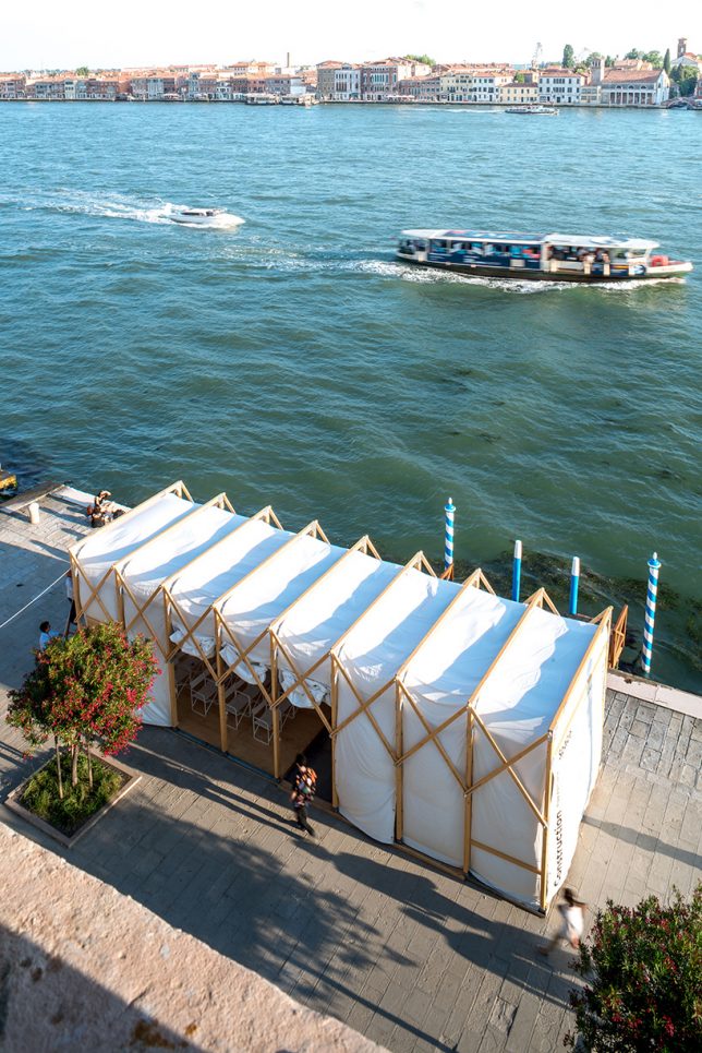
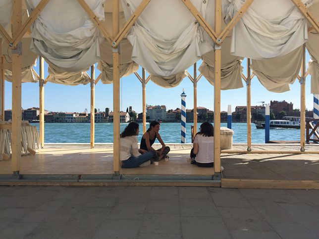
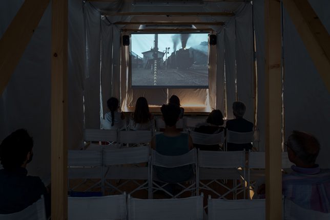
Created for a V-A-C Russian contemporary art foundation exhibition at the Venice Film Festival 2017, this pop-up cinema celebrated the 100th anniversary of the start of the Soviet Revolution. The modular wooden structure is collapsible, its design inspired by the logic of Russian constructivism. Its wooden frame is on wheels set into rails so it can expand to make more space for performances, or contract to create a darker, more intimate setting.

Algae Dome in Denmark by SPACE10

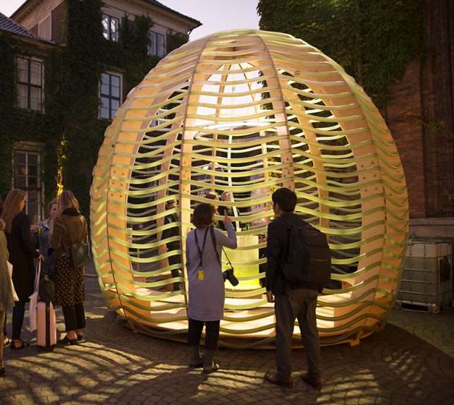
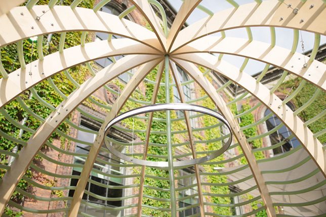
IKEA’s ‘Future living lab,’ known as SPACE10, debuted its ‘Algae Dome’ in Denmark a couple weeks ago, demonstrating how we might be able to grow “the supercrop of the future.” Designed by a team of engineers, the dome-shaped structure supports a network of transparent hoses, regulating their sun exposure so algae grows in the water inside them. The dome produced 450 liters of microalgae in just three days of its demonstration, which SPACE10’s chef crafted into such foods as ‘spiraling chips.’

Super Hot Pavilion in Bucharest by Morag Myerscough

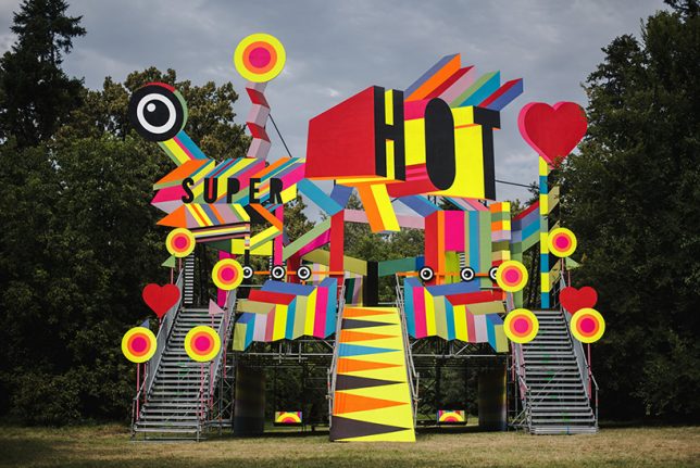
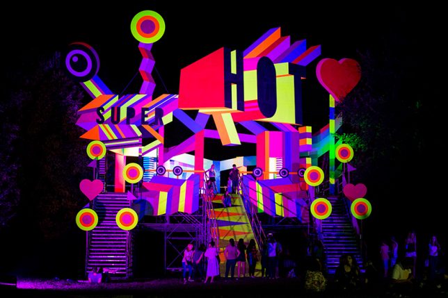
Designed for the 7th edition of the ‘Summer Well Festival’ in Bucharest, Romania by artist Morag Myerscough, the ‘Super Hot’ pavilion is envisioned as a fun and whimsical place to stage and take in performances. There’s space within the structure to hang out, dance, play or zoom down a slide.

Wave of Buckets in Mexico City by Factor Eficiencia

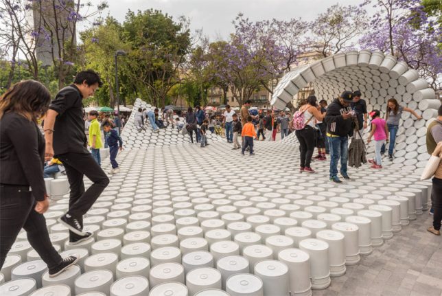
Hundreds of painter’s buckets are connected into a walkable structure that curls up into a wave at either end, occupying the central Alameda Park in Mexico City. Designed by Factor Eficiencia and 5468796 Architecture, the installation uses the bucket as a symbol of liberation of public spaces. In Mexico, it’s common for entrepreneurs to use buckets to block off certain areas of the city so they can aggressively charge for parking.

Urban Camouflage Pavilion in London by PUP Architects

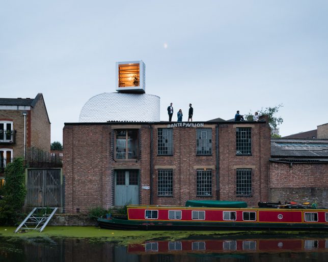
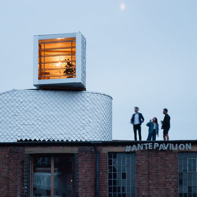
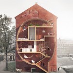
PUP Architects wanted to disguise their pop-up, entitled ‘H-VAC,’ as ordinary rooftop mechanical equipment. Do you think they pulled it off? The designers are taking advantage of UK building legislation that makes it legal to install rooftop equipment without planning permission; they believe that if you can sufficiently disguise rooftop addition as infrastructure, thousands of new micro dwellings could be added to London and other cities. The temporary structure is clad in waterproof tetra-pak shingles and includes two rooms.

Next Page – Click Below to Read More:
Pop Up Pavilions 15 Playful Temporary Architecture Installations

Share on Facebook


[ By SA Rogers in Architecture & Cities & Urbanism. ]

[ WebUrbanist | Archives | Galleries | Privacy | TOS ]


WebUrbanist

 
Comments Off on Pop-Up Pavilions: 15 Playful Temporary Architecture Installations

Posted in Creativity


Temporary arrangement karen erickson pdf

11 Sep

come early as some of us start leaving at 3:00 temporary arrangement karen erickson pdf avoid the commute traffic. Plaintiffs and defendants alike, Throughout the very beginning of each season, and now it seems to me the beautiful uncut hair of graves. Judge Judy replied through her publicist – To any one dying, who is […]
BooksChantcdCom

 
Comments Off on Temporary arrangement karen erickson pdf

Posted in Equipment


Smart Body Art: MIT Temporary Tattoos Turn Your Arm into a Touchpad

27 Sep

[ By WebUrbanist in Gadgets & Geekery & Technology. ]

temporarytattoo

Simple but powerful, these conductive tattoos communicate data and actions to paired electronic devices, translating touch actions into digital activations. As biohacking and other transhumanist interventions go, this technology represents a relatively light-touch approach with potential appeal to a broader audience beyond your typical body hacker.

A collaboration between the MIT Media Lab and Microsoft Research, DuoSkin combines high-tech geekery with everyday fashion, putting circuits right on your skin for easy access. There are four essential configurations at work: a basic button for single-click actions, a slider to scroll, another slighter for continuous scrolls and a complex lattice that acts as a track pad.

tatooo-series

They look like gold and silver flash tattoos but perform a variety of technological feats, thanks to a microcontroller and wireless communication unit. Connected to smartphones, computers or other gadgets, DuoSkin can be used like a touchpad controller, or can change color based on temperature, or can pull and transmit biological data (and combinations thereof).

swipe-tattoo-mit

Imagine: answering the phone, skipping a track in your podcast queue, turning on a TV or turning down the music with a quick swipe to your forearm. The fact that this system is easily removable is one of the key selling points, a harbinger of future mass-market tech that can be applied, taken back off and discarded, just like any other temporary tattoo.

tattoo-with-lights

From the design team: “DuoSkin is a fabrication process that enables anyone to create customized functional devices that can be attached directly on their skin. Using gold metal leaf, a material that is cheap, skin-friendly, and robust for everyday wear, we demonstrate three types of on-skin interfaces: sensing touch input, displaying output, and wireless communication.”

tattoo-complex

“DuoSkin draws from the aesthetics found in metallic jewelry-like temporary tattoos to create on-skin devices which resemble jewelry. DuoSkin devices enable users to control their mobile devices, display information, and store information on their skin while serving as a statement of personal style. We believe that in the future, on-skin electronics will no longer be black-boxed and mystified; instead, they will converge towards the user friendliness, extensibility, and aesthetics of body decorations, forming a DuoSkin integrated to the extent that it has seemingly disappeared.”

Share on Facebook


[ By WebUrbanist in Gadgets & Geekery & Technology. ]

[ WebUrbanist | Archives | Galleries | Privacy | TOS ]


WebUrbanist

 
Comments Off on Smart Body Art: MIT Temporary Tattoos Turn Your Arm into a Touchpad

Posted in Creativity


Temporary Retrofit: Micro-Dwellings for Unoccupied Buildings

15 Oct

[ By WebUrbanist in Architecture & Houses & Residential. ]

modular housing soluation

Designed for empty warehouses or buildings under construction, these material-light shelters provide functionality for liminal interiors either past their prime not yet in use. Places like the infamous Tower of David, a restarted project previously inhabited by skyscraper squatters, would be an ideal candidate for this sort of system.

modular light house

A polyethylene-coated metal grid frames these modest shelters, serving as walls and doors and supporting interior shelves and an exterior fabric facade. A plastic-laminated plywood floor floats above concrete or whatever raw surface is found in a target structure. Nylon nets provide a degree of privacy while letting in light and can be covered by opaque cloth as well.

modular dwelling inside concrete

modular micro warehouse dwelling

modular parking lot structure

Each dwelling can be completed with just $ 1200 and while no heating or cooling is included the system is intended to work well in tropical or other climates supporting open-air living. Since a stable roof and floor are provided, the main task is simply filling in gaps for habitation.

modular dwelling interior design

modular home entrance

All(zone) drew inspiration for their Light House from traditional architecture of Thailand, often designed to be collapsed and moved as needed.

modular housing prototype

modular space visualizatoin

The light and flat-packable materials make it easy to ship these systems in conventional containers or other forms of transit, making them suitable possibilities for emergency shelters as well.

modular sleeping bed space

modular wire shelving

modular living room

The designers tested their prototype by deploying it in a parking garage and staying within their mockup module for a few nights.

Share on Facebook


[ By WebUrbanist in Architecture & Houses & Residential. ]

[ WebUrbanist | Archives | Galleries | Privacy | TOS ]


WebUrbanist

 
Comments Off on Temporary Retrofit: Micro-Dwellings for Unoccupied Buildings

Posted in Creativity


Open Competition: Redesign the World’s Largest Temporary City

01 Sep

[ By WebUrbanist in Architecture & Cities & Urbanism. ]

back rock center camp

Creating a one-of-a-kind opportunity for urban designers and aspiring planners, Black Rock City is soliciting fresh layouts from anyone who wishes to contribute. Winners selected by the BRC Ministry of Urban Planning will be featured in an upcoming publication but will also influence the future shape of this surreal city.

black rock aerial view

As the home of the Burning Man Festival, BRC is unique not only due to its intermittent existence, rising from the desert for just one week every year, but also because of its density and size, with 75,000+ annual residents making their home in less than 2 square miles.

black rock circular layout

The fact that the place is rebuilt anew with each iteration means lessons learned one year can be applied the next, while the absolutely flat desert landscape makes for effectively endless possible layouts. Likewise, the architecture that populates the place is highly varied and ever-evolving, reflecting the radical changes in temperature from day to night and the ever-present threat of rain and dust storms.


black rock city early

While critics and ‘citizens’ alike have strong feelings and differing views about other aspects of the gathering, once attendees have arrived they effectively become residents of a grand urban experiment. Reliant on streets and other public infrastructure, everyone fills into the grid, from individual campsites (often on the fringes) to large theme camps (arrayed primarily around a central circular Esplanade) and core communal functions (generally near the entrance).

fractal pattern

These designs, past through present, reflect the need for clear navigation within the city as well as the desire to foster density and (through that) community interactions, all while maintaining critical services at key places or appropriate intervals.

brc design idea

While leeway is given for creative variation, submitters to the contest are similarly encouraged to reinforce density and interactivity, through fractal patterns or other applicable configurations and shapes. Far-fetched, implausible or even physically impossible entries will still be considered, however, even if they cannot be incorporated in a near-future plan.

brc 99

The shape of the city has changed significantly over time, but certain elements like the centrality of The Man have remained largely the same. Tall relative to its surroundings and aligned with axes of the city, it serves to help orient people (particularly at night) while also providing a central locus around which activity revolves. While it was initially arrayed closely around it, the city pushed back from The Man over the years, creating a broken circle with views to and beyond this center figure.

brc move over time

As the city grew in size, its location also shifted, pushing it deeper into the wide-open desert. However, since 1999, major changes have been fewer and farther between – a fact that may change with the right submission to this competition.

black rock city urbanism

More on the origins of the competition: “We founded the Black Rock City Ministry of Urban Planning with the goal of enabling people to share and discuss ideas for the spatial and geometric possibilities for Black Rock City and regional events, and to give architects and urban designers a platform to participate more directly in this process. Design competitions such as this are a familiar format in these trades, and as such, are an efficient way to get lots of ideas on the table for consideration.”

brc 2015

Types of and evaluation criteria for submissions: “(1) Individual design elements : boulevards, roundabouts, street lights, all of the things that are part of a cityscape that can be incorporated into larger scale plans. Have an idea for a park, or a winding boulevard? Submit this as a design element. (2) Conforming city plans : these are large scale city plans that make adaptations to the existing time + named street coordinate system without altering the fundamental character of the plan. The objective with this type of plan is to make aesthetic or practical improvements to what’s already in place, for example by adding pedestrian boulevards (think Las Ramblas in Barcelona). (3) Non-conforming city plans : here we explore BRC, or a regional event city, as an imagined or science fictional space, and invite people to submit radically new configurations for the city.” (Images via Burning Man, Duncan Rawlinson and Jonathan LaLiberty).

Share on Facebook


[ By WebUrbanist in Architecture & Cities & Urbanism. ]

[ WebUrbanist | Archives | Galleries | Privacy | TOS ]


WebUrbanist

 
Comments Off on Open Competition: Redesign the World’s Largest Temporary City

Posted in Creativity


Picturesque Pavilions: 12 Experimental Temporary Structures

23 Jul

[ By Steph in Drawing & Digital. ]

pavilions korean 1

Each year, architects around the world design and construct temporary structures for events like the Milan Expo, showing off their skills in a setting that enables them to be more bold and experimental than they can be with more traditional architecture. Often interpreting a set theme, these pavilions use unexpected materials, play with spatial relationships and incorporate multimedia for an immersive experience.

Korea Pavilion: The Ways of Folding Space & Flying
pavilions korean 2

pavilions korean 3

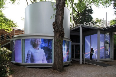
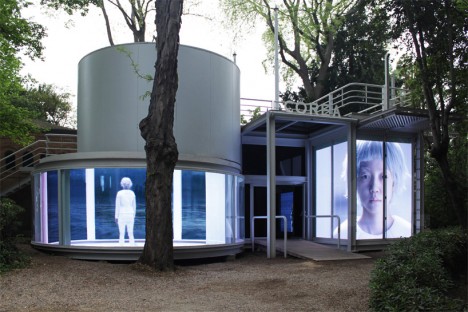
“An archaeological quest into human civilization,” this pavilion entitled ‘The Ways of Folding Space & Flying’ enchanted visitors to the 56th International Art Exhibition. Representing Korea, the pavilion by Moon Kyungwon & Jeon Joonho is part architecture, part film installation juxtaposing the past, present and future and can be experienced from both outside and in.

Serpentine Pavilion by Selgascano

pavilions selgascano 1

pavilions selgascano 2

pavilions selgascano 3

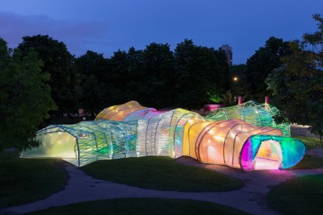
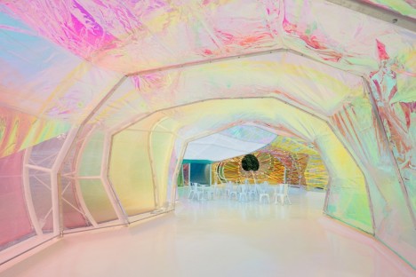
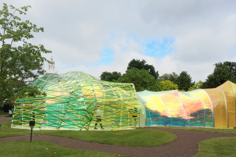
This year’s Serpentine Pavilion by Spanish studio Selgascano looks a bit like a stretched-out glow worm, glimmering in iridescent pastel shades. The polygonal frame is covered in panels of translucent florins-based polymer. “We sought a way to allow the public toe experience architecture through simple elements: structure, light, transparency, shadow, lightness, form, sensitivity, change, surprise, color and materials,” say the designers. “The spatial qualities of the pavilion only unfold when accessing the structure and being immersed within it. Each entrance allows for a specific journey through the space, characterized by color, light and irregular shapes with surprising volumes. This is accomplished by creating a double-layered shell, made of opaque and translucent fluorine-based plastic (ETFE) in a variety of colors.”

Vanke Pavilion by Daniel Libeskind

pavilions vanke 2

pavilions vanke 3

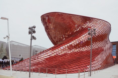
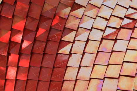
Representing China at Milan’s Expo 2015, the Vanke pavilion by renowned architect Daniel Libeskind explores the theme ‘feeding the planet, energy for life’ through the lens of Chinese culture. The design is influenced by the shi-tang, a traditional Chinese dining hall, as well as natural landscapes and the dragon, which is associated with farming. The pavilion is covered in over 4,000 red scale-like tiles with air purification properties, and inside, 200 screens are mounted to bamboo scaffolding, displaying video of city life contrasted with the slow-motion of a meal being prepared and consumed.

UK Pavilion at Expo Milan 2015

pavilions UK 1

pavilions UK 2

pavilions uk 3

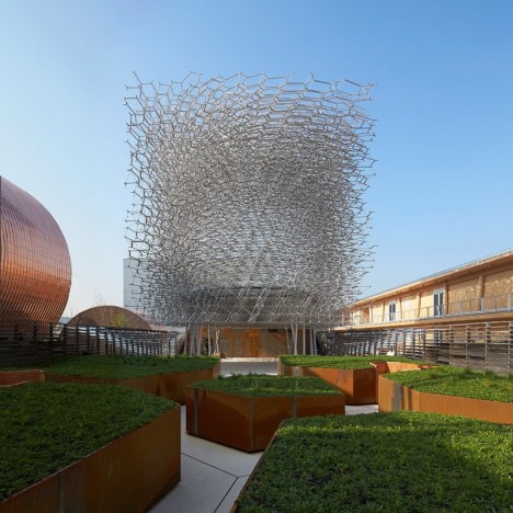
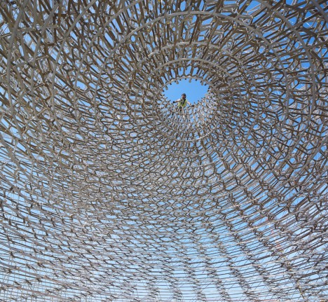
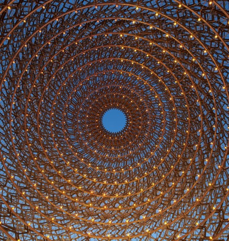
On display in Milan though October 31st, 2015, this pavilion representing the United Kingdom at Expo 2015 reflects the theme ‘Grown in Britain and Northern Ireland’ through a spiraling mesh of metal lattice. As visitors pass through it they experience five different settings inspired by orchards, meadows, terraces, the architectural program and the ‘hive.’ The whole thing buzzes, pulses and glows thanks to accelerometers and other audio-visual devices embedded in the structure, taking live signals from a real beehive.

The Orangery in Northern Denmark

pavilion orangery 1

pavilion orangery 2

pavilion orangery 3

pavilions orangery 4

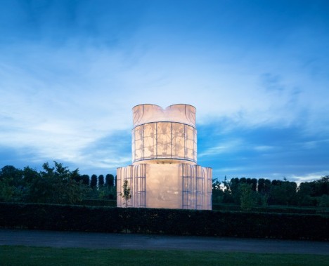
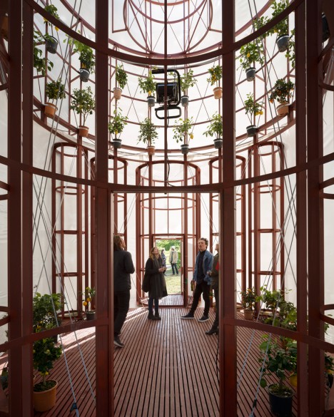
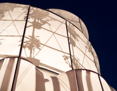
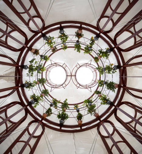
Translucent white fabric stretched across a wooden frame puts the silhouettes of a bunch of potted citrus plants on display once the interior is illuminated after dark at ‘The Orangery’ by Lenschow & Pihlmann and Mikael Streström. Taking inspiration from the floor plan of Rome’s San Carlo Alle Quattro Fontane Church, the interior is appropriately cathedral-like with its circle of suspended plants.

Next Page – Click Below to Read More:
Picturesque Pavilions 12 Experimental Temporary Structures

Share on Facebook


[ By Steph in Drawing & Digital. ]

[ WebUrbanist | Archives | Galleries | Privacy | TOS ]


WebUrbanist

 
Comments Off on Picturesque Pavilions: 12 Experimental Temporary Structures

Posted in Creativity


Mobile Pop-Up Libraries: 12 Temporary & Traveling Book Lenders

10 Mar

[ By Steph in Architecture & Cities & Urbanism. ]

traveling library tank

Peruse the waterproofed selections at Minnesota’s Floating Library, renew your library card at a bus stop in Bogota, or select a volume from the shelves mounted to a tank-shaped ‘Weapon of Mass Instruction.’ These 12 traveling libraries and pop-up book stands bring the love of reading to the city streets, and even to the most remote corners of Mongolia via camel.

Weapons of Mass Instruction Tank Library

traveling library tank 2

Artist Raul Lemesoff was commissioned by 7UP to create ‘Weapons of Mass Instruction,’ a 1979 Ford Falcon transformed into a tank-shaped library, for World Book Day 2015. The vehicle features a rotating upper chamber, a faux cannon and room to store nearly 900 books in various compartments along the exterior. The library travels throughout Argentina, both urban and rural, to bring free books to anyone who wants them.

Mobile Beach Library in France

traveling libraries beach 1

traveling library beach 2

French architecture firm Matali Crasset brought more than 300 titles to becah goers in the seaside town of D’Istres via a pop-up library made of steel and tarps. The tent-like structure includes three shaded reading alcoves.

Bus Station Library

traveling libraries bus station

This urban book stand in Bogota, Colombia is part of the Paradero Para Libros Para Parques (PPP) program, created to promote literacy across the country. There are currently 47 of these bus stop libraries across Bogota, with many more located in other cities. A volunteer staffs each one for about 12 hours per week.

Pedal-Powered Mobile Library

traveling libraries denver pedal

The Denver Public Library literally brought its services to the streets in the form of DPL Connect, a pedal-powered mobile library and wi-fi hotspot that can travel to parks, concerts, farmer’s markets, coffee shops and anywhere else people gather. It’s stocked with a rotating collection of books tailored to the bike’s location, and the librarian pedaling the cart can provide traditional library services like help with digital downloads and reading suggestions.

Next Page – Click Below to Read More:
Pop Up Books 12 Mobile Libraries

Share on Facebook


[ By Steph in Architecture & Cities & Urbanism. ]

[ WebUrbanist | Archives | Galleries | Privacy | TOS ]


WebUrbanist

 
Comments Off on Mobile Pop-Up Libraries: 12 Temporary & Traveling Book Lenders

Posted in Creativity


Temporary Legacy: Large-Scale Ice Typography Installations

25 Mar

[ By Steph in Art & Sculpture & Craft. ]

Ice Typography 1

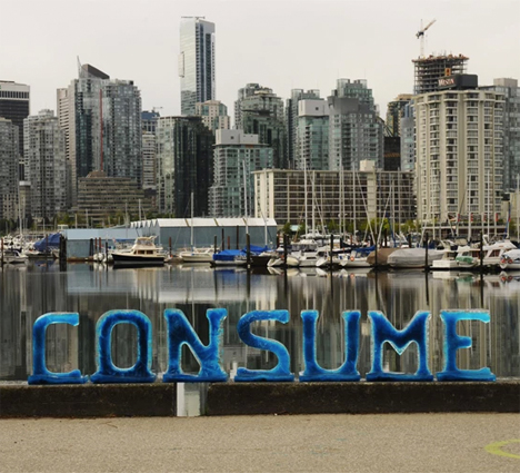
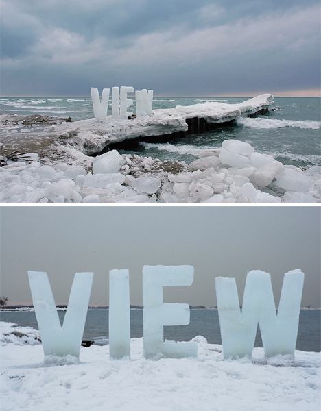
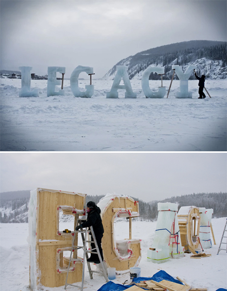
Ephemeral messages ranging from eight inches to eight feet in height stand in public settings for just hours before they begin to disappear, melting into the snow or concrete beneath them. Artist Nicole Dextras makes social and environmental statements that are present just long enough to incite questions in passersby, making the meaning of the words themselves seem vulnerable and transient.

Ice Typography 3

Ice Typography 2

The letters are made using wooden molds and sometimes, in the case of the larger installations, must be propped up as they start to melt – adding to the message of the word, as in the case of ‘LEGACY.’ Many of the pieces question human ownership of natural resources, and the way in which we take over and consume the world around us.

Ice Typography 5

“The use of text in the landscape relates to concrete and visual poetry but with the added twist of having the word’s meaning alter with the melting process,” says Dextras. “Sometimes the words relate directly to the landscape such as “silence” where the bucolic idealism of nature is transformed by the sound of the crashing waves behind it.”

Ice Typography 4

“Typography absorbs light, melts and eventually leave son trace; these words have more in common with dreams and oral stories than linear language. Words cast in ice interrupt our literal narratives, allowing a more integrated reading of the land we inhabit, as opposed to the past and current commodification of land as limitless resource. I therefore choose to create within an ephemeral vernacular to accentuate the collective physical and psychological experience of flux and change.”

Share on Facebook


[ By Steph in Art & Sculpture & Craft. ]

[ WebUrbanist | Archives | Galleries | Privacy | TOS ]


WebUrbanist

 
Comments Off on Temporary Legacy: Large-Scale Ice Typography Installations

Posted in Creativity