Quite a few months ago we started the process of redesigning Digital Photography School. For some time we’ve wanted to freshen up of the site as it’s been a couple of years since we last did (and the web has changed a lot since then!).
Our first port of call was to get your feedback on what you’d like to see – your feedback was great and we’ve put a lot of it into place (with more still to come).
If you’re reading this post and everything has gone to plan you’re hopefully seeing the the result!
We are still putting a few finishing touches on this design but while we do – we wanted to stop and share with you some of the important updates.
The big three …
Mobile Mobile Mobile!

You’ll notice the new design is what’s called responsive. This means it reformats itself depending on they size of the screen viewing the page. The super wide screens we could optimise a little better for, but we’ll get to that.
Bigger text, better readability.

If you look through the articles on the site you’ll notice a significantly bigger font. Some have said perfect, others have said a little too big. We’d love to know your thoughts in comments below.
Improved commenting system.

We’ve moved to Disqus for commenting allowing you to more easily upload your photo’s, keep track of your comments and create threads in all the articles. All your original comments have been kept the way they were so it’s the best of both worlds.
Some other things we’ve Done
Nicer Archive Pages.
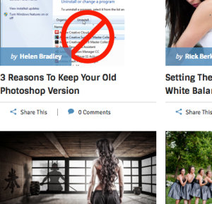
We’ve created what we feel are more usable archives and search results pages. Hopefully making it easier to find the articles you’re looking for. See what they look like in our Photography Tips, Post Production and Cameras and Gear archives.
Some new Color

We’ve added a bit more color to the site. We hope you like it!
A flashy new Home for our eBooks.
Our new bookstore page is designed to help you find the right eBooks with much less fuss.
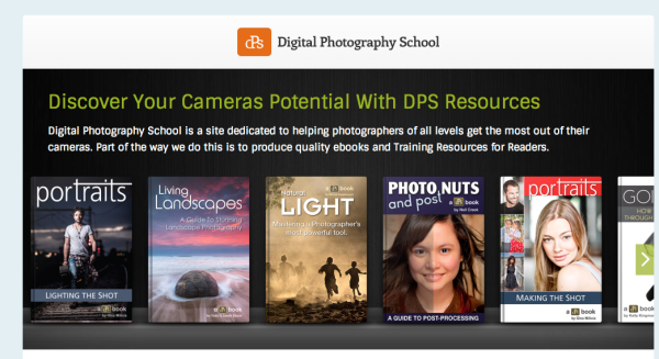
Built for Speed
Millions of people visit dPS every month and whilst an never ending vigil you should find this new design a little more zippier than the last. Where possible we’ve kept everything as efficient as we can.
Different but similar.
We’ve tried not to change the menus of the site to much. There are still three main categories (tips, post and gear) and the submenus are the same.
A totally new front page.
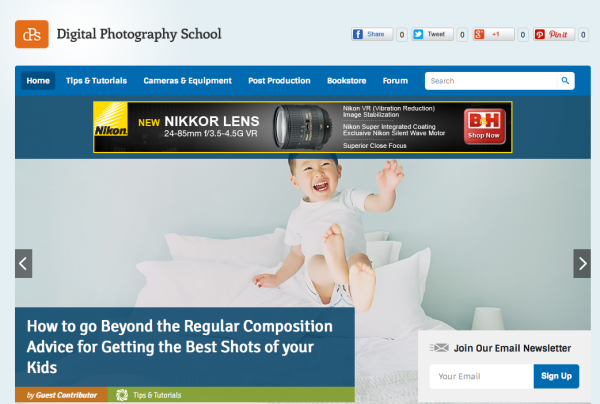
You’ll notice the front page is very different. We’ve tried to create the best window into the site as we can. This was perhaps the most controversial page so we’d love to know what you think.
New ways to share articles.

We’ve added a bunch of new ways to share articles with links at the top and the side. The next part is up to you!
The Forums are up Next
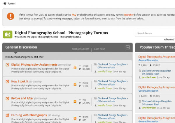
The development team are hard are work getting the forum ready for an update as well. Just like the blog this will be mobile friendly, cleaner, easier to use and a lot more colourful!
… and a Little Glimpse into the Future
A few of you made the suggestion that you’d like to be able to bookmark some of the articles and really customise your dPS experience. Once this new design over we’re excited to start working on exactly that. I won’t give to much away but it’s something to be excited about!
How you can Help?
There’s over 4,000 articles on dPS and I’m sure we’ve missed something – in fact our team are currently working through the full site still making tweaks as we find them.
You can help with this – if you do spot a bug, or some formatting that just doesn’t look right please let us know via the form below and we’ll get them fixed ASAP.
We can’t wait to hear your thoughts and as always thanks for being part of the dPS community.
jQuery(document).ready(function(){jQuery(document).trigger(‘gform_post_render’, [5, 1]) } );
Post originally from: Digital Photography Tips.
Check out our more Photography Tips at Photography Tips for Beginners, Portrait Photography Tips and Wedding Photography Tips.
Team Notes From Our New Design
The post Team Notes From Our New Design appeared first on Digital Photography School.

Digital Photography School


 Shooting With Your Creative Team & Post Production
 Planning A Shoot With A Creative Team
 Reaching Out To Modeling Agencies
 Working With A Creative Team
 Concept To Creation: Turn Inspiration Into Concept
 Concept To Creation: Finding Inspiration
 The 1920s Shoot With Celeste Van Rooyen
 The Workflow Process With Jonathan Skow
 Marcin Tyszka
 Greg Kadel
 Mood Boards: Communicate Your Ideas To Your Creative Team
 Concept To Creation: How Professional Photographers Do It
 Vapour With Greg Cunningham
 Planning A Shoot With A Creative Team
 Tips For Working with Agency Models
 Diego Angarita – The Freelance Retoucher
 Mastering The Digital Workflow


You must be logged in to post a comment.