RSS
 

Posts Tagged ‘Teach’

Five Self Assignments That Teach You To See

15 Aug

In my 20 years in photography, I’ve seen a lot of different assignments teachers have given their students.  Most I have heard, or been given myself from time to time, have centered around learning to use the camera.  Things like “Use Only One Exposure Mode”, “Use Only One Lens”, or “Use One Aperture Setting”.  The most interesting to me, from a photographic standpoint, involved learning to see.  The reason I say this is that simple camera use can be easily learned. It’s basic math when you boil it down.  But learning to see creatively, learning to compose a shot, takes much more than learning buttons, dials, and controls.  These self assignments force you to look around you, to really see what you’re shooting and try to make interesting images.

1. Pick A Color

Pick up your camera and choose a color for the day. Go out and make images with that color as a dominant element in the image. Find as many different ways as possible to do this.

This image I went in search of things red. 1/320, f/7.1, ISO 1000. EOS 5D Mark II, EF 100mm f/2.8L IS Macro.

This image I went in search of things red. 1/320, f/7.1, ISO 1000. EOS 5D Mark II, EF 100mm f/2.8L IS Macro.


2. Pick A Shape

Choose a shape and create images which use that shape in an interesting way. It could be features in architecture, artwork, or juxtaposition of multiple structures. Squares are relatively easy. Start there, and then search out triangles, circles, or combinations of shape.  Again, look for the most interesting composition you can to highlight that shape in your image.

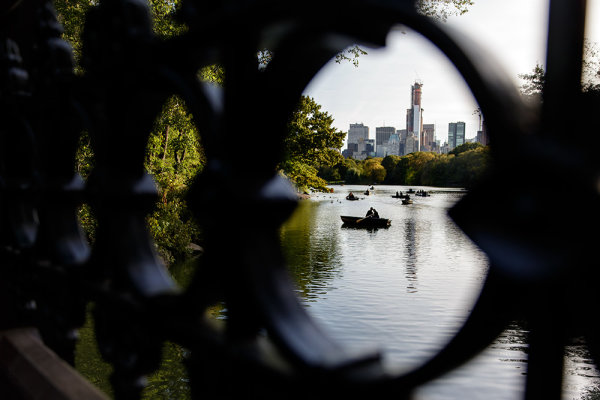
I ventured into Central Park in New York City without a real game plan in mind. I found a sundial and started shooting that, and then went in search of more circles. Found this ironwork and used it to frame a pair of lovers in a rowboat. 1/160. f/2.8, ISO 100. EOS 5D Mark III, EF 24-70 f/2.8L II at 24mm.

I ventured into Central Park in New York City without a real game plan in mind. I found a sundial and started shooting that, and then went in search of more circles. Found this ironwork and used it to frame a pair of lovers in a rowboat. 1/160. f/2.8, ISO 100. EOS 5D Mark III, EF 24-70 f/2.8L II at 24mm.

3. Shoot Something Different

If you’re like me, you probably have one type of subject you gravitate to more than any other.  But it’s easy to get too comfortable, and miss opportunities to make great images, when you’re only looking for one thing.  Once in a while it’s a good idea to change things up and shoot something different.  If you’re a sports shooter, try shooting a still life.  If you’re a landscape artist, try shooting macro.  These types of exercises forces you out of your comfort zone and helps you learn to see in a new way.

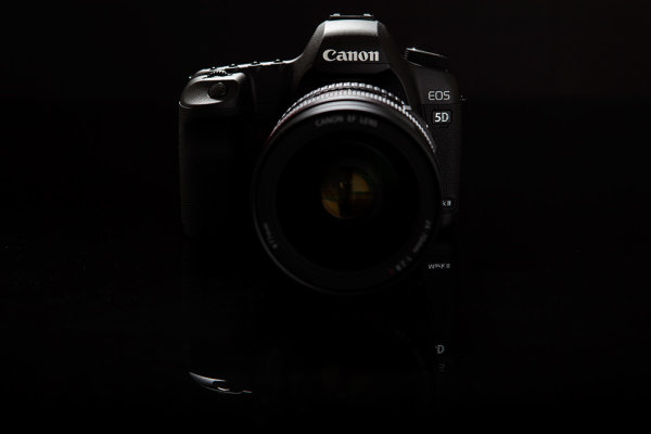
Normally I'm a landscape guy first. But I decided I wanted to try a still life of one of the tools of my trade.  I used some black plexi as the table, and black matte board for the background. I used a single speedlite in a softbox above and behind the subject. EOS 5D Mark II with EF 24-70 f/2.8L II. 1/200, f/8, ISO 100.

Normally I’m a landscape guy first. But I decided I wanted to try a still life of one of the tools of my trade. I used some black plexi as the table, and black matte board for the background. I used a single speedlite in a softbox above and behind the subject. EOS 5D Mark II with EF 24-70 f/2.8L II. 1/200, f/8, ISO 100.

4. Shoot Reflections

Reflections are a powerful element in photography, but I’m almost embarrassed to admit how long it took me to actually start SEEING them.  I had a “lightbulb moment” one day when shooting with a friend of mine, and since then, I am constantly looking for reflections as an element in my work, whether it be portraits, landscapes, or still lifes.

This is probably the most photographed puddle in New England, but it's great for producing a reflection of Pemaquid Point Lighthouse. Reflections add interest to images so always be on the lookout. EOS-1D Mark IV, EF 16-35mm f/2.8L II. ISO 100, 1/20, f/16.

This is probably the most photographed puddle in New England, but it’s great for producing a reflection of Pemaquid Point Lighthouse. Reflections add interest to images so always be on the lookout. EOS-1D Mark IV, EF 16-35mm f/2.8L II. ISO 100, 1/20, f/16.

5. The 15 Foot Circle

Stand in the center of a room, or wherever you happen to be.  Make photographs only of subjects that happen to be within 15 feet (or 10, or 5) of where you’re standing.  Give yourself a time limit. Exhaust all possibilities. Get as many images as you can using only that area before moving on.  This kind of exercise forces you to really look at things and work to compose interesting images.

I was standing in a dining room at the holidays last year and decided to try the 15 foot circle. This was a line of candles on a fireplace mantle. EOS-1D X with EF 70-200 f/2.8L IS II. ISO 400, 1/250, f/2.8.

I was standing in a dining room at the holidays last year and decided to try the 15 foot circle. This was a line of candles on a fireplace mantle. EOS-1D X with EF 70-200 f/2.8L IS II. ISO 400, 1/250, f/2.8.

For beginners, these assignments are great for learning to see. For more experienced photographers, these are great ways to stay fresh, to restart the creative eye when you’re feeling blocked, or to just do something different.  What other self assignments have you tried to refresh your photographic vision?

Post originally from: Digital Photography Tips.

Check out our more Photography Tips at Photography Tips for Beginners, Portrait Photography Tips and Wedding Photography Tips.

Five Self Assignments That Teach You To See


Digital Photography School

 
Comments Off on Five Self Assignments That Teach You To See

Posted in Photography


What to Teach Your Kids about Photography

10 Aug

A Guest Post by Jeff Guyer.

001

We love photography. We love our kids. So, it would stand to reason that if we can find a way to combine photography and spending time with our kids it’s a big win, right? Of course it is. If your kids are anything like mine, however, they’ve either already reached a point where they vanish into thin air the moment they even sense a camera coming out of a bag, or will reach that point soon enough. So, how do we enjoy our cherished hobby without abandoning our kids for hours or days at a time? If they’ve grown weary of their time in front of your camera, maybe it’s time to help transition them from test subjects and guinea pigs to budding photographers themselves.

STEP 1 — WHERE TO START…COMPOSITION & AUTO MODE

002

I know– the mere mention of Auto Mode makes you cringe. Ordinarily I’d agree, but it’s time to get over it (at least for a little while). I’ve been teaching a kids photography class for three years, and I can state with absolute certainty that if I tried teaching my own son the way I teach my students, he would most likely never pick up a camera again. In the classroom, I start each semester with a demonstration. We talk about the exposure triangle (aperture, shutter speed, ISO).

To illustrate, I pull out an old, 1972 Pentax Spotmatic and do something that would be impossible with any of today’s DSLR’s– I open it up. I take off the lens. I open up the back. I show them how the shutter stays open longer at slower shutter speeds. I demonstrate how the aperture ring works on older lenses. Let them see what’s going on from front to back. I show them how these concepts work on a practical, visual level. From exposure, we work our way to composition, to lighting, etc. It’s a logical progression and it works. An effective classroom approach, however, won’t often be the same recipe for success when we try it on our own kids. Why?

Because our kids just want to spend time with us and take nice pictures. They spend enough time in school learning nuts and bolts. If you are going to get (and keep) them interested in photography, you’re going to have to teach them without teaching them.

006

Huh?

You’ve taught your kids all kinds of things without sitting them down and making a formal lesson out of it. This is no different. But whereas in the classroom I start with the technical, with my son I start with composition and let the technical fall into place later.

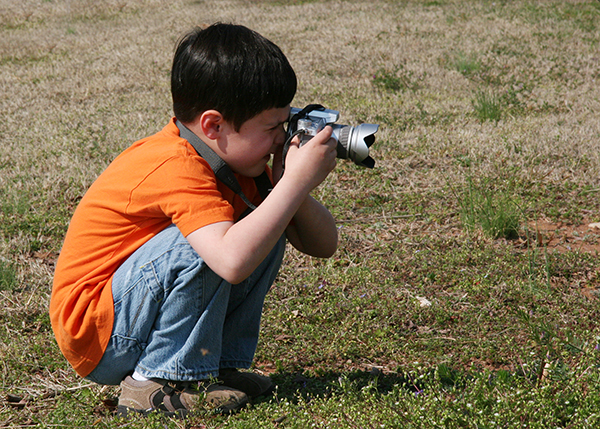
We all know that composition consists of the placement of our subject and other elements within the boundaries of the frame. What you have to remember, though, is that your child views the world from a much lower vantage point than you do. So, start by getting down on their level and see things as they do. It may also help at first to leave the big guns at home and use a point & shoot or even an iPhone. The iPhone is an amazing compositional tool. A live view that you can share with your kids will be a huge help in guiding them towards alternate angles and helping them get what they see with their eyes within the confines of the frame.

This is where they will start expressing themselves creatively. It also gives you a chance to get inside their heads and maybe even let them teach you a thing or two about creativity. In some ways, pressing the shutter button is almost secondary at this point.

STEP 2 – SUBJECTS & LOCATIONS

003

Start by thinking about what frustrates you most about basic photography and make sure to remove as many of these stumbling blocks as possible. The more you do to create a successful environment for them, the better your chances for successfully instilling a love for photography. Stationary subjects like landscapes are a great place to start, as are pets, toys, or even cracks in the sidewalk for that matter.

As long as you are helping them select relatively stress-free subjects on their visual level, you increase their chances of success. Remember also, that creativity does not usually fall too far from the tree. Free from our adult notions of creativity, your kids might very well have some pretty awesome creative visions of their own. Be open to those visions and be sure to give them a chance to guide the journey as well.

Once they get more comfortable with capturing their vision in a box, you can start introducing games, challenges, and scavenger hunts. You’ve got their interest and attention. Now hold onto it by making it fun and exciting. Shooting themes (e.g., “Lines,” “Red,” “Doors,” “Reflections,” etc.) is a great way to both engage their imaginations and expand how they see the world around them.

STEP 3 — CAN WE FINALLY TALK ABOUT EXPOSURE NOW?

004

As children become more and more comfortable with the ideas of composition and choosing their subjects, they will be in a better position to not only start asking questions about why their photos are too light or too dark, but to understand the answers as well. By now you are hopefully comfortable with your own grasp of exposure, as well as the interplay and symbiotic relationship between the three elements. Once again, it’s all well and good, but your 8-year-old is going to get a glassed-over look in her eyes and expel the biggest yawn you’ve ever seen the moment she starts hearing things like “depth of field,” “stopping down,” and shooting “wide open.” So what do we do? We teach it visually by example.

Imagine a room with a large single window covered with a curtain. Congratulations– you’ve just stepped inside a camera. The window and curtain combine to act as your shutter and aperture. If your kids can get their heads around the concept simply by way of discussion, great. If not, pick a room of your house and demonstrate. If I open the curtain just a little, I have a smaller aperture. If I open it wider, I have a larger aperture. If I open and close the curtain very quickly, I have a faster shutter speed, and if I open and close it more slowly I have a longer, slower shutter speed. Demonstrate this with various combinations, showing them how their choices affect how much light enters the room and for how long.

Once they have a handle on aperture and shutter speed, you can add ISO to your demonstration with the use of sunglasses. Technically, ISO is a measure not of the light entering your camera, but of your camera’s sensitivity to that light. For purposes of this discussion, starting with sunglasses on and taking them off will be comparable to raising the ISO. The light entering the room has not changed, but it obviously becomes brighter with the removal of the sunglasses.

STEP 4 — ARE WE HAVING FUN YET?

005

I suppose my most important piece of advice is to make sure you keep all of this in perspective. We love our kids first and photography second. “You’re doing it wrong,” or any variation of it is strictly off-limits. Allow for mistakes and imperfections. Celebrate and embrace them. Just remember, though, that your kid can read you like a book. The second they realize you’re getting pushy or not having fun, it’s over. You didn’t just wake up one morning an accomplished photographer. You worked at it. If you guide them right your kids will work at it, too.

And one day they might even take a killer, life-altering photo and thank you for it.

Jeff Guyer is a photographer based in Atlanta, GA. In addition to shooting portraits, architecture, sports, weddings, and just about anything else that pauses in front of his lens, he also teaches a Digital Photo Challenges class for kids. Follow him on Facebook at http://www.facebook.com/guyerphotography or on Twitter @guyerphoto

Post originally from: Digital Photography Tips.

Check out our more Photography Tips at Photography Tips for Beginners, Portrait Photography Tips and Wedding Photography Tips.

What to Teach Your Kids about Photography


Digital Photography School

 
Comments Off on What to Teach Your Kids about Photography

Posted in Photography


6 Lessons the Square Format Can Teach You About Composition

29 Jul

Square format composition

In another article I wrote that one of the main attractions of the square format for me is composition. Today I’m going to elaborate on that idea.

Composition in the square format is a different process than within a rectangular frame. The benefit of understanding of why that is so is that you will be able to apply the lessons learnt to improving the composition of your images in any aspect ratio. Even if you never intend to use it in earnest, it’s worthwhile playing around with the square format for this reason alone.

Let’s take a look at some of these factors:

1. Balance

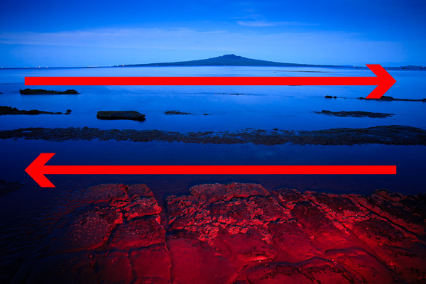
A square is a perfectly balanced shape. Each side is equal in length. Using the square format encourages the eye to move around the frame in a circle. This is different to the rectangular frame, where the eye is encouraged to move from side to side (in the landscape format) or up and down (in the portrait format). There are many factors that influence the way the eye moves around a photo, including the use of line, texture, colour, selective focus and negative space. But the shape of the frame is a major factor.

In this landscape, composed within the 3:2 aspect ratio of my 35mm camera, the eye is encouraged to move from side to side by the shape of the frame and the horizontal lines:

Square format composition

In this square format photo, the eye is encouraged to move around the frame in a circle:

Square format composition

2. Space

Negative space is the term used to describe the empty space in an image around the subject. Composition is often improved by getting closer to the subject. But sometimes you can create atmosphere or emphasise the shape of the subject by including negative space around it. In the rectangular frame, this can be difficult to do as it results in a lot of empty space. But it can be very effective in the square format.

Here is a photo that I took of a lizard in the 3:2 aspect ratio:

Square format composition

And here is the same photo cropped to a square:

Square format composition

Which do you prefer? There is no right answer – it’s entirely subjective. But it’s interesting how the dynamic of the image is changed by a single crop.

3. Simplicity

The square format lends itself to a simple approach. There is less room within the square frame than the rectangular one, therefore simplifying the composition becomes a necessity.

Creating a simple composition is often much harder than it seems. But it’s a very useful exercise. For your photos to have impact, you want to eliminate as many distractions as possible. The focus should be on your subject. If there are other elements within the frame that pull the viewer’s eye away from the subject that can lessen the strength of the image.

The composition of this image is about as simple as it is possible to get:

Square format composition

4. Shape

How many shapes can you see in the images below? There are circles, squares, diamonds, rectangles and triangles within these photos. The square format lends itself to this style of composition. I think that’s because the square is such a powerful shape in itself, that it emphasises other shapes within it. Linked with this are the ideas of balance and simplicity. Simplifying the composition emphasises shape, and so does placing shapes within a square frame. Converting to black and white emphasises them further.

Square format composition

5. Central composition

In the square format you can often place the subject in the centre of the frame for an effective composition. Generally speaking, many photographers tend to avoid place the subject off-centre for a more interesting composition.The rule-of-thirds is a reminder of this. But in the square format that doesn’t apply.

It’s even more true when the image is simple. The less distractions there are in the frame, the more effective a central composition becomes. If the subject has a strong shape, the empty space around it emphasises the shape. And the square format provides the perfect, balanced frame:

Square format composition

6. Black and white

Take away colour and what do you have? An image that relies on tonal contrast for impact and that emphases visual elements such as line, texture and shape. The square format and black and white seem made for each other, which perhaps explains its popularity with fine art photographers.

Take another look at the photos in this article. Do you prefer the colour images or the monochrome ones? The answer may give you an idea for future photo projects.

Final thought: Have fun

Whether you shoot with the intention of utilising the square format, or go back over old images to see whether they can be improved by cropping to a square, the most important thing is to have fun with the process. Enjoy the challenge of getting to grips with the square format and its implications for composition. Don’t take it too seriously. You’ll create some beautiful images and the lessons you learn about composition along the way will help you create better images in the future.


Post originally from: Digital Photography Tips.

Check out our more Photography Tips at Photography Tips for Beginners, Portrait Photography Tips and Wedding Photography Tips.

6 Lessons the Square Format Can Teach You About Composition


Digital Photography School

 
Comments Off on 6 Lessons the Square Format Can Teach You About Composition

Posted in Photography


What the Mona Lisa Can Teach You About Taking Great Portraits

13 May

Mona-Lisa

When it comes to famous images the Mona Lisa by Leonardo Da Vinci is one of the most recognized in the world.

When I visited the Lourve in Paris a couple of years ago I was stunned by the crowds of people gathering around this small image, pushing and shoving to get close and to take a picture of it (I got some great shots of the crowd).

The Mona Lisa has been at the center of much debate and speculation over the years but why is it an image that intrigues people so much and what can we learn from it as photographers today?

While we live in a different time (the Mona Lisa was painted in the 1500′s) and use different technology – is there something in this famous image that we can be inspired by as image makers today?

Lessons from the Mona Lisa for Photographers

Today I want to explore some of the different aspect of the Mona Lisa and point out some things that Leonardo did in painting this image that I think we could take away as portrait photographers today.

Composition
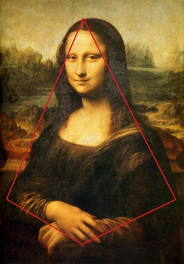
mona-pyramid.pngWhile we look at the Mona Lisa today and see it’s composition as fairly standard and simple – for it’s time the composition of the Mona Lisa was ground breaking and has set new trends in painting which have been followed for centuries since.

One of the compositional elements that the portrait is known for is Leonardo’s use of a pyramidal composition which shows the subject with a wider base at her arms and her hands forming the front corner and everything is in place to draw the eye up her body to her eyes and her infamous smile.

Take Home Lessons for Today

The same form of composition can work for us. While I wouldn’t dare suggest that this is the only or best way to set up a portrait shot – the pyramidal composition is one worth trying.

The Pose

Again – today we look at Mona Lisa’s pose and it seems fairly normal but for it’s day it was quite revolutionary as most portraits at the time were rigid, stiff and quite often profiles rather than front on.

In contrast Mona Lisa is somewhat relaxed and at ease as she leans upon the arm of a chair with her hands crossed in a relaxed fashion.

While she’s slightly turned to one side she sits open to the viewer and holding their eye.

Also unusual for the time was the fact that Leonardo went against the norm with the framing of this image and opted for a three quarter length pose rather than a full length one. In this way he filled the frame with his subject which lends itself to an intimate image and little room for distraction by her context.

One last aspect of the pose is that the Leonardo has positioned Mona Lisa’s eyes at the eye level of the one viewing the image. This brings a sense of intimacy to the image as we the viewer gaze directly into her eyes (there’s not a sense that we’re looking down on her or that she’s doing that to us).

mona-hands.png

Take Home Lessons for Today

This classic pose works today. Fill your frame with your subject by using a three quarter length pose, relax your subject, have them turn their body slightly away from the camera and look directly at the camera. Give their hands something to lean on (they can look awkward otherwise). Most of all – attempt to relax your subject.

The Background

mona-background.png
Much has been written about the background of the Mona Lisa and we can draw out a few things from it for today.

One thing worth noting is that while paintings of the day generally had both the subject and background in sharp focus with lots of detail – the background of the Mona Lisa seems to ‘fade’ or become more blurred and out of focus the further from the subject it extends.

This was unusual for the time and is an effect that many portrait photographers use today by choosing a large Aperture to make for a blurred background that leaves the viewer of the image to focus upon the subject.

While there is definitely points of interest in the background (there’s a lot of debate about whether the two sides of it ‘match’ and whether it’s supposed to be some kind of a fantasy/imaginary background) the colors in it are somewhat bland, muted and subtle – again leaving the focus upon Mona Lisa.

Take Home Lessons for Today

There are different ways to use a background of a portrait. It can either be used to put your subject into context by showing their surrounds – or it can be used as a backdrop that is largely a blank canvas with few features so that your subject stands out.

In a sense Leonardo has done both with his background. It doesn’t take the focus away from the subject – yet the landscape behind her does have an element of mystery and interest to it. It’s also visually complementary to the subject with some of the shapes and colors almost mirroring colors and shapes in the subject’s clothing.

The lesson is to carefully consider your backgrounds – they can greatly enhance or detract from your portraits.

Light

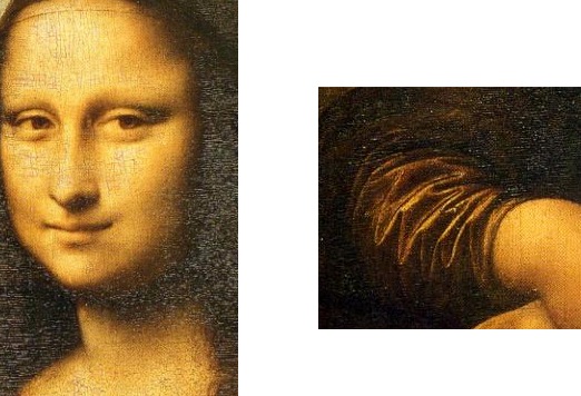
One of the things that I like about the Mona Lisa is the way in which light falls upon the subject. Leonardo uses light to draw the eye of the viewer to the parts of the image that he wishes to be highlighted (the face and hands) and balances the image nicely by placing hands and face in positions that counter one another.

Leonardo also uses shadow (or a lack of light) to add depth and dimension to different aspects of the image – particularly the area around Mona Lisa’s neck and in the ripples on the dress on her arm.

light-1.jpg

Take Home Lessons for Today

Think about how your subject is lit. Use it to draw the eye to key parts of your image but also use shadow to create depth and dimension to your shots.

Clothing

We’ve talked about clothes and portraits here at DPS before and Leonardo takes the approach of darker less obtrusive clothes in this image. Once again – this is a little different to other portraits of the time which are renowned for being bright.

While her dress has quite a bit of detail (the lace work is quite fine and the detail in the folds on her arms are lovely) and it all is within keeping of the feel of the image – everything works to highlighting her face.

mona-lisa-clothes.jpg

There’s also a lack of any kind of jewelry or any other kind of accessory to distract the viewer away from Mona Lisa’s face.

Leonardo obviously wants something about the woman herself to shine through in this image rather than anything else.

Take Home Lessons for Today

Clothes are another element that can be a real distraction in a portrait. Take a lesson from Leonardo and use clothes that fit with the subject and give them context – but which don’t distract your viewer.

Framing

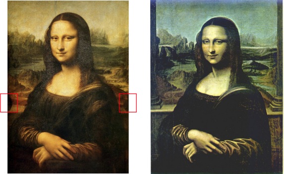
One of the things that I’d not noticed about the Mona Lisa before that i read about today is that on either side of the subject just under and to the side of each of her shoulders there is half of a round ball shape (see the images below on the left).

It is believed that what we see of currently of the image is actually slightly smaller than the original. Part of the image was lost when the image was re-framed at some point. What were the balls?

The most widely accepted theory is that in the original and full version of the painting two columns extend up from the balls on either side of Mona Lisa. She’s actually sitting on a balcony overlooking the view behind her. You can see the horizontal edge of the balcony extending between the two columns.

Here’s how one artist reproduced the Mona Lisa with the extra columns.

mona-lisa-framing.jpg

Whether or not the columns in the original looked exactly like this reproduction or not I’m not sure – but it seems that Leonardo used a technique that we call ‘framing‘ in photography today. This technique is all about drawing the eye of the viewer of an image to your main subject. It also has the potential to add a little context to a portrait (with the columns it would be more obvious that Mona Lisa is sitting on a balcony).

Take Home Lessons for Today

Learn to use techniques like framing to draw the eye of the viewer of your images to your main subject. Frames can be subtle and a natural part of the environment around your subject. Don’t use them in every shot but do keep your eye out for opportunities to include them to add another dimension to your portrait work.

Mystery

Who is the woman (its been argued that she is anyone from a female form of Leonardo himself through to the wife of the man who commissioned the image)? What is the background? Why is she smiling (or is she)?

mona-smile.png

There’s something mysterious both about the subject herself (her look is both alluring and aloof) and the way that the image was painted (Leonardo used a technique called ‘blurring’ around the edges of the subject that was new for his time that give it a mysterious quality). This leaves the viewer of the image asking questions and entering into it with imagination. Leaving elements of the image open to interpretation can make an image impact it’s viewer.

Take Home Lessons for Today

One of the elements that takes a proficient image and makes it a great image is that it goes beyond being a record keeping exercise and becomes a story telling one.

The Mona Lisa has drawn viewers to use their imagination and have conversation about it for centuries simply because it leaves parts of the story untold. This is something that can’t really be learned as a photographer – but is something that comes with experience.

What Lessons Does the Mona Lisa Teach You about Photography?

What have I missed out on? What do you see in this famous painting that could teach us about photography?

Post originally from: Digital Photography Tips.

Check out our more Photography Tips at Photography Tips for Beginners, Portrait Photography Tips and Wedding Photography Tips.

What the Mona Lisa Can Teach You About Taking Great Portraits


Digital Photography School

 
Comments Off on What the Mona Lisa Can Teach You About Taking Great Portraits

Posted in Photography