RSS
 

Posts Tagged ‘Switched’

Five Reasons Why I Finally Bit the Bullet Switched to Adobe Creative Cloud

19 Sep

When Adobe announced that they were transitioning their apps to a subscription model of the Adobe Creative Cloud in 2013, I almost fell out of my chair while clutching the cardboard box for my copy of Lightroom 4. It seemed absolutely crazy to me that Adobe would ask photographers and other creative professionals to spend money every month subscribing for software that they could simply buy once and use forever.

In the years that followed I resisted moving to Creative Cloud and continued to buy new versions of Lightroom one by one until a few months ago when I finally bit the bullet and subscribed. I was one of Adobe’s harshest critics in those intervening years and staunchly refused to buy into Creative Cloud for several reasons until I realized five important things that finally got me to switch over.

Five Reasons Why I Switched to Adobe Creative Cloud - couple portrait

Much of my hesitation to switch was due to the fact that I didn’t really understand the service Adobe was offering with their Creative Cloud Photography plan. That’s the one that lets you have Lightroom and Photoshop for $ 10/month.

What I failed to recognize was that Lightroom and Photoshop are just the tips of the iceberg, and there’s a whole slew of additional Adobe services that users have access to with a CC subscription. None of these by themselves are worth the price but when you examine all the ancillary benefits you get alongside great software it makes the idea of renting the software I used to own a lot more palatable.

Syncing between Lightroom Classic and Lightroom CC

When you subscribe to the Photography plan you get two versions of Lightroom, each with unique features and benefits designed to cater to specific types of photography workflows.

Lightroom Classic CC is the name of the traditional desktop app that has been around since 2007, now available only through a Creative Cloud subscription. This is for desktop-centric workflows where all your photos reside on a single computer.

Lightroom CC is a new different version of Lightroom designed for a cloud-centric workflow where all your photos reside in the cloud and can be edited anywhere – in a browser, on a tablet, on a phone, or even using Lightroom CC on a desktop computer.

What you might not realize is that you can use both of these programs together, with the key difference being the location where your original pictures actually reside. If you are accustomed to a traditional desktop-centric workflow you can use Lightroom Classic CC to sync specific albums in the Cloud.

This basically uploads low-resolution preview files of your photos to your Creative Cloud account. These previews, then, can be edited anywhere using Lightroom CC and the next time you load Lightroom Classic CC on your desktop all your edits are automatically synced to your original photos and catalog file.

photo editing in Lightroom CC - Five Reasons Why I Switched to Adobe Creative Cloud

I started editing this photo on my computer in Lightroom Classic CC. Then I pulled it up in my browser and made additional changes which were synced back to my desktop.

The key difference between both types of workflows is that when using albums published to the cloud from Lightroom Classic CC, your originals remain on your desktop which means you can’t export high-resolution images from Lightroom CC. However, for photographers who want to edit their pictures on the go and then return to their desktop for any final tweaking and exporting, this is an outstanding solution and one that could make the difference to those on the fence about subscribing.

One final note about this: The $ 9.99 Photography Plan includes 20GB of cloud storage, but the albums that you publish to the cloud from Lightroom Classic do not count against that 20GB. This is because they use low-resolution previews instead of your actual images which is fine for flagging, cropping, keywording, color correcting, and most of the other adjustments you would want to make on a mobile device.

family photo in Lightroom - Five Reasons Why I Switched to Adobe Creative Cloud

Having access to my photos on mobile has sped up my culling process enormously. It’s much faster for me to flag, reject, and rate photos on my iPad and the results are synced right back to my iMac in Lightroom Classic CC.

Photoshop is Included

I’ll be the first to admit that even though I call myself a photographer I rarely use Adobe Photoshop and instead do most of my post-processing in Lightroom. I do, however, have an old copy of Photoshop CS5 that I bought about eight years ago which I use when I really need to do some heavy processing.

But it’s slow, lacks a lot of modern features, and has an interface and layout that is confusing, to say the least. It also crashes on me a lot which doesn’t exactly help matters whenever I do need to use it.

Despite these issues, the fact that Photoshop is included did not do much to initially sway my barometer when it came to shelling out $ 9.99 each month for the Creative Cloud Photography plan. I forced myself to get by with what I had even though it was not really suiting my needs anymore.

image in Photoshop - Five Reasons Why I Switched to Adobe Creative Cloud

But the more I thought about subscribing to Creative Cloud the more I realized how nice it would be to have the full version of Photoshop ready when I needed it.

No need to think about buying, upgrading, or figuring out whether the version I had would really be current with the latest online tutorials. It just started to make sense for a small-time photographer like me to pay what really is a modest monthly fee to have the latest and greatest tools at my disposal for when I needed them.

Since I don’t use Photoshop all that often it would not be worth the price of a Creative Cloud plan by itself, but combined with everything else it sure did make a lot of sense.

Share albums publicly

I take a lot of photos of family, friends, and events just for personal use and like most people, I enjoy sharing these images with others. Until subscribing to Adobe Creative Cloud my workflow for this type of sharing was somewhat convoluted and involved exporting small-sized images from Lightroom, saving them to a Dropbox shared folder, generating a public link, and sending that out to others.

I couldn’t do much in the way of limiting access privileges either, and meanwhile, the images were taking up space in my Dropbox account that is perpetually near its limit anyway.

Now my process is much simpler, a lot more efficient, and results in a greater degree of control over what I can actually let other people do with my images. After publishing an album to the cloud from Lightroom Classic CC you can log in to Lightroom on the web, on mobile, or just load up Lightroom CC and generate a public link for any synced album.

Moreover, you can get an embed code, choose to allow downloads and show metadata, and even let people filter the photos according to Flag status.

album sharing - Five Reasons Why I Switched to Adobe Creative Cloud

While the images that are publicly viewable using this method are the low-resolution previews and not full-size images for printing, they are more than enough for most people.

The tradeoff in terms of overall simplicity and ease of use is more than worth it for me, and I’m not taking up valuable space in my Dropbox account or other file-sharing services.

Adobe portfolio

This might not be useful for some photographers but I have found Adobe Portfolio to be an incredible asset as a Creative Cloud subscriber and it really was one of the primary reasons I eventually chose to upgrade. Previously I was paying a service nearly $ 100/year for my photography website. But when I realized that Adobe Portfolio could do everything I need and was included with a Creative Cloud subscription I canceled my other hosting service and moved everything over to Adobe.

adobe portfolio - Five Reasons Why I Switched to Adobe Creative Cloud

Adobe Portfolio won’t give you the fanciest website in the world, but it could very well get the job done for you at not much more than what you are paying for a website now.

All Creative Cloud subscribers have access to Adobe Portfolio which, though not as full-featured as some of the other hosting providers, is more than enough for my needs and possibly yours as well. As an added bonus it syncs with Lightroom so I can create albums on my computer and have them synced automatically with my website. Something that was not possible at all with my previous hosting company.

If you are at all interested in Creative Cloud but unsure about the $ 9.99 monthly fee, I recommend looking at your current website hosting solution and comparing it to Adobe Portfolio. It is quite likely that the latter could suit your needs just fine and end up only costing you a bit more than what you are already paying for a website.

adobe portfolio - Five Reasons Why I Switched to Adobe Creative Cloud

Adobe Portfolio doesn’t have the breadth of features offered by other website platforms, but it does have a decent selection of themes and some solid options for photographers who want a simple, effective way to showcase their work online.

The price was right

As I looked at all the features offered by Adobe Creative Cloud I kept on coming back to the monthly fee, and for years I just couldn’t reconcile the idea of being locked into a perpetual contract just to use software that I could go out and buy once but use forever. However, I kept coming back to other software I had purchased like Aperture, Final Cut Express, and even other Adobe apps like Fireworks that simply wouldn’t run on my computer anymore.

Sure I had bought these apps but as time went on the only way to use them was to purchase new versions anyway. In the meantime by not upgrading I was losing out on the bug fixes, added features, and overall speed improvements offered by their newer counterparts. In some cases, like Final Cut Express, apps were simply deprecated by their developers leaving me with no choice but to upgrade anyway.

software - Five Reasons Why I Switched to Adobe Creative Cloud

I’ve paid hundreds of dollars over the years for software that I can’t use anymore, or won’t be able to use in the near future because it has been deprecated by its developers.

I still don’t like the idea of being locked into a monthly fee for software but when I considered all the benefits that came with what really was a modest price (only about $ 30 more than I was paying just for my website) the choice became clear. I’m not saying that Creative Cloud is right for everybody but it was definitely the right choice for me and, depending on your needs, it could be right for you too.

The post Five Reasons Why I Finally Bit the Bullet Switched to Adobe Creative Cloud appeared first on Digital Photography School.
Digital Photography School

 
Comments Off on Five Reasons Why I Finally Bit the Bullet Switched to Adobe Creative Cloud

Posted in Photography


Why I Switched From LEE Filters to Formatt-Hitech for Landscape Photography

03 Feb
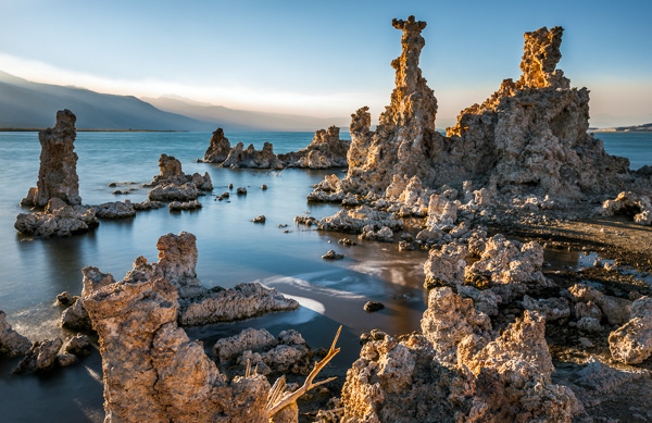
A hard graduated neutral density filter worked great here to darken the sky.

A hard graduated neutral density filter worked great here to darken the sky.

There are three types of photographers in the world; those that try to get it right in camera, those that simply rely on post-processing, and those who believe that both mindsets together lead to the best possible outcome. I try to always keep the mindset of that third type. If I can get everything right in camera (and save minutes or even hours in post) I will. I also have always loved post-processing and the art of making an image come to life. When shooting landscapes, you are more often than not at the mercy of mother nature. You can certainly schedule your time wisely and shoot at the best times of day but that doesn’t always mean that you’ll be able to capture everything in camera, as it is.

I’ve been using filters in one way or another for the better part of four years now. I started off with those bloody screw in filters (my gosh were those a pain in the rear). I remember very vividly just how frustrating it was to need a separate filter for each and every lens. I also remember how long it took to get to a scene, set up my tripod, look at the scene, decide I needed a filter, realize the filter I needed doesn’t fit the lens I had on, switch lenses, get the filter out of its case, screw it on, refocus and then finally take a shot.

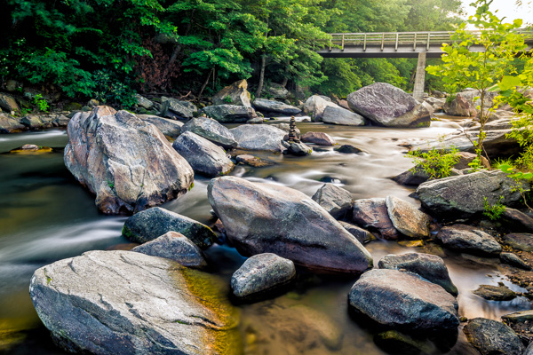
I used a my Formatt-Hitech 105mm circular polarizer here to remove glare from the rocks and water. The images without the filter were virtually unusable.

I used a my Formatt-Hitech 105mm circular polarizer here to remove glare from the rocks and water. The images without the filter were virtually unusable.

My brief stint with LEE Filters

After giving up on the screw-in filters, I eventually discovered the LEE Filter system. Those LEE filters are dang near impossible to get your hands on. I had to put my name on a waiting list at a camera store just to get the foundation system to attach the filters to my lenses. I then had to buy my filters on eBay and pay over retail to get them. My absolute favorite filter from LEE was (and still is) the Big Stopper. The Big Stopper is a 10 stop neutral density filter that will slow your shutter speeds down by…well…10 stops. This is a long exposure filter that is meant to slow time down drastically. You can easily get one to two minute exposures in broad daylight. The problem with the Big Stopper is that it’s a glass filter. This means that you have to be very careful with it and any time it’s on your person, you have to be extra cautious.

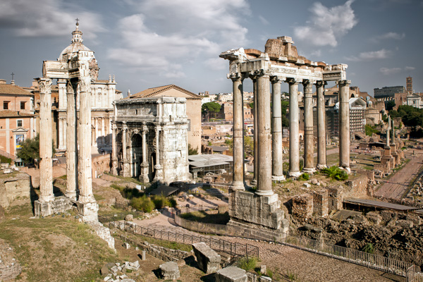
This 2 minute exposure caused the hundreds of tourists in the scene to disappear completely! © James Brandon

This two minute exposure caused the hundreds of tourists in the scene to disappear completely! © James Brandon

So what went wrong with LEE? Well, I’ll tell you…

Back in 2013, I was in California and was traveling up the coast from San Luis Obispo to San Francisco with my buddy Brian Matiash. We made it up to Big Sur and were trying to get down to Pfeiffer Beach for sunset. As we made our way up Highway 1, we pulled over to photograph Big Creek Bridge. I decided to put my Big Stopper to good use and started grabbing some long exposures of the bridge with the waves crashing against the shore below. I got a few shots where I was standing but soon decided to switch lenses and try something else. When I’m out in the field and need to switch lenses, I always point my camera down to the ground so that minimal dust will get into the censor during the swap. I pointed the camera down toward the ground (while still on the tripod) and then reached for my filter pouch to take off my Big Stopper before changing lenses. That’s when it happened. I felt a big thud against my shoe and then heard the terrible sound of glass hitting the gravel beneath my feet. Ugh…

It turns out the LEE filter holder can’t support the weight of a heavy Big Stopper. I’m not sure if this is a design flaw or what, but it certainly seems like oversight to me. With LEE filters (just like Formatt-Hitech) you have to screw an adaptor onto the lens you’re using (I just leave these adaptors screwed on most of the time). The filter holder then clips onto the adaptor via a pull pin on one side. This pull pin is angled away from the lens to match the shape of the ring adaptor. Because of the angle of this pull pin, you can actually just pull the filter holder off of the adaptor with surprisingly little force. Of course this will never happen if your camera is pointed out toward the horizon, but who among us never points their camera down? I got lucky that day because the filter hit my shoe first before hitting the ground. It didn’t bust the entire filter but one of the corners did however get a big chunk taken out of it.

My introduction to Formatt-Hitech

Colby Brown has been a friend of mine for a couple years now. I met him during the very, very early days of Google+ when a group of five or six of us would do hangouts almost daily. I have had the pleasure of watching his career virtually explode over this time and was really excited to see him land a signature edition filter kit with Formatt-Hitech. I’ll be the first to admit, I was pretty skeptical about trying any other type of filter besides LEE. Still to this day, I love my Big Stopper. However, that “event” in Big Sur really left me uneasy and nervous about using the LEE holder. So when Colby offered to send me his kit to review, I said what the heck, let’s see how it stacks up (see what I did there?) against LEE.

Unboxing

Don’t worry, I’m not posting one of those monotonous unboxing videos where I show you how the filters were packaged or how much paperwork is included. I’m including this section because of one thing; when I pulled the Formatt-Hitech filter holder out of the box, I knew instantly that it was better than LEE. It just feels better. It’s aluminum instead of plastic for one, but on top of that – the filter holder has a fastening screw to attach to the adapter ring instead of the little notched pull tab that’s on the LEE system. At first I wasn’t really sure this would be any better because, after all, you’re essentially just tightening the filter holder onto the adapter ring with a single screw. As it turns out though, the filter holder fits very snuggly onto the adapter ring, so when you tighten the screw the filters aren’t going anywhere. It takes a very strong push to cause it to budge at all, and no amount of filters will ever weigh that much. The LEE, on the other hand, requires surprisingly little force (see the video above).

Quality between LEE and Formatt-Hitech

The Colby Brown Signature Edition Landscape Filter Kit comes with basically everything you need to get started and stay satisfied using filters in the field for a very long time. I went all out and got the 100mm Premier Kit which comes with two graduated ND filters, a 6 Stop ND filter, the aluminum filter holder and to top it all off, a 105mm circular polarizer. Everything in the kit is extremely high quality and I use the filters on virtually every photo trip I take.

In all honesty, there isn’t a massive difference in the quality of images that come from either filter. Some will disagree with me on this of course. The LEE Big Stopper puts out a very obvious blue color cast in your images while Formatt-Hitechs new Firecrest filters put out virtually zero color cast. I’m actually quite fond of that blue/cool color cast though and have left it in several of my images to some extent. It’s also very easy to correct with a simple white balance adjustment so I’ve never considered it a huge deal.

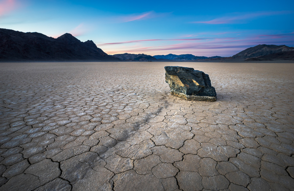
I used my Formatt-Hitech 105mm Circular Polarizer for this shot as well to remove the glare from the rocks in the foreground.

I used my Formatt-Hitech 105mm Circular Polarizer for this shot to remove the glare from the rocks in the foreground.

Where Formatt-Hitech wins

There are three main areas where Formatt-Hitech Filters excel and where LEE falls short.

  1. The first of those areas is the one I already covered; a superior filter holding system constructed of durable aluminum and a tightening mechanism that won’t fail in the field when pointed at a downward angle.
  2. The second area where Formatt-Hitech wins is availability. The simply produce and ship enough filters so photographers like you and me don’t have to be put on waiting lists, or pay over retail to acquire their products.
  3. The third reason Formatt-Hitech takes the cake is that they continue to push to boundaries of what filters can do. They continue to innovate and advance. Their new line of Firecrest filters can stop down a scene by up to 16 stops! That means you could shoot in broad daylight at f/8, ISO 100 and a shutter speed of 1/1000th of a second and as soon as you slide that filter on, you’re shutter speed will drop all the way down to 1 minute. That’s insane!
Here I used my 10 stop neutral density filter to slow the shutter speed way down. This was a 25 second exposure taken before sunset. The clouds coming over the Sierras in the background is actually smoke from the rim fire that occurred back in 2013.

Here I used my 10 stop neutral density filter to slow the shutter speed way down. This was a 25 second exposure taken before sunset. The clouds coming over the Sierras in the background is actually smoke from the rim fire that occurred back in 2013.

Conclusion

Both LEE and Formatt-Hitech make great filters (although Formatt-Hitech has a slight edge in my opinion). However, the fact that I simply can’t trust the filter holder from LEE was enough to make me look at other options. Sure, I could have just stuck with LEE filters and got a new filter holder system, but I like to be all in with the brands I associate with in the industry. The failure of the LEE system caused me to look into Formatt-Hitechs options and when I did, I was pleasantly surprised to find a superior company making superior products. I’m not sponsored by Formatt-Hitech, I just honestly believe their products are top notch. Let me know if you have any questions below.

googletag.cmd.push(function() {
tablet_slots.push( googletag.defineSlot( “/1005424/_dPSv4_tab-all-article-bottom_(300×250)”, [300, 250], “pb-ad-78623” ).addService( googletag.pubads() ) ); } );

googletag.cmd.push(function() {
mobile_slots.push( googletag.defineSlot( “/1005424/_dPSv4_mob-all-article-bottom_(300×250)”, [300, 250], “pb-ad-78158” ).addService( googletag.pubads() ) ); } );

The post Why I Switched From LEE Filters to Formatt-Hitech for Landscape Photography by James Brandon appeared first on Digital Photography School.

Digital Photography School

 
Comments Off on Why I Switched From LEE Filters to Formatt-Hitech for Landscape Photography

Posted in Photography