RSS
 

Posts Tagged ‘Styling’

Your Workflow for Styling Food Photography

05 Nov

The post Your Workflow for Styling Food Photography appeared first on Digital Photography School. It was authored by Darina Kopcok.

styling-food-photography

The success of any shoot relies on the timing and organization of the various elements to your workflow. There are so many things to remember when shooting. In food photography, forgetting one detail can make the difference between a great picture and one that is so-so. Here are my tips on what to consider during every stage of your food shoot and styling food photography.

styling-food-photography

Choose the right lens

Like with any genre of photography, choosing the right lens for what you’re trying to achieve is essential. In food photography, you can get a lot of mileage out of a couple of key lenses.

One of these is a 100mm/110mm macro lens if you’re shooting with a camera with a full-frame sensor. The macro capabilities will allow you to take the tight shots of ingredients or dishes, but you can also step back to take beautiful “food portraits.” This can make it a really versatile lens.

Another important lens is a 50mm. This will allow you to take overhead shots, and it’s a good lens to have for food portraits as well. Just keep in mind that on a full-frame, a 50mm is actually a wide-angle lens for food photography. You might need to use large backgrounds, and you can also end up getting distortion when shooting at a 3/4 angle — another good reason to have 100mm macro in your kit.

A 35mm lens is best suited to overhead shots and capturing large spreads of food and some lifestyle type of shots.

If you have the budget for it, I recommend a 24-70mm, as it’s an excellent all-around food photography lens.

Your Workflow for Styling Food Photography

Check your camera settings and exposure

If you want to shoot food, it’s best to set your camera to take RAW images. JPEG images are processed, which is handy, but they have a very limited color range as opposed to a RAW file. They also degrade in quality each time you retouch them, whereas you can edit RAW images as much as required without losing important information.

Do what you can to obtain the best exposure in-camera. Getting things right in-camera saves you a lot of time. It’s much harder and more time-consuming to try to fix things in post-production, and you still can’t always get as good of a result as you would if you just took the time to get things right in-camera.

When shooting in natural light, put your white balance on Auto and correct it in post-production if you need to. If you’re shooting with flash, be sure to set it to Daylight white balance.

If you’re using artificial light, set your ISO to 100. Your shutter speed should not exceed the sync speed of your camera. If you don’t know that, you’ll have to look it up. It’s generally around 200.

When shooting in natural light, use a tripod and lower your shutter speed to account for lower light conditions rather than cranking up your ISO, which will give your images unwanted noise.

Your Workflow for Styling Food Photography

Harness the light

Before you put the “hero” food down on the table, do a lighting test with a stand-in that is a similar shape and size of the dish you are shooting. Food dies very quickly, so you don’t want it sitting around while you’re tinkering with your lights.

Soft light is usually best for food photography, so use a diffuser, scrim, or translucent fabric to diffuse the light. In most cases, directional light (coming from one direction) will look best. Use black cardboard to create shadows, white cardboard or reflectors to kick in light or fill shadows.

The light should come from the side, the back, or somewhere in between to be most flattering to food. Never use front light – it looks great in portraits, but is too flat for food and will cause unwanted shadows on your set.

styling-food-photography

Choose the right surfaces and backdrops

Styling food photography also includes your surfaces. Your surface is what you place your food on. The backdrop is what goes behind your scene.

Slightly textured backgrounds and surfaces add more dimension and interest. But you can have too much of a good thing; a lot of texture will detract from the food, so tread lightly.

Avoid backgrounds or wood surfaces that are orange in tone, which looks unattractive with food. Most food is warm-toned, so a cool or neutral backdrop will make it pop. A warm backdrop with warm food can end up looking dated.

When choosing custom backdrops, avoid those that are shiny or reflective in any way. Metallic paint, black marble and such will be difficult to work with. A lot of matte varnishes also end up having a bit of glare, so do a patch test first.

Get creative with your surfaces and backdrops. Tablecloths, tissue paper, craft paper, canvas, linen, cheesecloth are all inexpensive DIY backdrops you can use.

 Choose the right props and shooting them correctly

There is a reason that “prop stylist” is a whole occupation on its own. Don’t underestimate how powerful the right props can be.

The key is to not over-prop your scene. One or two props are often all you need unless you’re telling a wider food story like a tablescape. Too many props distract from your food.

It’s also vital that you use dishes and flatware that are on the smaller size. Props can often appear to the camera much larger than they really are, and dominate the image.

Go for matte dishes as much as possible. You can manage reflections in glass and cutlery by spraying them with “Dulling Spray” by Krylon.

You can also use a polarizing filter to cut down on reflections, although you’ll lose 1-2 stops in doing so.

Your Workflow for Styling Food Photography

Food styling tips

Use garnishes, herbs, seasonings, crumbs etc to create interest and texture on your set. Use them sparingly though, to avoid a messy look.

Keep herbs fresh by storing them between sheets of wet paper towels. You can also put them in a Mason jar filled with water to make them last longer.

When dressings salads, do so at the last minute, and always have extra dressings and sauces ready to brush on your food subjects.

One great tip used by pro food stylists is to use citric acid, a product like “Fruit Fresh,”  to keep produce fresh-looking. Simply dissolve it in water and soak fruits and vegetables in the solution for 1/2 an hour. To keep a misted look on produce without having the water droplets evaporate quickly, use glycerine mixed with water and spray it on the items.

A food photographer should always have a food styling kit with items like brushes, cotton swabs, water spritzers, and squeeze bottles to bring to shoots. Other important items for your kit are drinking straws, tweezers, paper towel, and clean cloths.

Your Workflow for Styling Food Photography

Be aware of composition

Composition is a big subject and it can have a lot of impact on your food photography. Without it, the eye loses interest in what’s in the frame.

When shooting, check that you don’t have too much empty/passive space; crop tighter or rearrange your composition. On the other hand, you can shoot a bit wider to give yourself more leeway for cropping your compositions in post-production.

Remember that odd numbers of elements create balance and harmony, while even numbers compete with one another and weaken the impact of the image. There are many other principles of composition, like the Golden Mean, as well as leading lines, patterns, repetition, and texture.

Color is also a part of composition, so think carefully about how the colors of your props and backdrops complement your food.

Colors that are opposite the color wheel are called “complementary colors” and are especially pleasing to the eye.

Shooting your image

It’s best to shoot with a tripod and tether to your computer or laptop so you can see a larger and more accurate rendition of your image on the screen.

If you’re working with clients, they will expect you to shoot tethered. You’ll need to be able to show them every image and get their approval before moving on to the next shot to avoid them coming back to you, saying they didn’t like the image.

Shoot at a minimum of f/5.6 if you’re shooting overhead images

As for your aperture in general, f/5.6 or f/8 is a good default for food shots. You can have some nice bokeh with more of the food in focus.

While you’re shooting, don’t forget to take an image with a grey card or Color Checker to properly white balance in post-processing.

styling-food-photography

Focus and angle

To get the correct focus and angle, think about which would best complement the food and show it to the best advantage.

Overhead shots are the most graphic and work for many types of flat foods, such as pizza. They’re also a great way of getting more elements into the shot because the depth becomes flattened.

Use lower angles or straight-on angles for tall foods, such as burgers and stacks of pancakes. Keep in mind that lower angles create more surface shine

In general, you usually want to focus on the front of the food.

styling-food-photography

Post-Processing

Everyone has their own personalized workflow, but here are some tips for editing and retouching that you might find helpful.

If you use Lightroom, work on virtual copies of your files and keep the original untouched. Organize your images in Collections and input metadata that will help you find certain images according to keywords and other attributes.

If you’re more of a Photoshop person, save working copies as you retouch to avoid losing your work. Make sure you are using the correct color space for your purposes.

Always back up your RAW files and your work in at least three places, including a cloud backup system.

Your Workflow for Styling Food Photography

Your workflow for styling food photography: conclusion

There are a lot of details to remember while shooting and styling food photography. Hopefully, these workflow points can function as a kind of checklist for you of all things to keep in mind so you can take your images to the next level.

Do you have any other tips on styling food photography that you’d like to share? Please do so in the comments!

The post Your Workflow for Styling Food Photography appeared first on Digital Photography School. It was authored by Darina Kopcok.


Digital Photography School

 
Comments Off on Your Workflow for Styling Food Photography

Posted in Photography


Tips for Styling and Photographing Interiors

27 May

The post Tips for Styling and Photographing Interiors appeared first on Digital Photography School. It was authored by Lily Sawyer.

dps-how-to-style-interiors-for-photoshoots-lily-sawyer-interior-design

On Instagram, I run a page called Layered.Home that’s focused on interiors: design, styling, home improvements and lifestyle in an interiors setting. Here, I work with brands on their brand awareness campaigns and product placements. All these involve styling and photographing products and spaces, sometimes with a specific brief to adhere to and at other times I have the freedom to style as I wish.

The unprecedented rise and popularity of social media platforms has paved a way for a new photography niche: personal brand photography. This is where photographers shoot content for brands to use on their website, promotional materials and social media posts. Whilst this is not my niche, I have photographed businesses, interiors and products both for clients and for my own social media page and continue to do so.

Here are some articles I have written on this topic before: shooting interior spaces , taking better photos for Instagram and photographing mixed lighting for interiors.

Whilst I hope the above articles will give you some photography techniques, this article will focus on some techniques when styling interiors for photoshoots and some tips for photographing them at the end. Let’s dive in.

dps-how-to-style-interiors-for-photoshoots-lily-sawyer-interior-design

Purpose of the photoshoot:

Before you can style interiors successfully, first you have to ascertain the purpose of the photoshoot. Who is it for? What is it for? Are there any targets to meet? Regardless of the answer, bear in mind that the styling must always be on-brand.

Whatever the purpose may be, it is imperative that you understand your client’s branding first and foremost and that you style to strengthen the brand, not to dilute it.

Some purposes of styling might be for the following:

  • client’s website – images for landing pages, blog posts, slideshows etc.
  • social media feed – styling content for Instagram, Facebook, Twitter etc
  • seasonal promotions – spring, summer, autumn, winter, etc
  • advert in a magazine
  • feature in a magazine – magazines also have their own niches and styles so stylists match interiors to appropriate magazine brands
  • product placement
  • brand awareness campaigns

The latter two usually allow scope for styling off-brand. It may be because the client wants to reach your audience. Therefore, they may want you to style the product for your brand instead of theirs to reach your audience and as a result, expanding their customer base.

dps-how-to-style-interiors-for-photoshoots-lily-sawyer-interior-design

Style

There are many styles with now trendy names coined to describe them such as Scandinavian or Scandi, Bohemian or Boho, Scandi-Boho, Modern, Mid-century modern, Minimalist, Maximalist, Eclectic, Mediumalist(!), Retro, Vintage, Contemporary, Traditional, Transitional(!), Industrial, Country, French-Country, Rustic, Shabby Chic, Hollywood Glam, Period (eg. Victorian, Edwardian), Coastal. And it goes on.

Play it safe by reading up on the style or mixtures of style and nailing down the accessories and pieces that are appropriate for them.

Understanding both purpose and style will help make you an effective stylist.

Styling Tips

1. When it comes to styling, there are two general camps: hero or layer?

Hero styling is putting a piece in the spotlight, the piece that takes all of the attention. Nothing else surrounds it that might take away any of that attention and make the piece disappear. The aim is to evoke a strong response from the viewer and create maximum impact.

Layering is the opposite type of styling. This is where you carefully style a piece within an arrangement of various other pieces, often varying in texture and form. Layering creates a cohesively styled space that evokes a strong response – the same aim as hero styling, but as opposed to hero, it doesn’t do so alone.

If you think about it, the aim for many, if not all images, whether viewed on print or digital media is the same: the scroll-stopping, track-stopping, breath-taking response from the viewer. I’m sure there are many other ways to get there, but the aim is the same.

dps-how-to-style-interiors-for-photoshoots-lily-sawyer-interior-design

2. Evaluate what goes on the 6 walls!

In a space, there can be up to 6 walls; the latter two are almost always forgotten! When one walks into a room or space, the first things we see are usually eye level surfaces and spaces, and that means the walls in front of us and around us. We notice pictures, mirrors, tall lamps, and accessories at eye level.

A successfully designed space invites the viewer’s eye to wander everywhere and notice, not just eye-level design, but all-levels design. This includes the 4th and 5th walls – the floor and ceiling. A rug can do wonders to a floor in the same way a statement light or a painted/wallpapered ceiling can draw attention upwards.

Regardless of the style you are creating, bear in mind the 6 walls in your space.

dps-how-to-style-interiors-for-photoshoots-lily-sawyer-interior-design

3. Play with scale

Whether you are styling a Minimalist Scandi space or a Maximalist eclectic interior, do not underestimate what playing with scale can do to a space. You may be designing an all-white Scandi minimalist room with only six pieces in the room. Imagine having all of those six pieces at all the same scale – all small, medium or large.

Alternatively, imagine playing with scale using those six pieces so that you are putting an oversized light arching towards the center of the room or hanging low from the ceiling and an oversized rug on the floor. The rest of the pieces are a mixture of medium and small. Immediately you are upping the interest level and increasing the dynamic of the space.

dps-how-to-style-interiors-for-photoshoots-lily-sawyer-interior-design

4. Arrangement

In a Maximalist interior, it is easier to play with scale because you are dealing with so many decorative items often in varying sizes. The challenge is not so much the “what” as it is the “how.” How do you group and arrange together all these items so that there is order in the madness? Or so a full room does not look cluttered, and somehow there is a tidy structure to it all?

You can arrange by size, color, theme, in rows, or you can mix-and-match and group items, so a busy space gets punctuated by quieter spaces in between. I find that having such a structure helps with how the space is received.

dps-how-to-style-interiors-for-photoshoots-lily-sawyer-interior-design

Photographing interiors

Finally, you have finished styling. It is now time to photograph your space.

Photograph wide so that you show the entire space. Be careful of going too wide where distortions are disturbing or cannot be corrected, especially when shooting at 24mm and wider. A focal length between 35mm – 50mm is easy on the eye and won’t give you distortions.

Although interiors favor a wide-angle view of the space, close-ups are just as important. Use them to focus on specific features of the space or product. Get closer in and photograph vignettes and interesting compositions. Use mantle pieces or shelves for horizontal bases and alcoves or chimney breasts or sofa arms for vertical lines. Think of strong compositional framing and use elements in the space to achieve them.

dps-how-to-style-interiors-for-photoshoots-lily-sawyer-interior-design

Spaces look better when there is a contrast between light and shadow. This is why the use of flash (especially head-on, and flash that creates flat light illuminating an entire space) is often frowned upon and natural light is more favored. Choose a time of day where the light is at an angle, and you can photograph light and shadow. It looks natural and evokes emotion from the viewer.

That is what really makes an image successful.

dps-how-to-style-interiors-for-photoshoots-lily-sawyer-interior-design

I hope these tips help you style and photograph spaces and interiors.

Do comment below if you have tips to share, or if you would like to share some of the spaces you style after using these tips.


The post Tips for Styling and Photographing Interiors appeared first on Digital Photography School. It was authored by Lily Sawyer.


Digital Photography School

 
Comments Off on Tips for Styling and Photographing Interiors

Posted in Photography


4 Essential Things to Consider When Styling a Photoshoot

09 Mar

The post 4 Essential Things to Consider When Styling a Photoshoot appeared first on Digital Photography School. It was authored by Lily Sawyer.

A successful photoshoot doesn’t just happen by itself. Perhaps there are times when everything lines up and an impromptu photoshoot happens. But that is often the exception. From my experience, much planning goes into a successful photoshoot. Whether you are doing a family, newborn, or portrait shoot, formal, informal, indoor or outdoors, styled or casual shoots, there are common factors that are crucial to its success. Here are some essential things to consider when styling a photoshoot.

4-things-consider-styling-photoshoot-dps-tips-lily-sawyer-photo

1. Location

Location dictates equipment

Deciding on your location beforehand is necessary as that dictates the equipment you’ll need. If shooting in a studio, you need to think of the lenses you would use for the amount of space available in your studio. If you have a small studio, you may only be able to use a 35mm or a 50mm lens for portraits. A 24-70mm would be ideal for a small space, but you need to consider any distortions if you’re shooting portraits at close range using a short focal length.

4-things-consider-styling-photoshoot-dps-tips-lily-sawyer-photo

If you are relying on natural light indoors, then you would need to think of the time of day you are shooting and the available ambient and natural light at those time to give you ample light that you need for your shoot. It would also be a good idea to have a reflector handy for both shoot, but most especially for indoor shoots. Their are various types of reflectors, that create different effects.

4-things-consider-styling-photoshoot-dps-tips-lily-sawyer-photo

Backdrops

Another thing to consider when shooting indoors is your background or backdrop. If it’s in a client’s home, you may need to ask them for photos of an idea of walls, windows, possible backdrops you can use if you haven’t been there before. If shooting in your own home or studio, then you have more control and can prepare the space beforehand. You can go for a light or dark backdrop, fabric or walls, wallpaper or painting, or just the available surfaces in the home. You may need to declutter a bit so unnecessary objects are in the shot.

4-things-consider-styling-photoshoot-dps-tips-lily-sawyer-photo

Weather – Plan B

If shooting outdoors, you need a plan B in case the weather doesn’t cooperate on the day. A plan B could be a cafe nearby or a sheltered area such as a gazebo. Generally, when shooting outdoors during the day, the opposite problem occurs. There is often too much light. The first thing to decide on is the time of day to shoot. Will it be golden hour? Middle of the day? Early morning? Dusk? Evening? Understand the needs for these different times of the day.

Best times of day to shoot

Early and late and golden hour are great times to shoot because the light comes from an angle. Golden hour gives a nice warm glow to your images but light during early morning shoots are often quite cold. Midday light, when the sun is high up in the sky, gives harsh light. You need to mitigate this by using reflectors, so you don’t get dark shadows under the eyes. They can be a natural reflector like concrete paths, white walls, floors or the usual photography reflectors available.

4-things-consider-styling-photoshoot-dps-tips-lily-sawyer-photo

Urban or country? Each has a very different vibe. If shooting in a busy city location where you have to walk around and have nowhere to park, you may need to pare down your equipment. If going to the country, then you can fill your car with equipment and props to your heart’s content and make a shoot logistically easier.

If shooting with artificial light either indoors or outdoors, you have more control over the amount of light available for your shoot and natural lighting is not so much a factor. However, this would require more equipment such as light stands, softboxes, electronic flashes, triggers and receivers, batteries, and diffusers.

You can read more about equipment you would need for a home or portable studio here.

4-things-consider-styling-photoshoot-dps-tips-lily-sawyer-photo

2. Overall colour scheme

Details matter when it comes to the outcome. For an image to be pleasing and successful, it involves more than just lighting. It involves tones and color schemes. When planning your shoot, it may help to think of a theme like vintage, bold, contemporary, simple, maximal or busy. Also think of a seasonal feeling; summer, spring, autumnal, or winter. Considering these things helps you eliminate ideas that won’t be fitting and narrows them down to a few essentials.

You can then decide on the colors. Winter would call for cool white, grey and blue tones and you may decide on a pop of color. Spring may have a combination of pastel colors with dominant greens. Summer may be bursting with saturation and light, blue skies, and warmth. Autumn can have burnt orange, red, purples and verdant greens.

Feeling your shoot while mentally preparing for it helps in streamlining everything to achieve the desired outcome. You could go for a rainbow shoot where you want the colors to pop against a plain white or dark backdrop.

4-things-consider-styling-photoshoot-dps-tips-lily-sawyer-photo

3. Props

Props are optional, but they are useful. My preference is minimal props, but I would suggest having them as tools during the shoot rather than items to be necessary in the shoot. Let me explain.

If I am photographing young children, I would often ask the parents to bring a bag of favorite toys without the knowledge of their children. During the shoot, I may need to use them to entertain, comfort, use during breaks and even to make them look at the camera. However, only one of those may make it into the shot, usually a soft comfort toy.

For engagement shoots, I’d ask the couple to choose one or two props they want to be in the shot but that these props must mean something to them. We’ve had picnic baskets, bikes, guitars, books and flowers amongst others. Sometimes, couples can’t think of props or don’t want any, and that is fine too. Often I’d say pick up a bunch of flowers just in case. Many couples, especially those who haven’t had a photoshoot yet may feel awkward and holding something like flowers helps.

A piece of outfit or accessory can be used as a prop too. A hat, bag or a special pair of shoes can work. This leads us nicely to the next factor…

4-things-consider-styling-photoshoot-dps-tips-lily-sawyer-photo

4. Outfits

Even when you have your lighting and location all planned perfectly, sometimes your photoshoot can still get ruined. Okay, ruined may be a bit too harsh but there is still one thing that can make or break your shoot – It’s the outfit.

I give my clients a guide on what to wear before their photoshoot in the hope that they plan their outfits beforehand and, even better, share them with me so we can discuss them. Often they send me options to choose from, and together we agree on one or two final outfits.

I once had a couple whose location was in the most beautiful country setting – it was a totally dreamy scene. Unfortunately, their outfits were not in keeping with the location. Although they were happy with the images and the shots were beautiful, their shoot could potentially have been published in many places but were let down by the outfits.

4-things-consider-styling-photoshoot-dps-tips-lily-sawyer-photo

Encourage your clients to treat the photoshoot as a special event that they plan and prepare for. If they can afford it, even buy new clothes for the shoot. With regards to matching outfits, like all white shorts and jeans, that’s down to personal preference. Mine is more towards classic complementary colors and patterns than matching or uniform outfits. Discussing this with your client is important. The one big no-no I always tell my clients is to avoid big logos, cartoon characters, numbers or letters, or anything that is trend-based that dates quickly.

I hope the above has helped with styling a photoshoot and what you can prepare in advance to ensure its success. If you have any more ideas, do share them here in the comments below.

The post 4 Essential Things to Consider When Styling a Photoshoot appeared first on Digital Photography School. It was authored by Lily Sawyer.


Digital Photography School

 
Comments Off on 4 Essential Things to Consider When Styling a Photoshoot

Posted in Photography


4 Tips for Creative HDR Styling with Aurora HDR 2018

27 Dec

Arguably the best software for making high dynamic range photos is Macphun’s (soon to be Skylum) Aurora HDR 2018. This image editor can be used as by itself or in conjunction with their popular Luminar photo editor (as well as a plugin for Photoshop, Lightroom, Aperture, and Elements). Within Aurora HDR are tons of photo editing tools including their popular presets (filters). But you don’t have to use Presets to creatively style your HDR photos.

Here are four tips beyond using presets for achieving creative images.

1. Make your images pop with subtle HDR enhancements

4 Tips for Creative HDR Styling with Aurora HDR

Before – the middle image of a 3-shot bracket.

Instead of going right for the Presets at the bottom of Aurora HDR, dive right into the HDR Basic panel on the right-hand side of the software. Start with the Contrast and HDR Enhance sliders to enhance textures and details in your photo. Then play with the Smart Tone to tame down the shadows that can be created by increasing the contrast.

Next, head to the Color panel right below HDR Basic and adjust the Vibrance and Saturation. Keep these color adjustments minimal if you’re going for a more subtle, realistic look. Based on the color edits that you make, you may also need to balance out the color temperature if your image appears too cool or too warm.
4 Tips for Creative HDR Styling with Aurora HDR

Add the HDR Basic and Color Filters.

4 Tips for Creative HDR Styling with Aurora HDR

2. Add a Polarizing and Graduated ND Filter Effect

Landscape photographers are well aware of the effects of the polarizing and graduated neutral density (ND) lens filters. If you aren’t familiar with them, here’s a quick rundown. A polarizing filter helps darken skies and minimize reflections and glares of light bouncing off of surfaces such as water or glass. Similarly, the graduated ND filter helps balance out exposures by darkening backgrounds that are much brighter than foregrounds. In essence, both of these filters are often needed to obtain the best landscape photos.

If you don’t have these filters or happen to forget them, Aurora HDR’s post-processing effects can produce very similar results. Simply click scroll to the Polarizing Filter panel and apply as much of the effect as you wish. In the example below, increasing the polarizer makes the blues really pop, especially in the sky.

Further down, you’ll find the graduated ND filter effect, known simply as Top & Bottom Tuning. This allows you to adjust the exposure, contrast, vibrance, and saturation of the top and bottom areas of your image separately. If you happen to have an untraditional horizon, click the Set Orientation button to fine tune the horizon’s rotation and make your graduated ND filter effect blend more realistically.

4 Tips for Creative HDR Styling with Aurora HDR

Polarizing Filter and Top & Bottom Tuning (ND filter)

Skylum Aurora HDR Creative Styling Tips

3. Replace the sky

4 Tips for Creative HDR Styling with Aurora HDR

Before – the middle image of a 5-shot bracketed set.

If you’ve ever photographed a sunset and wished the sky had been more colorful, you can actually make this edit rather quickly with Aurora HDR. All you need is a clear photo of the ideal sunset that you want to swap into your bracketed image. You can pull that ideal sunset image from your own archives, or use a stock photo like the one that I’m using from Pexels in the example below.

Start by running your brackets through Aurora HDR and making any desired adjustments to the resulting photo. Below, I’ve applied a Warm Skylight filter. Next, go the Layers section in the right-hand panel and click on the plus sign. Select “Add Image Layer…” This is where you can select your ideal sunset photo and import it as an image layer.

Once your new image has loaded, you can apply any filters or adjustments as desired. Next, click on the paintbrush icon next to the image layer. A small drop-down menu will appear with four options: Brush, Radial Mask, Gradient Mask, and Lumosity.

4 Tips for Creative HDR Styling with Aurora HDR

If your image has a straight horizon with no big obstructions, the Gradient Mask will easily mask your ideal sunset into your bracketed shot. But in my case, I have a big building in the way, so the Brush is my best bet. After clicking on Brush, a thin bar of options will appear on the top panel. This is where you can control whether you’re painting over the image, or Erasing (backtracking on any mistakes). You can also control the size, softness, and opacity of the paintbrush.

When I’m done painting in my new sunset sky, I’ll press the blue Done button. Check out the before and after images below!

4 Tips for Creative HDR Styling with Aurora HDR

4 Tips for Creative HDR Styling with Aurora HDR

4. Add a texture overlay

4 Tips for Creative HDR Styling with Aurora HDR

Before – the middle image of a 3-shot bracketed set.

Using a similar technique to sky replacement, you can add textured overlay layers to your photos for a more creative effect. All you need is a textured photo, such as the weathered paper image below. Simply import that image as a new layer. You can then selectively mask it by using the Brush, Radial Mask or Gradient Mask tools (explained above). Or you can apply the texture equally to the whole image by adjusting the opacity. The resulting image had a moody, vintage look to it.

Skylum Aurora HDR Creative Styling Tips

Over to You

Have you used Aurora HDR 2018 to enhance your images? What tools have you found to be the most useful for achieving more creative photos? Let us know in the comments below!

Disclaimer: Macphun, soon to be Skylum, is a dPS advertising partner.

The post 4 Tips for Creative HDR Styling with Aurora HDR 2018 by Suzi Pratt appeared first on Digital Photography School.


Digital Photography School

 
Comments Off on 4 Tips for Creative HDR Styling with Aurora HDR 2018

Posted in Photography


The Yashica digiFilm Y35 exemplifies everything wrong with retro styling

14 Oct

Allen Murabayashi is the Chairman and Co-Founder of PhotoShelter. He’s an avid photographer and frequently speaks on how photographers can use online marketing to grow their businesses. This article was originally published on PhotoShelter, and is reproduced here with permission.


At the turn of the millennium, Chrysler introduced the PT Cruiser, a retro-styled automobile that echoed design elements from the 1930s.

People went gaga for it because it was retro cool while retaining modern utility. Turning on the car didn’t require the driver to manually crank the engine. The car had air conditioning, power windows, and all the modern accoutrement that said retro cool need not be inconvenient to be successful.

In photography, a resurgence of interest in film isn’t a self-flagellating exercise. Film possesses a quality that can only be simulated in digital. Large format digital simply doesn’t exist, and many alternative processes have no digital equivalent.

Companies like Fujifilm have succeeded in incorporating rangefinder-style design, which feels nostalgic while incorporating incredible technology that place their cameras on par with other top-of-the-line offerings from other manufacturers.

Then, there is Yashica. A few weeks ago, the company teased their “Coming Chapter” featuring an attractive Chinese model in jumpcut vignette that seemed to take styling cues from Blade Runner (PSA: smoking is bad for your health). Although Yashica never scaled the heights of its contemporaries, Nikon and Canon, it still had a fairly storied history with its SLRs and TLRs before Kyocera sold the trademark rights to a Hong Kong-based firm in 2008.

An initial announcement about a smartphone lens system brought about a collective yawn, but photographers were still waiting to be delighted with a more substantive announcement of their “unprecedented” return to the camera world. And here is.

The Yashica digiFilm Y35 is a digital camera with a 1/3.2inch 14-megapixel sensor that uses pretend film—each with different ISO ratings, aspect ratio, and color. They’ve launched a Kickstarter to give you an opportunity to purchase the $ 125 camera. Over 5,100 fools people have backed this project to the tune of nearly $ 1m.

As I wrote in 2013, the camera of the future isn’t from the past. The Yashica Y35 reminds me of those old DigitalRev videos where Kai and crew would purposely handicap themselves using inferior cameras like the Barbiecam for, well, no purpose at all.

You can plausibly make an argument that vinyl records have an acoustic advantage over low resolution streamed audio, that a handmade knife is more balanced and sharper than a factory manufactured version, but you can’t convince me that the Y35 yields any advantage in any aspect of photography whatsoever.

The only unprecedented aspect of this comeback is how unprecedentedly disappointing it is. In the pursuit of brash consumerism, this newly branded Yashica has forgotten a large part of why we take photos in the first place: joy.

Here’s a suggestion, save your $ 125 to donate to Hurricane Relief in Puerto Rico and use your smartphone instead. You’ll feel better and your photos will look better too.

Articles: Digital Photography Review (dpreview.com)

 
Comments Off on The Yashica digiFilm Y35 exemplifies everything wrong with retro styling

Posted in Uncategorized


10 Tips to Improve Your Food Photography Styling

27 Apr

This is a guest post by Jules Clancy of Stonesoup.

While portrait photographers need to be skilled in the art of getting their subjects to relax in front of the camera to get a great shot, we food photographers have things a little easier. At least our subjects (mostly) can’t talk.

image1guest.jpg

But that doesn’t mean you should forget to apply a little charm in the food styling department.
The more time spent making the food attractive as possible, the easier things are when it comes to taking the shot.

So here are 10 tips to help you improve your food styling, naturally.

1. Use less food than you normally would

While it may seem more generous to serve plates piled high with food, an over crowded plate can look less appealing than a minimalist spread. Think about how you can use the white space of the plate to frame your dish.

image2guest.jpg

2. Use paper to add texture to plates

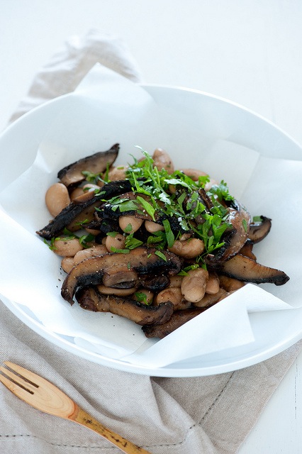
Lining plates with parchment or baking paper helps to add visual interest and soften the lines of your plates.

3. Look for contrast with backgrounds

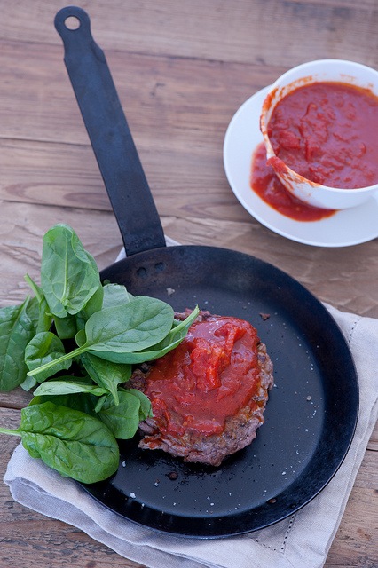
While there are times when all white on white can be visually striking, I find I get better shots if I go for contrast. So a pale coloured food and plate gets a dark background where as a vibrantly coloured dish tends to be best with a simple white background.

image3guest.jpg

4. Allow food to spill over naturally

Getting a bit messy really helps to add movement and life to your photographs, rather than having everything confined to plates and bowls.

5. Choose simple crockery and tableware

While highly decorative China and napery are beautiful on their own, they can detract from the visual impact of the food. Plain plates, especially classic white allow the food to be the star.

image4guest.jpg

6. Emphasise the natural beauty of the food

Try and think about what it is that makes a particular dish look delicious and then serve it in a way to flaunt it.

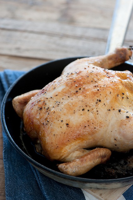
For example, I love the golden, cripsy skin of a well roasted chicken. Rather than carve the chook into individual slices with tiny slivers of skin visible, the whole bird tends to look best.

7. Get some work-in-progress shots

It can be easy to focus on getting the final plated-up food shot and miss out on some great opportunities along the way. Try taking a few shots during the preparation and cooking process.

image5guest.jpg

8. Try and capture the ‘yum’ factor

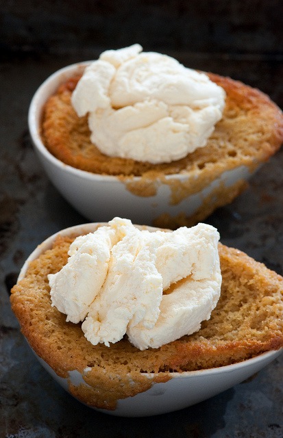
Think about what makes your subject really delicious and then aim to highlight this characteristic in your shot. Ice cream is a great example. It’s all about smooth creaminess and licking drips from the sides of your cone or bowl.

9. Always be on the lookout for ideas

Inspiration can strike from anywhere. When you’re eating out or even just flicking through your favourite food mag, take note of what looks appealing and what doesn’t.

image6guest.jpg

10. Dig in and reshoot

Once you have a shot of the whole food that you love, eat or serve some out and then take another shot. Often a half finished plate is more appetizing than the original whole.

A few great food photography blogs:

  • What Katie Ate
  • Wrightfood
  • Souvlaki for the Soul

For more tips on improving your food photography see:

  • Food Photography – An Introduction
  • 11 Great Camera Angles for Food Photography
  • 7 Tips for Aspiring Food Pornographers
  • Food Photography Tips and Techniques
  • 10 Tips for Mouth Watering Food Photography
  • A Basic Food Photography Kit

Also check out our Snapn Food Guide to food photography.

Jules Clancy is a qualified Food Scientist, and self-taught food photographer. She blogs about her commitment to cooking recipes with no more than 5 ingredients over at Stonesoup.

Post originally from: Digital Photography Tips.

Check out our more Photography Tips at Photography Tips for Beginners, Portrait Photography Tips and Wedding Photography Tips.

10 Tips to Improve Your Food Photography Styling


Digital Photography School

 
Comments Off on 10 Tips to Improve Your Food Photography Styling

Posted in Photography


Styling your Get Sole Shoes with Fabgelous – STUDIyo Photo

16 Dec

www.STUDIyoPhoto.com Get Sole shoes are highly versatile canvas shoes that you can where to almost any occassion. Mix and match it with different clothes, even the shoes itself can be a fashion statement. You can even try using different shoe laces to add an accent to the shoes. Visit American Boulevard to get your pair NOW! You may also contact STUDIyo Photo to get a PAIR of GET SOLE Shoes. Need a Photographer??? Visit www.STUDIyoPhoto.com
Video Rating: 5 / 5

Vinodh succeeds in releasing Madan from jail and Saxena thanks him for helping him, later photographer Gyan indirectly proposes Kanchan, there in saxena house, Vinodh pleads in front of Saroj to return to Vrindavan. A heating argument takes place between Sodhi and Amrit as Sodhi was forcing Amrit to go to Agra to pick Saroj but Amrit strictly disagrees and instead insults Mr & Mrs. Sodhi. Kanchan gets angry on Karuna. Will Kanchan reveal Saxena that she loves Gyan? Will Saroj go to Vrindavan? “Every average girl in India, has a picture of an ideal dream husband in terms of looks, nature and outlook towards life. The expectations from the husband are fairly simple — need to provide security, tender moments of love which may or may not be met. Shubh Vivaah is a story of a father and his five daughters. The love they share, the bonds they cement, the faith they place on each other and the dedication with which they try to change the harsh realities of their lives.”
Video Rating: 3 / 5