RSS
 

Posts Tagged ‘Style’

How to Develop a Unique Style for Your Photography

17 Feb

In today’s world, everyone has a camera. It may be as simple as the camera on their phones, but they still have one. This means that millions, maybe billions of people are taking photos every day. What does that mean for you? It means you have to compete with all those to make your images stand out. You have to find a way to be different, but how? The best way is to develop a style that is uniquely yours.

When people look at your work they instantly know it is yours, or someone trying to copy it. Your style is how you become known and how you make yourself stand apart.

How to Develop a Unique Style for Your Photography

Looking north along the Harbour Esplanade.

What does having a photographic style mean?

Basically, that you do something to your images that make them different, whether it is done when the shot is taken or in post-processing, or maybe both. Whatever it is that you do, you want people to know straight away that the image is yours before they see the name. There should be a similarity between all your images and they look like they belong together.

It almost goes against the grain of what humans are like and our need to conform. If you want your images to stand out you have to find a way to make them different to what everyone else is doing. Think about how you can work that is not the same. It can be about photographing the same thing, but you do it your way.

When I was in art school we were told over and over again that nothing was original anymore. Anything that you wanted to do had already been done. It is true in most cases, but that doesn’t mean you shouldn’t try to find a way to work that could be different.

How do you develop a style?

Ask any artist or photographer that has their own distinct style and they will give you a different answer. For most, there will be something that drives them to create work in a particular way.

There are four main things to consider when developing your own unique style; why you are doing the work, the subject matter, the technical process, and post-processing. Let’s look at these individually and see some artists who work that way.

How to Develop a Unique Style for Your Photography

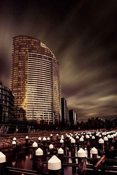
A long exposure of a building in the Docklands.

Why are you doing it

This is a bit like an artist’s statement in that you know what you are trying to do with your images. Many artists work this way. They understand what they are trying to achieve and have a look or story they are trying to get.

Australian artist/photographer Tracey Moffat looks at indigenous people and culture, and how they are understood culturally and socially. She says she is more interested in creating her own realities than dealing with reality. From the start, Moffat has an idea of what it is she is striving for.

My own work starts with the idea of what would the world be like without humans. I find places like Pripyat, the worker’s town that was evacuated after the Chernobyl nuclear disaster in 1986, fascinating. It has not been lived in since, and there is a quietness in the images that I find quite appealing. I try to photograph places with no people in them to see if I can imitate that silence. At the same time, I like to create a world in my images that doesn’t seem quite real.

How to Develop a Unique Style for Your Photography

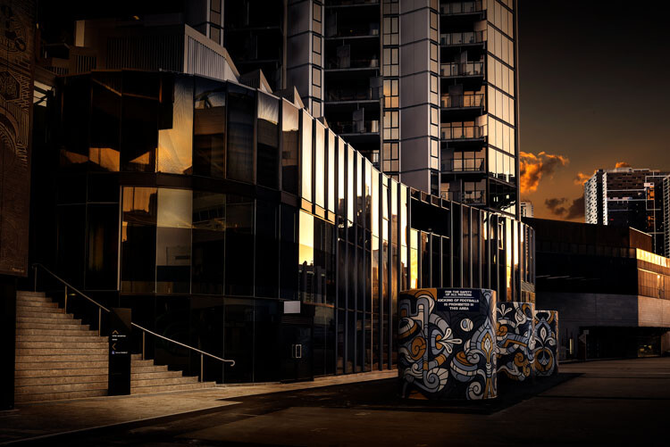
Off the street at the entrance of a building.

The subject matter

Usually, someone who is developing a style, or has one, will have a certain subject matter that they stick to – it might be mountains, the night sky, or waterfalls. It will be what they want to photograph and they tend to only do that thing. While some can be that strict with themselves, most photographers have a few things they like to photograph. However, that doesn’t mean that all the images will fit within that same style.

One of my favorite painters, Rick Amor, does a lot of architectural paintings. He creates his own realities in fictional cities, but he also likes to paint scenes from the beach and he does a lot of self-portraits. There is variety in his work, and each has its own style.

It could be said that I like architecture the most, but really, what interests me is the hand of man. I find anything that man has built or destroyed interesting. I tend to concentrate on cities, perhaps because I live in one, and it is easy to get there to take photos. However, if you were to look at my Instagram page you would see that I also like to photograph anything with water in it. Many images do not fit my subject, but you can’t always do art images and I do like photographing other things from time to time.

How to Develop a Unique Style for Your Photography

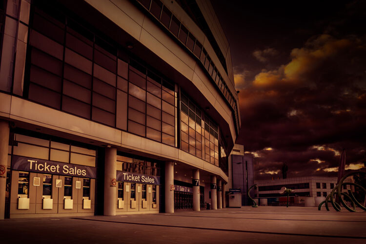
Etihad Stadium closed.

The technical process of taking images

The best way to get your images is knowing how to use your camera and getting the best out of it. There are photographers that rely on their cameras to give them what they want and the technical details become very important. The art of photography comes from the technical aspects.

If you are a technical photographer then you would be looking for a specific technique that you can use that will help give all your images the same feel. What that technical aspect will be is completely up to you. There are a lot of photographers that are striving for an image that is very technical, and the creative part isn’t necessarily that important.

You will find that many landscape and nature photographers are more technically driven. Matty Smith, an Australian underwater photographer, does his best to get everything in camera. He likes to reduce how much post-processing he has to do, therefore it is very important to him that he gets what he wants while out in the field, or under the water.

I am not a technical photographer. I don’t let the technical aspects of photography dictate my image. That doesn’t mean I don’t know them, they just don’t mean as much to me.

Using Post-processing

You will find that technical photographers don’t do a lot of post-processing, while others will use it a lot. There are no rules about what you should use, but you will find that many photographers that have really distinctive styles get their look through photo editing.

Brooke Shaden is primarily an artist who uses photography to create her own look. She does portraits in different settings and often uses costumes for them. The thing that sets her apart is her post-processing. She has a distinctive style that is hers. You will see lots of images that are similar, but they are usually people who are trying to imitate what she does.

My work is mostly created with post-processing. I have things I like to do to images, and playing in Adobe Photoshop is as much fun to me as taking the photos. I spend far more time processing than I do taking the images. I like to play with the light to see what I can do with it and for me, an image is complete when it looks almost like a movie still, not quite real.

How to Develop a Unique Style for Your Photography

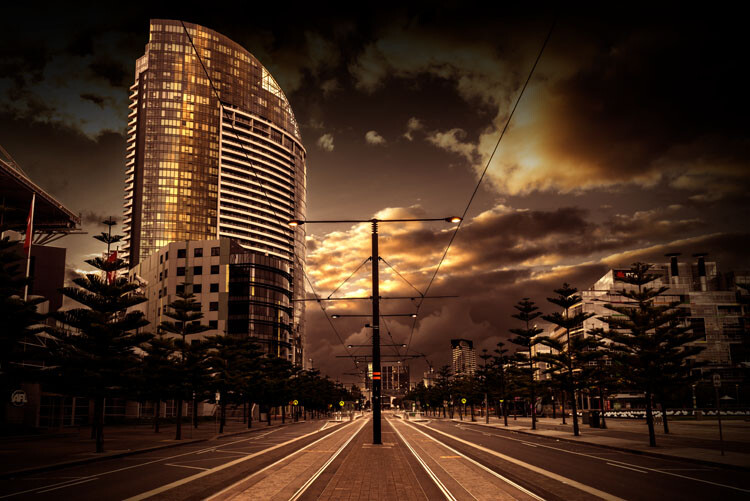
La Trobe Street looking to the Bolte Bridge.

Artists who have their own style

There are so many photographers that have very distinctive styles and if you want to develop your own style you should look at their work to see what they do. See if you can find inspiration.

Here is a list of photographers that have, at some stage, influenced my photography and helped me to develop my own style.

  • Joel Grimes
  • Peter Eastway – see also: The Magic of Antarctica with Special Guest Peter Eastway
  • Kristy Mitchell
  • Joel Tjintjelaar
  • Julia Anna Gospodarou
  • Art Wolfe

There are a few for you to start with.

How to Develop a Unique Style for Your Photography

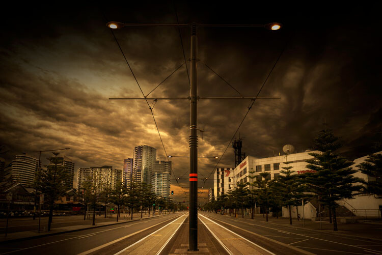
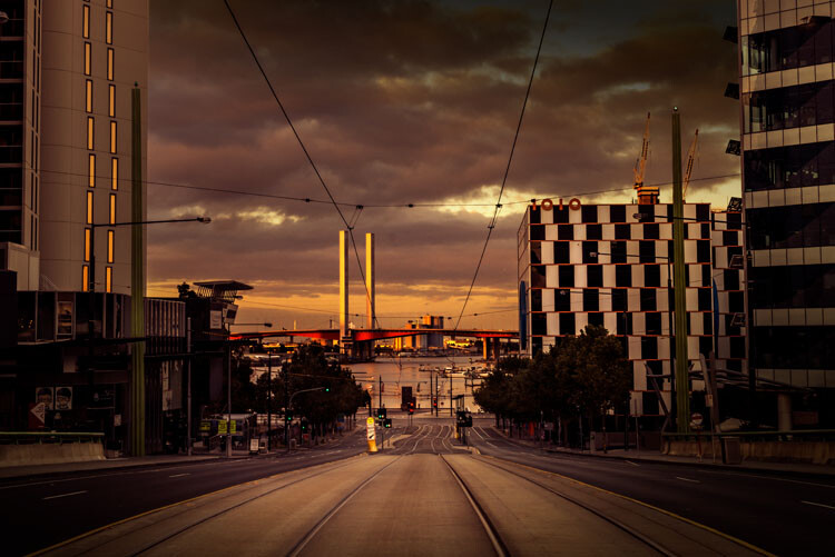
The Harbour Esplanade looking down the tram tracks.

Should you copy

It is so easy to copy what another photographer does, especially if they teach somewhere, but should you really copy what they do? There have been photographers who have done that and everyone just says, “Oh they are copying so and so.”

It is okay to copy what a photographer does to learn some new skills, but ultimately if you want your own style, one that is uniquely yours, then you need to work out what to do with your own images.

I learned a lot about developing a style and working as an artist through my fine arts degree. I also watched a lot of videos on how other photographers created their work. I would pick up tips and then see if I could apply them to my own work. I experimented with what they did so I could use it, but also so it would look different.

How to Develop a Unique Style for Your Photography

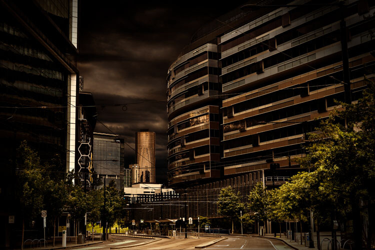
Near the end of Collins Street.

How to develop your own style

Go through all the steps here and see which apply to you. Work out what you want your work to be about and how you can get a look that is you, or so others know it is yours without having to look for a name.

Remember, that for your style to be uniquely yours, it needs to be different to what others are doing. It can be something simple, or perhaps more complicated. It won’t happen straight away and may take you quite a while to develop your own look.

You might find that you start one thing, and then change. It is normal, and in the beginning, it will change quite a bit. It will also evolve over time. What I am doing now is quite different to what I was doing 20 years ago, or even 10 years ago. Some might say that it is has changed a lot in the last two to three years.

As you start thinking about it, you may also find that you already have a style and are not even be aware of it, which is what happened to me. It took me a while to see what my style was, though many others could see it before I did. However, I know it now and understand it better.

To see how you progress places like Instagram can be perfect. You see all the work there and it is easy to look at the images together and over time.

Finally

Just experiment and try things. You never know where it will end up. Also, don’t always listen to others, especially for approval, do your own thing and eventually others will come around to it.

Have you developed a unique style for your photography? How did you do it? Please share your comments and thoughts below.

leannecole-developing-your-style-44

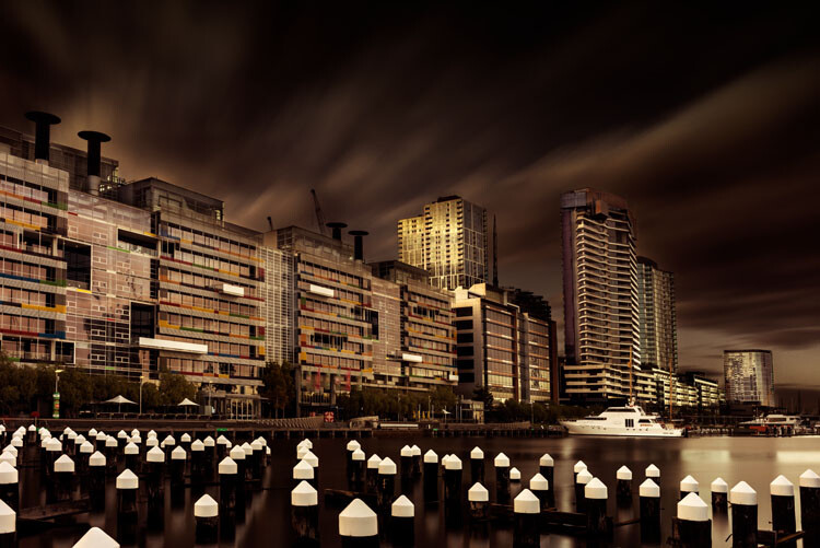
A long exposure over the water at Docklands.

googletag.cmd.push(function() {
tablet_slots.push( googletag.defineSlot( “/1005424/_dPSv4_tab-all-article-bottom_(300×250)”, [300, 250], “pb-ad-78623” ).addService( googletag.pubads() ) ); } );

googletag.cmd.push(function() {
mobile_slots.push( googletag.defineSlot( “/1005424/_dPSv4_mob-all-article-bottom_(300×250)”, [300, 250], “pb-ad-78158” ).addService( googletag.pubads() ) ); } );

The post How to Develop a Unique Style for Your Photography by Leanne Cole appeared first on Digital Photography School.


Digital Photography School

 
Comments Off on How to Develop a Unique Style for Your Photography

Posted in Photography


ONA releases new style bags and accessories for mirrorless users

31 Jan

$ (document).ready(function() { SampleGalleryV2({“containerId”:”embeddedSampleGallery_1926634051″,”galleryId”:”1926634051″,”isEmbeddedWidget”:true,”standalone”:false,”selectedImageIndex”:0,”startInCommentsView”:false,”isMobile”:false}) });

Premium camera bag brand ONA has announced a set of new small bags and a wrist strap that are aimed at compact system camera users. The Bond Street is an upright bag designed to hold a single body and a couple of lenses, or three or four lenses while the camera is in use or on a strap. The bag has a large flap-over cover which is secured with a locking clasp, while the padded interior comes with a single adjustable divider. ONA offers the Bond Street in black or ‘antique cognac’ leather, or in a ‘smoke’ grey waxed canvas.

A second bag, called the Beacon, is shaped more like a tripod case, but features a pair of zip-up compartments for lenses, accessories or small cameras. Three dividers allow the bag to be converted from a single compartment to four, so a small tripod can be accommodated or four CSC-style lenses. The case has a carry handle as well as a removable shoulder strap, and is made from black ballistic nylon with leather trim.

The company is also to begin sales of a leather wrist strap called Kyoto, which it says is strong enough to support cameras up to 6lbs – though it has been tested to 10lbs. The underside of the strap, which ONA says is made from the same leather as is used for its bags, is suede-lined for comfort. The Kyoto comes in black, ‘dark truffle, and ‘antique cognac’.

The Bond Street bag is set to cost $ 219, while the Beacon will be $ 149. The Kyoto wrist strap will be priced at $ 49. All will be available from January 31st.

For more information see the ONA website.

Press information

The Leather Bond Street
Camera Bag and Insert
Suggested Retail: $ 219

Handcrafted with full-grain leather and antique brass hardware, the Leather Bond Street is our most compact bag—for your camera, everyday essentials, or both. Designed specifically for mirrorless and instant cameras, the Bond Street adapts the style and function of our popular Bowery bag into a smaller silhouette that comfortably holds a camera and 1-2 lenses. The Bond Street features a closed-cell foam padded interior, a removable padded divider, and a zip pocket on back perfectly sized to fit your smartphone, batteries or other small goods. Like the Bowery, the Bond Street can also be stowed as an insert in a larger bag by detaching the strap.

Exterior Dimensions: 9”Hx7.5”Wx4.5”D I Weight: 1.7 lbs Colors: Antique Cognac (ONA5-064LBR), Black (ONA5-064LBL). Also available in Waxed Canvas: Smoke (ONA5-064GR)

The Kyoto
Leather Camera Wrist Strap
Suggested Retail: $ 49

The Kyoto camera wrist strap is handcrafted from full-grain premium leather left over from the material used to make ONA’s premium camera bags. Designed for the photographer who needs their camera at-hand without wanting a traditional strap, the Kyoto wrist strap is lined with suede, reinforced for strength, and padded for comfort. A steel key ring clasp and a leather scratch guard allow for compatibility with most cameras; the strap is intended for camera kits up to 6lbs and has been stress-tested to 10lbs.

Colors: Antique Cognac (ONA062LBR), Black (ONA062LBL), Dark Truffle (ONAO62LBL)

The Beacon
Lens Case
Suggested Retail; $ 149

The Beacon lens case is a first-of-its-kind, combining the silhouette of a vintage lens case with the function, style and flexibility of ONA’s camera bags. The Beacon is designed to protect up to four lenses and small accessories, utilizing a close-cell foam interior and customizable padded dividers. For the photographer or creative who needs more flexibility, the Beacon can also hold select camera bodies, 360 and action cameras and small tripods. Highly durable and water-resistant, the Beacon is handcrafted from premium 1050D ballistic nylon and features full-grain leather accents and solid brass hardware. It features two large zippered openings, a small accessories pouch and a removable strap to protect your lenses in a suitcase or attached to a larger bag.
Exterior Dimensions: 4″Wx18″Lx6″H (with handle) I Weight: 1.7 lbs
Colors: Black Nylon (ONA5-058NYL)

Articles: Digital Photography Review (dpreview.com)

 
Comments Off on ONA releases new style bags and accessories for mirrorless users

Posted in Uncategorized


Display your camera collection in style with these 3D-printed wall mounts

30 Aug

$ (document).ready(function() { SampleGalleryV2({“containerId”:”embeddedSampleGallery_4952012233″,”galleryId”:”4952012233″,”isEmbeddedWidget”:true,”standalone”:false,”selectedImageIndex”:0,”startInCommentsView”:false,”isMobile”:false}) });

Looking for a sleek, minimalist display for your vintage camera collection? LaudWorks, a purveyor of DIY project tools, has launched a small accessory called Hangie for easily mounting a camera on a wall. The 3D-printed mount is offered in both steel and plastic versions with multiple color options, and is nearly invisible when used, giving the impression that the camera is floating on the wall.

The Hangie mount is simple to install: first, attach the mount to a wall using two screws, then secure the camera using a tripod mount screw. The metal version of Hangie is made from bronze-infused stainless steel and is designed for heavier cameras; LaudWorks says it tested this version with a Canon EOS 7D and a EF-S 17-55mm lens attachment (1500g / 3.3lb). The plastic version, meanwhile, is made from white nylon plastic and is made for ‘small, lightweight cameras.’

Both products are available from Shapeways; the plastic version is $ 4 and the metal version is $ 21. 

Via: PetaPixel

Articles: Digital Photography Review (dpreview.com)

 
Comments Off on Display your camera collection in style with these 3D-printed wall mounts

Posted in Uncategorized


Declutter Your Desk in Style: 16 Modern Office Organizers

24 Aug

[ By SA Rogers in Design & Products & Packaging. ]

desk organizers main

Open-plan offices with simplified furniture may look nice and minimalist, but they typically lack built-in storage and organization, making it hard to wrangle all the little things you need to use each day. That calls for some creative solutions that won’t make a cluttered situation even worse. These modern desk organizers are up to the task, and they look good, too.

3D Desk Organizer by Block

desk organizer block 1

desk organizer block 2
The shaped wire that makes up the Sketch Desk Tidy by Block mimics the look of a drawing that’s been translated into a 3D form suggestive of a building. The powder-coated steel cage in blue or black rests upon a wooden base to hold pens and other small office items.

5 Brilliant Ideas from RIT’s Metaproject for Poppin

desk organizers poppin 1

desk organizers poppin 6

desk organizers poppin 5

desk organizers poppin 3

desk organizers poppin 2

Poppin, a New York-based shop for modern office products, teamed up with students from the Rochester Institute of Technology for this edition of ‘Metaproject’ to deliver a series of economical, reproducible yet aesthetically pleasing and highly functional accessories. The results solve a lot of storage problems commonly seen in workspaces, especially those that have switched to a minimalist open-plan design scheme that leaves no room for drawers, hooks and cabinets. The creations include the High-Rise Hanging Family, modular organizers that fit over a felt divider; Branch Holder for your keys, bags and headphones; The Booster Desk so you can stand up when you feel like it; the Munch Mat Takeout Bag so you don’t make a mess with your lunch, and the Task Chair Overhanger for purses, scarves and jackets.

Cliff Riser with Built-In Storage

desk organizer cliff 1

desk organizer cliff 2

desk organizer cliff 3

This simple steel riser is more than just a way to elevate your monitor – it has two drawers built into the side to hold small items like tape dispensers and staplers or personal effects. The Cliff by Heckler Design comes in six colors and is just the right size to be useful without taking up too much desk space.

Memory City USB Station

desk organizer memory city 1

desk organizer memory city 2

Do you have trouble keeping track of a bunch of different external storage devices like USB thumb drives? Instead of tossing them all in a drawer, keep them handy and visible with the Memory City USB Station. This plastic diorama of train stations scenery includes slots for thumb drives and flash cards, which then tower over the scene like skyscrapers.

Next Page – Click Below to Read More:
Declutter Your Desk In Style 16 Modern Office Organizers

Share on Facebook


[ By SA Rogers in Design & Products & Packaging. ]

[ WebUrbanist | Archives | Galleries | Privacy | TOS ]


WebUrbanist

 
Comments Off on Declutter Your Desk in Style: 16 Modern Office Organizers

Posted in Creativity


How to Add a Soft Focus Look to Your Images for a Unique Style

21 Aug

Soft focus photographs present themselves with a tranquil and almost dream-like effect. They have become quite popular, and can be found to some extent in many genres of photography, from portraits to landscapes.

In reality, what many of us think of as soft focus photos, aren’t actually soft focus at all. The more accurate term is soft contrast. Soft focus is essentially the blurring of an image, which is not exactly the same as soft contrast. The softening effect can be achieved a number of ways using softening filters mounted in front of your lens, or in post-processing. With the powerful digital editing tools we have today, a soft contrast effect is both easily achieved, and infinitely adjustable.

Before and After

In this example, you will see at a step-by-step workflow for applying a soft focus, or soft contrast, look to a photograph in Photoshop using our old friend the High Pass Filter. You might be familiar with using the High Pass for sharpening, but in this case it will be used on the opposite end of the spectrum. We will begin with a RAW image file and work our way to a finished product ready for publishing.

Don’t worry. All these edits are incredibly easy, fast, and will give your images a little creative boost if used correctly. Let’s get started!

Here have the RAW file or as I affectionately call it the “Genesis Image”.

Raw

Make basic edits first

We will begin with some basic edits in Adobe Lightroom, then transfer the image to Photoshop to apply the soft contrast magic. It’s best to perform your core processing first, before beginning the soft contrast process. I like using Lightroom because it makes for a super simple transfer, for working in tandem with Photoshop.

For this photo I performed some global exposure adjustments, as well as made some selective adjustments. I also made use of the HSL panel to bring the color saturation and luminance closer to my visualization.

LR Adjustments

Open in Photoshop and duplicate the background layer

Once you’ve finished the foundational processing it’s time to bring your image into Photoshop. Right click it in Lightroom and choose “Edit in Photoshop”.

Now that you have your file open in Photoshop, you can begin the easy process of applying the soft contrast effect. To begin, you need to duplicate the base layer. Do this by right clicking the base layer and selecting Duplicate Layer, or by pressing control+J (command+J for Mac).

Duplicate Layer

Apply the High Pass Filter

Next, select the High Pass Filter. To do this, select from the top menu: Filter > Other > High Pass. The image before you will transform into a garbled mass of gray muck.

High Pass Filter Select

You will be given the option of adjusting the radius of the High Pass. I have found that for most images, a radius of 10-20 pixels is appropriate, but in the end it will be up to you and your creativity to decide. After you’ve selected the radius, click OK.

Next, go to: Image > Adjustments > Invert. You can save some some time by using the keyboard shortcut Ctrl+I (Command+I for Mac).

High Pass Invert

Change the layer blend mode

And vola! Wait…the photo still looks like a moldy piece of bread. Everything is okay, though! The next step is one of the most important, and it will make all the difference. In your layers panel, change the blending mode to Softlight.

High Pass Softlight

Boom!

High Pass Softlight Effect

The image looks like a photo again. The soft contrast effect has now been applied to every part of the image. If you like how everything looks, great, you’re completely finished and can go on your way. Most often though, additional fine tuning will be needed to bring out the best of your photograph. This is the real power of Photoshop, because you can now selectively choose what areas will benefit most from the softening. To do this you need to add another layer mask, but don’t let this intimidate you.

Add a layer mask to refine the effect

At the very bottom of the layers panel you will see a small row of icons. The layer mask icon is the white rectangular box with the gray dot inside, click that. A layer mask will be added to your adjustment layer. This way, you can choose exactly where you want your effect to be applied using the brush tool.

Add Mask

Now I can really get creative. I want to leave the softening effect on some areas, but remove it from some of the key points of the composition; namely the rock face and the ground surrounding the waterfall. Use the brush tool (paint brush icon) and a layer mask to show or hide your edit. Be sure the two black and white squares at the far left bottom of the tool panel show the black square above the white one (hit D on your keyboard to set them to default and X to swap the colors). This means you are hiding the effect from the image by masking it.

If you click the two sided arrows above the squares (switch to put white on top – or click X on your keyboard to do this) you will be able to paint back in the effect, in the case you remove too much (using a mask is non-destructive editing, you are not removing pixels just hiding or showing parts of one layer). Also, remember the the brush tool is completely customizable as far as size, flow, and opacity are concerned.

Layer Mask Adjustments

Final edits back in Lightroom

In the case of this photo, I save and close it in Photoshop, and it will automatically import back into Lightroom where I will finish up some minute details. The final edits include mainly selective sharpening and a slight vignette.

Final Adjustments

And it’s done! In what amounts to a few short minutes, I have gone from a RAW file, to an image that artistically captures what I saw when I clicked the shutter.

Before and After

As with any type of post-processing, it’s important to remember that less is often more. Be judicious with your edits and only go as far as you need, in order to reach the image you want to make.

Have a soft contrast or soft focus image you’ve edited in Photoshop? Feel free to share them in the comments below.

googletag.cmd.push(function() {
tablet_slots.push( googletag.defineSlot( “/1005424/_dPSv4_tab-all-article-bottom_(300×250)”, [300, 250], “pb-ad-78623” ).addService( googletag.pubads() ) ); } );

googletag.cmd.push(function() {
mobile_slots.push( googletag.defineSlot( “/1005424/_dPSv4_mob-all-article-bottom_(300×250)”, [300, 250], “pb-ad-78158” ).addService( googletag.pubads() ) ); } );

The post How to Add a Soft Focus Look to Your Images for a Unique Style by Adam Welch appeared first on Digital Photography School.


Digital Photography School

 
Comments Off on How to Add a Soft Focus Look to Your Images for a Unique Style

Posted in Photography


How to Bump Your Photography up a Level by Using Film Style Limitations

19 Aug

Get 50% off Tom’s ebook Ang’s World – A Life in Photography eBook, now only until July 26 at Snapndeals.

One of the most important skills in photography is pre-visualization. The idea is that before you capture an image in the camera, you have a clear idea in your mind of what it’s going to look like. You preview the image before you shoot it. Colour or black-and-white in rendering? Rich in tones or pale and soft? Misty-blurry in feel or so tack-sharp you might cut your eyes on it? What – exactly – will your image look like?

One of the early objections to digital photography was that it wasn’t really photography because there was no negative; no sense of what kind of picture you’re making. In fact, with digital, there’s not much at all, apart from data in the form of a very, very long row of zeroes and ones. You know what kind of image you have only when you use that data to drive a screen (on camera or at computer) or a printer. And before you get there, you have to process the image. If you feel feel isolated from the process of creating the image, it’s no wonder.

01 DSC3714
The most basic in-camera processing setting is your exposure. For this nature shot in my back-garden (above), I over-exposed by two stops. This pales out the colours, fills the shadows nicely to get the effect I envisaged, all suffused with light.

If you feel a bit disjointed from your images or from your camera, one way back is to try some old-school photography. If you feel your photography is getting a bit jaded, you can re-discover its joys by committing to a treatment or filter effect at the time you take the photograph.

You simply think, feel and shoot as if you’re using film.

I love this way of working. There are two simple steps. You choose an in-camera processing or filter effect (which, of course, produces JPEG files), and you do not use the screen to review your images (it’s good practice anyway). So, let’s set to the Toy Camera option – this vignettes the image heavily (darkens the corners), under-exposes, and adds strong saturation. And off we go:

02 DSC43152013
This indoor scene on our dining table (above) is rich in a surreal way, because the strong colours in the centre and heavy vignetting forces the viewer’s attention to the centre. The very shallow depth of field – from using a f/2 aperture – also helps make the space tensioned.

One reason some photographers have returned to work with film, is that the process of envisioning how the image will look before clicking the shutter, creates a sense of connection with the subject. You feel more involved with the process, and that’s an important part of the fun of photography.

03 DSC6410 2014

This portrait is a rich-toned black-and-white: it takes a shocking amount of processing in-camera, but comes out with deep, sharp tones that is surprisingly flattering. It works well in mixed hard and soft lighting.

There’s another advantage to camera processing – if you work this way, you often don’t need to touch the image before being able to use it. When I photograph for my books, I produce thousands of images, and have to submit as many as 1,500 images to the art department. You won’t find me messing about with the images more than I need to, I have a book to write! So images that pop straight out of the can into the book are what I aim for, like this one.

04 DSC9708 2

This late evening scene in Auckland, New Zealand comes straight out of the camera as rendered by the Toy Camera effect. I did try out some adjustments, but quickly decided it was best left as shot.

04A DSC14092014

Garden furniture left in the rain came out glowing with the Toy Camera filter, which often brings out a mood that is slightly world-forsaken. I like using the filter with the lens wide open, to leave as much as possible softly blurred.

So the question is; do you know what your image will look like before you capture it? If commitment scares you, one approach is to at least think ahead to the post-processing that you’ll do. Instead of blundering around trying one effect or adjustment after another, you will go straight to the effects that you want. Saves a LOT of time.

Or you can do as I’m showing here, and bravely go for it. More jeopardy equals more fun! And that’s exactly what you’d have done with film. You load the camera with film – say slow black-and-white for fine grain, or fast colour for low-light work. 24 or 36 exposures, and you’re stuck with it until the last frame reels off, come rain or shine, action or still-life. Many photographers have found fun in photography again by embracing the risks of film-like limitations.

05 IMG 1367

I’ve used the Hipstamatic app on my iPhone since the beginning, as I enjoy the commitment to the image coming out according to the film and lens combination you pick. This is one of my favourite combinations – the Libatique lens – and the Dream Canvas film.

Just like learning to work with a fixed focal length, what looks like an imposition and inhibiting feature, can actually free you artistically. For example, knowing that I’ve chosen a filter that gives a particular soft focus but richly coloured look, means that everyday scenes become mysterious washes of colour and tone. Without that effect, I might not have thought of making this shot.

06 IMG 1446

This is a Hipstamatic shot using D-Type Plate film with the Jane lens, processed for increased saturation.

A mundane scene like the mess on a chopping board just looks ordinary in colour. But in black-and-white, with a bit of fake Tintype effects, and the image moves into another arena.

Committing to a treatment challenges you, and changes the way you look at things. Some photographers say they can see compositions only in black-and-white. If you set your camera to shoot black-and-white, you will find that you photograph different things from your usual subjects. You’ll probably shoot them in a different way too. If you’re feeling especially brave, you can set your camera to apply an art filter. I like using the Illustration filter, which pumps up colours and draws a line on sharp edges. It works neatly with nature.

07A__DSC2691A
A moderate wide-angle view of a nature reserve. (Looks pretty but actually it’s over-run with invasive foreign species.) In the soft light, I thought the image would come out flat and lacking in contrast. So I decided to add some filter fizz.

07B DSC02690 2014

With the illustration filter applied, all the important features have been brought out; the trees, the slope of the hill, the bright lilies, and lily leaves. This image came straight out of the camera, with no post-processing at all.

You don’t have to be so drastic though. One useful in-camera effect available in several models, is built-in HDR (High Dynamic Range). In fact, what the effect does should be called tone-mapping. It makes three or more rapid-fire shots of the subject, at different exposure values. Then, in camera, it combines them so that the image is predominantly filled with mid-tones. Now if you try this on a moving subject, you get weird double-fringed effects. More in-camera fun!

08 DSC27672014
Three separate exposures of trees waving in the wind, even when shot at a high rate of fire, will create blurred or fringed images. Then tone-mapping them – processing to bring out mid-tones – gives a half-photographic, half-graphic effect. (Post-processed to reduce brightness and increase saturation.)

All this works, because pre-visualization makes you see in a different way. What happen is that the camera actually reprograms the way you see. That makes a lot of sense, if you think about learning new skills. Let’s take martial arts, for example. Before you start classes, you just see people punching, kicking. Once you learn more about it, you start to get your eye in – you see when someone’s leaning too far forward, or that there’s no power in a strike. It’s exactly the same moves as before, but your now-tutored eyes see more; they see differently.

In photography, you may start to see relationships, not objects. You pick out shapes and aren’t distracted by textures. Or you may see small details which before you’d overlook. In short, committing to one look for your images can invigorate your seeing, which will inspire your photography to greater, new levels.

09 IMG 4425 2015
An extravagant flower display at a hotel reception looks charming when given a look of aged film, complete with old-world border given by Hipstamatic Libatique lens with Ina’s 1969 film options.

Get 50% off Tom’s ebook Ang’s World – A Life in Photography eBook, now only until July 26 at Snapndeals.

googletag.cmd.push(function() {
tablet_slots.push( googletag.defineSlot( “/1005424/_dPSv4_tab-all-article-bottom_(300×250)”, [300, 250], “pb-ad-78623” ).addService( googletag.pubads() ) ); } );

googletag.cmd.push(function() {
mobile_slots.push( googletag.defineSlot( “/1005424/_dPSv4_mob-all-article-bottom_(300×250)”, [300, 250], “pb-ad-78158” ).addService( googletag.pubads() ) ); } );

The post How to Bump Your Photography up a Level by Using Film Style Limitations by Tom Ang appeared first on Digital Photography School.


Digital Photography School

 
Comments Off on How to Bump Your Photography up a Level by Using Film Style Limitations

Posted in Photography


Using a Flat Picture Style for Better Finished Images

13 Aug

During my career in photography, I’ve continued to evolve, both my shooting and editing styles, to achieve the results I wanted. Several years ago, while working with film editors on a cinema project, I came across a concept that I decided to apply to my own photography, and I have to say, it has improved my final images a great deal. Let me explain about using flat picture styles.

Finished-Image

When Hollywood studios film a movie using a digital cinema camera, many times the camera will be set to record what is known as Log Gamma. This is similar to the picture styles that we DSLR and camera users have come to know and love. But while picture styles or picture controls are for the most part intended to provide a finished look, Log Gamma does just the opposite. A video file shot using Log Gamma will be very flat, with little contrast and color saturation. The purpose of shooting video this way, is so that it retains as much information as possible about the range of tones in the image, so the colorists who work on the video later can bring out that detail, and create a visual look to the film. This process is called color grading.

As I began to understand what the colorists were doing, I adjusted my workflow to allow me to take advantage of the same concepts. I find that by using a flat, low contrast, low saturation picture style, when I process the RAW file I can bring out better detail and contrast, and avoid clipping in the highlights and shadows.

Choosing a Flat Picture Style

Before Image With Histogram

A flat or neutral picture style will give you an image with the least contrast, maintaining better highlight and shadow detail. This allows you to bring out those details in processing. The histogram on your camera, and later in Photoshop or Lightroom, allows you to see where your highlight and shadow tones fall, to avoid clipping.

I had been shooting RAW for some time, but have left the Picture Style set to Standard or Landscape, for the most part. Once I saw this technique, I decided to change my picture style on my camera to Neutral (for Canon cameras) or Flat (on newer Nikons).

Canon Picture Style

Canon Picture Style

The reason is that the histogram shown on the back of the camera, as well as the image preview, reflect the selected picture style. The result is that if the picture style selected is a more contrasty one, such as Landscape, the histogram will reflect that, and may indicate clipping of highlights or shadows, especially in a contrasty scene.

Clipped Histogram

This histogram shows clipped highlights, meaning detail is lost in the brightest areas of the image.

On my Nikon D810, I use the Flat picture control, because it is the best choice for capturing the full range of tones in the scene, and those tones are reflected on the histogram on the back of the camera when I review the shots. This is important because I need an accurate indication of where the highlights and shadows in a scene fall in my histogram.

Nikon 810 Flat Picture Control

Nikon 810 Flat Picture Control

Nikon picture control

Nikon picture control – if you do not have Flat, choose Neutral or Faithful

The histogram on your camera is a graphed indication of where the pixels in your image fall in relation to highlights and shadows. The left edge represents blacks, the mid-left represents shadows, the middle is midtones, the mid-right is highlights, and the far right is whites. While not all cameras have a Flat picture control or style, most have a Neutral or Faithful picture style or control, that works similarly. Also, most cameras give you the ability to edit the picture styles, so you can turn down the contrast if you like, ensuring that you capture more highlight and shadow detail, and reducing the chances of clipping highlights or shadows.

When you clip highlights, objects in the scene that are clipped will show as pure white with no detail. When shadows are clipped, objects in those areas will show as pure black in the scene, also with no detail. When viewing the histogram, if the squiggly lines that make up the graph are pushed up against either the left or the right side, that is called clipping. When that happens, you are losing detail in the shadows if it’s pushed against the left, and in the highlights if the graph is pushed against the right. By reducing the contrast in the picture style, you’ll reduce the chances of losing detail in the scene.

Shooting RAW, and knowing I’ll be making adjustments in post, it doesn’t really matter what picture style I use, because I can change that when processing the RAW file. But it’s essential to be able to see an accurate histogram on my camera, to ensure I’ve captured as much tonal range as possible.

Processing the RAW File

Image photographed using flat picture control

This image was shot using the Flat picture control, and then the highlight and shadow sliders in Adobe Camera RAW were adjusted to further reduce contrast.

Once I begin processing the RAW file, I’ll do even more, if necessary, to flatten the image and compress the range of tones within the histogram. This includes using the Highlights and Shadows sliders in Adobe Camera RAW to bring out details on both ends of the histogram.  You can watch the histogram change in Adobe Camera Raw or Lightroom as you do so, to be sure you don’t go too far. If the highlights begin to look muddy, you’ve gone too far. By the same token, if the shadows start to look washed out, that’s probably too far as well. You want to maintain detail in each, but not lose the depth of tone completely. It’s important to note that this adjustment will vary for different images, depending on where the highlights and shadows fall in the images.

In addition to adjusting the highlights, shadows, and contrast here, I will use the Dehaze slider, Lens Correction, and Spot Removal brush in Adobe Camera RAW. If you prefer, you can use the Vibrance, Saturation, and Adjustment Brush to complete the image in Adobe Camera RAW or Lightroom, but my preference is to work in Photoshop. There I can use a Layers workflow along with masking and Adjustment Layers and with various plugins, to achieve my final image.

Building Up Color and Contrast

Using Adjustment Layers

Using Adjustment Layers in Photoshop, I built up the color saturation and contrast to achieve the final image.

Once I have the image at the desired level of flatness, I then go about building up color saturation and contrast, or in Hollywood terms, color grading my image. After bringing the image into Photoshop, there are a number of ways you can go about this. The first is to use adjustment layers so that you can continually adjust each layer as desired, until you flatten the image for your final output. In addition, if you’re making an adjustment that you only want to apply in certain areas, you can use layer masks to hide or reveal it as desired.

Many of these adjustments will be to personal taste. I personally prefer my images to have punchy color and contrast. So a set of adjustment layers I might use would be Vibrance, Exposure, Hue/Saturation, Curves, and Exposure.  The flexibility of using adjustment layers allows me to direct adjustments where I need them, rather than being forced to make them globally.

Image processed with Nik Color Efex Pro

This is the same image, but I used Nik Color Efex Pro to achieve the final image instead of adjustment layers.

If adjustment layers aren’t your thing, perhaps using a plugin such as Google’s Nik Efex Pro. It’s now available at no cost, and is a software package I highly recommend. I’ve created several presets in Color Efex Pro, and will also use Viveza and its control points to further adjust my image. For landscapes, in Color Efex I have created a preset using Brilliance/Warmth, Pro Contrast, Skylight Filter, Detail Extractor, and Vignette:Lens, that I find to be pleasing for a majority of my landscape images. Depending on the image, I will tweak these settings to meet my vision.

Summing Up

Before and After

On the left is the image with its tones flattened and desaturated, using a Flat picture control and adjusting highlights and shadows as needed. On the right is the image fully processed building contrast and color saturation.

By starting with a flattened file, you give yourself room in the range of tones to build contrast and saturation, without clipping highlights, shadows, or any of the color channels. While shooting with a more finished picture style may look more pleasing on the camera’s LCD screen, or upon import into Lightroom or Photoshop, the contrast has already been adjusted to give it a pleasing look. Any adjustments to Saturation or color may result in a file that at the very least looks overcooked, and at worst, shows evidence of clipping highlights, shadows, or color channels.

An image showing before and after color grading.

On the right is the image with the flat picture style, while the left has been “color graded” in Photoshop.

Building-contrast-2

googletag.cmd.push(function() {
tablet_slots.push( googletag.defineSlot( “/1005424/_dPSv4_tab-all-article-bottom_(300×250)”, [300, 250], “pb-ad-78623” ).addService( googletag.pubads() ) ); } );

googletag.cmd.push(function() {
mobile_slots.push( googletag.defineSlot( “/1005424/_dPSv4_mob-all-article-bottom_(300×250)”, [300, 250], “pb-ad-78158” ).addService( googletag.pubads() ) ); } );

The post Using a Flat Picture Style for Better Finished Images by Rick Berk appeared first on Digital Photography School.


Digital Photography School

 
Comments Off on Using a Flat Picture Style for Better Finished Images

Posted in Photography


How to Accelerate the Development of Your Personal Photographic Style with Lightroom

16 Jul

If you want more Lightroom help from Viktor, get 50% OFF his Four Seasons Lightroom Preset Collection, on now at Snapdeals (only until July 19th, 2016)

Over the years, Lightroom has become the most important tool for my photography. I use it for organizing and editing my photos, as well as publishing them to various channels. But, this hasn’t always been the case.

Images Personal Artistic Style in Lightroom 01

When Adobe introduced Lightroom years ago, 100% of my editing was done in Photoshop. But, gradually over the years with every new version or update of Lightroom, it became a one-stop destination for all of my post-processing activities. Today, Lightroom meets 90% of my photography needs with Photoshop meeting only 10%.

Compared to Photoshop, I love Lightroom because of its nondestructive RAW editing and speed. But, if I had to choose my favorite Lightroom feature, it would be the ability to create presets.

Images Personal Artistic Style in Lightroom 02

Notice patterns and make them into presets

Preset functionality drastically changed the way I approach photo editing and helped me accelerate the development of my personal style. Yet, when presets were first introduced in Lightroom 3, I initially overlooked the feature until I decided to put an extra effort toward increasing the efficiency of my editing.

When I started analyzing the way I take and edit photos, I noticed certain patterns. I recognized that the way I take pictures directly affects the way I process photos in Lightroom.

For example, when shooting landscapes and cityscapes, I always set the exposure for the highlights (sky) that results in underexposed foreground shadow areas. Then, as I begin editing, I start by opening up the shadows, recovering details in the highlights and adding a graduated filter to the sky area. I boost contrast and clarity, increase the saturation and vibrance. This usually results in an oversaturated sky so I only desaturate the blue hues. I also ensure that the vegetation in my photos is not electric green by shifting the green hues toward the yellow spectrum. In the final steps, I add vignetting, increase sharpening and reduce noise.

Images Personal Artistic Style in Lightroom 03

Though these steps soon became second nature, it also meant that I performed anywhere from 20 to 30 identical adjustments to every edited photo. When I realized this, it quickly became obvious that if I recorded the common edits and adjustments as a Lightroom preset, then I could reuse them again and again more efficiently.

When I finally saved the edits listed above, my first preset was born. I named it “Natural” because it fully reflected my photography style in achieving a natural and well-balanced look, with rich colors.

Images Personal Artistic Style in Lightroom 04

Create variations

I then created two more presets, based on the first Natural preset. I shifted the color balance toward warm colors (yellow, orange) to emulate the warm hues of the early morning. I called this one “Sunrise.” Another preset I created was “Overcast” in which I decreased saturation and boosted contrast to imitate cloudy and darker days.

These three presets – Natural, Sunrise and Overcast — were the foundation of my Landscape collection.

Images Personal Artistic Style in Lightroom 05

Over the years, I gradually created new presets while making sure each of them reflected my taste and photography style. At some point, I looked back and realized that I was actually defining and perfecting my own artistic style while also exploring different artistic directions and the future of my work.

Today, I have three main preset collections that cover the different aspects of travel photography: Landscape Collection, Cityscape Collection and People Collection.

Experiment and save

I use the preset-based editing approach on a daily basis because it not only saves me an enormous amount of time editing, it also keeps my artistic style consistent. But, at the same time, I am also able to continue experimenting with new approaches that can be saved as new presets that reflect my evolving style.

I highly recommend that you try a similar approach with your photography.

Images Personal Artistic Style in Lightroom 06

Making your own presets

Here are some actionable steps that can help you jumpstart the process of creating your own presets:

If you’ve been using Lightroom and have a decent sized photo collection, select your favorite photos from the archives and create your own presets based on the edits and adjustments of the selected photos. Continue refining your presets over time to make sure that they are generic enough to work with a variety of photos. Also, keep growing your preset collection, and be sure to organize them by topic and/or style.

For photographers who are just starting out and don’t yet have a sizeable archive, I recommend using someone else’s presets as a starting point. It is fairly common that well-established photographers are willing to sell or give away their Lightroom presets to help budding photographers. Simply find a photographer whose style you like, and use his or her Lightroom presets as the foundation for your future collections.

You can even try to reverse engineer them to figure out how certain effects were achieved. Also, don’t be afraid to modify the presets until you come up with something exciting and unique to you.

Images Personal Artistic Style in Lightroom 07

Conclusion

Developing your personal artistic style in photography is a long, and sometimes chaotic and uncontrollable process. By recording your artistic tastes and versions as Lightroom presets, and by using them as the foundation for your preset-based editing routine, you can accelerate, simplify, and streamline an otherwise extremely complex process.

If you want more Lightroom help from Viktor, get 50% OFF his Four Seasons Lightroom Preset Collection, on now at Snapdeals (only until July 19th, 2016)

googletag.cmd.push(function() {
tablet_slots.push( googletag.defineSlot( “/1005424/_dPSv4_tab-all-article-bottom_(300×250)”, [300, 250], “pb-ad-78623” ).addService( googletag.pubads() ) ); } );

googletag.cmd.push(function() {
mobile_slots.push( googletag.defineSlot( “/1005424/_dPSv4_mob-all-article-bottom_(300×250)”, [300, 250], “pb-ad-78158” ).addService( googletag.pubads() ) ); } );

The post How to Accelerate the Development of Your Personal Photographic Style with Lightroom by Viktor Elizarov appeared first on Digital Photography School.


Digital Photography School

 
Comments Off on How to Accelerate the Development of Your Personal Photographic Style with Lightroom

Posted in Photography


How to Create a Dramatic Cinematic Style Portrait Using Photoshop Color Grading

30 Jun

Cinematic style portraits are personally one of my favourites. What I like the most about them are the desaturated colours and the dramatic ambience.

Before we start the tutorial on colour grading, I will give you some of my best tips to achieve this cinematic look:

  • Use a large aperture, something between f/1.4 and f/2.0. If you have a long lens then you can also use that. The idea is to have a nice background bokeh (when things in the background are blurred). You also want to have nice separation between the model and the background.

IMAGE 1

  • If you’re shooting indoors with strobes, then try to add ambience by adding shadows to the model’s face. You do not want flat lighting, it is boring.
  • If somehow you can’t get the dramatic lighting, don’t hesitate to enhance the contrast with some dodging and burning in Photoshop.

IMAGE 2

  • If you’re shooting outside, the I recommend shooting right after sunset. You will get nice soft light on the model’s face, and you will also have city lights behind them, to really get a cinematic feel. This only works with a large aperture, and it adds another point of interest.

IMAGE 3

  • Your model should have a strong expression on their face, especially if it’s a male. Cute smiling images do not really work that well with this style.
  • Leave some space in the frame. You do not want your model to take up the whole frame, so leave some space around them, to add context to your image. You can get better results if the viewer is able to locate the spatiotemporal context of your image.

IMAGE 4

  • Your model should not wear something too flashy (something like pink or yellow), limit their clothes to sombre, subdued colours.
  • Try to use complementary colours as much as possible, it creates nice depth to your images. Usually in movies, the actor is either in blue and the background in yellow/orange, or vice versa. Try to keep your actor in a range of cold colours and your background in warm colours, it works the best. The opposite also gives you good results.

IMAGE 5

  • The most important thing is that your model should look like a character. Try to add accessories, clothes, or poses that make the character look credible. You can discuss with the model or stylist before the session, the look you want to give to your images, and have a look together at the wardrobe.
    IMAGE 6

Color Grading in Photoshop

For the colour grading tutorial I am going to work on this image:

IMAGE 7

This image was taken on a Canon 6D, with an aperture of f/1.8, on a 50mm lens. This was taken during a short film where I was the photographer. There was a lighting behind the window aiming at the model, we added some fog to create this 1945 look.

What we’re going to do with this image is bring it back to life, by enhancing the contrast between the yellows in the highlights, and the greens in the shadows. We’re going to have a colour scheme based on analogous colours, going from green to yellow.

Let’s start with some basic exposure correction on Lightroom, this will depend on your image, so adjust accordingly.

IMAGE 8

Do basic adjustments in Lightroom, or your program of choice, first.

After the basics are done let’s move the image over to Photoshop to start our colour grading. If you are using Lightroom just right click and choose Edit in Photoshop.

First, duplicate the layer in Photoshop so that you won’t do any destructive editing. You can always go back to the original layer if you don’t like the results.

IMAGE 9

IMAGE 10

Make a duplicate layer.

The first thing we’re going to do is to create a new layer adjustment, go to: Layer > New Adjustment Layer > Color Lookup…

Screen Shot 2016 06 23 at 2 08 13 PM

Pick filmstock_50.3dl and reduce the opacity of the layer to around 20%. You need to reduce the opacity otherwise the effect is going to be too strong.

IMAGE 12

IMAGE 13

Next thing we’re going to do is create a curves layer and redo the contrast. This will really depend on your image, so adjust according to your taste.

IMAGE 14

Adjustment layer Curves to add contrast.

Then create another curves layer, go to the blue curve and lower the top right extreme of the layer. This will add yellow to your shadows.

IMAGE 15

Add yellow to the shadow areas using this curve adjustment

Next step is to play around with the colour balance (make another new adjustment layer) to enhance to greens in the midtones and the yellows in the highlights. Once again just the sliders to add green and yellow to both the highlights and the midtowns.

IMAGE 16

Select Midtones from the pull-down menu and add green and yellow.

IMAGE 17

Select Highlights from the pull-down menu and add green and yellow.

Right now, we are basically done with colour grading. Lastly is to quickly dodge and burn, to enhance the light coming from the window, and to darken the image and the background. We are basically doing a manual vignette.

To lighten up the image, create a curves layer, make it brighter, and add a black layer mask (CMD/CNTRL+I to invert the layer mask). Call the layer Dodge, and paint with a white brush (because the mask is black) in the spots where you want to brighten up the image. Pick a brush with an opacity around 40% with and edge hardest of 0%

To create a dark layer, we will basically do the same thing but darken up the curves layer and paint over the spots in the image we want darker.

IMAGE 18

This Curves adjustment layer is for dodging or lightening areas of the image.

IMAGE 19

This Curves adjustment layer is for burning or darkening areas of the image.

IMAGE 20

Rename your layers to identify them easier.

IMAGE 22

This is the final result:

IMAGE 23

Conclusion

Cinematic portraits rely heavily on great colour grading – but the lighting, model, camera settings and ambience should not be neglected. It all starts with a great image and ends with Photoshop to enhance your vision.

Enjoy the art !

googletag.cmd.push(function() {
tablet_slots.push( googletag.defineSlot( “/1005424/_dPSv4_tab-all-article-bottom_(300×250)”, [300, 250], “pb-ad-78623” ).addService( googletag.pubads() ) ); } );

googletag.cmd.push(function() {
mobile_slots.push( googletag.defineSlot( “/1005424/_dPSv4_mob-all-article-bottom_(300×250)”, [300, 250], “pb-ad-78158” ).addService( googletag.pubads() ) ); } );

The post How to Create a Dramatic Cinematic Style Portrait Using Photoshop Color Grading by Yacine Bessekhouad appeared first on Digital Photography School.


Digital Photography School

 
Comments Off on How to Create a Dramatic Cinematic Style Portrait Using Photoshop Color Grading

Posted in Photography


Street style chronicler Bill Cunningham passes away at 87

28 Jun
Bill Cunningham at Fashion Week photographed by Jiyang Chen. May 2012.

Over the weekend, the photography and fashion communities lost a living legend when Bill Cunningham passed away at age 87. He chronicled New York City street fashion trends – from fanny packs to designer bags – for almost 40 years for the New York Times.

‘I never bothered with celebrities unless they were wearing something interesting.’ Cunningham’s 2002 article on his own body of work for the Times explains his approach. He took as much interest in what people were wearing in Harlem and downtown as he took when photographing New York’s elite at countless galas and runway shows. Cunningham was known by his signature plain blue jacket and bicycle, and was named a ‘living landmark’ by the New York Landmarks Conservancy.

Cunningham was hospitalized recently after a stroke, and the news of his passing came not long after this Saturday. 

Articles: Digital Photography Review (dpreview.com)

 
Comments Off on Street style chronicler Bill Cunningham passes away at 87

Posted in Uncategorized