RSS
 

Posts Tagged ‘stronger’

8 Vital Tips To Crop Your Photos For Stronger Compositions

29 Jun

The post 8 Vital Tips To Crop Your Photos For Stronger Compositions appeared first on Digital Photography School. It was authored by Kav Dadfar.

Tips to crop your photos better

Even the best photos can be ruined if they are not cropped properly. It’s easy to get carried away with cropping since you can take away more and more of what may seem like a useless portion of the image. This can quickly lead to cropping way too much. Or, the opposite can happen if you are worried that you’re taking away too much. Believe it or not, sometimes even the professionals need tips to crop their photos better. So here are 8 tips to crop your photos better so that you can avoid making mistakes.

 Tips-To-Crop-Your-Photos
f/2.8 – ISO 160 – 1/100 sec

1. Tell the complete story

If you’re taking a photo of two people
playing catch, you would never dream of cropping out one of the people or the
ball. The photo would no longer make any sense!

Take the subjects into consideration when
cropping out elements. Are they interacting with anything in the frame that
would change the context of the subject’s actions if removed? This is a
surefire way of knowing whether or not you are cropping too much from the
image.

 Tips-To-Crop-Your-Photos
f/8 – ISO 100 – 1/100 sec

2. Remove partial elements

There may be something in your frame that isn’t fully in view, like an elbow or a stray tree branch. Without the entire element in the frame, sometimes these partials can be distracting from the subject and should probably be cropped out.

Just like your image is trying to tell a complete story, you don’t want any unnecessary details distracting the viewer from what you are trying to get across in the image. Photobombs are funny, but only in the right context, so consider removing that random person in the background that you didn’t intend to be there in the first place.

 Tips-To-Crop-Your-Photos
The cropped image on the right removes the distracting elements.

3. Keep the subject at eye level

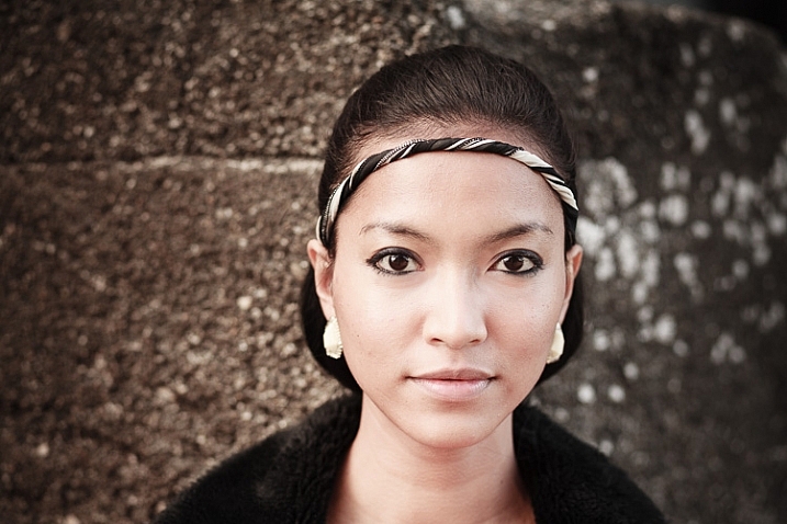
A portrait becomes much more engaging when the subject seems like they are at a more natural eye level. Concerning portraits, this may actually be one of the more important tips to crop your photos.

Cropping too tightly on the subject will
create a close-up shot that seems unnatural and even uncomfortable to look at. Keep
things in proportion by allowing the subject’s eyes to stay at a more natural
level in the frame.

Additionally, your subject will seem to want a little breathing room. When cropping at eye level, make sure that you are giving the frame enough space so that their gaze doesn’t seem interrupted by the edge of the frame.

 Tips-To-Crop-Your-Photos
f/3.5 – ISO 100 – 1/100 sec

4. Centering the subject is not a requirement

Just like you’re trying to tell the entire story by keeping important elements within the frame, that might also play into your composition as well. Apply the rule of thirds (or other compositional rules) to help you determine where your subject should rest within the frame. This will help you lay out other elements in frame as well, making sure that you don’t accidentally cut something out or when you don’t realize that you have centered your subject.

In fact, when cropping appropriately, you can even fix any composition problems that you might not have considered when snapping the image in the first place.

 Tips-To-Crop-Your-Photos
Using the rule of thirds, you can ensure you crop your images better.

5. Try to avoid cropping limbs

While it may be a good idea to crop out part of your subject, try to avoid cutting off the limb of your subject. Cropping limbs creates an eerie effect and shows that you hadn’t considered your framing when taking the shot. Similarly, you wouldn’t want to cut off any piece of your subject that doesn’t make sense, like half of their ear or the tip of their nose.

6. Crop out the errors

You might think that a true photo would include leaving the image as it stands, mistakes and all. However, cropping properly can mean that you cut off portions of an image that distract from the subject or are just simply wrong.

For example, maybe you have accidentally captured your camera strap in your shot. Would you really want to leave that in?

So one of the best tips to crop your photos is to remove anything that wasn’t your intention to include. Of course, ideally, you should spot these errors when taking the photo, but if you didn’t, and you can crop to correct, then you should.

Havana Cuba
f/8 – ISO 100 – 1/250 sec

7. Crop consistently

If you’re shooting a series of portraits, landscapes, or anything else of the same subject, then it’s important that you crop all of the photos in the series consistently. The series is supposed to be a coherent, consistent set of photos aesthetically, which means the composition and cropping should all work together as a set.

Without uniformity, when the photos are looked at in a group, if they are not composed and cropped consistently, then it is going to have a jarring effect. For scenario shots, like a landscape, keep the rule of thirds of the Golden Triangle rule in mind as well to help with consistency.

 Tips-To-Crop-Your-Photos

8. Cropping doesn’t always have to be right-angles

The majority of the time, cropping will involve right-angles to give you square and rectangle shapes. However, there is no hard rule that says this is the way it has to be. To wrap up these tips to crop your photos, you can also be creative and crop an image as an oval, hexagon, or any other shape that may lend itself better to the image.

Depending on the subject, the composition, and how you want your final image to look, cropping in various other shapes than right-angles may look intriguing.

Conclusion

Sometimes the difference between a good photo and a great photo comes down to the way you crop it. The great thing about digital photography is you can adjust photos without fear because you can always return to the original by using software like Lightroom. So experiment with your cropping, and you may see a big improvement in your photography. Also, share your before and after results in the comments section!

The post 8 Vital Tips To Crop Your Photos For Stronger Compositions appeared first on Digital Photography School. It was authored by Kav Dadfar.


Digital Photography School

 
Comments Off on 8 Vital Tips To Crop Your Photos For Stronger Compositions

Posted in Photography


4 Key Elements to Help You Create Stronger Landscape Photography

08 Aug

If you’re like me and love great landscape photography, then you’ve probably wondered how the same photographers seem to be able to pull off beautiful shots of sweeping mountain vistas or incredible black and white images of rolling hills and valleys. It’s as if they have some secret formula for “getting lucky” time and time again. Have you ever thought about what goes into making a strong landscape photograph? The techniques, the composition, the timing, the tools?

4 Key Elements to Help You Create Stronger Landscape Photography

The fact is, there is no secret formula for making better photos of landscapes. There’s almost always much more that goes into the task than simply snapping a picture of a pretty place. Most great landscape photos are made in beautiful places but that doesn’t mean that every picture of beautiful scenery is a great landscape. While there are no concrete “rules” for doing solid landscape photography there are a few ways to strengthen your landscape work and make those “awesome shots” happen more frequently.

#1 – Construct Interesting Elements

I once had a professor of photography tell me that any photograph could be judged by how much information it contained. It’s easy to say that a successful landscape photo shows the beauty and majesty of a place, but the truth is there is so much more. When setting up for your photo, pay attention to everything that falls within the frame. Look for interesting foreground elements such as trees or rocks, water, even people or animals.

4 Key Elements to Help You Create Stronger Landscape Photography

Look for ways to add more information to the photograph. Generally, the more you fill the frame with interesting elements the more interesting and appealing the overall photograph will be. But there is also a flip side to this concept as sometimes less is more. There are times when you must know what to NOT include in order to give a better feel to the photo. Look at this photo from a blustery winter morning.

4 Key Elements to Help You Create Stronger Landscape Photography

The feelings of solitude and isolation are brought about by the use of empty space. More on composing your landscape photos a little later.

#2 – Lighting

Yes, yes…I’m sure you’ve heard the phrase “chasing the light” when it comes to making good photos. This is especially true when it comes to landscape photography. There’s a reason why photographers love to shoot in the early morning hours (ugh) or in the waning light of the afternoon or late evening.

4 Key Elements to Help You Create Stronger Landscape Photography

It comes down to the quality of light which again, adds more interest to a landscape. When you have beautiful light, the entire landscape is transformed into something different. It becomes less ordinary and more extraordinary.

4 Key Elements to Help You Create Stronger Landscape Photography

As much as it pains me, getting up early and staying out late is virtually a necessity for landscape photographers. The reason being is that some of the most gorgeous golden light comes in the late afternoon as the sun gives way to night. Just as true, the early morning “Blue Hour” as the first glimpses light begin to appear, is another prime time for shooting landscapes.

Even locations that seem somewhat lackluster at midday can take on an entirely new feel in the late or early hours of the day. So be sure to try out different spots at daybreak and sundown. There’s a good reason why we landscape junkies really do chase the light.

#3 – Composition

The very word “composition” describes the nature of how something’s parts are constructed or arranged together. Having all the best ingredients doesn’t help you much if you don’t know how to put them all together into an awesome cake, a beautiful symphony, or in your case…a strong landscape photograph. The way you compose the elements in your landscapes can often make or break the photograph. Again, there are no actual rules to composing your photo but there are some tried and true practices.

4 Key Elements to Help You Create Stronger Landscape Photography

Adjust the horizon so that it isn’t exactly in the middle of the frame and place foreground or background elements off-center to add interest and make stronger images.

4 Key Elements to Help You Create Stronger Landscape Photography

It helps to use imaginary lines such as the Rule of Thirds (again, not exactly a rule) to help compose your image.

4 Key Elements to Help You Create Stronger Landscape Photography

Just as importantly, always remember to shoot your landscapes in accordance with how they “feel”. Composition in landscape photography is about conveying a feeling, not just how the scene looks. Shoot different compositions of the same location until you find one that works best for that particular landscape.

#4 – Gear and Technical Considerations

While a successful landscape photo doesn’t rely on having the latest or greatest gear, there are a few gear and technical aspects that make for better photos. Here are a few tips.

Use a wider lens

Even though many solid landscape photos can be shot at long focal lengths using zoom lenses, generally short focal length (wider angle) lenses work best. Wide angle lenses allow you to include more into the frame of your photo.

4 Key Elements to Help You Create Stronger Landscape Photography

Use smaller apertures

Continuing on from lenses, using a smaller aperture increases the depth of field and brings more elements into focus. Remember, the larger the F-Number the smaller the physical aperture of the lens becomes.

….and wait for it…..

Use a tripod

If you’ve read any of my other articles, you’ll know that when it comes to landscape photography I believe a sturdy tripod is worth its weight in gold. Reducing motion as much as possible is key for obtaining sharper landscape photographs. Using a tripod helps to eliminate as much camera shake as possible. This becomes important because generally the smaller apertures used in landscape photography call for longer shutter speeds which make hand holding the camera less desirable.

Final Thoughts

A successful landscape photo is a careful construction of multiple ingredients. Knowing what to include (or exclude from your photo) and understanding when the best light happens, go a long way to making a better image.

4 Key Elements to Help You Create Stronger Landscape Photography

Just as importantly, knowledge of how to compose the elements in the frame and what techniques or gear will be needed are both essential to “getting lucky” time and time again. Producing stronger landscapes takes patience and a little planning but it is well worth the effort.

The post 4 Key Elements to Help You Create Stronger Landscape Photography by Adam Welch appeared first on Digital Photography School.


Digital Photography School

 
Comments Off on 4 Key Elements to Help You Create Stronger Landscape Photography

Posted in Photography


How to Create Stronger Photos by Working the Subject

07 Nov

One way to create better compositions, and thus stronger images, is to do something called working the subject. Generally speaking, there are two ways to approach taking photos. Let’s take a look at both, and how you can learn to work the subject to improve your photography.

The first is to take as many photos as you can, in the hope that some of them turn out well. This is called machine-gunning, or spray and pray. It’s easier to do with digital cameras than it ever was with film cameras, as you are no longer limited by the number of frames on a roll of film.

Working the subject

Incidentally, this is one of the reasons often cited as a benefit of using film cameras. Knowing that every time you press the shutter button it adds to the cost of the shoot (processing plus film) is a good incentive to be more intentional and think carefully before you take a photo.

The second way is to take plenty of photos, but in a way that is more purposeful. The idea is to think about what you are doing and spend your time exploring the possibilities and potential of the subject. This is called working the subject.

Try new photography techniques

The dividing line between the two methods is sometimes a thin one. An example of this may be when you are trying a new technique, such as panning. Panning is a bit of a hit and miss technique. If you’ve chosen a good subject you should create some interesting photos, but you’re also going to get a lot of misses along the way.

The difference in this situation is that the photographer who is working the subject looks at the photos they have taken already, evaluates what works and what doesn’t, and adjusts their techniques and camera settings accordingly.

Another way of looking at it is that they are using the earlier photos as stepping stones to get to the more interesting images. A photographer who is machine-gunning, on the other hand, doesn’t think a lot about what they are doing and relies on serendipity rather than their own skill.

This is where the instant feedback of digital cameras is a useful tool for learning and improving.

Panning in Spain

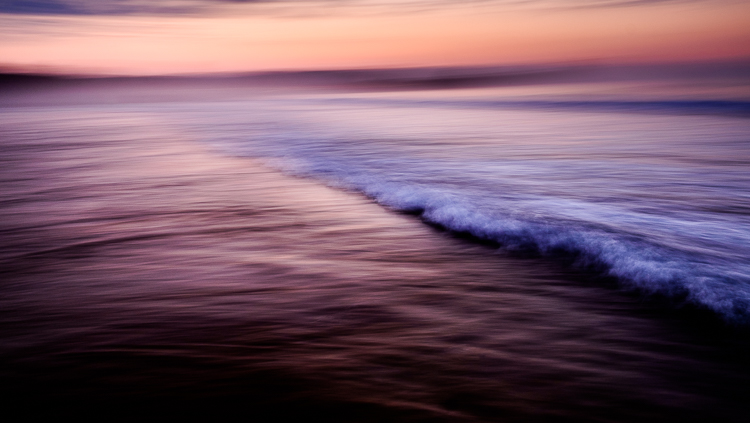
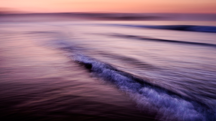
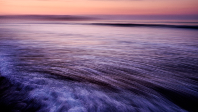
Let me illustrate the point with some photos I made in Spain. I stood in the sea at sunset and panned with my camera as the waves came by. I took a lot of photos, and these are some of my favorites.

working-subject-1

Working the subject

Working the subject

These images were created by working the subject. Doing so helped me figure out where to stand, what angle to use, how slowly to pan the camera, and the best shutter speed to use.

Photographing an old car

Working the subject doesn’t necessarily mean that you take lots of photos. Let me give you an example.

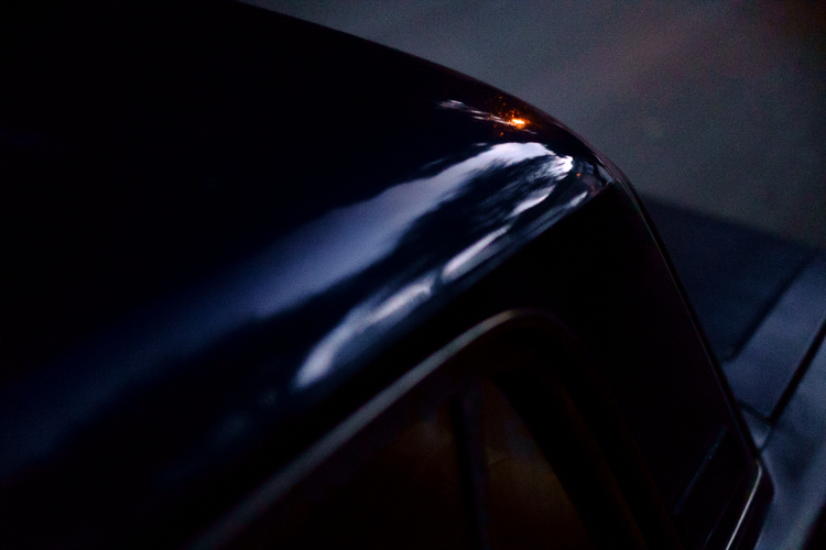
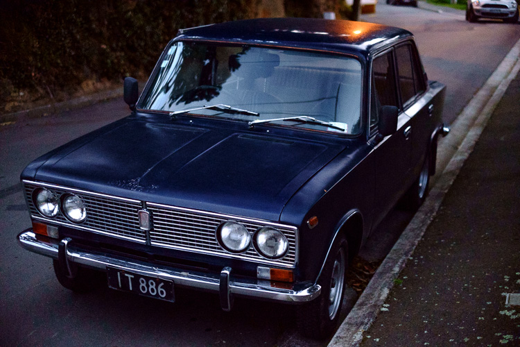
I bought a Fuji X-Pro 1 camera a couple of years ago and took it out one evening at dusk with the intention of shooting at high ISO in low light to see how it performed (the answer – very well). As I was walking around my local neighborhood I noticed an interesting car parked on the street. Intrigued (and wondering how a Lada ended up in New Zealand) I took this photo.

Working the subject

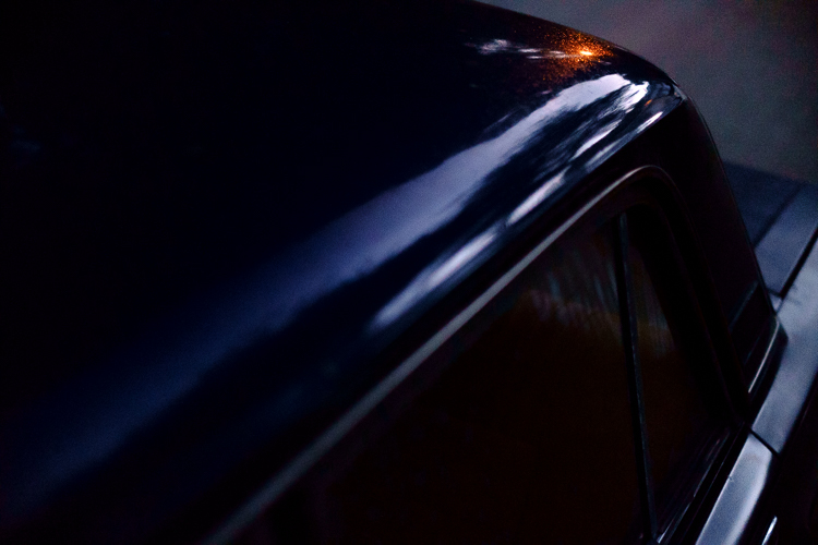
It’s nothing special, but I knew there was a better picture there. I kept looking and realized that what had really caught my eye was the way the light from the street lamp reflected off the roof of the car. So, I moved in closer and created the following images. They all contain the reflection of the street lamp and just part of the car rather than all of it.
Working the subject

Working the subject

Working the subject

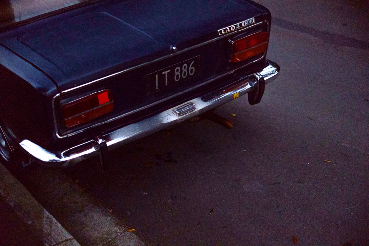
Then I took another photo of the rear of the car.

Working the subject

Analysis of the shoot

I only made five photos, but I was still working the subject. When I break it down and think about what happened the process went something like this.

  1. I saw something interesting and took a photo. That was just my first impression. My gut feeling told me that there was a better photo to be had.
  2. I looked closely until I realized that the real subject, the thing that really interested me, was the way the street light was reflected in the car’s paintwork. So, I moved in close and made several photos that showed that.
  3. Lastly, I moved away from the car and took another photo, which was okay but not as good as the others. I understood that I had gotten what I wanted and decided to move on to look for another subject.

The last point is crucial because one of the differences between working the subject and machine-gunning is that the photographer who is working the subject knows when to stop.

Working the subject in China

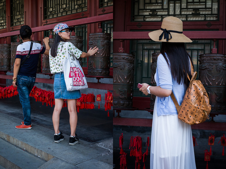
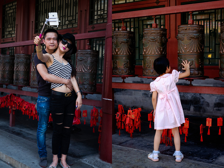
Here’s another set of images taken in Beijing. We were visiting a historic site called Prince Gong’s Mansion, made up of a series of interconnected buildings, courtyards, and gardens.

One of the courtyards contained some Tibetan style prayer wheels. I noticed that as people walked into the courtyard most of them passed by the prayer wheels, turning them as they went. I stood nearby and took some candid portraits of people doing so.

Working the subject

Of course, some of the photos are better than others, and I’m going to show you some of my favorites below. But there were also many times that I looked at the scene through the viewfinder and it wasn’t quite right, so I didn’t press the shutter.

One benefit of this method is that you don’t have as many photos to sort through and edit afterward. But it also shows discipline and an awareness of the subject. A machine-gunning photographer would take photos of everyone, without thinking about it much.

The photographer who is working the subject, and being more purposeful, is thinking about how to make each photo better than the one before. They may also be thinking about how the images are going to work together, or whether they should use a different technique, a different lens, or find a different point of view to add variety to the sequence of photos.

Working the subject

Conclusion

One of the key steps involved in learning to be a better and more creative photographer is knowing when to work the subject rather than machine-gun, and become more purposeful and intentional in your approach to making photos.

Can you think of any other examples of when working the subject can help you to create better images? Please let us know in the comments below.


Mastering Composition

If you’d like to learn more about composition then please check out my ebook Mastering Composition: A Photographer’s Guide to Seeing.

googletag.cmd.push(function() {
tablet_slots.push( googletag.defineSlot( “/1005424/_dPSv4_tab-all-article-bottom_(300×250)”, [300, 250], “pb-ad-78623” ).addService( googletag.pubads() ) ); } );

googletag.cmd.push(function() {
mobile_slots.push( googletag.defineSlot( “/1005424/_dPSv4_mob-all-article-bottom_(300×250)”, [300, 250], “pb-ad-78158” ).addService( googletag.pubads() ) ); } );

The post How to Create Stronger Photos by Working the Subject by Andrew S. Gibson appeared first on Digital Photography School.


Digital Photography School

 
Comments Off on How to Create Stronger Photos by Working the Subject

Posted in Photography


How to Cull Your Images to Tell a Stronger Story in Your Blog or Social Media Posts

13 Sep

I have this photographer friend. This person is wildly talented, with impeccable images and an amazing eye. I love seeing what she is going to create next until she puts up a blog post. So let’s talk about how and why to cull your images.

These posts are usually a long, meandering wander through her shoots, with no thought to tell a story. Images that you swear are repeats – until you look closely and realize the model’s left pinky finger has maybe moved ever so slightly. Blurry shots that should have been culled in the first round. It boggles my dang mind to look at these posts because we as photographers should know better.

Cull-Images-top


You are better served to share your images in a way that compels viewers to keep coming back for more. While I may not be a pro-level blogger, I still think it’s an excellent way to share your images, and there are a few tricks that I always try to keep in mind as I’m putting together a blog post.

Step 1: Be Brutal

Think about this from the viewer’s perspective. They weren’t at the shoot. So how can you tell them the story in a concise way that shows off your best work? To do this, you have to be brutal. Cull like a maniac, and then cull some more.

Does it hurt to eliminate images that you love from the narrative of your post? Yep, it’s like choosing your favorite child, but you gotta shrink down the number of images you share. You must. Beyond the obvious culling— things like strange facial expressions, awkward hands, etc., there are so many photographers who feel they need to share each and every image that they love. Unfortunately, this is a good way to head straight to Boring Postville.

Do not share the same scene, and the same pose five times in a row! The viewer’s eye will get bored and start to skip over. Your goal is for each new image to draw the eye, and surprise the viewer in some way. If the images start blurring together, the surprise element is gone and you’ve lost their interest. Be brutal in editing: your posts will thank you.

culling (2 of 2)

culling (1 of 2)

Lovely people, lovely images, but they’re so much alike and it’s killing me softly. These do not both need to be in a post together.

Step 2: Change Your Perspective

If you were an invisible spy at the photo shoot, how would you absorb all the information of the day? You’d start far away and move in closer. Too many posts start with the super-tight ring shot, or the close up of the hand on the face, and the viewer is left wondering subconsciously, “How did we get here?”

So aim to tell your story from the perspective of someone who was peeking over your shoulder. A great example is a wedding day. You don’t start a wedding day with the big dramatic first kiss, right? Set your scene. Show the viewer your location. Introduce them to the setup, then move in close to get the detail shots. It’s a much closer proximation to the reality of the day, and it helps our brains understand what’s going on when we’re viewing it on a computer after the fact.

Start broad.

Start broad.

Then move in for more detail...

Then move in for more detail…

... and then even more detail.

… and then, even more detail.

From there, remember to include varying visual perspectives. If you’ve already shared a couple’s full-body portraits, don’t overdo it with the same angle. Move into a closeup of their faces, or a detail of their outfits. Or share a different detail from the day altogether. But for the love of Richard Avedon, please don’t share a dozen nearly-identical photos! Find a new perspective, and make it memorable.

culling (4 of 1)

Far away!

culling (3 of 1)

Close up! And it’s unique enough of a perspective, that including this shot rounds out the story of the previous one.

Step 3: Tell the Truth – Kind of

My favorite Emily Dickenson line is, “tell all the truth but tell it slant.” This is advice straight from a poet to a photographer, so use it wisely. Friends, there is no grand blog court that has ruled that you must share every image, from every scene, in every shoot. YOU are the artist, and YOU get to decide how you’re going to tell the truth! Let’s not squander that freedom! You’re an artist, and you can unfold a story in the most artistic way you deem worthy. Here’s what you do NOT have to do:

  • Share images in the precise order you shot them.
  • Share images from the scenes or poses that you wanted to try but didn’t quite work (and hey, good job trying new stuff!).
  • Share images the client asked you to take that don’t totally represent your vision or your brand.
  • Share images that don’t progress the story you want to tell.

The science of photography is that you always get to tell the truth. The art of photography is that you can tell it slant. Play that line because you can.

culling (5 of 1)

Step 4: Stay in the Flow

So, now that you’ve culled only the very best of your images, laid them out in a compelling story, shared your artistic skill with the world, and put together a bomb post, make sure the little details aren’t subtly throwing shade onto your creation.

Step away from your computer, go for a walk, have a glass of wine, do you… and then come back to review what you’ve written, shared, and how it all comes together. Try to have fresh eyes.

Is anything too repetitive? Do your shots flow together? Do your black and white images land in places throughout the post that make sense? If you include captions, do they add or detract from the overall effect of your story? These little details can take a post from good to truly excellent, so make sure you give your post another look before you click “Publish.”

culling (6 of 1)

What are your tips for culling photos for a great social media or blog post? What are your big no noes? I’d love to hear them.

googletag.cmd.push(function() {
tablet_slots.push( googletag.defineSlot( “/1005424/_dPSv4_tab-all-article-bottom_(300×250)”, [300, 250], “pb-ad-78623” ).addService( googletag.pubads() ) ); } );

googletag.cmd.push(function() {
mobile_slots.push( googletag.defineSlot( “/1005424/_dPSv4_mob-all-article-bottom_(300×250)”, [300, 250], “pb-ad-78158” ).addService( googletag.pubads() ) ); } );

The post How to Cull Your Images to Tell a Stronger Story in Your Blog or Social Media Posts by Laura Sullivan appeared first on Digital Photography School.


Digital Photography School

 
Comments Off on How to Cull Your Images to Tell a Stronger Story in Your Blog or Social Media Posts

Posted in Photography


Stronger than Concrete: New Glass Bricks Support Dutch Facade

22 Apr

[ By WebUrbanist in Architecture & Offices & Commercial. ]

glass brick facade

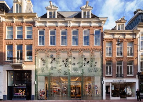
A new type of see-through glass brick used in this Dutch building facade aims to bridge traditional brick with transparency; the assembled bricks have been tested and shown to be as strong as concrete, able to support heavy loads in compression like its opaque competitor.

glass brick assembly

Architecture firm MVRDV applied this new technology to the front of a Chanel shop in Amsterdam that was damaged behind repair, allowing for a see-through storefront that still references local historic brick while using fully-recyclable glass.

glass brick detail

The bricks themselves are held in place with likewise see-through glue and help support the remaining terracotta brickwork on the floor above into which they visually transition. The structurally-sound result stands out against the street, but also lets additional light into the interior of the building.

glass brick details

glass brick in context

This new approach to brick can help mediate between the desire for solidity and openness, providing a cheap alternative to both masonry and glass construction traditions. The construction process was as much a laboratory experiment as an architectural process, involving teams from around the world in different disciplines.

glass brick view

Researchers from Delft University of Technology, engineers at ABT and contractors at Wessels Zeist joined forces to develop and test structural solutions and fabrication techniques, ultimately leading to the development of this new type of brick. The bricks were then cast by a glass company Venice and joined using glue from Delo Industrial Adhesives in Germany. (Photos by Daria Scagliola and Stijn Brakkee).

Share on Facebook


[ By WebUrbanist in Architecture & Offices & Commercial. ]

[ WebUrbanist | Archives | Galleries | Privacy | TOS ]


WebUrbanist

 
Comments Off on Stronger than Concrete: New Glass Bricks Support Dutch Facade

Posted in Creativity


How to Take Control of Aperture and Create Stronger Photos

14 Nov

aperture and composition

The focal length of the lens you use, combined with the aperture setting, determines how the camera sees whatever you point it at. This has profound implications for composition. Let’s look at them one by one.

Selective focus and bokeh

Selective focus occurs when you focus on your subject, and use a wide aperture to make the background go out of focus. Bokeh is the blurred parts of your photo. It originates from the Japanese word boke, and has come into use because we don’t have a word in English for it.

aperture and composition

This photo shows both selective focus and bokeh. I focused on the model’s eyes, and selected an aperture of f/1.4, to blur the background as much as possible.

There are several factors that affect bokeh.

1. Aperture

The wider the aperture, the less depth-of-field there is, and the more bokeh you get. Photographers that like to use selective focus buy prime lenses, as they have often wider maximum aperture settings than zooms.

But, you can still obtain nice bokeh with zooms, if you pay attention to the following points.

2. Camera to subject distance

The closer you are to the subject the less depth-of-field there is. This is a useful tip if you have a zoom lens with a limited maximum aperture (such as an 18-55mm f/3.5-5.6 kit lens). Just set the focal length to longest available setting, the aperture to its widest setting, and move in as close as you can. You’ll be surprised by what you can achieve.

aperture and composition

This photo was taken with an 18-55mm kit lens set to 55mm and f/5.6, the widest available aperture at that focal length. It’s not nearly as close to how little depth-of-field there would be if I had used an 50mm prime lens at f/1.4 – but it’s still enough to blur the background.

3. Subject to background distance

The more distance there is between subject and background, the more out of focus the background will get, at any given aperture setting.

4. Quality of light

Light affects bokeh. Soft light (like that on an overcast day) produces smooth, even bokeh. Sunlight or reflections, create a different type of bokeh with more texture.

aperture and composition

I took this photo on an overcast day. The bokeh is very smooth.

aperture and composition

I took this photo in the early evening. The artificial lights reflecting from the shiny objects in the background have created a different type of bokeh.

5. The aperture blades of the lens

The more blades the lens has, the rounder the shape of the aperture, and the smoother the quality of the bokeh. Less expensive lenses tend to have fewer aperture blades, and may not produce the same quality of bokeh as better ones.

6. Other optical characteristics of the lens

Some lenses, such as the Helios 58mm f/2 lens, used to take the photo below, have optical characteristics (or more likely, flaws) that produce a certain type of bokeh. Lensbaby is a company that makes lenses that produce a specific type of bokeh.

Aperture and composition

f/2.8 on a prime lens

I’ve singled this aperture setting out because it hits a sweet spot when it comes to composition, especially for portraits.

If you have a normal or short telephoto prime lens, and use the widest aperture setting (generally f/1.2, f/1.4 or f/1.8) then the depth-of-field is very narrow indeed. Sometimes that works really well, but other times you need a little more depth-of-field to create a stronger image. It’s like any technique – overuse it and it becomes a gimmick.

The solution is to mix it up a little by using aperture settings like f/2, f/2.8, and f/4. You’ll still get a narrow depth-of-field and create some beautiful bokeh, but a little more of your subject will be in focus.

Using f/2.8 (or thereabouts) shows subtlety, restraint, and maturity.

aperture and composition

I took this photo with an 85mm lens (full-frame) at f/2.8. The depth-of-field is still shallow enough to blur the background nicely.

The middle apertures

Now we get into the middling apertures, those from around f/4 or f/5.6, to f/8, depending on your lens.

The effect of these apertures depends on the focal length of your lens and how close you are to your subject. For example, you could use a super telephoto lens (300mm plus) and shoot from farther away from your subject to create images with shallow depth-of-field at f/5.6, or get the entire scene in focus at the same aperture with a wide-angle lens (35mm and less) if you focus on the right spot and are much closer to your subject.

These middle apertures represent the transition between photos where some of the image is out of focus, to those where everything is in focus.

You can still use selective focus at these apertures (although perhaps not with wide-angles), although the effect is much gentler than with the widest aperture settings of your lens. Use these apertures when you want good depth-of-field but don’t mind if the background is out of focus a little.

aperture and composition

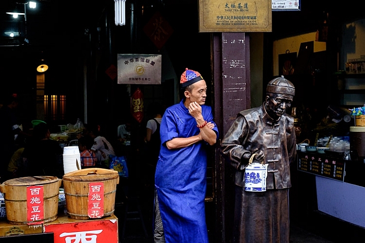
I used an aperture of f/4.5 for this photo. The depth-of-field is sufficient to get the man, the statue, and the wooden baskets in focus. The background is unimportant and doesn’t need to be in focus.

The smaller apertures

These are the ones you use when you need everything within the frame to be sharp, like with landscape photography. This can be anything from f/8 on a wide-angle lens, to f/11 or f/16 on longer focal lengths. With telephotos and macro lenses you can stop down to f/16 and still not get everything in focus.

The thing you need to be aware of here is diffraction. When the aperture gets too small, the light passing through it spreads out, and softens the image. Thanks to diffraction, images taken at f/22 are usually visibly softer overall, than those taken at f/8 or f/11. Noticeable diffraction may start at f/16 or f/22 on a full-frame camera, and around f/11 on an APS-C camera.

aperture and composition

An aperture of f/11 ensured everything in this photo, taken with a 14mm lens (APS-C), was in focus.

Take control

Every time you take a photo you should be thinking about what the optimum aperture is for the composition you want to make. Do you want to open the aperture and throw the background out of focus? Do you want to stop down and get as much as possible in focus? Or somewhere in between?

What aperture settings do you like to use with your photos? Do you use a Lensbaby or other lens that gives a certain bokeh effect? Please let us know in the comments – I’d love to hear your thoughts and see your images.

This week on dPS we’re featuring a series of articles about composition. Many different elements and ways to compose images for more impact. Check out the ones we’ve done so far:

  • Using Framing for More Effective Compositions
  • 7 Tips to Improve Your Skyline Photos
  • 33 Images that Exemplify Compositional Elements
  • Weekly Photography Challenge – Composition Craziness

Mastering Composition ebookMastering Composition

My new ebook Mastering Composition will help you learn to see and compose photos better. It takes you on a journey beyond the rule of thirds, exploring the principles of composition you need to understand in order to make beautiful imag

googletag.cmd.push(function() {
tablet_slots.push( googletag.defineSlot( “/1005424/_dPSv4_tab-all-article-bottom_(300×250)”, [300, 250], “pb-ad-78623” ).addService( googletag.pubads() ) ); } );

googletag.cmd.push(function() {
mobile_slots.push( googletag.defineSlot( “/1005424/_dPSv4_mob-all-article-bottom_(300×250)”, [300, 250], “pb-ad-78158” ).addService( googletag.pubads() ) ); } );

The post How to Take Control of Aperture and Create Stronger Photos by Andrew S. Gibson appeared first on Digital Photography School.


Digital Photography School

 
Comments Off on How to Take Control of Aperture and Create Stronger Photos

Posted in Photography


Hoya HD3 lens filters claim to be 4x stronger than optical glass

27 Aug

Kenko Tokina USA recently announced the Hoya HD3 series UV and Circular Polarizer lens filters. According to the company, the filters are 4 times stronger than optical glass, and offer a 99.7 percent light transmission rate. Read more

Articles: Digital Photography Review (dpreview.com)

 
Comments Off on Hoya HD3 lens filters claim to be 4x stronger than optical glass

Posted in Uncategorized


Gitzo updates Traveler range with stronger legs and new locks

19 Aug

Premium tripod manufacturer Gitzo has released updates to its well-known Traveler range of carbon fiber tripods. The company has introduced its Carbon eXact carbon fiber tubing to the range, which it claims makes the legs stronger. Read more

Articles: Digital Photography Review (dpreview.com)

 
Comments Off on Gitzo updates Traveler range with stronger legs and new locks

Posted in Uncategorized


How to Make Stronger Photographs Through the Process of Visual Design

18 Jun

Sails 600

Photography is an art that relies on light. It also relies heavily on the visual message. You have no way of communicating anything to your viewer except through the visual language you use. If you use strong visual elements, your images will be effective and people will stop and look. If you want to convey a message, use the most powerful visual imagery you can: color to enhance your scene, light to punctuate it, and use shapes and texture to fill in the details. Doing this will not only be more satisfying for you as a photographer, but will make your visual language stronger and your message more compelling.

It is right to assume that photography is about being able to see a scene, and then photograph it. I am going to challenge that assumption, and say that there is something vastly more important that comes after you “see” the scene, and before you photograph it. Most often, the next step is called composition.

Loosely defined, composition speaks about how the image is put together, what the components are in the scene, and how they work together. Very often, the first thing that we think of when we hear composition is, you guessed it, the Rule of Thirds. I truly believe that the Rule of Thirds is a good place to start, but it is by no means the only compositional tool. In fact, some of the most iconic images of our time have broken this very rule. So, the next step after you have decided on a scene is not to just snap away. Put some serious thought into how you will visually design your image, and then capture that scene photographically. After that, grab the camera!

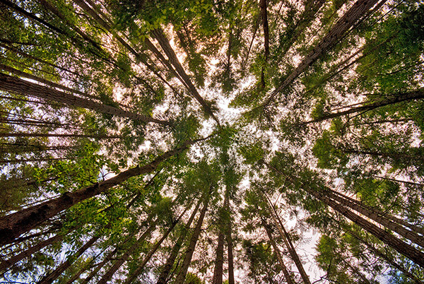
Forest-Canopy-600b

What is visual design?

Visual design sounds like a fancy word for composition, but in reality it takes composition to the next level. It is not simply about making sure everything is aligned on a grid à la the Rule of Thirds. Rather, it is about working with the flow and dynamic elements in your scene. In this article I will discuss the nuances and tools you can use to improve your composition to get the most out of any scene.

There have been many times when I have looked at a photograph and I could almost feel the wind in the scene or smell the salty sea air. The photographer captured the image in such a way that when I looked at the scene, it evoked my memory of similar scenes I had witnessed in real life. At a very high level, people relate to images in a few different ways.

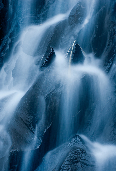
Waterfall 600Photographs evoke emotions, memories or feelings based on what the person sees in the image. In many ways, the viewer’s perception is their reality. So, if the image is of a loved one, the person looking at the photograph will immediately be transported to a memory of that person, good or bad. That memory could cause them to be quite emotional. The reaction to the image could be utterly visceral depending on what emotion is recalled. The same is true in a landscape scene or a seascape scene. The goal of every photographer should be to visually translate the scene in such a way that the viewer can either relate to the scene or would like to be in that scene.
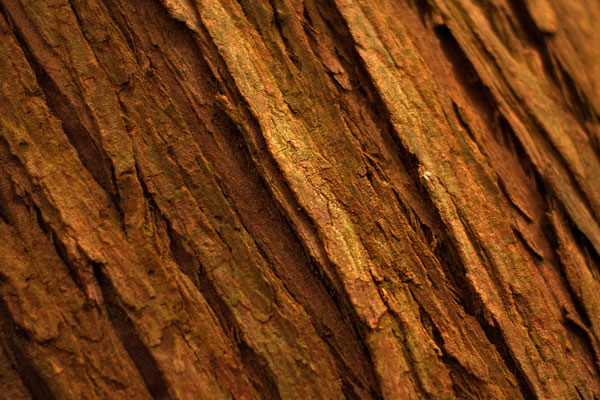
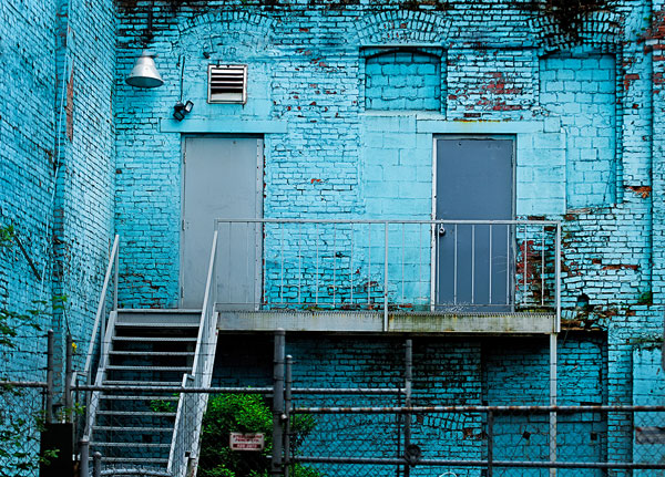
The goal here is to change your perception on composition, to help you break out of the mental constraints of the Rule of Thirds, and open up new pathways to explore in photographic visual design. Don’t get me wrong, I am not suggesting that the Rule of Thirds is bad; it is still a very relevant and useful tool. All I am saying is that it should not be your only tool.

What do we have to work with?

Light, color, and shape all play an integral role in visual design. Using these tools is a good start; however, now we will discuss some details about making more powerful visual design choices. The idea here is to move your images from good to spectacular. The new elements we will be talking about are:

  • Form
  • Color and color relationships
  • Texture
  • Unity
  • Coherence
  • Balance and rhythm
  • Space (positive and negative)

Form and texture

Form is similar to shape, but in this context I am referring to form in a more three-dimensional sense. Form is enhanced when there is side light to emphasize the shape of the object in the image. When the sun lights a rounded, polished rock from one side, the rounded form of the rock is emphasized. This gives the viewer some critical information about the object. Side light also emphasizes texture and that too is a key piece of information. With side lighting, you can emphasize the object’s shape and form to the point that the viewer can almost “feel” the three-dimensional aspects of the image. This is a really strong way to communicate visually.

009

At a higher level, when you want to communicate form and texture, side lighting is your best friend; soft side lighting is even better. The important idea to remember here is that side lighting adds dimensionality to your image. Try this on your next photo shoot: take a look where the sun is and take a photo of the subject with the sun over your shoulder. Then move to the side of the subject and take another shot. The difference will astound you. If you do this in the soft glow of sunrise or sunset, your results will be that much better.

Using color in your design

We all know how important color is. Think of your favourite image in color, then strip that color out and somehow it is not necessarily as impactful. That’s not to diminish the fact that black and white photography can be equally impressive – it absolutely is, however, to keep this article in context, we’ll leave black and white for a future article.

004

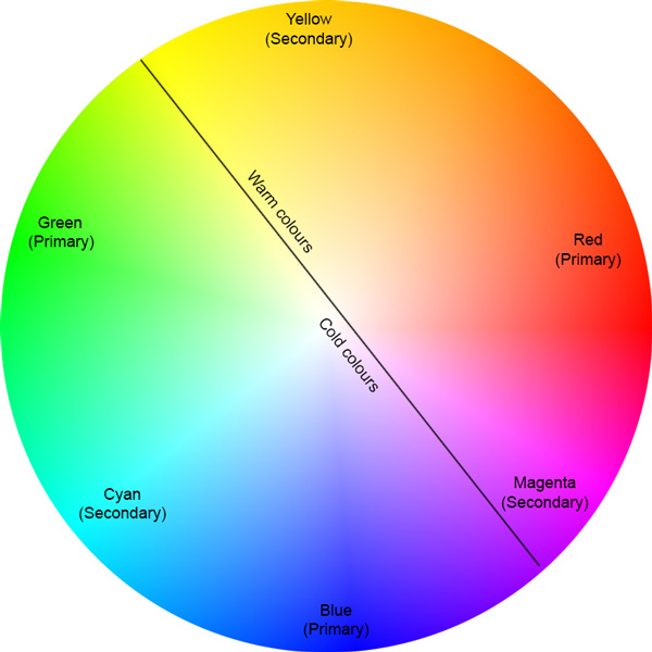
color gives the viewer crucial information about the scene. The warm colors of a fiery sunset or the cold blues of a glacier convey critical information about the scene. The overall color in your scene can determine how the viewer interprets it, so be purposeful with your use of color. If you want to convey warmth, choose reds, oranges, and yellows for your scene. If you want to convey cold, use blues, grays, and greens in your scene. You can see which colors are warm and which colors are cold if you look at the visual color wheel.

Colour Wheel

Certain colors draw the viewers’ eyes into the scene. Reds and yellows in particular cause the viewer to look at those colors (it’s not arbitrary that emergency vehicles are painted red and yellow warm colours,as they demand your attention). Be careful when you see anything that is red or yellow in your scene. It can either add value to the scene, if it is the subject of your image, or it could be distracting if it is not the subject of your image (in the background).

Rgb cmy

Let’s talk about color theory briefly. This is by no means an exhaustive guide to color theory, rather a quick introduction into it. Your camera can “see” three colors: Red, Green and Blue (RGB). These three colors are the primary colors in the visual color wheel (different to the color wheel used when painting). There are secondary colors too, namely, Cyan, Magenta and Yellow. These six colors and their combinations make up the visual color wheel. The hue (color) and saturation (richness or intensity) of all of these colors give us multitudes of combinations of colors. Understanding this aspect color theory will help you make better choices about color when photographing.

Using primary and secondary colors together makes your images compelling. So, looking at the color wheel, images that have red and yellow in the scene make very interesting photographs. Images with red and green in the scene work well too. The next time you look at a scene to photograph, try and look at what predominant colors are in the scene and try to photograph those colors only. This alone can make your images much more striking and visually interesting.

Take some time to practice intentionally composing your images using these techniques.

Ipad 005


The preceding article is a full-length excerpt from the CLARITY eBook series. Join other dPS readers today and dramatically improve your photography by learning the step-by-step process of visual storytelling and techniques for making stronger photographs. Get your CLARITY photography eBooks today!

The post How to Make Stronger Photographs Through the Process of Visual Design by Barry J Brady appeared first on Digital Photography School.


Digital Photography School

 
Comments Off on How to Make Stronger Photographs Through the Process of Visual Design

Posted in Photography


Women To Get A Stronger Image In Stock Photography

22 Feb

women-stock

The stock industry is about to change.

We’ve heard that before but this time the change, if it happens, will be positive, affect content rather than distribution and will give new opportunities to photographers to shoot not just more images but more interesting images.

The change is coming from Sheryl Sandberg. Facebook’s CEO has teamed up with Getty to promote a new collection of images that portray women in a more positive way. Instead of the usual clichéd stock images of women in suits, women holding babies and women laughing alone with salad, the collection will show girls on skateboards, women in the operating theatre and women planing wood. Even men get a look in with dads now shown wearing the bjorn.

The collection currently contains more than 2,500 images which will be returned alongside the usual results for relevant search terms. Buyers can also search the collection exclusively. Ten percent of the proceeds from the photos will go to LeanIn.org, Sandberg’s non-profit organization.

The aim, says Sandberg, is to change the way women and girls are portrayed in the media and to remove many of the old stereotypes that she believes hold women and girls back.

“When we see images of women and girls and men, they often fall into the stereotypes that we’re trying to overcome,” Sheryl Sandberg told The New York Times, “and you can’t be what you can’t see.”

The effect of the shift in imagery could be huge. The three most-searched keywords on Getty are “women”, “business” and “family” and yet buyers often complain they can’t find the images that portray those keywords in the way they want. Writing in The Cut last November, for example, Emily Shornick produced a slideshow of results for the keywords the publication typically needs to illustrate. “Girl power” and “feminist” returned women, often scantily clad, in boxing gloves and gripping dumbbells and power tools; “career women” stand on cliffs or climb symbolic ladders, hold folders and fall asleep on computers; a “businesswoman” is a multi-armed octopus who can hold a baby, a computer, a frying pan and an iron in her many hands. Despite the millions of images available on stock sites, few of the results produced the “feminine sass” the publication was hoping to find when it searched for “girl power.”

The aims of Getty’s new collection then are laudable. More images of women engineers and female coders in the media and in advertising can only be a good thing for encouraging girls to take up the sciences. They may even come as a relief to photographers looking for a shoot more creative than one that involves telling another model in a business suit to hold a laptop and smile.

Do Advertisers Want Strong Women?

The question, though, is whether buyers will go for these new portrayals. The Cut might be looking for sassy images of girl power but how representative is that magazine of buyers in general?

It’s possible, in fact, that despite the advances women have made in the workplace over the last few decades, art buyers have gone backwards.

In 1981, Lego’s famous ad showed a little girl holding a model made of colored bricks. That ad wasn’t just portraying the creativity that its product allowed children to enjoy. It was also suggesting that its bricks were for all children, boys and girls alike. Today’s toy marketing is much more gendered. Stores now are more likely to have pink shelves for girls and blue shelves for boys. In catalogs, girls brush princesses, pet puppies and play with dolls; boys build towers, push cars and experiment with chemistry sets.


toys-stock

That three-quarters of the more feminist images now included in Getty’s Lean In collection aren’t new suggests the company might indeed struggle to make sales. Those photos were drawn from Getty’s main collection where, presumably, they were passed over by buyers who chose instead to purchase images with traditional portrayals.

For photographers, that represents a dilemma. As keen as photographers might be to produce more positive depictions of girls and women, they have to shoot what sells not what they wish customers would buy (especially if that 10 percent donation to LeanIn.org is taken before Getty has calculated their royalties.) Restaurant owners might wish people would buy fruit juice instead of soda, but if people buy soda, they’ll continue to offer it. This wouldn’t be the first time that buyers have complained about the stereotyped nature of stock imagery even as they fill their shopping carts with it.

Getty Can Make The Market

The real strength of this initiative though is that Getty has thrown its weight behind it. The company doesn’t just supply images to a market. It also tries to influence that market. Each year, its research department issues reports on trends in the stock industry. That tells photographers what they might want to shoot if they want to increase their sales but it also tells buyers what they should be buying if they don’t want their ads to look old and out of date. Getty is influential enough to create trends as well as report on them. Current trends, the company says, include a preference for realistic body shapes and more shots of women at work.

Getty’s collaboration with Lean In is a positive move but photographers will need to be careful. It’s easy for Getty to promote a particular kind of image but if the sales of those new images fail to occur it will be the photographers who are left holding the bill for the shoots. Photographers who find that their traditional portrayals of happy salad eaters and boxing businesswomen make them profits shouldn’t have to risk their revenues to please buyers who are afraid to take risks themselves.

The best strategy will be to continue shooting images that you know can find buyers, keep an eye on the trends and the Lean In collection, and ease more positive portrayals into the shoots as you see those becoming popular.

If the stock industry is changing again, we’ll all need to manage that change carefully.


Photopreneur – Make Money Selling Your Photos

 
Comments Off on Women To Get A Stronger Image In Stock Photography

Posted in Equipment