RSS
 

Posts Tagged ‘Strange’

Video: Strange, amusing and bizarre camera commercials from the ’80s and ’90s

29 Mar

Editor’s note: There is a slight bit of profanity in this video, so if you’re in a work environment proceed with caution.


Canadian photographer and YouTuber Azriel Knight has published a humorous commentary video that features five old camera commercials from multiple manufacturers, giving the public a brief look at some of the marketing campaigns that hawked cameras to consumers in the 1980s and 1990s.

The advertisements include a high-energy 1991 Canon Rebel commercial featuring tennis professional Andre Agassi, a voyeuristic Japanese commercial for the Minolta X7, and a bizarre, somewhat psychedelic Nikon commercial advertising a point-and-shoot camera’s red eye correction feature.

Articles: Digital Photography Review (dpreview.com)

 
Comments Off on Video: Strange, amusing and bizarre camera commercials from the ’80s and ’90s

Posted in Uncategorized


DPReview TV: the Laowa 24mm F14 Probe may look strange, but it sure is fun

05 Aug

This week we take a look at one of the more unusual optics we’ve seen for quite a while. The Laowa 24mm F14 Macro Probe lens may look like something out of a science fiction movie, but as Chris and Jordan discover, it opens the door to some really interesting photo opportunities.

Be sure to subscribe to our YouTube channel to get new episodes of DPReview TV every week.

Articles: Digital Photography Review (dpreview.com)

 
Comments Off on DPReview TV: the Laowa 24mm F14 Probe may look strange, but it sure is fun

Posted in Uncategorized


This strange gadget literally shocks you into taking ‘better’ photos

21 Feb

A new project called Prosthetic Photographer involves a very real gadget designed to zap humans into taking better images. The system was created by artist and designer Peter Buczkowski, and it works with both DSLR and mirrorless cameras. Using artificial intelligence, the device constantly scans for ‘ideal’ scenes and uses mild electric shocks to force/train the photographer to capture them.

“The Prosthetic Photographer enables anybody to unwillingly take beautiful pictures,” Buczkowski explains on the project’s website. The gadget is a way for an AI to train a human, though the AI itself was first trained using a dataset containing 17,000 images, and those images were captured and rated by humans.

Using what it learned about quality photos, the Prosthetic Photographer AI identifies scenes worth capturing and trains the human behind the camera to recognize them. To do this, the AI triggers a small electric shock delivered through electrodes on the handgrip, which forces the photographer’s finger to press a button and capture said ideal scene.

As demonstrated in the video at the top of this post, users can adjust the shock strength using knobs on the back of the device. “This system is part of a new aesthetic, based on computer-generated decisions that were taught by previous human skill,” Buczkowski explains on his site. “The conscious skill of photography becomes obsolete this way.”

The resulting images feature the AI’s own aesthetic tastes, which are based on the images used to train the system. Of course, some of the scenes captured by the human who is being ‘trained’ are often… less than striking.

Articles: Digital Photography Review (dpreview.com)

 
Comments Off on This strange gadget literally shocks you into taking ‘better’ photos

Posted in Uncategorized


A strange shootout: $5,000 Zeiss Otus 28mm F1.4 vs $4,250 Leica Q

31 Jan

PhotoShelter founder and CEO Allen Murabayashi recently decided to pit two unlikely competitors against each other. In a short, unscientific comparison review, Murabayashi wanted to see how the $ 5,000 Zeiss Otus 28mm F1.4 lens stacked up against the almost-as-expensive $ 4,250 Leica Q, which sports a fixed 28mm F1.7 lens.

When you consider the identical focal lengths and “must have deep pockets” price tags, the shootout almost makes sense—so Allen slapped the Otus on a Nikon D850 and went out shooting with both cameras. And despite the fact that Allen admits “it’s impossible to make a straight apples to apples comparison” when it comes to image quality—given the D850’s 45MP resolution compared to the 24MP Leica Q—he was still able to draw a pithy conclusion about who the Otus is made for, and why you might choose the Leica Q instead:

You can certainly make the argument that a 45MP sensor needs great glass, and in this regard, the Otus delivers the goods. But the slow operation of the lens turns a pretty great digital camera into something more like a large format camera.

If you like “slow” photography and have deep pockets, the Otus might be for you. If you just have deep pockets (and a bad back), stick with the Leica.

For a bit more depth, or if you want to check out some side-by-side comparison shots from PhotoShelter’s testing, watch the video above or check out the full written comparison on the PhotoShelter Blog.

Articles: Digital Photography Review (dpreview.com)

 
Comments Off on A strange shootout: $5,000 Zeiss Otus 28mm F1.4 vs $4,250 Leica Q

Posted in Uncategorized


A forgotten solution: Why this strange 1975 zoom lens is so sharp

15 Aug

For a few years now, I’ve had in my collection one very strange lens. I bought it primarily for it’s value as a collectible so, up until now, I haven’t really spent much time playing with it.

Made in 1975, this manual focus Minolta MC Rokkor-X 40-80mm F2.8 lens is one strange puppy. When it was first introduced, no other zoom lens could top its image quality and it really didn’t have much competition until more recent years. This is largely due to its very unique Gearbox design that sought to overcome the problem with zoom lenses that we still face today.

Way back in 1959, the first commercially-available 35mm still camera zoom lens, the Bessematic-mount Zoomar 36-82mm F2.8, was released by Voightlander. It’s mechanical design would not be unfamiliar to you since the focus and focal length were adjusted via a few round-turns of the lens barrel.

This simple helicoid design remains the only common method manufacturers use to make our lenses zoom in and out and focus. When you twist the zoom/focus ring(s) of a lens, the optics are carried forward or backward through a threaded barrel. This design results in a fixed movement ratio of the optical groups mounted inside that helicoid. The problem with this is every focal length requires a slightly different adjustment of the lens element/group spacing to properly correct aberrations and the fixed ratio of a helicoid cannot provide that kind of variance.

The helicoid is relatively simple, easy to make, and its shape tailors to a fitting physical design of a lens. If a lens were designed to have as few compromises as possible, it might look vastly different from what we see sitting on store shelves. For simplicity though, manufacturers have stuck with the helicoid and instead invested in overcoming its mechanical shortfalls with optical solutions.

Over the years, lens designers, aided by computers, have learned how to improve the optical designs of the zoom lens to work around most of the limitations of the locked-ratio helicoid. Modern zooms still aren’t quite as good as a prime lens but, with aspherical lens elements and fancy coatings to help out, they’re getting pretty darn close.

Back in the early 1970’s, Minolta’s engineers, armed with their slide rules and cigarettes, had a go at thinking outside the box to come up with a lens design that would allow for precise positioning of the optical groups in a zoom lens. What they came up with was so clever that it required they put it inside a box—a gearbox, to be precise.

Rather than work with the limitations of a helicoid design, this clever bunch decided to abandon that whole concept and create a new one where lens groups would be blessed with the freedom to move independent of each other. They came up with this unorthodox gearbox design that drives 12 optical elements in 12 separate groups along linear, gear-operated rails. With the chains of fixed-ratio movement cast from them, the entire lens design could be “geared” for precise positioning of the optics to best correct for aberrations throughout the range of focal lengths.

What they did was figure out how to make a hand held zoom lens that is as well corrected across its range of focal lengths as a fixed focal length lens would be at its one—that’s the theory anyway. In spite of the weird and wart-like appearance of their solution, Minolta’s engineers achieved with this lens something that is truly unique and special. There is no mistaking this lens for any other, that’s for sure.

Weighing in at 19.75 ounces (560 g), it isn’t particularly big or heavy. In fact, even with all the metal machinery inside this lens, it’s almost exactly half the weight of Nikon’s current 24-70mm f/2.8 VR.

Focus is adjusted by turning the big wheel while focal length is controlled by moving the lever arm. Both controls are very smooth and easy to move across their fairly short range of motion. The focus wheel features a precise distance scale with Infrared Index.

The lens has a 55mm diameter coated front element. Here you can see the profile of the gearbox which is fixed to the left-hand side of the lens body.

Did I mention it has a macro mode? The lens has a metal stem poking out of the gearbox which, when twisted anti-clockwise and pushed in, shifts everything inside the lens out toward the front, essentially putting more space between the film/sensor plane and the rear element (same thing an extension tube does). The result of this forward-shift is a reduction in the Minimum Focal Distance from 3.3 ft (1.01 m) to 1.2 ft (.37 m) @40mm.

Here, the stem is shown in the Macro position. When pushing in this stem, the focal length lever shifts forward with the internal glass. What a cool, whacky design!

Let’s see how well all of the engineering effort translates into actually making images with this lens.

My sister told me about this row of old silos that sit alongside a two-lane road not too far from where I live. Yesterday, I had to go by it while I was on errands. On the return trip I pulled over for this shot.

I had the lens set to 40mm and the aperture was wide-open at F2.8. This was the first shot I took and I kind of hurriedly grabbed it because of the unique lighting. That isn’t vignetting in the grass. Passing over head was a thick, dark cloud that cast the strangest light over this scene. No sooner I had shot this and the sun was back out in the open.

On the same errand run, I came across this old Chevrolet police car. Focal length was 80mm @ F8.

I was very interested to see how well the lens would control chromatic aberrations when shooting this brightly lit chrome.

I’ve not used a pre-1980’s zoom lens that didn’t produce some purple-fringing in a shot like this. Kudos to Minoltas engineers because there was none. Zoomed 400% in the 42 megapixel RAW file I could see nothing but bright chrome and colorful rust. 80mm @ F4

The Jelly Palm in our front yard is full of fruit this time of year. I shot this with the lens’ Macro mode enabled. 40mm @ F2.8

Just a bowl of bananas on the dinner table. Shot somewhere around 50mm @ F5.6

The Magnolia tree in the yard is sprouting new buds. Macro mode, 40mm @ F2.8. In the shade and backlit, color and contrast is good and the out-of-focus background is pleasantly smooth and non-distracting.

My second oldest daughter was kind enough to pause a moment for this final shot. 80mm @ F2.8

What can I say? The lens is awesome. All the effort put into designing this strange Gearbox-driven lens seems to have resulted in an excellent mid-range zoom lens. When I first started shooting with it, I did find it a little fiddly using a lever and wheel to make adjusts but after awhile I grew fond of it; it’s actually really fun to handle.

You don’t hold this lens like you would a traditional zoom, with your hands wrapped around the barrel. I keep it propped with the gearbox resting on the up-turned palm of my left hand and use my thumb to move the focal length lever and index finger to turn the focus wheel. The travel distance of both is just right so that you aren’t moving your fingers outside their natural range or having to make repetitious movements.

I can highly recommend this lens to anyone wanting to own a piece of history and/or turn some heads on their next photo walk. Comparing this to my favorite zoom lens, the incredible Minolta MD 35-70mm f/3.5, I would say it at least equals it. They’re both around the same size and weight and have a similar range of focal lengths. In fact, this Minolta 40-80mm f/2.8 lens is the antecedent to the 35-70mm f/3.5 (thus, for giggles, I used it to shoot the lens photos).

Minolta likely found that the unusual design and complexity of making this Gearbox lens was cost prohibitive and went back to the drawing board to come up with a balanced compromise. They only made two versions of it before canning the whole idea. The lens I have is the 1st Gen ‘MC’ version. An ‘MD’ version was made in 1977 and after that they called it quits.

Both versions can still be found for sale online, but I’ll warn you, this lens is priced for the committed collector.


Tom Leonard is an engineer, amateur photographer, and gear collector who travels around the world for work 30 days at a time. You can read more about Leonard’s travels and see his photography on his website.

This article was originally published on Tom’s blog, and is being republished on DPReview with express permission.

Articles: Digital Photography Review (dpreview.com)

 
Comments Off on A forgotten solution: Why this strange 1975 zoom lens is so sharp

Posted in Uncategorized


Imperial Pomp: Strange Post-Soviet Skyscrapers in Remote Russia

01 Jun

[ By SA Rogers in Culture & History & Travel. ]

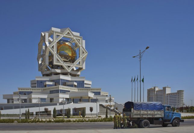
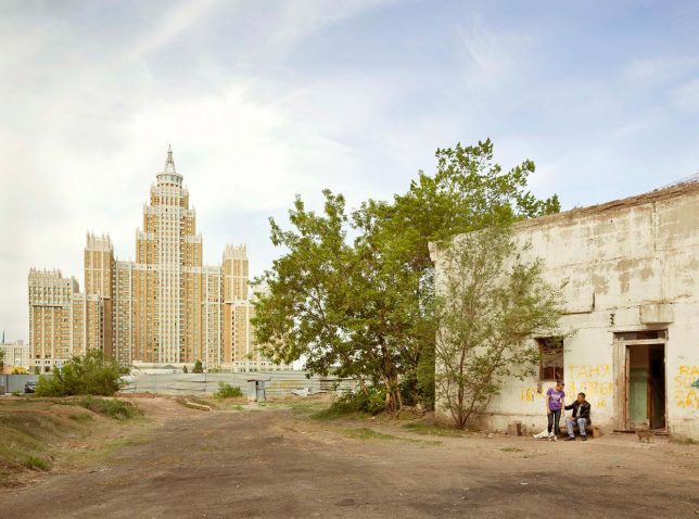
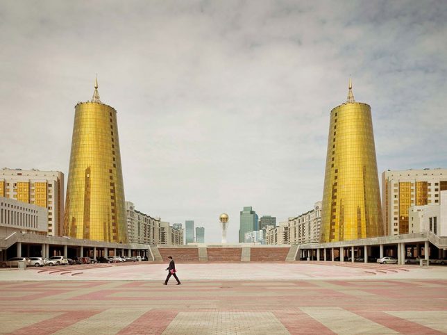
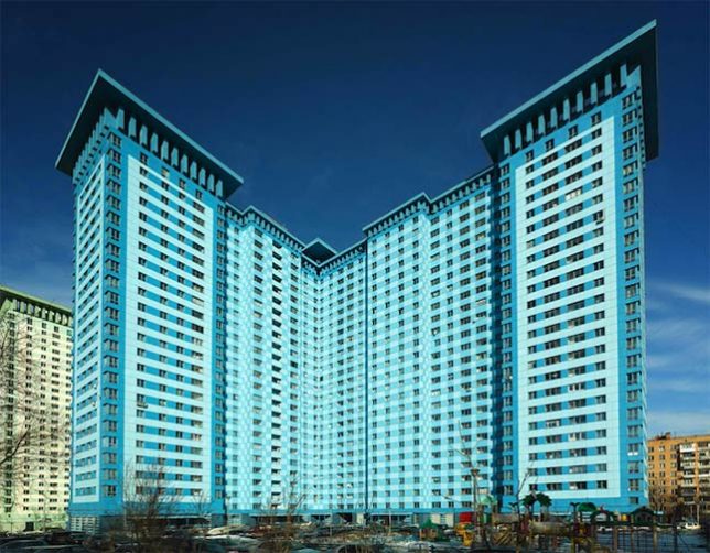
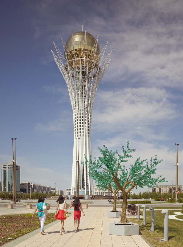
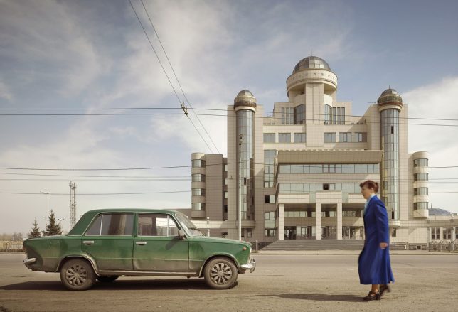
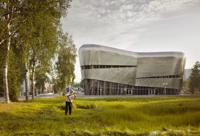
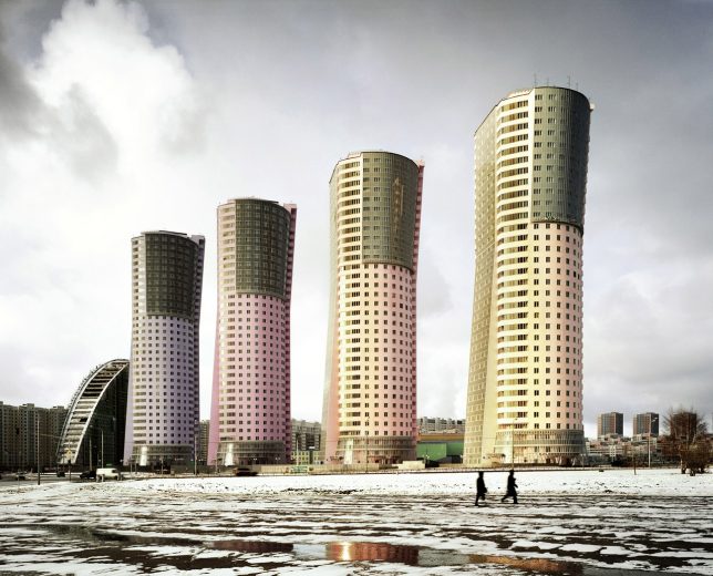
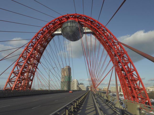
Deep in the most remote reaches of the Soviet Union, strange skyscrapers glitter against the sky, made all the more out of place by their sleepy rural settings and lack of similarly scaled surroundings. Photographer Frank Herfort calls them ‘Imperial Pomp,’ monstrous and overly ostentatious structures that sprung up throughout the nation and the former Soviet Union in the decades since the collapse of the USSR. Traveling to places that might not otherwise draw many foreign visitors, Herfort captured the skyscrapers in all their strangely proportioned glamour for his photo book ‘Imperial Pomp – Post Soviet High-Rise.’

“After exploring Moscow’s structures I realized, that in all cities and former Soviet countries you can find such buildings,” says Herfort. “So I traveled to Vladivostok, to Blagoveshchensk on the Chinese border on River Amur, to Astana in Kazakhstan, to Baku in Azerbaijan, to Sochi and to St. Petersburg. And everywhere in between. I was always impressed by these huge constructions while driving through Moscow. Moscow doesn’t have a big skyline or big houses in the cityscape, and then I was even more impressed when suddenly there appeared one of these big new colored buildings. They are standing like single flowers cropped in the landscape.”

The German photographer notes that he feels like the buildings are “used to manipulate the humans and try to make them feel small.” He says the buildings rarely have infrastructure or real access built around them to invite the public to experience and interact with them, because they weren’t built with a care for anything other than showing off. That would certainly fit with the American perspective on Russia and its strongman fascination.

The buildings do feel like modern iterations of the strange Soviet-era monuments that still litter much of the former Soviet Union, though they’re nowhere near as creative and sculptural as the wondrous and bizarre relics of what used to be Yugoslavia.

Herfort’s book is out of stock at the publisher’s website, but a few copies are still available on Amazon, and you can see more of his work at his website.

Share on Facebook


[ By SA Rogers in Culture & History & Travel. ]

[ WebUrbanist | Archives | Galleries | Privacy | TOS ]


WebUrbanist

 
Comments Off on Imperial Pomp: Strange Post-Soviet Skyscrapers in Remote Russia

Posted in Creativity


Architectural Fairy Tales: Unreal Structures Tell Strange Sci-Fi Tales

11 Feb

[ By SA Rogers in Art & Drawing & Digital. ]

last day 2

These fictional structures seem to be ripped right out of the concept art for a sci-fi film, envisioning a world of architecture that’s totally out of scale with humans but fittingly grand for the environments in which they’re placed. ’Last Day’ by Ukrainian architect Mykhallo Ponomarkenko is the first prize-winning entry at this year’s Fairy Tales concept architecture competition, using classical painting techniques to tell stories of a huge artificial platform that uses anti-gravity engines to escape the laws of physics.

last day 1

“Landscapes have always inspired me to put something weird, unreal and out of human scale into them,” says Ponomarkenko. “Something not feasible and not practical that contrasts with the natural surroundings, but also exists at the same scale. These satirical interventions lead to new ideas and feelings about nature – they make the viewer more aware about the environment and our harmful impact on it.”

“We are flat surface creatures. Sometimes I feel that we crave it so much that the planet is going to be turned into pavement so cars can go anywhere, and our industries could continue expanding. The ‘Saturn Rings’ in my proposal represent these flat surface desires but in a more poetic, optimistic, and friendly manner.”

last day 4

Organized by Blank Space, an online architecture platform, the fourth annual Fairy Tales competition announced three winners selected from over 60 project submissions. Winners are awarded prizes of $ 2,500, $ 1,500 and $ 1,000, respectively, and select projects will be featured in the fourth print edition of Fairy Tales: When Architecture Tells a Story. Read the story that goes along with ‘Last Day’ and see the rest of the entries over at Blank Space.

last day 3

“The proposals put forth in the Fairy Tales competition create entire worlds of the imagination – they build their immersive stories as much by what they don’t say, as by what they do,” says Blank Space. “The winning entries in this year’s competition include oblique references to current events, mundane daily activities and human emotions that we all easily relate to – they make visible how we shape space, and in turn, how space shapes us.”

“The images and narratives are so wildly outlandish, and yet, so grounded that it seems like we could mistakenly stumble into any of them. They are personal and powerful – a testament to the power of architecture as a world-builder.”

Share on Facebook


[ By SA Rogers in Art & Drawing & Digital. ]

[ WebUrbanist | Archives | Galleries | Privacy | TOS ]


WebUrbanist

 
Comments Off on Architectural Fairy Tales: Unreal Structures Tell Strange Sci-Fi Tales

Posted in Creativity


Strange Manger: The World’s Weirdest Nativity Scenes

26 Dec

[ By Steve in Art & Sculpture & Craft. ]

nativity-scene-1a

No room at the inn? No kidding – the denizens of these strange nativity scenes would get even the kindest innkeeper flipping the switch on the No Vacancy sign.

nativity-scene-1b

The Modern Nativity Hipster Nativity Set throws tradition out the window and recasts the original nativity in a modern mold. “We started joking about how religions would be different if their sacred texts were set in modern times,” explains creator Casey Wright, who whipped up the concept while enjoying a few beers with his buddies. How hipster-ish is The Modern Hipster Nativity Set? Well, Joseph sports a man-bun and wears a denim shirt while he takes a selfie with Mary, who’s holding a coffee from a certain popular java purveyor as she puckers up with her best duck-face.

nativity-scene-1d

nativity-scene-1c

Meanwhile, the fashionably sunglassed Three Wise Men roll in on Segways bearing gifts bought online at Amazon. The shepherd captures the miraculous event for posterity by posting it on Instagram using the hashtag #babyjesus. Clean green electric power for his tablet provided via solar panels on the manger’s roof because global warming.

That Ain’t Kosher

nativity-scene-9a

nativity-scene-7b

Y’know, we liked The Last Supper a lot better when Leonardo da Vinci painted it but hey – not everyone’s a vegetarian. Flickr user quik86 uploaded this iconic image of a baking bacon and sausage nativity back in December of 2010 but some things never get old, especially when they’re smothered in bacon.

Kitty Nativity

nativity-scene-3a

nativity-scene-3b

For over ten years, sisters Annette and Sue Amendola have been setting up a classic nativity scene outside their home in Red Hook, Brooklyn. The scene itself wasn’t out of the ordinary… at least it wasn’t until a bunch of stray cats arrived and made it their own.

nativity-scene-3c

The clowder of kittehs was first attracted by food the Amendola sisters would leave out but then stayed to enjoy the replica manger’s comfy bales of hay. “When the figurine of baby Jesus does finally appear on the hay bale,” explains Annette, “the cats usually push him right off to take their rightful spot.” Cats: doing the devil’s work since 0 AD.

Praise Cheeses

nativity-scene-10a

We’ve got your cheesy nativity scene right here, highlighted by a Babybell Jesus and an Emmental angel personifying Oh Hole-y Night. Not suitable for the lactose intolerant.

Next Page – Click Below to Read More:
Strange Manger The Worlds Weirdest Nativity Scenes

Share on Facebook


[ By Steve in Art & Sculpture & Craft. ]

[ WebUrbanist | Archives | Galleries | Privacy | TOS ]


WebUrbanist

 
Comments Off on Strange Manger: The World’s Weirdest Nativity Scenes

Posted in Creativity


Strange Sights of France: 12 Offbeat Travel Destinations

28 Sep

[ By Steph in Destinations & Sights & Travel. ]

france sights machines 2

You haven’t really seen France if you’ve never toured a mansion made of pebbles, taken a ride on a gigantic animatronic elephant, checked out Nazi bunkers turned guerrilla art or gazed upon row after row of horrifying anatomical curiosities. These 12 offbeat and little-known sights in Paris and beyond go a bit off the beaten path for a whole new look at one of the world’s most popular tourist destinations.

Palais Ideale: Palace of Pebbles
france sights postman palace

france sights postman palace 2

france sights postman palace 3

france sights postman palace 4

france sights postman palace 5

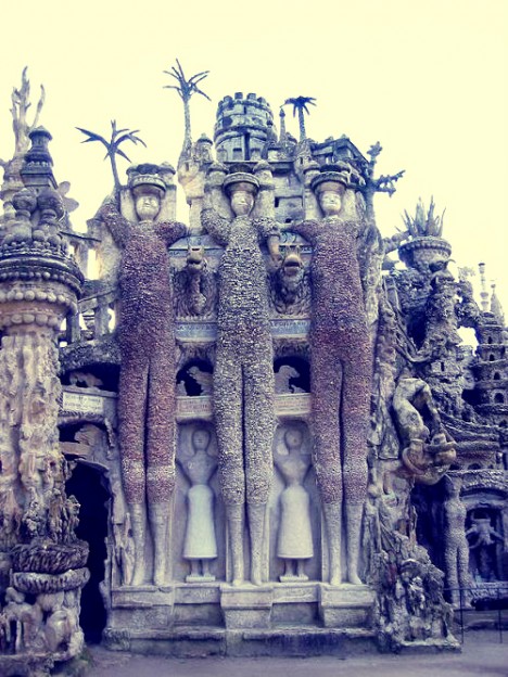
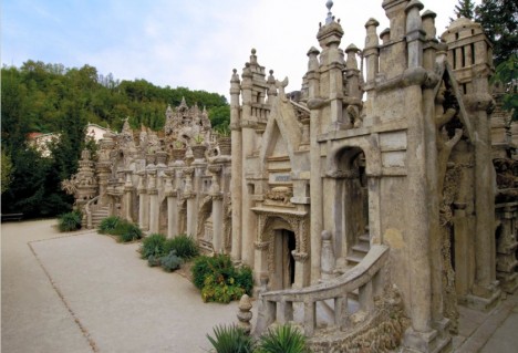
A postman named Ferdinand Cheval spent began building his “Palais Ideale” from scratch using pebbles in 1879, looking for interesting stones along his route and carrying them back in his pockets. As he grew more involved with the project, he began toting them in baskets, and then wheelbarrows. Each night when his shift ended, he would join the stones using cement, lime and mortar by the light of an oil lamp. It took him over twenty years to complete his masterpiece, which is filled with hundreds of incredible tiny sculptures. He also spent over eight years building his own mausoleum nearby, and was buried there in 1924.

Le Moulin Jaune
france sights moulin 1

france sights moulin 2

france sights moulin 3

france sights moulin 4

france sights moulin 5

france sights moulin 6

france sights moulin 7

france sights moulin 8

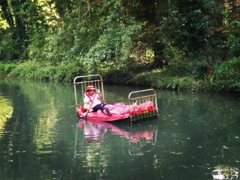
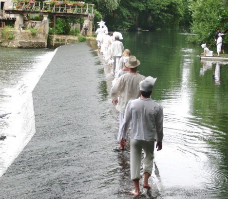
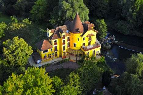
“The Yellow Windmill” is a quirky amusement park an hour’s drive southeast of Paris, with a bright yellow castle and a garden full of strange art installations and circus-like performances. The whole thing was dreamed up and run by a Russian avant-garde performance artist named Slava Polunin, who’s best known for “revolutionizing the art of clowning.” He can be spotted paddling down the Grand Morin river on his bed.

Paris’ Own Kowloon Walled City
france sights kowloon 1
france sights kowloon 7

france sights kowloon 6

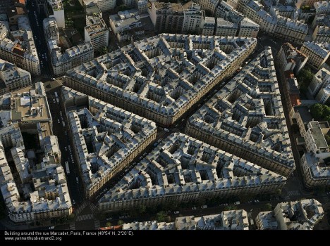
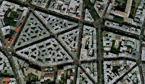
Paris would have had a lawless Kowloon City of its very own, almost exactly like the one that was razed in Hong Kong in 1993, had one 18th century vision for a “proletariat citadel” ever come to pass. The labyrinthine cluster of interconnected buildings in Paris’ 18th arrondissement at the intersection of rue Eugene Sue and rue Simart was built to host 10,000 workers, becoming one of the densest blocks in the city. The idea was that it could function as its own autonomous citadel resistant to the forces of suppression. Internal courtyards are so small, daylight barely pierces them all the way to the ground, and when it was first built, it very likely looked a lot like the real Kowloon. It never became nearly as squalid, however, so it’s not in danger of being demolished.

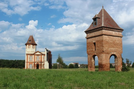
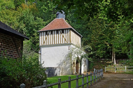
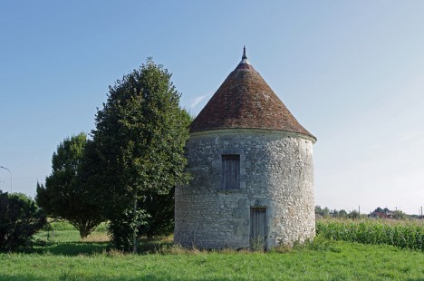
Pigeon Castles in the Countryside

france sights pigeonnier cielas

france sights pigeonnier 1

france sights pigionneir 1

france sights pigeonnier janicek

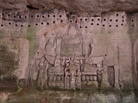
What look like bizarrely tiny castles dotting the French countryside (and other areas of Europe) are not made for humans at all, but rather pigeons. People once built ‘pigeonniers’ (or dovecotes in English) to house the birds, which were raised for their meat, eggsand fertilizer. But by the 14 century, they became a symbol of status, and only landed estates of a certain size were allowed to have them. As other types of meat became more available after the Middle Ages, pigeonneirs fell out o favor, and today many stand as ruins while others are carefully preserved. (images via Daniel Jolivet, alain cielas, patrick janicek)

Next Page – Click Below to Read More:
Strange Sights Of France 12 Offbeat Travel Destinations

Share on Facebook


[ By Steph in Destinations & Sights & Travel. ]

[ WebUrbanist | Archives | Galleries | Privacy | TOS ]


WebUrbanist

 
Comments Off on Strange Sights of France: 12 Offbeat Travel Destinations

Posted in Creativity


Radically Surreal: A Strange World of Mind-Bending Illusions

28 Feb

[ By Steph in Art & Drawing & Digital. ]

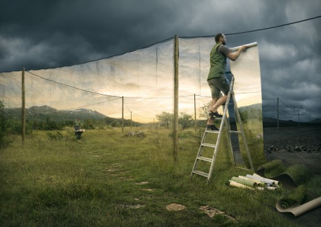
johansson 1

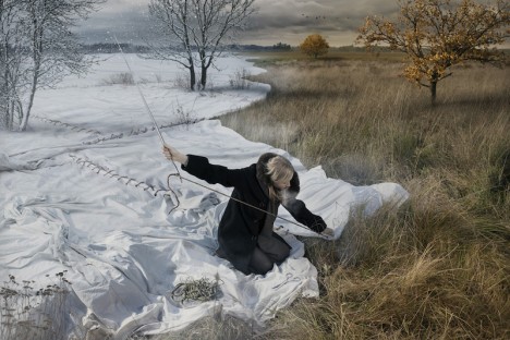
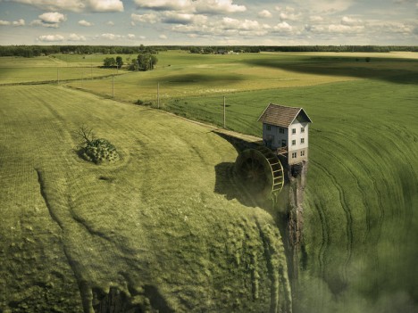
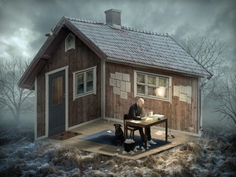
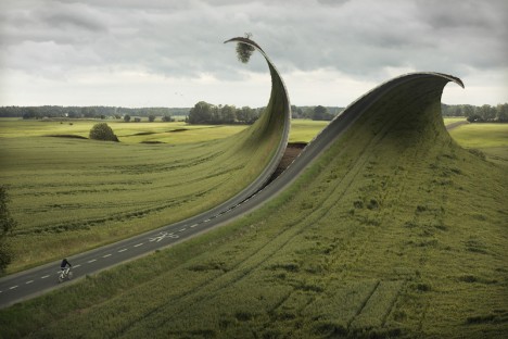
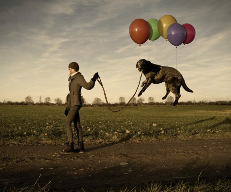
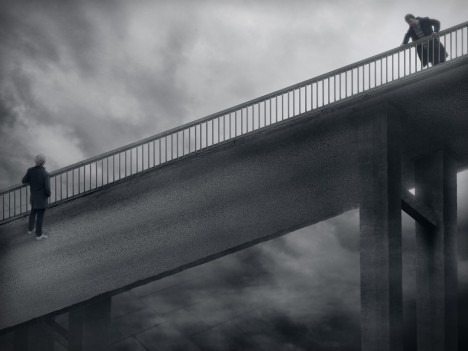
Reality is malleable and nothing is quite as it seems in the surreal world of photographer Erik Johansson, who takes hundreds of photos of a single subject, merges them together and digitally manipulates them to produce optical illusions and the strangest of scenes. Often, these subjects are creating the illusions themselves, changing their environment in unexpected ways.

johansson 3

johansson 4

A single woman spreads a snowy landscape by way of a giant white quilt, while a man climbs a ladder to erect pleasantly sunny surroundings like wallpaper to replace his dreary reality. Roads cut with giant scissors curl like fabric. Houses and streets are seen from multiple perspectives at once, M.C. Escher-style.

johansson 9

johansson 5

johansson 6

The Swedish-born, self-taught photographer starts with a sketch and begins the planning process, which can take months or even years for each shoot. “This is the most important step as it defines the look and feel of the photo, it’s my raw material,” says Johansson. “This step also includes problem solving, how to make the reflections, materials etc. realistic.”

johansson 7

johansson 8

Curious about the whole process? Johansson offers a layer-by-layer breakdown of his image “Let’s Leave” in the video above. Check out some of the artist’s earlier work, too.

Share on Facebook


[ By Steph in Art & Drawing & Digital. ]

[ WebUrbanist | Archives | Galleries | Privacy | TOS ]


WebUrbanist

 
Comments Off on Radically Surreal: A Strange World of Mind-Bending Illusions

Posted in Creativity