RSS
 

Posts Tagged ‘Stack’

How to Create Mandalas in Photoshop Using Stack Modes

30 Apr

The post How to Create Mandalas in Photoshop Using Stack Modes appeared first on Digital Photography School. It was authored by Megan Kennedy.

create mandalas in photoshop with stack modes

There are so many facets to Photoshop that even regular users can sometimes be surprised by new ways to use particular features. Stack Modes is one of the tools in the Photoshop repertoire that I’ve only just started really playing with recently. And, it turns out, the function is great for generating intricate patterns and even mandala-like designs. In this tutorial, I’ll guide you through the steps to create mandalas in Photoshop with Stack Modes.

create mandalas in Photoshop

Can I use Stack Modes?

First things first – unfortunately, Stack Modes aren’t available in all versions of Photoshop. For this tutorial, I’m going to be using Photoshop CS6 Extended. Doing a little research, it looks like Extended and CC versions of Photoshop have the stack mode function. However, if you don’t have the Stack Modes tool required for this tutorial, you can try creating something a little similar here.

What are Stack Modes?

So what exactly are Stack Modes?

The Stack Modes function works by combining a group of image layers with similar content into the one image. For example, astrophotographers may use Stack Modes to combine hundreds of shots into one frame.

Stack Modes can also be used to reduce noise and remove people and objects from photos. It’s a pretty nifty function!

What are mandalas?

Throughout history, mandalas have seen numerous incarnations and applications. Meaning circle in Sanskrit, mandalas are a geometric array of symbols and designs made for spiritual, meditative and artistic purposes.

In modern terminology, mandala is a phrase sometimes used to describe other circular visual arrangements like spirographs and scientific diagrams. The term mandala may also be used to describe the meditative or visual quality of an artwork.

How to create mandalas in Photoshop with Stack Modes

Setting up

To create mandalas in Photoshop, the first step is to pick a single photograph to work with. Something with a few colors and small details is a good bet. I’m going with the flower seen below:

create mandalas in photoshop with stack modes flower close up

Open your image in Photoshop and right-click on the image layer in the Layers Panel. Select Duplicate Layer… and click OK at the prompt.

Select the Background layer in the Layers Panel (not Background copy) and hit Delete.

Next, click on Image on the top toolbar. Select Canvas Size… and (roughly) double the height and width of your canvas so we have room to expand the design.

Click OK.

How to Create Mandalas in Photoshop Using Stack Modes

Adjusting layers

Drag your image to the top of the canvas. Right-click on your image layer in the Layers Panel and select Duplicate Layer… hit OK at the prompt.

With the Move Tool selected, click on the image on the canvas to select it (one layer will be behind the other).

Hold the Shift key on your keyboard down and drag the selected image by the top-middle transform control icon towards the bottom of the canvas, flipping the image to mirror the remaining photograph so it looks like this:

create mandalas in photoshop with stack modes – duplicating the image

Select both layers by depressing the Shift key and clicking on each layer in the Layers Panel.

Right-click on either layer icon and select Merge Layers. The two layers will merge into one. Drag the merged image to the left edge of the canvas.

Right-click on the layer in the layers panel and hit Duplicate Layer… and Click OK at the prompt. Hold down the Shift key and click the left-most transform icon and drag the duplicated layer towards the right edge of the canvas, flipping the second layer to mirror the first. Like in the example below:

create mandalas in photoshop with stack modes – duplicating the image again

Making room

We have a pretty cool image now, but we aren’t finished yet!

To create mandalas in Photoshop, we need to extend the canvas further to accommodate the rest of the layers we will be making.

Click on Image->Canvas Size… and add an extra hundred-or-so cm’s to the height and width of the image. Don’t worry if the canvas looks too large, we can always crop it back down once the mandala is finished.

Back to layers

Okay. In the expanded canvas, select our two layers by holding Shift and clicking on both layers in the Layers Panel. Right-click and select Merge Layers.

Next, right-click on the merged layer and click Duplicate Layer… Click OK at the prompt. Hold down the Shift Key and rotate this newly created layer to form a cross-like structure.

How to Create Mandalas in Photoshop Using Stack Modes

Duplicate one of the layers again and rotate it so that it looks like mine below:

create mandalas in photoshop with stack modes – rotating the image

Duplicate the layer again and rotate it so that your image looks like this:

How to Create Mandalas in Photoshop Using Stack Modes

You can continue adding layers with the duplicate/rotate process until you are happy with the look of your image, or you can leave it as is.

When you are ready, select all the layers in the Layers Panel by holding Shift and clicking on the first and then the last layer in the Layers panel. Right-click on the selection and select Convert to Smart Object. This will combine your layers into a single Smart Object.

Making the mandala happen

With all this duplicating and rotating, the final step to creating mandalas in Photoshop is pretty straight forward. With your Smart Object layer selected, click Layer (in the top tool bar) then click on Smart Objects->Stack Modes. A range of options like Entropy and Kurtosis will become available.

How to Create Mandalas in Photoshop Using Stack Modes

You can look up the exact mathematics behind each setting here, but basically, each option is an algorithm that blends the layers together a different way. Select one and see how it looks…and if you don’t like it, simply undo it and try a different mode.

Here’s my result using the Maximum Stack Mode:

create mandalas in photoshop with stack modes – the final result
The result from using the Maximum Stack Mode

Final touches

Now you have your mandala, the rest is up to you! You can adjust the colors of your creation or increase/decrease the contrast…you can even invert the colors via the Curves Adjustment Layer and see what that looks like.

You can create mandalas in Photoshop forever – the possibilities are endless! It’s a great opportunity to experiment and explore.

If you’ve created a mandala with this method, go ahead and share below!

The post How to Create Mandalas in Photoshop Using Stack Modes appeared first on Digital Photography School. It was authored by Megan Kennedy.


Digital Photography School

 
Comments Off on How to Create Mandalas in Photoshop Using Stack Modes

Posted in Photography


Film Fridays: Thinking about spending a stack of cash on a film camera? Read this first!

14 Mar

We recently launched an analog forum and in a continuing effort to promote the fun of the medium, we’ll be sharing an article from our film friends over at 35mmc on Fridays. This week’s article addresses the ever-inflating second-hand film camera market and the realities of what you get for your hard-earned cash. So don’t drop $ 300 on an Olympus MJU II before reading this first!

Thinking about spending a stack of cash on a film camera? Read this!

Articles: Digital Photography Review (dpreview.com)

 
Comments Off on Film Fridays: Thinking about spending a stack of cash on a film camera? Read this first!

Posted in Uncategorized


Look at this teetering stack of Panasonic cameras

05 May

We’re working on reviewing the Panasonic GX850 and while shooting some product shots got a bit carried away with the stacking. From top to bottom: the Panasonic GM1, Panasonic GM5, Panasonic GX850, Panasonic GX85 and Panasonic GX8.

Note: No Panasonic cameras were injured in the making of this photo.

Articles: Digital Photography Review (dpreview.com)

 
Comments Off on Look at this teetering stack of Panasonic cameras

Posted in Uncategorized


Flip, Stack, Connect: 13 Highly Customizable Furniture Designs

05 Aug

[ By Steph in Design & Furniture & Decor. ]

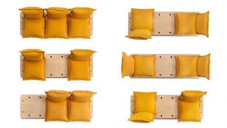
customizable facile sofa

Somewhere between half-hearted DIY jobs and expensive custom-created solutions, there’s customizable furniture kits, which make it easy to create the ideal setup for your home and life without requiring special skills or tools.

Hacka IKEA kitchen

customizable ikea hacka

customizable ikea hacka 2

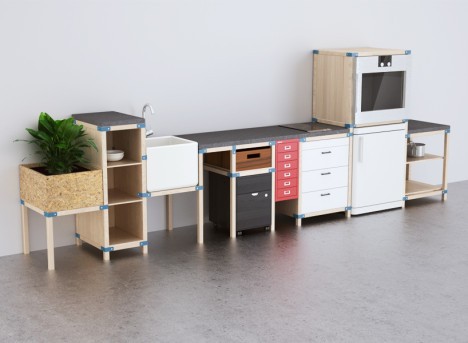
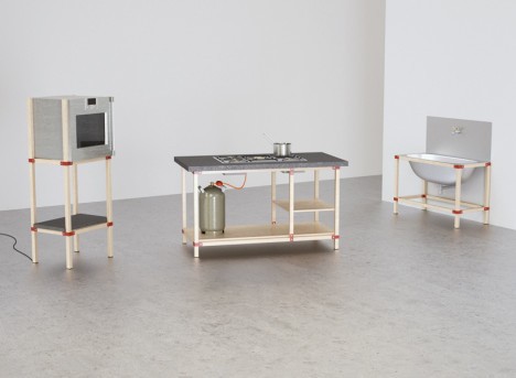
People hack IKEA products all the time, creating new items from cheap components available at the Swedish big-box store. The ‘Hacka’ concept is a kit that makes it even easier to do using a series of orange joints and wooden beams. You essentially create your own framework around IKEA products like countertops, sinks and storage cabinets for a completely customizable setup that’s easy to change around at your whim.

The Homework Desk

customizable homework desk 2

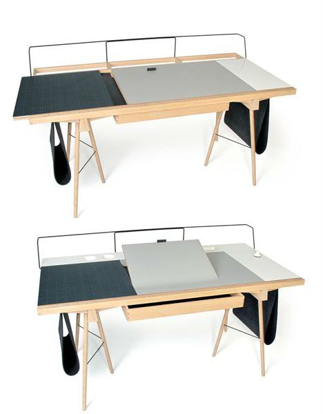
Start with two simple trestle legs and add whatever surfaces work best for you, whether that’s a flat desktop, a self-healing cutting mat, storage for writing implements or some combination of the three. With The Homework Desk, you can incline your surfaces like a drafting table, hang felt slings for additional storage or connect various compartments including pen holders, vertical filing systems and even a hidden phone charger. The whole front ledge of the desk functions as a ruler, too.

Push-Pull Foam Chair

customizable push pull foam

customizable push pull foam 2

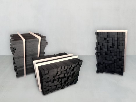
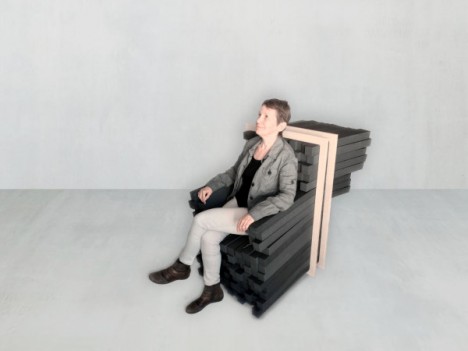
Do you like chairs that are deep and low to the ground, or prefer a higher perch? Do you like armrests, or would you rather have that space free for a better range of movement? The Sink In chair consists of foam bars enclosed within a wooden frame so it’s incredibly easy to create a seat that’s tailored to your exact desires.

Dots Storage System

customizable dots 2

customizable dots
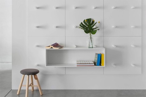
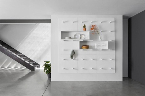
Protruding cylinders attached to wall panels in a grid pattern support a series of boxes for storing and displaying various objects in the ‘DOTS’ system by PolarisLife. Move them around, add more shelves, arrange them however you like them. When the cylinders aren’t supporting a shelf, they can be used to hang things like coats, bags and plants.

Next Page – Click Below to Read More:
Flip Stack Connect 13 Highly Customizable Furniture Designs

Share on Facebook


[ By Steph in Design & Furniture & Decor. ]

[ WebUrbanist | Archives | Galleries | Privacy | TOS ]


WebUrbanist

 
Comments Off on Flip, Stack, Connect: 13 Highly Customizable Furniture Designs

Posted in Creativity


How To Quickly Focus Stack an Image in Photoshop

04 Aug
Four-image focus stack of sunset in Bishop, California. The foliage in the foreground was just inches away from the camera.

Four-image focus stack of sunset in Bishop, California. The foliage in the foreground was just inches away from the camera.

When you take into account all the different ways to get a tack sharp image, it can be quite overwhelming. I’ve been photographing landscapes as a full time photographer for six years now, and have tested just about every method out there. Focus stacking is just one more option, but it is one of my favorites, if the conditions are right.

Focus stacking is a life saver when you have a foreground subject that is very close to the frame, and a background subject that is equally important to the image. This happens quite a bit in landscape photography when using super wide angle lenses! Some will argue that hyperfocal calculations work in these situations too, and while they certainly can, I personally don’t like hassling with the charts and measurements unless I really have to.

Two image focus stack of Lily Lake near Estes Park, Colorado.

Two image focus stack of Lily Lake near Estes Park, Colorado.

One of the most important things you can do out in the field is to inspect your shots instead of just assuming you nailed it. You’ll find articles all over the place making fun of photographers for chimping, but the ability to zoom in on all the tiny details of your shot is a major advantage over the film days.

When I’m taking pictures of a magnificent sunset, I’m working fast and keeping my head on a swivel. When I take a shot, I’ll quickly review it and zoom in all the way on my main subject. Then, I’ll zoom in on the other parts if they need to be sharp as well (sometimes they don’t). If you have a really close foreground subject and it’s tack sharp, but the mountains in the background are just a bit soft; this is a good time to consider focus stacking.

Two image focus stack at Great Sand Dunes National Park in Colorado. One for the sand that was less than a foot from the lens, and one for the background.

Two image focus stack at Great Sand Dunes National Park in Colorado. One for the sand that was less than a foot from the lens, and one for the background.

The best part about focus stacking is that it’s super easy! Just put your camera on a tripod and set your lens to manual focus. I use live view on the back of my camera to zoom in as close to my subject as possible and turn the focus ring on my lens until I see the subject become tack sharp. Once you’ve gotten that shot, scroll around the image and see what is soft in the background. If the mid-ground is soft, turn your focus ring until it’s sharp and take the same picture with the same settings. Then, dial the focus ring for the background and take another shot. That’s it until post processing!

Stacking the Images Together in Photoshop

Final image from the video. Three image focus stack from Zion National Park.

Final image from the video. Three image focus stack from Zion National Park.

When Focus Stacking Doesn’t Work

In all the images above that had foliage in them, there was virtually no wind at the time I took the shots. The foliage was perfectly still. If the wind is blowing and the leaves are swaying back and forth, focus stacking is going to be a nightmare, and isn’t even worth bothering with in most cases.

It’s also important to note that having the entire image in sharp focus isn’t always the best artistic approach to a scene. Sometimes having your subject sharp and the background soft will do a much better job of drawing the viewer’s eye where you want. It really just depends on the situation.

Conclusion

Focus stacking is just one trick to have in your bag, and this is just one method of doing it. There are also third party programs like Helicon Focus to consider. I personally haven’t used the program but have heard great things about it.

Have anything to add to the article? Let me know in the comments below!

googletag.cmd.push(function() {
tablet_slots.push( googletag.defineSlot( “/1005424/_dPSv4_tab-all-article-bottom_(300×250)”, [300, 250], “pb-ad-78623” ).addService( googletag.pubads() ) ); } );

googletag.cmd.push(function() {
mobile_slots.push( googletag.defineSlot( “/1005424/_dPSv4_mob-all-article-bottom_(300×250)”, [300, 250], “pb-ad-78158” ).addService( googletag.pubads() ) ); } );

The post How To Quickly Focus Stack an Image in Photoshop by James Brandon appeared first on Digital Photography School.


Digital Photography School

 
Comments Off on How To Quickly Focus Stack an Image in Photoshop

Posted in Photography


Alley Stack: Brooklyn Home Made of 5 Shipping Containers

01 Mar

[ By Steph in Architecture & Houses & Residential. ]

Shipping Container Home Brooklyn 1

A tiny slice of real estate in Brooklyn is now an affordable, low-impact multi-level residence made of five stacked and renovated shipping containers. Williamsburg couple Michele Bertomen and David Boyle bought a 6×12-meter lot that had been vacant for 60 years, squeezed between two brick buildings. Conventional building materials would have stretched their budget, so they set out to design and build a shipping container house with a total cost of just $ 50,000 (not including the lot).

Brooklyn Shipping Container Home 2

That price is unheard of in New York City, and it took a lot of innovation – with more than a few bumps in the road – to make it happen. Getting the right permits took ten months, with city officials repeatedly requiring changes to the couple’s plans. Luckily Bertomen is an architect and Boyle a contractor, saving them a lot of money. Once the plans were done and the materials acquired, it took just a few hours to put it all together.

Brooklyn Shipping Container Home 3

The shipping containers were purchased for $ 1,500 each and once assembled, create an interior space measuring nearly 1,600 square feet. The container walls are insulated with Super Therm, a paint that contains ceramic particles, and the home is heated with radiant heat that runs through the concrete floors.

Brooklyn Shipping Container Home 4

Believed to be the first shipping container residence in New York City, the house features multiple outdoor areas (including a private porch for the couple’s dog) and a roof terrace. See a complete tour of the interior at Inhabitat and DNA Info.

Share on Facebook


[ By Steph in Architecture & Houses & Residential. ]

[ WebUrbanist | Archives | Galleries | Privacy | TOS ]


WebUrbanist

 
Comments Off on Alley Stack: Brooklyn Home Made of 5 Shipping Containers

Posted in Creativity


Stack on Sheets: Minimalist Printer Needs No Paper Tray

30 Aug

[ By WebUrbanist in Gaming & Computing & Technology. ]

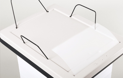
stack simple paper printer

An elegant concept and beautifully executed, this thesis project strips away everything but the essentials from the process of printing, proposing a simple solution to reduce visual clutter in your office.

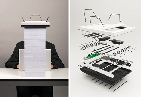
stack printer design concept

Dubbed Stack, an aptly short title for such a minimal machine, the design represents a thesis solution by Mugi Yamamoto. Aside from its small size and refreshingly spare appearance, its approach also circumvents a classic shortfall of typical printers: the size of the paper tray.

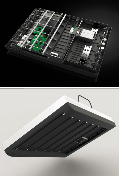
stack minimal printer design

Instead of reloading frequently, you simply set Stack on top of a pile of blank sheets of paper and let it work its own way down, itself a lovely process that also lets you know how far you are through the printing job at hand.

stack printer design details

A few points of concern, though, from a practical standpoint: it is hard to say how well the printer would remain stable as it progresses, or whether shifts in weight along the way would cause jams. It is also not entirely clear whether power cords would pose an problem, or how high the finished paper stack could go before potentially spilling off the sides. Still, as a concept, it is lovely, and at least some of these issues could be corrected by introducing elements like guides that flip down to keep the stack aligned below, or higher supports above to stabilize finished sheets.

Share on Facebook


[ By WebUrbanist in Gaming & Computing & Technology. ]

[ WebUrbanist | Archives | Galleries | Privacy | TOS ]


WebUrbanist

 
Comments Off on Stack on Sheets: Minimalist Printer Needs No Paper Tray

Posted in Creativity


Bunyan’s Pride: 19 Log Cabins That Stack Above The Rest

14 Dec

[ By Marc in Architecture & Houses & Residential. ]

The typical rectangular cabin plopped in the middle of the woods is no longer the standard, as homeowners get increasingly creative with rustic housing, the designs are becoming larger than life.

(Images via freshome, trendir, homesresult, kubodo, design-crisis)

Cabin GJ-9 is a slick prototype created by Gudmundur Jonsson Arkitektkontor, a Norway based firm. Finne architects adds a twist to the typical cabin with this house that takes full advantage of the privacy afforded by dense woods, by having walls made of glass. Danish Dorte Mandrup created this 10 square room that is more an outside reading nook than anything else. Olson Kundig architects created this gorgeous, and huge, “cabin” that is about as far from the typical log design as one can get. Any fan of the Lord of the Rings, and Hobbits in general, will get a kick of this rounded doorway, that makes this cabin feel like a hidden hideaway.

(Images via besthousedesign, izifunny, slim69, funelf)

AATA Architecture created the Morevara cabin, a modern twist on an old classic. This second cabin utilizes a unique layout that allowed them to keep a trunk of a tree emerging through their kitchen counter, truly adding to the natural aesthetic. Chalet Cyanella is located in the French Alps and gives a glimpse of a modern interior that contrasts sharply with the natural panorama outside. Lastly, we have a house in Seattle that literally escapes to the treetops to separate itself from urban sprawl.

(Images via trendir, houseplans, demagz, inhabitat)

WRB in Sweden created the top cabin, which actually has a gorgeous seaside view. The clean lines make it look more like an artistic statement than a vacation home. Piet Ein Heek created this log box room, which can shutter itself up and look like a pile of sticks. More images are available here. Studio Aisslinger created this Berlin cabin that looks caged, yet open, and has an incredibly distinctive design. OLGGA came up with this portable log cabin, which looks rustic on 3 sides, and hides a sleek, modern interior.

(Images via didohomes, coolcrack, santabanta, offbeatenough, izifunny, standout-cabin-results)

Log cabins don’t have to be small huts in the woods. This giant edifice is one of the most epic cabin examples, as it looks more like an ancient Viking hall than anything else. A grand fireplace with hewn logs supporting the interior structure lend a rustic atmosphere to the interior. The third example shows a more modern, yet equally large, take on the fireplace, with seating for at least a dozen around the fire. The bottom example is more like a log mansion, yet still manages to integrate aesthetically with the nature around it. Another example of a grand entrance, is followed by an interior example of a possible lobby for homes like this. Large logs, leather, stone, and fire all combine to make any log cabin feel traditional, regardless of the size.


Want More? Click for Great Related Content on WebUrbanist:

Waterfront Wonders: 8 Great Modern Island + Ocean Homes

With stunning views of lakes, rivers and beaches, these eight modernist homes are a perfect match for their gorgeous waterfront settings.
5 Comments – Click Here to Read More »»


Fire-Inspired: 14 Converted & New Lookout Tower Homes

From 15th century guard towers on the Italian coast to modern timber-framed fire towers in Montana, these 14 homes get their inspiration from high places.
3 Comments – Click Here to Read More »»


Share on Facebook


[ By Marc in Architecture & Houses & Residential. ]

[ WebUrbanist | Archives | Galleries | Privacy | TOS ]


WebUrbanist

 
Comments Off on Bunyan’s Pride: 19 Log Cabins That Stack Above The Rest

Posted in Creativity