RSS
 

Posts Tagged ‘Split’

How to Use a Split Tone Style in Lightroom Mobile for a Consistent Instagram Feed

09 Sep

The post How to Use a Split Tone Style in Lightroom Mobile for a Consistent Instagram Feed appeared first on Digital Photography School. It was authored by Ana Mireles.

Have you ever seen an image and immediately known who took it? That’s because the photographer has a unique style.

If you want to make your own images recognizable for your clients and followers, you might want to try a split tone style.

Keep reading to learn how this works.

Create a split tone style
Snapshot taken with the default camera app on a Redmi Note 8.

Style

You can create your own style through many different elements, from lighting and composition to a particular way of post-processing.

This last one is where a split tone style fits.

Introduction to split toning style
Canon 50D | Sigma 28-300mm | 28mm | 1/800 sec | f/3.5 | ISO 100

Using this technique, you can keep your images consistent. That way, the viewer feels like all your images belong together and associates the images with you and your brand. This works for your portfolio, your website, and your Instagram feed.

Split tone

When you assign a certain tone to the shadows and a different tone to the highlights, it’s known as a split tone. The full white and full black will always remain untouched. But the highlights will be cool while the shadows will be warm.

Let me show you what I mean with this gradient:

Split tone gradient

You can also change the ratio between highlights and shadows. On these next gradients, see how the same split tone colors give a different effect when you adjust the split tone balance:

Split tone changing balance

This is just an example, but you can use any combination of colors that suits your style and brand. For that, you can create a color palette.

Choose a color palette

A color palette is a range of colors used in a particular context. These colors need to work well together and reinforce your style.

There are different theories you can use to create your color palette. You can go for a monochromatic scheme or a complementary one. If you’re not sure, there are some great tools to help you. You can check out Adobe Color or Color Hexa.

Adobe Color Website

Just like a filter, different split tones may look better on some images than others. Having a color scheme gives you the flexibility to apply different split tone combinations while maintaining your style.

Split tone style

Almost every program has a feature or a way to do split toning: ACR, Capture One, Photoshop, Luminar, Lightroom, etc. Also, many apps allow you to do split toning on your phone: Photoshop Express, Lightroom Mobile, and VSCO Cam. Choose whichever fits best into your workflow.

In most cases, the split toning interface is similar from program to program. You’ll have two gradients: one for the highlights and one for the shadows. You’ll also have a balance slider.

I’m going to show you how to split tone in Lightroom Mobile, because it’s the program I find most comfortable. Also, because Lightroom Mobile allows you to save your split tone effect as a preset.

Both split toning and preset functionality are included in the free version of Lightroom Mobile, so you can follow along without getting a subscription.

Split toning in Lightroom Mobile

When you have your image open in Lightroom Mobile, you can see the menu at the bottom. Scroll to the right until you find Effects.

Once you open the Effects tab, on the top right you can find Split Tone. This will open the gradients for the highlights and shadows. Below these gradients, you’ll find a slider to control the split tone balance.

Move the highlights, shadows, and balance values until you’re satisfied.

Split tone style in Lightroom Mobile

In the color palette section of this article, I was telling you that there are different ways to split tone. Here you can see an example of split toning using a monochromatic scheme (the center photo), and another that uses complementary colors (the right photo).

Make it a preset

To keep your split tone style consistent without having to remember the specific values every time, you can create a split tone preset. That way it becomes a one-touch edit you can apply to every photo.

To do this, click on the three dots in the top right. This will open a menu; from there choose Create Preset. Make sure that only the Split Toning option that you find inside Effects is checked. Otherwise, the preset will save additional edits that you might not want to replicate in other photos.

Then name the preset and tap on the check icon (in the top right) to save.

Lightroom Mobile Presets

Next time you want to apply the split tone effect to a photo, just open it in Lightroom Mobile, go to Presets, then User Presets, and find the split tone preset you want.

You can also create different split tone presets that use variations from your color palette. That way, you can use the preset that fits each image best while maintaining the overall aesthetic.

Conclusion

Using a split tone style will help you maintain a consistent look in your images. This will make your account recognizable to your followers and let your clients know what they can expect from your brand.

It doesn’t matter which app or program you use; the important thing is that it’s easy to incorporate into your workflow.

Share your recommendations and experiences in the comments section.

The post How to Use a Split Tone Style in Lightroom Mobile for a Consistent Instagram Feed appeared first on Digital Photography School. It was authored by Ana Mireles.


Digital Photography School

 
Comments Off on How to Use a Split Tone Style in Lightroom Mobile for a Consistent Instagram Feed

Posted in Photography


This 3D-printed accessory makes it possible to shoot split double exposures on Instax Mini 90 cameras

09 Aug

One of the accessories you can purchase for some of Lomography’s instant cameras is the Splitzer, an add-on component that makes it possible to shoot multiple exposures on the same frame. Unfortunately, the accessory isn’t available for the Fujifilm Instax Mini 90, but photographer Guillermo Hernandez has managed to create his own 3D-printed version for the popular camera.

Like the Splitzer, the 3D-printed component simply attaches to the front of the lens. To capture a double exposure, simply cover the half of the frame you don’t want exposed, take a shot, then rotate the Splitzer 180-degrees before taking another shot.

As you can see in the sample photos below, this allows you to create unique compositions wherein a single subjects can be in two places at once or frame the same object side-by-side.

$ (document).ready(function() { SampleGalleryV2({“containerId”:”embeddedSampleGallery_9993708725″,”galleryId”:”9993708725″,”isEmbeddedWidget”:true,”selectedImageIndex”:0,”isMobile”:false}) });

It’s undoubtedly a novel accessory, but it’s a fun way to get a little more out of a Fujifilm Instax camera. Hernandez is selling his Instax Mini 90 Splitzer in multiple colors for $ 5 on eBay with $ 3 shipping, but if you have access to a 3D printer and know some basic CAD tutorials you could probably whip up one yourself. Hernandez has other 3D-printed photo-related products on his eBay store, too.

Articles: Digital Photography Review (dpreview.com)

 
Comments Off on This 3D-printed accessory makes it possible to shoot split double exposures on Instax Mini 90 cameras

Posted in Uncategorized


Pixelmator Photo 1.2 update adds cursor support, ML Color Match, Split View and more

10 Apr

Pixelmator has released a 1.2 update for its powerful iPad photo editing app Pixelmator Photo that adds cursor support, an improved Split View mode, a Match Colors tool, a new copy/paste function and much more.

The update comes on the heels of Apple’s new iPad Pro models and accompany Magic Keyboards, which offer not only a tactile typing experience, but also an integrated trackpad that works alongside iPadOS 13.4 to bring mouse-like support to iPadOS apps. By adding support for the new cursor functionality, Pixelmator Photo adds yet another means of input for editing photos on the go (it works with third-party Bluetooth cursors and trackpads as well).

Also new is Split View support, which lets you use Pixelmator Photo alongside another app without interrupting your workflow, as well as a new ML Match Colors function, which allows you to ‘match the look and feel of one photo to another’ thanks to machine-learning. Pixelmator has also added a new intensity slider for color adjustments and presets and the ability to share images directly from the Photos browser within the app without opening each image individually.

Other improvements and fixes addressed in the 1.2 update include improved screenshot capture, new default color adjustment options, a collection of user interface changes and a handful of bug fixes to smooth out the overall experience.

Pixelmator Photo 1.2 is available to download in the iOS App Store for $ 4.99.

Articles: Digital Photography Review (dpreview.com)

 
Comments Off on Pixelmator Photo 1.2 update adds cursor support, ML Color Match, Split View and more

Posted in Uncategorized


Panoram app will split your panoramas up for easy posting to Instagram Stories

22 Jan

There are countless apps capable of splitting up a panorama photo so it can be put side by side into an Instagram post, but Panoram appears to be one of the first apps to offer this sort of capability for Instagram/Facebook Stories (or Snapchat).

Panoram is currently an iOS only app for the time being. As its name suggests, Panoram will take a panoramic photo and split it into three separate frames that can then be uploaded to Instagram, Facebook or Snapchat so they can be viewed as a single image when viewers tap through their feeds. Cropping the photo is done directly in the app using a basic overlay.

The app itself isn’t too special, but its do one thing well approach makes it a nice app to keep around for when needed. Currently there’s no option for additional frames, so don’t count on using ultra-wide panoramas.

Panoram is free to download in the iOS App Store. The free version contains ads and plasters a watermark on the final panorama, which can be removed with a $ 1 USD in-app purchase.

Articles: Digital Photography Review (dpreview.com)

 
Comments Off on Panoram app will split your panoramas up for easy posting to Instagram Stories

Posted in Uncategorized


How to Create Silky Split Toned Black and White Photos Using Luminosity Masks

22 Mar

Have you ever found it hard to choose between processing an image in color or black and white? It can be a tough decision. Enriching colors that instantly captivate your attention versus a timeless black and white photograph full of texture and complex shadows.

There’s every chance you’ll process both versions because you can’t have the best of both worlds, right? Well, with split toning, maybe you can – sort of.

1 How to split tone black and white images using luminosity masks

Split Toning 101

At its core, split toning is a pretty simple editing technique. You can create a split tone effect by simply introducing color into the highlights and/or shadows of your photograph.

It’s often used by photographers (and extensively by film makers) to recreate a film look and to create a consistent style across a series of images. In recent years, it’s become renowned for creating the ever so popular “orange and teal” look.

These days, the mere thought of split toning your photograph is greeted with groans of “not another Insta-image”. But for all of its popularity on social media platforms, perhaps split toning is most effective when applied to black and white photographs. This is where its subtle tones combine with texture and luminance to create sumptuous results.

2 How to split tone black and white images using luminosity masks

Black and White Versus Color

Colors are powerful. Not only do they add excitement and interest, but they also set the tone for your images. By default, colors come with a little extra baggage – they’re moody, symbolic and represent a preconceived tone.

3 How to split tone black and white images using luminosity masks

Tones such as reds, yellows, and oranges are usually associated with warm, gooey feelings of love and comfort.

4 How to split tone black and white images using luminosity masks

Whereas the cooler tones such as blue, cyan and magenta are typically associated with melancholic feelings of calmness and reflection.

You could almost think of color as a way of spoon-feeding the viewer with the tone, style, and mood of your images. Essentially, colors can make your job of storytelling a lot easier.

With this in mind, you’d be forgiven for wanting to enhance the emotion of your photographs by pumping up the saturation of your colors. But there’s a consequence. They’re too powerful.

Color Can be a Distraction

For all of their excitement and emotional qualities, colors have the potential to be overly dominant and cause major distractions. I’m not going to pretend I know the science behind why this is, but have you ever noticed that black and white photographs appear to offer a little more oomph? A particular grittiness.

It’s almost like they have a 3-dimensional quality that seduces your eyes and encourages them to roll around in the graduating tones. Okay, maybe it’s just me.

The theory goes that the presence of strong color can make it more difficult for your eyes to detect luminance, perceive depth, and absorb the finer detail in your images. A problem black and white photographs need not worry about.

5 How to split tone black and white images using luminosity masks

You may notice that your primary focus flickers from color to color instead of exploring the shapes and textures of the building in this image.

6 How to split tone black and white images using luminosity masks

Removing the color helps your eyes to journey through the maze-like building to explore the textures, lines, and shapes.

Enter Split Toning

Without color, your eyes turn into luminance seeking missiles as they journey deep into your image to revel in silky graduating tones, land on interesting shapes, and explore complex textures.

So how do you combine the moody nature of color with the textural qualities of a black and white image?

This is where split toning makes its grand entrance. Applying a subtle color to the highlights and shadows of your black and white photographs gives you a slice of the emotional qualities that color can offer, without disguising the depth and texture of your black and white photograph.
Who said you can’t have the best of both worlds?

7 How to split tone black and white images using luminosity masks

Basic Color Theory 101

Before you dive in and start splashing color around as if you’re celebrating the Holi festival, it’s a good idea to have a basic understanding of color theory. Then you’ll know exactly what colors to combine when you split tone your black and white photographs.

The Adobe color wheel is a great tool that represents the relationship between primary, secondary, and tertiary colors. Photographers, designers, and artists often apply basic color theory to the color wheel to create visually appealing color palettes for their work.

8 How to split tone black and white images using luminosity masks

Here are three common color schemes you can use to develop a subtle, harmonious, or contrasting color palette for your split toned black and white photographs.

Analogous Color Scheme

An easy way to understand the analogous color scheme, which also avoids you having to pronounce it, is to think of it as a really good set of next-door neighbors.

9 How to split tone black and white images using luminosity masks

Analogous color schemes use colors that are directly next to one another on the color wheel. They are naturally harmonious and can often be found in nature.

Triadic Color Scheme

10 How to split tone black and white images using luminosity masks

Triadic color schemes use colors that are evenly distributed around the color wheel. This type of color scheme is typically more vibrant and interesting than an analogous one.

Complementary Color Scheme

11 How to split tone black and white images using luminosity masks

Colors that are directly opposite one another on the color wheel are known as complementary colors.

If you have watched almost any movie in the last 10 years or scrolled through your Instagram feed in the last 10 minutes, it’s highly likely you would have noticed a strong presence of orange and teal colors. This is a perfect example of a complementary color scheme.

Brief Recap

So far I have briefly covered the advantages of color and black and white photographs and how, in theory, it’s somewhat possible to combine their qualities to get the best of both worlds using a split toning technique. I’ve also introduced a basic level of color theory, so you will know how to create visually attractive color combinations in your split toned images.

At this point, you might be wondering how to apply all this wonderful information and actually split tone your photographs. So, let’s dive in and bring it all together.

How to Create a Silky Split Tone Effect

A common and very easy way to split tone your images would be to use the Lightroom Split Toning tab in the Develop Module.

12 How to split tone black and white images using luminosity masks

This allows you to select a specific hue for the highlights and shadows, adjust the saturation, and the balance of the effect.

13 How to split tone black and white images using luminosity masks

While this method is extremely fast and produces acceptable results, it lacks the ability to infuse your images with a triadic or analogous color scheme. More importantly, it doesn’t allow you to control how the split toning effect is applied to the different tones in your image.

Using Luminosity Masks in Photoshop

Having more control can help you to create a silky split toned black and white photograph that makes you want to instantly hit print and proudly publish it for all to see. To gain this level of control you’ll need to take a deep breath and join me as we take a big brave step into Photoshop.

Step 1: Creating Luminosity Masks

To get started you’ll need to open up Photoshop and load a series of luminosity masks.

If you’ve just exhaled that deep breath with a, “Huh!? What is that!?” there’s no need to run a “What’s a luminosity mask?” Google search. All the basic information you need (and a free action that does all the work for you) is available right here.

Originally developed and thoroughly documented by Tony Kuyper, luminosity masking is regarded as one of the most effective techniques to control your images in Photoshop.

Despite its complex sounding name, luminosity masking is a relatively easy technique you can use to apply subtle adjustments to your images in a clean and effective way.

14 How to split tone black and white images using luminosity masks

Several tonal adjustments were applied to this image using luminosity masks to gradually build contrast and depth in this image.

Luminosity masks are commonly used among landscape and architecture photographers to seamlessly blend bracketed exposures, gradually build contrast, and create silky black and white photographs. They work by creating a series of selections that isolate the highlights, mid-tones, and shadows on a granular level, which allows you to target specific tones based on their luminance (brightness) value.

Sadly, the process of creating luminosity masks is nowhere near as fun as using them. So, to save you (and me) from:

  • Death by 100 confusing screenshots detailing how they are created
  • Spending 15 minutes creating luminosity masks every time you want to split tone an image in Photoshop

Here’s a link to download a Photoshop Action that includes all the information you need to install and create luminosity masks in a just a few clicks.

15 How to split tone black and white images using luminosity masks

Luminosity masks in Photoshop.

Essentially, having a selection of luminosity masks at your disposal gives you ultimate control over your photographs. It means you’re able to work with the highlights, mid-tones, and shadows independently of one another. Which, if you’re partial to the odd black and white photograph, provides you with the perfect system to create a beautiful split toning effect.

Step 2: Create a Color Palette

With your luminosity masks created, head over to the Adobe color wheel to create a visually attractive color palette. Note down the hex value of your desired colors, as you will need these in the next step. For this example, we’ll create a complementary color scheme.

16 How to split tone black and white images using luminosity masks

Step 3: Apply your Shadow Color

Create a Solid Color Adjustment Layer and enter the hex code of the color you’d like to introduce into your shadows.

17 How to split tone black and white images using luminosity masks

Step 4: Color Blending

Change the blend mode of the Solid Color Adjustment Layer to “Color”. As you do so, you’ll notice that your entire image will be colorized with the hue you selected. Now select the default white layer mask and delete it by dragging it to the trash can icon.

18 How to split tone black and white images using luminosity masks

Step 5: Select a Luminosity Mask

Navigate to the Channels tab and locate the luminosity masks you created using the Photoshop action in step one. You’ll notice that seven luminosity masks with varying degrees of intensity have been created for your highlights, likewise for your shadows, and two luminosity masks will target the mid-tones of your image.

15 How to split tone black and white images using luminosity masks

Luminosity masks are stored in the Channels tab.

The aim here is to apply one of these luminosity masks to the Solid Color Adjustment Layer you just created. This will restrict the effect of the adjustment layer to only appear in specific areas of your image.

Clicking on each of the luminosity masks allows you to preview the target areas of your image.

Luminosity masks work much in the same way as regular masks. The white areas of the mask will reveal the effect and the black areas of the mask will conceal it. The grey areas of a luminosity mask will partially reveal the effect which helps to create a subtle and clean finish.

19 1 How to split tone black and white images using luminosity masks

Clicking on a luminosity mask allow you to preview what areas of your image it targets.

The general aim is to select a luminosity mask with just enough white (and gray) in the areas where you’d like the color to be visible. As a rule of thumb, when choosing a luminosity mask to add color into your highlights, selecting the “Lights 2” or “Lights 3” mask usually works well.

If you intend to introduce a color into the shadows of your image (like in this example), then you may find that using the “Darks 2”, “Darks 3” or “Darks 4” luminosity masks will provide you with a silky-smooth finish.

19 2 How to split tone black and white images using luminosity masks

The white areas represent where the blue tone will be revealed.

Step 6: Load Luminosity Selection

With your chosen Luminosity Mask selected click on the “Load mask as selection” button at the bottom of the Channels panel. Upon doing so, you’ll notice that the marching ants appear to indicate the selection.

20 How to split tone black and white images using luminosity masks

Step 7: Create a Layer Mask

Navigate back to your layers tab, select your solid color layer and click the “Add Layer Mask” button. This will create a layer mask using the luminosity selection which will restrict the Solid Color Adjustment Layer to only be visible in the white areas of the mask.

In the example, you can see that the blue color tone is now only visible in the darker areas of the image.

21 How to split tone black and white images using luminosity masks

Loading the “Darks 4” luminosity mask helps to restrict the effect to the shadow areas only.

Step 8: Refine Your Color

At this stage, there’s every chance the effect will look a little too strong and not very subtle. This is where working with adjustment layers and masks gives you complete control.

To refine the effect, double-click on the Solid Color Adjustment Layer to reduce the saturation and brightness. If need be, you can also adjust the overall opacity of the Solid Color Adjustment Layer to soften the effect.

22 How to split tone black and white images using luminosity masks

Reducing the saturation and brightness helps to create silky smooth shadows.

If your effect is still too strong then you may want to consider deleting the layer mask and repeating steps 5 and 6 to select a luminosity mask with a softer selection.

Step 9: Housekeeping

To help keep your layers neat and tidy, you can rename the Solid Color Adjustment Layer to “Shadows”.

23 How to split tone black and white images using luminosity masks

Step 10: Mid-tones

Repeat steps 3-8 to apply your desired color to the mid-tones. Only this time, when you get to step 5, you’ll need to select the “Midtones 1” luminosity mask.

25 How to split tone black and white images using luminosity masks

Note: When you load the “Midtones 1” luminosity mask as a selection, Photoshop will display a warning which states “No pixels are more than 50% selected. The selection edges will not be visible.”

24 How to split tone black and white images using luminosity masks

You can safely ignore this warning. Your mid-tones will still be selected, this message is just Photoshop’s way of saying, “Woah there! You are making a selection so subtle that the marching ants can’t show you where it will apply.”

Step 11: Highlights

Finally, you can now introduce a color into your highlights.

26 How to split tone black and white images using luminosity masks

To do this, you’ll need to repeat steps 3-8, modifying step 5 to select a “Light” luminosity mask. Often the “Lights 2” or “Lights 3” masks will create subtle results.

27 How to split tone black and white images using luminosity masks

Here’s an example of the shadow, mid-tone, and highlight layers combining to split tone the image.

28 How to split tone black and white images using luminosity masks

Before and After

14 How to split tone black and white images using luminosity masks

Here is the image prior to applying the split toned effect.

1 How to split tone black and white images using luminosity masks

Here is the image after applying a complementary split toned effect.

As you can see, the subtle toning helps to add a little emotion to the cityscape without losing the sense of depth of the original black and white image. And because the toning has been applied with luminosity masks and layers, you’re able to tweak and control the precise tone until it has a silky quality that makes you want to jump inside the image and roll around in its graduating tones.

Examples

Here are a few examples of different color schemes applied to the cityscape using the exact same process.

Warm Analogous Color Scheme

29 How to split tone black and white images using luminosity masks

Warm analogous color palette created with the Adobe color wheel.

30 How to split tone black and white images using luminosity masks

A Cool Analogous color scheme

31 How to split tone black and white images using luminosity masks

Cool analogous color palette created with the Adobe color wheel.

32 How to split tone black and white images using luminosity masks

Triadic color scheme

33 How to split tone black and white images using luminosity masks

A vibrant Triadic color palette created with the Adobe color wheel.

34 How to split tone black and white images using luminosity masks

Conclusion

Whether you are looking for a way to add a little more emotion into your black and white photographs or simply trying to work out if you prefer an image in color or monochrome, you may find that split toning a black and white image can often give you the best of both worlds.

35 How to split tone black and white images using luminosity masks

And besides, in a world full of heavy saturation, smartphone filters, and HDR, it can be refreshing to strip away excess color and produce a sumptuous split toned black and white photograph.

I hope this encourages you to play with the color wheel and experiment with split toning effects. If you decide to give it a try, I’d be delighted to see your photographs in the comments below.

The post How to Create Silky Split Toned Black and White Photos Using Luminosity Masks by William Palfrey appeared first on Digital Photography School.


Digital Photography School

 
Comments Off on How to Create Silky Split Toned Black and White Photos Using Luminosity Masks

Posted in Photography


How to Rescue an Image in Lightroom With Split Toning

17 Feb

Split toning is one of the most overlooked features in Lightroom (or any post-processing program for that matter). It’s a technique used mostly in the film industry and is apparent in just about any action movie poster. You know the ones, where the skin tones are super warm, while the background and shadows are cool and blue.

That’s all split toning is: adding a hue to your highlights and an opposing (but complementary) hue to your shadows. Most of the time, the best colors to stick with are an orange tone for your highlights and a blue tone for your shadows, although there are certainly exceptions.

How to Rescue an Image in Lightroom With Split Toning

Before processing.

How to Rescue an Image in Lightroom With Split Toning

After processing and split toning added.

Great location, less than ideal lighting conditions

The location was Ke’e Beach, an incredible spot on Kauai that is literally at the end of the road on the north side of the island. I was there with my workshop students and we had realized earlier on in the day that shooting conditions were going to be tough.

A think layer of vog (volcanic fog) had blown over all the way from the Big Island. It covered all of Kauai’s north side in a thick, desaturated haze. This made shooting conditions quite challenging. On top of all that, the ocean was quite angry that day! A rough sea is normal in the winter on Kauai, but this was something else.

Our goal at Ke’e Beach was to photograph the waves that exploded out of the sea and then fanned out, almost like seashells. But because of the conditions, the waves were just getting obliterated before they could fan out. Still, we didn’t give up. We focused on capturing the anger and drama of the ocean and everyone walked away with some great shots.

Split toning to the rescue

In the video below, I process an image from that evening from start to finish inside of Adobe Lightroom Classic CC. The problem with the shot is that it came out of the camera looking quite dull. Because of the thick haze and everything in the shot being backlit, the resulting RAW file looked almost monochromatic. The sky was grey and looked overcast, the rocks and water were dark, and it just looked uninspiring.

?

A common technique that a lot of photographers reach for in these situations is just embracing it and converting the image to black and white. But, if you’re looking for something new to add to your bag of tricks, split-toning can be quite effective at saving images as well.

For this image, I started out by doing what I could in the Basic module to bring out details, add contrast, and make the image pop. After a few other adjustments, I made my way down to the Split Toning module, adding a warm orange tone to the sky (the highlights) and a cool blue/teal tone to the rocks and water (the shadows).

Here are the settings I used in the Basic panel.

These are the Split Toning settings I applied.

The result is a dramatic looking shot that both effectively shows the power of the ocean that evening and also gives the impression of a warm, vibrant sunset.

After

Conclusion

Split toning is a powerful and fun technique. It can be used both to enhance already great images or save otherwise dull ones. When you discover this technique for the first time, you’ll have a blast going through your images and trying it out in different situations. And, just a heads up, it can be used on either color or black and white images. Regardless of the image type, you’re simply adding one hue to the highlights and another to the shadows.

Have you used split toning in Lightroom before or is this completely new to you? If you have done it, please share your favorite split toned image in the comments below. If not, give it a go and share your results.

The post How to Rescue an Image in Lightroom With Split Toning by James Brandon appeared first on Digital Photography School.


Digital Photography School

 
Comments Off on How to Rescue an Image in Lightroom With Split Toning

Posted in Photography


Major Update: Adobe adds tone curve, split toning and more to Lightroom CC

13 Dec
The tone curve, one of the most important features missing from Lightroom CC 1.0, is finally being added. Photo: Adobe

Adobe has launched a major update to the entirely Lightroom CC ecosystem today, releasing major updates for Lightroom CC on Mac, Windows, iOS, Android, and the web, in addition to a few updates for Lightroom Classic CC and Adobe Camera Raw. If you’re a Creative Cloud subscriber, you’ll want to update ASAP.

Here’s what Adobe has in store for you with this latest Lightroom update.

Tone Curve and Split Toning

Two of the most useful and conspicuously absent features in Lightroom CC 1.0 were the Tone Curve and Split Toning. Well, there’s no longer any reason to hop back into Lightroom Classic CC to take advantage of these: they’re coming to Lightroom CC.

You’ll find the Tone Curve next to the Auto button in the Light panel, where you can choose between Parametric Curve or Point Curve modes, as well as the Red, Green, and Blue channels.

Split Toning lives in the Effects panel, where you can … well … split tone.

Adobe Sensei Auto Mode

Another major feature improvement coming with the December update is Auto mode, which is now much more intelligent thanks to Adobe Sensei artificial intelligence platform. From Adobe’s blog post about the update:

Using an advanced neural network powered by Adobe Sensei, our artificial intelligence (AI) and machine learning platform, the new Auto Settings creates a better photo by analyzing your photo and comparing to tens of thousands of professionally edited photos to create a beautiful, pleasing image.

This new Auto mode is launching ecosystem wide—you’ll find it in Lightroom CC, Lightroom CC for iOS, Lightroom CC for Android, Lightroom CC on the web, Lightroom Classic, and Adobe Camera Raw (ACR).

Everything Else

The three updates above are the most impactful, but the December update comes with a bit more to enjoy.

  • Lightroom CC now lets you change the capture time of an image or batch of images (“providing relief for those times that you forgot to change your camera’s time or time zone settings.”).
  • Lightroom CC for Android received several bug fixes and the ability to launch directly into popular modes from the home screen by pressing and holding the app icon.
  • Lightroom CC for iOS now lets you create and customize a text based watermark for your images on export, and HDR capture has been improved.
  • Lightroom Classic CC and Adobe Camera RAW are seeing some ‘refinements’ to the Color Range Masking tool.
  • And, finally, Adobe has added support for new cameras and lenses, including the Sony a7R III, Leica CL, iPhone X, and Google Pixel 2 among others.

You can read more about the December update on Adobe’s blog. CC subscribers just have to update their copy to the latest version to take advantage of all the features described above.

Articles: Digital Photography Review (dpreview.com)

 
Comments Off on Major Update: Adobe adds tone curve, split toning and more to Lightroom CC

Posted in Uncategorized


Split Level: Segmented Russian Rock Dwelling Bridges Lake & Cliff

02 Nov

[ By WebUrbanist in Architecture & Houses & Residential. ]

lake front

Steep sites with limited buildable areas have always proved challenging for architects, but this home aims to navigate rocky terrain by breaking up a single dwelling into stair-connected segments.

lake rock residence

russian home above

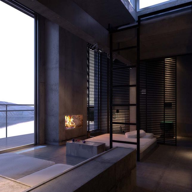
Designed by Igor Sirotov, the PS1 House is a private residence to be built onto a series of stone lips that span from the lake’s surface below to access points above.

lake stone buildings

rrussian house detail

Weathered steel and concrete blend the buildings into the landscape while physically linking them via steps and railings as well.

russian interior spaces

The idea was driven in part by a desire to minimize the building’s footprint and need to alter the natural landscape, taking advantage of existing natural formations.

russian fireplace modernist brutalist

The design borrows from Modernist and Brutalist camps, austere but materially rich with aging in mind.

stone building segments

Steel frames and stone floors match the color and pattern palettes of surrounding site elements, providing semi-permeable shelters for bedrooms, kitchens and dining spaces at intervals between the top and bottom.

Share on Facebook


[ By WebUrbanist in Architecture & Houses & Residential. ]

[ WebUrbanist | Archives | Galleries | Privacy | TOS ]


WebUrbanist

 
Comments Off on Split Level: Segmented Russian Rock Dwelling Bridges Lake & Cliff

Posted in Creativity


How to Use Split Toning to Make Your Photos Stand Out

10 Aug

Have you ever taken a picture and then been disappointed, because it didn’t capture the moment? Maybe it looked exactly like what you saw, but when you viewed the image afterwards it was lacking something.

This is one of the greatest challenges photographers face, to express a feeling or vision in a two-dimensional medium. One of the most overlooked tools in the photographer’s processing kit is color.

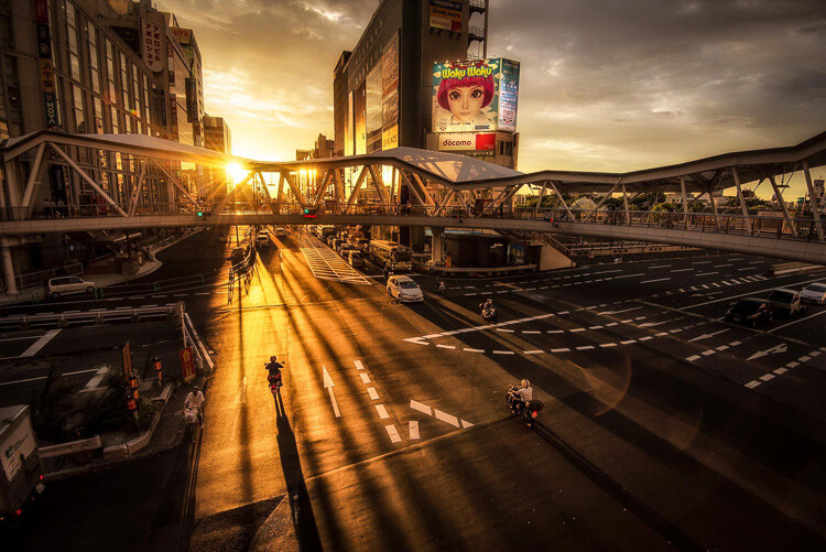
Osaka Sunset

Example of a warm split tone.

I’m not talking about the color of the things in your photograph, like a red car or yellow dress. I mean the overall color cast, the tone of your image, is important too.

Colors affect the way people feel, so much so that there is a whole body of science around it. Even some basic knowledge of color theory can help improve your photography.

Beyond White Balance

The first place to head when you want to change the tone is white balance. For instance, if it’s a gray cloudy day you might want to move the temperature slider towards the warmer side, making your image appear more yellow-orange, or sunny. Move it in the opposite direction, and your image will get cooler or more blue.

Fisherman in Xingping China

Example of a cool split tone.

Although changing the white balance of an image is helpful, it is still a global adjustment – it affects the entire image. In other words, editing the tone of your image with just the white balance is like a mechanic trying to fix an engine with a sledgehammer. It may not be the right tool for the job.

To make more fine-tuned adjustments, and thus have greater control on the overall mood of your images, you may want to have a look at Split Toning.

Penang Sunrise at Fisherman Jetty

Magenta and warm tones.

A Bit of History of Toning

Toning first started as a way to change the color of black and white photographs. For instance, in the past, chemicals were added to the development process to give prints a sepia tone. Later on, other chemicals toners were used to give images two different tones like red and blue.

It may sound complicated, but in today’s digital darkroom, all split toning really means is that you add color to the shadows, highlights, or both. There are a number of ways you can split tone an image. One of the most common is to make the highlights yellow and shadows blue or vice versa. However, let’s take a look at how you can also adjust a single color, to create a particular mood in Adobe Lightroom (also possible in Photoshop and Bridge).

Split Tone Window in Adobe Lightroom

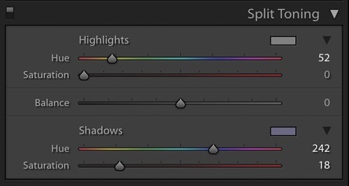
This is what the Split Toning slider looks like in Adobe Lightroom.

Magenta Zen

My favorite color cast to add to my images is magenta. Like a yin and yang varnish, this color (a purplish-red) represents harmony, balance, love, and personal growth. It has a calming effect that stimulates creativity and happiness.

When split toning for magenta, I usually make my adjustments to either the shadows or highlights. I rarely make changes to both, as it tends to be overkill. More often than not, I adjust the shadows, as it’s usually the underexposed darker parts of the image I am trying to bring out. If the image is very bright then I edit for the highlights.

Dubai Cityscape

There is no rule as to how far you should move the sliders. However, I tend to move the hue slider somewhere between 230-250 and the saturation slider between 10-20. It all depends on the image and the intensity of the colors, shadows, and highlights. You can also use the eyedropper to choose the color.

Another added bonus to adding some magenta is that it tends to take off the rough color edges. Browns, greens, and yellows are smoothed out, giving your photos a softer tone.

Pudong Shanghai Cityscape

Split Toning Keyboard Shortcuts for Lightroom

There are a couple of shortcuts in the Lightroom Split Toning panel you’ll want to know about.

First, it can be difficult to to choose the right color when the saturation strength is low. To briefly boost the hue up to %100 saturation, just press and hold Option on Mac (or Alt on Windows), then move the hue slider to either side. This will show the color at full strength so you can select it more easily.

Second, to more easily view the colors split in the image, hold down Option/Alt and then drag the Balance slider in the Split Toning panel.

Experiment

Split Toning is much more than just magenta. Try adjusting the warmth or coolness in your photographs in the split toning panel, instead of using white balance for something different. You can also give your photos a cinematic feel, old film look, and more by split toning. Have fun, get creative, and find what works for you.

Sunset at Sheikh Zayed Mosque in Abu Dhabi

Umbrellas in Busan Rain

Sunrise at Taj Majal

googletag.cmd.push(function() {
tablet_slots.push( googletag.defineSlot( “/1005424/_dPSv4_tab-all-article-bottom_(300×250)”, [300, 250], “pb-ad-78623” ).addService( googletag.pubads() ) ); } );

googletag.cmd.push(function() {
mobile_slots.push( googletag.defineSlot( “/1005424/_dPSv4_mob-all-article-bottom_(300×250)”, [300, 250], “pb-ad-78158” ).addService( googletag.pubads() ) ); } );

The post How to Use Split Toning to Make Your Photos Stand Out by Pete DeMarco appeared first on Digital Photography School.


Digital Photography School

 
Comments Off on How to Use Split Toning to Make Your Photos Stand Out

Posted in Photography


Sony may split off its imaging products business

29 Mar

Sony is considering splitting off its imaging products business, according to a new statement from the company. Sony detailed planned management and organizational structure changes last week, saying its previously announced semiconductor business split will take place next month, placing its image sensors, among other things, under a wholly owned subsidiary.

Sony has been undergoing fairly extensive business restructuring over the past couple of years, having split off its TV business in summer 2014 and its Video & Sound business in October of last year. The semiconductor business split out next month will be its third business group to be separated into an autonomous subsidiary. Whether Sony will proceed to split out its Imaging Products and Solutions Sector is yet to be seen.

Splitting off these segments into subsidiaries will help Sony Corporation focus on strategy across the entire company, placing some operations under the governance of each new Sony Group that until recently were handled by headquarters. The transition of these services to Sony Group companies will start on April 1.


Press release:

Sony Corporation announces changes to organizational and management structure

Tokyo, Japan – Sony Corporation (“Sony” or the Company”) has been engaged in the sequential splitting out of business units across the Sony Group, in order to reinforce the competitiveness of each business, and ensure clearly attributable accountability and responsibility.

In addition to Game & Network Services, Mobile Communications, Pictures, Music and certain other Sony Group businesses that were already operating autonomously as subsidiaries, in July 2014 Sony split out its TV business, followed by its Video & Sound business in October 2015. The Company also plans to split out and establish its semiconductor business as a wholly owned subsidiary in April 2016. Sony is also exploring the split out of its Imaging Products and Solutions Sector.

Concurrently, Sony has also been proceeding to realign the platform functions that support each of its business units in order to enhance the effectiveness and efficiency of these operations.

As previously announced, operations that until now have resided within Sony Corporation, including the Consumer AV Sales Platform, the Manufacturing, Logistics, Procurement, Quality and Environmental Platform for Sony’s electronics business, as well as certain cloud-based platforms and service-related businesses, will each be transferred to the related Sony Group companies. This transition is scheduled to be made sequentially from April 1 2016.

Once the splitting out of these functions has been completed, Sony Corporation will focus on the following Group headquarters functions:

Headquarters: Responsibility for the Sony Group’s overall strategy and governance, and oversight of their execution

  • R&D: Leadership of Sony’s differentiation and creativity through technological innovation
  • New Business: Incubation of new businesses in areas beyond Sony’s current business domains
  • Brand Design: To enhance Sony’s brand value and implement horizontal Group-wide initiatives
  • Professional Services: To support the operations of the Sony Group following the completion of the splitting out process

In conjunction with this structural realignment, certain changes will also be made to Sony’s executive assignments and system effective April 1, 2016, in order to further clarify lines of responsibility and assignments within each business and the headquarters organization. 

The Company will newly appoint four executives, currently in charge of four of the Sony Group’s business segments, as “Corporate Executive Officers” of Sony Corporation. They, together with the six existing Corporate Executive Officers, will assume ultimate responsibility for the Sony Group’s management within the scope assigned to them by the Company’s Board of Directors. Sony will also re-classify its other executives. The executives responsible for executing their assigned business operations under the oversight of the relevant Corporate Executive Officers will be named “Business Executives” of Sony Corporation, while the executives responsible for the headquarters functions assigned to them under the oversight of relevant Corporate Executive Officers will be named “Corporate Executives” of Sony Corporation.

Via: Sony Global

Articles: Digital Photography Review (dpreview.com)

 
Comments Off on Sony may split off its imaging products business

Posted in Uncategorized