As modern day photographers it is easy to get overwhelmed and consumed by new gear, new technology, new software, new techniques (did someone say HDR?) and so on. With so much going on in the industry, sometimes you need to step back, sit down and relax.
Sometimes you need to stop the rush in your head and slow the heck down.
With that said, I thought it would be worthwhile to share some advice for you new photographers that feel an intense desire to do more than you know you can handle at the moment. Or for you photographers that have experience already, but want to go back to simplicity.
Before I dive into my advice, read through Simon Ringsmuth’s article: 5 Tips to Help You Slow Down and Take Better Photos. Now that you have done that, here is my advice.
Slow Down
To add to Simon’s article, I wanted to share a video I recorded on the same topic of slowing down:
You will notice that I have shared some very specific things you can do to force yourself to simplify your photography. Things like switching to manual focus completely, using a smaller memory card, or not using Auto-ISO. Each of these things will force you not only to think, but to think specifically about the subject or scene rather than just broadly.
Prime Lenses
Prime lenses are another way to simplify. It would be nice to have expensive zoom lenses with f/2.8 or wider apertures. But do you need that? Might it just complicate your photography?
Instead of spending the money on expensive lenses, or an all-in-one zoom, try prime lenses. When I am on the job I’m typically using either a 20mm, 35mm, 50mm or 85mm lens. Each has an aperture of f/2.0 or wider. They’re lighter so they don’t hurt my back, they’re smaller so they take up less room, and they make me move my feet and think about perspective more.
They are simple.

Made using a prime lens.
Technique
Admittedly, when HDR first became popular I hopped on the bandwagon. But eventually I got bored with doing the same bracketing technique over and over. At the time processing HDR was not even close to perfection, so the time needed for post-processing was way too much for my liking. So I stopped and instead started to bracket two exposures, or three if needed. Then I would manually mask in specific parts of the scene as needed. I would do this using onOne Perfect Layers or Photoshop – depending on what else I wanted to do to the photo.
Having written books on long exposure and panoramic photography, I love both those techniques. But I don’t always need to do them. I don’t always need filters or a tripod.
A good example of this is as follows. Recently I have started trusting the dynamic range of my camera’s sensor more than ever. Instead of using a filter as often as I used to, when possible I will use that dynamic range and recover highlights and shadows inside of Lightroom. The histogram for my photos is typically towards the middle so that it’s even easier to recover both ends of the spectrum.
Fortunately the Nikon D810 has an amazing dynamic range to allow this. Many other cameras are in a similar situation. That doesn’t mean I never use my neutral density filters, because I do. It just means I simplify when I can, because it allows me to enjoy photography even more.

Sky blackened without filters and only using Lightroom.
Processing
When it comes to processing photos I often see so many filters being used by photographers. There is nothing wrong with that, but I sometimes feel it’s overboard. I might be a minority with how I feel about processing, but here it goes.
When processing photos I am a mix of a purist who also likes to experiment. I am colour-blind, so I rely on my ColorChecker Passport to guarantee accurate colors. But I know that my colors are often off. It happens and that’s okay, but I still aim for accuracy. That’s the purist side of my mentality. The experimental side wants me to try new things, and that is also okay.
But, lately while processing I have been keeping things simple. Very basic color correction as needed, contrast, clarity, and so on. Or a very basic black and white conversion using either Lightroom, onOne, Silver Efex or Tonality. I don’t go for anything out of the ordinary. My black and white processes are very simple. Because sometimes simple is best.

Simple photo and processing brought a smile to hundreds of Vineland, NJ residents.
Keep it at One
If you really want to return to simplicity, try spending your photography time with only one camera body and one lens. For the past few months I have been participating in the WE35 project at The Photo Frontier. It’s a project where each photographer is researching the world of photography, and life in general with only one camera body and a 35mm lens (or 35mm equivalent).

Doing this is extremely challenging and mentally fulfilling. It requires you to simplify your entire photography workflow. So I encourage you to give it a try, as well as the other tips I have shared here.
I will leave you with one more note. Believe in yourself, your knowledge, and your creativity. You don’t need expensive equipment or to always do fancy techniques. You need yourself, your camera and a lens. So step back and enjoy photography and stop driving yourself nuts over every piece of gear and technique that you can do.
googletag.cmd.push(function() {
tablet_slots.push( googletag.defineSlot( “/1005424/_dPSv4_tab-all-article-bottom_(300×250)”, [300, 250], “pb-ad-78623” ).addService( googletag.pubads() ) ); } );
googletag.cmd.push(function() {
mobile_slots.push( googletag.defineSlot( “/1005424/_dPSv4_mob-all-article-bottom_(300×250)”, [300, 250], “pb-ad-78158” ).addService( googletag.pubads() ) ); } );
The post Stop the Rush and Return to Simplicity by Scott Wyden Kivowitz appeared first on Digital Photography School.

Digital Photography School
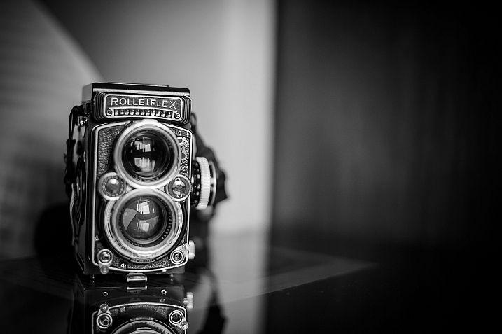


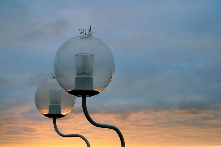


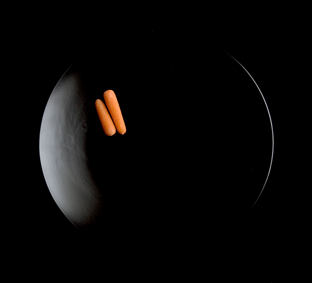


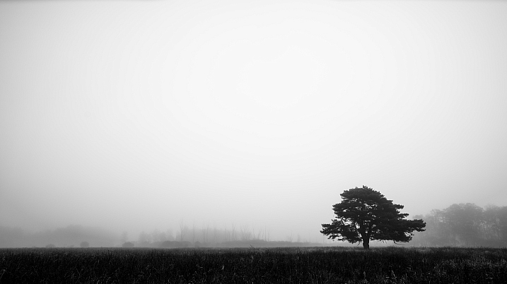


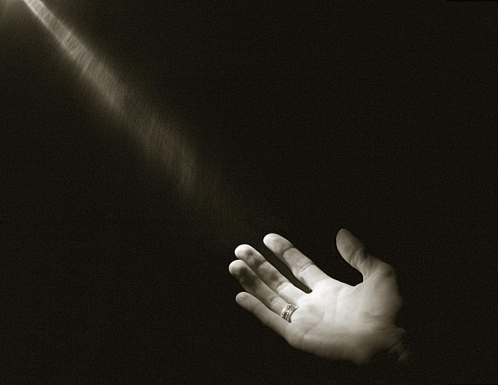
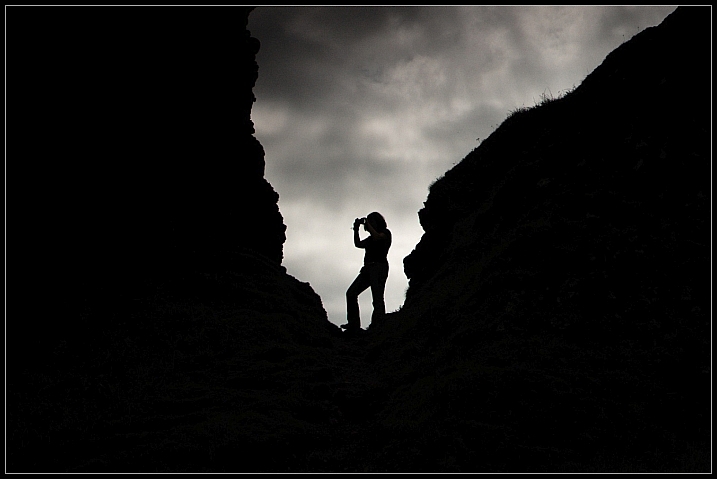
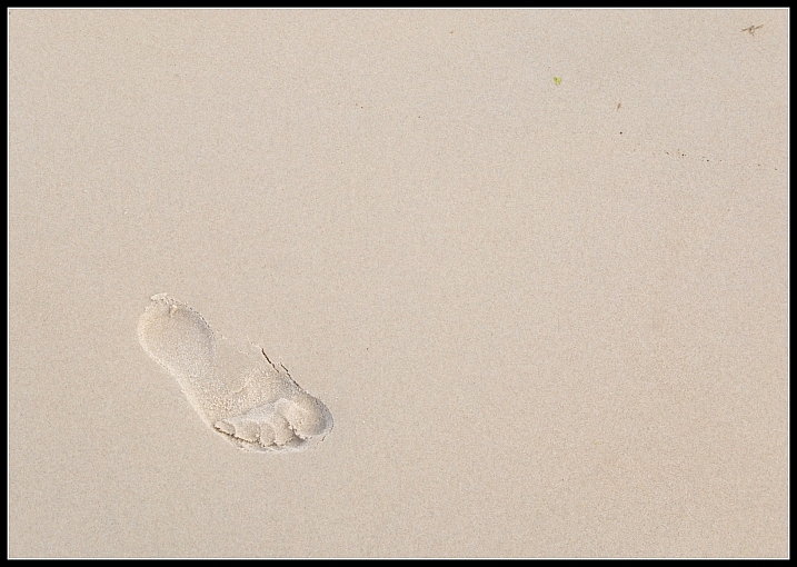
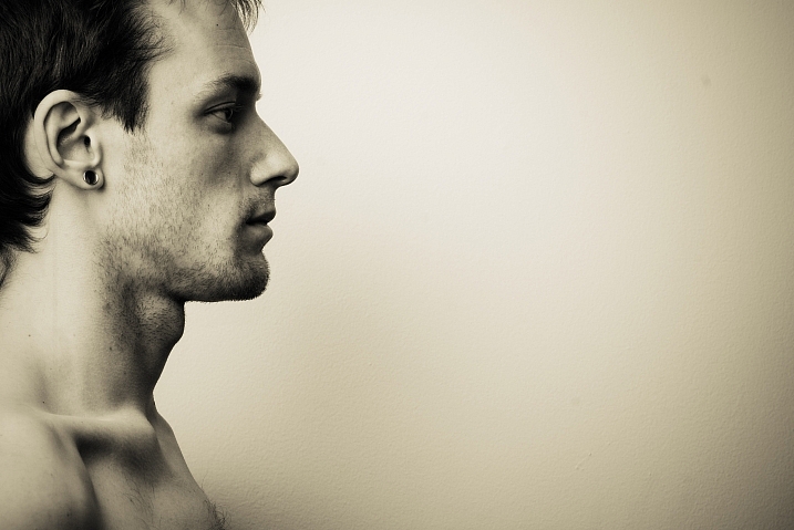
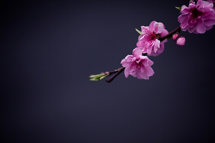
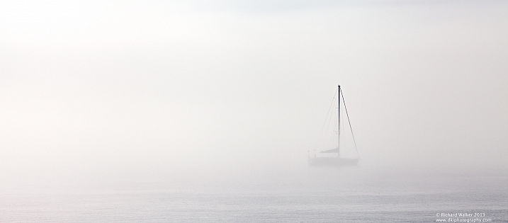
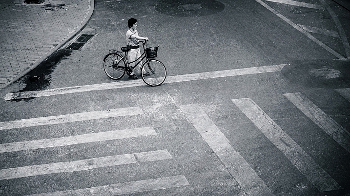

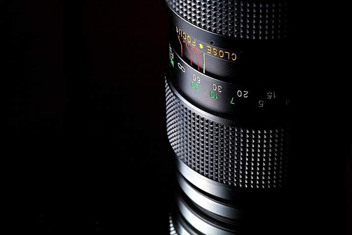
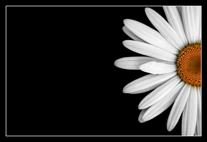


 It’s the simple things in life that are often the best – so in this weeks photography challenge we’re expecting to see some great photos because the theme is ‘simplicity’.


You must be logged in to post a comment.