RSS
 

Posts Tagged ‘Shapes’

Slideshow: Winners of All About Photo’s AAP Magazine #13 Shapes competition

28 Oct

Winners of All About Photo’s AAP Magazine #13 Shapes competition

Earlier this month All About Photo selected 25 photographers from 11 countries as winners of its “Shapes” competition. Winning images appear in the 13th edition of AAP Magazine, which can be purchased here. The subject matter displayed in these works illustrates shapes and patterns found in place settings, architecture, abstractions, and more.

The top 3 winners, who were rewarded a $ 1,000 cash are as follows:

First place winner: JP Terlizzi (United States)
Second place winner: Wendel Wirth (United States)
Third place winner: Klaus Lenzen (Belgium)

The remaining mentions, whose images also appear in print alongside the winners are: Maureen Ruddy Burkhart (United States), Zak van Biljon (Switzerland), Hyun De Grande (Belgium), Hans Wichmann (Germany), Steven Raskin (United States), Fabrizio Spucches (Italy), Deborah Bay (United States), Donell Gumiran (United Arab Emirates), Marcus Trappaud Bjørn (Denmark), Kevin Lyle (United States), Songyuan Ge (China), Nicola Ducati (Italy), Axel Breutigam (Canada), Frank Lynch (Switzerland), Barry Guthertz (United States), Karine Coll (France), Francesco Pace Rizzi (Italy), Abdulla AL-Mushaifri (Qatar), Rosario Civello (Italy), Ursula Reinke (Germany), Golnaz Abdoli (United States) and Don Jacobson (United States).

All About Photo is currently accepting entries for their Solo Competition.

1st Place Winner: ‘Marchesa Camellia with Rhubarb’ by JP Terlizzi (United States)

Artist Statement About the Series: The Good Dishes integrates memory, legacy and metaphor with my response to loss. As I witness an early generation of family members pass, my cousins and I were each faced with the emotional task of cleaning out the family home. Sorting through the heirlooms, we would determine which items to toss, sell or preserve. Without fail, when it came to the family’s fine china, that item was always given to the person that most cherished its memory and sentimental value.

Growing up in a large Italian family, everything was centered around food and the family table. I remember vividly my mother’s vintage marigold stoneware dishes that she bought at the grocery store back in the early 1970s. She used them every day for as long as I could remember, and they had a life of their own. Along with my mother’s everyday dishes she had one set that she kept on display behind glass that only she handled, only she washed, and only she hand-dried; these were deemed ‘the good dishes.’ Whenever I heard, ‘I need to use the good dishes,’ that meant one of two things in our household: the priest was coming over for dinner or it was a very special occasion. Either way, the food presentation, table dress and table manners all changed whenever ‘the good dishes’ came out.

Eating is a physical need, but meals are a social ritual. Utilizing the passed down heirlooms of friends and family, The Good Dishes celebrates the memory of family and togetherness. It borrows the stylized rituals of formal tableware and draws inspiration from classic still life paintings. Background textiles are individually designed and constructed to reflect patterns found in each table setting while presentation, etiquette and formality are disassociated by using food and fine china in unconventional ways as metaphors for the beauty and intimacy that are centered around meal and table.

2nd Place Winner: ‘Wood III’ by Wendel Wirth (United States)

?Artist Statement: In the winter months, the muted horizon parades elemental forms; barns and grain elevators, cow houses, cowsheds, granges as they have been called.

3rd Place Winner: ‘Architecture Minimal I’ by Klaus Lenzen (Germany)

Artist Statement: The photo shows the contours of a cooking plant, seen in Duisburg in the Ruhr area in the western part of Germany.

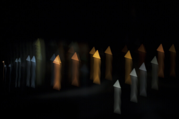
Merit: ‘Triangle Theorem’ by Deborah Bay (United States)

?Artist Statement: Image from the Traveling Light series exploring the interaction of light and color with optical objects. The series follows in a long lineage of experimental studies that investigate the most elemental components of photographic processes: light and lenses.

Merit: ‘Working Class Virus’ by Fabrizio Spucches (Italy)

Artist Statement: Under the umbrella of Corona Virus, current matters such as integration, global warming, conspiracy theory, ecology are depicted through a series of portraits.

Merit: ‘City Waves’ by Hans Wichmann (Germany)

Artist Statement: Skyscraper in Vienna/Austria photographed upwards with light from the side. Edited with hard contrasts in Photoshop. The sky was photographed separately and then inserted.

Merit: ‘Untitled’ by Hyun De Grande (Belgium)

Artist Statement: Attendre dans l’espace de rien (wait in the space of nothing).

Merit: ‘City Center, Las Vegas, NV’ by Axel Breutigam (Canada)

Artist Statement: Buildings and structures are fascinating to me, in particular, modern and contemporary designs.

Exploring a building from all possible angles of view and finding the parts of the structure which lead to another layer of abstraction is what I am seeking visually. To do so it is often necessary to give space and put things into a reductive perspective.

Merit: ‘Shape of Desert’ by Donell Gumiran (United Arab Emirates)

?Artist Statement: Liwa Desert lies 155 miles Southwest of Abu Dhabi, and about 62 miles south of the Arabian Gulf. It’s at the edge of the Rub’ al-Khali, aka the Empty Quarter – a 255,000 square-mile desert that has more sand in it than the Sahara. The area has an assortment of villages and farms – situated along the top of the T – in the midst of the ‘endless landscape of undulating sand shape dunes.’

Merit: ‘City Shapes’ by Ursula Reinke (Germany)

Artist Statement: N/A

Articles: Digital Photography Review (dpreview.com)

 
Comments Off on Slideshow: Winners of All About Photo’s AAP Magazine #13 Shapes competition

Posted in Uncategorized


How to Make Image-Filled Shapes in Photoshop

28 Aug

Photoshop may not be primarily a graphics program but it still comes with very useful tools for that kind of work. For example, making image-filled shapes.

It doesn’t matter if you’re doing some professional job like web design for your business or something personal like a birthday card, you’ll often need to constrain your photo to fit within a specific shape. In this tutorial, I’ll show you how to do that with just a few clicks.

image-filled shapes Photoshop tutorial Intro1

Create a Shape

First, you need your shape. You can easily create one with the Shape tool from the toolbox. You can click and hold to display the menu with your choices. In this first menu, you’ll have some basic shapes like rectangle, ellipse, line, polygon and a customize shape tool.

image-filled shapes Photoshop tutorial Shape Tool

If you choose the custom shape you’ll have a second menu with all your possibilities for that. You can access it in the options bar at the top. If you don’t see many choices, just click on the bracket on the right and click All from the menu that will open; this will load all the preset shapes. If you download any new shapes from the Internet you’ll also found them in this menu.

Image-filled shapes Photoshop tutorial Custom Shape

To draw the shape you chose on a blank canvas, just click and drag until it reaches the size you want, then let go. Whenever you draw a shape on your canvas you can choose to use Fill and Stroke from the options bar. In this case, the filling will be your photo, so set the Fill as black so that your image will be constrained to the shape that you chose.

Here’s how you can do it:

image-filled shapes Photoshop tutorial Draw Shape

Add Your Image

Now that you have your shape you need to bring in the image to fill it. Go to Menu > File > Place. This will open a browser window so you can choose the file from your computer. Choose the one you want and click OK. This photo will be imported into your project as a new layer.

image-filled shapes Photoshop tutorial Place Image

Clipping Mask

Now you just have to go to Menu > Layer > Create Clipping Mask. This can also be achieved by clicking Alt + Ctrl (PC) or Cmd (Mac) + G at the same time.

image-filled shapes Photoshop tutorial Clipping Mask

Note: If you were following my steps exactly then the image was placed as a layer at the top. However, if you are working with a complex project with many layers or if you followed the instructions in a different order this might not be the case.

If that happens, then you do need to take an extra step. Just drag and position the image layer on top of the shape layer in the Layers panel for the Clipping Mask to work as you want.

As a result, you’ll only see the photo through the shape and the best part is that the process is non-destructive. In other words, you did not cut out your photo, the rest of it is just hidden underneath which gives you two advantages.

First, you can reposition your photo to best fit the shape. If you click on the Move tool from the Toolbox you can just click and drag the image so that it gets placed in the best possible way. You can also use any of the transformation tools to resize or rotate it until you are happy with the result.

Second, you can work on the shape as well without worrying about damaging your photo or showing any empty canvas because the photo is complete and untouched underneath.

image-filled shapes Photoshop tutorial Free Transform

Extra tip

You can do as many image-filled shapes as you want in the same canvas, as they will just be stacked as additional layers. For example, you can add text to your project.

To do that, instead of using the Shape Tool go to the Type tool and select a font type broad enough to make the effect noticeable. Then repeat the process of placing an image (it can be a different photo than the one you used for the shape) and creating a clipping mask.

image-filled text Photoshop tutorial

And again, since the image is intact underneath, you can come back and edit the text anytime you want. Have fun!

image-filled text Photoshop tutorial edit type

The post How to Make Image-Filled Shapes in Photoshop appeared first on Digital Photography School.


Digital Photography School

 
Comments Off on How to Make Image-Filled Shapes in Photoshop

Posted in Photography


Polaroid unveils flexible LED panel you can bend into different shapes

29 Sep

Polaroid has been on a lighting spree of late, and the brand continued that trend this week by launching a lightweight, flexible LED light panel that can be bent into various positions and shapes.

The 12×12-inch (30.5 x 30.5cm) panel offers flicker-free 5600K color temperature light at a thickness of just 16mm / 0.6in. Inside are embedded 256 total LEDs that output 4500 lumens of light, which Polaroid says makes it nearly as bright as direct sunlight; however, the panel does include a diffusion filter to produce a softer “dreamy glow.”

According to the product’s Amazon page, Polaroid’s new panel includes a remote control for toggling the light’s channels and settings, it is dimmable, and it’s being described as durable, though Polaroid doesn’t detail the exact materials it used to make the product.

The Polaroid flexible LED panel is available now for $ 125 USD.

Press Release

Polaroid Announces the Polaroid Flexible LED Lighting Panel; Brings Bendable, Controlled Lighting to Photographers and Videographers

Super-bright, featherweight LED light that folds and bends into the perfect shape for every shot

Edison, NJ – September 26, 2017 – Polaroid today announced the Polaroid flexible LED lighting panel, an incredibly lightweight, bendable light source that is a must-have accessory for any photographer or videographer. Mold the light to the desired form and position, as the pliable flat-mat material can be reshaped to give focused control over the light’s direction and fall-off. Anyone from professional photographers to casual enthusiasts can use the simple wireless remote control to quickly dim the daylight balanced light source, making it perfect as a main light or as a versatile fill light in larger set-ups.

The Versatile Light That Fits Any Situation

Perfect for both indoor and outdoor use, the 5600K color temperature light source delivers flicker-free brilliant light wherever you take it. Bright and flexible enough to be part of a larger professional shoot, the Polaroid flexible LED lighting panel is also light enough for use at solo outings, weddings and location shoots. The compact design and bendable material make this the perfect accessory for the photographer on-the-go.

Perfect Lighting for Portraits, Products or Macro Photography

Measuring at 12×12” and just 16mm wide, the super slim Polaroid flexible LED panel mat weighs a mere one pound, making it easy to arrange and mold the light into your ideal position. Even at this ultra-portable size, the Polaroid flexible LED lighting panel delivers superb color reproduction similar in comparison to a natural light source; with 256 LEDs it can produce up to 4500 Lumens – nearly the brightness of direct sunlight. For those looking to achieve a softer look, the included special diffusion filter turns the brilliant LED light into a dreamy glow – perfect for portraits and product shots!

Photographers and videographers can purchase the Polaroid flexible LED lighting panel from Amazon for 124.99 USD.

Articles: Digital Photography Review (dpreview.com)

 
Comments Off on Polaroid unveils flexible LED panel you can bend into different shapes

Posted in Uncategorized


How to Make Custom Bokeh Shapes

28 Feb

How to Make Custom Bokeh Shapes

The theory

Bokeh (pronounced b??k?) is a Japanese term that translates to blur in English. Bokeh is used by photographers to describe the quality of the unfocused or blurry parts of a photograph. Every photograph has a depth of field – the area of a photograph that is in focus.
For example, in the image below, the upper half of foreground is sharp and in focus, meaning that it is inside the depth of field. The background, however, is blurry or outside of the depth of field. The reason the leaves in the upper foreground are focused is because I physically positioned myself close to them with my camera set to a wide aperture – resulting in a shallow depth field and an unfocused background. It’s this subsequent softness and shape in the background that is described as Bokeh.

How to Make Custom Bokeh Shapes

Looking at the image again, you’ll notice that the points of light in the unfocused areas of the photograph are circular in shape. That’s because my lens renders them to appear that way. However, you can change this shape to create your own patterns by making simple filters and attaching them to your lens.

googletag.cmd.push(function() {
ruleset_slots.push( googletag.defineSlot( “/1005424/_dPSv5topic-rhs(300×250)”, [300, 250], “pb-ad-0” ).addService( googletag.pubads() ) ); } );

What you need to make custom bokeh

How to Make Custom Bokeh Shapes

  • Camera
  • A large aperture lens (I used a Canon 50mm f/1.8, but the larger the aperture the better the effect)
  • Lens cap for the above lens
  • A sheet of black poster board
  • Scissors
  • Craft knife
  • Pen
  • Compass (optional)

Making the filterHow to Make Custom Bokeh Shapes

To begin, place the lens cap on the sheet of black poster board and carefully trace around the outside of the cap with a pen. Alternatively, you can measure the diameter of your lens, set a compass to the measurements and trace an outline with the compass instead. Mark out an extra little tab coming off of the outline to help remove the filter later.

Cut around the outline of the lens cap and tab so that you have a circle that fits snugly in front of your lens. Usually, the filter diameter is about 0.5 mm smaller than the lens cap size, so you may have to trim the edges of the circle a little more for a tight fit.

In the very center of the circle, draw the outline of the shape or design you want to use. Keep in mind that to work properly, the shape can’t too be too big or small. Making the shape too small blocks so much light that most of your photos will be underexposed and turn out black. Too large a shape and you won’t be able to see the effect in your photos at all. It’s a little fiddly, but keep the shape to at least 5mm and at most 20mm. As an example, I cut shapes that were about 15-20 mm on the longest side for my f/1.8 lens. It may take some experimentation to get perfect.

googletag.cmd.push(function() {
ruleset_slots.push( googletag.defineSlot( “/1005424/_dPSv5topic-rhs(300×250)”, [300, 250], “pb-ad-1” ).addService( googletag.pubads() ) ); } );

How to Make Custom Bokeh Shapes

Keep the design simple

The simpler the design, the easier it is to cut with the craft knife, which will make for a more defined bokeh shape. I recommend shapes like 5-pointed-stars, triangles, hearts, crosses, or even question marks. Cut the outline of the shape out with the craft knife, tidying up any messy corners carefully or they will show up in your photographs.

How to Make Custom Bokeh Shapes

Take your filter and press it into the front of your lens so it sits snugly in the ridges.

Using your custom bokeh filter

Set your camera to Aperture Priority or Manual mode. For maximum effect, you want to set the f-stop to be as wide as possible. On my lens, the lowest aperture available is f/1.8 but depending on the lens you use, you might be able to go wider still (f/1.4 or f/1.2). Because the filter blocks a lot of light, you will need to make longer exposures and/or use a higher ISO, so having a tripod will prove handy.

googletag.cmd.push(function() {
ruleset_slots.push( googletag.defineSlot( “/1005424/_dPSv5topic-rhs(300×250)”, [300, 250], “pb-ad-2” ).addService( googletag.pubads() ) ); } );

Remember that only unfocused points of light in the photograph will be affected by the filter. If you want a dramatic effect, try going out at night with your camera set to manual focus and see the results at different focal lengths. The most dramatic effect will be seen at the closest focus distance (when you’re close to the subject and the background is far away). Have fun with reflective objects, fairy lights, reflections, and even glitter to create some eye-catching bokeh patterns. My favorite shape is the heart, can you tell?

How to Make Custom Bokeh Shapes

How to Make Custom Bokeh Shapes

The outline of a tree is marked out at night by the pretty fairy lights draped on its branches. I couldn’t resist the opportunity to test one of my heart-shaped bokeh filters.

How to Make Custom Bokeh Shapes

How to Make Custom Bokeh Shapes

How to Make Custom Bokeh Shapes

Moving the camera around during exposure with a custom bokeh filter can produce some interesting results

How to Make Custom Bokeh Shapes

googletag.cmd.push(function() {
ruleset_slots.push( googletag.defineSlot( “/1005424/_dPSv5topic-rhs(300×250)”, [300, 250], “pb-ad-3” ).addService( googletag.pubads() ) ); } );

How to Make Custom Bokeh Shapes

Light filtered through an oak tree transforms into an intriguing array of diamonds.

How to Make Custom Bokeh Shapes

This bokeh filter transforms car lights into a sprinkle of stars

The post How to Make Custom Bokeh Shapes by Megan Kennedy appeared first on Digital Photography School.


Digital Photography School

 
Comments Off on How to Make Custom Bokeh Shapes

Posted in Photography


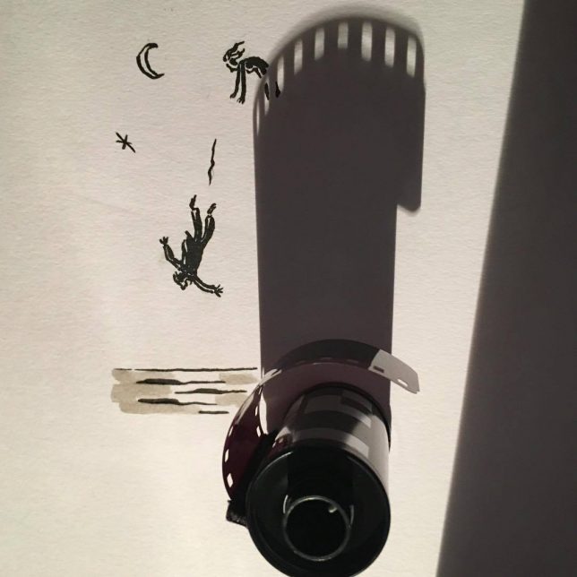
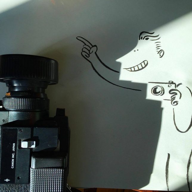
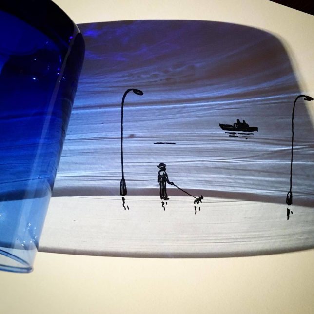
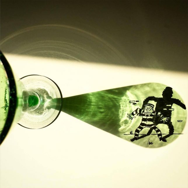
Art in the Shadows: Everyday Objects Cast Unexpected Shapes Onto Paper

10 Dec

[ By SA Rogers in Art & Drawing & Digital. ]

art-in-the-shadows-3

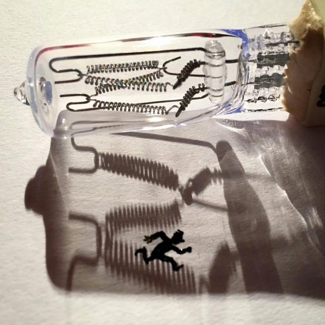
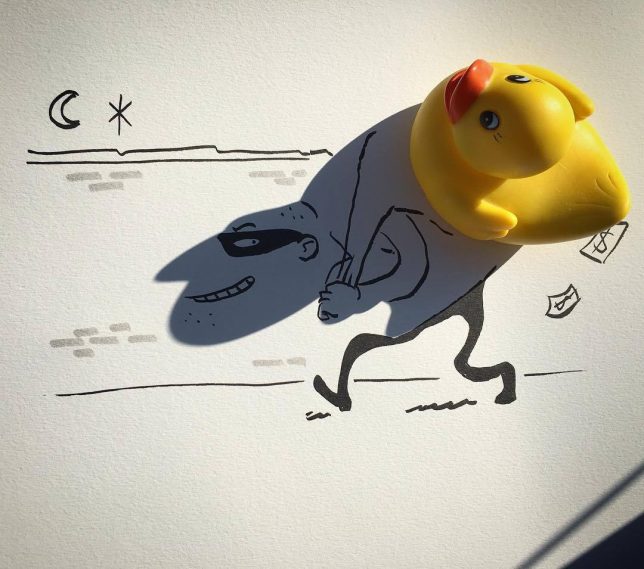
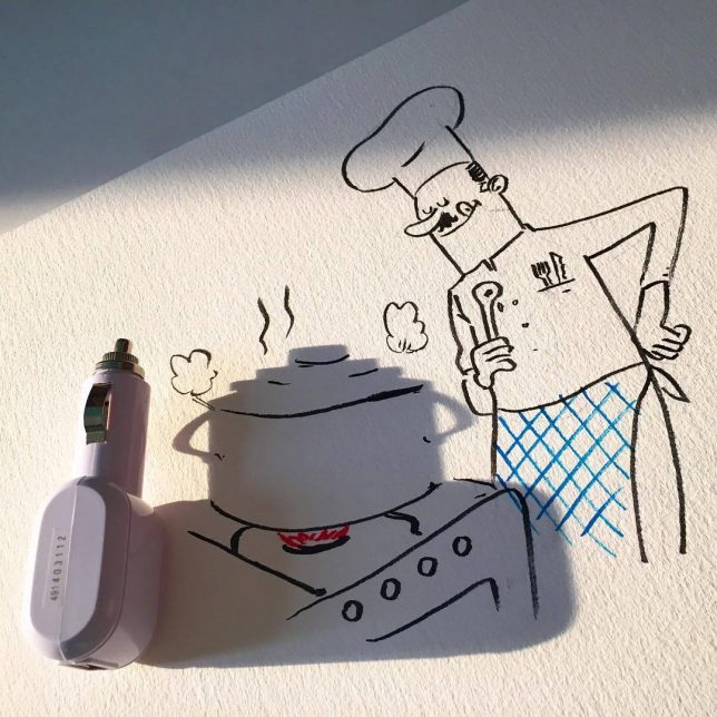
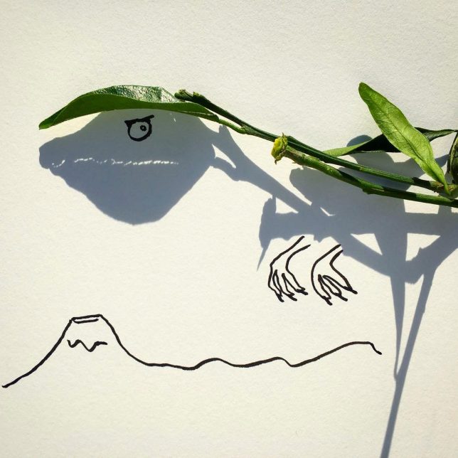
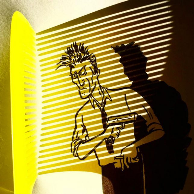
Has doodling ever been more creative than this? While most people wouldn’t give a second’s thought to the shape an everyday object’s shadow casts upon adjacent surfaces, artist Vincent Bal looks at them and sees the beginnings of a character or scene. It might be a phone charger, a fallen leaf, a drinking glass or a Christmas ornament, but in its shadow, Bal sees far more than the object itself.

art-in-the-shadows

art-in-the-shadows-2

art-in-the-shadows-5

art-in-the-shadows-6

art-in-the-shadows-7

Each of Bal’s quick and clever illustrations is a testament to the creativity of an artist’s brain. Calling his work ‘shadowology,’ Bal plays around with silhouettes and light sources to find inspiration for sketches most people would never dream up. It takes the game of finding shapes in the clouds and applies an artist’s hand to the process, embellishing the shapes into something more.

art-in-the-shadows-8

art-in-the-shadows-9

vincent-bal-2

vincent-bal-1

Calling himself a ‘filmmaker and doodler and procrastinator from Belgium’, Bal shares his work on his popular Instagram account and sells prints on Etsy.

Share on Facebook


[ By SA Rogers in Art & Drawing & Digital. ]

[ WebUrbanist | Archives | Galleries | Privacy | TOS ]


WebUrbanist

 
Comments Off on Art in the Shadows: Everyday Objects Cast Unexpected Shapes Onto Paper

Posted in Creativity


Against All Odd (Shapes): 12 Homes Tailored to Tiny & Difficult Plots

24 Nov

[ By SA Rogers in Architecture & Houses & Residential. ]

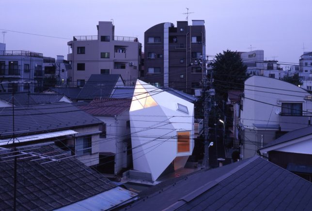
odd-shaped-house-mineral-3

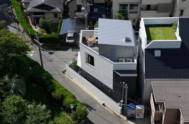
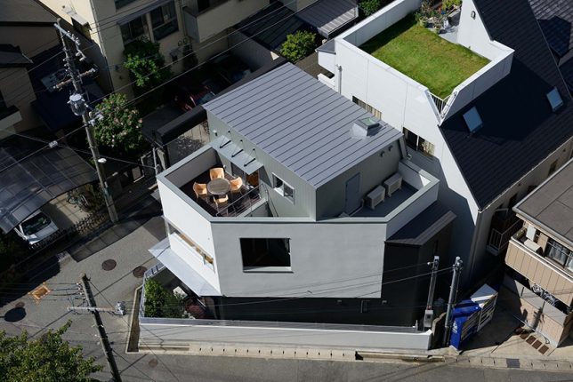
Plots of land long considered too small and strangely shaped to build upon prove to be more valuable when they seem thanks to some creative thinking. Across the world (put particularly in cramped Tokyo), architects are rising to the challenge to expand available living spaces in heavily populated cities, designing structures that fit these ‘odd lots’ without sacrificing privacy, comfort and outdoor spaces.

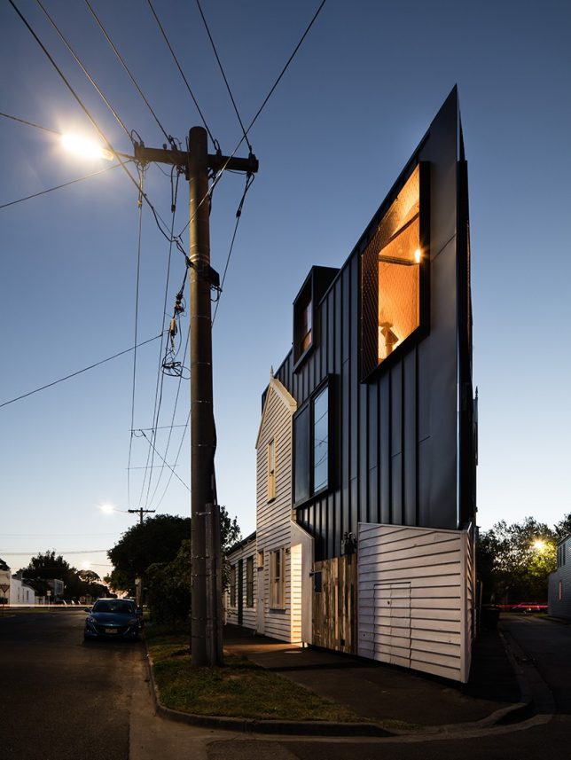
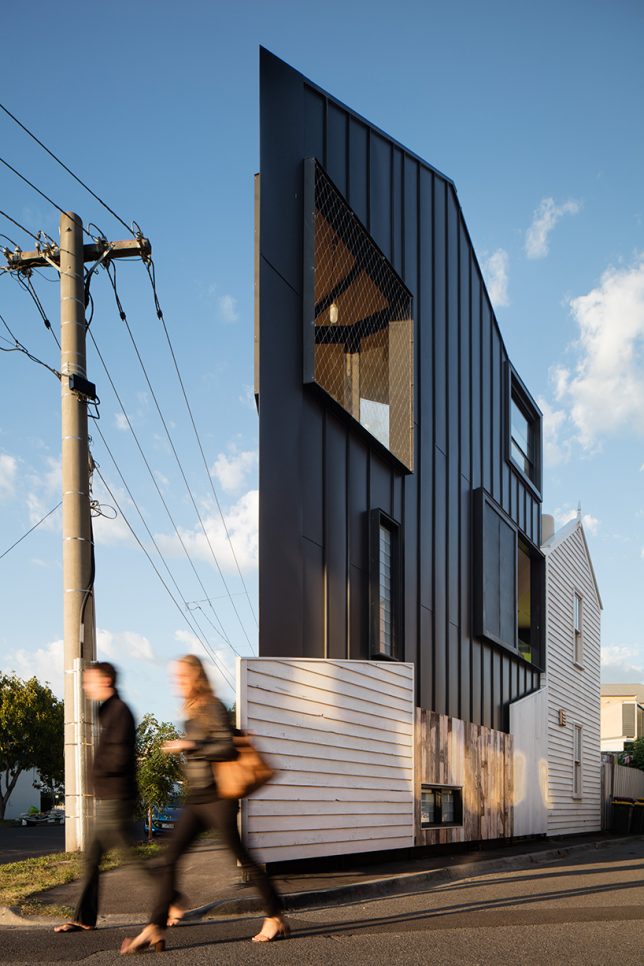
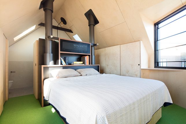
Wedge-Shaped Home by Oof! Architecture

odd-shaped-house-wedge-1

odd-shaped-house-wedge-2

odd-shaped-house-wedge-4

odd-shaped-house-wedge-5

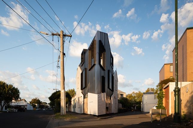
The geometry of this triangular site in a residential neighborhood in Melbourne presented a major challenge for OOF! Architecture, especially due to strict building rules. The architects created a three-story structure full of split-level living areas to avoid wasting space on internal walls, doors and hallways.

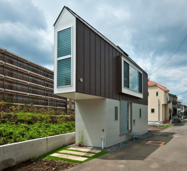
House in Horinouchi by Mizuishi Architect

odd-shaped-houses-horin-1

odd-shaped-houses-horin-2

odd-shaped-houses-horin-3

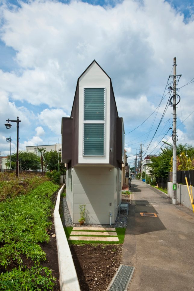
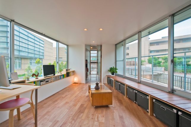
One of Tokyo’s most distinctive odd-shaped houses, ‘House in Horinouchi’ by Mizuishi Architect Atelier had to fit within a strip of land roughly the size of a parking spot while still having a place to store bikes outside. The ultra-narrow result features a tapered cantilevered end, a slightly wider area containing the living spaces, and a play loft for the owner’s children.

Grass Cave House by Makiko Tsukada

odd-shaped-house-grass-cave-1

odd-shaped-house-grass-cave-2

odd-shaped-house-grass-cave-3

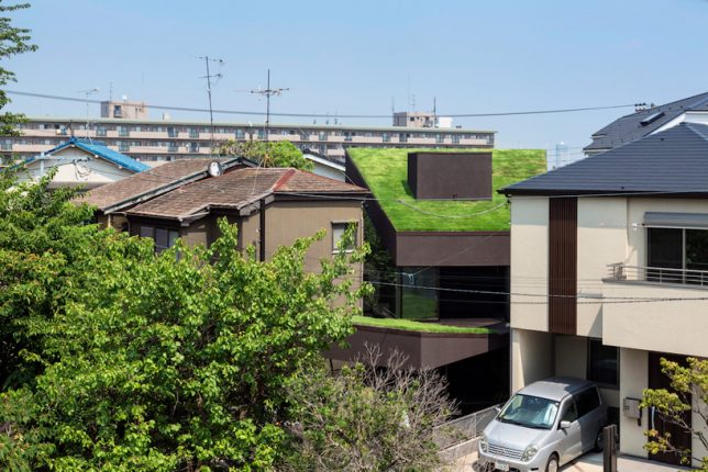
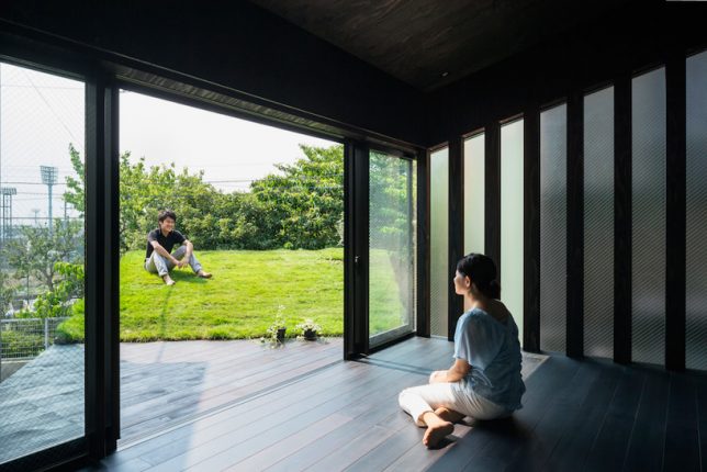
This plot is squished between several existing houses in the suburbs at an odd angle, which could easily have resulted in a dark structure with very little privacy and no outdoor spaces. Instead, Makiko Tsukada Architects built a step-shaped structure consisting of three grass-covered volumes, including a carport roof and the home itself. Large windows face these elevated lawns to bring sunlight inside.

Mountain House by Hiroki + Tomoko Sekiguchi

odd-shaped-house-mountain-1

odd-shaped-house-mountain-2

odd-shaped-house-mountain-4

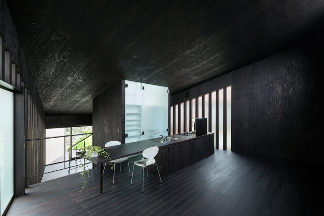
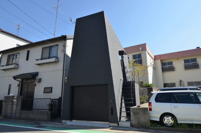
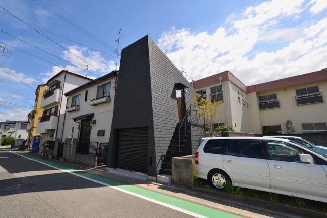
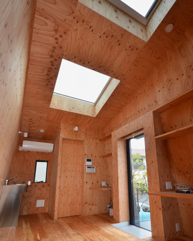
Monolithic and windowless from outside, ‘Mountain House’ by Hiroki and Tomoko Sekiguchi Architects has to accommodate a large four-wheel-drive car on its lowest level and contend with the prying eyes of neighbors. The result frames views of the sky and accesses daylight via skylights.

Triangular House by H.ARCHITECTS

odd-shaped-houses-triangular

odd-shaped-houses-triangular-2

odd-shaped-houses-triangular-3

Strict Japanese setback requirements prevent architects from building right up to the edge of the plot, including roof overhangs, yet the typical Japanese plot is incredibly small. This one was considered too awkward to build on and used as a parking lot for many years, but H.ARCHITECTS found a solution that makes the most of the adjacent park. A z-shaped interior layout allows for the creation of a few outdoor spaces, like the third floor balcony.

Next Page – Click Below to Read More:
Against All Odd Shapes 12 Homes Tailored To Tiny Difficult Plots

Share on Facebook


[ By SA Rogers in Architecture & Houses & Residential. ]

[ WebUrbanist | Archives | Galleries | Privacy | TOS ]


WebUrbanist

 
Comments Off on Against All Odd (Shapes): 12 Homes Tailored to Tiny & Difficult Plots

Posted in Creativity


Flexible Furniture: Mold this Seat into All Sorts of Shapes

07 Sep

[ By WebUrbanist in Design & Furniture & Decor. ]

the body modular seating

Sitting in a single position for long periods is not just uncomfortable but also a health hazard, but is the solution to be found in a single form or something more pliable and adaptable?

modular chair lying down

London designer Kirsi Enkovaara (images by Aava Anttinen) explores plasticity and comfort in this project titled The Body, a thesis work completed at the Royal College of Art.

the body chair design

The idea is in part to avoid presuppositions about ‘best ways’ to sit or lie down, letting a user bend and twist their furniture into shapes suitable for different activities and allowing for various positions of rest.

modular moldable furniture london

The structure itself is composed of canvass and filled with rice, giving it the right combination of flexibility and rigidity to support a person while also allowing it to be reshaped on demand.

modular seat design curve

From the designer: ‘The Body’ encourages a person to find their choice of sitting by discarding learned cultural norms. Trusting in their touch, movement and the feelings that arise in reaction to these in order to create the most comfortable way of sitting. The structure of ‘The Body’ is made from canvas and rice allowing it to be formed into reconfigurable rigid structures.

modular comfortable seat exploration

“The project started from an interest in emphasizing the psychology of sitting. When we are sitting or laying down we are less aware of our surroundings and in a more relaxed state. This is why the construction of the seat needed to reflect the qualities of human touch, the tactility and safety of which provides us with great comfort.” Many of her other works, both of art and design (or somewhere in between), likewise explore different relationships between ourselves and everyday objects.

Share on Facebook


[ By WebUrbanist in Design & Furniture & Decor. ]

[ WebUrbanist | Archives | Galleries | Privacy | TOS ]


WebUrbanist

 
Comments Off on Flexible Furniture: Mold this Seat into All Sorts of Shapes

Posted in Creativity


Cute Cameras: Animal Shapes Make CCTV More Palatable

22 May

[ By Steph in Design & Fixtures & Interiors. ]

Cute CCTV Camera Designs 1

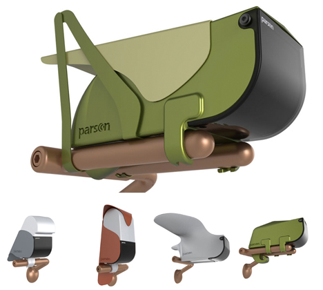
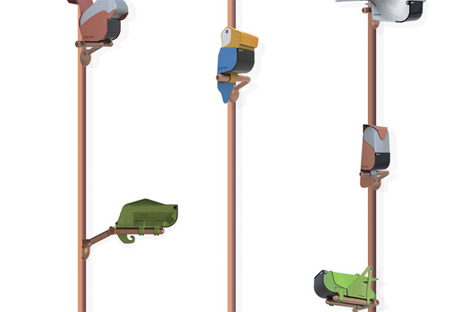
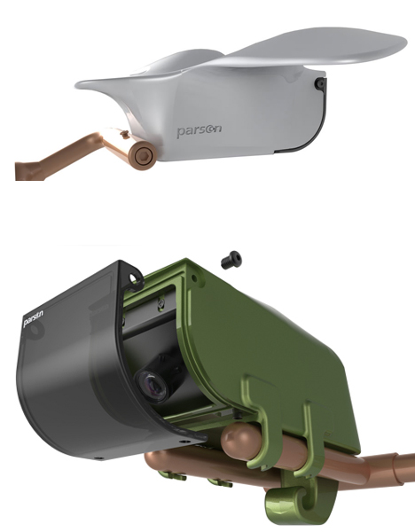
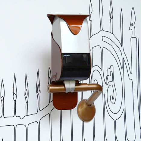
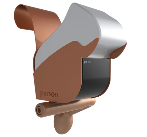
Would a cute, artistically designed chameleon sculpture make you feel better about being watched? A new series of CCTV camera cases by Italian designer Eleonora Trevisanutto transforms ugly, ordinary security equipment into decorative objects that make surveillance seem a little less intimidating.

Cute CCTV Camera Designs 3

Cute CCTV Camera Designs 4

You’re still being watched, sure, but by a lizard, squirrel, grasshopper, owl or an adorable abstracted bird. It’s like a kinder, gentler Orwellian vision of the future. “The camera is no longer a ‘looming control’ means, but a decor element, an integral part of the place in which it is located.”

Cute CCTV Camera Designs 5

The need for less intimidating CCTV cameras does make sense for places like retail stores, daycares and other businesses where security is necessary, as well as private homes. The models don’t just differ visually; each animal offers its own individual functions, equipped with vision systems that can perform different operations like face recognition. That’s right – that lizard knows exactly who you are.

Cute CCTV Camera Designs 2

While many of us are so used to seeing ordinary cameras virtually everywhere we go that we don’t even notice them anymore, Parson’s ‘Animal’ series was made to be seen.

Share on Facebook


[ By Steph in Design & Fixtures & Interiors. ]

[ WebUrbanist | Archives | Galleries | Privacy | TOS ]


WebUrbanist

 
Comments Off on Cute Cameras: Animal Shapes Make CCTV More Palatable

Posted in Creativity


Learn Shapes and Carve Pumpkins with Shawn the Train – Fun Cartoon for Kids

02 Aug

Educational cartoon for children where Shawn the Train teaches different shapes and carves pumpkins with them. Video shows colorful shapes and train. Great Train theme will help your child remember shapes even faster. Also check out preview of our upcoming cartoon “The Alphabet Adventure With Alice And Shawn The Train” on our channel. Thank you for watching!!! Your kids will love it!!! ***POSTER SHIPPING WITHIN CONTINENTAL US IS ONLY .94! THAT IS INCLUDING POSTER TUBE! ON AMAZON.COM AND CANADA IS ONLY .95!!!*** www.amazon.com coilbook™ | Learning is easy when it’s fun!™
Video Rating: 0 / 5


Microsoft Visio 2010 – Make It Easier to Select Multiple Shapes

08 Feb

When using a selection rectangle in Visio 2010, select objects even if the rectangle does not completely surround them.

When trying to select multiple shapes in a Microsoft Visio 2010 diagram by creating a selection rectangle, you might find the process tricky as Visio requires you to completely surround each shape for it to be added to the selection. This can especially be true if you are editing a diagram on a laptop and using a touchpad / trackpad or other non-mouse pointing device.

By making a simple tweak, you can add objects to the selection by surrounding only part of them with a selection rectangle. While this may cause inadvertent selections in some cases, you might find the ease in selecting a large group of objects to more than make up for that in the long run….

Read more at MalekTips.
New Computer and Technology Help and Tips – MalekTips.Com

 
Comments Off on Microsoft Visio 2010 – Make It Easier to Select Multiple Shapes

Posted in Technology