RSS
 

Posts Tagged ‘Secret’

5 Secret Tips to Take Sharp Photos Using Any Camera

30 Jan

The post 5 Secret Tips to Take Sharp Photos Using Any Camera appeared first on Digital Photography School. It was authored by Kunal Malhotra.

How to take sharp photos is one of the most common issues a beginner photographer faces. In order to suggest a few important tips, I went back a few years and recalled the issues I used to come across.

Here are five tips I learned over the years to ensure I always take sharp photos using any camera.

1. Select Maximum AF Points

1 - 5 Secret Tips to Take Sharp Photos Using Any Camera

Every digital camera has a certain number of focus points, which are used by the camera to lock focus. By default, you can either allow the camera to use all the focus points or reduce them to a specific number such as 11, 9 or even one point.

I make sure that I am making use of all the focus points, to minimize the use of ‘focus and recompose.’ Keeping all the focus points active ensures that you get to use the entire focusing area on the sensor. Whereas, reducing the active focus points makes you focus and recompose the frame, resulting in soft focus.

2. 1-point AF

2 - 5 Secret Tips to Take Sharp Photos Using Any Camera

In the majority of situations, using single-point autofocus can help you nail the focus. Because if you allow the camera to lock focus as per its functionality automatically, there are chances that the focus might go off.

Assume you are taking a portrait, and in order to achieve crisp focus, you wish to focus on the eye of the subject. While using autofocus point selection, chances are, the camera might focus on the nose or the lips. The reason this happens is the camera does not know that you want to want to focus on the eye specifically.

Now by using the single-point autofocus feature, you can manually select the point where your eye is in the frame. Doing so, allows you to get the accurate focus on the eye, without any hit and trial method.

3. Back Button focus technique

3 - 5 Secret Tips to Take Sharp Photos Using Any Camera

There are some situations when you try to focus on a subject and the camera takes some time before you can fully press the shutter release button. Alternatively, when you want to take photos in Burst Mode the camera misses focussing on a few shots. You can eliminate these issues and achieve accurate focus by using the back button focus method.

The Back Button focus technique allows you to assign a button placed on the rear side of your camera to focus, and the shutter release button when pressed fully, captures the image.

While using this technique, you will realize that on pressing the shutter release button halfway, nothing happens. This is because another button using your thumb is now controlling the focusing.

4. Use of Shutter Priority

4 - 5 Secret Tips to Take Sharp Photos Using Any Camera

If you are a wildlife, action or sports photographer, there might have been instances where you were not able to freeze the motion of your subject. Moreover, if you shoot in low-lighting conditions, you might have encountered shake in your photos.

In any of the above situations, I make sure that I am using my camera on Shutter Priority mode. The basic rule that I start with is using the shutter speed 1/2x of the focal length. For example, while shooting at 50mm, I ensure that I start shooting by using 1/100 sec (1/2×50 = 1/100). In the worst situations, I reduce the shutter speed by 1-2 stops if my lens supports Image Stabilization.

Using the Shutter Priority mode ensures that your camera is using a specific shutter speed that results in no or minimum shake in the image. If you wish to freeze the motion of a moving subject, you can dial a fast shutter speed like 1/2000 sec and let the camera do the remaining math.

5. Take backup shots

The last important tip to get sharp photos would be to take a few backup shots during your shoot. Imagine if you are doing a commercial shoot and when you return to your editing desk you realize that the subject is out of focus or the image is not sharp.

Make sure that after clicking the desired photo, you take a few extra photos of the same frame. These backup photos reduce the risk and increase the possibility of getting sharp photos.

In the past 8-9 years, these five tips have helped me to nail focus in almost any situation and deliver quality work to my clients.

Do you have other tips? Do share your views in the comment below.

The post 5 Secret Tips to Take Sharp Photos Using Any Camera appeared first on Digital Photography School. It was authored by Kunal Malhotra.


Digital Photography School

 
Comments Off on 5 Secret Tips to Take Sharp Photos Using Any Camera

Posted in Photography


The Secret to Sharing Photos with Lightroom CC

18 Jan

The post The Secret to Sharing Photos with Lightroom CC appeared first on Digital Photography School. It was authored by Simon Ringsmuth.

After years of resisting the urge to sign up for one of Adobe’s Creative Cloud plans, I finally gave in. I purchased a subscription to the Photography bundle which includes Lightroom and Photoshop. While initially, I didn’t see a whole lot of benefits to this, I continue to discover all sorts of perks included in the Creative Cloud that I didn’t even think about before I jumped on the train.

One of the best, and also one of the least-talked-about, features has been the ability to share photos publicly right from Lightroom. This feature has been a total game-changer for me and it could re-shape the way you go about getting your work seen by others.

Traditional Lightroom sharing

With all previous versions of Lightroom, sharing images involved a few steps and some hoops to jump through. Mostly, this involved exporting images to your computer and then uploading them to social media sites, online photo platforms, or even email them to friends, family, and clients. Unfortunately, this also meant some hassles. Such as having duplicate copies of your shared images (one in your Lightroom catalog and one that you exported for sharing) and having to re-export and share images after you made any changes. The process could also be time-consuming, especially if exporting a large batch of images.

Some social sites like Flickr and Facebook created plugins for Lightroom, but in my experience, those have been somewhat unreliable, and I have used some that were ultimately abandoned by their developers. This meant that relying on these plugins was an exercise in frustration and, more often than not, futility.

Psst…have you heard about Lightroom’s photo-sharing capabilities?

Before I jumped to Creative Cloud, I had several presets that I created to export images for different groups of people. I had a hierarchy of folders in my cloud storage service that I used for sharing, and a headache if I needed to re-share images after further edits. After switching to the Creative Cloud Photography plan, that includes both Lightroom Classic CC and Lightroom CC, I have replaced all of that with a simple click of the mouse or tap of my iPad.

Using the sharing features of Adobe Creative Cloud, you can instantly make individual photos or even entire albums public. Then you get a link to share with anyone you want. You can further customize these features. You can specify whether people with the link can download photos, access picture metadata, and see only pictures that have a particular Flag or Star Rating. The images you share can have comments and likes from viewers, and you can get information on this activity as well.

Sharing doesn’t use your Cloud Storage

My favorite part about this type of sharing is that none of your shared images count against your Creative Cloud storage quota. Even if you have the Photography plan with only 20GB of storage, you can share as many photos to the web as you want without using any of that 20GB allotment. This feature does not use your allocated space because Adobe doesn’t share full resolution images with this feature.

You probably wouldn’t want to do this with clients who need high-resolution downloads for printing, but it’s great for getting your pictures seen by many people without any real effort on your part.

Sharing with Lightroom Classic CC

If your workflow is dependent on the more traditional Lightroom Classic CC as opposed to the cloud-focused Lightroom CC, you still have access to most of the cloud-based sharing features. You will, however, need to launch Lightroom CC at some point if you want to fine-tune your sharing options. The first step in sharing is to enable syncing. You achieve that by clicking on your name in the top-left corner of the application and choose “Start” under the option to Sync with Lightroom CC.

No need to panic at this point – nothing is going to happen to your photos, and no images are going to be suddenly shared to the cloud or anywhere else. All this does is give you the option to sync photo albums with Lightroom CC so you can edit your images using that program on your desktop or mobile device. It’s not even sharing the actual pictures, just low-resolution preview files. After you make any edits, those changes get automatically synced back to Lightroom Classic CC.

This feature also gives you the option of making your images available publicly on the internet for anyone to view. However, first, you must choose individual albums that you want to sync with Lightroom CC. Right-click on a collection in your Library and select Sync with Lightroom CC.

Doing so doesn’t share the photos publicly, but makes them available to Lightroom CC while also giving you the option to share them with others if you wish. (Note that this feature is only available for traditional photo collections in Lightroom and will not work with Smart Collections.)

After you have synced a Collection with Lightroom CC, you will see a small two-way arrow icon next to its name, and you will have access to additional features when you right-click on it with the Lightroom CC Links option. You can now make the album Public. Once you have completed that step, you can view the photos on the web or get a public link to send out to family and friends.

It is as simple as that! With one click you can get a link to an entire photo Collection, and Lightroom does all the heavy lifting of uploading them and putting them in a clean gallery format. For more options, open up Lightroom CC on your desktop or mobile device.

Sharing with Lightroom CC

Because Lightroom CC is built from the ground up to live and breathe in the cloud, it has a more robust suite of tools available for sharing (even though the basics are relatively similar to its desktop counterpart). Whether you have your original images stored in Lightroom CC (or stored in your Adobe Creative Cloud account) or synced from Lightroom Classic CC, the process of sharing them is the same.

To get started, navigate to one of your albums on the left side of the Lightroom CC interface. Right-click on the name of the one you want to share to the internet via a public link. Then choose the option that says Share to Web…

As the saying goes, here’s where the fun begins. After choosing this option, you get presented with a dialog box giving you several options to customize how your photos get shared online. What I like about this is you can specify different parameters for each shared album. See the screenshot below.

In this example, I opted to show only photos with a Pick status that are rated three stars or higher. I’m not allowing any location data to be visible either. The link can be copied and shared with anyone you want, or posted on social media sites. Any changes made to the album are automatically reflected in the shared link as well. So, if you add more images to the album, or change the Flag status or Star Rating, anyone with the link can automatically see the revised images.

If at any point you want to stop sharing the album, you can right-click on the name of the album and choose the Stop Sharing option. If you re-share it in the future, a new link gets generated for you to re-send to friends, family, and clients.

When visitors click on the link to your shared album, they will see a grid with all your images that they can scroll through and click. Icons in the top right corner can be used to play a slideshow or download a ZIP archive of the photos in the gallery if you have that option enabled.

When viewers click on an individual image, they have the option to leave comments or click a Like button. This information automatically syncs with Lightroom Classic CC so you can see it on your desktop.

When you view the link of one of your shared albums, you can also see any user comments and delete ones you don’t want. The one catch with this is that anyone who wants to leave a Like or Comment will need an Adobe ID. It’s a bit of extra effort but helps cut down on spam and other unwanted input from random internet users.

When people leave comments on publicly-shared photos, you can see a yellow icon appear by the Collection name in Lightroom Classic CC. Click the Collection to review the comments.

Finally, you can share any individual picture from an album on the web using its own unique link. Right-click on a single photo to get a unique link for that one image as well as the same sharing options that you have for full albums.

Sharing is a great way to get feedback from clients and see what photos they really like.

User control and privacy

The advantages of Lightroom’s built-in photo sharing system are enormous. Not the least of which has to do with user control and privacy.

When you share pictures on social media sites, your images and personal data get mined and used for advertising. However, no such activity takes place when using Lightroom shared albums. You control exactly what you share, and can remove images at any time. Deleting your images from the internet is as simple as clicking the Stop Sharing button.

Where sharing is beneficial

Here are a few scenarios to help you see where photo sharing may be beneficial:

  • After returning from a trip, create an album with your favorite images and share the link instantly with family and friends.
  • Create an album with pictures of your kids or other loved ones in your life and share the link. As you add more pictures to the album, anyone with the link can automatically see the new images.
  • Share a preview album with clients after a photo session, and ask them to click Like on their favorites. Then you can see the results and know which ones they appreciate. This can help you if you are assembling a physical album for them.

I took a lot of photos at a Petting Zoo birthday party my kids were invited to. Instead of uploading them to social media, I just shared a link to the album with parents and enabled downloads.

The more I use these sharing features, the more I have come to appreciate them. I don’t think I’ll ever go back to my old workflow again. Moreover, I hope this is useful for you and would love to hear any thoughts you may want to share in the comments below.

The post The Secret to Sharing Photos with Lightroom CC appeared first on Digital Photography School. It was authored by Simon Ringsmuth.


Digital Photography School

 
Comments Off on The Secret to Sharing Photos with Lightroom CC

Posted in Photography


Secret Camera Settings that Supercharge your JPEG Photos

09 Jan

The post Secret Camera Settings that Supercharge your JPEG Photos appeared first on Digital Photography School. It was authored by Simon Ringsmuth.

Shooting pictures in RAW definitely has its advantages, but there are plenty of good reasons you might want to shoot using the JPEG format as well. It really comes down to personal preference, and both types of file formats have their pros and cons.

One of the biggest assets of the RAW format is that you can adjust your images as much as you want in programs like Lightroom or Luminar. Whereas the lossy compression algorithms used to create JPEG files leave much less room for post-processing flexibility. For this reason, to get the most out of your JPEG files, there are some important settings in your camera you should learn and customize to get your photos looking their best.

When you use RAW, you have access to the full data readout from your camera’s sensor. None of the data used to create your image was tossed out by your camera to compress the image and save memory card space. When shooting JPEG, your camera makes a series of determinations on the fly. It calculates what it thinks are the best values for various settings to get a pleasing photo almost like following a recipe to bake a cake. You can tweak that recipe to get the final output to be more customized to your taste. Doing so can be extremely helpful in many different photography settings.

White Balance

White balance is perhaps the most critical setting for JPEG shooters to understand. Getting this right can have a massive impact on how your images look. If you notice your images looking slightly yellow or blue, it’s likely due to the white balance not being calibrated correctly. Most people only use the Auto White Balance option which leaves the heavy lifting up to the digital brain inside your camera.

However, it’s straightforward to set the white balance by yourself and get much better results, particularly in tricky lighting situations. Especially indoors.

Setting the white balance at this cat show was really tricky due to the old fluorescent lights at the venue. Several of my auto white balance shots had a yellow tint, so I set the proper white balance in my camera and was able to achieve much better results.

It only takes a few seconds to set the white balance when shooting JPG and it can save you a lot of hassle in the long run. All DSLR and Mirrorless cameras, as well as most point-and-shoots, come with a variety of white balance settings. You can specify these if you know a little bit about the lighting conditions in which you are shooting. Many cameras have options such as Sunlight, Cloudy, Incandescent, Shade, even different types of fluorescent lighting. These can be selected to help make your photos look as good as possible.

The Overcast white balance setting gave me just the right look I was aiming for in this shot.

In my experience, the Auto white balance setting works great outdoors. However, when shooting inside, even the latest cameras can get tripped up by the many different types of artificial light. If you’re at a school, office, sporting event or another indoor setting with fluorescent lights, just choosing that option in your White Balance menu can make a huge difference to how your photos turn out. Try different settings and see what you like. Chances are, one of the pre-selected settings can help a great deal if you notice your photos looking a little blue or orange.

The picture I wanted to take was not what I ended up with. I missed a good opportunity largely due to improper white balance settings. A richer, more natural tone was what I wanted, but the image came out much cooler than I intended because I did not take a few seconds to set a proper white balance.

Finally, you can go all out and set a white balance of your own, which isn’t as big of a deal as it might sound. Every camera has its way of doing this. As long as you have a mostly white surface to point your camera at you should be all set (ideally it works if the surface is just slightly gray). Once again, the actual procedure is going to be different on every camera, and if you’re unsure do an internet search of your camera model and “custom white balance.” You should find the information you need.

Sharpening

While you adjust White Balance for various photography situations, Sharpening is a setting that you fine-tune to your taste and leave as-is. Of course, each photographer is different, but I’ve found I like a certain level of sharpening on all my JPG photos. This is because I have a particular type of look that I’m trying to achieve. Sharpening can’t fix an out-of-focus image. However, it can give your photos a certain level of pizzazz or clarity that you might have seen in other pictures but aren’t quite sure how to achieve on your own.

I ramped up the in-camera sharpening to get a clean, crisp image of these crayons. The foreground and background are just slightly out of focus due to shallow depth of field, but the middle is tack sharp.

Be careful not to set the sharpening too high though. Over-sharpening can lead to images that look fake and over-processed. However, you might find that with a few tweaks to the sharpening setting you can get your images to look much better.

Contrast

Adjusting the contrast slider can make dull images come to life and punch-up an otherwise boring image. Either you or your camera, depending on your shooting mode, makes decisions about how bright or dark your images are based on the exposure settings. The contrast becomes the overall difference between the brightest and darkest portions of your pictures. Dialing up the contrast makes bright parts brighter and dark parts darker, whereas lowering the value will have the opposite effect.

Adjusting the contrast value helped me get the shot I was aiming for.

Contrast may seem like such a simple thing and, for the most part, it is. But it’s something that often gets overlooked by casual photographers. They may want to have nice JPEG shots straight out of their cameras and not worry about fussing with all the technical details. You might find that you prefer your photos to have a little contrast lending an interesting dynamic element to them. Or, perhaps you want your images to be a bit more subdued. Try adjusting the contrast slider, and you might realize that it does the sort of thing you have always been trying to achieve but never quite knew how to get.

Saturation

If you have ever played around with filters on apps like Instagram you probably noticed that some of them make your colors pop and stand out while others have more subdued, muted tones. This effect is due in large (but not exclusive) part to saturation adjustments. You can fine-tune this on your camera to customize the look of your images. Some photographers prefer an over-saturated look – especially when taking nature or landscape pictures. It also works well for certain types of portraits too.

Adjusting your saturation after you take a picture can work, but it’s best to get it right in camera if possible.

Some photographers like a softer touch and prefer their JPEG files to be less saturated for a calm, timeless look. It’s all based on personal preference of the photographer. It can be useful and time-saving to change the saturation in-camera instead of in an image editing program. Adjusting the saturation is as simple as increasing or decreasing the value in your camera. You may find, after several test shots, that you prefer your images to be somewhat over or under-saturated. Either way, it’s worth giving it a try to see what you end up liking.

Other settings

Most cameras have additional custom settings you can change in addition to the basic ones covered so far. They can include things like film simulations, grain effects, highlight/shadow adjustments, and noise reduction, which can be very handy when shooting at higher ISO levels. If you have never explored these settings before, it’s a good idea to dive into your camera menus and do some experimenting.

If you dig into your camera menus you will find many other settings you can change to get just the right look you are going for.

Change some numbers, take some test shots, and see how the results compare to your normal shooting mode. It’s a good bet that you’ll end up with some appealing results. At the very least, you may learn more about your camera than you did before.

Custom Banks

A feature offered by many cameras is the ability to save banks of custom settings you can activate at will. Even my old Nikon D200, which came out in 2006, had this ability. The same is also true for every camera I own today. You can save specific values of most of your image adjustments such as Saturation and Contrast to a bank that you can recall at will. Using these custom settings means you don’t have to change individual values every time you want to shoot with a specific style.

This Fuji X100F has seven custom banks where you can save a huge variety of settings. You can switch between each bank with the touch of a button.

Think of this method as creating custom presets in Lightroom that you can apply to your camera with the touch of a button. If you’re shooting outdoors, you may have an in-camera preset with greater saturation and contrast. Perhaps you find yourself shooting school basketball games, so you create a preset with custom white balance and sharpening levels. If your camera does offer this feature, you can find it in the menus, or you can search online for your camera as well as the phrase “custom setting bank.”

Wrap up

I know not everyone shoots in JPEG, but if you do, some of these custom settings can come in handy and save you a lot of time. However, be aware that it’s difficult to undo them afterward. Unlike RAW, your JPEG files contain much less wiggle room and if you crank up the saturation and contrast in your camera, it’s challenging to undo these changes on your computer. Still, if you pay attention to what you are doing and make your adjustments carefully, you might be surprised at how useful these settings can be.

The post Secret Camera Settings that Supercharge your JPEG Photos appeared first on Digital Photography School. It was authored by Simon Ringsmuth.


Digital Photography School

 
Comments Off on Secret Camera Settings that Supercharge your JPEG Photos

Posted in Photography


5 Reasons to Consider Concert Photography with a Wide Open Aperture (and the Secret to Perfecting it)

21 Oct

Concert photography is arguably one of the most adrenaline-filled niches you can engage in as an image maker. Musicians, magazines, fans, and record labels alike turn to skilled concert photographers to tell a story for the momentous performance. For most music photographers (due to venue constraints) there is less than ten minutes to capture enough great images to populate a full gallery. Partner this with tumultuous circumstances such as sporadic lighting and an excitable audience and you have effectively created a photographic situation that is unlike any other.

As such, shooting with a very wide open aperture might appear to be too daunting of a task! There are common misunderstandings of how to use and work with a wide open aperture! If your inner aesthete drools over soft, dreamy photographs and creamy bokeh, then you better get ready to play with some low, low, low numbers. We are here to tell you how to photograph concerts at f/1.2, f/1.4, and f/1.8!

Wide aperture concert photography tips

Why Use an Ultra Wide Aperture?

Here are 5 reasons you may want to consider shooting concert photography with a wide open aperture.

1. Aesthetic and Style

To preface, a lot of the quality and final image look is based on the type of lens used. In the past several years, photography fans are gravitating towards the shallow depth of field aesthetic. If you’re in the business of producing commercial music photography (like myself), you’re going to want to keep following the trends and adapting to what is sought after in the industry.

Aesthetic and Style with Wide Aperture Concert Photography

An added bonus is being able to niche yourself a bit in an industry that has a lot of competition, many photographers are wary of shooting fast paced events with a wide aperture due to potential focusing issues. If you can master this art, you have something that will separate you from others.


2. Low Light Capability

Low light concert photography with wide aperture

Unless you’re shooting a big name at an amphitheater, a lot of smaller venues will have very poor lighting. You’ll need to use equipment that will illuminate the frame with whatever limited lighting is available. In these low light scenarios you need a lens with a wide enough aperture to let in more light. Using a lens that goes down to f/1.2, for example, is a great way to let enough light in and make the frame bright. Remember, the aperture is the hole the light passes through in your lens. The wider the aperture, the more light that enters the camera.


3. Shallow Depth of Field

Shoot concert photography with shallow depth of field

The wider the aperture, the shallower the depth of field. Shallow depth of field is great for live concerts because the stage can be rather cluttered compositionally. From instruments to cables, background props, and other band members, there can be a lot going on in the frame at once. Only having one subject in focus with the rest blending into a creamy bokeh makes for a much more visually pleasing and simplified image. With the depth-of-field being so shallow, whatever troubles you about the background can easily melt into a beautiful creamy bokeh.


4. Detail Shots

Capture detail in your concert photography with wide aperture

On the topic of shallow depth of field, if you are photographing for an instrument company, an aperture of f/1.8 will likely become your best friend. This is because photographs taken with a large aperture allow all of the focus to lie on the subject, and the background ceases to remain a distraction. Many instrument companies love to have their products captured in a natural usable setting, such as musicians at a live show.A shallow depth of field will keep the interest solely on your single subject.


5. Sharpness

How to achieve sharpness in your concert photography with wide aperture

Due to technological constraints, lenses that open their aperture below f/2.8 are fixed millimeter lenses (they do not zoom). As a general rule, fixed millimeter lenses tend to be sharper than lenses with a range.


Let’s Talk About the Elephant in the Room: Focusing with a Wide Open Aperture

Right where all of the benefits of an f-stop of 1.2 start to break down is the focusing. The wider the aperture and the shallower the depth of field, the more difficult it can be to focus on what you want. Pair that with a live show in which the lighting is a bit of a mess, and the subjects move spontaneously in various directions, and it sounds like the perfect recipe for a photographer migraine. However, focusing with a wider aperture doesn’t have to be so difficult- it’s just a different thought process.

The Concept of Sharpness

Sharp concert photography through composition

Really, the focus stems from a desire to have an image that is sharp. But what is sharpness? Sharpness is an interesting concept. How sharp a subject appears is a matter of two things: the focus the camera captures and the amount of contrast on your subject. The term “sharpness” is, in fact, an illusion. You see, for an image to be considered sharp, it needs to have contrast. If the there is little contrast in the image, the subject will not look three-dimensional regardless of whether the focus is perfect or not. Biologically, the way that our eyes work, our vision naturally detects edges to register sharpness, and shadows and highlights in order to record the depth in a subject. This is a very important concept to understand when answering the question of how to make images look sharp. When editing your concert photography images, be attentive to the shadows and highlights. And add contrast to define your subject.


Perfect Focus

Sharp concert photography through perfect focus and wide aperture

In terms of getting your image to actually be sharp (from being in perfect focus), here is the basic concept of how focus works in a camera. When you focus your camera on a subject, it establishes a focal plane. To get your subject in focus, it has to be on the focal plane. Focal planes happen on an x (horizontal) and y (vertical) axis. This means anything along either of those axes will be in focus, and anything not on them will be out of focus. The concern with a wide open aperture is that your focal plane is quite small. As you decrease your aperture number and make the opening wider, the invisible area in front and behind the plane of focus will get smaller and smaller, leaving you with much less wiggle-room. As such, distance from the subject plays a key role in your focus.

When shooting wide open, even the smallest diversion from either of the focal plane axes will cause your subject to be out-of-focus. You cannot take a step forward or back without the need to refocus when shooting at a wide aperture. But by keeping this in mind, you can adjust your photography technique to better accommodate the small focal plane.

Single Point Autofocus

Using single point focus and wide aperture in concert photography

A trick to help make sure that what you want in focus is indeed sharp, is to use single point autofocus. By default, your camera will probably select either the object that’s closest to the camera or what’s in the center of the frame. By using single point autofocus, you tell the camera exactly where to focus, which is extremely helpful with low aperture numbers. Refer to your camera model’s manual to find how to change the focus setting!

The Real Secret

The real secret to wide aperture concert photography

Keeping in mind how the focal plane works, this is the big trick to shooting wide open at a concert: The farther away you are from the subject, the easier it is to get the subject in focus. You can get the subject in focus and still maintain and extremely creamy depth of field.

Whether you’re in a photo pit or just in the main venue floor, your position to begin the concert shoot can significantly affect your success for the rest of the shoot. Keeping in mind that for most general photography passes your time is limited, you need to be ready to jump right into the shoot the very second the music hits your ears. My suggestion is to start on the outer edges of the pit or venue and work your way to the middle. Many concert photographers all flock to the center of the shooting zone, and begin shoving to claim their dead center spot. When you start from the edge, while the other photographers are all congregating and fighting for the center, you have much more room to move freely on the outer edge. This is where you will have an advantage to be able to move a bit further away from your subject in order to expand your plane and get that perfect focus.

Shooting concert photography in wide aperture

Now that you’ve been let in to the secret, go out there and capture some awesome concert shots!

The post 5 Reasons to Consider Concert Photography with a Wide Open Aperture (and the Secret to Perfecting it) appeared first on Digital Photography School.


Digital Photography School

 
Comments Off on 5 Reasons to Consider Concert Photography with a Wide Open Aperture (and the Secret to Perfecting it)

Posted in Photography


Lightroom Mobile – The Secret to Shooting and Editing on Your Smartphone

30 Nov

Why use Lightroom Mobile

Many people don’t realize the benefits of using Lightroom Mobile with your Adobe Lightroom Subscription. When you subscribe to Adobe’s Photographer’s plan, not only will you receive Adobe Lightroom Classic, but you also get access to Lightroom Mobile.

Lightroom Mobile - The Secret to Shooting and Editing on Your Smartphone

Lightroom Mobile is a cloud-based program which originates from your Lightroom Classic desktop. It’s easy to set up, and Adobe’s help desk is there to quickly assist if you have any questions. You not only have the ability to share your images across multiple devices, but you can also shoot and edit quality RAW images right from your phone or tablet.

 Setting up Lightroom Mobile

The first thing you need to do is enable Lightroom Mobile from within your desktop version of Lightroom. This will signal Lightroom to sync the files that you select. Below is a screenshot of Lightroom’s Activity Screen that shows the status of Lightroom mobile. The activity screen is located in the upper left-hand corner of your Lightroom desktop page.
Lightroom Mobile - The Secret to Shooting and Editing on Your Smartphone

Creating Collections

The secret to working with Lightroom Mobile is to create collections within your Lightroom desktop version that you want to sync with Mobile. It will not automatically sync everything in your Lightroom catalog, you have to tell it which images you want to show on your devices and this is done through collections. I wouldn’t recommend syncing all your images to Lightroom Mobile. Leave this for special collections and your portfolio.

Select a group of images you would like to include in a collection and navigate to the collection module on the left panel of the Lightroom desktop app. Click the + sign in the collections pane to create a new collection.

Lightroom Mobile - The Secret to Shooting and Editing on Your Smartphone

Create a new collection.

Once you have created the collections and added images to them, you need to be sure that these collections will sync. When you first create them, there is a box to tick to enable Lightroom Mobile and syncing between devices – make sure that is checked off.

Lightroom Mobile - The Secret to Shooting and Editing on Your Smartphone

Enable Lightroom Mobile

If you don’t enable Lightroom Mobile upon import or when you create a new collection, you can always enable it after the fact by making sure the firebolt is enabled located to the left of the collection name. Just tick the box next to the collection you want to sync and the firebolt will show.

Lightroom Mobile - The Secret to Shooting and Editing on Your Smartphone

Firebolt Icon is Located to the Left of the Collection Title

To stop a Collection from syncing with your device, do one of the following in the Collections panel:

  • Click the firebolt sync icon next to the name of the Collection to turn it off.
  • Right-click a Collection and deselect Sync With Lightroom Mobile from the sync menu.

Viewing Images on Your Device

If your Lightroom Mobile is enabled correctly, you will need to sign into the Adobe Creative Cloud with your password. The mobile version should start filling up with the collections you enabled on your Lightroom desktop. You can also enable Lightroom Mobile to automatically pull images that you take from your Mobile device. Make sure you create a special collection of those images only.

Creating Images with Lightroom Mobile

With the current version of Lightroom mobile, you can create images on your Smartphone with the app. It gives you the option of either shooting in JPG or DNG. You can also shoot in automatic or professional mode and use a variety of presets. I prefer to shoot an image without any preset adjustments made to it and apply any edits afterward. That way you will always have the un-retouched original image.

The automatic shooting mode on Lightroom mobile works really well. It gives you separate focus and exposure points as well as overexposure indicators that show up as a series of parallel lines indicating highlight clipping. These three tools are the keys to getting a good shot on your mobile device. If you scrub left or right on the screen, the highlight clipping indicators will go away when the exposure becomes balanced. If portions of the image are overexposed, it will show up as you see in the image of my white dog below.

Lightroom Mobile - The Secret to Shooting and Editing on Your Smartphone

Automatic Shooting Mode with Over Exposure Highlights

The beauty of using Lightroom Mobile is you can edit images on your Mobile device or from your main computer. They can be located in a collection taken with your DSLR, or they can be images taken with your cell phone and located in your Lightroom Mobil collection.

Note: if you have your monitor calibrated, the colors may come out differently on your pad or phone if you decide to edit from there. No editing is permanent within Lightroom, so it’s an easy fix if it doesn’t look right on your main desktop computer.

One of the keys to success in mobile photography is to get it right in the camera just like a DSLR. Using these tools with this intuitive mobile app will help you accomplish that goal.

Please keep in mind, your phone or tablet is not a DSLR, so know that the images will not be of the same quality as a high megapixel DSLR. However, the Lightroom Mobile camera app gives you some great tools to create some really nice Smartphone images.

Editing in Lightroom Mobile

Once you have created your images and imported them to Lightroom Mobile (either from your desktop or from your smartphone), you have almost as many options for editing on your device as you do on your desktop.

If you tap on the edit screen in the top left corner, it will open up a menu of several different editing options.

Lightroom Mobile - The Secret to Shooting and Editing on Your Smartphone

Select the Edit Tool

On the edit screen, you can choose to edit the image globally or choose selections and edit specific areas individually. This is how to start a post-processing workflow, whether you’re using Lightroom Classic CC desktop version or Lightroom Mobile.

Then you can go through the different options for post-processing, starting with light, color, effects and finishing off with detail. You can also make a selection in your image and go through all of those same adjustments, just affecting the selected areas.

Local Adjustments

By tapping on the selective icon on the bottom left, it will bring up a menu with a paintbrush. Tap on the brush, and then select the middle brush size and paint with your finger over the area you would like to edit. If you overdo it, you can use the eraser tool to clean up your selection. After you make the selection, then you can make any number of adjustments on just that area. Once you have made all the necessary adjustments, save your edits.

Lightroom Mobile - The Secret to Shooting and Editing on Your Smartphone

Using this technique will give you the most interesting effects by truly painting with light and not just adding random light adjustments for the whole image.

Give Lightroom Mobile a try and make it a part of your everyday photo organizing and editing. Give some of these selective tools a try and let me know how it goes in the comments area below.

The post Lightroom Mobile – The Secret to Shooting and Editing on Your Smartphone by Holly Higbee-Jansen appeared first on Digital Photography School.


Digital Photography School

 
Comments Off on Lightroom Mobile – The Secret to Shooting and Editing on Your Smartphone

Posted in Photography


Secret Studio: Suspended Mobile Room Slides & Hides Under Busy Overpass

25 Aug

[ By WebUrbanist in Design & Fixtures & Interiors. ]

Designer Fernando Abellanas has built a remarkable micro-dwelling in Valencia, Spain, that slides into position under a bridge, suspended safely out of sight from the traffic passing by above.

The clever construction of the room’s frame allows it to roll over tilted sections of beam, making its way between a lofted and secluded position and the top of a slope on the other side for entry and egress.

A hand-crank lets the dweller move the enclosure back and forth without any need for an external power source. Furniture and fixtures, meanwhile, stay put, attached to the vertical span of bridge supports where the room docks.

Embracing a minimalist approach and industrial palette, this urban refuge has flexible walls that can form an enclosure and act as privacy screens, allowing the occupant to hiding completely behind raised plywood surfaces.

A light-touch approach means the structure leaves essentially no footprint – it glides lightly around existing infrastructure. And its built-in mobility mechanism assures castle-like protection, vertical space acting as a natural moat.

Indeed, the designs were based on childhood fantasies and real-worldassociations with hard-to-access spaces like tree houses and table forts easy for children to access but hard for adults.

The dull hum of the road is a bit like the buzz of a family going about its business — the buffer of concrete also dampens some of the noise, making the space less loud than it would be to occupy a space alongside the highway.

Abellanas has long been fascinated with furniture as well as forts, and his work with other artists and architects reflects an ongoing interest in paradigm-challenging designs do-it-yourself guerrilla interventions.

Share on Facebook


[ By WebUrbanist in Design & Fixtures & Interiors. ]

[ WebUrbanist | Archives | Galleries | Privacy | TOS ]


WebUrbanist

 
Comments Off on Secret Studio: Suspended Mobile Room Slides & Hides Under Busy Overpass

Posted in Creativity


Lightroom’s Secret Weapon: The Radial Filter and How to Use it

17 Oct

Back when Lightroom 5 was released, Adobe included an extremely useful tool called the Radial Filter. However, the name wasn’t particularly clear about what it could do, so many people still have yet to find how useful and powerful it can be. Further improvements were added in Lightroom 6, with the ability to further edit the effect of the tool with the Brush function.

LR Radial Filter panel vignette beginning 7

Workflow process

A generally accepted practice when editing images, is that you do your global adjustments first. These are the ones that affect the whole image at once. Some examples of adjustments that you might use are:

  • Exposure
  • White Balance
  • Contrast
  • White or Black Point
  • Sharpness
  • Clarity
  • Shadows and Highlights

Once the global adjustments are done, then the local adjustments can be made. These are changes made to only a small part of the image. They may be to add final polish to the image or to fix some blemishes. These changes should be subtle and layered on with a delicate touch. It should not be obvious that they have been made, but when you are finished and compare the before and after image, there should be some improvement visible.

How the Radial Filter fits in

This is where the Radial Filter can be used, adding in areas of highlight or clarity to the key subject, brightening or darkening areas, or adding a custom vignette. Lots of little touches to take your final image to the next level.

My example image is a shot of a couple tiger cubs taken at Melbourne Zoo in 2010. It was very dark and shaded in their enclosure so the original RAW images are very dark. This image has been edited in Lightroom 6 to apply all the required global adjustments. It is now ready to have some localized tweaks added with the Radial Filter.

LR Radial Filter BASE IMAGE 1

WHERE TO FIND THE RADIAL FILTER AND HOW TO USE IT

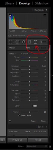
The Radial Filter lives in the right panel of the Develop Module. Under the histogram are six shapes that link to different tools. The round circle with a dot in the centre at the fifth position from the left is the Radial Filter.

LR radial filter panel where to find 2

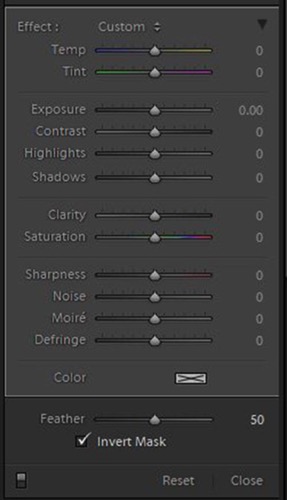
When you click on the button for the Radial Filter (you can also use the keyboard shortcut Shift+M to open the Radial Filter), a panel opens up with all the editing choices available for this tool.

LR radial filter panel editing options 3

Adding and adjusting the filter

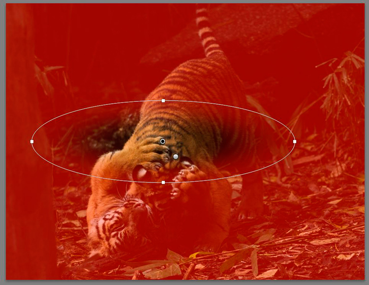
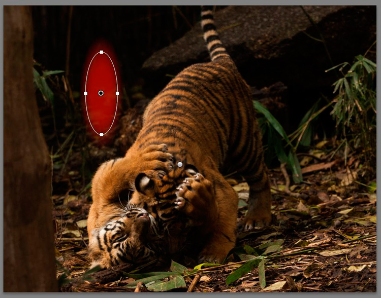
If you click on your image and drag the mouse out a bit, a roundish ellipse shape will form with a centre button and four control handles. Let go of the mouse when the shape is roughly the size you want it. The Radial Filter only offers a roundish ellipse shape but it has a lot of flexibility with changing the size and squashing it down to be a narrow oval shape instead of a circle.

LR radial filter panel new one 4

Clicking and dragging on the centre button allows you to move the filter to the part of the image you want to edit. Use the control handles to change the size and also the shape of the ellipse.

LR radial filter panel change tool shape 4a

Which area is affected

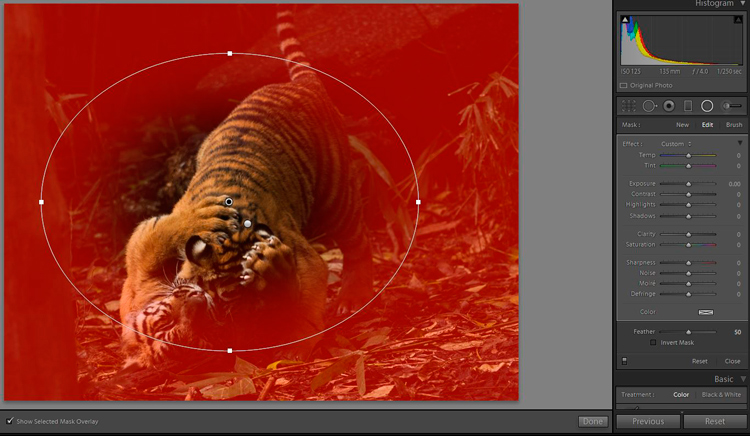
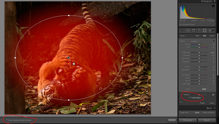
By default, Lightroom sets the editing area to OUTSIDE the ellipse. If you want to edit INSIDE the area, tick the Invert Mask box on the Panel.

LR radial filter panel move change size 5

The red colour shows up if you have Show Selected Mask Overlay ticked. It is handy to see where Lightroom will apply the effect and how much feathering you need to use.

NOTE: if you do not see a coloured overlay like the red one shown here, hit the O keyboard shortcut for “overlay”. Holding shift and tapping O will change the color of the overlay.

LR radial filter panel mask controls 6

Note: Always click Close or Done (or the keyboard shortcut Shift+M again) once you are finished editing a particular button so you can see the edited image clearly.

USING THE RADIAL FILTER TO EDIT AN IMAGE

In the example image the aim is to bring attention to the tiger cubs, adding some tweaks around the head and paws area (it’s not 100% sharp due to the low light and the movement while they were wrestling).

Add an off-centre edge vignette

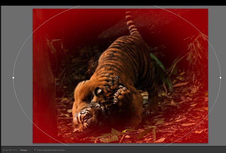
First, we add a vignette to darken the distracting elements on the edge of the frame and bring the focus to the cubs.
Because they are not in the absolute centre of the image, the usual post-crop vignette tool will not work. This is where the Radial Filter is so useful, as you can add a vignette with the focus an off-centre subject rather than being limited to the middle of the frame.

The vignette needs to have Invert Mask NOT ticked, as the effect goes on the outside of the ellipse.

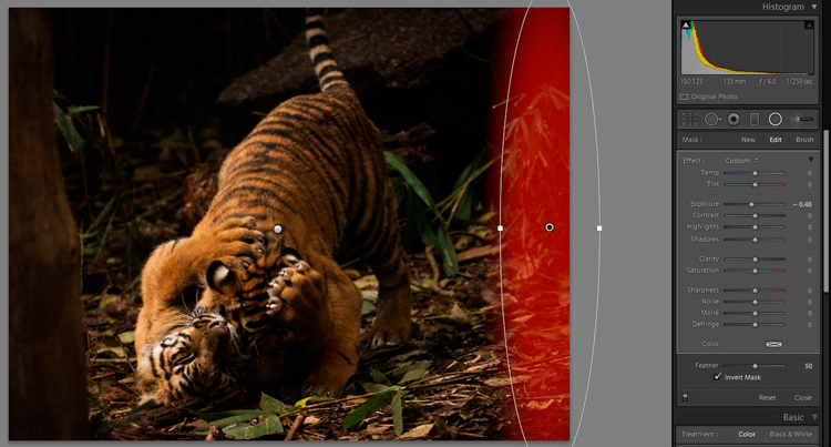
Add the Radial Filter and adjust the shape to be quite large – you can make the ellipse bigger than the actual image if necessary. Invert the mask and bring the exposure down just enough to darken the edges of the frame.

LR radial filter panel vignette beginning 7

Feather the filter

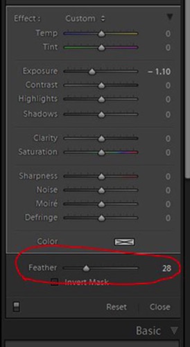
Lightroom has a default feather setting of 50 which is quite a lot, too much for this image, so adjust the feather down. Be careful not to go too far as a harsh edge will become visible.

LR radial filter panel changfeather 8

The right-hand edge of the image still has a bright spot of foliage. So add another long Radial Filter and bring the exposure down a little bit.

LR radial filter panel darken hedge 9

There are no set numbers of how much to edit with this tool, you will need to experiment and go with what feels right. The good news is these are all non-destructive edits (the image is not permanently changed) so you can remove them all and start again, or change the settings on one or all of them, as many times as necessary.

Tone control on select areas

There is a bright spot of foliage on the left-hand side, just sticking out from behind the tree trunk. Create a new Radial Filter just big enough to cover the right area and shape with the control handles.

Invert the mask and bring the exposure down a bit. This time, click and drag on the bottom control handle and drag to the right until the ellipse tilts back to the left a bit and aligns better with the line of the tree trunk.

LR radial filter panel darken foliage tilt 10

Add focus on the subject

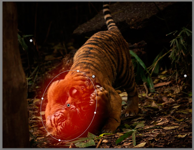
Now it is time to add some brightness and focus to the tiger cubs. Add a new Radial Filter to cover the area on the bright side of the head and paws and bring up the exposure a tiny amount. That is where the sunlight is naturally falling, so that is the area that needs brightening. Be careful to add light effects only to the lighter parts of the image as it can look a bit odd if a darker area is unnaturally bright.

LR radial filter panel add brightness 11

Now is a good time to mention that you may have to make LOTS of little adjustments to cover areas with different shapes. It is fiddly and takes time, but you will get a better result if you take the time to edit that way.

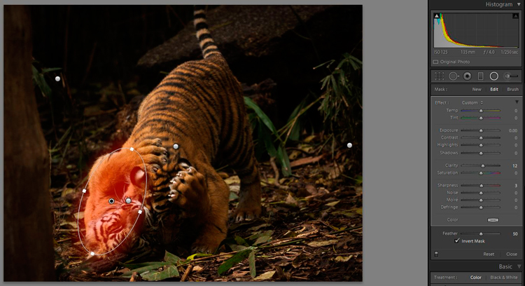
Adding some clarity to the side of the face and paw in the sunlight is the next step. Create a new Radial Filter with size, shape and tilt to match the area and invert the mask. Add some clarity, and because this image is not quite sharp, just a little bit of sharpness. Be careful with these tools, as it is easy to go too far and get obvious effects.

LR radial filter panel clarity sharpness 12

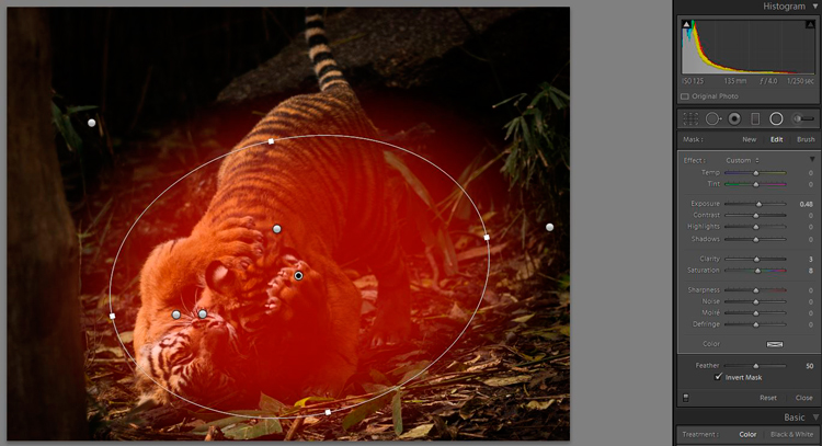
The vignettes have darkened the overall area in the middle a bit much so let’s add some brightness. Add a Radial Filter to cover the area around the cubs and tweak the exposure up a small amount. Also, increase clarity and saturation a very small amount.

LR radial filter panel brightness circle 13

Before and after comparison

Let’s stop there and compare the BEFORE image with global adjustments only to the AFTER image with several specific applications of the Radial Filter.

LR radial filter panel finished with dots 14

First, we have the finished image with all the dots for the different individual Radial Filters added.

LR radial filter panel before comparison 15

Then we have the BEFORE image.

Finally the AFTER image with both global, and local edits applied with the Radial Filter.

LR radial filter panel after no pins comparison 16

CONCLUSION

As you can see, careful use of the Radial Filter can add many small subtle changes to an image, and bring the focus to the subject. It can also be used to further enhance the subject and give it extra punch and vibrancy.

The Radial Filter is a very capable tool that can take a bit of time to get used to. The limited shape has some challenges to learn how to work with it to get the best effect but it gives you a lot of power and control too.

Do you have any other tips for using the Radial Filter? Please share in the comments below.

googletag.cmd.push(function() {
tablet_slots.push( googletag.defineSlot( “/1005424/_dPSv4_tab-all-article-bottom_(300×250)”, [300, 250], “pb-ad-78623” ).addService( googletag.pubads() ) ); } );

googletag.cmd.push(function() {
mobile_slots.push( googletag.defineSlot( “/1005424/_dPSv4_mob-all-article-bottom_(300×250)”, [300, 250], “pb-ad-78158” ).addService( googletag.pubads() ) ); } );

The post Lightroom’s Secret Weapon: The Radial Filter and How to Use it by Stacey Hill appeared first on Digital Photography School.


Digital Photography School

 
Comments Off on Lightroom’s Secret Weapon: The Radial Filter and How to Use it

Posted in Photography


The Secret to Getting Tack Sharp Images for the Web

29 Jun

Do your images end up looking soft when you resize them and export them for the web? When you resize an image, it loses some sharpness. With a 24 MP image measuring 6000 px you need to resize quite a lot to downsize it for optimal web use which is often around 800 px wide. That is why a set-once-and-forget Continue Reading

The post The Secret to Getting Tack Sharp Images for the Web appeared first on Photodoto.


Photodoto

 
Comments Off on The Secret to Getting Tack Sharp Images for the Web

Posted in Photography


The Secret to Finding the Hero Angle in Food Photography

27 Jun

Have you ever stared at a photo of a food dish, and instantly thought that something looked a little odd? Like the shot wasn’t quite bang on, but you can’t quite put your finger on what it is? Chances are the dish hasn’t been shot using its hero angle.

Rachel Korinek Food Photographer DPS Hero Angle 12

You can have the freshest ingredients, the maddest styling skills, and be able to tame ever changing natural light, but if your angle isn’t complimentary to the food you’re shooting – you’re missing out on the full potential of creating a powerful food image.

Never fear though, the secret to finding the hero angle in food photography is simple. Just approach the shoot with two things in mind; the height of the dish and/or the props, and the layers contained in them.

The Height of Your Dish and Props

The height of food basically falls into two categories; tall or flat.

Tall subjects are simply anything with height – like a bundt cake, an ice cream cone, or a burger with the lot. For tall subject you will usually default to shooting somewhere between a 45 degree angle to straight on. Going beyond 45 degrees can sometimes limit being able to see the full dish and layering.

Flat subjects are simply anything whose width is inherently larger than its height – like a tart, a cookie, or a pancake. For these types of subjects, default to shooting somewhere between straight above and a 75 degree angle. Going too close to 45 degrees will also accentuate their flat qualities.

Rachel Korinek Food Photographer DPS Hero Angle 8 Rachel Korinek Food Photographer DPS Hero Angle 5

But what about everything else? What about soup, salad, or how about liquids? I am so glad you asked, because this is where the fun starts.

There are quite a few foods that are dependant on serve-ware. A burger or cake can hold their own, but liquids, soups, salads, and puddings cannot. Which category these guys fall into is dependent on the food styling prop in which they are presented.

Take soup for instance, is it being served in a bowl, or is it a fancy cold soup served in a tall shot glass? The salad, is it served on a plate or a large glass bowl? What sort of holder is the liquid in; tall, short, opaque? Is it in a flat tray because you’re about to freeze it and turn into granita?

Oh the possibilities are endless! But remember, they all fall into two categories, so you’ve got a 50/50 shot of getting it right. I’m pretty sure you’ve got this.

The Layers in Your Dish and on Set

There are two things to consider when thinking about layers in food photography. The layers present in your food dish and the layers present on set.

Layers in a dish are the number of visual components in a recipe. The classic example is a burger with seven layers, bun, meat patty, cheese, sauce, slice of tomato, lettuce, bun. Or a layer cake with seven layers, cake, jam, cream, cake, jam, cream, cake. So to get the best food photography shots, you’ll want to choose an angle that exposes these layers in their best light.

Rachel Korinek Food Photographer DPS Hero Angle 6 Rachel Korinek Food Photographer DPS Hero Angle 7

Layers on set are the number of elements or props that you have on your set (props) on top of one another. For example, napkin, plate, and garnish would be three layers and would appear on top of one another. I don’t count the food/recipe as a layer as it is the subject and will always be present. If the prop layers are an important part of telling the food story, you’ll want to make sure your angle captures those elements too.

Putting it all Together

Now that you’ve thought about the height of your dish and the layers, you can marry those two, in order to figure out your hero angle. Let’s look at some examples.

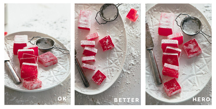
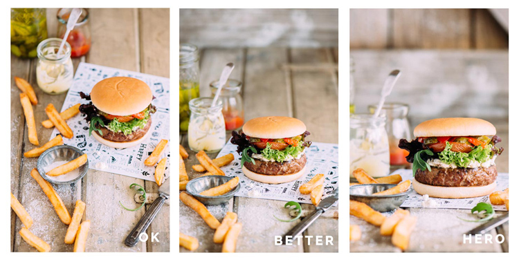
This is a little game I like to play called; Okay, Better, Hero. There is nothing wrong with any of these shots I’m about to show you per say, but there can only be one hero, right? That’s what we’re aiming for, so let’s dive right in.

Turkish Delight (a flat dish without layers)

Rachel Korinek Food Photographer DPS Hero Angle 1

I shot this Turkish delight with a 105mm micro (macro) lens, at a 25 degree angle, overhead, and 75 degree angle respectively.

Because this is such a flat dish, you may expect that the overhead angle would be the most flattering. But really the 75 degree shot is hero angle, here is why. It is so close to overhead, yet allows you to capture the gorgeous light coming through the Turkish delight which adds to the richness of its colour.

25 degrees also captures the colours, but accentuates the flatness of the dish, and detracts from the overall feel.

Rachel Korinek Food Photographer DPS Hero Angle 11
Horizontal variation, shot at the same angle.

The Burger (tall dish with layers)

I shot this burger with a 105mm micro (macro) lens, at a 45 degree angle, 25 degree angle, and straight on respectively.

Rachel Korinek Food Photographer DPS Hero Angle 4

The hero angle is the one shot straight on, because it allows the viewer to focus on all the delicious layers, and elongates the height of the burger which you naturally expect to be a tall food. Your mind thinks, the taller the burger, the more ingredients, and the more bang for your buck you get.

The 45 degree angle doesn’t give you enough context of the layers, and the 25 degree angle makes the top burger bun look too flat.

Kale Pesto (tall dish without layers)

I shot this with a 60mm micro (macro) lens, at a 85 degree angle, 45 degree angle, and straight on.

Rachel Korinek Food Photographer DPS Hero Angle 3

Pesto, being a sauce or condiment, is dependant on the serve-ware in which it is presented. As you want to show that there is enough of the pesto to coat an entire family size dish of pasta, it was shot in a tall glass. This also complimented the tall spoon, and bottle of oil in the shot as props.

The 45 degree angle is workable, but straight on one is the hero angle here. It allows for an overall sense of how the dish is being served and stored, while still allowing the viewer to comprehend its texture.

If you want to get into the nitty gritty, the 45 degree angle allows for reflection of the plate to show up in the glass, hindering the ability to see the texture of the pesto.

Egg and Bacon Muffins (flat with layers)

I shot this with a 60mm lens, at a 45 degree angle, 30 degree angle, and from directly overhead.

Rachel Korinek Food Photographer DPS Hero Angle 2

Here the 45 degree angle accentuates the flatness of the dish, but does show the layers. The 30 degree angle is better, but it doesn’t show the full layers of the dish as much as the overhead shot does. That’s why the overhead shot is the hero angle in this case. It allows you to see right into the dish, while still getting the action of the egg filling being poured into each compartment.

Putting Finding That Hero Angle Into Practice – 5 Take Aways

Next time you’re doing a food photography shoot, put the following into practice:

  1. Thinking about whether your dish falls into the tall or flat category.
  2. Are there layers in your dish, or through your use of props on set?
  3. For tall foods, especially those with layers, explore angles between straight on and 45 degrees.
  4. For flat foods, explore angles between overhead and 75 degrees.
  5. Take a few shots with different angles outside the recommended ones above, and look for the OK, better, hero shots.

Do you have a favourite angle for food photography that you can always rely on? Please share in the comments below, as well as your food shots.

googletag.cmd.push(function() {
tablet_slots.push( googletag.defineSlot( “/1005424/_dPSv4_tab-all-article-bottom_(300×250)”, [300, 250], “pb-ad-78623” ).addService( googletag.pubads() ) ); } );

googletag.cmd.push(function() {
mobile_slots.push( googletag.defineSlot( “/1005424/_dPSv4_mob-all-article-bottom_(300×250)”, [300, 250], “pb-ad-78158” ).addService( googletag.pubads() ) ); } );

The post The Secret to Finding the Hero Angle in Food Photography by Rachel Korinek appeared first on Digital Photography School.


Digital Photography School

 
Comments Off on The Secret to Finding the Hero Angle in Food Photography

Posted in Photography


Learn Ansel Adams’ Biggest Secret for Stunning Photography – Visualization

22 Jun

Ansel Adams is the most widely known photographer in history, you don’t need to look very far to see one of his images. Would you like to know the whole key to Ansel Adams’ stunning photographs?

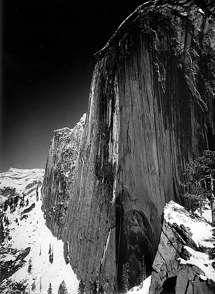
This is a photograph of half dome in Yosemite taken in 1927 by Ansel Adams

Monolith, The Face of Half Dome, by Ansel Adams (Image courtesy Ansel Adams Illumes and The Ansel Adams Gallery)

In this this video interview with his son, Michael Adams, you will hear about his breakthrough as a photographer, when he went from merely recording an image, to being an artist who interpreted the image to tell the story he wanted.

As you’ll hear, Ansel had his breakthrough when he climbed up to take a photograph of Half Dome, the iconic monolith in Yosemite, California. The moment he realized that the yellow filter just wasn’t going to convey what he saw and felt, he changed to a red filter which expanded the tones of the image and brought out the darkness of the sky, thereby creating the mood he had visualized.

Ansel said, the whole key lies in first visualizing the image you want, rather than just snapping away.

By first forming the image or idea in your mind’s eye, you can then set about to capture it. His son Michael summed it up with, “He knew what he wanted and he got what he wanted.”

These are Ansel’s’ key points that you can practice to continually improve your photography:

  • Look at the external event, and then visualize what you want it to look like, clearly and decisively.
  • Try to make the photograph of what you saw and felt.
  • Train yourself to see what the camera sees by comparing what you see, with what it looks like in the camera.
  • Practice your craft and do your homework so you can make the photograph you desire by going through these steps to capture what you visualized.
  • Placing the camera: Find the best point of view of the lens.
  • Make a proper lens selection.
  • Decide on your depth of field and set your aperture.
  • Control your exposure and later, the development.

As he said, with practice this becomes automatic and instinctive. Put Ansel’s advice into action and let me know your results in the comments below.

googletag.cmd.push(function() {
tablet_slots.push( googletag.defineSlot( “/1005424/_dPSv4_tab-all-article-bottom_(300×250)”, [300, 250], “pb-ad-78623” ).addService( googletag.pubads() ) ); } );

googletag.cmd.push(function() {
mobile_slots.push( googletag.defineSlot( “/1005424/_dPSv4_mob-all-article-bottom_(300×250)”, [300, 250], “pb-ad-78158” ).addService( googletag.pubads() ) ); } );

The post Learn Ansel Adams’ Biggest Secret for Stunning Photography – Visualization by Marc Silber appeared first on Digital Photography School.


Digital Photography School

 
Comments Off on Learn Ansel Adams’ Biggest Secret for Stunning Photography – Visualization

Posted in Photography