RSS
 

Posts Tagged ‘scale’

How to Add a Sense of Scale to Your Landscape Photos

14 Feb

You might find that sometimes you take pictures of grand, scenic landscapes only to have viewers not react to the picture the way you had hoped. You present them with a well composed, properly exposed photo of a dramatic scene, but the viewers quickly pass it by. Why is this happening with your landscape photos?

Adding a Sense of Scale to Your Landscape Photos - Grand Canyon

One reason might be that the viewer cannot get a sense of the scale of the scene.  They cannot tell if they are looking at something really big, or just something that looks big in a picture. Viewers are used to being tricked by the camera, such that small things look huge.

Remember that a picture is just a two-dimensional representation of a scene and it is hard for the viewer to put things in the right context. You only have a split second to do so, or the viewer has likely moved on to other things.

Using items to add a sense of scale

It can be tricky to relay a sense of proper perspective in your photographs. For example, you might have a photo of some cliffs, but it might not be clear to the viewer whether these cliffs were 7 feet tall or 700 feet tall.

It happens to me all the time, and my hard drive is littered with photos of large cliffs and mountains that did not translate into compelling photographs because there is no sense of scale. In the example below, however, I think you get a sense of the height of these cliffs. How?

Adding a Sense of Scale to Your Landscape Photos - cliffs

I think it is because of the castle in the middle of the picture. It is just a tiny item, but your eye picks up on it and uses it to put the rest of the picture into context.

It is probably not something you really think about, but it happens nonetheless. You know that castles are fairly tall, and you subconsciously use that knowledge to add a sense of scale to the entire picture.

Finding items to use to add a sense of scale

The same dynamic works in other contexts. Your picture doesn’t need to be dramatic cliffs like the one above. It can be any landscape or coastal scene.

Look for things that your viewer knows. Those items give them something to use to add a sense of scale to the picture. It can be anything. Sometimes the item you use is the actual subject of the picture. For example, in this picture below, the lighthouse provides an actual subject or center of interest for the picture.
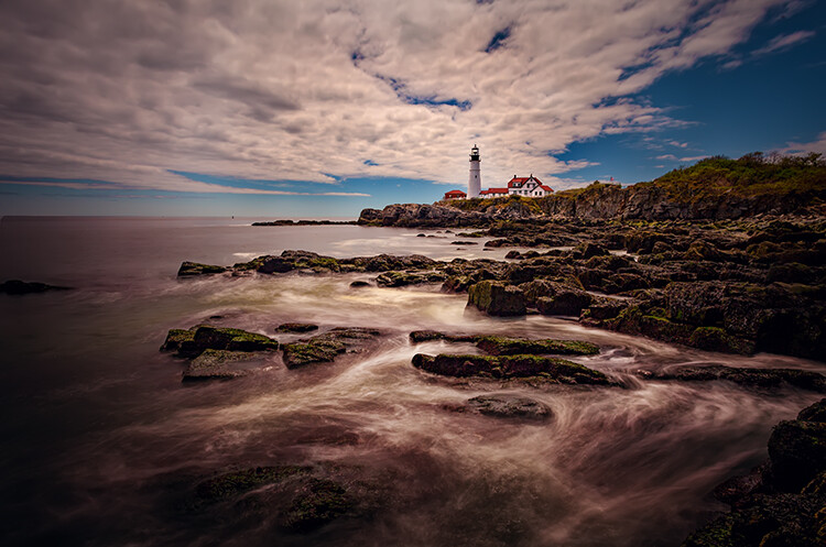
lighthouse - Adding a Sense of Scale to Your Landscape Photos

In addition to providing a point to the picture, the lighthouse is also providing your viewer with a sense of scale. It makes the viewer’s mind more comfortable with the entire image. The viewer has a better idea of what they are looking at, and the relative size of all the elements.

Small things provide scale too

You don’t have to use a large structure like a lighthouse to provide this sense of scale though. You can also include small things that just give your viewer a little clue. In the case of landscapes, perhaps a bird or birds in the distance will help. In fact, animals of any kind often work. In the picture below, the herd of cows provides context for the picture.
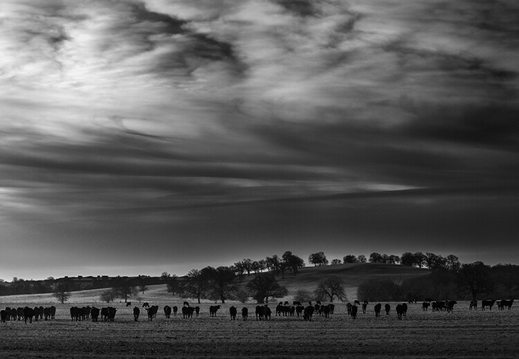
cows - Adding a Sense of Scale to Your Landscape Photos

When there is nothing else available, just use trees. We have a sense of the general height of trees and our mind will use that to provide context to the photo. Of course, there are trees everywhere (you almost cannot avoid them) so that should be easy to do.

Keep the people in your pictures

The final item I want to mention is the one that you may struggle with, and that is adding people to your pictures. This is an incredibly powerful tool. We, humans, are amazingly adept at recognizing people in a picture and we will use that to provide context to the entire scene.

Therefore, there is no more powerful way to add a sense of scale than by including people to your pictures. Your viewer will see those people in the pictures and naturally use them to gain a sense of scale.

little people on a cliff - Adding a Sense of Scale to Your Landscape Photos

To do this, you will have to reverse your thinking in a lot of ways, particularly if you are a landscape photographer. You probably spend a lot of time trying to avoid having people in your pictures.

You probably ask the people you are with to step out of your frame. Or you might spend a lot of time standing around waiting for people to move. In many cases, you will still want to do that, but sometimes – to add this sense of scale – you might want to include those people in your image.

Adding a Sense of Scale to Your Landscape Photos

Conclusion

There is no magic bullet to creating a sense of scale in your images. It is something I get asked about from time to time, and I do not have a quick answer. The good news is that just thinking about it puts you ahead of the curve.

So next time you are out shooting, look around and find things that will work for you. Use them to add that sense of scale. Hopefully, the ideas in this article will provide you with some things you can use for your images.

The post How to Add a Sense of Scale to Your Landscape Photos by Jim Hamel appeared first on Digital Photography School.


Digital Photography School

 
Comments Off on How to Add a Sense of Scale to Your Landscape Photos

Posted in Photography


How to Show a Sense of Scale in Your Photography

02 Nov

Picture this: You’re standing in front of an awe-inspiring natural wonder, a giant mountain or an extraordinary monument. Eagerly, you raise your camera to your eye and *click* you snap a shot.

There, on the LCD screen on the back of your camera, you see that all the majesty of the scene has disappeared.

How to Show a Sense of Scale in Your Photography

A photo of Skogafoss waterfall in Iceland, taken to show the scale and majesty of the scene.

In its transition from reality to the screen on your camera, your subject has lost its grandeur and sense of scale – there’s no true representation of how impressive the scene is. Has this happened to you?

Photography works with only two dimensions, for the most part. The world, on the other hand, is viewed in three dimensions. Missing that extra dimension can be a big deal.

Without giving a bit of thought to your composition, you can lose a lot of the sense of scale – making even the most remarkable subject matter look completely unremarkable on camera.

Understanding lens distortion

A camera doesn’t necessarily see the same thing our eyes do. Depending on your type of lens, and how much zoom you are using, there can be quite a difference between the image and reality.

Wide-angle lenses can make a real mess of perspective, making objects close to the camera seem significantly bigger than ones farther off. This can be used to your advantage for creative shots, but it will completely ruin the sense of scale.

How to Show a Sense of Scale in Your Photography - gnome

From up close and seen with a wide-angle lens of 17mm, this gigantic-looking gnome looms over the fence it is sitting on.

A gnome photographed from a distance to show how lens distortion influences scale

A gnome photographed from a distance to show how lens distortion influences scale.

A gnome telephoto - How to Show a Sense of Scale in Your Photography

At a focal length of 55mm, the sense of scale is restored and we can see that the gnome is actually quite small compared to the fence.

The more you zoom in (use a longer focal length), the less distorted your object will appear. Unfortunately, if you are taking pictures of large buildings or natural wonders, this has fairly limited application. It isn’t always possible to jog several hundred meters down the road in order to have room to zoom into 200mm when photography a tall building.

If we want to get the entire object in the frame, we’ll need to make some compromises with lens distortion, which leads us to our next trick for properly showing scale.

Provide a reference

So how can we tell if something is big?

Well, it’s not usually a problem in real life to know if an object is big or not. But in photography, we don’t always have the same opportunity to glance around and get a sense of proportion. This bothersome little detail can mean that even a huge, incredible wonder in real life can look insignificant.

How to Show a Sense of Scale in Your Photography

A photo of a mountain, with a reference point of a village below to show scale.

So how can we make sure that immense size is properly appreciated? Provide a familiar reference point to define scale. By including people or common objects in a scene, the viewer can quickly understand the scale.

Skip giving that reference point and your mighty mountains could just as well be macro shots of pebbles, for all your viewer knows.

An image showing the scale of the Gullfoss waterfall - How to Show a Sense of Scale in Your Photography

This is the incredible Gullfoss in Iceland, but without a clear point of reference, we don’t have a strong idea of its scale.

Image showing hikers on the Gullfoss waterfall - How to Show a Sense of Scale in Your Photography

Use of a longer lens helps us to see that those tiny specks on the rock are actually hikers – and helps us to understand that this waterfall is massive!

Showing Distance

How can we tell if something is far away?

Again, it isn’t difficult to recognize distance in real life. Once again, two-dimensional pictures have a habit of looking extremely flat without paying a bit of attention to what is included in the frame.

Well, for starters, you can use depth-of-field to provide a sense of depth. When the background drops off into a blur, it helps the viewer to more easily recognize distance.

Depth-of-field refers to the amount of area that is in focus in a picture. You can make sure that the background falls out of focus by using one or combining multiple of the following methods:

  • Selecting a wide lens aperture
  • Zooming in on your subject
  • By having a significant distance to the background behind your subject
How to Show a Sense of Scale in Your Photography

A man exploring the mountain photographed to show a narrow depth of field.

But you’ll need to do more than just shoot with a wide aperture if you want a mountain range to look imposing.

Another good technique you can use is to layer your background elements. This is easiest to recognize with mountains.

A man taking a photograph in a mountain range - How to Show a Sense of Scale in Your Photography

Including the whole scene

Sometimes showing the true scale of a scene requires a bit of give and take – you need to make a few compromises.

Zooming in and capturing expressions or the human element can cause you to lose the sense of scale. On the other hand, zooming out can cause your image to lose any interaction or interest.

A man sitting in the rocks on the edge of a mountain - How to Show a Sense of Scale in Your Photography

The hiker is sitting on the edge of a cliff – but without zooming back the viewer has no idea how big the drop is.

The best way to account for this is to simply be aware of it as you set up your shot. Balance the objects in the frame and decide what is the priority and purpose of the shot. If you want to show the scale of a scene, you probably won’t be able to take a tight shot that shows reactions or emotions.

A hiker in the mountains, photographed to show the scale of the cliffs - How to Show a Sense of Scale in Your Photography

By pulling back a bit, we can see the entire cliff – but now we can’t see the hiker’s expression!

Changing up your perspective

Sometimes capturing the majesty of a scene requires a creative perspective. Many photographers forget to explore the potential that comes from mixing up the camera’s point of view.

Taking a low shot can help add emphasis or might to a scene.

 How to Show a Sense of Scale in Your Photography

A low angle shot of a waterfall, showing its grandeur

Using a drone to cruise overhead and look down over an area can also be a fun way to show scale. The bird’s eye view perspective can be used to discover new angles of looking at otherwise familiar landscapes.

How to Show a Sense of Scale in Your Photography

Drone – image by dPS author Suzi Pratt.

Using Lines

Lines have always been an important element of any composition. They give an image a sense of movement and can direct the viewer’s eye around a shot, especially when they all tend towards a single vanishing point on the horizon.

A group of hikers photographed using leading lines to show distance - How to Show a Sense of Scale in Your Photography

The strong lines in this image help us to understand the size of this mountain trip.

Using leading lines is also a way to provide a sense of depth and show distance. You get a quick comparison of the distance between objects in the frame, giving you a quick point of reference to work with for the rest of the picture.

Recognizing and using natural lines in a scene is a surefire way to create a dynamic and interesting composition.

A deliberate approach to photography

By having the different techniques that can be used to show a sense of scale top of mind when you are out exploring with your camera, you can increase your chance of coming back with some real keepers.

It’s a common complaint of beginner or casual photographers that they can’t quite seem to make their pictures look as impressive as real life. But with a bit of practice, you can shoot pictures that leave your audience in awe!

The post How to Show a Sense of Scale in Your Photography by Frank Myrland appeared first on Digital Photography School.


Digital Photography School

 
Comments Off on How to Show a Sense of Scale in Your Photography

Posted in Photography


How Including People or Manmade Objects in Your Landscapes Can Add a Sense of Scale

25 May

My natural instinct as a landscape photographer has always been to keep people and manmade objects out of my images. I want to create images of nature that are pure and free (or at least appear to be free) of human interference. That said, over the past few years, I have started to backtrack on this a bit, especially when the camera fails to show the true scale of a landscape. In this article, I’ll share a small collection of images from my portfolio that include situations where allowing people or objects into the scene made the image a success.

Add a manmade object to show size

Na Pali Coast Sunset Sony A7RII and Sony 16-35 f/4 | ISO 500, f/4.5, 1/800th.

Here is (quite possibly) the most beautiful and rugged stretch of coastline on Earth, the Na Pali Coast of Kauai. I’ve photographed it from land, sea and air and still there is just no way to truly capture how incredible it is in person. On my most recent trip to the Garden Isle, I took my workshop group on a sunset cruise up to photograph whales and the Na Pali Coast.

As we were taking in the incredible scenery, I noticed one of the many helicopters that tour the coastline cutting through the scene. Using my Sony FE 16-35 f/4 lens, I framed a shot with the helicopter (flying right to left) on the right side of the frame (it’s the tiny little white spot) with plenty of space on the left side to see where it was headed. Take away the helicopter and it’s still an incredible scene, but without the helicopter, there’s just no way to accurately communicate how massive these cliffs are.

Use tourists to show scale

Balanced Rock Sunset Sony A7 and Canon 16-35 f/2.8 | ISO 100, f/11, 1/20th.

One of the easiest to reach landmarks in Arches National Park (located in Moab, Utah) is Balanced Rock. You just drive to the parking lot, and you’re pretty much there. But to get the sunset in the background, you’ll need to walk to the other side.

As our group was getting into position for what was turning out to be a beautiful sunset, a tourist climbed right up onto the rocks and started taking selfies. Ugh. Well, instead of getting upset, I decided to make lemonade out of the lemons and yelled over to him, asking if he’d mind throwing his hands up in the air. We were able to get a shot showing just how huge this sandstone rock formation really is, and the pose of the tourist turned out quite nice.

Go with the flow

Grand Canyon Lookout Sony A7RII and Sony 16-35 f/4 | ISO 100, f/7.1, 1/10th.

Like the previous image, sometimes you just have to go with the flow. As Bruce Lee so famously said, “Be water, my friend.”

As the sun set over Grand Canyon National Park in Arizona, I was in position to walk away with some really nice shots of the pink glow over the canyon. And just like in Moab, I saw a tourist walk right into the frame as I was about to press the shutter. This time though, he was much closer to the camera and as luck would have it, he was dressed in a cowboy hat, boots, and a leather backpack. Perfect! I never said a single word to this guy, he just stood there looking out over the canyon holding onto the tip of his cowboy hat. I assume he posing for someone else, but I was plenty happy to steal a few frames for myself.

Add yourself into the shot

Delicate Arch Beneath the Milky Way Sony A7S and Sony 16-35 f/4 | ISO 4000, f/4, 30 seconds.

You can’t always have people walk into your frame at the perfect time, wearing clothing that perfectly matches the location you’re photographing. Sometimes you have to take matters into your own hands, as I did here at Delicate Arch in Arches National Park.

My workshop group and co-instructor Mike were down inside the “bowl” beneath the arch and I stayed up top to light paint the arch for them during their 30-second exposures. We had walkie-talkies and Mike would give me a countdown to begin painting the arch in different ways. Since I couldn’t really concentrate on getting any of my own shots, I set my Sony A7S on a tripod, put it in time-lapse mode and just hoped to come out with one or two shots at the end of the night.

In the image above, that light shining under the arch is yours truly. I was standing beneath it, wearing a headlamp, so the students could get a silhouette of me looking up at the arch. After the shot, I looked over toward my camera (not on purpose though) and the direct light caused a starburst effect. This turned out to be my favorite image I’ve taken at this location by far. Not bad for the “set it and forget it” method!

Conclusion


Sometimes there just isn’t a good way to transfer a three-dimensional landscape to a two-dimensional photograph. Things always get lost in translation to some extent. At the end of the day, we are part of nature and if including a human or manmade object into an image help give the viewer a more accurate sense of scale, I say go for it.

The post How Including People or Manmade Objects in Your Landscapes Can Add a Sense of Scale by James Brandon appeared first on Digital Photography School.


Digital Photography School

 
Comments Off on How Including People or Manmade Objects in Your Landscapes Can Add a Sense of Scale

Posted in Photography


Grime in 1:20 Scale: Gritty Dollhouse-Sized Urban Architectural Models

14 Mar

[ By SA Rogers in Art & Sculpture & Craft. ]

urban architectural models

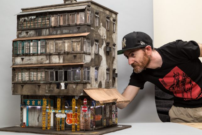
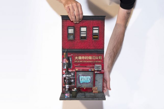
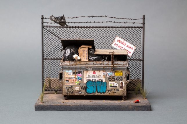
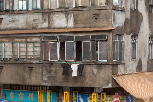
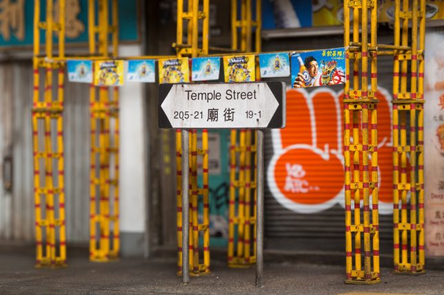
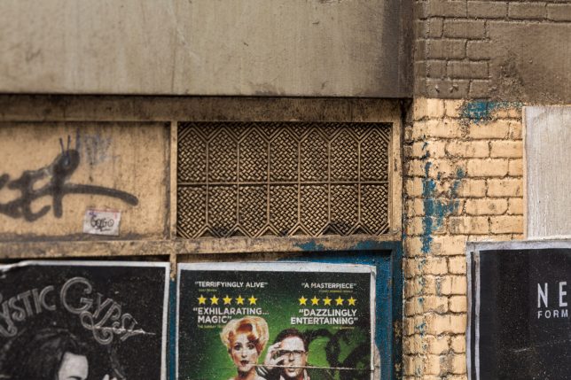
The kind of graffiti-covered, poster-plastered, weathered and visibly aging architecture that once characterized many big cities and has now largely been demolished is recreated in miniature by artist Joshua Smith. Every aspect of Smith’s tiny urban environments is crafted in loving detail, with absolutely nothing overlooked. Photographs of each miniature will make you wish you could examine them in person with a magnifying glass, appreciating the realism in every sidewalk crack, weed, pebble and fallen leaf.

urban architectural models 2

urban architectural models 9

urban architectural odels 5

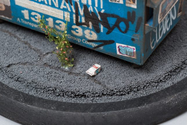
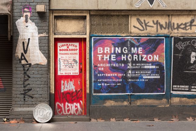
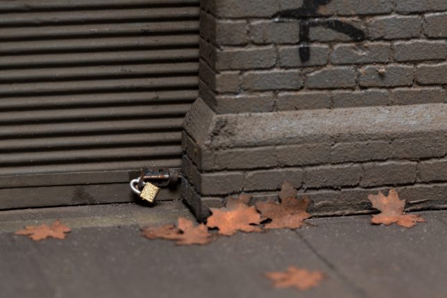
A dumpster at the Oakland Docks is packed full of tiny trash, some strewn around its base, a plastic bag fluttering on the barbed wire fence behind it. Melbourne’s Liberated X Bookshop and Shoe repairs features some fantastic Bladerunner-inspired wheat pasting, peeling plywood and the world’s tiniest padlocks. Big Bang Fireworks Company, based on 15 Pell Street in New York City’s Chinatown looks like you could slide those windows open and find a tiny family dining inside.

chinatown

dumpster

urban architectural models 9

urban architectural models 10

Based in South Australia, Smith previously worked for sixteen years as a stencil artist, and has now shifted his focus to model-making. The artist recently granted an interview to ArchDaily about his modeling process.

urban architectural models 3

urban architectural models 4

urban architectural models 7

“The longest build, which was my Kowloon Miniature, took three solid months working on average six to seven days a week and eight to sixteen hour-long days,” says Smith. “I strive to create a reality. I take as many reference photos as possible to mimic every single streak of rust, grime and chipping of stonework. I want viewers to be fooled, if I are a photo of the completed work in sunlight, to think it is the real thing.”

Take a closer look at some high-resolution images at Joshua Smith’s website.

Share on Facebook


[ By SA Rogers in Art & Sculpture & Craft. ]

[ WebUrbanist | Archives | Galleries | Privacy | TOS ]


WebUrbanist

 
Comments Off on Grime in 1:20 Scale: Gritty Dollhouse-Sized Urban Architectural Models

Posted in Creativity


Brutal East: New Scale Models of Brutalist Architecture Made of Paper

28 Feb

[ By SA Rogers in Art & Sculpture & Craft. ]

brutal east main

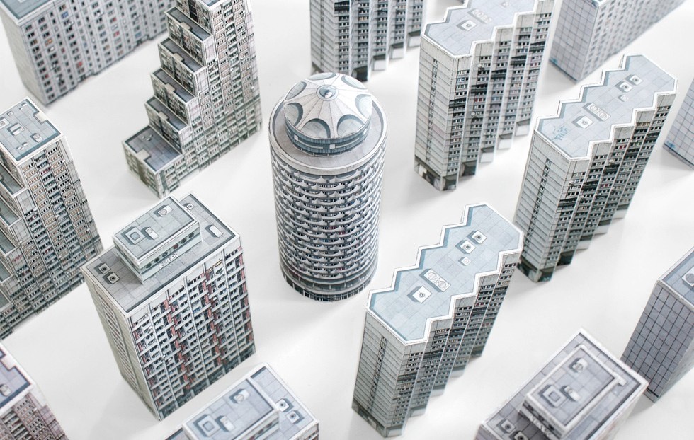
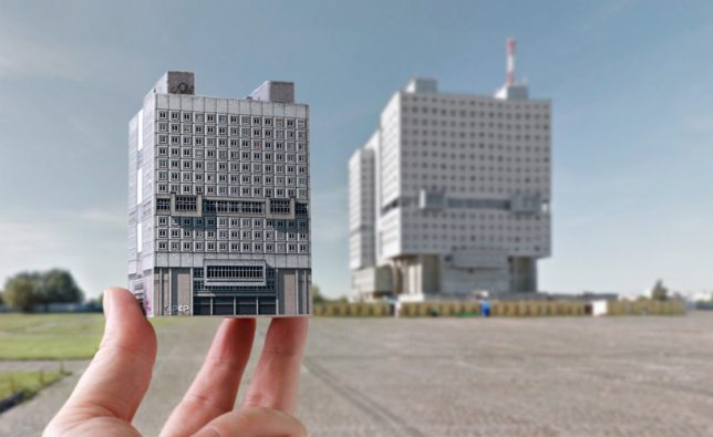
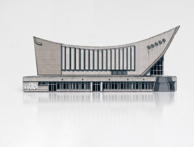
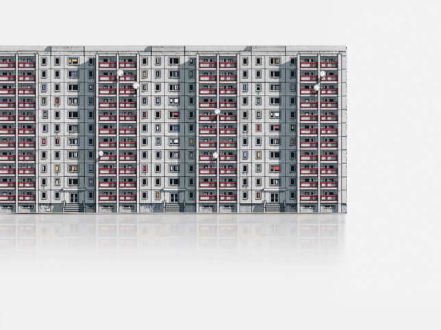
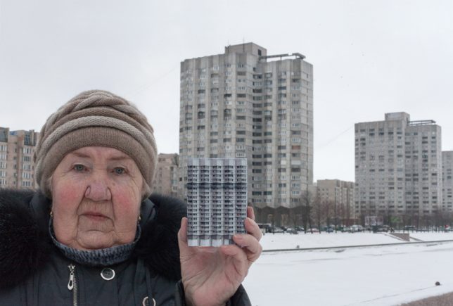
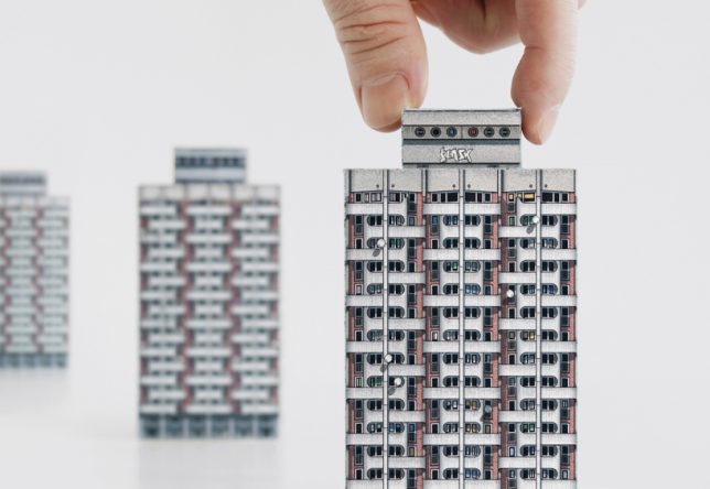
Hold the most iconic and imposing of Eastern Europe’s Brutalist architecture in the palm of your hand with this new set of paper miniatures by Zupagrafika. The design studio presents ‘Brutal East,’ a kit of seven cut-outs you assemble yourself into tiny towers from Belgrade, Kaliningrad, Prague, St. Petersburg, Wroclaw and more. ‘Build Your Own Brutalist Eastern Bloc,’ the packaging reads, an enticing statement if any architecture nerd ever heard one.

brutal east 3

brutal east 5

brutal east 2

“From the functionalist panelák estates to the otherworldly concrete grand designs, the charm of the former Eastern Bloc architecture is certainly brutal,” say the designers. “’Brutal East’ by Zupagrafika is a kit of illustrated paper cut-out models celebrating post-war architecture of Central and Eastern Europe that allows you to playfully explore and reconstruct some of the most controversial edificies erected behidn the Iron Curtain.”

“Contains 7 Brutalist buildings to assemble, from omnipresent pre-cast housing estates to mighty Post-Soviet landmarks awaiting renovation or threatened by demolition.”

brutal east 1

brutal east 4

The kit is appealingly packaged and beautifully detailed, each building bearing its tiny satellite TV dishes, stains, graffiti and weathering. It’s a neat way to hold on to divisive architecture that may soon be lost to history. While many people think these structures are ugly and depressing, they’re undeniably memorable.

brutal east 6

brutal east 7

‘Brutal East’ is just the latest kit of paper Brutalist models from Zupagrafika; the design studio previously released a set of Modernist Architectural Matryoshka it calls ‘Blokoshka’ as well as sets from London, Paris, Katowice and Warsaw. They also offer tiny paper models of Polish street icons like advertising columns, ticket validators and 1980s cars. All kits are available in the studio’s online shop.

Share on Facebook


[ By SA Rogers in Art & Sculpture & Craft. ]

[ WebUrbanist | Archives | Galleries | Privacy | TOS ]


WebUrbanist

 
Comments Off on Brutal East: New Scale Models of Brutalist Architecture Made of Paper

Posted in Creativity


Audi Ad Fakery: These Hyperrealistic Photos Were Made with a $40 Scale Model

27 Oct

[ By SA Rogers in Art & Photography & Video. ]

audi-ad-fakery-main

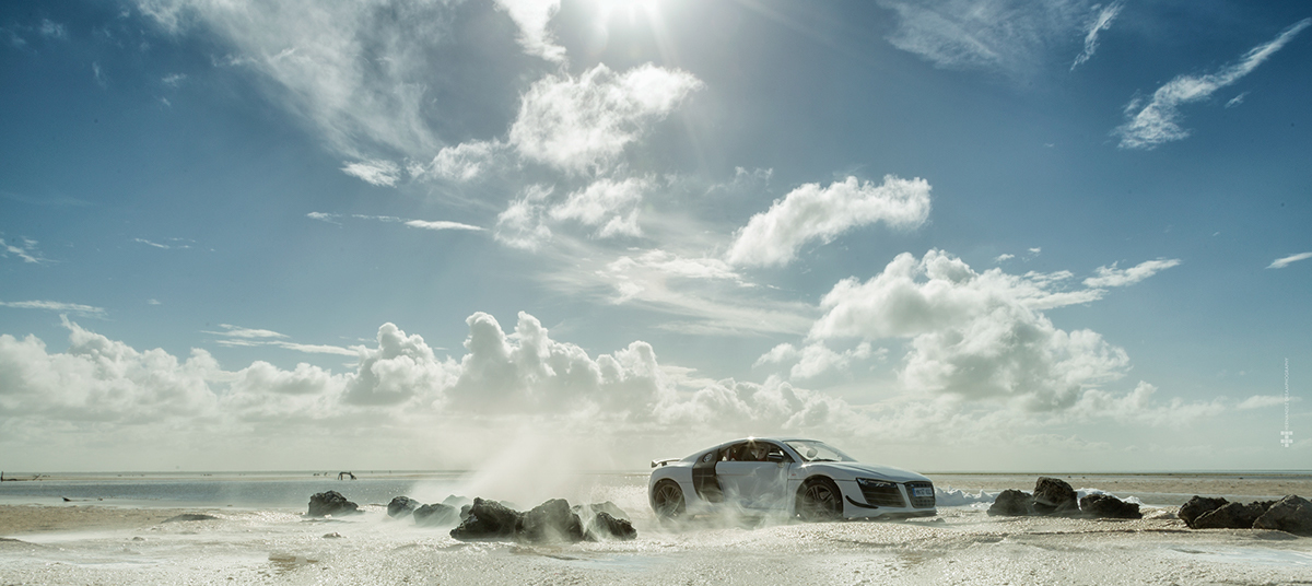
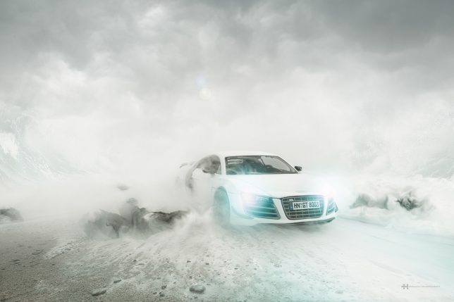
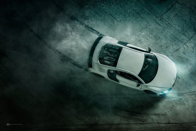
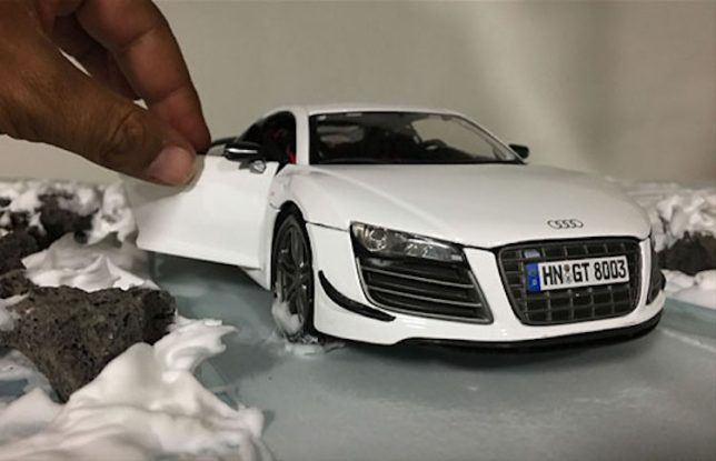
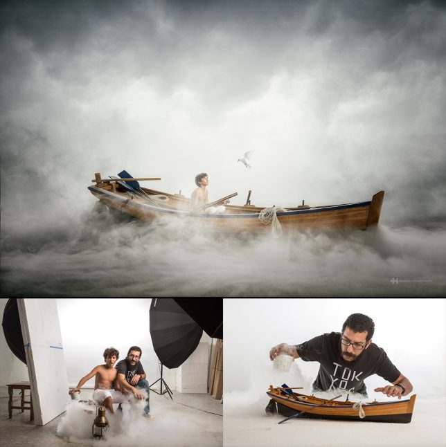
These photos may seem to depict a $ 160,000 luxury automobile zooming through sand, snow, sea foam and salt flats, but the objects on your screen are smaller than they appear. The lack of a person sitting in the driver’s seat is not an indication that the car is self-driving: it’s because the car itself stands only a few inches tall. This version of it, anyway. Photographer Felix Hernandez bought a $ 40 scale model of the Audi R8 sports car on the internet and created the sets in his studio, with astonishingly realistic results.

audi-ad-fakery-2

audi-ad-fakery-3

audi-ad-fakery-6

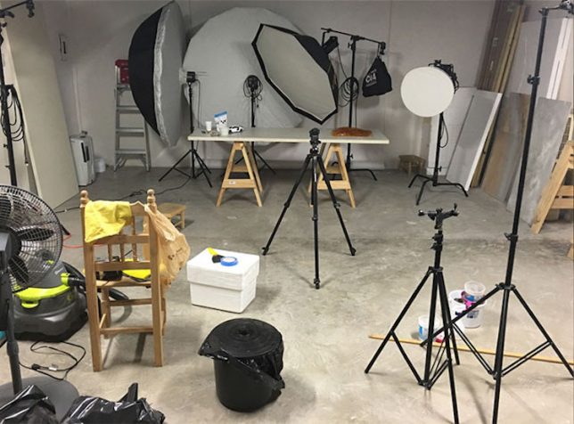
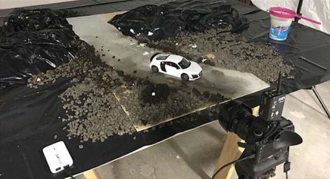
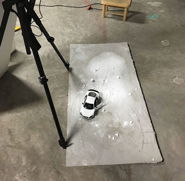
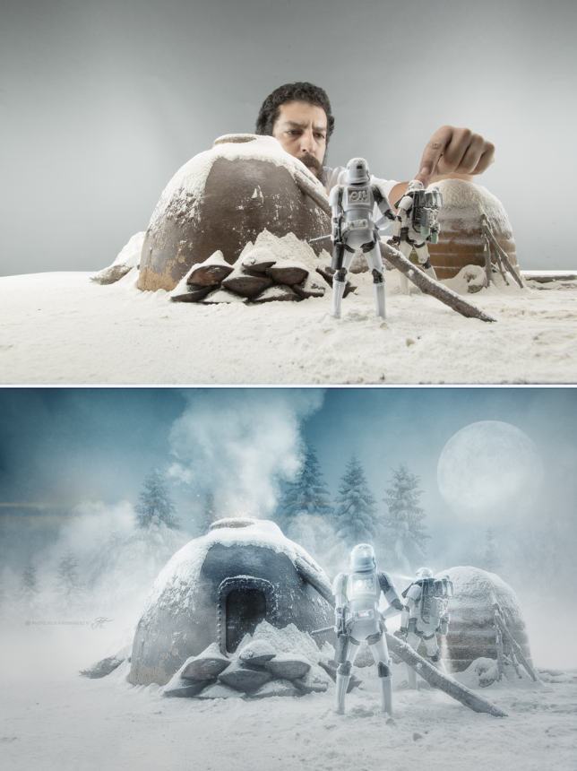
The automaker commissioned Hernandez to create the series as a promotion for the high-end car. As behind-the-scenes photo of his studio setup reveal, most of the work is done with miniatures and special effects rendered mostly in ordinary edible household products. Careful lighting, staging and camera angles make the models appear full-sized, so minimal Photoshopping is needed for the final effect.

audi-ad-fakery-4

audi-ad-fakery-5

audi-ad-fakery-7

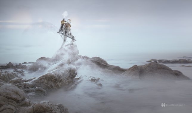
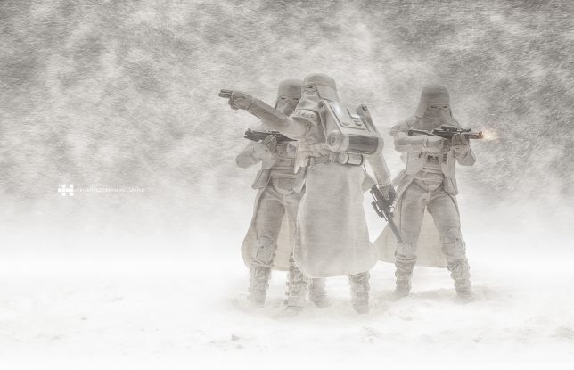
“I love photo manipulation and digital art, but what’s really cool is doing as much as you can in-camera,” says Hernandez in a piece he wrote for PetaPixel. “For snow scenes, I use wheat flour. For desert scenes, I use corn flour. For atmosphere, I add smoke. For rain, I spray water. For droplets, I add corn syrup. In some photos, I add images into my background. I also use Photoshop for adding effects that are difficult or impossible to do in-camera – things like adding a sense of motion, color grading, etc.”

hernandez-the-crow-and-the-dove

hernandez-miniatures-2

hernandez-miniatures

hernandez-miniatures-4

Previous photosets have included a series in which the artist took photos of a young boy and a miniature boat and blended them together in Photoshop, as well as Stormtrooper figurines hand-painted to make them appear more rugged and worn. See them all on Behance.

Share on Facebook


[ By SA Rogers in Art & Photography & Video. ]

[ WebUrbanist | Archives | Galleries | Privacy | TOS ]


WebUrbanist

 
Comments Off on Audi Ad Fakery: These Hyperrealistic Photos Were Made with a $40 Scale Model

Posted in Creativity


Real Scale Revealed: Digital Mashups Show Off Oversized Wonders

08 Oct

[ By SA Rogers in Art & Drawing & Digital. ]

quick-perspective-scale-1

When you see the Burj Khalifa photoshopped into New York City’s skyline, glimpse a B-2 bomber on an NFL football field or spot the largest scorpion that ever lived creeping up next to a cat, you get a better sense of just how big these things are. Kevin Wisbeth, who created the YouTube series ‘A Quick Perspective,’ offers up a bunch of digitally altered images mashing together various images and objects to give people a real sense of scale.

quick-perspective-scale-6

“These are all concept images that don’t seem appealing enough for a video,” he says – but the results are stunning nonetheless, starting with the 1,729-foot Willis Tower (the second-tallest building in the United States) placed inside the Mir Mine, one of the deepest mines in the world (pictured top.) The second depicts the 882-foot-long Titanic atop the deck of the U.S.S. Ronald Reagan, which measures 1,092 feet in length.

quick-perspective-scale-4

The Pulmonoscorpius kirktonensis, or Breathing Scorpion, was a prehistoric arachnid that grew up to 24 inches long, or about the size of a contemporary house cat.

quick-perspective-scale-3

The M-1 Rocket motor, designed in the ‘50s, was never actually built – but if it had been, it would have boasted a diameter large enough to fully cover a Smart Car with two feet left over on either side.

quick-perpsective-scale-7

The Dionysus asteroid, which is part of the Apollo asteroid belt and contains resources estimated to be worth $ 2.6 trillion dollars, “wouldn’t even surpass the bridge span” of the Golden Gate Bridge if placed above it.

burj-khalifa-size

The Burj Khalifa pokes into the sky above Manhattan, easily surpassing One World Trade Center by almost 1,000 feet and the Empire State Building by 1,300 feet. It’s currently the tallest structure in the world at 2,722 feet tall.

quick-perspective-scale-8

“Although the Death Star doesn’t exist in reality, it’s truly the biggest and most bad-ass machine ever conceived. The Death Star’s estimated width is around 99 miles across, or around 1/4 the length of Florida.”

See more of the images on Imgur.

Share on Facebook


[ By SA Rogers in Art & Drawing & Digital. ]

[ WebUrbanist | Archives | Galleries | Privacy | TOS ]


WebUrbanist

 
Comments Off on Real Scale Revealed: Digital Mashups Show Off Oversized Wonders

Posted in Creativity


Art of Protest: Student-Built Scale Model of $20 Billion ‘Bailout City’

17 Aug

[ By WebUrbanist in Art & Sculpture & Craft. ]

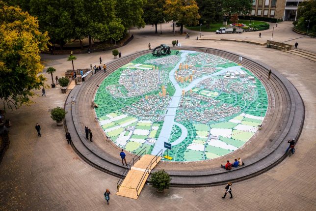
hypotopia city imag

After the Austrian government spent €19,000,000,000 to bail out a bank in 2014, a student group in Vienna created a giant urban model of a place Hypotopia in protest. This visionary city for 100,000 people represents a place that could have been built with the money used to rescue the Hypo Group Alpe Adria banking group.

hyptopia entry path

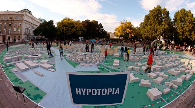
The city of Hypotopia is and will remain a Utopian fantasy, but represents a novel form of protest – a way for it to take physical form and convey a visceral sense of lost possibilities. This (quite literally) walkable city was opened to the public, allowing people to inspect it in full detail.

According to Lukas Zeilbauer, “while Utopia stands for an ideal fictitious world, ‘hypo’ is a Greek word meaning under, beneath or bellow – so a change coming from the bottom, from the folk.” While fictional architecture has been used by niche practitioners for polemical purposes throughout history, it is rare for such a large-scale, full-city effort to be driven by political motivations.

hypotopia view

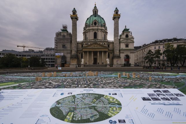
Students from the Technical University of Vienna designed and created the model city in Karlsplatz, a central city square, building it over the course of four months. Were it to be built, it would be the sixth largest city in Austria.

Construction of the model was aided by businesses who donated building materials, including wood and concrete blocks, carted in wheelbarrows to the site and assembled according to a predetermined computer model.

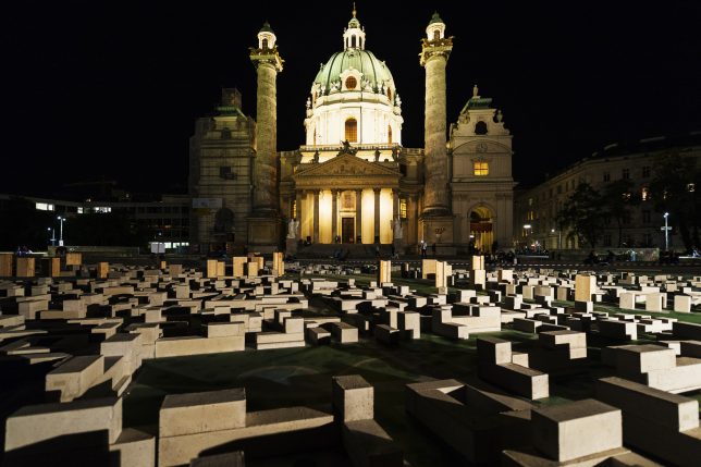
hypotopia at night

The public received the project with great enthusiasm, as the majority of citizens did not agree with using taxpayer money to bail out the bank in question.

Meanwhile, the makers of the model did more than just create a miniature mock-up: they actually ran the math and calculated the cost of construction, from architecture to infrastructure, making room and accounting for everything … except big banks, that is (images by Armin Walcher).

Share on Facebook


[ By WebUrbanist in Art & Sculpture & Craft. ]

[ WebUrbanist | Archives | Galleries | Privacy | TOS ]


WebUrbanist

 
Comments Off on Art of Protest: Student-Built Scale Model of $20 Billion ‘Bailout City’

Posted in Creativity


How to Use Framing to Create a Sense of Scale

02 Aug

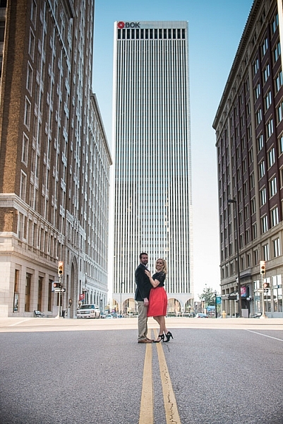
One thing that can be difficult to get across when taking pictures is a true sense of how large something is in real life. A skyscraper that appears towering and imposing in person, can come across as unimpressive, or stripped of its majesty when photographed. Natural formations that inspire awe and self-reflection, often seem puny and insignificant when we go through our photos later at home or on our phones.create-sense-of-scale-bok-center

This is something I have had happen many times in my own journey as a photographer, and while it can be tricky to create a sense of scale, there’s a way to use the concept of framing to capture the massive size of things in the world around you.

What is framing?

Framing has to do with the way the elements in a picture are positioned, in relation to one another. I struggled with the concept of framing for scale for a long time, before I really got the hang of it. But if you really want to show how big something is, it helps to put something else in the picture with it. This concept might seem a little counterintuitive, but adding elements to the foreground, background, or image sides, helps to not only give the viewer a sense of scale by showing how big the object is in relation to something else, but often it helps make the picture more compelling from a compositional perspective.

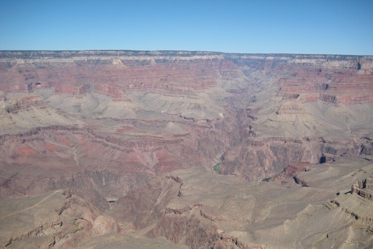
As an example, here’s a picture I took when I visited the Grand Canyon a few years ago. I really wanted to capture the sheer size of this natural wonder, so naturally I pointed my camera out from a precipice and took a few pictures. Sadly, the resulting images look flat, muddy, and downright boring – almost the polar opposite of the Canyon itself.

An incredibly boring picture of one of the most amazing natural formations I have ever seen.

An incredibly boring picture of one of the most amazing natural formations I have ever seen.

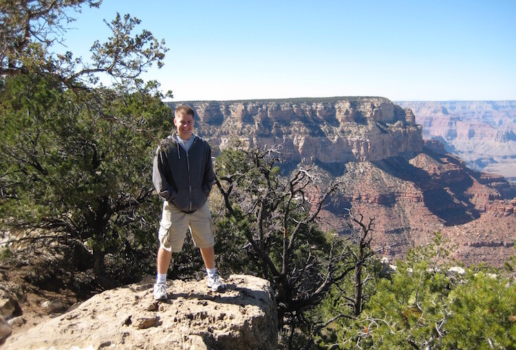
The problem with this image is it does nothing to impart a sense of scale to the viewer. In order to truly appreciate how big the canyon is, we need other visual information in the frame, to which we may compare the background elements. Fortunately, one of my friends took a much better picture that includes a few foreground elements, which although they block out some of the Canyon, help to capture the grandeur of this natural wonder.

create-sense-of-scale-grand-canyon-foreground

A much better picture, even though part of the Grand Canyon is blocked out.

The second picture works because it contains several layers: me, the trees, the plateau, and a glimpse of the rest of the Canyon. Of course this concept, like much in the world of photography, is quite subjective and some might think the top picture looks better because you can see more of the canyon itself. However, in my opinion the bottom image is more interesting because of the multiple compositional layers, while at the same time helping the viewer understand just how big the Grand Canyon really is.

How to apply framing to show scale

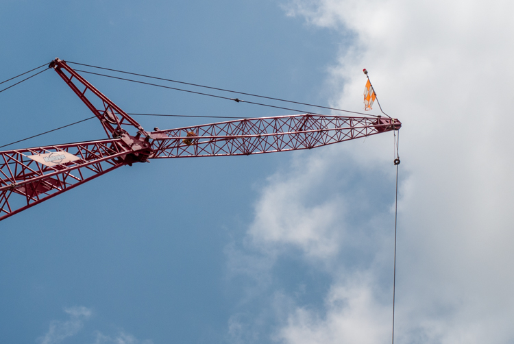
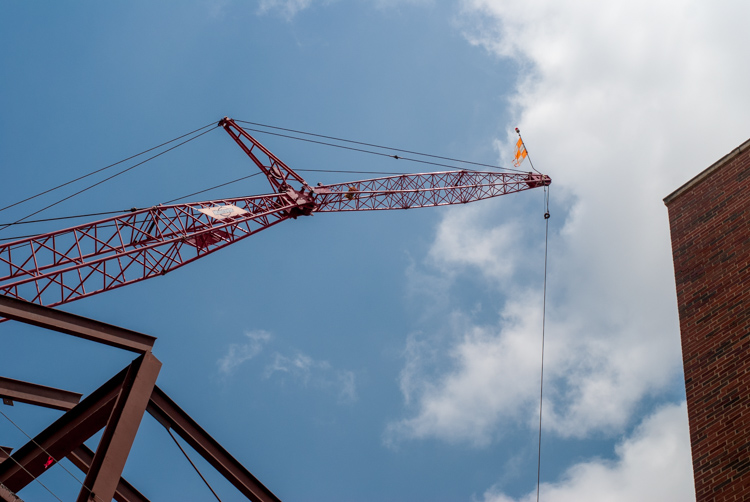
You can see the same principle at work in the following pair of shots as well. The first one was zoomed in a little and focused just on the crane, which is fine, but it doesn’t really tell the story of how big the crane is, or how much it towers over the surrounding buildings.

create-sense-of-scale-crane-unframed

To adequately capture the size of this piece of construction equipment I stood in the same place, but zoomed out a little bit, in order to frame the crane between two of the surrounding buildings. The result is a picture that adds a great deal of additional context, which helps the viewer to understand the size of the subject in the photo.

create-sense-of-scale-crane-framed

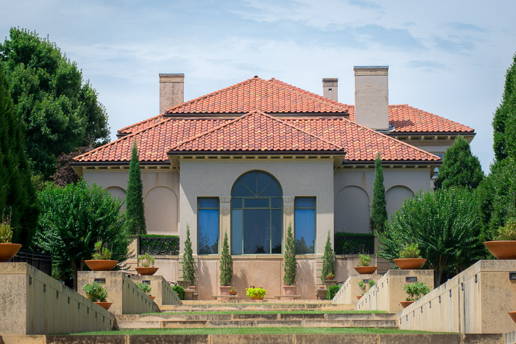
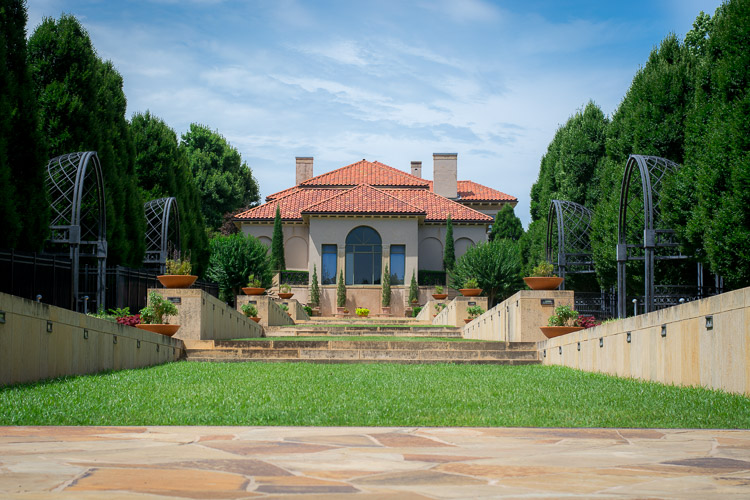
Often these types of framing decisions are not all that complicated. It can be as simple as stepping a few meters in any direction, or zooming in and out with your camera. Another example is this set of two images taken at the Philbrook Museum in Tulsa, Oklahoma. It’s a grand building with a rich history, but unless the building is properly framed it can look like any other house.

create-sense-of-scale-philbrook-unframed

Looking at the above image you might get the idea that this dwelling is somewhat old, with a bit of a terrace in front. But, it doesn’t really capture a true sense of the scale, not only of the house, but its surrounding gardens.

create-sense-of-scale-philbrook-framed

In the second image (above), the size of the mansion is smaller in the image, yet it seems much larger because it is framed on the sides by rows of trees, as well as the lower portion of the photo which shows many distinct levels of the terrace. It’s somewhat ironic that stepping back and re-framing a shot like this, so that the subject is smaller in the frame, can actually make it appear larger. But, you will find this phenomenon to be true across a wide range of photographic situations in which you want to convey the true size of something.

Don’t overdo it

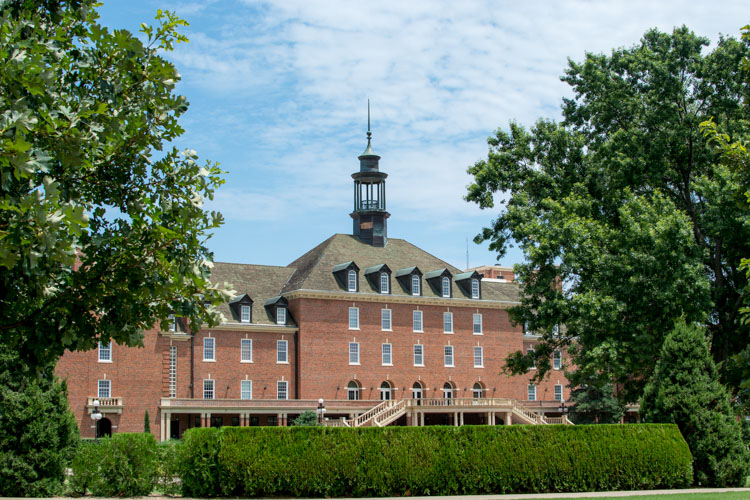
Of course, just as important as knowing how to frame your subjects is knowing when to hold back a little bit. The picture below shows the student union of Oklahoma State University, one of the largest student unions in the country. Yet when it is framed between two trees on the sides and a hedge in the foreground, it almost gets dwarfed and seems somewhat diminutive in size.

create-sense-of-scale-student-union-framed

One reason the framing is not useful here is because it actually covers up part of the building, whereas in the previous example the technique was used enhance the large subjects. There are also several visual cues, such as windows and stairs, that on their own do a good job of imparting a sense of size to the viewer. To properly showcase how big this structure is, it’s enough to simply show it on its own.

create-sense-of-scale-student-union-unframed

The above examples are just a few illustrations of how you can use the idea of framing to capture a sense of scale, but I’m curious about your own personal approach. How do you use various photographic techniques to truly capture the size of your subject? Leave your thoughts and images in the comments below.

googletag.cmd.push(function() {
tablet_slots.push( googletag.defineSlot( “/1005424/_dPSv4_tab-all-article-bottom_(300×250)”, [300, 250], “pb-ad-78623” ).addService( googletag.pubads() ) ); } );

googletag.cmd.push(function() {
mobile_slots.push( googletag.defineSlot( “/1005424/_dPSv4_mob-all-article-bottom_(300×250)”, [300, 250], “pb-ad-78158” ).addService( googletag.pubads() ) ); } );

The post How to Use Framing to Create a Sense of Scale by Simon Ringsmuth appeared first on Digital Photography School.


Digital Photography School

 
Comments Off on How to Use Framing to Create a Sense of Scale

Posted in Photography


Drawn Together: The Evolution of Architectural Scale Figures

18 May

[ By WebUrbanist in Art & Drawing & Digital. ]
architectural selfies

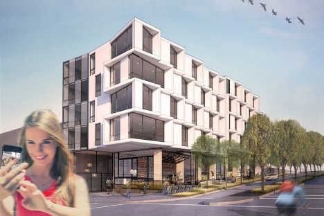
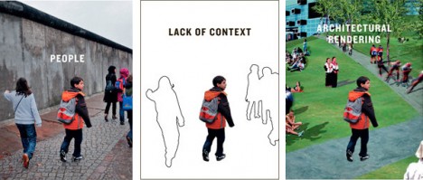
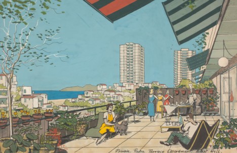
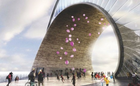
As they evolved, illustrated figures in architecture (sometimes called ‘scalies‘) have grown to have more personality, color and life, serving as more than a means to measure relative distances, heights and widths in renderings.
architectural scalies figure void

abstract scales

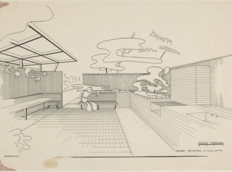
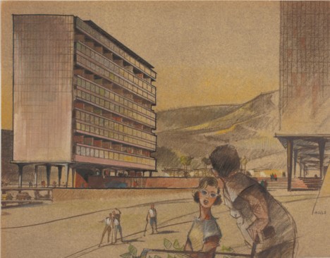
Historically, architectural drawings rarely featured people and, when they did, these were simplified constructs, often just outlines or silhouettes, designed simply to give the viewer a sense of scale.

scalies from gizmodo

scalies

Over time, start to see figures sitting in furniture, holding books (or recently: mobile devices), groups interacting and other strategies to bring these two-dimensional people to life, and the architectural scenes they inhabit along with them.

scalies in new rednerings

Their evolution is not accidental: scalies are often used with very explicit aims, from trying to give people a sense of the use that will take place in a finished building or space to conveying a broader vision of its popularity. Developers, for instance, may want to sell investors on how well their project will do financially, and thus pack drawings with figures to create that impression.

loitering scalies

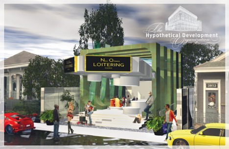
On the flip side, architectural students may take things to opposite extremes, setting lewd, crude or generally absurd scenes for shock value and collegial entertainment.

scalies package

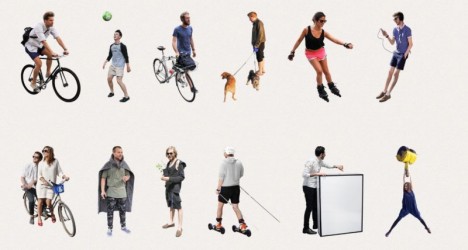
While some architects simply photo-edit their own scalies out of various images, there are professional makers as well, who take pictures against green screens and sell them in bundles, like “100 Business People” or “100 Casual People.” With the rise of 3D modeling, some companies are starting to capture and sell three-dimensional figures as well.

scalies in extreme environmen ts

sad keanu architecture rendering

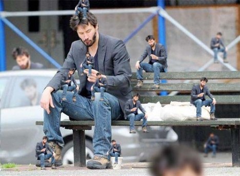
Increasingly, other ‘support’ objects have coming into play, from cars to carried accessories. Some designers go out of their way to make scalies stand out, using scantily-clad models, impossible characters (like dinosaurs) or famous figures (like a sad Keanu).

scalies example

Taking the larger view, scalies show us a great deal about times, places and cultural norms; in the mid-1900s, you find men golfing and women in kitchens, dressed (of course) in period attire. Today is no different, but we notice the cultural cues less since these are now our times and places (Images via Gizmodo, Curbed, The New York Times and DesignObserver).

Share on Facebook


[ By WebUrbanist in Art & Drawing & Digital. ]

[ WebUrbanist | Archives | Galleries | Privacy | TOS ]


WebUrbanist

 
Comments Off on Drawn Together: The Evolution of Architectural Scale Figures

Posted in Creativity