You have probably heard various reasons for converting a photograph to greyscale. I think that there is just one good reason.
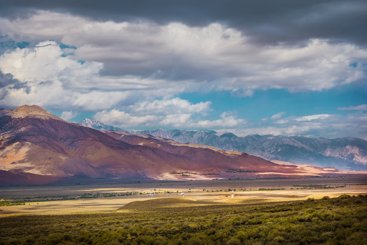
converted to sRGB profile and NO edits were done on the image – this caption is just for Richard’s information
Small Point
First though, a small point – the terms black and white versus greyscale.

Is it black and white?
It is a personal bugbear. We all do it. I do it. But we really should not say “black and white”. Maybe it is easy to say, and B&W does have a much wider catchment of understanding, however, it is a long way from the truth, and “greyscale” is much more accurate.
Singular Reason for Choosing Greyscale
The reason for choosing greyscale seems very clear to me. I could write one sentence, take a bow, then exit stage left. However, I think you, readers of dPS, deserve a little more explanation than that. Also, I admit, I have experienced that it is not necessarily an idea which others always greet with immediate enthusiasm. So I am very interested to see what you think.

The pipe walk?
You have probably heard some of the standard reasons given for choosing greyscale. For many people, at the top of the list is that it reveals form, shape, and line. Closely related to this is the capacity to emphasize texture. Also, the use of greyscale can help to set a mood, enhance an atmosphere. The luminance, the relative brightness of objects within the frame, often takes on more importance. All these are good reasons for choosing greyscale.
First Example

A good guy …
Months after I had taken it, I came back to the image above and converted it to greyscale. I liked this guy when I met him. Rather, I liked his face, but I did not think the portrait offered much. Then:

… shines out from the picture.
In the context of writing for dPS, I find it difficult to comment on my own photographs, but surely the greyscale version is a great deal better, do you not agree?
The reasons include many of the standard ones given above. For me, and we all see things differently, the prime thing is that the mood is much more dramatic. Surely the greyscale version emphasizes the shape of his face much more. The processing choices are quite extreme and show the texture and details of his face. Luminance is now also a much bigger factor. For me (please refer to my dPS articles on Photographer’s Metadata) it shows the man’s vibrant character more strongly. That is curious, isn’t it? When the color is removed the character is more evident.
Zen
For me, the preliminary point to grasp is that if something is not contributing to a picture in a positive way, it probably has a negative impact on the final result. If an element in the image is not contributing in a good way, it is very likely a distraction. All a bit Zen, aiming for clarity of vision, with all the unnecessary removed.

A little Zen?
Removing the Distractions
Looking at the photograph of the watermelon store below, what do you think is the point, what is the subject, what is the story? I think it adds to the photograph that there is retail transaction taking place, and this tells part of the story. However, at least for me, I do not think that is the main subject of the photograph.
The biggest feature is obviously the melons, and I do not think it is their color, I think it is their shape, and the repetition of that shape which is emphasized by the rim light. I am certain that the van at the back is not helpful, adds nothing to the story at all, and it is quite a big distraction.

What is the subject here?
The Zen of removing non-contributing factors, unnecessary distractions should be the reason why you choose to convert a picture to greyscale. The item at the top of that list of distractions is the most obvious thing. The biggest distraction is color itself. A tip that I heard a few years ago, which I have found very helpful, is that the reason for converting an image to greyscale is that it REMOVES THE DISTRACTION OF COLOR.
Sorry, did I raise my voice for a moment there? I hope I did not offend you. But, at least for me, it is about as solid and certain as anything is in the compromise-filled world of photography. If color is not contributing to the photograph, it is a distraction.
Whether you agree or not, as I’ve said, for me the photograph of the melon stall is about the repetitive shape of the melons. All of the items mentioned a couple of paragraphs above, the standard reasons, are improved by converting to greyscale, by removing the distraction of color.

Shapes and light.
More Examples
Another street shot.

Filipino street boys.
In the greyscale version below, the luminance of the objects is improved. Just look at the plastic begging cup in the boy’s hand, it is much more of a feature. The texture is shown a great deal more clearly in the grime on the boys’ faces, shirts, and very much in the matted nature of their hair. The mood grimmer. All of these, probably more, are part of the standard list of reasons for choosing greyscale. However, all of them are subservient to the main overall reason. All the improvements are achieved because a conversion to greyscale has removed the distraction of color.

With every detail clear to see.
The next photograph is a typical Filipino sari sari store.

Minding the store.
Again, I acknowledge that we all see things differently. I can only say how I see it, but I would think that for most viewers, the removal of the distraction of color, has made the store owner much more prominent. Also, the clutter of all the sachets seems greater, their pattern, you might call it texture, seems more evident. It seems color was a distraction.

It is clear to see.
Greyscale for portraits
I am very fond of using greyscale for portraits.

This does not work.
It would have been better to use a different chair, as that yellow is a huge draw away from the subject of the photograph, but I was chasing the light. The use of greyscale soon removes the distraction.

This does work.
As with the man at the top of this article, portraits can sometimes be greatly improved by using greyscale. The face, which is, after all, the subject of the photograph, is what your eye is drawn to.

Incomparable.
As I have said, the use of greyscale can help to show shapes and lines, make more of a feature of luminance. All of that is gained because – you may well have gotten the mantra by now – it removes the distraction of color.
To my eyes, photographs of babies seem to work particularly well in greyscale.

There are too many distractions here.
Returning to the original Zen question, does the color add anything to the photograph above? Being a little absolutist about it, no it does not. It is, therefore, detracting from the end result.

Fewer distractions.
Removing the distraction of color, allows the texture to be emphasized. The skin of babies, and their young mother’s too, usually has a lack of texture, it is the beautiful smoothness which is emphasized.
Sometimes it can be a matter of personal taste.

Sweet dreams.
But I much prefer the emphasis of lines and the calm mood of the greyscale version.

Sweeter dreams.
Finally, on the theme of portraits, and children in particular.


Greyscale for other subjects
If you even half accept what I am saying, mostly from the examples of portraits, what do you think about applying the same idea to other subjects?
Below is a unique form of transport in the Philippines, a jeepney. What do you think the color adds to the version on the left?

Converting to greyscale emphasizes the shiny parts, and the shapes and lines as well. Aren’t your eyes less drawn to the blue roof, and blue spare wheel cover?

Though it is almost monochrome, does the color add anything to this image of buildings?

A bit of a crop, a change to greyscale, and the subject, the bicycle, becomes much clearer.

Then, with the photograph below, what do you think the subject is? Yes, of course, it is sand dunes. More specifically, isn’t it the lines of the sand dunes? It seems that this is a good time to ask the Zen question again. Is the color adding anything to that? The sand is not a color which appeals to me in this example, and the sky is a very insipid. To my eyes, the color adds nothing.

The desert.
The lines, light and shadow, the texture … the subjects of the photograph can sing their song when it is in greyscale.

The shapes, lines, textures of the desert.
The Counter Example
Sometimes a point is made clearer with a counter-example. You might think the point of this photograph is the radiating lines.

I think the color is at least an equal part of the subject of this photograph, not a distraction at all. The color version is much better to my eye.

Then, I wonder what you think of this photograph.

That girl!
You may have different tastes than I do, and you are welcome to disagree. I would recommend that you question each individual shot, keep thinking, do not follow any formula. It may seem contrary to many of the decisions and comments I have made above, but I much prefer this shot in color.

Closer, warmer.
I’ve had to think about why I prefer the color version of this image. I think the really shallow depth of field is a factor, meaning that, with much of the image out of focus, the color is less present, distracts less from the subject of the photograph.
Also, because the main subject is a fairly large portion of the photograph, it is quite an intimate photograph. The color is not only NOT a distraction, but enhances that intimacy, with a warm tone, and even the detail of the small pink tongue. The luminance is a factor in both versions, but the face seems to still shine through in the color version. Neither is the photograph as much about line, shape, or texture. Simply, it is a much better, more fully cohesive story when told in color.
Processing
One extra bonus to converting a photograph to greyscale is that it can allow quite a lot more flexibility in post-processing. My assertion is that this is also a result of removing the distraction of having to deal with color. If you do not have to worry about color when processing, you can certainly kick around all those greyscale pixels a lot harder. The distraction of color might be, as in the case of this photograph shot into the light, that the color was not very good in the original shot.

I would never even start to think of publishing this.
Or?

This? Yes!

This is not a great landscape photograph to start. I think it is very clear that the light, and the subsequently flat colour, does not help. It is too dull and flat.

Remove the color, and the greyscale version is nowhere near to being a competition winner but, at least to my mind, it is better. It has a bit more depth, a bit more spark.
As stated repeatedly, with color out of the equation, no longer needing to be considered, you do have a lot of choices.

Soft, warm Arabian colors.

Hard, lots of contrast, the structure of the pot and its holder are shown clearly.

Texture, details, more balanced.

The feel and the look that I had in my mind’s eye.
For those who might remember the early Elton John album, Tumbleweed Connection, the album cover was my inspiration. I felt I got close. The point being that without color in the way, you can bend those pixels into all sorts of different moods.
Simple Conclusion
The first thing is an acceptance that if something in the frame is not adding to the photograph, it is detracting from it. Then, choosing greyscale removes the distraction of color! Simple!
P.S. Yes, of course, I also call them black and white photos all the time too!
The post The One Good Reason to Choose Greyscale by Richard Messsenger appeared first on Digital Photography School.

Digital Photography School





You must be logged in to post a comment.