RSS
 

Posts Tagged ‘Purple’

Weekly Photography Challenge – Purple

14 Mar

The post Weekly Photography Challenge – Purple appeared first on Digital Photography School. It was authored by Caz Nowaczyk.

This week’s photography challenge topic is the color PURPLE!

Weekly Photography Challenge – Purple
Photo by dPS writer, Megan Kennedy © Megan Kennedy

Another fun challenge. You can capture the color purple in so many ways.

You can photograph a still life, flowers (macro or not), landscapes (think the beautiful purple tinges between the Golden and Blue hour), cityscapes (think light trails as the sun has just gone down leaving a purple hue in the sky), bokeh lights, abstracts, live music photography (think purple lighting), use colored purple gels on your lights, or people wearing purple clothing. 

Alternatively, you may like to do some purple split toning in post-production.

There are so many options!

So, check out these pics to give you some ideas, have fun, and I look forward to seeing what you come up with!

abstract flower photography aster
Photo by dPS writer, Jaymes Dempsey © Jaymes Dempsey
How to apply compositional theory to still life photography
Photo by dPS writer, Darina Kopcok © Darina Kopcok
Weekly Photography Challenge – Purple
Photo by dPS writer, Charlie Moss © Charlie Moss

Check out some of the articles below that give you tips on this week’s challenge.

Tips for Shooting the color PURPLE

Mastering Color Series – The Psychology and Evolution of the Color PURPLE and its use in Photography

A Beginner’s Guide to Abstract Flower Photography

How to use Colored Gels to Create Unique and Creative Portraits

How to Create a Delicious Blurry Bokeh Background in 4 Easy Steps

How to Create Abstract Images With a Soft-Focus Look Using Vaseline

How to Apply Compositional Theory to Still Life Photography

5 Product Photography Tips to Improve Your Images

Simply upload your shot into the comment field (look for the little camera icon in the Disqus comments section) and they’ll get embedded for us all to see or if you’d prefer, upload them to your favorite photo-sharing site and leave the link to them. Show me your best images in this week’s challenge.

Share in the dPS Facebook Group

You can also share your images in the dPS Facebook group as the challenge is posted there each week as well.

If you tag your photos on Flickr, Instagram, Twitter or other sites – tag them as #DPSpurple to help others find them. Linking back to this page might also help others know what you’re doing so that they can share in the fun.

The post Weekly Photography Challenge – Purple appeared first on Digital Photography School. It was authored by Caz Nowaczyk.


Digital Photography School

 
Comments Off on Weekly Photography Challenge – Purple

Posted in Photography


Mastering Color Series – The Psychology and Evolution of the Color PURPLE and its use in Photography

06 Jun

The post Mastering Color Series – The Psychology and Evolution of the Color PURPLE and its use in Photography appeared first on Digital Photography School. It was authored by Megan Kennedy.

Purple has had a long history in visual arts. From prehistoric to modern artworks, purple has come to represent aspects of religion, royalty and status. In this article, we’ll look back on the history of the color purple, its evolution and its impact in the context of modern visual art.

The psychology of purple

In the traditional color wheel used by artists, violet and purple are placed between red and blue. Purple takes up the space closer to red, between crimson and violet. Violet is positioned closer to blue.  Despite this, both violet and purple are often placed under the one heading of purple, sharing psychological associations.

As an intermediary between red and blue, purple tempers the extremes of both. Like blue, purple has a soothing effect, cultivating introspection and calm. Like red, purple also generates a visual vibration, stimulating creativity and passion. Lighter purples are considered light-hearted. Darker shades of purple are associated with wisdom and intellect.

Over history, the limited resources and arduous processes needed to obtain rich purples made it an expensive luxury. For this reason, the color purple came to be associated with status, royalty and wealth. Perhaps due to it’s uncommon and distinctive presence in nature, purple has also been attributed to exoticism, mystery, and magic.

In Christian tradition, purple is used during lent to signify mourning and majesty, anticipating the crucifixion of Jesus Christ. Hinduism associates purple with a oneness with God, peace, and wisdom. In China, purple represents spiritual awareness as well as physical and mental healing. Japanese cultures view purple as the color of privilege, wealth, and Japanese aristocracy. In Africa, purple is a symbol of status and wealth, whereas, in Brazil, purple can indicate mourning or death.

The evolution of the color purple

Hematite and manganese

Used by Neolithic artists in the form of sticks, or ground and mixed with fat as a paint, hematite and manganese are the oldest pigments used for purple coloring in art. Dated between 16,000 and 25,000 BC, early artists used purple to draw and paint figures and the outlines of their hands on the walls of sites like Pech Merle cave in France. Manganese is still used today by some indigenous Australians as a traditional pigment for coloring the skin during rituals.

Han purple

Despite it’s name, Han purple has been found to occur well before the Han dynasty in China. Created by melting silica with copper and barium at high temperatures, Han purple first appeared on glass beads found at burial sites. The pigment was later used in wall paintings, ceramics, and sculptures, including the terracotta warriors in the tomb of Emperor Qin Shihuangdi in Xi’an. The use of Han purple peaked in the Qin and Han dynasties (221 BC to 220 AD), declining during the Tang dynasty (618-907 AD).

Han purple can fade and decompose over time, particularly when in contact with acids or heat. However, the unique light-absorbing and emitting properties of the pigment generates powerful rays of light in the near-infrared range when exposed to an LED flashlight. This means that even faint traces of the pigment (invisible to the naked eye) can be viewed by conservators and scientists evaluating Han purple and its properties and history.

Tyrian purple

Ranging from a reddish to bluish purple, Tyrian purple became the most renowned shade of purple in history. Citizens of Sidon and Tyre, two cities on the coast of Ancient Phoenicia, (present-day Lebanon), were producing purple dye sourced from the mucous secretions of certain sea snails by the 15th century BC. The process for extracting the color from the snails was both unfortunate for the snail and protracted for the dye-maker as more than 10,000 snails were needed to dye a single cloak.

According to an article in The New York Times, the extricated snails were “…boiled for days in giant lead vats, producing a terrible odor. The snails, though, aren’t purple to begin with. The craftsmen were harvesting chemical precursors from the snails that, through heat and light, were transformed into the valuable dye”.

Tyrian purple was extremely pricey, and purple-dyed textiles became the color of emperors, generals, nobles, politicians, priests and magistrates throughout the Mediterranean.

Although it was used predominantly for dying textiles, Tyrian purple was also used for painting. Tyrian purple has been chemically detected in the Saffron Gatherers, a late bronze age fresco in the Aegean Island of Santorini.

Purple in the middle ages

During the middle ages, artists created purple pigments by mixing red and blue mediums together. For blues, artists sourced blue azurite or lapis-lazuli. For reds, red ochres, cinnabar, madder or minium were used. Artists also mixed woad or indigo dye for blues and cochineal dye for reds. Different mixtures resulted in different intensities and shades. However, many of these materials were prone to fading and many paintings with purple have dulled or changed in color. Jan Gossaert’s painting of a young princess is an example of this – the pattern on the garments of the sitter, now seen as blue, were originally purple in color.

Mauve

In 1856, 18-year-old British chemistry student, William Henry Perkin, was working on a cure for malaria. During his experiments, he encountered an intriguing residue, the first synthetic aniline dye. Perkin realized the compound could be used to dye fabrics. He soon patented the dye and manufactured it under the name aniline purple and (confusingly) Tyrian purple. The color’s name was later changed to mauve in 1859, reflecting the French name for the purple mallow flower. Chemists called the dye compound mauveine.

Mauve quickly became fashionable. Queen Victoria wore a silk gown dyed with mauveine to the Royal Exhibition of 1862. Perkin developed an industrial process, built a factory, and produced the dye in large quantities. His efforts made purple accessible to anyone, not just the wealthy. However, due to dye’s propensity to fade, the success of mauve faded too, replaced by other synthetic dyes by 1873.

Cobalt violet and manganese violet

The first truly violet pigment was cobalt violet, developed in 1859 by Salvetat. Ranging from deep to pale shades of violet with either a pink or blue hue, the first cobalt violets were composed of cobalt arsenate. The highly toxic compound is now rarely used, replaced today by cobalt ammonium phosphate, cobalt lithium phosphate, and cobalt phosphate.

The only truly lightfast violet pigment with relatively strong color saturation, all alternative light-stable violet pigments are duller in hue. Although in use today, the high price, weak coloring power and toxicity of cobalt violet have limited the pigment’s application.

Also known as permanent violet, Nuremberg violet or mineral violet, manganese violet is believed to have first been discovered by E. Leykauf in 1868. More affordable and less toxic than its predecessor, manganese violet became an economical alternative to cobalt violet in the 1890s and remains in use today.

Love Symbol #2

In 2017, the Pantone Color Institute announced a new shade of purple in honor of the singer Prince. The hue, dubbed Love Symbol #2, is a blue-based purple inspired by Prince’s adoption of the color throughout his career. Laurie Pressman, Vice President of the Pantone Color Institute said: “long associated with the purple family, Love Symbol #2 enables Prince’s unique purple shade to be consistently replicated [while maintaining] the same iconic status as the man himself”.

“Why this particular purple?” asks Pressman. “We are not sure of the exact reason, however, what we do know is that the language of this unique new purple, Love Symbol #2 conveys an aura of mystery, intrigue, and unconventionality, a color that stands apart from all others, something Prince, a performer of distinctive style, certainly did”.

Purple in visual arts

Ancient art to realism

The use of manganese and hematite to create purple pigments dates back at to at least 25,000 years BC. Evidence of purple in art has been found at sites such as the remote East Kalimantan province of Borneo and Neolithic sites in France. Much later, during the early stages of the church, variations of purple garments marked the hierarchies of Christian officials (mirroring the practices of pagan traditions). In medieval art, pages of the bible and gospel manuscripts were written in gold lettering on parchment dyed Tyrian purple. In Byzantine-style painting, figures of importance were depicted in purple robes.

Renaissance art saw portrayals of angels and the Virgin Mary garbed in purple. Because Jesus was said to have been clothed in purple by Roman soldiers during the events leading up to his crucifixion, purple also signified suffering, sacrifice, and majesty. The Assumption of the Virgin by Palma Vecchio features Mary dressed in a long purple gown. In Michelangelo’s Creation of Adam, God is dressed in a subtle lilac shift.

Purple featured in post-renaissance movements such as baroque and rococo art, academic art and realism. In 1789, French rococo artist, Antoine Callet, depicted Louis XVI in his royal costume, which included a luxuriant panel of purple material. Painted between 1880 and 1890, Wladyslaw Czachorski’s Lady in a Lilac Dress portrays a woman in an opulent lilac gown. The Shepherdess by academic artist William-Adolphe Bouguereau features a cool, purple backdrop, rhyming with the shepherdesses’ own garments. However, as seen in Jean Francois Millet’s The Angelus, realist artists broke away from the depiction of purple as a status symbol, instead using subtle variations of the hue to reflect the harshness of middle and lower class society.

Pre-raphaelite to abstract art

Combining cobalt blue with madder, pre-raphaelite artists like John William Waterhouse painted women in rich purple garb. As seen in Monet’s Grainstack (Sunset)Waterloo Bridge, Blurred Sun and Water Lilies (1919), impressionist painters used purple to delineate both shadow and detail. Purple also played a significant role in post-impressionist art, as seen in A Sunday Afternoon on the Island of La Grande Jatte by Georges Seurat.

The symbolism movement saw purple used in increasingly varied applications. In paintings such as Death and Life by Gustav Klimt and The Cyclops by Odilon Redon, purple is used to highlight detail and depth. Fauvism then pushed purple to shocking brilliance. Henri Matisse’s Woman with a Hat sees purple mashed together with a range of colors, creating life and vibrancy. In Woman in a Purple Coat, Matisse exploits purple as a bold separation of subject and environment. Mirroring impressionism, Andre Derain painted shadowy purples, as seen in Charing Cross Bridge, London. And Jean Puy used fluid purples to illustrate Strolling Through Pine Woods.

As seen in Puberty by expressionist Edvard Munch, purple was distorted or exaggerated in ways that matched expressionism’s often hostile or alienated depiction of the modern world. Examples of purple in cubist art include Picasso’s Bowl of Fruit, Violin and Bottle and Claude, Son of Picasso. Abstraction, devoid of recognizable figurative imagery, used degrees of purple to evoke emotional responses in the viewer. Composition 8 (1923) by Vasily Kandinsky, Untitled (1957) by Franz Kline, Black Iris VI by Georgia O’Keeffe and Purple, White and Red 1953 by Mark Rothko are examples of purple’s application in abstract art.

Purple in contemporary art

As color technology evolved, purple became increasingly available to artists. In contemporary art, purple signifies both modernity and history, reflecting the social and cultural connotations of the color through time. Vaporwave, both a musical genre and artistic movement, incorporated the use of purple heavily in its internet-based aesthetic. Constructed of neon and tar, Dan Alva’s You Zig I Zag has roots in pop culture.  Monira Al Qadiri’s sculpture of an iridescent blue and purple oil drill illustrates the industrial processes of the oil industry. And Lori Hersberger makes use of purple in his sculptures and installations, exploring light and the transformative properties of color.

Purple in photography

Although it’s less available than other colors in the urban and natural landscape, purple is a favorite for many photographers. Because of its historically rare beauty, purple is often used to convey the surreal, the modern and the artificial. David LaChapelle utilizes purple to create striking contrasts signaling commodification and modernity. Marilyn Mugot documents the neon-purple landscapes of urban China at night, while Maggie West utilizes the otherworldly properties of purple in her bodies of work. Purple also has a strong presence in the experimental photography of Ellen Carey and in the aura photography of Christina Lonsdale.

Interestingly, colour outside our visible spectrum can be explored photographically. Consisting of longer wavelengths than those of visible light, near-infrared (as opposed to far-infrared, which is in the thermal-imaging territory) is generally invisible to the human eye. However, with infrared film, an infrared filter or a converted camera, photographers can capture near-infrared wavelengths, which, when emitted from different types of foliage, are often rendered as ethereal purple tones. Near-infrared photography can be mimicked in post-production, creating beautifully alien landscapes out of earthly forms.

Purple can also manifest as unwanted purple fringing. Most visible as a purple-colored fringe in the dark edges of a subject adjacent to illumination, purple fringing is usually caused by axial chromatic aberration. Because axial chromatic aberration occurs at its most severe at shorter wavelengths, fringing is rendered in violet. Methods for reducing purple fringing include shooting with a UV filter, avoiding overexposing highlights and not shooting with a wide-open lens in high contrast situations. Purple fringing can also be corrected in post-production.

Conclusion

From its origins in ancient art to its use in contemporary visual practice, purple reflects the visual complexities of life. As a combination of blue and red, purple absorbs attributes from each, inspiring clashes of calm and passion, stillness and visual movement. Due to its rarity in nature, purple has been associated with mystery and exoticism.

Historically difficult to obtain, purple has become a symbol of status, wealth and majesty. Purple’s role in religion has been linked to spirituality and mysticism. And purple’s momentum is believed to inspire both creativity and reflection. With such a diversity in meaning and visual scope, purple’s versatility connects with a wide range of audiences. Evoking emotions based in art and life, purple is a color of intricacy and depth.

We’d love to see your images that make use of the color purple. Feel free to share them in the comments below.


The post Mastering Color Series – The Psychology and Evolution of the Color PURPLE and its use in Photography appeared first on Digital Photography School. It was authored by Megan Kennedy.


Digital Photography School

 
Comments Off on Mastering Color Series – The Psychology and Evolution of the Color PURPLE and its use in Photography

Posted in Photography


Photo of the week: The Purple Hour

05 Aug

This image was shot in Myvatn, northern Iceland. I’d been shooting there for several years now, but this was the most magical I had ever seen it. The entire area was covered with fluffy frost and snow, created by a combination of fresh snow, high humidity and low temperatures.

The highlight was the snow-laden trees. After shooting a blazing red sunset with my northern Iceland workshop group, the colors subsided and a blue/purple sky, adorned by a full moon, remained above the trees.

The final image was focus-stacked from 2 shots captured with my Sony a7R and Canon 16-35mm F4L IS lens at 16mm, F11, 8sec and ISO100.


Erez Marom is a professional nature photographer, photography guide and traveler based in Israel. You can follow Erez’s work on Instagram, Facebook and 500px, and subscribe to his mailing list for updates. Erez offers photo workshops worldwide.

Articles: Digital Photography Review (dpreview.com)

 
Comments Off on Photo of the week: The Purple Hour

Posted in Uncategorized


Formula for LomoChrome Purple 400 film reworked

25 May

LomoChrome Purple 400 –  first announced in 2013 – has been reformulated and should now have improved sensitivity at ISO 400, a more refined grain and better rendering of red hues. Inspired by classic infrared film, it uses C41 processing, making it an accessible way for analog shooters to try their hands at this style of photography.

Are these improvements to LomoChrome Purple 400 related to an overall increase in market demand for film? It’s hard to say. The good new is Purple 400 is now better than ever and will still shift your blues to green, greens to purple and yellows to pink.

Articles: Digital Photography Review (dpreview.com)

 
Comments Off on Formula for LomoChrome Purple 400 film reworked

Posted in Uncategorized


Purple Reign: Photographer Brian Ach shares his experiences of working with Prince

23 Apr

Purple Reign: Photographer Brian Ach shares his experiences of working with Prince

Paris, France. June 2011. Brian wanted to show what it was like to experience a Prince performance, so he decided to shoot in a more artistic and editorial way than is typical for concert photography. This is the first shot he showed Prince, which was the shot that defined Brian’s stint as Prince’s tour photographer. Photo by Brian Ach.

Celebrity and concert photographer Brian Ach was Prince’s European tour photographer during the artist’s 2011 “Welcome 2” tour through North America, Europe and Australia. Brian shared some of his tour stories with us in his closing talk at PIX 2015, and this morning he chatted again with us about his experience photographing and working with Prince, following the musician’s death this week, aged 57.

You were hired to photograph the European leg of Prince’s tour in 2011. As a huge fan of his music, and knowing his reputation for hard work and high expectations, how did you approach this job?

I didn’t get a chance to meet Prince before the first show in Paris. Since I didn’t have any direction from him about how or what I should shoot, I decided that I was going to be true to myself and shoot the show the way I thought it should be shot. I decided to go for broke and shoot it in an artistic way, to make it worthy of his art and his performance.

When I was ready to deliver the edits to Prince after the show, I opted not to show them to him in chronological order. Instead, I picked what I considered to be the most interesting 6 or 7 shots and put those first. Prince entered the room and said, “You have something to show me,” so I pulled the first picture up on the screen. He stared at it for 15 seconds in complete silence and then got up and walked out of the room. I assumed I was going to get fired after a single shot, but a minute later Prince walked back in with his whole band. He pointed at the screen and said, “Look at that,” and then stood back with a smile on his face. He asked his manager, “Where did you find this guy?” and I answered, “Queens.” He laughed, and from that moment we had an understanding. He expected the best, so as long as I did my best work, we’d work well together.

Purple Reign: Photographer Brian Ach shares his experiences of working with Prince

Gdynia, Poland. July 2011. Being Prince’s photographer gave Brian the opportunity to be more creative. Photo by Brian Ach.

You have a lot of experience photographing musicians, from U2 to Taylor Swift, Jay-Z, Kanye West and Bruce Springsteen. Was it different to photograph Prince?

The advantage of shooting for an artist is that you get to shoot the whole show rather than just the first 30 seconds of the first few songs. This gives you time to be more creative as long as you get the basic shots out of the way, and it gives you access to areas of the stage that you wouldn’t normally have.

Prince was an epic performer, so photographing his show meant going for the epic shots. I shot a lot of wide angles from behind the stage to bring people right into the performance, and I had the luxury to swap out different lenses to try different things. Normally I would never shoot a concert with a 50mm F1.4, but I used it during a few quieter moments to really capture the feeling of the moment. I had time to experiment, to catch a strobe, get him backlit, drag my shutter. Prince was an artist, so he was going to “get” it if I took some chances to be more creative. However it was still a huge risk if he didn’t like what I shot!

Purple Reign: Photographer Brian Ach shares his experiences of working with Prince

Rotterdam, Netherlands. July 2011. This shot was initially rejected by Prince because of his animated expression.  Brian argued that it was a powerful and emotive shot, and Prince eventually agreed. Photo by Brian Ach.

Prince owned his public image. He was one of the first artists to start buying out photographers and his music, to refuse to have his interviews recorded. He made sure there was nothing out there that he felt cheapened his image or his music. He had strong opinions about what he wanted, and over time I was able to learn what he was looking for. Sometimes I argued with him about shots that he rejected and sometimes he conceded. Because even though he knew what he wanted, he was also collaborative. His entire career was one risk after another, so he appreciated and respected when I took risks and challenged him.

Purple Reign: Photographer Brian Ach shares his experiences of working with Prince

Paris, France. June 2011. This shot was rejected by Prince because of the empty seats behind the stage. Photo by Brian Ach. 

When I took this shot [above], I thought, “Yes!  I got it!”  I showed it to Prince and he said no, we weren’t going to use it. It was a great shot of him walking on stage singing with the crowd bursting into applause, but it wasn’t going to work. I asked what was wrong with it and Prince said, “There are empty seats behind me.  It can’t look like there were empty seats at my show.” Those seats had to be empty because they were behind the stage, but even though there was a good reason, it told the wrong story. I agreed with Prince and that photo wasn’t used.

Purple Reign: Photographer Brian Ach shares his experiences of working with Prince

Rotterdam, Netherlands. July 2011. Prince didn’t choreograph his shows, so Brian had to be on his toes at all times. He couldn’t just sit back and shoot or he’d have missed shots like this one. Photo by Brian Ach.

Prince didn’t play a concert; he put on a show, and it wasn’t the same show every night. His band had to know at least 300 songs and they had to be ready to play any of them, as they would often see the set list for the first time when they walked on stage. Nothing was choreographed, so it kept you on your toes thinking, “Man, he’s never done that before.”

One time, Prince did a guitar solo, ripped off the guitar, and threw it into the audience. When I saw him after the show he smiled that little smile he’s famous for. “Did you get that guitar in the air?” “You know what?  I did.”  “Right on.”

Purple Reign: Photographer Brian Ach shares his experiences of working with Prince

Rotterdam, Netherlands. July 2011. Prince saw Brian about to take this shot, so he moved his guitar from behind the mic stand to make it a cleaner shot. Photo by Brian Ach.

Do you have a favorite photo you took of Prince?

Prince was an amazingly energetic performer, but this photo [above] was taken during a very calm, peaceful moment. He was completely in the zone, and it was rare to catch him like this. At the same time, even as he committed himself to this moment, he still knew what he needed to do. Before the shot, he saw me there so he pulled his guitar from behind the mic stand. He knew I was going to get the shot and that it would be good. It’s that kind of awareness that you don’t see in many musicians. So confident in his ability that he didn’t have to think about performing; it just came naturally.

I once commented that his guitar playing seemed so effortless for him. He told me, “Yeah, that’s from practicing so long that my fingers bled. I’d play 8 hours a day when I was growing up. That’s called putting in the work. You’ve gotta put in the work.” He said that a lot, that you have to “put in the work”. I’ve found that to be true for my own work as well. I can’t be free to be creative if I’m thinking about the settings on my camera. A violinist plays scales for hours until they can play music without thinking about the notes. You’ve got to put in the work if you want to be good at something, and Prince put in the work.

Purple Reign: Photographer Brian Ach shares his experiences of working with Prince

Rotterdam, Netherlands. July 2011. A photo from the last show Brian shot. Photo by Brian Ach.

What is your favorite memory from working with Prince?

Before the last show I photographed, I left a handwritten note for Prince on the table in his dressing room. I told him how I’d never have believed that the kid in Ohio watching Prince perform ‘Purple Rain’ at the 1985 American Music Awards on TV would some day be living his dream photographing Prince on tour. I thanked him for the opportunity.

Prince didn’t say anything to me before the show or after the show, so I was worried that he didn’t get the note. But at 4am as the night was winding down, he put his arm around me and said, “Thanks for your note; that put me right to go on stage tonight. You make art. These aren’t photos; it’s art.” That was the one of the best things anyone has ever said to me. As a photographer I don’t get feedback or validation very often, so to hear that from one of my heroes was huge for me.

Prince never shared most of the photos I took of him during this tour. By the third show, he said that he wanted to keep the photos for himself rather than send them out on Wire Image. At the end of the tour he told me that the photos were art and needed to be shared, so he picked a few from each show to send to Wire Image. By then the tour was already over so the photos weren’t seen by many people, and Prince kept the rest in his personal collection.

A number of news agencies have called me asking if I have unpublished photos of Prince. I do – I have tens of thousands of them.  But they aren’t mine to share.

Articles: Digital Photography Review (dpreview.com)

 
Comments Off on Purple Reign: Photographer Brian Ach shares his experiences of working with Prince

Posted in Uncategorized


How to Correct Purple Fringing in Photoshop

13 Nov

A couple years after starting my business, I received a large print from my lab. Upon checking it, I noticed a problem with the print that was so blatant I couldn’t deliver it to my client. At first I thought the lab made the mistake, but nope. It was a problem created by my digital camera when I took the shot! It’s more than likely you’ve already noticed it in your images.

The problem is called purple fringing. In this article I’ll go over what it is, how to prevent it, and how to get rid of it.

What is Purple Fringing?

Purple fringing is when you get purple color in high contrast boundary areas in an image that was most likely taken in low light situations with a brighter background. It is most often attributed to a chromatic aberration that occurs commonly with digital cameras, but purple fringing can also be caused by lens flare.

How can you prevent getting it?

  • Avoid shooting with your lens wide open in high contrast situations.
  • Get a UV filter for all of your lenses.

Unfortunately, these actions don’t always resolve fringing problems, but it can prevent it from happening some of the times.

Purple fringing

Example image: You see it mostly in the branches and the edge of the roof.

Purple-Fringe-in-images-PROBLEMS-MARKED2

FYI:  I used my 14mm ultra wide lens for this shot. The lens looks like a fisheye lens with its bulging curvature, so it is not possible to put a lens filter on it.

Close-up view of purple fringing:

Purple-Fringe-in-images-PROBLEM-closeup

The image AFTER correcting it in post-processing:

Purple-Fringe-in-images-FIXED

Close-up view AFTER correcting it:

Purple-Fringe-in-images-FIXED-closeup

Steps to correct purple fringing in Photoshop:

Step One:

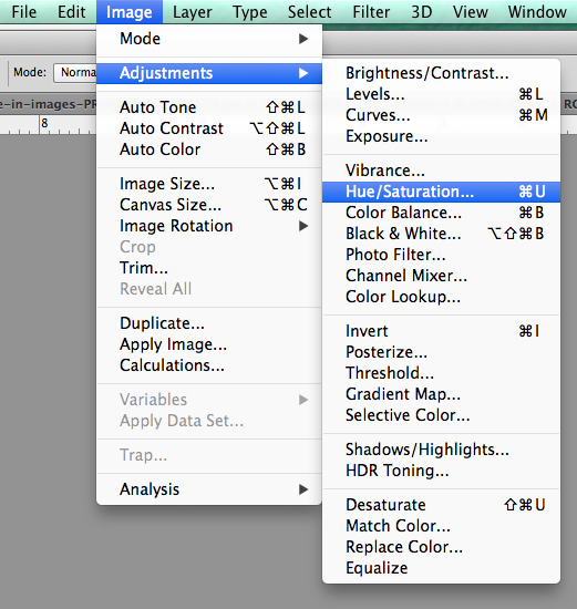
In Photoshop, click on “Adjustments” under the “Image” tab.

Step Two:

Select “Hue/Saturation”. (Or you can do this as an adjustment layer as well in case you need to mask off some areas later).

Photoshop-Saturation-menu

Step Three:

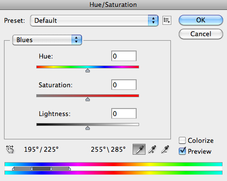
Where you see “Master”, click on it and select “Blues” to get to the blue channel.

Step Four:

Once you’ve selected the specific color channel, you will have the eyedropper tool. Select the left-most eye dropper.

BlueChannel

Step Five:

Then click on one of the areas in your image with purple fringing. I chose the tree branches on the right as they were one of the most prominent problem areas.

Step Six:

Next, go to the Saturation slide bar and move the slider to the left. Usually somewhere between -70 and -80 works best, but the exact number depends on the image and the amount of fringing.

Step Seven:

Lastly, check your image to see if you need to adjust anything else since reducing one color may effect the rest of your image. (If you’ve use an adjustment layer you can mask out the parts you don’t want effected)

There you have it! You’ve zapped away the purple fringe!

Read more on how to fix chromatic aberration here:

  • How to Fix Chromatic Aberration in Lightroom 5
  • How to Fix Chromatic Aberration in Photoshop

The post How to Correct Purple Fringing in Photoshop by Annie Tao appeared first on Digital Photography School.


Digital Photography School

 
Comments Off on How to Correct Purple Fringing in Photoshop

Posted in Photography


Allium ‘Purple Sensation’ flower opening time-lapse

20 Oct

Allium ‘Purple Sensation’ flower opening time-lapse Filmed by Neil Bromhall for www.rightplants4me.co.uk plant finder, plant identification and pruning advice website The flowers don’t open all at the same time but rather over a period of several days to ensure pollination. This plant is in the onion family. Filmed on Nikon D300. 55mm macro nikkor lens and studio flash. Exposure interval 1 frame every 6 minute filmed over a period of three days. Music ‘Simplicity’ by Paul Mottram
Video Rating: 4 / 5

 
Comments Off on Allium ‘Purple Sensation’ flower opening time-lapse

Posted in Nikon Videos


Macro – Purple Flower Drop

26 Sep

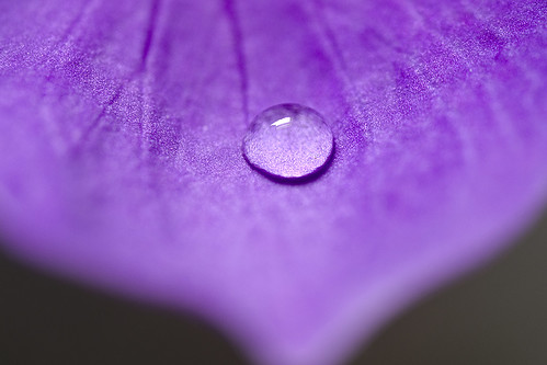
Macro – Purple Flower Drop, originally uploaded by Crouchy69.

Catchy Colors Photoblog

 
Comments Off on Macro – Purple Flower Drop

Posted in Equipment