RSS
 

Posts Tagged ‘Projects’

Lush Life: 12 Verdant Architecture Projects Making Plants a Main Priority

26 Sep

[ By SA Rogers in Architecture & Houses & Residential. ]

Not all architecture incorporating lots of living greenery is doomed to remain an unrealistic rendering, depicting buildings that can’t structurally support the weight of all the soil and water needed to keep full-sized trees alive. Architect Thomas Heatherwick built ultra-strong concrete pillars into his 1000 Trees design, for example. Other buildings take a subtler approach, choosing ivy, potted plants or existing trees rooted in the ground. All of these projects attempt to meld urban architecture with lush gardens in the hopes of cleansing the air, storing CO2 to mitigate climate change and providing enhanced access to green spaces in cities.

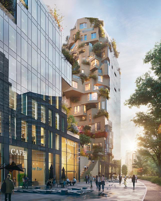
Valley: Green-Terraced Towers by MVRDV in Amsterdam, The Netherlands

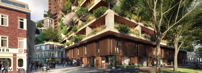
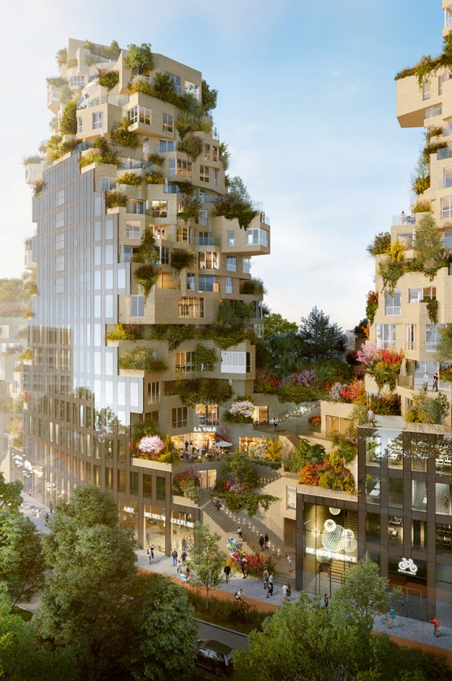
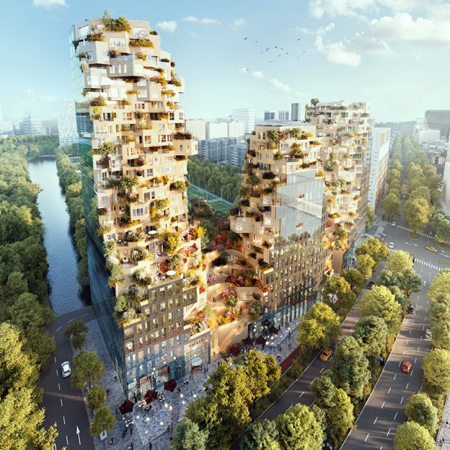
Construction began in August 2017 on MVRDV’s ambitious ‘Valley,’ a mixed-use complex of green-terraced towers in Amsterdam’s central business district. ‘Valley’ is notable not only for its unusual offset stacking of volumes , creating an irregular shape, but also for all the greenery it supports. The towers include 196 apartments, 7 stories of offices, shops, restaurants, cultural facilities and a three-story parking lot.

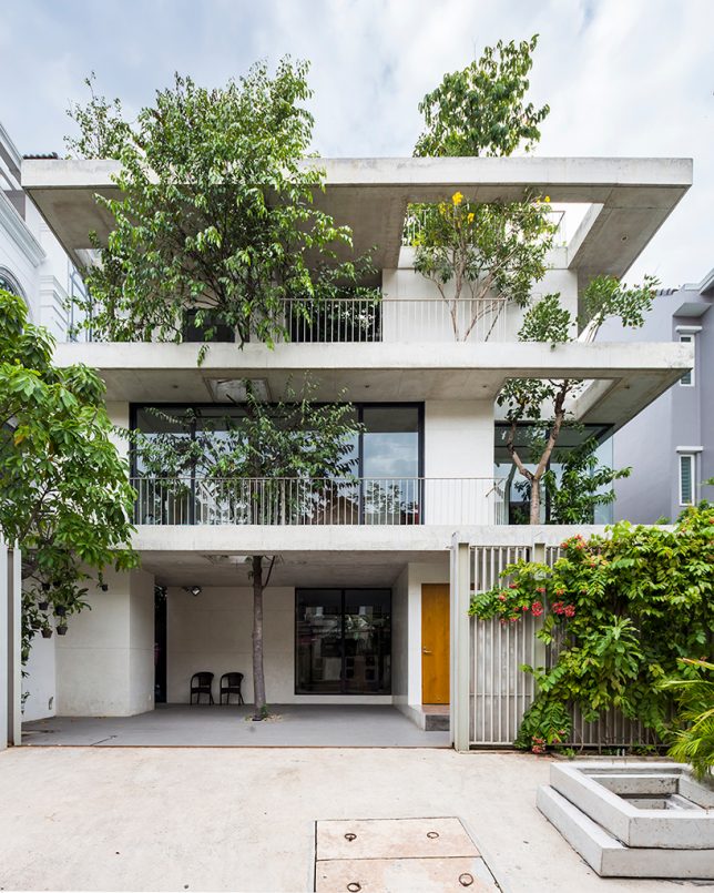
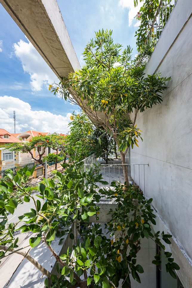
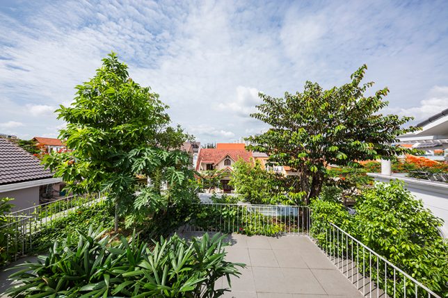
House for Trees by VTN Architects in Ho Chi Minh, Vietnam

VTN Architects approached ‘House for Trees’ as a way to alleviate the lack of access to green spaces as well as poor air quality found in big cities like Ho Chi Minh. This residential project incorporates trees into its design, envisioned by the firm as a “small park in a dense neighborhood.” The trees are set into deep planter boxes disguised among the concrete volumes of the house, with cut-outs allowing their crowns to rise as high as they like.

Nautilus Eco Resort by Vincent Callebaut in the Philippines

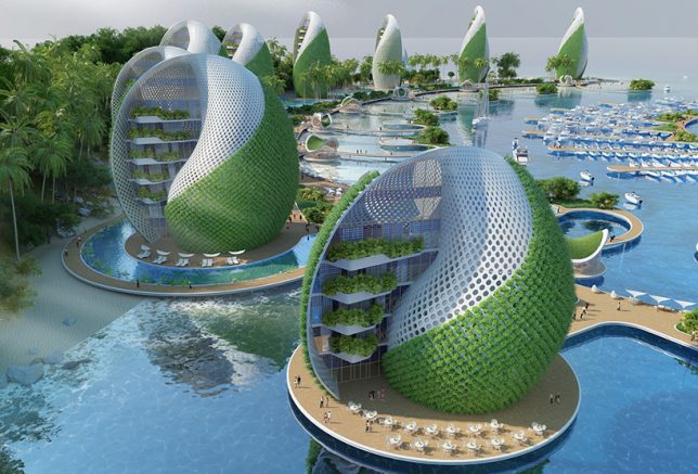
The Nautilus Eco Resort by Vincent Callebaut is designed as a ‘zero emissions, zero waste, zero poverty’ development for the Philippines in response to environmental and social problems in the country, like overfishing, pollution and mass tourism. The project would be built from reused or recycled materials, self-sufficient in producing its own energy and food, and engage volunteer ecotourists in cleaning up plastic waste that washes up onto the area’s beaches. It consists of a series of shell-shaped hotels and apartment towers spiraling around a central island housing a nautical center and scientific research laboratories. The plant walls cool the buildings as they grow food.

Amata + Triptyque Timber Building in São Paulo, Brazil

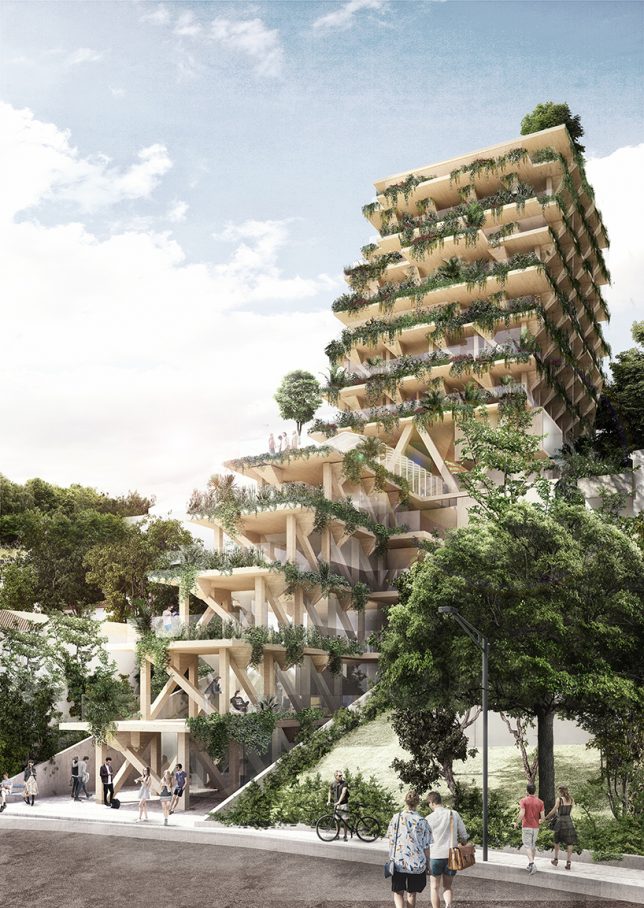
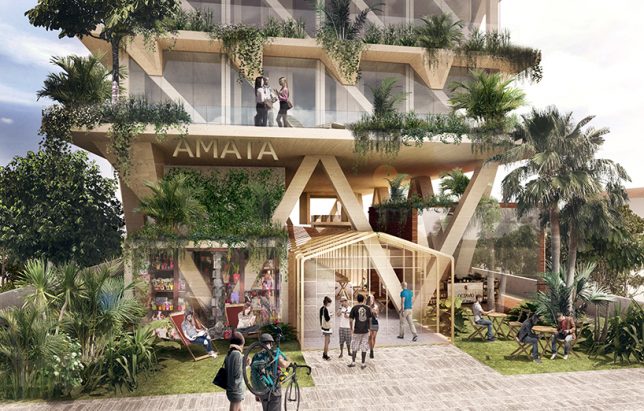
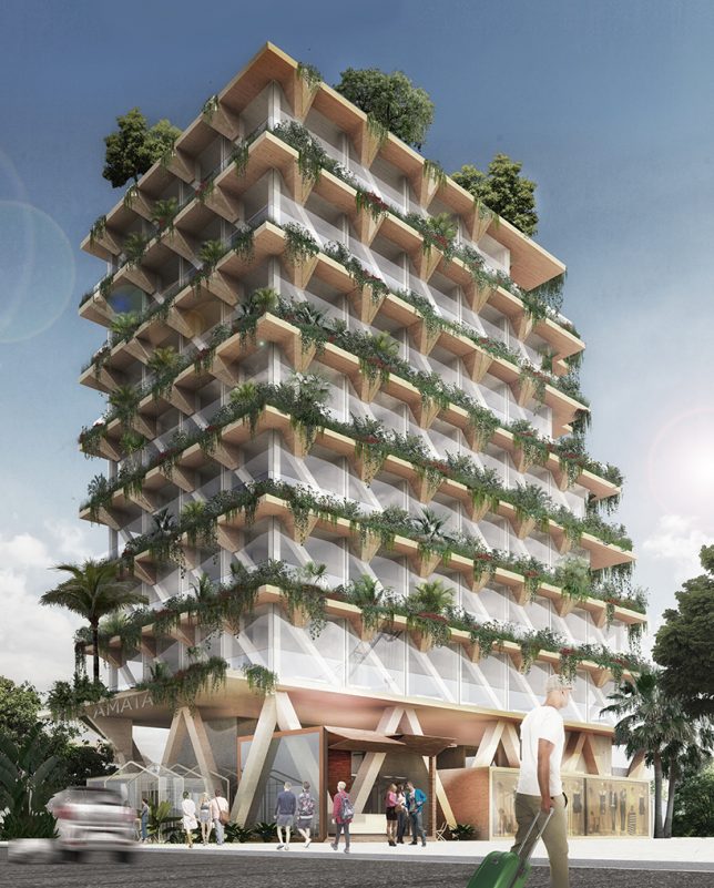
Constructed entirely from Brazilian timber, this building is a collaboration between architecture studio Triptyque and forest management company Amata. The building aims to be a giant carbon sink, contributing towards the fight against climate change. Each square meter of wood is capable of absorbing a metric ton of carbon dioxide from the environment. The 13-story building contains co-working, co-living and dining spaces, the edges of its terraces dripping with living plants.

Next Page – Click Below to Read More:
Lush Life 12 Verdant Architecture Projects Making Plants A Main Priority

Share on Facebook


[ By SA Rogers in Architecture & Houses & Residential. ]

[ WebUrbanist | Archives | Galleries | Privacy | TOS ]


WebUrbanist

 
Comments Off on Lush Life: 12 Verdant Architecture Projects Making Plants a Main Priority

Posted in Creativity


Starchitect Spotlight: 10 Iconic Architectural Projects by Herzog & de Meuron

29 Aug

[ By SA Rogers in Architecture & Offices & Commercial. ]

Based in Basel, Switzerland, the architecture firm Herzog & de Meuron is known for dramatic, monumental Modernist structures free of frivolity, expanding over the years from simple geometric silhouettes to more complex and dynamic shapes. Each of their buildings is almost like an oversized sculpture, some rising high above street level or cantilevering at striking angles while others, like their recent Berggruen campus, lie low and flat. These 10 projects represent some of the firm’s most iconic and memorable works.

Berggruen Institute, Los Angeles, California

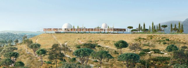
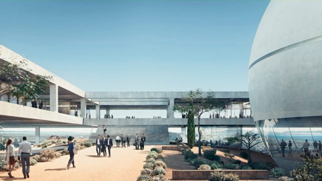
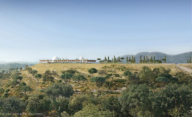
The firm conceived this new campus for the Berggruen Institute overlooking Los Angeles as a “landscape vision,” building on only a small area of the 447-acre site to keep 90% of it open and natural. Built along a mountain ridge in the Santa Monica mountains, the campus includes an elevated ‘frame’ surrounding a large courtyard garden and spherical lecture hall. It will act as a private educational forum for scholars and leaders in various fields working to “provide critical analysis and new ideas that will shape political, economic and social institutions.”

56 Leonard Street Skyscraper, New York City

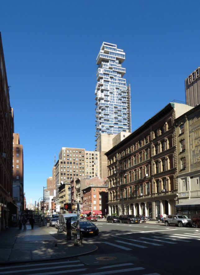
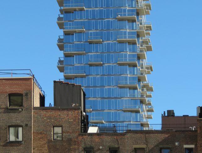
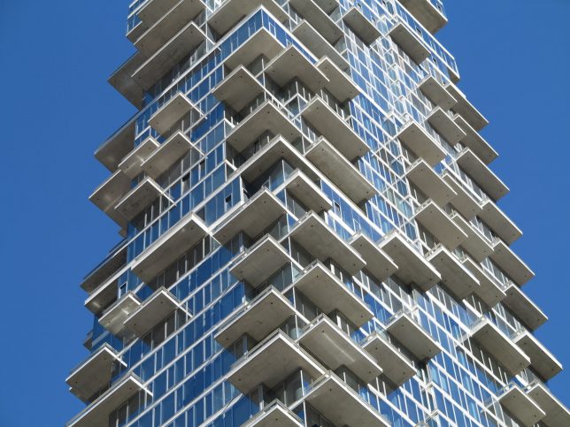
Construction of Herzog & de Meuron’s latest New York City skyscraper is complete, and the firm has released a stunning time lapse of the building process. This structure is envisioned as a stack of individual houses arranged in a Jenga-like formation, giving it a pixelated appearance. This arrangement also creates a series of terraces and projecting balconies on every level.

Elbphilharmonie, Hamburg, Germany

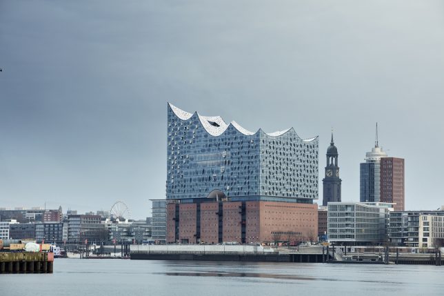
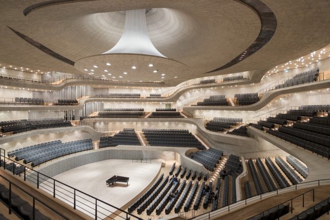
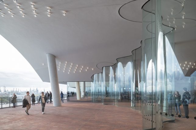
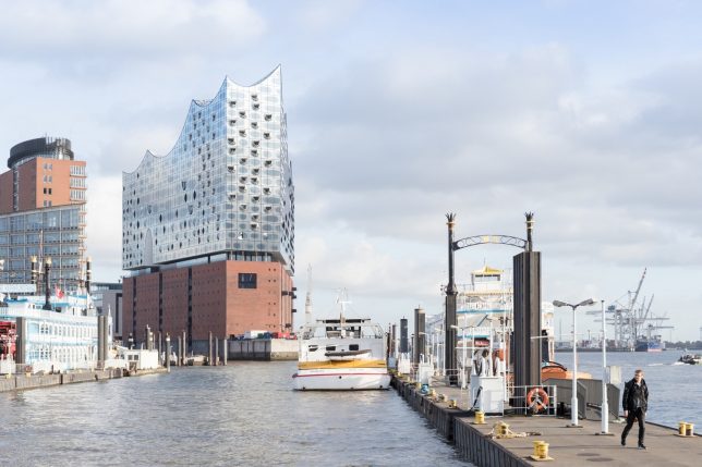
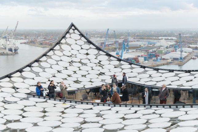
At $ 900 million, the price tag for Herzog & de Meuron’s Elbphilharmonie building in Hamburg is undeniably astronomical, but many in the city – and the international architecture community – say it’s worthwhile. Positioned on top of a 19th-century warehouse, the new structure glitters in a series of buoyant waves, echoing the water of the adjacent Elbe River. The 26-floor, 700,000-square-foot complex features a sweeping 269-foot escalator, performance halls, a main auditorium and a rooftop terrace.

1111 Lincoln Road, Miami, Florida

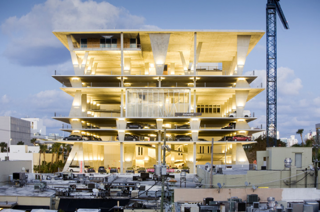
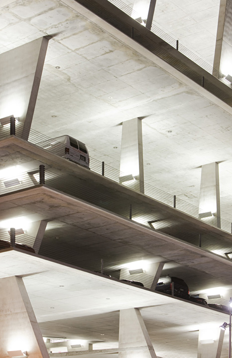
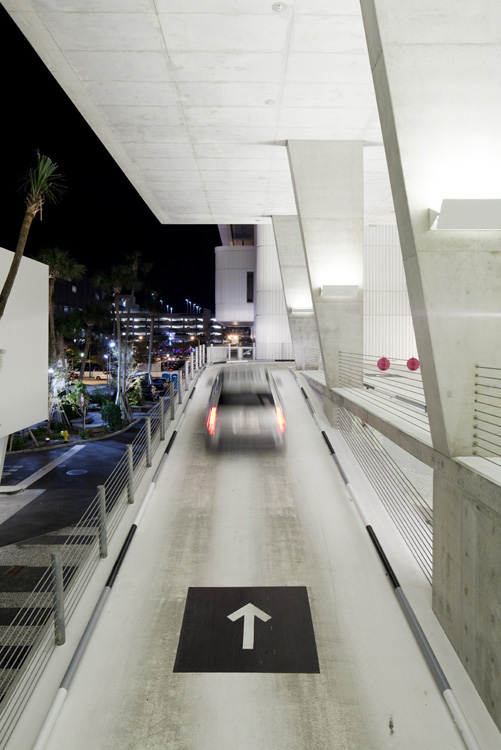
Helping to popularize a trend of high-design parking garages, 1111 Lincoln Road is a stunning, angular concrete structure positioned in one of Miami’s most active pedestrian areas, overlooking the city’s iconic Art Deco architecture. “Jacques Herzog stated that this building will reinterpret the essence of Tropical Modernism, and it somehow reminds me of the modern movement in Brazil, with raw structures providing shade, while containing smaller enclosing sub-elements,” the architects explain. “The slabs stand over a set of irregular columns, giving a sense of a precarious equilibrium. These columns also cast different shadows, giving more character to the facade.”

M.H. De Young Museum, San Francisco, California

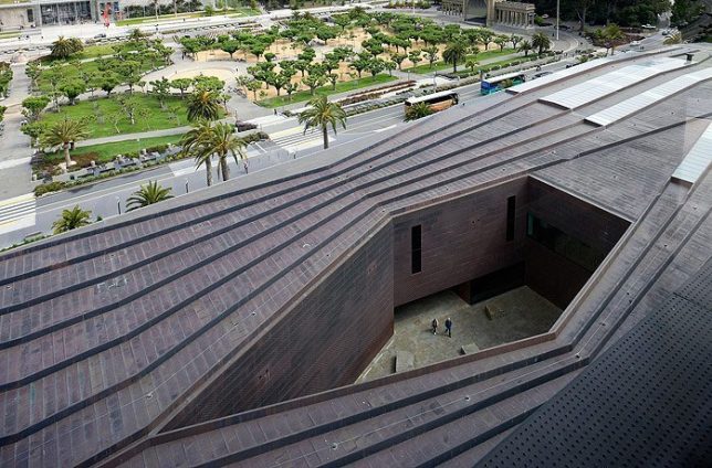
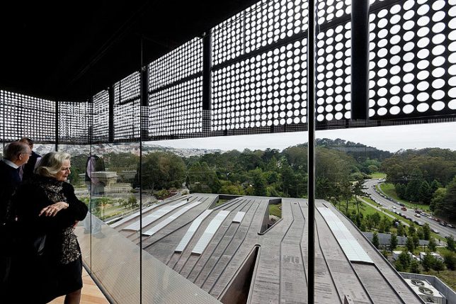
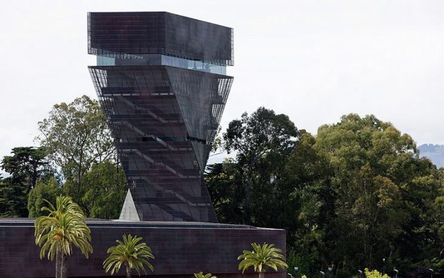
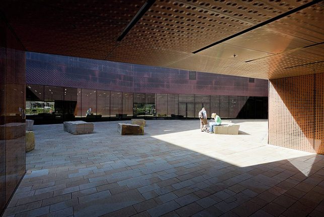
Reviving an 1895 museum that was destroyed by the 1989 Loma Prieta earthquake, the M.H. De Young Museum in San Francisco dramatically departs from the visuals of its predecessor, keeping only historic elements like sphinxes and original palm trees and taking on a monumental silhouette. Its inverted pyramid-shaped tower twists atop its ground-level roof, making it a landmark from a distance. Materials like stone, copper and wood help merge it with its park-like environment.

Tenerife Espacio de las Artes, Spain

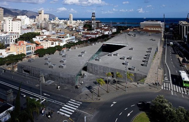
For the TEA cultural center in Spain, Herzog and de Meuron wanted to interfuse and interflow various activities and spaces within the center, cutting a new public path diagonally through the complex connected to the top of the General Serrador Bridge. The triangular space at the center is a new public plaza open and accessible to everyone in the city, featuring a cafe and restaurant along with the capability to become an open-air cinema. “The spatial interplay between inside and outside integrates rather than separates the very diverse urban landscapes which are so fascinating in Santa Cruz. The new cultural centre is therefore not only a place of encounter for people but also a place of intersection for the landscape of the contemporary city, the old city with its skyline along the Barranco and the archaic topography of the Barranco itself.”

Beijing ‘Bird’s Nest’ Olympic Stadium, China

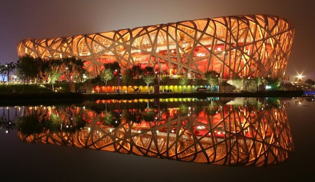
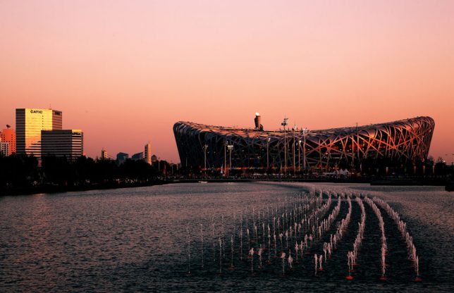
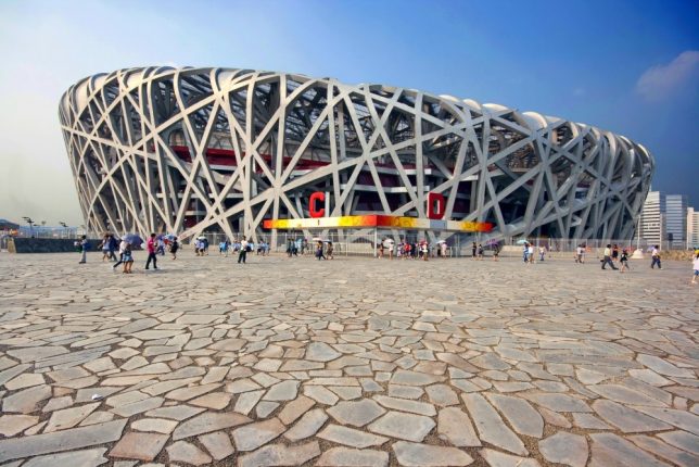
Completed in 2008, the national stadium in Beijing sits in the center of the Olympic complex, and like many Olympic structures once the Games are over, it has reportedly fallen into disuse and disrepair. In its prime, it was one of the most complex stadiums ever built, and it was especially impressive at night, when illuminated from within. Taking inspiration from Chinese ceramics, it integrates criss-crossing steel beams to hide the supports for the retractible roof, which was later removed from the design. Still, those beams remain its most striking and notable feature.

Feltrinelli Porta Volta

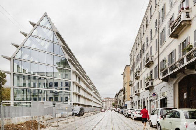
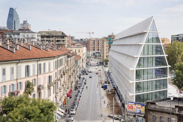
A long, gabled volume with a gridded exterior stretches down a Milan street, hosting a research center and offices for Fondazione Giangiacamo Feltrinelli. Situated within the city’s Ports Volta district, the elongated building is all white and glass, with glazing continuing right up its 5-story facade onto its roof. A strip of greenery stretches from the boulevard to its rear entrance. “The new buildings are inspired by the simplicity and generous scale of historic Milanese architecture such as the Ospedale Maggiore, the Rotunda della Besana the Lazzaretto and Sfrozesco Castle,” says Herzog & de Meuron.

VitraHaus

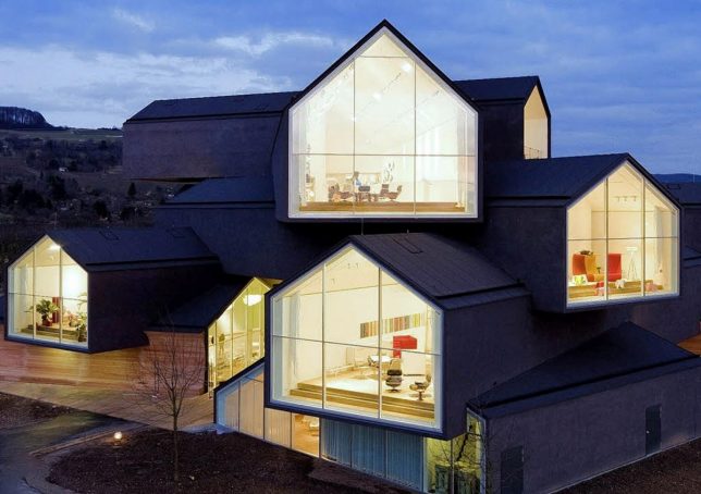
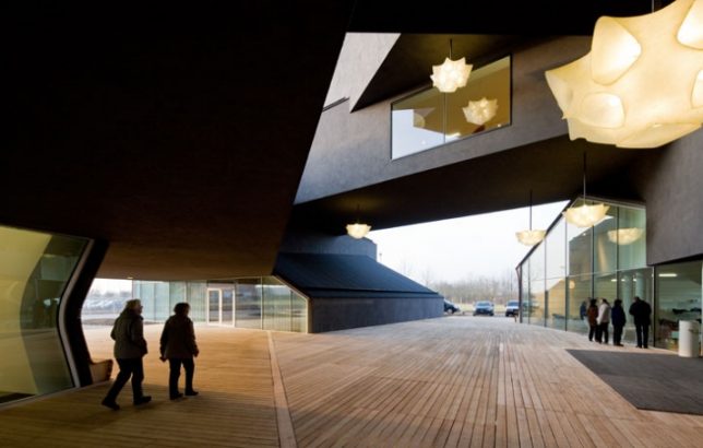
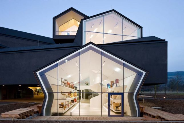
Another instant Herzog & de Meuron classic utilizing gabled typologies is VitraHaus, commissioned by home design company Vitra to present their home collection on their campus in Weil am Rhein, between the border of Switzerland and Germany. 12 ‘houses’ are stacked together into a five-story structure, with five houses at the base and seven more stacked on top of them. Some are cantilevered up to 49 feet, and all of them feature glazed ends to show off Vitra’s interiors.

The Tanks at the Tate Modern, London

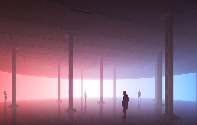
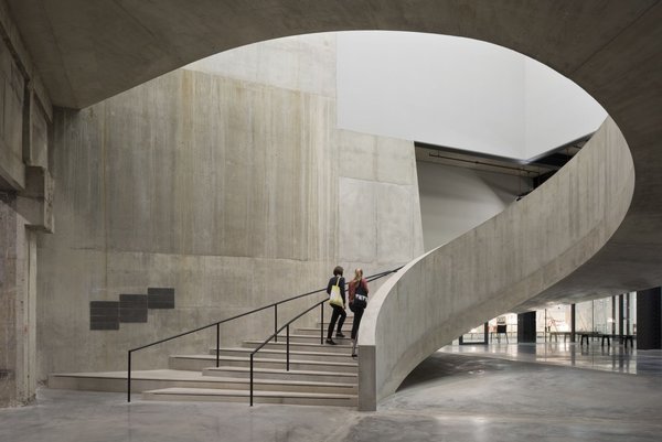
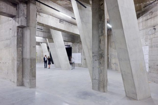
‘The Tanks’ are a series of underground gallery and performance spaces beneath the Tate Modern Museum in London, converted from former oil storage spaces by Herzog and de Meuron. In a previous life, the space the gallery occupies was a power station. The architecture firm transformed the raw industrial spaces without disguising their origins, giving them a vague dystopian feel.

Share on Facebook


[ By SA Rogers in Architecture & Offices & Commercial. ]

[ WebUrbanist | Archives | Galleries | Privacy | TOS ]


WebUrbanist

 
Comments Off on Starchitect Spotlight: 10 Iconic Architectural Projects by Herzog & de Meuron

Posted in Creativity


How I Evaluate Crowdfunding Projects: Kickstarter, Indiegogo & Beyond

01 Aug
How I Evaluate Crowdfunding Projects

How I Evaluate Crowdfunding Projects

13 Questions You Should Ask
Before Backing A Crowdfunding Project
on Kickstarter, Indiegogo and Beyond

Crowdfunding projects via sites like Kickstarter and Indiegogo have been increasing in popularity and some would say hit the mainstream. No disrespect to my wife, but she’s not an early adopter and it wasn’t until recently a mini ice machine showed up at our door that I realized she knew and took part in Kickstarter. By contrast, I’ve been using Kickstarter since it launched 2009/2010 and Indiegogo since 2014. In that time, for all the bad press these sites sometimes get, I’ve had a really good rate of return on my pledges. Roughly 85% of the projects I’ve backed have been delivered to my door and as it turns out my rate of return monetarily has been 83 cents on the dollar (ie for every $ 1 spent I’ve lost $ 0.17).  It would seem I’ve backed enough crowdfunded projects that I’d be considered a “super backer”, so I thought I’d share my evaluation process with you to increase the odds you back successful projects.

Do I Need This? / Suspension of Disbelief
The first thing you’re likely to see when visiting a project on Kickstarter or Indiegogo is the video pitch. Invariably the product discussed will be the best thing since sliced bread, but before you impulsively back the project ask yourself:

1. Is this a product I really need and/or will I use more than X times to recoup my cost? 

I can’t say I absorbed a lot in my college economics course, but I never forgot the discussion about the difference between wanting and needing a product. Be honest with yourself about whether you’re getting something that will be of use to you or if your money will be better spent on essential goods and services.

2. Is the product too good to be true? Or are the project organizers over ambitions?

One of the most entertaining aspects of evaluating crowd funded projects is to determine if they’re even possible. Does the product defy physics? (Ex. laser face razor)  Figuring out if you’re being sold snake oil is an important part of evaluating a pitch. When in doubt, watch the pitch video a few days later so as to not get swept up by hype and allow yourself time to research the technology/concept behind the product.

Product or Platform Dependencies

3. Is the product dependent on other products to be compatible?

If so will this product be obsolete by the time the product ships? (ex. iPhone cases being released after the next generation phone is released, GoPro accessories, etc.)  The biggest downside to accessory projects is that the product they’re an accessory for can change faster than the project can execute. Cell phone cases, cell phone lens add-ons and action cameras are all prone to this. For this reason, I rarely back these types of projects.

Is This Product Filling A Hole In The Marketplace?

4. Is there already something out there that is equivalent, proven and at a price point I should get instead?

If you like gadgets it’s pretty easy to lose sight of the larger marketplace as a whole when browsing crowdfunding sights. When you browse Kickstarter or Indiegogo your frame of reference will be all the projects on that site.  One project may seem better in relation to another and when you find one that strikes a nerve your reference point will be set against other sub par projects. Ultimately the “good” project catching your eye may be solved by an equivalent product elsewhere… like Amazon, so do your homework. This is especially true for batteries, chargers and similar accessories.

5. Are there or have there been other crowdsourced projects that are similar and how did they fare?

Odds are the products you’ll find on crowdfunding sites will not be one-of-a-kind. Research to see if an equivalent project is on going and/or more likely to be delivered? If you find a similar product that was crowd funded see if it was successful, well reviewed, and/or delivered on time. If a similar project failed in the past investigate why and see if the project you’re considering is repeating the same mistakes.

6. Will this product obsolete itself or be obsoleted by a dependent technology?

Sometimes our immediate desires cloud our vision of the future. Some products and technologies cycle faster than upstart companies (ex. operating systems). If you’re backing software (app or desktop program) is it likely to be compatible in 6 to 18 months? Will the company/product you’re backing be faced with an incompatibility and have to pivot resulting in costly delays?

Likelihood of Delivery

7. When is delivery targeted and what roadblocks are likely to impede that goal?

Most projects are required to list “Risks and Challenges”. Don’t gloss over this section and weigh it heavily in your evaluation whether to back the project. Are all the risks and challenges being accounted for? Are some risks being taken too lightly? If these risks don’t match up to the proposed delivery date reconsider backing the project or communicate your concerns to the project team.

8. Will this project bust because of expensive materials or labor costs?

Some projects face an uphill battle simply because the project organizers lack an understanding of the cost of materials and labor or have initial quotes unexpectedly changed by vendors mid-project increasing overall costs. Of the many projects I’ve backed, this is one of the most common reasons a project fails.

9. Is there a prototype in existence and has it been reviewed by others?

Crowdsourced projects are essentially pre-order campaigns and most crowdsourcing sites require a prototype to be in place before taking pledges. If this is not the case for the project that has caught your eye it’s time to take a harder look and/or reconsider backing it.

Leadership & Experience of Project Organizers

10. Is it a known company or are the project organizers well known?

Is the company or project organizers known? Sometimes established companies use crowd funding sites as a preorder mechanism. Odds are if they already produce and deliver products you’re going to get what is promised to you. If it’s a lesser known company or team look into the credentials of those running the project you’re interested in. It should not be good enough that a social media or celebrity talking head is the face of the company. In the worst case scenario see if the people behind the project have a bad reputation.

11. Do the project organizers have experience in the area of their project (software, engineering, manufacturing, etc.)

Ideally, the person or team assembled for the project that has caught your eye has the appropriate background, skill(s) and network to complete the job. A good idea alone won’t get the job done.

12. Have they successfully completed a Kickstarter or Indiegogo project?

Has the company or team behind the project successfully completed other crowd funded projects? Is the project being run by a company that is already established? If the answer to either of these questions is yes, your odds of seeing the promised product go up exponentially. On the flipside, Google the team or team members to see if they’ve tried before and failed under a different company name. Was it delivered on time? If not how late was it?

13. Do they communicate effectively and frequently?

Never underestimate the power of good communication. It is important to make sure that backer concerns and expectations are addressed quickly. If project comments are addressed slowly or incompletely that is a big red flag. Also important is the ability of project organizers to address hard questions constructively as it may be telling how they’ll communicate when the project hits some rough patches.

Committing to the Project
If everything looks good to these questions, I strive to back projects at a pledge level that is the best value (ex. early bird pricing or multiple unit orders). Then I swing back in a few days to reevaluate the project. At that point, I either back out or mentally validate I’m making a wise purchase. Note: If you get cold feet about a project you can undo your pledge, without penalty, if the fundraising window is still open.

Risk
With all this in mind I usually only commit a monetary pledge I’m willing to lose, assuming the project is never executed and delivered. There is never a guarantee a project will be completed and most crowd funding sites insulate themselves legally from liability if a project is a bust. My track record to date is pretty good with 85% of my backed projects being delivered. Again only pledge or spend an amount that you’re willing to lose. In an ideal world, the organizers will have a great deal of experience with engineering and manufacturing, delivering quite quickly after their campaign ends. For those that are trying their hand for the first time, you’re betting they can navigate the process before their funds evaporate. It doesn’t always work out, but when it does it can be a lot of fun.
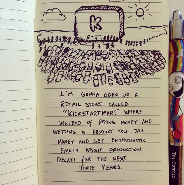
kickstartmartvia The Oatmeal

Addressing The Skeptics
Given my earlier reported rate of return, it could be interpreted that every successful project I’ve backed really cost me 17% more. If I’ve lost 17 cents overall for every dollar spent that could be equated to a 17% premium paid for my successful campaigns. In the macro sense, you could look at it this way but consider my reported numbers cover a span of 7+ years. From year to year the amount I lost, per dollar spent, fluctuates depending on how bold/expensive my pledges were. As it turns out my overall average pledge in this time frame was $ 132.77. I’d like to think that most of this “premium” is recouped by grabbing the greatest discounted offers with early project pledges (aka early bird pledges).  On the other side of the coin, one can make the argument that you’re backing projects for more altruistic purposes to help upstarts get started rather than opportunistically satisfying your consumer urges. In my case, I have backed several projects to help other photographers (photo books, conservation campaigns, etc.) so I’m not backing crowd funded projects just for material goods alone.

No matter how you slice it you’re going to have varying degrees of success, but hopefully, my process of evaluating projects helps you avoid scams and/or get the most out of your investment.

Related Reading
The 5 Biggest Crowdfunding Failures Of All Time (2017)
The Ugly Afterlife Of Crowdfunding Projects That Never Ship And Never End (2014)

The post How I Evaluate Crowdfunding Projects: Kickstarter, Indiegogo & Beyond appeared first on JMG-Galleries – Landscape, Nature & Travel Photography.
JMG-Galleries – Landscape, Nature & Travel Photography

 
Comments Off on How I Evaluate Crowdfunding Projects: Kickstarter, Indiegogo & Beyond

Posted in Equipment


Acclaim for the Reclaimed: 14 Cool Upcycled Architecture Projects

11 Jul

[ By SA Rogers in Architecture & Houses & Residential. ]

Going beyond simple stacks of shipping crates and ripped-apart pallets, these creative upcycled architecture projects reclaim stuff like corrugated iron, 5-gallon water bottles, old doors and even junk left over from the London Olympics as building materials and truly elevate them to new heights. These projects offer some fresh ideas, use the materials in new ways or demonstrate how recycled and upcycled architecture integrate into modern designs.

Stedsans in the Woods: Upcycled Permaculture Farm in Sweden

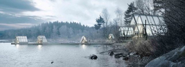
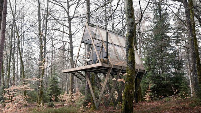
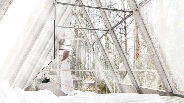
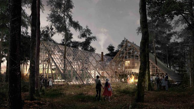
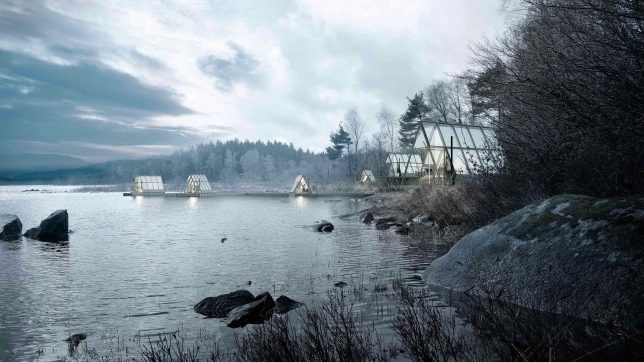
This permaculture farm and retreat nestled in the woods of southern Sweden will function as a “lab for discovering better ways to eat, live and connect with nature,” including a farm-to-table restaurant and a collection of beautiful treehouse-like cabins made of waste wood, fragments of old barns and glass from abandoned greenhouses.

Rising Moon Pavilion Made of Recycled Water Bottles

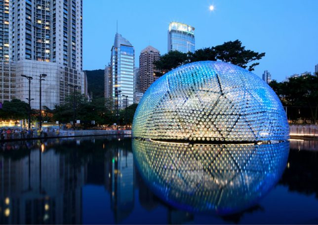
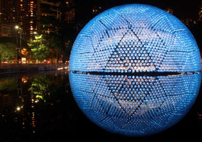
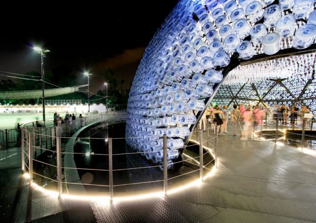
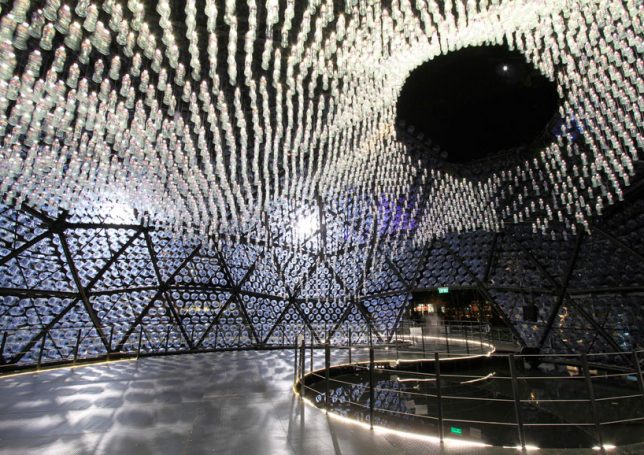
Reflecting itself into a perfect sphere on the surface of a still pool, ‘Rising Moon’ by Hong Kong-based studio Daydreamers Design is a geodesic dome fitted with 4,800 five-gallon polycarbonate water bottles, each acting as a lantern to help the structure glow. At night, they transmit light from inside out, while during the day, the interior is illuminated by the sun. LED torches are attached to pre-fabricated triangular modules with the bottles fitted over them, and an additional 2,300 bottles hang from the ceiling.

Parasitic Student Residences Made of Pallets for Paris

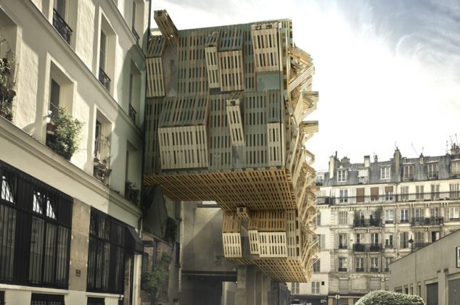
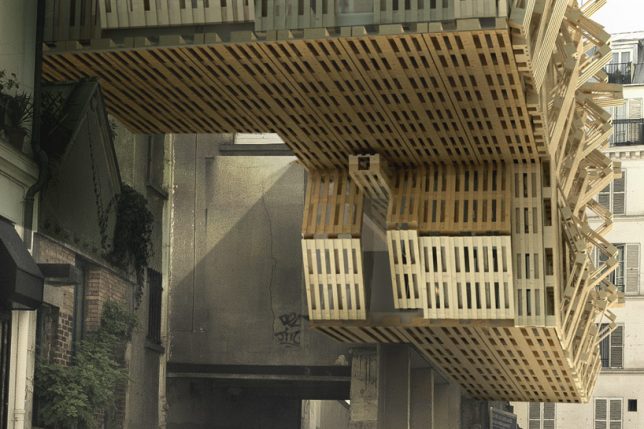
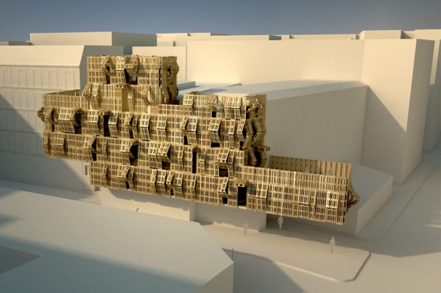
French architect and graffiti artist Stephane Malka proposes ‘Ame-Lot,’ a series of parasitic structures made of upcycled pallets and other reclaimed materials that attach to existing architecture. The pallets fold and unfold to let more light into the interior, and the structures can be constantly rearranged and added to as necessary for growth, becoming a visual meter of consumption in the city.
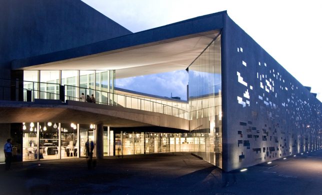
Collage House Made of Recycled Doors by S+PS Architects

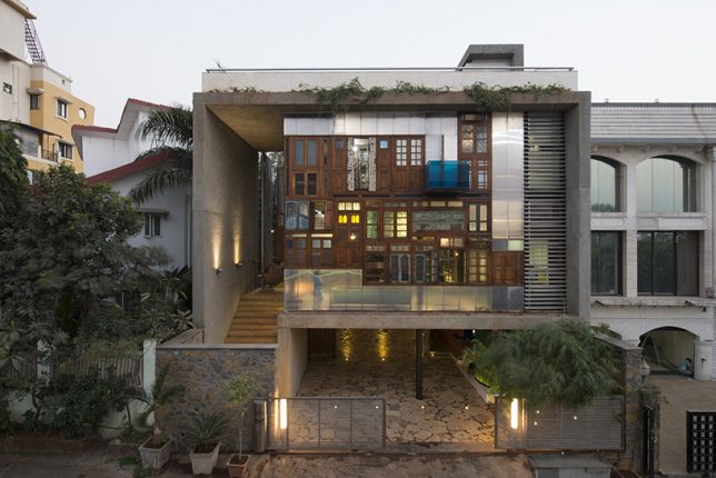
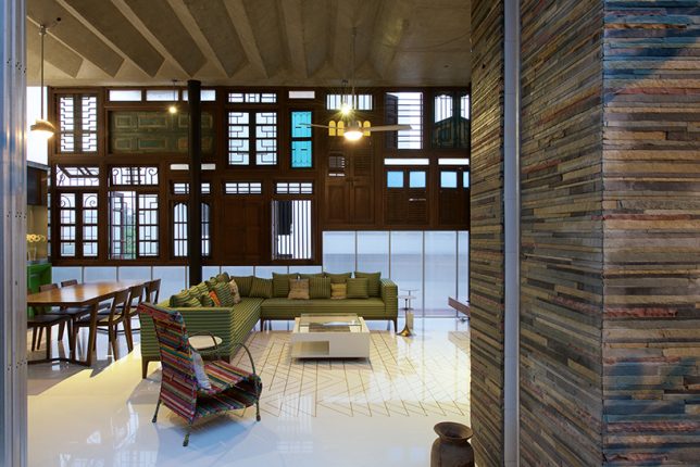
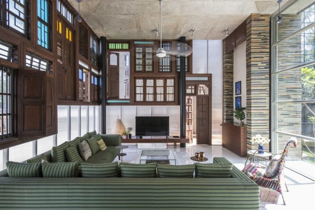
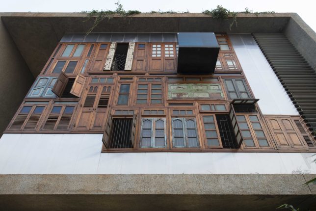
Over a dozen reclaimed doors and windows salvaged from demolished houses in the city make up a highly unusual and creative collage-style facade for a Mumbai residence by S+PS Architects. This double-height curtain wall makes for some seriously striking curb appeal, and sets the tone for the living room as well. The architects also incorporated other found materials into the home, like metal pipe leftovers pieced together like bamboo to form a ‘pipe wall,’
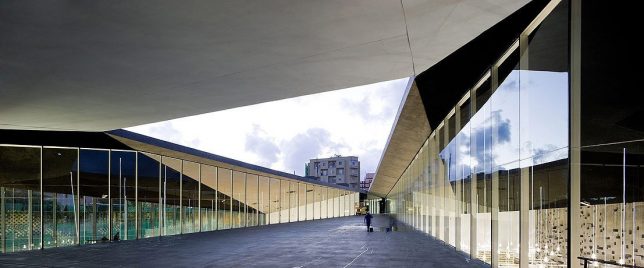
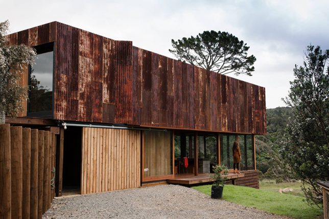
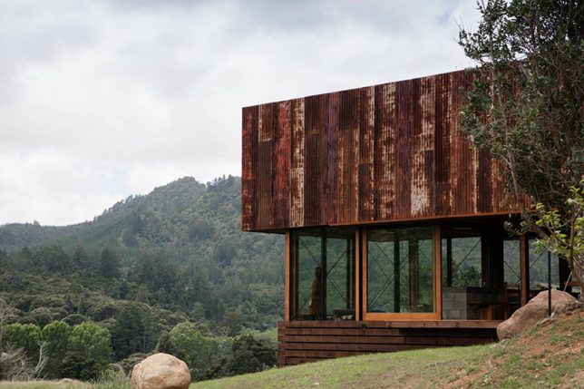
K Valley House Clad in Reclaimed Iron by Herbst Architects

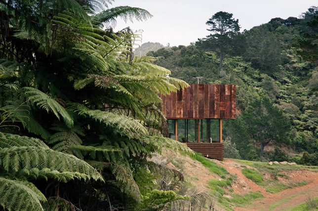
Rusted corrugated iron sheets resembling the sheds often seen in the New Zealand countryside contrast beautifully with the greenery of the Kauaeranga Valley in ‘K Valley House’ by Herbst Architects. “We positioned the form straddling the ridgeline, engaged with the slope at the high end and floating above the land as it falls away,” they say.

Next Page – Click Below to Read More:
Acclaim For The Reclaimed 14 Cool Upcycled Architecture Projects

Share on Facebook


[ By SA Rogers in Architecture & Houses & Residential. ]

[ WebUrbanist | Archives | Galleries | Privacy | TOS ]


WebUrbanist

 
Comments Off on Acclaim for the Reclaimed: 14 Cool Upcycled Architecture Projects

Posted in Creativity


End of Elevated Parks? UK Garden Bridge & US Pier 55 Projects in Doubt

28 Apr

[ By WebUrbanist in Architecture & Cities & Urbanism. ]

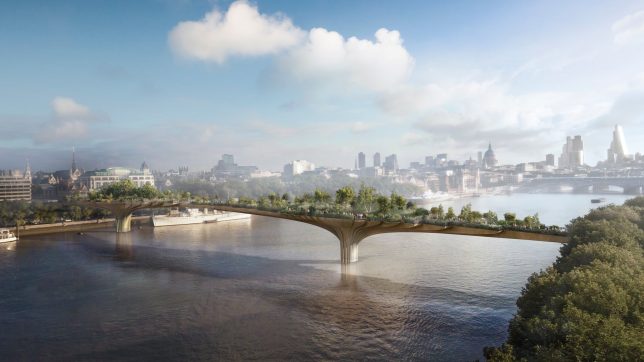
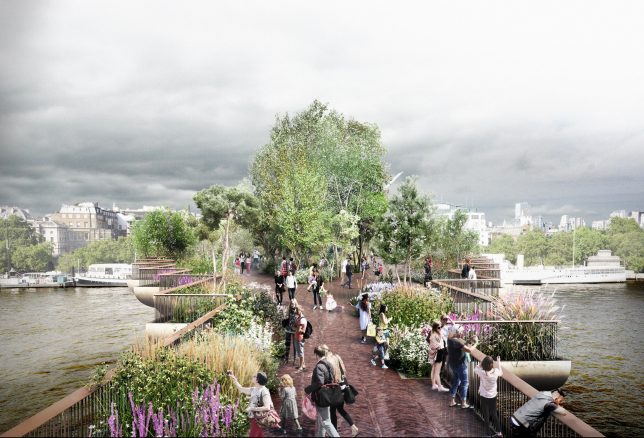
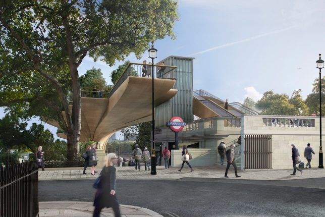
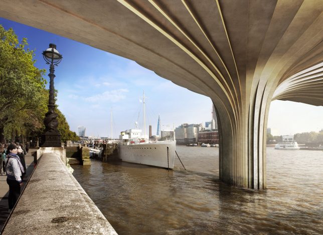
It has been a challenging few weeks for architect Thomas Heatherwick, whose proposals for elevated green urban spaces in both London and New York City face uncertain futures. While the specifics vary, there may be lessons for elevated parks that spans both cases — and if these fail to move forward, it could spell the end of a decade-long trend for lofted public parks.

The Garden Bridge project in London has long been criticized based on its cost and officials are getting serious about making sure the investment (especially tax dollars) will pay off. The design has been touted as a kind of High Line Park for England’s capital, but unlike the High Line it is a brand new construction project (not adaptive reuse) and not positioned to revitalize areas of its city.

At the heart of the issue, unsurprisingly, is money: an initial projection of £60,000,000 has blossomed into an estimated cost of around £200,000,000. Shockingly, even cancelling the project now would result in a bill of over £40,000,000, despite the fact that construction has not even started. While £70,000,000 in private funding was secured at the outset, the rest would have to be covered by taxpayer money, which is less than popular with the public. As of now, the mayor’s financial inquiry has resulted in a recommendation to scrap the project.

According to a governmental report on the project, “Decisions on the Garden Bridge were driven by electoral cycles rather than value for money,. From its inception when there was confusion as to its purpose, through a weak business case that was constructed after contracts had been let and money had been spent, little regard has been had to value for money.” It is unclear whether the project is stalled or slated for abandonment, but it looks unlikely to proceed at this point.

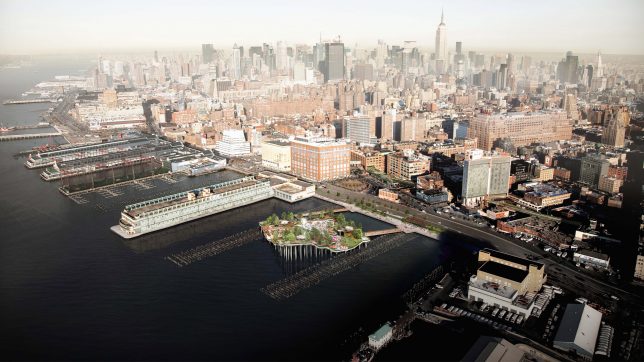
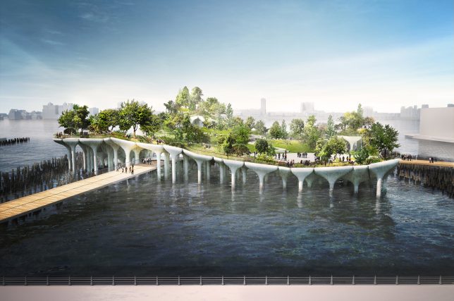
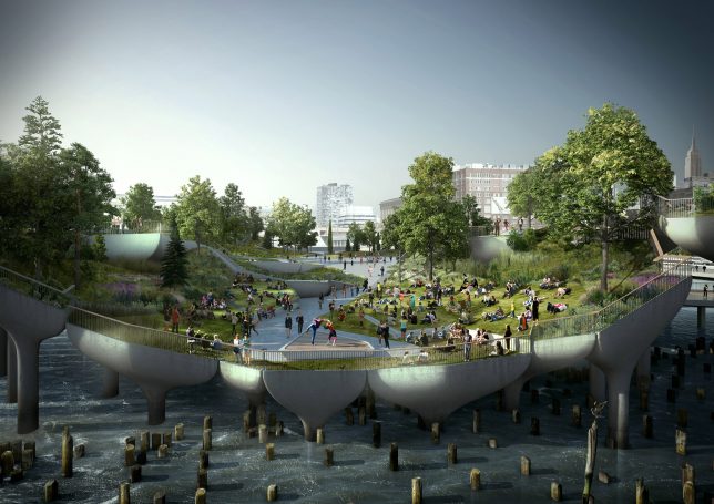
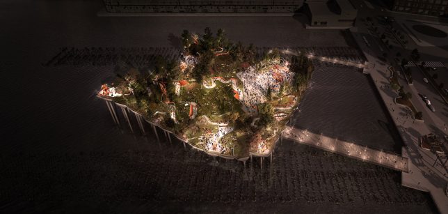
Meanwhile, across the pond, Heatherwick’s proposed Pier 55 project (images by Luxigon), an elevated park stretching out over the water next to Manhattan, is also stalled out, at least for now. Its permit was recently revoked in part based on environmental studies that concluded it would disrupt local marine habitats. There are also concerns that it will block views along the waterfront.

The 10,000-square-foot, $ 200,000,000 park was designed to replace a disused pier in the heart of New York City, but once again it lacks some of the conditions that made the High Line a viable solution, particularly its lack of reuse. Perhaps the elevated parks trend is coming to an end, or (more likely): it is too often pitched as a solution, even in cases where there is no obvious problem to be solved.

Share on Facebook


[ By WebUrbanist in Architecture & Cities & Urbanism. ]

[ WebUrbanist | Archives | Galleries | Privacy | TOS ]


WebUrbanist

 
Comments Off on End of Elevated Parks? UK Garden Bridge & US Pier 55 Projects in Doubt

Posted in Creativity


Underpass Art & Parks: 15 Fun Projects Reclaiming Disused Urban Space

13 Apr

[ By SA Rogers in Architecture & Cities & Urbanism. ]

Climbing walls, skate parks, art installations, theaters and even miniature marinas take advantage of the cathedral-like spaces beneath highways and bridges, revitalizing formerly disused and depressed square footage in urban areas. In cities around the world, underpasses are often fenced off, strewn with trash and generally unappreciated, but these intervention projects reclaim the space in fun and creative ways that benefit the community.

Folly for a Flyover by Assemble, England

“Starting with the idea that how spaces are imagined is often as important as their physical characteristics in determining their use, the Folly reclaimed the future of the site by re-imagining its past,” says ASSEMBLE of its ‘Folly for a Flyover’ installation beneath a disused motorway underpass in Hackney Wick. “The new ‘fairy tale’ for the site described the Folly as the home of a stubborn landlord who refused to move to make way for the motorway, which was subsequently built around him, leaving him and his pitched roof stuck between the East and Westbound lanes. The Folly hosted an extensive program of cinema, performance and play… by day the Folly hosted a cafe, events and boat trips exploring the surrounding waterways; at night, audiences congregated on the building’s steps to watch screenings, from blockbusting animation classics to early cinema accompanied by a live score.

A8ernA, Zaanstad Underpass Installation by NL Architects

Another underpass project offering access to the adjacent waterway is A8ernA by NL Architects, located on the river Zaan in the Zoog aan de Zaan village near Amsterdam. The architects describe the new highway, built on columns, as a “brutal cut in the urban tissue.” Their installation attempts to heal this cut while taking advantage of the cathedral-like space, creating an “optimistic intervention” encouraging a new type of urban life, and includes a supermarket, flower and fish shop, parking, a park and a ‘graffiti gallery.’ There’s also a skate bowl, a mini-marina, a soccer field and a small hilly park.

Underpass Park, Toronto

Toronto’s Underpass Park is not only the most extensive park to ever be built beneath an overpass in Canada, but one of the most unusual parks of its kind throughout the world. Transforming a derelict and underused space into a new urban neighborhood feature and pedestrian passageway, the park turns what was formerly a barrier between the north and south parts of the community into a connection. Murals by world-renowned graffiti artists, playgrounds, sculptural installations, sports fields and other amenities draw locals in to engage with the space on an unprecedented level.

Ballroom Luminoso Installation by JB Public Art, San Antonio

The I-35 freeway underpass in San Antonio briefly became ‘Ballroom Luminoso’ thanks to a public art installation by JB Public Art, featuring six color-changing chandeliers made of recycled bicycle parts and sprockets. After dark, the lanterns would light up, casting intricate gear-shaped shadows all over the concrete structure.

Seattle’s Fremont Troll

Frequently popping up in movies and television shows set in Seattle, the Fremont Troll is a public sculpture by four local artists set beneath a bridge in the Fremont neighborhood. The piece won a neighborhood competition in 1990 as an idea to revitalize what was, at the time, a dumping ground. The troll sculpture is clutching an actual Volkswagen Beetle.

Next Page – Click Below to Read More:
Underpass Art Parks 15 Fun Projects Reclaiming Disused Urban Space

Share on Facebook


[ By SA Rogers in Architecture & Cities & Urbanism. ]

[ WebUrbanist | Archives | Galleries | Privacy | TOS ]


WebUrbanist

 
Comments Off on Underpass Art & Parks: 15 Fun Projects Reclaiming Disused Urban Space

Posted in Creativity


Play On, LEGO Brick Layer: 14 Complex & Creative Toy-Brick-Inspired Projects

23 Mar

[ By SA Rogers in Art & Sculpture & Craft. ]

lego main

Play on, LEGO brick layer, ’cause the projects adults are coming up with using these little plastic toy bricks are totally incredible. Some amazing recent creations either made from or inspired by LEGO bricks include a functional camera that prints photos, a plastic helmet based on LEGO figures’ bowl-cut hair, stop-motion animation, a life-sized Batmobile and a robot that folds and flies paper airplanes.

Twin-Lens LEGO Camera Prints Photos

lego camera

lego camera 3

lego camera 2

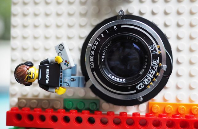
Making use of two retrofitted camera components and a LEGO brick housing, this fun model by a Hong Kong photographer blogging as Instax Magic doesn’t just take real photos, it also prints them. Taking lenses from a vintage Japanese Yashica camera and an ejection mechanism modified from a Fuji Instax mini camera, the creation playfully incorporates LEGO elements like figurines, fences and turbines. After seeing a neighbor throw a box of toy bricks in the trash, the photographer says “I started to think about the possibility of modifying a camera with LEGO. My impression is that there is always some creative way to use LEGO.”

LEGO Claw Shopping Bag

lego claw shopping bag

lego claw shopping bag 2

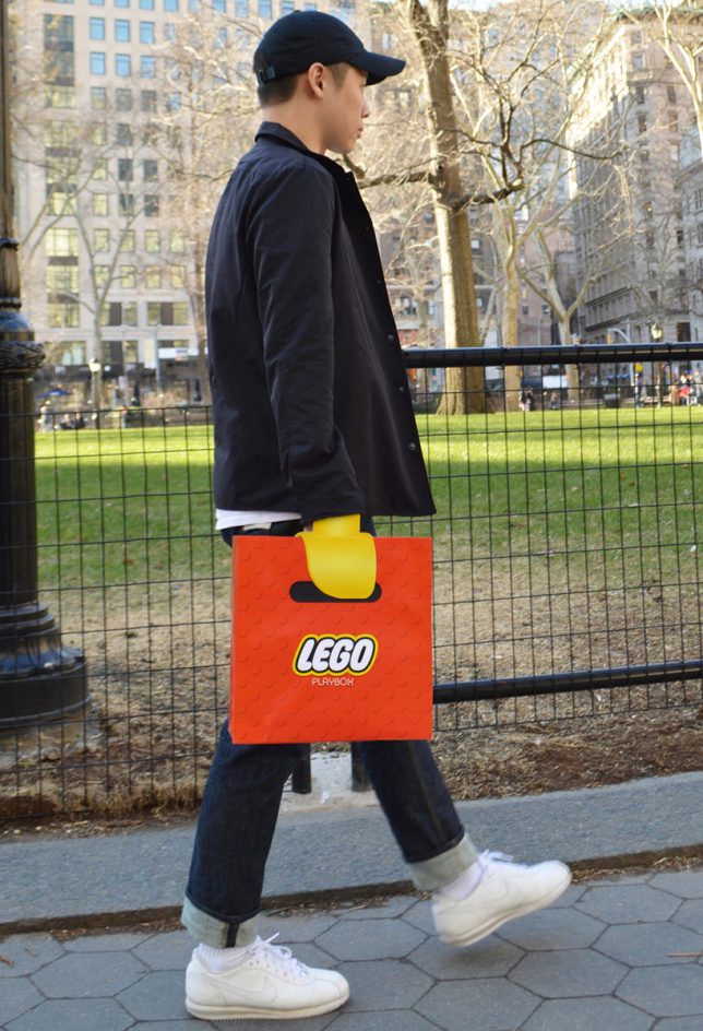
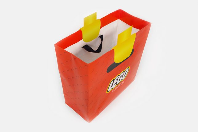
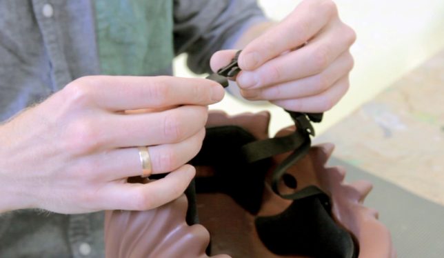
Walk down the street looking like you’ve got a yellow LEGO claw for a hand with this fun promotional shopping bag by New York-based advertising and designers Junho Lee and Hyun Chun Choi. The illusion only works when you’re wearing long sleeves, and you clutch a fabric ribbon hidden inside to hold the bag.

Intentional Helmet Hair, Courtesy of LEGO

lego bike helmet

lego bike helmet 2

Helmet hair is actually desirable if you wanna bike around town looking like a LEGO figure that sprouted to real-life dimensions. Design firm MOEF created a functional bicycle helmet mimicking the proportions and characteristics of the original plastic toy thanks to 3D scanning. Right now, it’s just a prototype, but it could go into production with the aim of encouraging kids to wear helmets.

LEGO Stop-Motion Marriage Proposal

lego stop motion marriage proposal

It took Atlanta-based filmmaker Walt Thompson 22 hours, 2,600 photos and hundreds of LEGOs to create a stop-motion animation marriage proposal to his girlfriend of four years, Nealey Dozier, even going so far as to dress the LEGO couple in outfits that matched what the real-life couple wore when they met.

Enlarged LEGO Vehicles in Real-Life Environments

life size lego cars

life size lego cars 2

life size lego cars 3

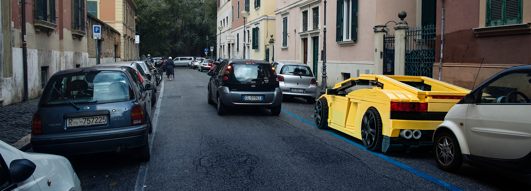
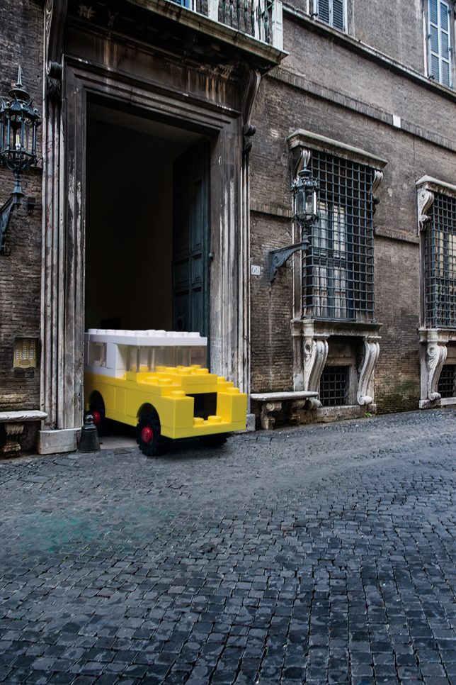
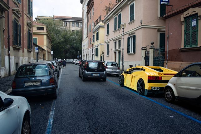
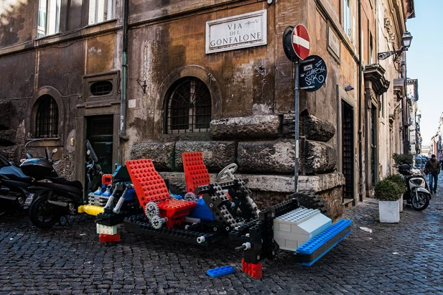
What would LEGO Lamborghinis, trucks, camper vans and helicopter models look like if they were kept exactly as they are, but enlarged to fit into the real world? Pretty ridiculous, as it turns out in this series of digital images by Italian photographer Domenico Franco, which sets them among Italian scenery. But at the same time, the models are so familiar, they don’t seem particularly out of place. “The aim is to transform ordinary contexts into extraordinary ones, thus compelling the toys to get out of the idyllic and politically correct landscapes belonging to their perfect and idealistic cities, with the result of instilling them in those vices, virtues and desires typical of human beings.” says Franco.

Next Page – Click Below to Read More:
Not Just For Kids 14 Complex Creative Lego Inspired Projects

Share on Facebook


[ By SA Rogers in Art & Sculpture & Craft. ]

[ WebUrbanist | Archives | Galleries | Privacy | TOS ]


WebUrbanist

 
Comments Off on Play On, LEGO Brick Layer: 14 Complex & Creative Toy-Brick-Inspired Projects

Posted in Creativity


Record Breakers: 12 Legitimately Sky-Scraping Tower Projects

06 Sep

[ By SA Rogers in Architecture & Offices & Commercial. ]

432 park avenue 2

After a few years of recession-induced stalling, record-smashing skyscrapers are going up around the world at a steady pace, knocking each other out of the top positions every year or so. While Dubai’s Burj Khalifa has held strong as the world’s tallest building, a number of new super-tall structures have sprouted up in the last two years to claim titles as the tallest in various cities and hemispheres, and a few proposals that are almost too tall to be believed aim to surpass the Burj by 2020.

432 Park Avenue, New York City

skyscrapers 432 park

432 park avenue 3

The tallest residential building in the world stands at 432 Park Avenue, topping out at 1,396 feet of exclusive condominium apartments. Completed in December 2015, the building is the third-tallest building in the United States and the second tallest building in New York City, behind One World Trade Center and ahead of the Empire State Building. It’s expected to be equaled in height by the 111 West 57th Street project in mid-2018. The video above documents the construction of the tower over the course of the entire building process.

MahaNakhon Skyscraper by Ole Scheeren, Thailand

tallest buildings maha

tallest buildings maha 2

tallest buildings maha 3

Pixelating in two sections along the way to its 1,030-foot-high pinnacle, the MahaNakhon tower by Ole Scheeren is a striking new addition to Bangkok’s skyline. Located in the city’s central business district, the tower is Thailand’s tallest building and contains a public landscape plaza, retail center, 200 serviced apartments and a 150-room boutique hotel.

The Tower in Dubai by Santiago Calatrava

skyscraper tower dubai

skyscraper tower dubai 2

skyscraper tower dubai 3

Famed architect Santiago Calatrava announced this year that he has been chosen to design and build the world’s tallest building, set to surpass the Burj Khalifa. Planned for Dubai Creek Harbor, ‘The Tower’ is a landmark observation structure offering panoramic views across the city from ‘The Pinnacle Room’ and observation garden decks attempting to recreate the legendary Hanging Gardens of Babylon. The tower will also contain a luxury boutique hotel, and is expected to be completed in advance of Dubai’s turn hosting the Expo 2020.

Grand Tower, Germany’s Tallest Residential Skyscraper

skyscrapers grand tower 1

skyscrapers grand tower 2

s,yscrapers grand tower 3

Germany’s tallest residential skyscraper is set to send 400 floors of high-end residences straight up into the sky of Frankfurt, creating a new urban landmark. The height of the tower will far surpass that of Germany’s provost tallest residential structure, the Colonia-Haus in Cologne. The penthouses at the top will enjoy wraparound glass-walled balconies gazing out onto the city.

Next Page – Click Below to Read More:
Recent Record Breakers 12 Legitimately Sky Scraping Tower Projects

Share on Facebook


[ By SA Rogers in Architecture & Offices & Commercial. ]

[ WebUrbanist | Archives | Galleries | Privacy | TOS ]


WebUrbanist

 
Comments Off on Record Breakers: 12 Legitimately Sky-Scraping Tower Projects

Posted in Creativity


Abandoned Architecture as Art: 13 Radical Reclamation Projects

19 Jul

[ By SA Rogers in Art & Installation & Sound. ]

abandoned art jellyfish 1

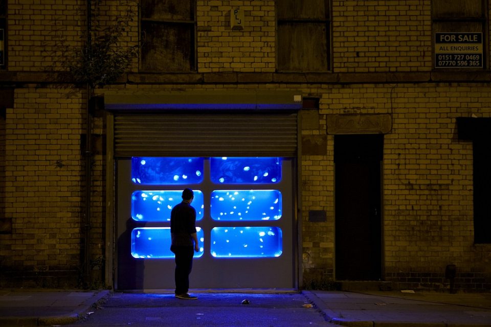
When an abandoned structure can’t be rehabbed in the traditional sense, whether due to practical constraints or simply becoming obsolete, it can be transformed for another purpose with paint, tape, lights and sculptural installations. Artists transform derelict buildings into public art, sometimes visible to lots of passersby and sometimes only to the urban explorers who might be curious enough to climb through a broken window.

Aquatics Building by Katharina Grosse

abandoned art aquatics 1

abandoned art aquatics 2

abandoned art aquatics 3

abandoned art aquatics 5

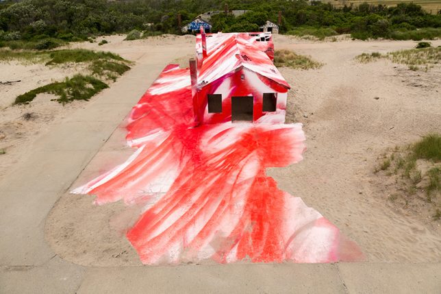
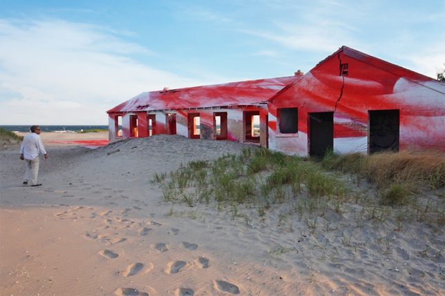
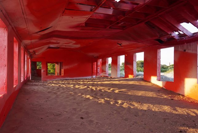
One of many abandoned military buildings making up Fort Tilden on the Rockaway Peninsula in Queens now spills red onto the surrounding sand in a site-specific installation by artist Katharina Grosse. The former aquatics building is highlighted inside and out in abstract crimson strokes meant to mimic the effect of a sunset in the Rockaways. The structure is set to be demolished in late 2016.

Circular Mural Inside Water Tank by Christina Angelina & Ease One

abandoned art water tank

abandoned art water tank 2

abandoned art water tank 4

abandoned art water tank 5

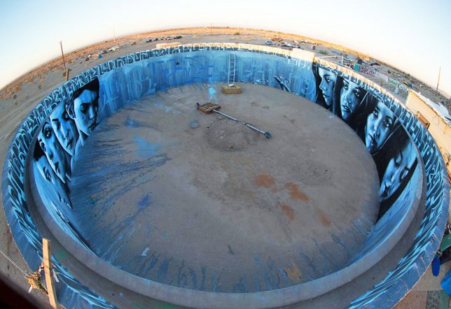
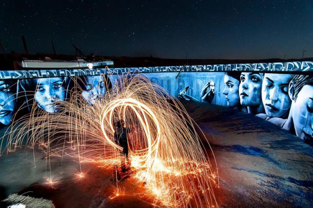
Only urban explorers curious enough to gain access to this abandoned water tank in Slab City, California will ever see this somber circular mural in person, climbing a staircase to the top of the tank to gaze inside. Artists Christina Angelina and Ease One create a starkly emotional contrast to the red and beige tones of the desert beyond the tank’s walls.

Flower House in Detroit by Lisa Waud

abandoned art flower house

abandoned art flower house 2

abandoned art flower house 3

abandoned art flower house 4

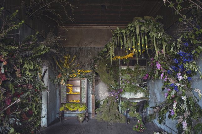
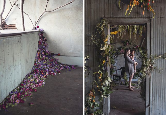
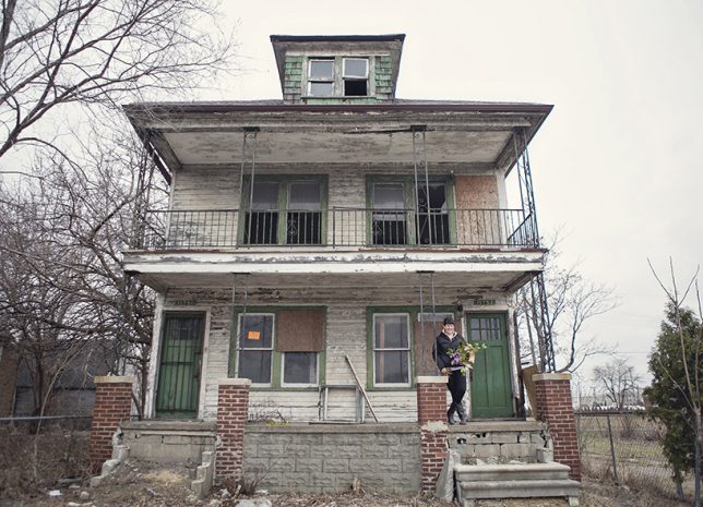
‘Flower House Detroit,’ conceived by Lisa Waud and realized with the help of florists from across the country, may be a temporary reclamation of an abandoned place, but it’s among the most striking installations for its contrast of life and decay. Each room had a different designer creating artful compositions of flowers, trees and even weeds, beautifying the space before it was deconstructed and repurposed. The land the neglected house stood on will be converted into a flower farm for Waud’s design business.

Monsters by Kim Köster

abandoned art monsters 21

abandoned art monsters 2

abandoned art monsters 3

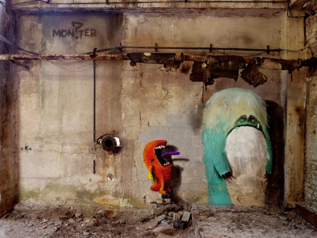
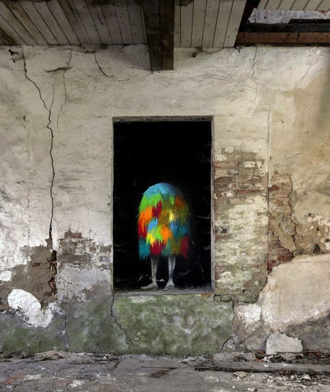
The idea of pairing monsters and abandoned buildings may sound like a nightmare, but German street artist Kim Köster makes both seem less scary with a series of fun paintings in Berlin. Choosing easily accessible public spaces as his canvas, the artist not only takes some of the fear out of dark derelict rooms in a physical sense, but also brings the to a much wider audience thanks to an interactive children’s picture book called Monzster.

Next Page – Click Below to Read More:
Abandoned Architecture As Art 13 Radical Reclamations

Share on Facebook


[ By SA Rogers in Art & Installation & Sound. ]

[ WebUrbanist | Archives | Galleries | Privacy | TOS ]


WebUrbanist

 
Comments Off on Abandoned Architecture as Art: 13 Radical Reclamation Projects

Posted in Creativity


Honoring Zaha Hadid: 5 of the Starchitect’s Greatest Projects

01 Apr

[ By Steph in Architecture & Public & Institutional. ]

SONY DSC

The world lost a star architect this week, trailblazing Iraqi-born Zaha Hadid, who was the first woman to receive the Royal Institute of British Architects (RIBA) Gold Medal. Her striking modern structures are experimental, visionary and bold, never afraid to make a strong statement. These are not buildings designed to blend into their environments, but rather sculptural focal points, every one of them a landmark in its respective city. Attempting to narrow down her best works is as futile as it is subjective, but here are five that stand out as prime examples of her distinctive style.

Glasgow Riverside Museum of Transport

hadid glasgow

hadid glasgow 2

hadid glasgow 3

hadid glasgow 4

The spiky, jagged front facade of this museum flows into ribbons of reflective zinc, symbolizing the landscape of its setting as the junction of the rivers Clyde and Kelvin. Designed like a linear tunnel bent to one side, its roof mimicking waves in the water, with a column-free, open center for hosting exhibits. Said Hadid of the project, “Through architecture, we can investigate future possibilities yet also explore the cultural foundations that have defined the city. The Riverside Museum is a fantastic and truly unique project where the exhibits and building come together at this prominent and historic location on the Clyde to enthuse and inspire all visitors.”

Heydar Aliyev Center, Baku

hadid heydar 1

hadid heydar 2

hadid heydar 3

hadid heydar 4

hadid heydar 5

The organic form of this cultural center in Azerbaijan gives it the look of a gigantic sea shell nestled among rectilinear Soviet architecture, establishing fluid connections between itself and the surrounding plaza. It’s all vaulted curves and sinuous lines extending over the roof and back to the ground again. Said Hadid, “Elaborate formations such as undulations, bifurcations, folds, and inflection modify this plaza surface into an architectural landscape that performs a multitude of functions: welcoming, embracing, and directing visitors through different levels of the interior. With this gesture, the building blurs the conventional differentiation between architectural object and urban landscape, building envelope and urban plaza, figure and ground, interior and exterior.”

Messner Mountain Museum, Corones

hadid messner 6

hadid messner 4

hadid messner 2

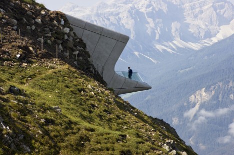
Poking out of a peak within the Italian Alps, the Messner Mountain Museum Corones almost seems to have unearthed itself from the depths of Mount Kronplatz to look out onto South Tyrol. In fact, the overlook visible from outside is only the tip of a structure enabling visitors to explore the mountain’s caverns and grottos. Views from the shard-like lookouts are directed to specific peaks, and the pale exterior panels are informed by the tones of the adjacent limestone.

London Aquatics Center

hadid london aquatics

hadid london aquatics 2

hadid london aquatics 3

The undulating swimming venue for the 2012 Olympics in London is inspired by “the fluid geometries of water in motion,” nearly every line within the interior taking its shape from waves. As dynamic and beautiful as it truly is, the design reflects a certain deliberate restraint on Hadid’s part. In contrast to the visually dazzling spaces she’s known for, this interior takes care not to outshine its intended purpose, keeping focus on the pool and its inhabitants. As seen in the aerial photography, controversial ‘wings’ were added to Hadid’s design to accommodate extra seating during the Games, but have since been removed to honor the integrity of her original vision.

MAXXI Museum, Rome

hadid maxxi 1

hadid maxxi 2

hadid maxxi 3

hadid maxxi 4

Often referred to as Hadid’s most iconic project, the MAXXI Museum of the Arts of the XXI Century in Rome complements the city’s antiquities while also bringing in a much-needed freshness and fluidity. An historic city full of ruins, without a lot of notable modern architecture, can start to feel static. Hadid injects a sense of vitality without dwarfing the centuries-old architecture in its immediate vicinity. Said Hadid, “Here we are weaving a dense texture of interior and exterior spaces. It’s an intriguing mixture of permanent, temporary and commercial galleries, irrigating large urban field with linear display surfaces. It could be a library; there are so many buildings that are not standing next to, but are intertwined and superimposed over one another. This means that, through the organizational diagram, you could weave other programs into the whole idea of gallery spaces. You can make connections between architecture and art – the bridges can connect them and make them into one exhibition.”

Share on Facebook


[ By Steph in Architecture & Public & Institutional. ]

[ WebUrbanist | Archives | Galleries | Privacy | TOS ]


WebUrbanist

 
Comments Off on Honoring Zaha Hadid: 5 of the Starchitect’s Greatest Projects

Posted in Creativity