Following on the successful redesign of the Flickr homepage last Fall, today Flickr is announcing the redesign of the photographer profile page. As far back as I can remember the Flickr profile page has remained the same — probably at least over the past decade or so — complete with the odd request for your airport code, even though that information never seemed to actually appear anywhere on your profile.
The new redesign is much more photocentric and offers a beautiful showcase of your most popular photos published to Flickr. Tiny little square thumbnails on the profile page have been replaced by much bigger, bolder versions of your own most popular images in an attractive mosaic format.
The new profile page will start rolling out to users over the next few days so if you don’t already have it, don’t fret, it’s on the way.
The redesign makes several changes in terms of what and how the information on your profile page is presented. Some information has been added, some removed and some streamlined.

Flickr’s new profile page shows your most favorited photos on Flickr.
1. Most dramatically, by default the new Flickr profile page has a beautiful mosaic of large sized photos showcasing your 25 most favorited photos on Flickr. Additionally your profile visitors can use a pull down menu to look at your 25 most interesting (as rated by Flickr’s algorithm) photos, along with your most viewed and commented photos. This is a super helpful way to get a quick impression of the type of photographer you are looking at when you find someone new that you might want to follow on Flickr. Personally this is my favorite feature of the new profile page.

Flickr’s new profile page lets you customize 25 photos on your page.
2. Because some people would rather show off other photos than their most favorited, popular, commented or viewed, Flickr now also allows you to add a custom collection of 25 photos as chosen by you manually from your stream. So you can showcase up to 50 total photos now on the profile page between your own chosen photos and Flickr’s selections. The organizer used to build your custom mosaic is super intuitive and allows you to review your albums or search for specific photos you want to add. You can change what photos appear here whenever you want. I’m looking forward to the creative ways that users come up with using this mosaic.

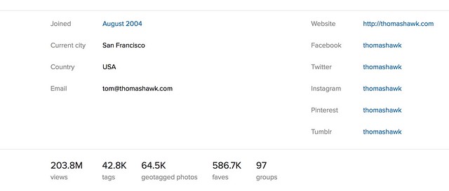
Flickr now makes user view counts public.
3. With the new profile page Flickr now shows you how many views a user has racked up on Flickr. If there is anything even mildly controversial about the new page design it would probably be this. In the past your total view count was available to you and you only through the stats page if you were a paid Pro account. Now your view count is posted publicly on your profile page for the entire world to see. So for the first time we can see that the Obama White House page has racked up an impressive 303 million views on Flickr, while alas, the current Trump White House has only racked up only a mere 2.1 million views on Flickr thus far.
Not that anyone’s keeping track or cares about these type of things though, am I right? 
4. On the old profile page Flickr allowed you a single website link. On the new profile you can include a link to your website and also additional links to your pages on Facebook, Twitter, Instagram, Pinterest and Tumblr.

Testimonials make the cut for the new Flickr profile page.
5. Testimonials are still included in the new Flickr profile page. I think it’s been several years since I’ve actually written someone a testimonial, but they were a lot of fun to get and give back in the old school days of Flickr. I’m glad they made the cut on the new page.
6. The old profile page prominently featured a link to everyone you were following on Flickr and featured the avatars of the last 16 people you had followed. This section has now been reduced to a small link at the top of the page linking to everyone you follow listed alphabetically.
7. The old profile page had a link to your favorites from other Flickr members including thumbnails of the last 12 photos that you’d favorited. The new page has a smaller link that just takes people directly to your favorites page.
8. Hometown and current location information has been retained and is still shown on the new profile page, but gender and relationship status has been removed.
9. Additional links on the new profile page include links to a photographer’s tags (listed alphabetically), geotagged photos (shown on a cool interactive map), links to your favorites and your groups.

Photos you are tagged in are larger.
10. Photos of a user are featured in much larger format with a link to all of the photos you are tagged in on Flickr.
Overall I think the new Flickr profile page is a terrific refresh to the site. It is good to see that Flickr continues to innovate finding fresh new ways to share photos. Although not the largest photo sharing site on the web today, Flickr is still my personal favorite and where I keep my primary archive of images. As a paid pro account (old skool) I am provided an unlimited amount storage for full high res photos at $ 49.99/year — a huge bargain. New Pro users get 1TB instead of unlimited storage so if you are old skool Pro *don’t* let that subscription expire. I also get detailed stats and an ad free browsing experience both for myself and for people who view my photo pages. If you are not Pro on Flickr already you should definitely consider it. It’s a wonderful community of photographers on the web where I personally interact on a daily basis.
Anyways, nice job to team Flickr on another big improvement to the site. Keep up the good work! More details in the help forum on the new page here.
You can follow my own photography on Flickr here. 
Thomas Hawk Digital Connection


