RSS
 

Posts Tagged ‘Problem’

No Filter? No Problem! 3 Simple Methods to Fix Your Sky in Post-Production

01 Jun

The post No Filter? No Problem! 3 Simple Methods to Fix Your Sky in Post-Production appeared first on Digital Photography School. It was authored by Nils Heininger.

What you see is not what you get

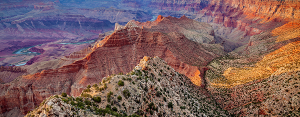
Quite often, we look at an amazing scene, take out our camera, make a snap, and become disappointed. We are not able to capture what we saw. Sometimes it depends on the perspective and composition. Other times it is an issue of dynamic range. When we are working under a bright sky, the latter is a problem.

Dynamic range means the range of light, in which we can still see detail. It is everything between pitch-black and dazzling-white. The human eye has a very wide dynamic range. For us, it is not a problem to see all the detail in the sky, while also recognizing every rock on a mountain.

Our camera, however, has to find a compromise. It either gets the detail of the rocks and a blown-out (white) sky in the background, or it gets the detail in the sky, but just the dark silhouette of the mountain. Sometimes you want that effect, and sometimes it is merely disappointing.

If you are really into landscape photography, you might consider getting a graduated neutral-density filter. You can put the filter in front of your lens and darken part of the image while leaving the rest untouched. There are systems for square filters, which you fix on using an adapter in front of your lens. You can also get screw-on filters, which you fix directly onto your lens. Both have advantages and disadvantages, and there are many options for ND-grad filters.

If you are just occasionally shooting landscapes, or you don’t want to invest too much money at the moment, you can fix the images in post-production.

Here are three different ways you can fix your sky in Lightroom or Photoshop.

1. Graduated Filter in Lightroom

Fixing something in post-production does not mean that you can be lazy while shooting. When you take your image, you have to make sure that you get the necessary detail and find a good exposure. I always recommend shooting in RAW format as it saves far more detail than .jpg files do.

Lightroom’s graduated filter changes the exposure of a part of your image. It will never recover lost information. Shoot your image as balanced as possible. Find a compromise of getting some detail in the sky and some in your foreground.

Before you use the graduated filter, you should adjust the image in a way that the darker parts are well exposed, and the sky is blown out. In the example image, I pushed the shadows and the whites, to make the buildings pop. It all depends on your image. Just make everything except your sky look like you want it to be.

Then click on the little rectangle in your toolbox. This is the graduated filter.

Applying the graduated filter is easy. Just left-click somewhere in your image, hold the mouse button, and pull it in the direction you want the graduation to happen.

In landscapes, we usually pull it down, as we want graduation along the horizon.

The tool marks the borders where the filter will affect the image. You can also see the intensity of the filter, by pressing “O.” This marks the area in red to give you a visual of the graduation.

If the selected area of your image somehow gets pitch-black, white, blue, or looks weird in any other way – don’t panic! Just check if the filter adjustments on the right are already active. Reset the filter adjustments by double-clicking on the sliders and the image will look like it did before.

Now you can adjust the sky. Usually, this means that you have to make the highlights darker. Pull the Highlights-slider to the left. I also added a little blue in the white-balance and pushed the whites, to have a little dramatic contrast in the sky. If you are irritated by the filter-marks, press “H” to make them disappear.

Still, there is a big issue with the image. As there is no straight horizon, the graduated filter also affects the buildings. This is not always a problem in landscapes – especially when using images of the sea, where the horizon is straight. If objects are towering above the horizon, there is an easy way to deal with it.

Add the Range Mask

The Range Mask helps us to quickly deal with deselecting some parts of the applied filter. In this case, we click on Range Mask -> Luminance in the filter options on the right. Here we can select which parts of the graduated filter will be affected. It’s a filter in a filter!

Luminance means that we can make the filter affect a certain range of brightness within the selected area. In the example, we want the filter to only affect the brighter parts (i.e., the sky) and not the darker ones (i.e., the skyscrapers). Hence, we will push the left marker of the range-slider to the right until we exclude the buildings from our selection.

That’s it!

Pros and Cons of the graduated filter in Lightroom

The graduated filter in Lightroom basically does the same thing that an ND-grad filter in front of your lens does – it changes a part of the image and leaves the other untouched. In Lightroom, however, you can choose between many different adjustments, while the physical analog ND-graduated filter will just make the image darker. You can also individually set up the area you want to edit and decide about the softness of its edge.

The disadvantage of the digital graduated filter is its limitations. You can’t recreate the information that your sensor did not capture. A filter in front of your lens will influence what your camera captures on its sensor. The digital filter can only work with what you have. You cannot push everything as far as you want and usually, you will lose some detail.

Still, the graduated filter in Lightroom is often a decent way to make your sky pop.

2. Mix different exposures with HDR

HDR is the abbreviation for High-Dynamic-Range. HDR images artificially increase the dynamic range of our camera by summing up the information of different exposures. Hence, you have to plan an HDR-image in advance.

While you are shooting, you have to create different exposures of the same image.

I usually take three images:

  1. A “well-exposed-compromise-picture” like I would take for applying the graduated filter in Lightroom.
  2. A darker image (silhouette with great sky-detail), one or two stops below the first.
  3. A bright one (good detail in the foreground, blown out sky), one or two stops above the first.

Make sure, these shots show the same image, and you don’t move your camera. It’s best if you shoot using a tripod.

If you are not familiar with calculating stops, there is good news – most cameras can do it for you. Your camera will likely call it “bracketing.”

Somewhere in your menu, you can select the bracketing setting. My camera asks me how many different exposures I need and how many stops they should differ from each other. Then I hit the shutter three times and have my three exposures.

Don’t forget to reset the bracketing, because it is more than annoying to have different exposures when you don’t want them.

The next step is quite easy. Upload your three exposures into Lightroom and select them. Right-click on one of them. Choose Photo Merge -> HDR and wait until the calculation is done. This can take a little while, depending on the image size and your computer speed.

A fresh window of photoshop should pop up. I always check the boxes Auto Align and Auto Settings and mostly use medium Deghosting. Deghosting is the process Lightroom uses to deal with small dissimilarities in the three images (e.g., moving people, clouds, waves).
Then you hit the merge button and wait again. Here is your finished HDR-image.

Wasn’t that easy?

Mix methods!

Sometimes, you won’t be happy with the HDR-image. You can still adjust it! Even though the image above looks a little innocent, there is a lot of detail in there. Get it out by applying local adjustments like a grad-filter.

Nonetheless, you have to be careful. HDR is still just a computer calculation, that does not know what you saw on location. If you do hard editing, you will find artifacts on your image. Artifacts are disturbances caused by processing an image.

Look closely at the example below, and you will find a black shade around the top of the highest tower. Artifacts like this often occur around areas of high contrast.

Pros and Cons of HDR

HDR is a quick and effective tool to make your sky pop. While the graduate filter in Lightroom can only work with the available information, HDR increases this information. If you check the file size of the original image, you will also find that the HDR image is often three times as big as each single exposure. If your computer is a little slow in processing images, it will have more issues with HDR images.
Another disadvantage is the preparation involved on location. You will need extra equipment to get a similar composition under different exposures. Movement in the image, as well as high-contrast areas, can also create artifacts.

HDR has often been overused to create an “edgy effect.” Don’t over-do it here. There is an easy rule of thumb – if you see that it’s an HDR, it is too much.

3. Make a composite in Photoshop

Composite means cutting out parts of one image and putting it above another. There have been many debates about this issue in the past and present. Are composites fake?

In our example, I think it is fine to cut out the sky of a good exposure and put it on top of the same scene. At least the sky looked like this some few seconds before. It was there – the camera simply couldn’t capture it.

To make a composite in Photoshop, you should already have adjusted the images in Lightroom. Prepare one image with a great sky and another one with a good foreground. Select both images, right-click, and choose Edit In -> Open as Layers in Photoshop. A Photoshop project with two layers will pop up.

In this example, I chose to treat the image with the blown-out sky as the background and put the blue sky on top of it. That means that we have to arrange the layers accordingly. Photoshop will always display the upper layer of your project. Thus, we need to keep the sky as the upper layer, but make the buildings disappear, so the lower layer is visible.

The best method to do this is to create a Layer Mask. It allows us to hide a part of the lower image without deleting any information. To create a Layer Mask, we select the upper layer and click on the little square-symbol with the circle in it. A white rectangle appears next to your layer.

Every white part of the layer mask will be displayed. The black areas will be invisible, while everything grey will be partly visible. Now, we need to fill the areas we don’t want to see (i.e., the buildings) with black. This process is called masking.

Masking involves skill and experience. A proper guide to masking in photoshop can fill books. In our example, we try the basics. We want to see the sky and hide the buildings. Thus, you have to mark the buildings with the Quick Selection tool (Press “W” on your keyboard). We need to select everything except the sky. For hiding the selection, we choose the layer mask and fill the selected area with black color (Edit -> Fill or press Shift+F5).

Now, you have your first composite. It looks a bit weird and artificial in the example. Usually, you need to make some adjustments after masking. Work on the layer mask for the edges of the building. This can be done manually brushing the parts you do not want to see.

You can also make some adjustments to fit the look of the sky and buildings. By using adjustment layers and pulling the opacity of the sky a little back, you will create a more natural look.

Pros and Cons of Composites

The big advantage of a composite is that you take two independent images and blend them into each other. It does not matter if the clouds or cars in the image move. You can control every part that you want to see. The result is pretty much dependent on your skills.

However, a composite is a lot of work. It takes a while to understand all the options, tools, and shortcuts to edit a layer mask. The amount of works depends on the scene. Editing the horizon of a seascape is easy. A skyline can be challenging. Put a bush in front of it, and it is easy to mess it up. You don’t want your image to look like the one below.

Which technique to use?

There is no right or wrong here. It differs from case to case. How much energy do you want to invest? Are your skills advanced? Did you prepare more than one exposure?

You can also mix methods or even manually create an HDR-image in Photoshop.

One day, I will get myself a bunch of ND-grad filters and work things out on location. Until then, I will continue using HDR or – if possible – get along with the graduated filter in Lightroom. So far, it has worked fine for me.

What do you think?

Is there a method you prefer? Do you work with ND-grad filters, or have another method of dealing with the issues of dynamic range? I would be glad if you share your own experiences and images in the comments below.


The post No Filter? No Problem! 3 Simple Methods to Fix Your Sky in Post-Production appeared first on Digital Photography School. It was authored by Nils Heininger.


Digital Photography School

 
Comments Off on No Filter? No Problem! 3 Simple Methods to Fix Your Sky in Post-Production

Posted in Photography


You probably don’t know what ISO means – and that’s a problem

06 Aug

Whatever camera or phone you have, it’ll report the ISO value it used to take its photos. Despite its ubiquity, ‘ISO’ probably doesn’t mean what you think it does. Worse still, it may be holding your camera back, both in terms of the images it takes and in the tools it provides you. This means it’s potentially holding your photography back, too. Part of the problem stems from the fact that ISO sounds like something you were already familiar with.

At first glance, ISO settings look just like the sensitivity ratings used for film (to the extent that there are some people who still refer to ASA: the US standard incorporated into the ISO standard for film). But ISO in digital isn’t the same as film. it’s essentially a metaphor for the way film sensitivity worked, if you got it processed in a minilab machine. This is a problem.

It causes confusion

The apparent familiarity and simplicity of ISO setting leads to a number of common misunderstandings. Despite what you may have heard or read, changing the ISO of your camera does not change its sensitivity.

ISO changes the lightness of the final image but it doesn’t change the fundamental sensitivity of your sensor. Nor is it an indicator of amplification being applied: although many cameras do increase their amplification as you increase the ISO setting, this isn’t always the case.

“Why can’t I use ISO 100 in Log mode?” The answer is that a log gamma curve is so flat that it requires very little light to achieve middle grey, which means it’s considered a high ISO. Strictly speaking, though, you can’t really calculate an ISO value for log at all, since the standard is based on a different colorspace and gamma. It’s a similar story for Raw.

This may sound like semantic nit-picking, but it causes a lot of misunderstandings. It’s widely thought that the additional noise in high ISO image comes from the ‘background hum’ of the sensor’s amplifiers. This feels right: we’ve all heard more hum if we turn up the volume on an audio amplifier. Unfortunately it’s simply not true: most noise actually comes from the light you’re capturing, so it primarily depends on your shutter speed and aperture*.

The ISO standard doesn’t specify that amplification needs to be used, nor does it specify what happens in the Raw file

The ISO standard doesn’t specify that amplification needs to be used, nor does it specify what happens in the Raw file. All it does is relate initial exposure to output JPEG lightness, however that is achieved. The only sure difference at the Raw level from an increase in ISO is that the change in ISO setting almost certainly led to less exposure, which means less light and therefore more noise for each tone from the scene.

There’s an ISO standard that’s slightly more pertinent to Raw files, which looks at when the sensor becomes completely saturated, but this doesn’t correspond to the standard used by your camera. So next time you see a graph comparing ‘Manufacturer’ and ‘Measured’ ISO, what you’re actually looking at is the ‘JPEG ISO’ vs ‘Saturation ISO.’ Any differences between the two mainly tell you how many stops above middle grey the manufacturer’s JPEG tone curve is designed to deliver.

It encourages poor exposure

As well as giving a false sense of simplicity, ISO’s increasingly tenuous attempt to mimic film ratings can mean making poor use of sensor response.

Film (particularly negative film) has a very distinctive response curve that gives lots of latitude for recovering highlights. Digital is very different: it offers a much more linear response but with a hard, unrecoverable clipping point in the highlights. And no, your favorite software doesn’t really recover completely clipped highlights from your Raw file**.

This graph shows the signal-to-noise ratio (essentially the noisiness) at different brightness levels of film and digital. The film response peaks and then gradually declines, with plenty of scope for recovering highlights from the right-hand side of the curve. The digital response rises to much higher levels than the film, then cuts-off abruptly. So why would you expose these two media in the same way?

Illustration based on DxO’s analysis

And yet, despite these differences, the digital ISO standard is based around ‘correctly’ exposing JPEG midtones***. A 2006 update to the standard gave manufacturers some flexibility in terms of how many stops of highlights they wanted in their JPEGs above middle grey****, but it still encourages exposure based on midtones, with a pre-set number of stops above this for highlights.

That’s not the best way to expose digital. The best results are achieved by giving as much exposure as possible without clipping the brightest tones you care about: a process called ‘exposing to the right.’ This maximizes the amount of light, and hence signal which, in turn, optimizes the signal-to-noise ratio (essentially ‘noisiness’).

And yet, by worrying about the JPEG middle grey, cameras end up giving every image the same number of stops for highlights, even though this is wasted in low DR scenes (that highlight space isn’t used and exposure is lower than optimal) or insufficient in high DR situations: the lovely colors of the sunset you’re shooting are lost, unrecoverably, to clipping.

Fujifilm’s DR modes essentially give you a choice of amplification and tone curve combinations that include different amounts of highlight information. These end up being rated as different ISO settings.

The ISO 200 / DR 100 example on the left has the least noise. The ISO 400 / DR 200 image has a shorter exposure, bringing more noise, despite having the same amount of amplification as the ISO 200 image. This low level of amplification means it has retained more highlight information than the ISO 400 / DR 100 image on the right, which used the same exposure but more amplification.

This problem isn’t easily solved: there are times that exposing-to-the-right will result in noisier midtones than you want. In these situations, you have to let the highlights go. However, fixating on JPEG midtones isn’t helpful.

It warps camera development

This brings us to the biggest problem with using a clumsy metaphor for film sensitivity as the way of setting image brightness in digital: it means we aren’t given the tools to optimally expose our sensors.

ISO ends up conflating the effects of amplification and of tone curve, meaning you have to do your own research to find out what your camera’s doing behind the scenes, and what the best way to expose it is.

We aren’t given the most basic tools: Raw histograms or Raw clipping warnings that would help optimize exposure

The preview image your camera gives, the histograms it draws and the exposure meters and guides it offers are all based on JPEG output and their midtones, because ISO says that’s what matters. This means we aren’t given the most basic tools we need: Raw histograms or Raw clipping warnings that would help optimize exposure. It means no development has been done to create more sophisticated tools that would help you judge the quality implications of exposing to the right, and when to let the highlights go.

In short, ISO is an increasingly shaky metaphor that promotes misunderstanding, obscures what your camera is doing and robs us of the tools we need to get the most out of our cameras. Isn’t it time for something better?

Thanks to Bobn2 for feedback and fact-checking

* This misunderstanding possibly stems from another misunderstanding. The hum you hear when you turn up the volume on an audio amplifier isn’t caused by the amplifier itself, it’s the hum of the mains electricity, made audible. [Return to text]

** Highlight recovery sliders usually rely on only one of the color channels having truly clipped, and try to guess the value of the clipped channels, based on the remaining, unclipped one, so tend to be limited in their effectiveness. [Return to text]

*** We put the word “correctly” in inverted commas because the more you think about it, the harder it becomes to pin down what ‘correct’ exposure might be. If you’re certain that you know what ‘correct’ exposure means, then you should probably check through the assumptions that underpin it. [Return to text]

**** This change is why the JPEG ISO ratings used by manufacturers don’t need to coincide with clipping-based Raw ISO numbers. We’ve previously written an article about how it works. [Return to text]

Articles: Digital Photography Review (dpreview.com)

 
Comments Off on You probably don’t know what ISO means – and that’s a problem

Posted in Uncategorized


No Windows, No Problem: These 12 Houses Are Bright, Beautiful & Private

31 Aug

[ By SA Rogers in Architecture & Houses & Residential. ]

Windowless houses might sound dark and depressing, but the careful control of apertures in a building’s facade can actually be a brilliant technique for enhancing privacy, making views more pleasant and creating the feel of a secluded sanctuary. Fortress-like from the outside, they’re surprisingly bright and airy inside, often thanks to courtyards, terraces and rear glazing hidden from view of the street and neighbors.

House for a Photographer by FORM, Shiga, Japan

The client who commissioned this home from FORM is a photographer who wanted a studio and gallery for his work attached to his living quarters, all on a compact L-shaped lot. From the outside, it looks like an impenetrable box, but take the narrow alleyway into the gallery space and you’ll find a private courtyard that feels like an inner sanctum, echoing the atmosphere of the temple across the street. The building’s only windows look out onto the courtyard instead of the street, resulting in a mood of turning inward.

W House by Cukrowicz Nachbaur, Bezau, Austria

The shape of this residence in Austria by Cukrowicz Nachbaur might be that of an archetypal home, but its street-facing facade covered in timber slats certainly isn’t. Located close to another rural residence, this home gets privacy by arranging a two-story volume next to a one-story volume with a courtyard between them. All the home’s windows and sliding glass doors are arranged to look out onto this courtyard, aside from a few skylights, and first-floor porches are set beneath the overhanging second story to create secluded outdoor areas.

Domus Aurea by Alberto Campo Baeza & Gilberto L. Rodriguez, Monterrey, Mexico

Modeled on the Emperor Nero’s house in Ancient Rome as well as the vivid works of Mexican architect and engineer Luis Barragán, ‘Domus Aurea’ by Alberto Campo Baeza features a gilded interior wall designed to reflect carefully targeted golden light throughout the space. Though the home’s openings amount to no more than some skylights and a narrow line of glazing on the first floor, the light bounces from one surface to the next. The architect placed the most public common areas on the first floor, the private rooms on the second and a swimming pool on the roof.

Mountain House by Hiroki + Tomoko Sekiguchi, Hyogo, Japan

Situated on a tiny lot practically sitting right on top of its neighbors, this home by Hiroki + Tomoko Sekiguchi gains some measure of privacy by opening up to the sky instead. The sloped walls create a little more space between the home and the houses next door, and the living spaces sit atop a parking garage for the owners’ vehicle.

Next Page – Click Below to Read More:
No Windows No Problem These 12 Houses Are Bright Beautiful Private

Share on Facebook


[ By SA Rogers in Architecture & Houses & Residential. ]

[ WebUrbanist | Archives | Galleries | Privacy | TOS ]


WebUrbanist

 
Comments Off on No Windows, No Problem: These 12 Houses Are Bright, Beautiful & Private

Posted in Creativity


No dual-cam? No problem: Patch app for iOS uses neural networks to create fake bokeh images

11 Nov

Most dual-cam equipped smartphones offer a ‘fake bokeh’ feature. Thanks to the slightly offset position of their two lenses, cameras in devices like the Apple iPhone 7 Plus, Huawei P9 or LG G5, can distinguish between objects in the foreground and background of an image. By applying digital blur to the latter they can simulate effects of shallow depth-of-field you would typically achieve with a DSLR and fast lens.

If your phone just has one camera, there are still a few pure software solutions out there to achieve the same effect. The Patch app for iOS is the latest and uses neural networking to identify the foreground subject in an image and isolate it from the background. If the scene is too complex for the algorithms to work automatically, there is also a manual selection tool that can be used to optimize the results. You can paint in areas that should be sharp, and remove areas that should be blurred. A zooming function allows for greater precision in this task. 

Once the selection is finalized users can choose from 5 different blur strengths to generate the desired effect. Patch does not have any particular camera hardware requirements and therefore works with most iOS devices. If you want to try the app you can download a free version that will leave a watermark on your images from the Apple App Store. A $ 1 in-app purchase will get you an upgrade to the watermark-free version.

Articles: Digital Photography Review (dpreview.com)

 
Comments Off on No dual-cam? No problem: Patch app for iOS uses neural networks to create fake bokeh images

Posted in Uncategorized


Canon US advises PowerShot owners of potential battery problem

17 Jan

Canon has released an advisory note informing select PowerShot owners that their cameras might be affected by an issue with poor contact between the battery and battery terminal. Affected cameras include some PowerShot SX280 HS and S120 units among others, and owners are directed to check their serial numbers to see if their camera is included in the advisory. Read more

Articles: Digital Photography Review (dpreview.com)

 
Comments Off on Canon US advises PowerShot owners of potential battery problem

Posted in Uncategorized


No Telephoto Lens No Problem – Tips on Shooting for the Crop

22 May

shoot-for-the-crop

Maybe your photos are better than you think. Perhaps all you need to transform your images into keepers is to simply cut out the dead wood and get ruthless with the crop tool. While I’m not against getting your shot perfect ‘in camera’, I do believe that cropping like a boss during post-production can turn a ‘meh’ shot into a ‘whoa’ shot just by carefully placing those marching ants in Adobe Camera Raw and hitting ‘crop’.

Why limit yourself to a mediocre image when there’s a little hidden gem inside your average shot, waiting to be teased out like a gleaming pearl?

Get closer after the fact

Here’s an example of a cropped shot with the full frame shot below it. During the shoot I was happy with the original composition (below), but after studying the shot at home I decided that the scene needed to be more intimate, so in I went with the scissors of brutality.

Vancouver Island Waterfall Landscape Image Crop - Gavin Hardcastle

Cropped version

How to Shoot for the Crop

Full image uncropped

Tell the story

When your image has an obvious story, it’s often wise to cut out any non-essential space to ignite a more immediate reaction in your audience. By discarding all distractions, you’ll direct their attention to what matters most. With the image below, I wanted to portray the resilience of nature under the menacing specter of toxic pollution. I knew I had the shot but the story had much more impact after I’d cropped out all of the wasted space in my image. Ideally I would have used a longer lens to achieve the same result but all I was carrying at the time was a 24-105mm and there was no way I was going to let that stop me. Shoot, crop, done, breakfast.

'Held To Ransom' by Gavin Hardcastle

held-to-ransom-full-gavin-hardcastle

Use your megapixels

You’ve doubtless heard grumpy old fossils whine on about why big megapixels are pointless unless you’re printing wall sized prints. I’m here to tell you that’s a load of old codswallop. Try cropping out a small section of a 16 megapixel image and let me know good it looks at the full size of your computer screen. Lacking in resolution, hmm? Well I guess it depends on the size of your crop, but chances are things are starting to look a little crusty if you’re not packing some heat in the megapixel department. Size, as they say, does matter.

Here’s another example of using my megapixels to get closer to my subject. As you can see from the full frame image below the crop, I made no attempt at composing a foreground because I knew I’d be cropping out everything but my main subject – the magic tree of Fairy Lake on Vancouver Island. You can even see a hideous vignette in the full frame shot caused by the polarizer rig. Crop, done, lunch.

gavin-hardcastle-fairy-lake-port-renfrew-vancouver-island-crop

gavin-hardcastle-fairy-lake-port-renfrew-vancouver-island-full

If you can’t afford a big telephoto lens but have a good quality wide-angle lens and a decent megapixel count, it’s still worth taking that shot of the bird on the other side of the lake. You can crop it later and possibly come away with a keeper. Sometimes it’s not even the cost of long lenses that puts people off using them, it’s the chiropractors bills that come from dragging them around. That being said, a top notch telephoto lens creates a specific look and for serious wildlife shooters it’s a must-have lens. This isn’t an anti-telephoto article so don’t be leaving angry comments.

A second chance at composition

When you’re familiar with a location and you’ve shot there many times before, it’s easy to plan your compositions long in advance. But what if it’s your first time and you’re shooting under pressure? Sometimes you get lucky, but sometimes you won’t spot the perfect composition until you review your images back at home on a full size computer screen.  That’s when cropping will give you that second chance at getting the perfect shot.

Butchart Gardens Vancouve Island Gavin Hardcastle

Teach yourself composition

I’m always telling my students that you can learn a huge amount about composition simply by reviewing and editing your images. Try and find two or more new compositions that are hiding in plain site right there in your existing images. This simple process teaches you a lot about balance, symmetry, framing, leading lines and whatever other compositional elements are right there in your images. Spend enough time doing this and you’ll become a better photographer when you’re out shooting. When cropping, you can start by asking yourself a few essential questions:

  • What is the main subject of my image?
  • What parts of the image do I love?
  • What parts of the image do I not like?
  • How can I focus the viewers attention?
  • What can I exclude?

By answering these five simple questions you’ll quickly identify the strongest parts of your image and transform them from stale, forgotten megabytes, into beautiful memories you can share with the world. I hope you found this article helpful and please, get cropping and then share your best cropped images with me, I’d love to see your results.

grand-canyon-crop

The post No Telephoto Lens No Problem – Tips on Shooting for the Crop by Gavin Hardcastle appeared first on Digital Photography School.


Digital Photography School

 
Comments Off on No Telephoto Lens No Problem – Tips on Shooting for the Crop

Posted in Photography


Solving the Problem of Duplicate Photos

02 Apr

I usually write about tips for Photoshop and Lightroom, but today I’m going to cover more of a workflow solution, solving the problem of duplicate photos on your computer or hard drives.

find-and-remove-duplicate-images-opener

If you’re like me, from time to time you’ve encountered the problem of duplicate photos. You might have imported a set of photos twice, accidentally duplicated a folder of photos, or you might have totally lost control of your photo collection to the extent that you now have multiple copies of your images and you don’t know where to begin finding, and cleaning them up.

While it’s easy enough to clean up a few duplicate images, if you have a lot of duplicates spread across multiple folders, the problem can be overwhelming. This is where some good software can make a big difference – the problem is finding that software.

There are a number of good quality, free programs that can help you find and delete duplicate photos if those images are in jpeg and tif formats. However, when you throw a folder of raw files at these programs, most of them flounder – they either don’t support raw formats or they don’t support a wide enough range of raw images to be of much use.

One program that can handle a wide range of raw formats and which is well up to the task of handling large image collections is Visual Similarity Duplicate Image Finder from MindGems (NOTE: this program is currently available for Windows computers only). This program comes in three versions – you will need the Professional version ($ 39.95) which can find duplicate photos, and which supports raw images – the entry level version doesn’t have this feature.

You can download a demo of Visual Similarity Duplicate Image Finder here. The demo is severely limited in its overall functionality, but it is very good for helping you decide if the program will work for you. You can scan folders for duplicates, view the first few that are found, and see a little of how the program will perform day to day.

find-and-remove-duplicate-images-1

Once you download and install either the Demo or Pro versions, launch the program and on the right of the screen locate the Folders box. Drag and drop folders of photos that you want to search into the folders box or click Add Folder to browse to select one or more folders. You can select to scan subfolders of these folders if desired as well.

find-and-remove-duplicate-images-2

Once you have the folders selected, you need to decide if you want to compare images inside a folder or not – the program refers to this as “self-scan”. If, for example, you think that one or more folders may contain duplicate photos you would select self-scan so the program compares the images inside the folders with each other, as well as making comparisons between all the folders. You may disable this self-scan option if you have a folder of images and you want to import some additional images into that folder but need to check first that you won’t be importing duplicates.

find-and-remove-duplicate-images-3

While the developer recommends leaving the program options at the default settings you can, if you wish to do so, change the scan method. The default is Visual Compare, but there are three other options: Hash, File Size and EXIF Date Time Original. If you leave the setting at Visual Compare you can determine the amount of similarity required between images for them to be considered duplicates – the higher the Similarity value the more similar they must be to be considered duplicates. The default is 95%.

If you are using the Pro version you can configure an After scan option so you can, for example, set the program to save the scan results as a project file and then close down the computer. This means you can run the application unattended and have it shut everything down when it is finished the scanning process.

find-and-remove-duplicate-images-4

This ability to save the scan results as a project is enormously useful because the scanning process can take some time. By saving the results to a file you can return at any time to work on the duplicates that were found without having to do a new scan. In the Demo version you cannot save and load projects.

If you don’t want to include certain file types or folders in a scan click the Filter button to set a filter to filter out these files. There are other filter options too for file size and age of file.

find-and-remove-duplicate-images-5

To start the scan click the Start Scan button and wait until the scan is complete. Depending on the number of files involved this may take some time.

Once the scan is complete you will see a list of the identified duplicates. The list contains the filenames, folders, dimensions and file size as well as the date/time. Each set of duplicates is given a group number which is useful as there may be more than two duplicates. If you selected Visual Compare as the Scan method, then the percentage Similarity is also shown for each image.

find-and-remove-duplicate-images-6

In the Auto Check panel you can have the program automatically mark the images for deletion according to rules you set. Options include Images with smaller dimensions, Images with smaller file sizes if dimensions are equal or Images with smaller file sizes regardless of dimensions. You can also choose to mark the images to delete as being those with the Older Dates or Newer Dates. This feature only selects the images and you can undo or change any selection before deleting the checked images.

find-and-remove-duplicate-images-7

Click the Preview tab and you can make a visual check to see if the images are indeed identical or close enough that you will delete one of them. In many cases even images which are 99% similar can show significant differences so you will probably want to check all that are not 100% similar to decide what you want to do with them. The Preview panel makes this easy and you can, if necessary, click on an image in the Preview Panel to open it full screen size to check it and those similar to it.

find-and-remove-duplicate-images-8

Once you have checked the images to delete, you can delete all of them in one step. You can send them to the Recycle bin, or you can move them to another location and, if desired, you can choose to automatically delete empty folders. It is also possible to delete images one at time by clicking on the file name and pressing Delete.

find-and-remove-duplicate-images-9

If you don’t complete all the work on your duplicates in one session, click Save Project to save the project file. Next time, click Open Project and select the project file to load it again and you can continue working immediately without having to scan first.

find-and-remove-duplicate-images-10

Visual Similarity Duplicate Image Finder is a professional tool and is designed to help manage large image collections. It has a lot of handy options that will speed up the process of determining what images are potential duplicates and for helping you to manage them according to your workflow requirements. When you consider the time that it will save you in organizing your image collection its purchase price looks like good value indeed.

Do you have other methods of sorting images? Please share your ideas in the comments below.

The post Solving the Problem of Duplicate Photos by Helen Bradley appeared first on Digital Photography School.


Digital Photography School

 
Comments Off on Solving the Problem of Duplicate Photos

Posted in Photography


TURN OFF CAPS in Photoshop! (Fix Brush Problem)

24 Jan

www.facebook.com The Caps Lock key activates the Precise Cursor in Photoshop


Windows 7 – Disable Automatic Error / Problem Reporting

02 Feb

Prevent Windows 7 from automatically contacting Microsoft or prompting you to contact Microsoft whenever a software / hardware / operating system error or problem is detected.

Depending on your Windows 7 configuration, whenever a problem or error is detected in software, hardware, or the operating system, a problem report may be sent to Microsoft. This way, if solutions are later available such as an updated hardware driver, you will be notified and possibly provided a download link.

For various reasons including privacy concerns, you may not wish this automatic or prompted sending of information to occur. To disable automatic checking for solutions:…

Read more at MalekTips.
New Computer and Technology Help and Tips – MalekTips.Com

 
Comments Off on Windows 7 – Disable Automatic Error / Problem Reporting

Posted in Technology


zoom ring problem, Refused to fix by Nikon Richmond, Canada (Nikon Nikkor 24-70mm f2.8G ED)

16 Dec

Refused to fix by Nikon Richmond, Canada (Nikon 24-70mm f2.8G ED) who named Jodine, said this is normal and within Nikon Standard… I had this lens for about year, but never had this sound before and is extremely smooth..
Video Rating: 5 / 5