The post Mastering Color Series – The Psychology and Evolution of the Color PINK and its use in Photography appeared first on Digital Photography School. It was authored by Megan Kennedy.
From the Renaissance to contemporary art, pink has endured as a color of emotional versatility. In this edition of the Mastering Color Series, let’s take a look into the color pink and its role within the history of visual arts.

The psychology of pink
The English word pink derives its name from flowers of the Dianthus genus. A combination of red and white, pink can be raucous and racy, or delicate and subtle. Buoyant light pinks describe playfulness, youth, kindness and affection. Darker shades of pink denote passion, love, energy, eroticism and confidence. However, too much pink can be a bad thing, influencing anxiety and claustrophobia.
Sweet foods like fairy floss, bubblegum, ice cream and lollies all embody tasty shades of pink. Associated with the smell of roses and the softness of flower petals, pink conjures ideas of tenderness and sensitivity. Evoking images of cherry blossoms, pink evokes impressions of spring, renewal and life. As a warm color, pink is drawn to the foreground of an image, cultivating intimacy and directing attention.
In the early 20th century, pink was designated the color for young boy’s clothing. The logic was that pink was a strong color and suited to boys. Blue was viewed as a lighter shade and was, therefore, more appropriate for girls. From the 1940s, however, pink came to be seen as a color for females. Products marketed at women and girls rapidly became pinker. As a result, pink has often been categorized as a color of femininity.
In China, pink is considered to be a shade of red, and comes with many of the same connotations. Indian culture sees pink as a color of youthful charm, celebration and nurture. Korean’s view pink as a sign of trust and security. In Germany, pink is considered bright and soft – a color of peace and harmlessness. In Thailand, pink is associated with Tuesday on the Thai solar calendar.

Evolution of the color pink
Ancient pinks
Although relatively rare in nature, pink may be the world’s oldest color. Compared to red, however, pink had tentative beginnings in art history. There is little evidence of a dedicated pink pigment being used in prehistoric artworks. Made by mixing whites derived from gypsum and reds made of ochres or realgar, the ancient Egyptians regarded pink as a secondary color, ranked alongside brown, grey and orange.
Despite it’s scant early use as a pigment, pink manifested in other mediums. Pink sandstone proved ideal for constructing magnificent edifices. Carved in the first century AD, AL-Khazneh is one of the most elaborate temples in the ancient Arab Nabatean Kingdom city of Petra. Furthermore, in China, the Tang Dynasty Leshan Giant Buddha, carved into a cliff face of pinkish sandstone, is the largest stone-carved Buddha in the world.

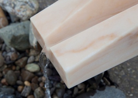
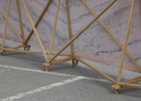
Pink can manifest in types of stone, appearing as an artistic medium for centuries
According to “Precious Colours” in Ancient Greek Polychromy and Painting, pink had a significant presence in the art of ancient Greece. Pink hues were found on fragments of the Mycenaean palace at Pylos and an examination of the Pitsa painted panels revealed pinks used in the painting of men’s skin. Pink is also seen in “small scale figures from the symposium scene on the tomb of Aghios Athanassios, where cinnabar is mixed with calcium carbonate whites and kaolinite to produce a subtle tone of pink”
Later, pink (from manganese) was used by the Romans to color glass for glassware, mosaics and decorative panels in walls and furniture.
Medieval and renaissance pigments
During the medieval period, pink pigments are thought to have consisted of a mixture of lead white or calcite and madder and cochineal. Cinnabar, a sulfide mineral, was also crushed and mixed into shades of white.
During the renaissance, Italian writer and painter Cennino Cennini described a light pink he called cinabrese. It was made by blending sinopia (sourced from hematite) with lime white (composed of calcium hydroxide, and calcium carbonate). As suggested by Cennini, cinabrese was used for filling out fleshy tones.
However, in The Book of the Art of Cennino Cennini, Christina J. Herringham observes that “what pigment was used to produce the lovely pinks and crimsons of the early Italian painters is not really known with exactness”. Contenders include “madder…kermes…[the] bodies of the Coccus illicis gum lac…and Brazil-wood or verzino“. Vermilion and carmine may also have been mixed with whites to produce pinks.
Fuchsine, magenta and quinacridone
In 1856, whilst trying to synthesize quinine, British man William Henry Perkin accidentally discovered mauvine, the first synthetic dye. The discovery prompted a surge in the industry and in 1858 German August Wilhelm von Hofmann produced a reddish-purple dye, made by combining aniline and carbon tetrachloride. Meanwhile, in the same year, Frenchman François-Emmanuel Verguin discovered the same substance independent of Hofmann and patented it. Named fuchsine by its original manufacturer Renard frères et Franc, production of Verguin’s dye commenced in 1859.
In the meantime, two British chemists, Chambers Nicolson and George Maule produced another aniline dye with a similar red-purple color. They began to manufacture the dye in 1860 under the name roseine, later changing the name to magenta in honor of the Battle of Magenta.

In 1935 quinacridone dyes were developed. A family of synthetic pigments, quinacridones are typically deep-red to violet in color. With exceptional vibrancy and lightfastness, quinacridones are often used for creating varying tones of magentas and pinks in artist’s paints.
Shocking pink
Due to the invention of color-fast chemical dyes, pinks quickly grew in application and impact during the 20th century. During 1931, a radical shade of pink was created by Italian fashion designer Elsa Schiaparelli. The pink, dubbed shocking pink was made by adding a small amount of white to magenta. Schiaparelli’s designs, made in conjunction with surrealist artists like Jean Cocteau, displayed her new shade of pink prominently.

PINK
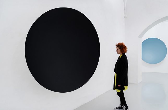
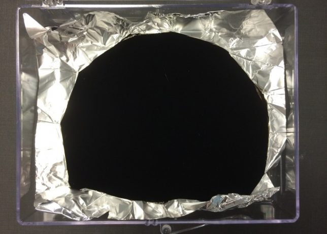
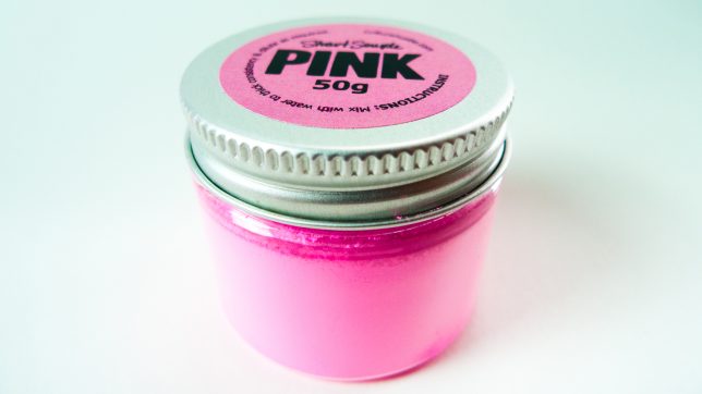
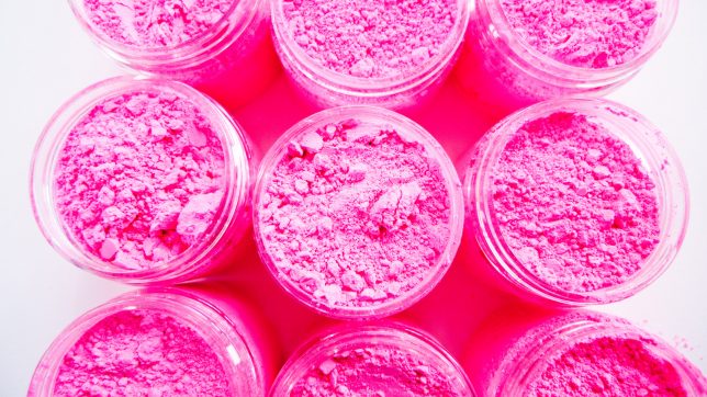
In February of 2016, Anish Kapoor secured an exclusive contract for the use of Vantablack in his art. In retaliation, artist Stuart Semple created a fluorescent pink pigment he dubbed PINK. Declaring it to be the world’s pinkest pink, Semple released PINK for sale, but with one caveat – any artist looking to purchase PINK are obliged to agree to a legal declaration which states: “you are not Anish Kapoor, you are in no way affiliated to Anish Kapoor, you are not purchasing this item on behalf of Anish Kapoor or an associate of Anish Kapoor. To the best of your knowledge, information, and belief this paint will not make its way into that hands of Anish Kapoor.”
Despite the ban, Kapoor did get his hands on PINK. He posted a picture of his middle finger dipped in the dry pigment to his Instagram account in December 2016. Nevertheless, Semple continues to sell PINK, anti-Kapoor declaration intact.

The website where Stuart Semple sells his PINK.
Pink in visual arts
Renaissance to pre-raphaelite
Pink truly came to life from the 14th century. During the early renaissance, infant incarnations of Jesus and angels were sometimes depicted dressed in pink, as in Cimabue’s the Virgin and Child Enthroned with Two Angels. Lorenzo da Sanseverino’s Virgin and Child, with Saints Anthony Abbott, Mark, Severino, and Sebastian depicts the child Jesus in a pink robe, matching the garb of one of the surrounding saints. Later, Raphael’s Madonna of the Pinks depicts the infant Jesus and the Virgin Mary with pink carnations, a slight anachronism – the flower is said to have first appeared at Jesus’crucifixion.
Baroque artists used pink hues to convey a broad range of subjects. The heavens and its holy occupants are grazed in soft pinks in Paolo de Matteis’s Triumph of the Immaculate. And Willem van Aelst and Rachel Ruysch used pink in arresting still life paintings. But it was during the rococo movement that pink saw a perceptible rise to fame in western art. Characterized by indulgent paintings featuring splendid pink costumes, rosy nudes and fine pink detailing, the color graduated from a secondary hue to a commanding presence in art.
Jose Ferraz de Almeida Junior’s Nha Chica and Batismo de Jesus are two examples of pink’s application in academic art. Realist painter Jean-Francois Millet’s Gleaners depicts three peasant women, one with distinctive pink sleeves, linking to the pinks hues in the overcast sky. And pre-raphaelite artists like Dante Gabriel Rossetti used intricate pinks to emphasize symbolic paraphernalia.

Impressionism to cubism
With an emphasis on the depiction of light, impressionists applied pink in a variety of contexts. Claude Monet used combinations of pink in his water lilies series. Manet painted the Plum with soft pinks verging on purple and Edgar Degas’ famous the Pink Dancers portrays figures dressed in flourishing pink ballet dresses. Paul Gauguin added depth to his paintings by filling them out with saturated fields of pink. And Vincent van Gogh painted post-impressionist pinks in his depictions of flowers, carefully detailing the blossoms of Almond Blossom.
Fauvism saw everyday settings painted in radical color. Les toits de Collioure by Henri Matisse charges a landscape with bright pink hues. In Charing Cross Bridge, Andre Derain contrasts a green and blue city skyline with a richly pink sky. As one of at least four renderings of the same landscape, Georges Braque crams a vista with active pinks in The Olive Tree Near l’Estaque. Unfortunately, the painting caught the eye of a thief, who stole it from the Musée d’Art Moderne de la Ville de Paris in May 2010.
Street, Dresden by expressionist Ernst Ludwig Kirchner is a haunting portrayal of modern public space underscored by glowering pink. Considered one of the earliest examples of cubism, The Young Ladies of Avignon by Pablo Picasso portrays five nude female prostitutes, their flesh padded out in varying degrees of pink. And abstract artists such as Robert Delaunay (Circular Forms) and Agnes Martin used color pink to convey meaning, doing away with the figurative altogether.
Pink in contemporary art
Loaded with meaning, pink is a common theme in contemporary art. Embracing ephemerality and visual abundance, Tanya Schultz works as Pip & Pop to create intricate installations and artworks from materials including sugar, glitter, found objects and craft effects. Sculpted not from icy rose-hued water but from solid glass, Roni Horn’s Two Pink Tons are deceptively evanescent in appearance. And Daniel Arsham’s Lunar Garden reflects his fascination with the familiar and the surreal, re-imagining a traditional zen garden in solid pink hues.
Known for her grotesquely intriguing representations of the human body, Mithu Sen aimed to stretch the limits of artistic language through her sculpture made of false teeth and pink dental polymer. Yue Minjun’s self-portraits depict him as bright pink-skinned characters in the throws of maniacal laughter. Anne Lindberg’s Drawn Pink culminated in an immersive gesture of movement and color and Karla Black’s weightless sculptures appear to keep themselves afloat in wispy pinks, blues and greens, exploring the nature of physical experience.
Lori B. Goodman investigates the tenuous nature of the color in her installation Pink writing, “it is said that pink is initially a calming color but that too much exposure creates anxiety.” And Anish Kapoor’s Gossamer, an elegantly carved piece of onyx, slumbers in quiet pink within gallery confines.

Pink in photography
Even before the inception of color photography, pink has had a presence in the photographic landscape. Popular in the mid-to-late 19th century, hand-colored photographs depicting pastel pink cheeks and clothing added a level of realism to the photography of the time.
Pink is now abundant and accessible. As a result, many modern photographers turn their attention to pink. One striking example of pink’s application in photography is manifested in Richard Mosse’s Infra series captured in Aerochrome. Invented for reconnaissance during the Second World War, Aerochrome registers infrared light (normally invisible to the naked eye), transforming green shades into rich pinks in the process. As a result, Mosse’s documentary of war-torn Congo is dominated by pink hues, evoking an otherworldly beauty juxtaposed with war.
Photographers like Kate Ballis and Zoe Sim also use in-camera infrared conversions and filters to capture illusive pinks. Documenting the color preferences of children, JeongMee Yoon explores the socialization of gender and identity through her Pink & Blue Project. Smothering participants in luxurious pink materials, Loreal Prystaj’s series Pretty in Pink marries portraiture and materiality. Andria Darius Pancrazi photographs architecture in a format he describes as “softserve pinkcore mulhollandwave” and Martine Perret’s series Sel Rose captures abstract aerial shots of the pink waters of Western Australia.
Manit Sriwanichpoom inserts Pink Man into photographic scenes in various ways to channel his feelings towards Thai society. Singaporean Nguan documents his home city with restrained pinks and Xavier Portela documents the pink and purple hues of cities at night.

Infrared technology and effects render green organic matter in pinks and purples
Conclusion
Pink was a latecomer to the artist’s pallet. Nevertheless, as an extremely versatile color, pink has seen extensive use in art movements over time. Sometimes underestimated, pink can be lighthearted and subtle or raucous and bold. Associated with love, kindness, tenderness, affection, intensity, playfulness and sensitivity, pink denotes emotional abundance. Palpable in depth and weight, pink is a color of visual buoyancy, conveying meaning through sensual and emotive experience.
We’d love for you to share your images with the color pink in the comments below!
See the other colors in the Mastering Color Series here.

The post Mastering Color Series – The Psychology and Evolution of the Color PINK and its use in Photography appeared first on Digital Photography School. It was authored by Megan Kennedy.

Digital Photography School

















You must be logged in to post a comment.