RSS
 

Posts Tagged ‘Parking’

Pop-Up Parking Garage & Rooftop Green Space Rises Higher When it Rains

05 Oct

[ By SA Rogers in Architecture & Public & Institutional. ]

Stormwater flooding, too few places to park and a lack of green space are three of the main issues plaguing every major city, and this strange but kind of brilliant building concept attempts to solve all three at once. ‘POP-UP’ by Danish architecture firm THIRD NATURE places a five-level parking garage topped with a public park on top of a stormwater reservoir, with the building’s height changing depending on how much it has rained lately.
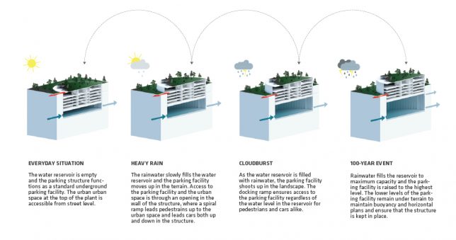
On a dry day, all that’s visible of the POP-UP structure is the rooftop park, which essentially sits at ground level. But when rain falls, it fills the underground reservoir, causing the parking structure to rise higher in the landscape, highlighting its adaptability in the face of changing weather. The architects present it as an alternative to constructing a rainwater reservoir that’s empty most of the time or a mono-functional parking facility that takes up valuable urban space.


“By 2050, the Earth’s population is expected to grow to over 9 billion people,” says THIRD NATURE. “The migration to cities is on the rise and urban spaces are under pressure from the growing numbers of cars and traffic in the streets. With the quest for green, livable and human-scale cities cars and car parking have become an increasing challenge fighting for m2 in the dense cities – often at the price of urban areas and parks.”

“At the same time, climate changes require cities to handle huge amounts of stormwater generated by more and more powerful cloudbusts – this by building large water reservoirs under roads and squares. The situation calls for a rethinking of the way we establish parking, storage of stormwater and new urban spaces.”

They compare the building to a piece of cork in a glass of water. Hydraulic and mechanical lifts would help balance the weight ratios of parked cars in the structure to make sure it’s able to move up and down smoothly without changing the water level underneath. The two lowest levels of the parking structure would be off-limits, remaining underground to ensure the stability and buoyancy of the building.

Though an approach that reduces the number of individual vehicles allowed into a city would arguably be more practical, it’s also true that many places (especially in the United States) are likely to remain car-centric for the foreseeable future. Is this a realistic compromise?

Share on Facebook


[ By SA Rogers in Architecture & Public & Institutional. ]

[ WebUrbanist | Archives | Galleries | Privacy | TOS ]


WebUrbanist

 
Comments Off on Pop-Up Parking Garage & Rooftop Green Space Rises Higher When it Rains

Posted in Creativity


World’s Largest Bicycle Parking Garage Stores Over 6,000 Rides in the Netherlands

03 Sep

[ By WebUrbanist in Architecture & Public & Institutional. ]

The Netherlands, where bikes outnumber citizens, is well known for its cycle-centric transportation infrastructure. In Utrecht, over 100,000 cyclists ride through the city every day, connecting between home, school, work and public transportation. Now open, this newly-built bicycle parking lot can already house 6,000 rides at a time, but is aiming to more than double that capacity by the end of the year.

It actually looks a lot like a conventional parking lot, filled with ramps and arrows pointing cyclists through the structure, crisscrossed with walking paths for people traveling to and from their personal vehicle. Dense stacking allows for layered storage across the multiple levels of the structure.

Eventually, the parking structure will store a remarkable 33,000 bicycles by 2020, which, to most people, might sound like a lot of bikes. But the design, patterned after Tokyo’s amazing underground bike parking station, has people worried — not because it could be overbuilt, but because the capacity might not match the demand.

As popular as cycling already is in the region, the number of people on bikes continues to grow and the Netherlands has long had storage space issues related to this growth. One cycling organization quoted John Lennon to make the point: “life is what happens while you are busy making other plans.” They say politicians are still being too slow to make decisions and implement plans to increase bike-supporting infrastructure. Still, too many riders and fewer seems like a good problem for a city to have.

Share on Facebook


[ By WebUrbanist in Architecture & Public & Institutional. ]

[ WebUrbanist | Archives | Galleries | Privacy | TOS ]


WebUrbanist

 
Comments Off on World’s Largest Bicycle Parking Garage Stores Over 6,000 Rides in the Netherlands

Posted in Creativity


No Quarter: Parking Meters Pimped To Perfection

17 Jul

[ By Steve in Culture & History & Travel. ]

It’s time to pay tribute to parking meters, those metal “trees” of the concrete jungle that have collected billions of coins over eight decades of service.

Parking meters have been fixtures of the urban street scene since the first of 150 “Black Maria” meters was installed on the corner of First Street and Robinson Avenue in Oklahoma City exactly 82 years ago today. The so-called “curbstone parking automats” (see photo caption above) were quickly embraced by retailers who watched their sales increase as day-long street parkers vacated choice parking spaces in favor of actual shoppers.

Park Hair

Space reserved for Jayne Mansfield? OK, that was in poor taste but still – Flickr member Lulu Vision thought this “only in S.F. moment” was worth capturing and we must agree. Parking meters have evolved over the decades but they don’t get much respect. Even so, you don’t have to be one of those “that cloud looks like Elvis” types to see the winking blonde plying her trade on the streets of San Francisco.

Wait, so putting wigs on parking meters is a thing now? Flickr member Tofu (tofuart) snapped the black-wigged meter above in September of 2013 while strolling along South of Market, San Francisc… aha, now we get it: wigging out the parking meters is a ‘Frisco thing. Whew!

Don’t Be Carless, Help The Homeless

The turnover from analog to digital parking meters left many municipalities with hundreds of obsolete meters. What to do? Well, if you’re the city of Montreal you re-install those meters with a new purpose: collecting donations to support the homeless.

Dubbed “ParcoDon” and instituted in 2007, the program saw 70 obsolete parking meters dolled-up and decorated by local celebrities and organizations. The artwork helped members of the public discern the difference between an actual parking meter and a ParcoDon meter, with roughly $ 23,000 being collected over the program’s first three years.

Never mind the irony of meters once used to charge drivers to park now helping to support citizens who can’t afford a home, much less a car. Oh hey, looks like the idea’s catching on – the images above hail from Miami, Florida and Pasadena, California, respectively.

Next Page – Click Below to Read More:
No Quarter Parking Meters Pimped To Perfection

Share on Facebook


[ By Steve in Culture & History & Travel. ]

[ WebUrbanist | Archives | Galleries | Privacy | TOS ]


WebUrbanist

 
Comments Off on No Quarter: Parking Meters Pimped To Perfection

Posted in Creativity


Underground Illusions: Anamorphic Parking Lot Turns Flat Paint into Sculpture

06 Jul

[ By SA Rogers in Art & Installation & Sound. ]

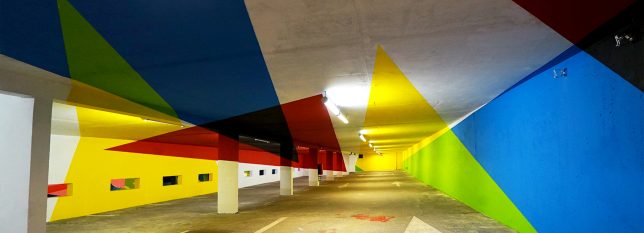
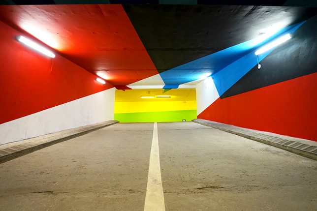
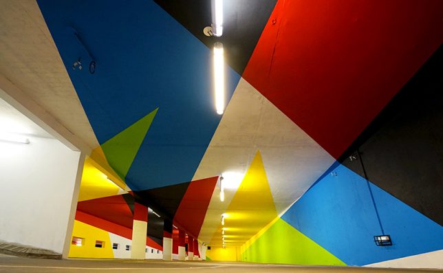
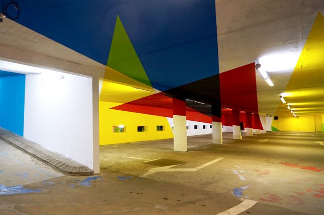
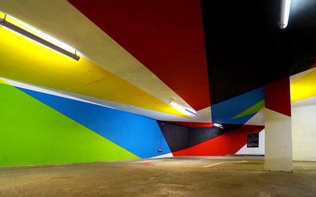
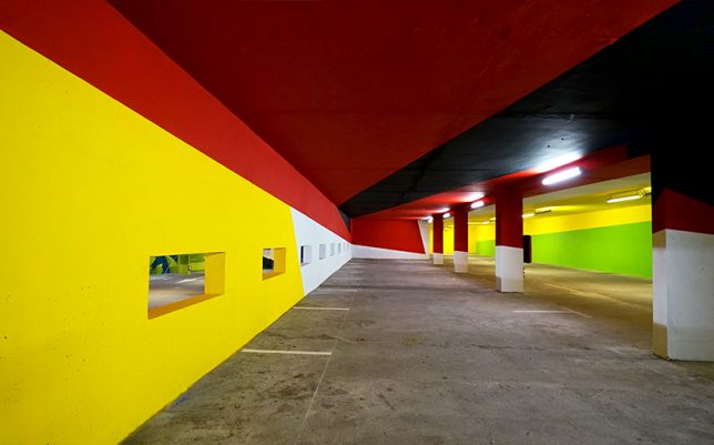
You’re driving through an underground parking garage when suddenly, the colorful geometric shapes splashed all over every surface pop out into three dimensions. Try not to crash your car! When optical illusions line up right, they can be really disorienting, and it’s always cool to see them carried out on a large scale. Argentinian artist Elian Chali got to take over an entire parking lot in the Saint-Gervais Mont Blanc region of France, transforming it into a trompe l’oeil canvas.

“This artwork, which uses basic geometry and primary colors, makes use of the architectural factors where it inhabits,” says Chile. “Each element adopts a new function and the space becomes a huge sculpture. The relationship with the environment is not easy to achieve, therefore not only the walls will be intervene, but the painting will invade everything that you find in your way in order to offer to the users of the parking, the possibility of breathing inside a work of art.”


It’s a pretty cool effect, with some triangles stretching dozens of feet and crossing ceilings, support pillars and walls to end on the floor. Presented by 2KM3 Contemporary Art Platform and curated by Hugues Chevallier and Zoer, the piece comes together as an optical illusion when you hit just the right spot while driving through.

Chali is known for applying his signature vivid style to buildings around the world in the form of massive murals, often taking up entire multi-story facades. Each one takes its respective environment into account in its composition, paying homage to the history of the building and its setting, the materials it’s made of, and the ways in which it has aged or weathered. Keep up with his work on Instagram.

Share on Facebook


[ By SA Rogers in Art & Installation & Sound. ]

[ WebUrbanist | Archives | Galleries | Privacy | TOS ]


WebUrbanist

 
Comments Off on Underground Illusions: Anamorphic Parking Lot Turns Flat Paint into Sculpture

Posted in Creativity


Modular Remix: Parking Garage Picked Apart, Reassembled Like LEGO

31 May

[ By WebUrbanist in Architecture & Offices & Commercial. ]

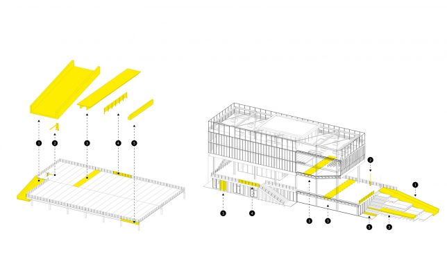
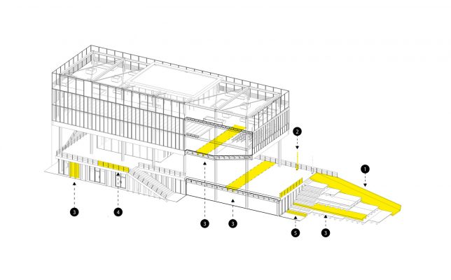
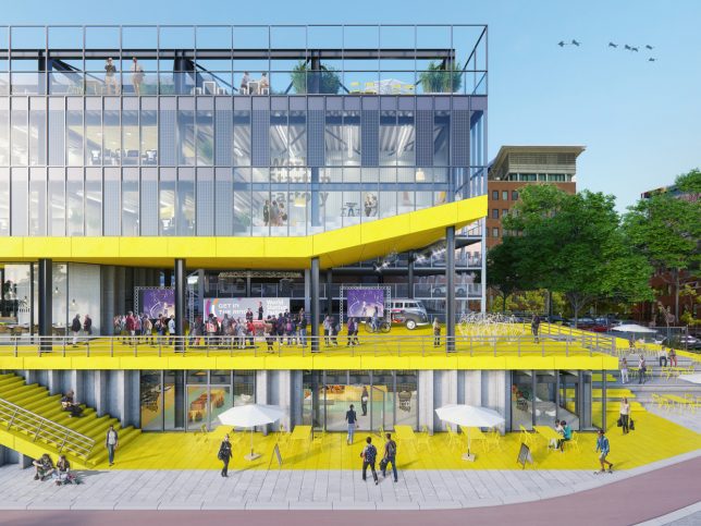
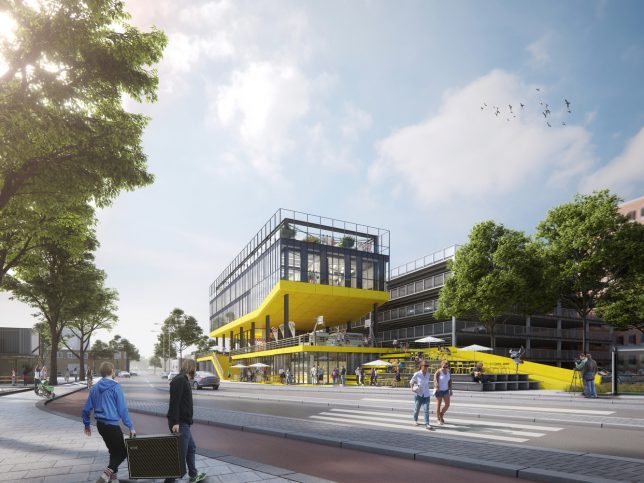
As autonomous vehicles begin to roll out on city streets, adaptive reuse projects like this one could help old parking structures readily find new and productive urban purposes. This award-winning design by Dutch firm Studio Komma and The Men of Foam for The Hague features a mixed-use program built on the bones of an existing parking garage, with a twist: parts can be moved around like modular LEGO blocks.

And the LEGO piece is no idle comparison — the team used actual bricks to mock up their designs, focusing on how individual modules could play larger roles in the overall scheme. They also considered how these same re-situated units might later be shifted around to serve other functions.

Ground floors commercial and social spaces are fit into the framework of the extant garage, using the old second-story parking level for overhead shelter. Above the existing second level, new levels reuse ramps and other elements to grow the program vertically — these mostly-indoor third and fourth floors shelter an outdoor public zone left open in the middle.

Colors and details in the proposed scheme highlight elements of the adaptive reuse while aiming “to create an iconic building that is an accelerator for the transformation of an industrial area into a new energetic urban district.” Pieces of the old structure are preserved and made modular, fitting into the new program where useful but retaining aspects of their original shape and character to illustrate change over time.

In developing the ZIP2516 scheme, which subsequently won the Lot 2 Urban Lab Challenge, the architects were “challenged to think about temporary structures that have a permanent high quality.” Its modularity is intended to extend into the future as well — additional elements (like glass cladding and structural supports) are made to be moved as the needs of the site and city continue to evolve.

Share on Facebook


[ By WebUrbanist in Architecture & Offices & Commercial. ]

[ WebUrbanist | Archives | Galleries | Privacy | TOS ]


WebUrbanist

 
Comments Off on Modular Remix: Parking Garage Picked Apart, Reassembled Like LEGO

Posted in Creativity


Future-Proof Parking Garages: Autonomous Vehicles Drive Reusable Designs

03 May

[ By WebUrbanist in Architecture & Cities & Urbanism. ]

As driverless vehicles hit the streets and shared car usage grows, forward-thinking architects, developers and urban planners are working on adaptable designs to future-proof parking garage structures and give them second lives.

Big firms like Gensler see the writing on the wall, predicting car usage will peak by the end of the decade and ride-sharing may dominate by 2025. The effect of this on cities and real estate will be massive, freeing up home garages, street parking and dedicated parking structures — nation-wide there are over 500,000 parking spots and spaces inside buildings and outdoors covering an estimated 3,500+ square miles.


Gensler’s The Mod concept plays to new possibilities in light of their predictions, featuring garage floor heights that will work for new uses. Its modular sections can be easily moved or removed to let in light and facilitate circulation. Built-in utility hookups also help make conversion easier. The firm has also designed a building in Ohio with three parking levels made to be changed into offices over time with easily-added facades and details similar to ones found on other floors (below).

Another such project — a 1,000-car garage for building residents in the Arts District of Los Angeles by Avalon Bay — is to be completed in four years, a long time in this age of fast-evolving technology. Accordingly, their plans include tricks to make converting this area back to other residential uses easy and efficient. This includes flat floors (rather than inclined ones found in many garages) so they can be turned effectively into usable spaces, like shops or community areas.

Converting garages will be a huge project of the coming decades, but so will rethinking the way new architecture is designed in the age of autonomous vehicles. Without people at the wheel, cars can park themselves in smaller spaces. Loading/unloading zones will be reduced and the way people enter buildings (from the street rather than a garage) could change dramatically as well.

Then, of course, there are streets — with less street-side parking, space is opened up for things like parklets, walking and biking paths (not to mention all of the changes to how roads will work). Accordingly, many designers, developers and planners are wisely anticipating these changes — still, their ultimate effect on the built environment remains to be seen as the future continues to take shape.

Share on Facebook


[ By WebUrbanist in Architecture & Cities & Urbanism. ]

[ WebUrbanist | Archives | Galleries | Privacy | TOS ]


WebUrbanist

 
Comments Off on Future-Proof Parking Garages: Autonomous Vehicles Drive Reusable Designs

Posted in Creativity


Artistically Enabled: 18 Weird & Creative Handicapped Parking Signs

10 Apr

[ By Steve in Culture & History & Travel. ]

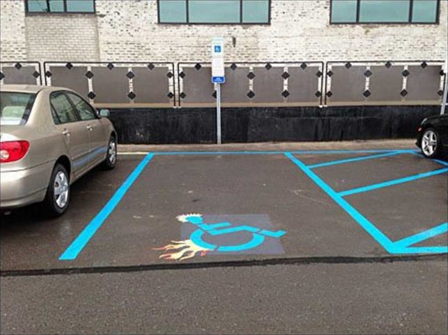
Blue & white Handicapped Parking signs and stencils are one of urban life’s most familiar icons… and then there are those that have been creatively hacked.

There’s a fine line between amusement and mean-spiritedness but when it comes to visual imagery, outrage is often in the eye of the beholder. With that in mind, this edgy, spiky, flame-enhanced “Parking Space Designator” (is that what the kids are calling them these days?) follows the road blazed by TV’s Dr House and his boss flame-graphic walking cane. You’ll find the stencil on steroids above outside a Retail Boutique Incubator, tentatively attributed to Sean McDougal of Disfunctional Design Store.

Interlocked & Loaded

Those interlocking driveway paving stones can be fit together in any number of patterns, including a reasonable, recognizable facsimile of the accessible parking graphic. Flickr user zwei zwei (zwei1189) captured this image on February 5th of 2015.

Brazil Not

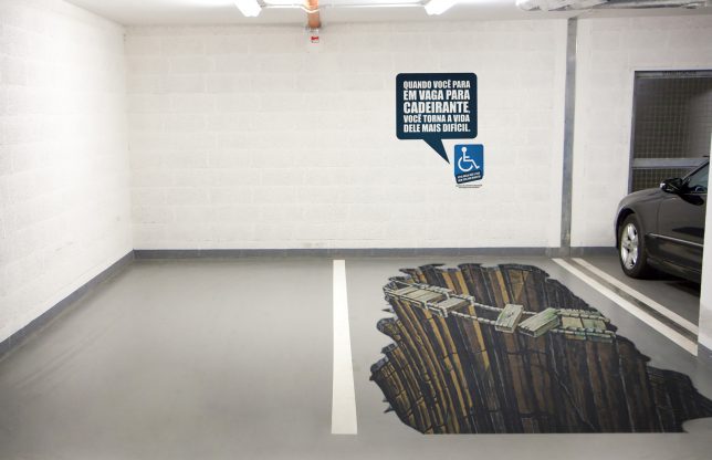
A parking spot reserved for the “Sorcerer” truck, we assume? Not quite – this clever conjunction of a designated handicapped parking space and some awesome eye-fooling 3D graphic art comes from Brazil, where there’s an ongoing problem of able-bodied people parking in handicapped spaces “just for a minute”. Yeah, riiight. The explanatory text on the wall roughly translates from Portuguese to read “When you stop in place for disabled, you make his life more difficult”. It’s a theme we’ll revisit further on in this post.

Hold My Beer And Park This

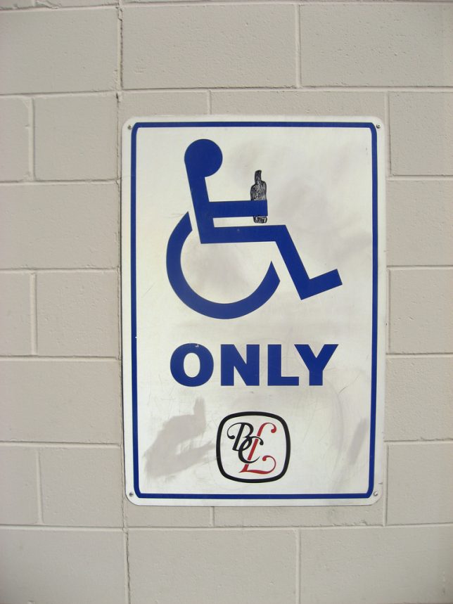
Flickr user Mike Klassen snapped this mildly yet distinctively modified accessible parking sign behind a BC Liquor store in late September of 2008. As for that “fine line” we mentioned previously, well, this edges close to it but we’ll leave the last word to Nathan Ridge, one of the commenters at Klassen’s photo page: “I’ve heard of discrimination against disabled persons, but this is the first time I’ve heard of it the other way around! I love it, especially since I’m in a wheelchair myself!”

Triple Chair Lift

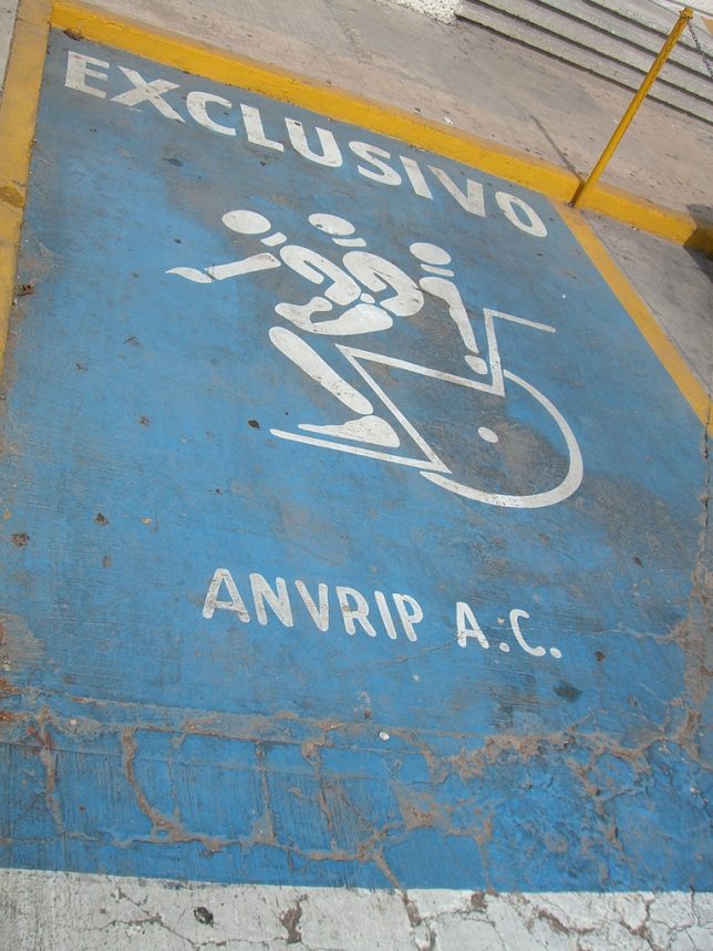
When Mexico sends us their handicapped parking place stencils, they’re not… actually sometimes they ARE sending us their best. Take the “EXCLUSIVO” stencil above, snapped by Flickr user Mary Doyle (buffoonmeatmary) on August 5th of 2007. We can’t say whether this awesome graphic shows a disabled person getting into or out of their wheelchair but either way, the image demands a Six Million Dollar Man bionic sound effect to accompany it.

Elderly Man Driver

Elderly man driver, that elderly man driver, he don’t say nothing but he must know something, he just keeps rolling along… at 10mph under the speed limit until he (or she) parks, right on top of this designated Elderly-only parking space. Who knew this even existed? One might state just being a senior citizen isn’t actually a “disability” in the strict sense, though don’t try convincing any grouchy cane-wielding oldster of that. Flickr user Wee Viraporn snapped what appears to be a standardized stencil on January 3rd of 2010.

Next Page – Click Below to Read More:
Enabled 18 Weird Creative Handicapped Parking Signs

Share on Facebook


[ By Steve in Culture & History & Travel. ]

[ WebUrbanist | Archives | Galleries | Privacy | TOS ]


WebUrbanist

 
Comments Off on Artistically Enabled: 18 Weird & Creative Handicapped Parking Signs

Posted in Creativity


World’s Sexiest Parking Garage Has a New Competitor For the Crown

23 Mar

[ By SA Rogers in Architecture & Public & Institutional. ]

parking garage cliniques 1

It may not be as jaw-dropping and awe-inspiring as Detroit’s decaying Michigan Theater parking garage, nor quite as multifunctional as the stunning Herzog de Meuron structure at 1111 Lincoln Road in Miami – but this new structure in Belgium is definitely one for the books. The undulating wooden slate facade of this staff parking garage for the Cliniques Universities Saint-Luc hospital in Brussels is beautifully fluid, with a clever design that disguises most of its bulk underground while remaining architecturally interesting.

parking garage cliniques 5

parking garage cliniques 8

parking garage cliniques 4

Modulo Architects and De Jong Gortemaker Algra Architects were charged with creating a functional industrial structure capable of holding 985 cars that would also serve as a welcoming introduction to the hospital itself, incorporating daylight, natural materials and a striking look. Taking inspiration from natural canyons, they created a stepped design that brings sunlight down into the first two subterranean levels.

parking garage cliniques 9

parking garage cliniques 6

parking garage cliniques 10

The two above-ground parking decks “bridge the terrain gradient” between street level and the green roof, which is designed to be both a functional outdoor space and something pleasant to look at from the higher floors of the adjacent hospital. The parking garage effectively raises this green space above street level for a sense of privacy, avoids obscuring views of the surrounding architecture and manages to be pretty cool to look at, itself.

parking garage cliniques 7

parking garage cliniques 2

parking garage cliniques 3

“We challenged ourselves to also make the underground decks clear and pleasant,” the architects say. “By introducing a sinuous ‘canyon’ encompassing the garage that allows light and air to reach even the lowest deck. Natural light and this (eventually green) canyon-wall contribute to orientation and ensure a positive experience for the user. The facades, made of meandering hardwood slats (FSC), naturally relate to the character of the canyon. An appealing building, nicely embedded with added value for the user is the result.”

Share on Facebook


[ By SA Rogers in Architecture & Public & Institutional. ]

[ WebUrbanist | Archives | Galleries | Privacy | TOS ]


WebUrbanist

 
Comments Off on World’s Sexiest Parking Garage Has a New Competitor For the Crown

Posted in Creativity


Park Like a Girl: Women Frustrated with Pink “Ladies” Parking Places

19 Sep

[ By Steve in Culture & History & Travel. ]

ladies-parking-1

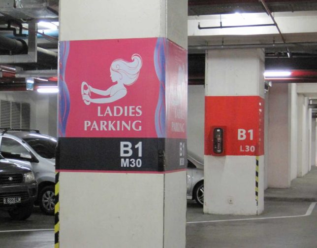
Sexism or security – why not both? Pretty pink women-only parking spaces show once again that best intentions can bring about unintentional consequences.

A curious fact about designated women-only parking is that many of the most obvious examples can be found in developing nations – societies not exactly known for egalitarianism and women’s rights. Travelers from First World countries who notice these “pink paradises” are often bemused by both the concept and the location, as is the case with Canadian blogger Maiya of Hungry Woman Eats who snapped the Ladies Parking section at the Gandaria City Mall in Djakarta, Indonesia.

Shanghai Surprise

ladies-parking-9a

ladies-parking-9b

ladies-parking-9c

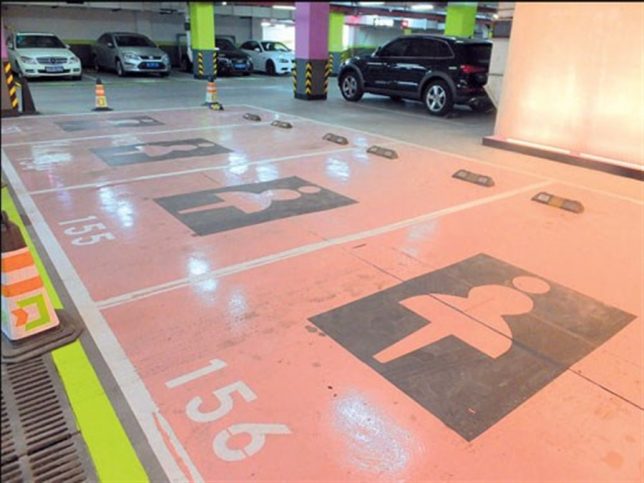
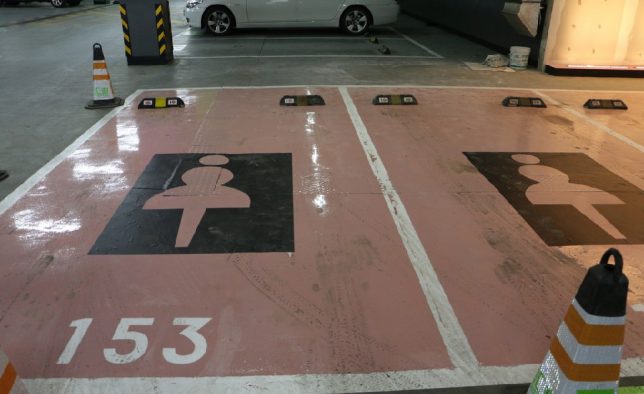
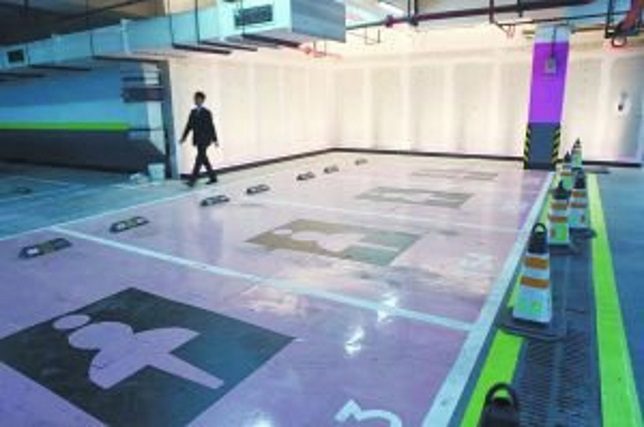
Women-only parking has come under fire, however, from (among others) women’s rights groups who are offended by the pink paint, cutesy signage and (in some cases) the extra width allotted to each space. Some men are peeved as well, including a netizen who posted on xinmin.cn “Isn’t it a kind of discrimination against men drivers? Some men may be less skilled at parking than women.” Hurt feelings aside, who’s taking the fall for the glossy floors of these women-only parking spaces at the Wandu Center in Shanghai, China? You try navigating that slick expanse on a rainy day, loaded down with shopping bags, and wearing stilletto heels.

One Tire Over The Line

ladies-parking-3

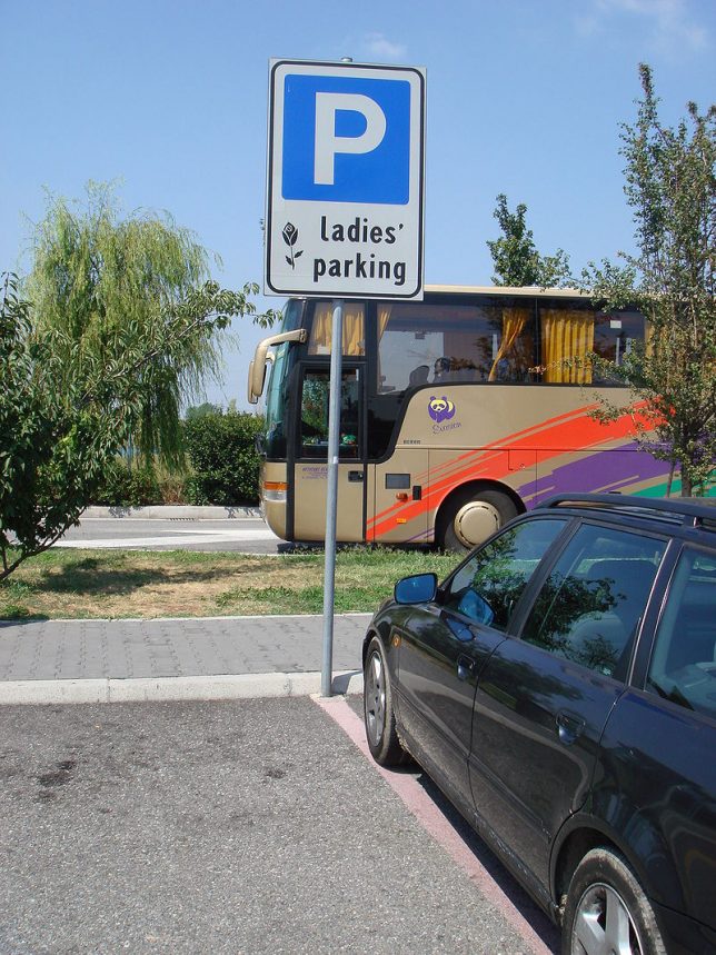
Without the benefit of a distance-shot, we’ll just have to assume this rather stark and (mainly) sexism-free Ladies’ Parking sign at a Brescia, Italy rest area denotes at least two parking spaces reserved for the fairer sex. We’ll refrain from commenting on the above driver’s parking technique, however, and make no allusions to their gender. Kudos to photographer Stefano Bolognini, who visited the location – that may even be HIS poorly parked car – in 2007.

Turkish Delight

ladies-parking-4a

ladies-parking-4b

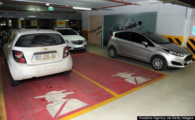
Why did ladies’ parking get the works? That’s nobody’s business but the Turks’… and business must be very good indeed at the MarkAntalya Mall in Antalya, Turkey. Not content with working up a couple of pink parking spots just for show, the mall has designated a whopping 450 parking spots for women, most of them selected for their convenient location to mall entrances. It’s “positive discrimination” in action – their words, not ours.

Next Page – Click Below to Read More:
Park Like A Girl Women Frustrated With Pink Ladies Parking Places

Share on Facebook


[ By Steve in Culture & History & Travel. ]

[ WebUrbanist | Archives | Galleries | Privacy | TOS ]


WebUrbanist

 
Comments Off on Park Like a Girl: Women Frustrated with Pink “Ladies” Parking Places

Posted in Creativity


My Space: 15 Creatively Painted High School Parking Spots

29 Aug

[ By Steve in Art & Street Art & Graffiti. ]

senior-parking-1aa

So custom-painted assigned high school senior parking spots are a thing now, and it appears students are expressing a LOT (ahem) of creativity.

senior-parking-1b

senior-parking-1c

The concept looks to be a win-win for both schools and students: the former collect fees for each space and nip parking spot rage in the bud; the latter get to be creative and take pride in their work. Take Martha Caldera’s take on Drake’s “If Youre Reading This Its Too Late” mixtape, which garnered her (and others as well) a measure of Twitter fame and thousands of shares.

States Caldera, “The only thing that’s going to motivate me to wake up for school tomorrow is pulling up in my parking spot.” One wonders if Drake – who played high school student Jimmy Brooks in Degrassi: The Next Generation – would approve.

PokeSpot

senior-parking-2a

Topics and themes for the parking spaces are pretty much left up to the individual students. Many choose to express their currents interests as illustrated by Reddit-user mrpopper96 above. Trends are fleeting, of course, but no worries since next year’s senior class simply paints over the work of their predecessors.

School Of Fish

senior-parking-9a

senior-parking-9b

This parking space may be slippery even when it’s NOT wet. We’re not sure what kind of car this student drives but please, please, please let it be the one in the second image.

Tread On Me

senior-parking-4a

Jeep Patriot parking only? We’ve come a long way since Peter Fonda’s character was hassled for his Stars & Stripes motorcycle gas tank. We’d hassle the dude above over his spelling but hey, that’s the school’s job.

Reece Witherspot

senior-parking-5a

senior-parking-5b

When the Good Lord gives you lemons, make lemonade. When your parents name you “Reece“, well, see above. By the way, is that a space painted like a Rebel Flag just intruding into the top of the second photo? Who knows, Reece might go to Robert E. Lee High School.

Next Page – Click Below to Read More:
My Space 15 Creatively Painted High School Parking Spots

Share on Facebook


[ By Steve in Art & Street Art & Graffiti. ]

[ WebUrbanist | Archives | Galleries | Privacy | TOS ]


WebUrbanist

 
Comments Off on My Space: 15 Creatively Painted High School Parking Spots

Posted in Creativity