
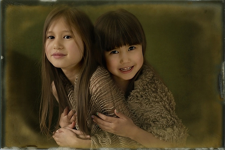
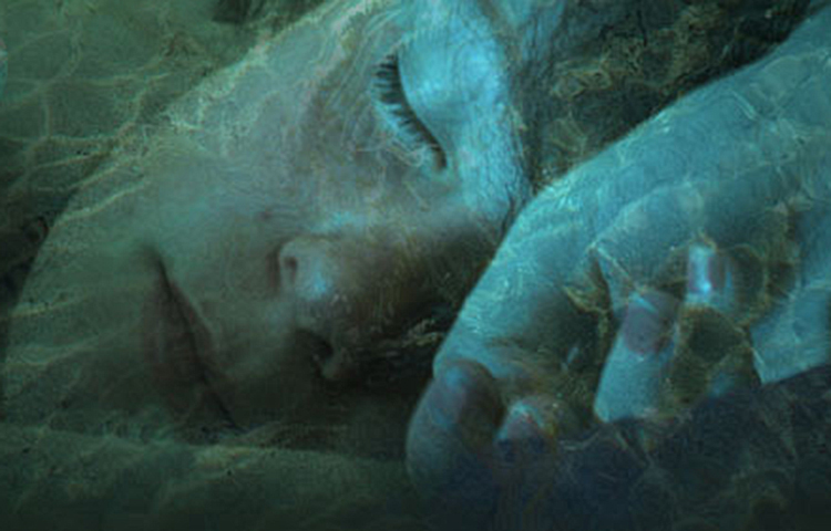
I’ve been shooting these moody portraits lately and I thought about adding some creative overlays to a few to make them a little different and more interesting.

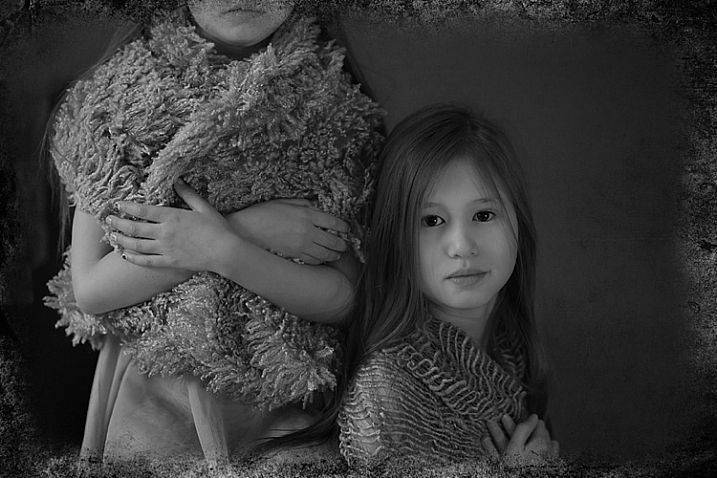
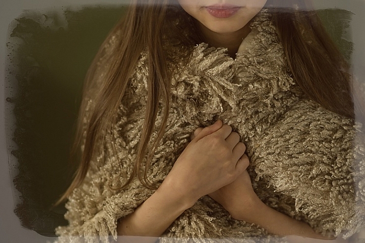
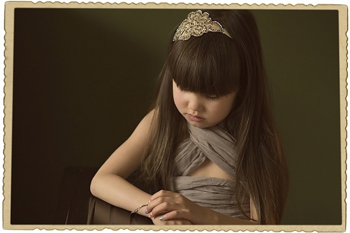
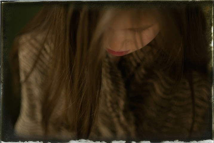
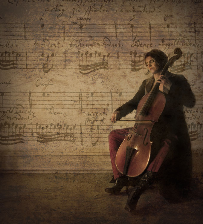
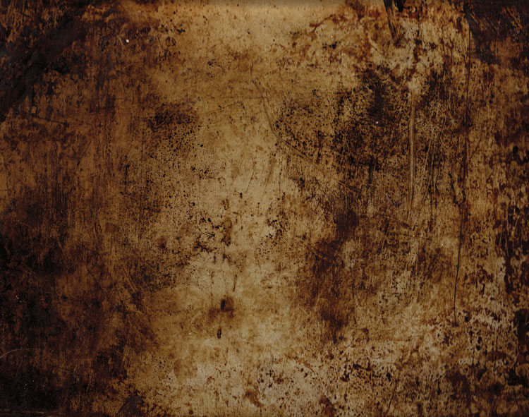
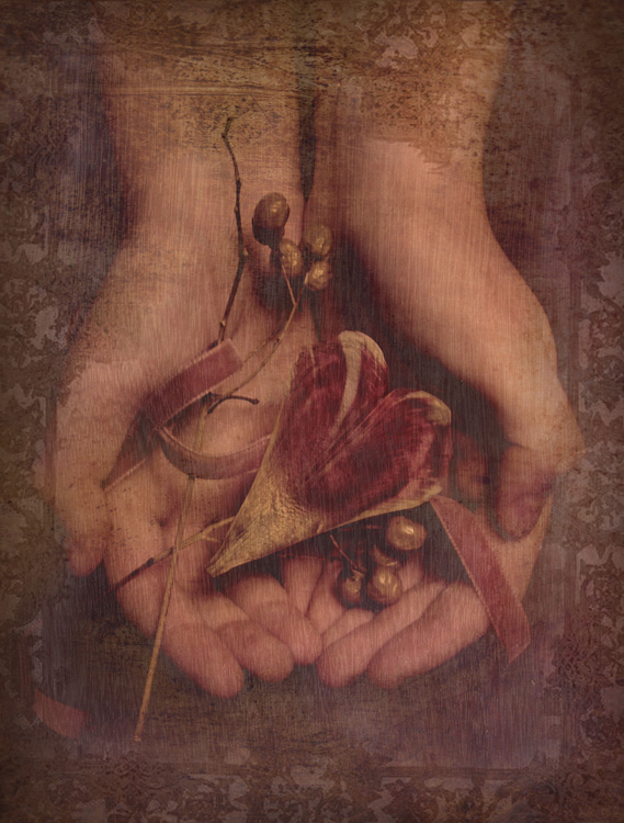
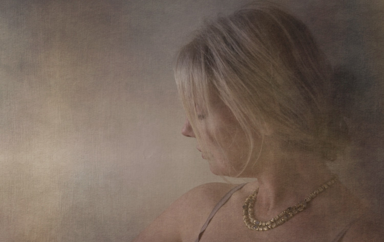
Here is a basic tutorial on how to add an overlay using Photoshop. Take your images from simple portraits (top) to textured backgrounds (above) above and finally to incorporating some surreal or artistic elements in the finished portraits (below).

Getting started
First of all, I wanted my images to have a dark background and look more moody rather than smiling portraits. You can read here on how I have achieved these types of portraits in my home studio using natural light only.
Secondly, in order for you to be able to follow this tutorial, you need to have a good understanding of how to use layers and masks in Photoshop. It is a simple but extremely powerful tool which I believe to be the most fundamental editing technique you need to learn when using Photoshop.
Thirdly, you need to decide on the images that you wish to use as creative overlays. A quick search on Google provided me with some free overlays that have a high enough resolution to use with my images.


 Designed by Freepik
It is essential that these overlays are in PNG format because it supports transparency. If the background isn’t already transparent (which is indicated by the checkered grey and white boxes), you can extract the image from the background if need be before you can use it as an independent overlay. But that’s a lot more work.
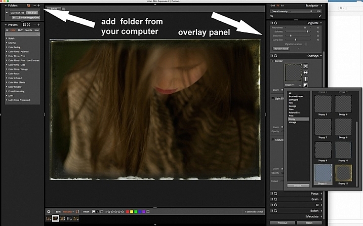
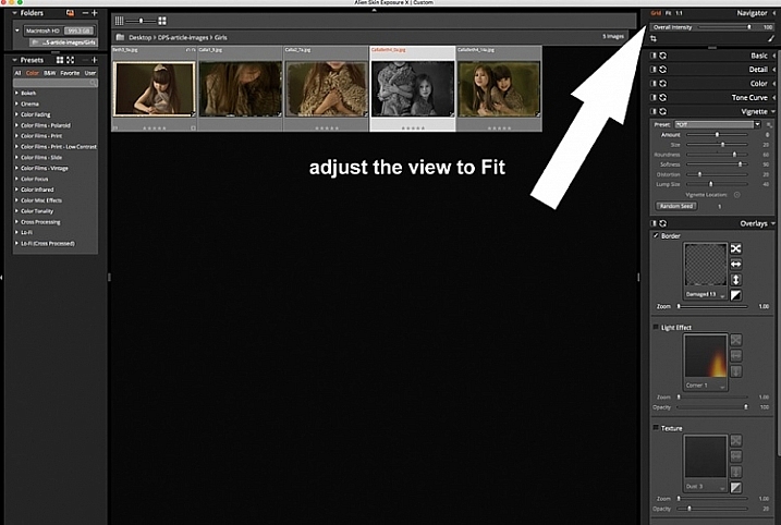
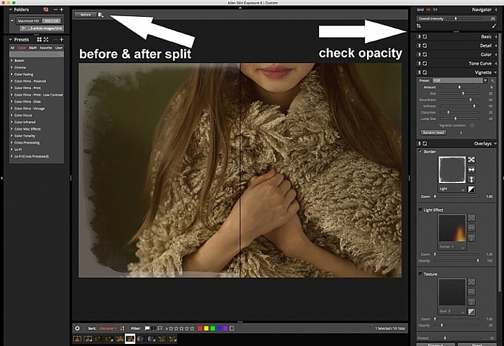
I will walk you through this process step-by-step. You will need to refer to the layers shown on the Photoshop screenshots below to be able to understand the process.
#1 Open your image in Photoshop
Once you open your image in Photoshop it will become the Background Layer. In my case, here I have renamed the layer as the file name “lsp-portraits-13” which appears at the very bottom of the file next to the “eye” icon. This just means it is visible and it is what I am showing you now.

#2 Open your texture image in the same Photoshop file
The texture I’m using is called Chambord as you can see on the layer name. You can easily add a new image onto an existing open Photoshop file two ways:
- By dragging your image from its source folder on your computer into Photoshop directly.
- Or by opening your texture file in Photoshop as a separate image, selecting the entire image, copying it and then pasting it into the portrait image you are working on.
The latter is the long-winded way. The former is quicker and it is the smarter way too because Photoshop automatically makes the new texture a Smart Object. That means it matches the size of your image yet you can still change the scale without losing any pixels.
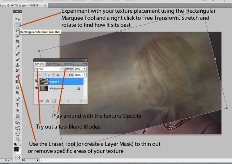
Change the blend mode of your texture image layer (Chambord in this case) to Overlay on the Layers tab. Add a layer mask to the Chambord layer and remove the texture from the person on the image by painting on the mask with black using a soft brush.
Your layer should look like the second layer below with the “eye icon” turned on. You can also adjust the opacity of your texture to your liking by moving the layer opacity slider next to the blend mode.
Note: If you don’t mask out the texture, the person will also be covered in texture and would look really odd! You only want the texture to fill the background and nothing else.

#3 Now you can proceed with adding overlays
The set of leaf overlays, however, come as one image, so I’ve had to use the latter method mentioned above. I opened the overlay file separately in Photoshop and used the marquee tool to select the specific leaf I wanted to use. Then I copied and pasted it onto the other file that I was working with the portrait image opened.
It is essential that you set the blend mode for each texture overlay to “Overlay”. You can experiment with various modes but for this type of work, I’ve found the Overlay and Soft Light modes tend to be the most suitable.
You can see that I added a mask on the leaf layer so that I could remove anything else around the specific leaf that I didn’t want to use. I have added four leaves in total to this image, each one on separate layers with their respective masks. I have also played around the opacity for each layer.
You will also notice that three of the leaves have a separate Levels Adjustment Layer on top of them. This is a simple way of adjusting the look of the overlay, for example, brightening it, darkening, increasing the contrast, etc. You just need to make sure that you clip the levels layer to the corresponding overlay it is adjusting by pressing Alt+Cmd/Ctrl+G. The arrow down indicates it is clipped (only applies to that and no others) to the layer below it.
You will also notice that there is a layer called Group 1 with the folder icon next to it. I grouped all four overlays after I have made individual adjustments with the levels layers. This is in case I want to make further adjustments to all of them, I only have to clip the adjustments to the Group rather than repeating myself for each overlay layer. Especially if all the adjustments are to be exactly the same anyway.
You can do this by selecting all the overlay-related layers and choosing “New group from layers” from the drop-down menu at the top of the Layers panel.

#4 Use adjustment tools to make final changes
Although the leaves are now where I wanted them to be, the leaves are far too saturated for my liking and they stand out too much. Not to mention they do not match the green tone of the entire image.
To correct this, I added a Hue/Saturation adjustment layer and clipped it to Group 1 so that it only affects that group and not the other layers. I played with the sliders to get the green looking similar to the green leaves on the little boy’s shirt. I wanted the overall image to have the look and feel of an old illustrated postcard with subdued tones and muted colors.

#5 It’s time to save your work!
If you want to keep all the layers and the original image, you need to save your file as a PSD image (Photoshop Data File). As long as you don’t merge or flatten the layers, you will have access to all the original elements used in making your composite image.
This is a non-destructive process but the files can take up a large space on your computer drive. However, if you change your mind later on about some of the elements, you can always go back into it without starting from scratch. Just choose the layer you wish to make changes on.
You must also save a compressed version of your image, usually a JPEG, which is a flattened lossy file. It is much smaller and only contains the final finished image without all the layers that went into creating it.
Conclusion
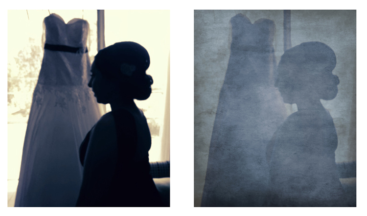
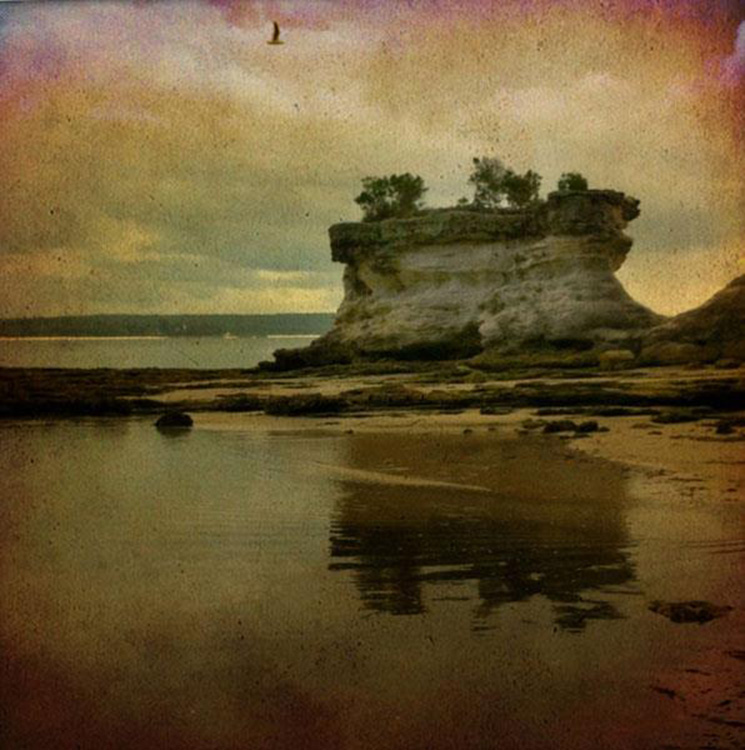
So that’s the simple process of using overlays! Below are the other two images showing the various layers using exactly the same process as shown above.


I hope you enjoyed this little tutorial.
Have you used texture overlays before? If you have more tips, please share them below.
The post Basic Photoshop Tutorial – How to Add Creative Overlays to Your Portraits appeared first on Digital Photography School.




You must be logged in to post a comment.