RSS
 

Posts Tagged ‘Overlay’

How to Make and Apply a Bokeh Overlay Using Photoshop

08 Jun

Bokeh overlays are an excellent way to add a trendy stylized look to your portraits. You can purchase overlays, but I would instead suggest making your own. It’s easy, fun, and best of all, it’s free!

In this video, I take you through the process of making and applying a bokeh overlay to a portrait using Photoshop. You will also learn to how to color tone your image to create a stylized look.

How to Make Your Own Bokeh Overlays

You can create bokeh overlays from almost any photo that is not too bright, and which has good contrast. The photos themselves do not have to be great photos at all; they can even have boring subjects and be totally out of focus.

To demonstrate the power of this technique, we will work with two bad cell phone pictures; a photo of a hamburger and a photo of a street.

How to Make and Apply a Bokeh Overlay Using Photoshop

It’s a good idea to look through your phone and experiment with the photos that you already have.

To create a bokeh overlay, place the image into your working document by going to File > Place Embedded. Once the image is in the Layers panel, right-click on it and select Convert to Smart Object. This will make it so that any filter that you apply is non-destructive and you can edit it later if you need to.

To blur the image, and get the bokeh effect, go to Filter > Blur Gallery > Field Blur.

Start by dragging the Blur slider to the right to make the image blurrier. In most cases, you’re going to want to keep the bokeh small, so don’t take the blur slider past 200px.

How to Make and Apply a Bokeh Overlay Using Photoshop - field blur

You can then fine-tune the effect by adjusting the Light Bokeh, and the black and white points in the Light Range. You can introduce more colors to your bokeh effect by dragging the Bokeh Color slider to the right.

Here are my results:

How to Make and Apply a Bokeh Overlay Using Photoshop

How to Applying a Bokeh Overlay to Your Photo

Once you have made your bokeh overlays, you can apply them to any image by using layer Blending Modes.

For this type of effect, the Screen Blending Mode will be the best to use in most cases. But you can try any of the Blending Modes in the Lighten Category to see if they can give you a result that works better for your image. If you’re not familiar with Blending Modes and how they work, then check out this comprehensive look at Blending Modes where I explain each one in detail.

The Screen Blending Mode allows you to keep the bright pixels of an image and hide the dark ones. In this case, the bokeh is bright, so it will stay, and it will hide the darker background.

How to Make and Apply a Bokeh Overlay Using Photoshop

How to Use Layer Masks to Hide Problematic Areas

Some overlays will not be perfect matches for your photos. Sometimes the bokeh may cover up important parts of the portrait, such as the eyes or even the entire face. Create a layer mask and paint on the mask with black to hide those problematic areas.

When you paint with black on a layer mask, you hide pixels. To reveal them again paint on the mask with white. Painting with different levels of gray will give you different levels of transparency.

How to Make and Apply a Bokeh Overlay Using Photoshop

Use Levels to Change How the Bokeh Blends

The bokeh overlay may not give you the best results by simply changing the Blending Mode to Screen. In many cases, you will have to modify the luminosity of the layer to change how the bokeh blends. Remember, the Screen Blending Mode reveals bright pixels and hides dark pixels.

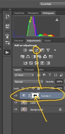
By using a Levels or Curves Adjustment Layer, you can control the brightness of the layer which will control how much of the bokeh is revealed. When using an Adjustment Layer add a Clipping Mask to make sure that the changes only affect the bokeh layer. To clip an Adjustment Layer to the layer blow it, you can press Command/Control+Option+G.

How to Make and Apply a Bokeh Overlay Using Photoshop

Apply a Color Tone to the Image

To finalize the stylized effect, you can color tone your image by using a Selective Color Adjustment Layer.

Under the Colors dropdown menu select Blacks and slide the Cyan slider to the right, and move the Yellow slider to the left to subtract yellow. Doing so will add a blue tint to the shadows, and it will give your image a retro feel.

How to Make and Apply a Bokeh Overlay Using Photoshop

You can watch a video of the whole process below:

Conclusion

Here is the before and after comparison of the image.

Before tutorial

Before

Finished tutorial

After

There it is, a quick and easy way to make and apply your own bokeh overlays. Try it and please share your images in the comments below.

The post How to Make and Apply a Bokeh Overlay Using Photoshop by Jesus Ramirez appeared first on Digital Photography School.
Digital Photography School

 
Comments Off on How to Make and Apply a Bokeh Overlay Using Photoshop

Posted in Photography


Heathen’s Gate: Ingenious Overlay Reveals History of Ancient Roman Ruin

02 Jun

[ By WebUrbanist in Culture & History & Travel. ]

monumental

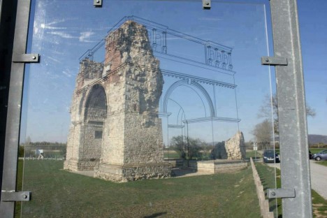
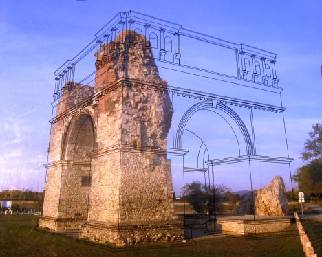
A pane of glass overlaid with a simple line drawing brings crumbling ruins to live at one of Austria’s most famous historical sites, reanimates a ruin near the Open Air Museum Petronell. When a viewer lines up the illustration with the structure, known as Heidentor (Heathen’s Gate), the image completes itself in a compelling yet entirely low-tech fashion.

historical military city

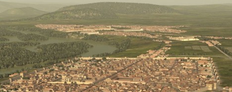
Located just east of Vienna, Carnuntum dates back to the the 1st Century A.D., when Roman soldiers expanded on an existing town 50,000 people to create a military encampment. Between 354 AD and 361 AD a huge triumphal monument was erected next to the camp and city. Contemporary reports suggest that Emperor Constantius II had it built to commemorate his victories.

historical military encampment

“When the remains of Carnuntum disappeared after the Migration Period the monument remained as an isolated building in a natural landscape and led Medieval people to believe it was the tomb of a pagan giant. Hence, they called it Heidentor.”

Preserving ancient historical sites is often a balance between stabilization and restoration; fully restoring can enhance the exterior appearance, but is costly and arguably diminishes the authenticity of a ruin. This approach strikes a balance, much like augmented overlays in digital history apps.

Share on Facebook


[ By WebUrbanist in Culture & History & Travel. ]

[ WebUrbanist | Archives | Galleries | Privacy | TOS ]


WebUrbanist

 
Comments Off on Heathen’s Gate: Ingenious Overlay Reveals History of Ancient Roman Ruin

Posted in Creativity


Datascrapers: Infographic Skylines Overlay Income Inequality on City Grids

06 Nov

[ By WebUrbanist in Art & Drawing & Digital. ]

city-data-blocks

Somewhere between data visualization and civic artwork, these info-driven diagrams reveal wealth disparities in the centers of America’s second and third largest cities. Herwig Scherabon‘s project, titled simply Income Inequality, uses a matrix of blocks (minimicking magnetized iron) to highlight rich and poor neighborhoods.

urban-data-la-chicago

The city grids form a recognizable backdrop for these axonometric representations, allowing viewers to read the baseline built enviroment against the overlaid information. In turn, the millions of stacked pixel blocks end up forming an alternative landscape of skyscraper-like structures in the urban environment.

income-inequality-representations

The net result is a map of the city’s invisible patterns and correlations shaped by power, money and time, revealing inequalities and mechanisms of segregation. Above: Chicago’s infamous low-income South Side (with Lake Michigan for reference). Below: poor areas of Los Angeles located directly next to the downtown core.

cityscape-by-wealth-and-poverty

The final presentation was mounted on a pair of wooden boards with the city names shown on the cites, exhibited at the Glasgow School of Art graduate show. Captions on the side give more details on the diagrams.

city-captions-on-side

From the artist/designer: “The two large prints (150x75cm) are visualizations of income inequality in Los Angeles and Chicago and are currently shortlisted for the Information is Beautiful Awards. They are printed on matte Somerset Velvet paper and mounted on thick wooden boards. The images are abstract diagrams of these cities that show a high resolution matrix of blocks. The height of these blocks corresponds to the income in the respective output area.”

downtown-millions-of-blocks

wall-mounted-artworks

“It is part of the design idea to inspire the viewer to look for their own neighborhood or other areas that interest them. I want to trigger a train of thought for what the reasons behind inequality might be. I am always fascinated by the patterns and correlations in the urban fabric. The politics behind urban planning tell us a lot about the people who live in these places and the powers who shape them. I think that it is utterly important to try to unveil the inequalities and the segregating mechanism that we got used to live with.”

Share on Facebook


[ By WebUrbanist in Art & Drawing & Digital. ]

[ WebUrbanist | Archives | Galleries | Privacy | TOS ]


WebUrbanist

 
Comments Off on Datascrapers: Infographic Skylines Overlay Income Inequality on City Grids

Posted in Creativity


How to Add a Texture Overlay to Your Images for a Stunning Effect

07 Feb

Adding a texture overlay to your images is an amazing creative tool. It adds another dimension of depth in the image; it makes it dreamy and adds a painting flavor. It also creates a timeless feeling, especially useful when you want to give a vintage look to your pictures.

You will really love this effect, it can be used in your personal work, and also sometimes in your commissioned work when you have some creative freedom over the result.

Adding a texture overlay is very easy. In this article I will explain how to create your own textures, then how to edit them to have infinite creative possibilities.

05 texture 100 percent

First – shoot your own textures

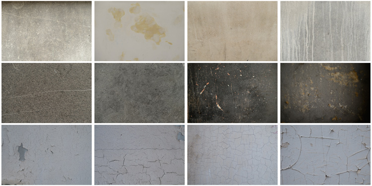
You can find many free textures online, for example on Deviant Art, or on any stock photo website. This is east, and sometimes helpful, although you can have copyright issues. The textures you will find online for free, are not always at high resolution. You will mainly find small files, not always the best to work with. But, I must say that so far I have never had any issues regarding textures size, even when printing my work in large format.

Shooting your own textures can be very fun, and a great creative exercise. Okay sometimes you will feel weird because people will not understand what you are shooting down on the pavement, nor they will see the point in photographing an old and dirty rain gutter. But it is well worth it.

It is very easy to find great textures around you and build you own texture stock. You only have to take a walk with your camera to find textures. Look for some old painting on the walls, wood on the doors, or any bench in the street. You can also find metal objects with great texture and colors. You are looking for whatever has scratches, and can add an organic and natural feeling to your work. You can use stones, such as marble or granite, but also canvas or any other fabric with a nice texture as well.

01 textures

When shooting your texture, pay attention to your exposure compensation, as you want to have a contrasty, image to get more difference between the darks and lights. Also, you want to make sure everything is more or less sharp, so pay attention to your focus, depth of field, and angle from which you are shooting. This way the texture will be more homogeneous on your final image (and as you will see later in this same article you can adjust the texture in many ways).

To help you start your own textures library, you can find a link to download some textures you can use for free at the bottom of this article. I found many good textures for free online, so it is my way to pay forward this kind of generosity I found among photographers.

You can create your own textures at home

In Brussels it is freezing cold and rainy during the winter, so maybe you are the same as me, you do not want to go outside.

03 blue tale 01 no texture

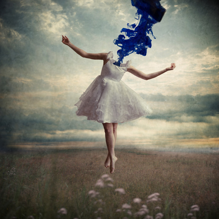
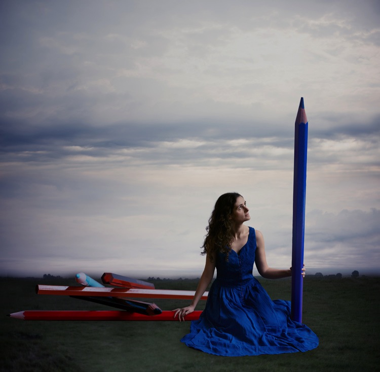
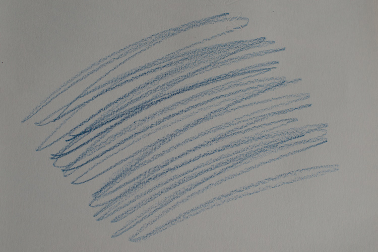
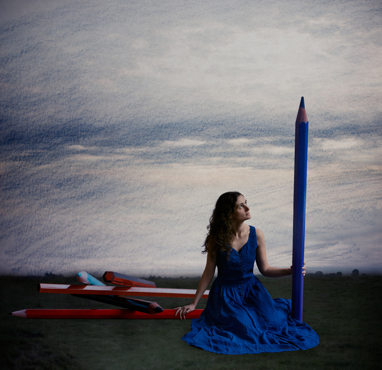
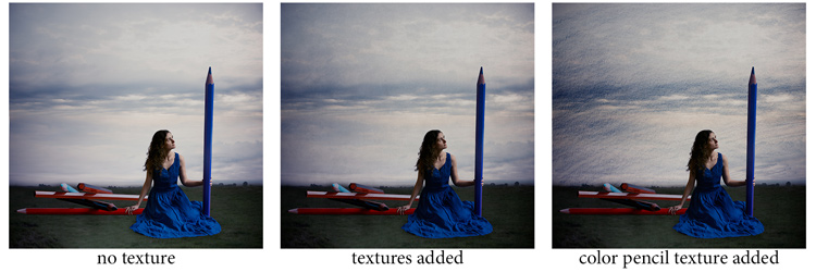
When you look for a specific effect you can make your own specific textures. For example, in the picture A Blue Tale (above) I wanted to play with a pencil color effect. Therefore I created the following texture to be added to the clouds.

I simply colored a piece of paper with a blue pencil crayong to have those lines and a texture effect. In this case, the preparation of the texture is fully part of the creative process, to put all those details together to create the image.

02 color pencil texture

03 blue tale 03 color pencil texture added

03 blue tale textures

You can also play with paper, painting, burn some paper (although I recommend being very careful).

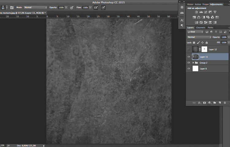
Now that you have your textures ready to be used, let’s open them in Photoshop. You can also use the ones that I shot for you down my street. To add a texture you can simply grab your moving tool and drag and drop it on your picture – or by doing copy/paste on your image.

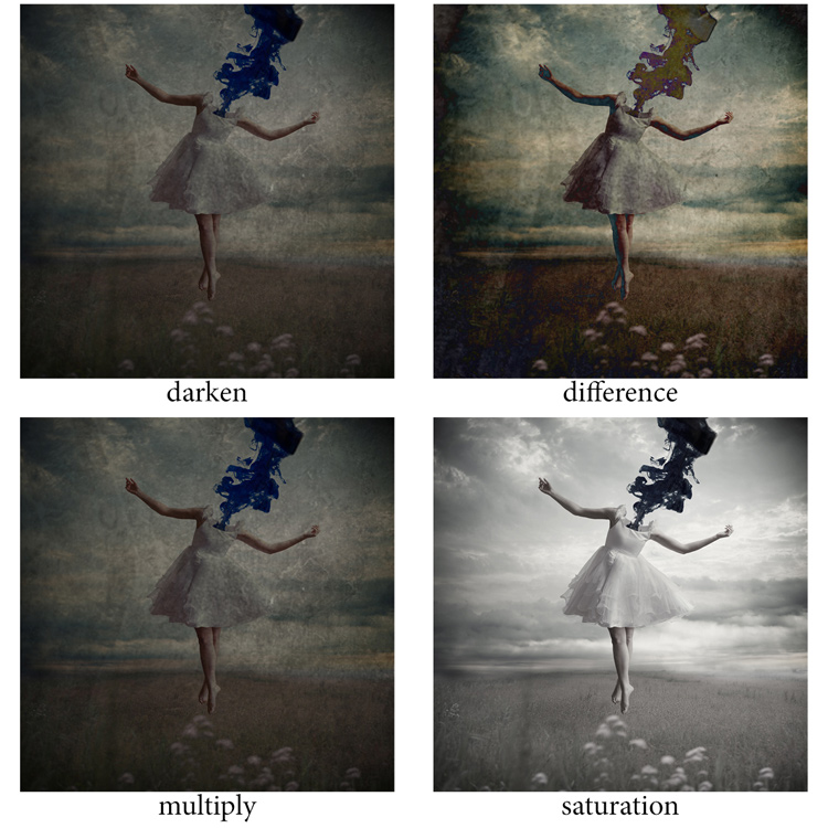
Play with the Blend Modes

You can change the Blend Mode to change the look. When you add a texture to your image it will first look as follows, you see only the image of the texture on top of your image.

04 texture normal 100 percent

Play around with all the options Photoshop offers. Some texture/image combinations it will look weird, and others will look amazing.

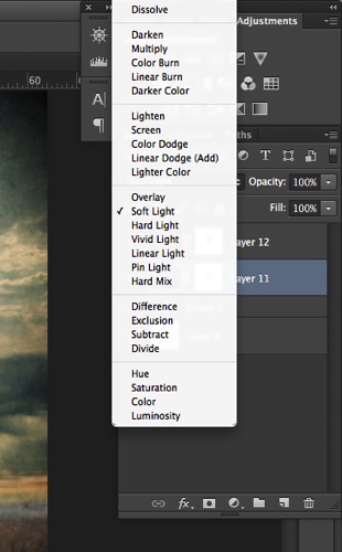
Select your texture and hold down the Shift button, and + or –, to change quickly Blend Modes to go through them one by one, and test on your image. It allows you to see what every single Blend Mode will do to your texture – great way to quickly learn which one you like best.

  • The darkening group will help you to get rid of all light tones.
  • The lightening group will allow you to get rid of your darks.

04 Blend Modes panel

Most of the time, I choose the Soft Light Blend Mode – but you can choose any option, depending on your taste and the sought-after effect.

04 Blend Modes

Modify your texture

Move and resize the texture layer. Grab your Move Tool to place the texture as you wish on the image. Use Cmd/Ctrl+T to activate the Free Transform Tool and resize the texture layer, or flip it, to adjust it to the underlying picture.

You can add a Levels Adjustment with Cmd/Ctrl+L, to add some more detail contrast in your texture. You can also adjust the color. Usually I add the color in my image and prefer a desaturated texture. Hit Cmd/Ctrl+U to play with its color – if you want to desaturate it or change the color tones.

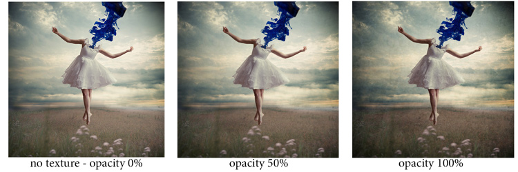
Play with the layer opacity

Turn down the opacity to see what best suits the chosen texture and image, in this case we’ll turn it down to 82%. Once you have found the right opacity you can always go back and change it whenever you want.

05 opacity

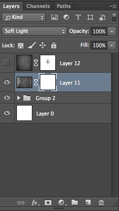
Add a layer mask on the texture layer

Applying texture over the whole image is great to give an artistic feel when the person is far away or it’s applied on a landscape. But, usually you want to avoid strong texture on your main character, especially if it is a close-up portrait, so you will want to soften the texture, or to erase it completely on areas such as the skin and eyes.

06 add layer mask

Add a layer mask on the texture layer and paint in black, playing with your brush opacity, size, and hardness to erase the texture where you want. Paint white your layer mask with a very soft edge brush, and low opacity, to bring back some texture on the subject edges to blend it with the background.

05 texture 100 percent

Add some more textures

You can lower the opacity of your textures and add as many of them as you whish to get the visual affect you want. If you want to see the full edit of this picture you can have a look at my speed editing video below:

I hope you will now want to add texture overlays to some of your work, or at least give it a try. It’s a great technical and creative exercise.

You can start with the free textures I prepared for you (click here to download them), and with some time start to shoot your own. Feel free to share the results or your technique in the comments below.

Editor’s note: if you have questions or issues downloading the textures, please contact Amelie on her site as they are not being hosted here on dPS so we cannot sort that for you. Thank you.

googletag.cmd.push(function() {
tablet_slots.push( googletag.defineSlot( “/1005424/_dPSv4_tab-all-article-bottom_(300×250)”, [300, 250], “pb-ad-78623” ).addService( googletag.pubads() ) ); } );

googletag.cmd.push(function() {
mobile_slots.push( googletag.defineSlot( “/1005424/_dPSv4_mob-all-article-bottom_(300×250)”, [300, 250], “pb-ad-78158” ).addService( googletag.pubads() ) ); } );

The post How to Add a Texture Overlay to Your Images for a Stunning Effect by Amélie Berton appeared first on Digital Photography School.

Digital Photography School

 
Comments Off on How to Add a Texture Overlay to Your Images for a Stunning Effect

Posted in Photography


How to Understand and Use Lightroom’s Loupe Info Overlay

01 Dec

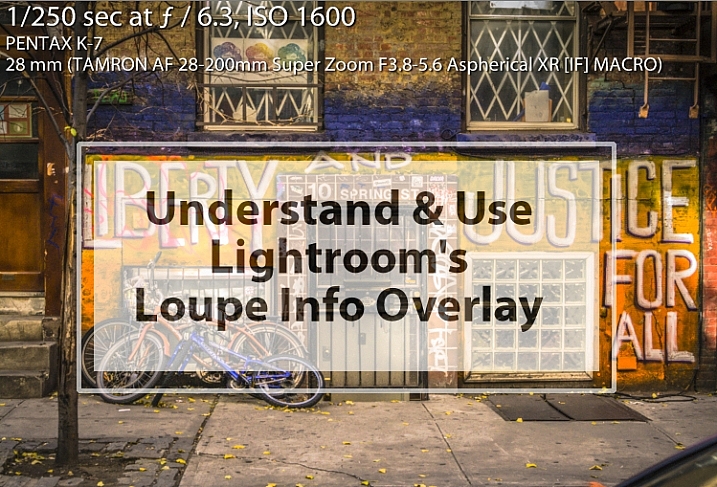
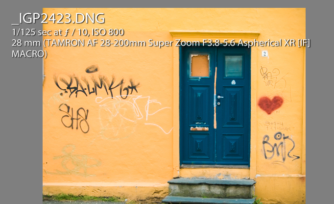
Lightroom Loupe Info Overlay intro image

The Lightroom Loupe Info Overlay feature provides valuable information about your photos. Used intelligently it can help you find your photos, and can even help you improve your photography skills. I’ll explain what it is, how to enable and disable it, how to configure it, and some reasons why the Loupe Info Overlay is such a valuable feature.

What is the Loupe Info Overlay?

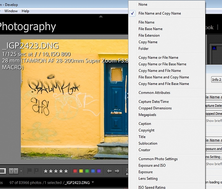
Loupe Info Overlay is a small text overlay which appears in the top left corner of your images in the Develop module inside Lightroom, and when you are viewing images in Loupe view in the Library module. The Loupe Info Overlay confuses many first time Lightroom users when they turn it on, often accidentally, and then struggle to turn it off again.

What Lightroom Loupe info overlay looks like

Turning the Overlay Off and On

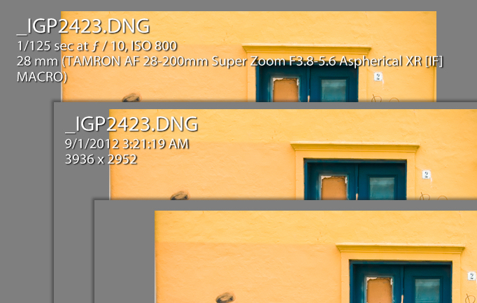
To view the Loupe Info Overlay you must be viewing an image in the Develop module, or in the Library module in Loupe (or single image) view. To display the Loupe Info Overlay, tap the I (i) key on your keyboard. Tap the i key repeatedly (but slowly so you can see what you are doing) to rotate through the three options for the Loupe Info Overlay.

They are: (1) Loupe Info Overlay off; (2) Loupe Info 1; and (3) Loupe Info 2. You will see that there are two different overlays which can be separately configured to show a range of information about your images.

The three states of the Lightroom Loupe Info Overlay

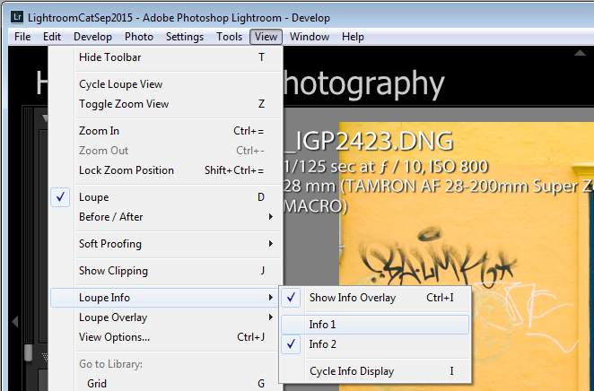
You can also display the Loupe Info Overlay using the Lightroom menus: choose View > Loupe Info and then select Info 1 or Info 2 to display one of the two overlay options. If Show Info Overlay is selected then selecting it again will hide the Loupe Info Overlay.

How to turn the Loupe Info Overlay on and off

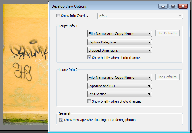
Each Info Overlay is comprised of three lines of information, and you can select only one piece of information from a list of options for each line. The defaults for the Loupe Info Overlays are:

Loupe Info Overlay 1:

  • File Name and Copy Name
  • Capture Date/ Time
  • Crop Dimensions

Loupe Info Overlay 2:

  • File Name and Copy Name
  • Exposure and ISO
  • Lens Setting

Default settings for the Loupe Info Overlay

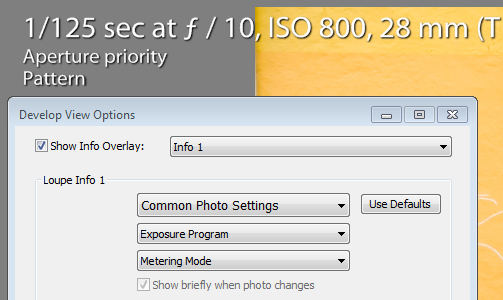
These items can be changed if you select View > View Options, and in the Library Module click the Loupe View tab. Select the Show Info Overlay checkbox and then choose the Info Overlay to show from the dropdown list – it’s a good idea to show the one you are going to change so you can see what it looks like and if the information you are seeing is what you want to see.

To change the information that appears in any of the three lines of the Info Overlay click the appropriate dropdown list – there are three for Loupe Info 1 and three for Loupe Info 2, all in the order they appear on your screen.

Some settings for the lines of information in the Loupe info overlay

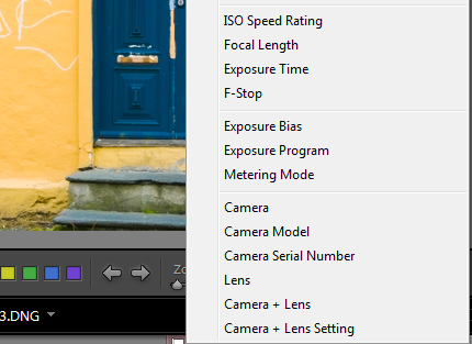
From any of the lists you can select None to turn that line off so nothing displays there, or choose from any of the options on the list. These include a range of file name options, Common Attributes (whether the image is flagged, rated, has a label, or is a virtual copy), the crop dimensions and megapixels.

Also in the list are various items which are extracted from the image metadata such as Copyright, Title, Creator, and Common Photo Settings which include Shutter Speed, Aperture, ISO, the Lens, and the Focal Length. These are also available as individual options so, if you don’t want to see all that detail, you can choose to see Exposure Time, ISO, F-stop, Exposure Bias, Exposure Program, Metering Mode, or Camera + Lens Settings.

More settings for the Loupe info overlay

Of the options available, Common Photo Settings is a good one to use if you want to see a lot of information about each shot.

How the Loupe Info Overlay can make you a better photographer

If you plan to use the information from the Loupe Info Overlay to improve your photography, then consider setting the options for one of the Loupe Info Overlays to include Common Photo Settings, Exposure Program and, for example, Metering Mode. This will give you valuable insight into your camera settings at the time you took each shot.

Suggested settings for loupe info overlay that can help you troubleshoot problem shots

I use the Info Overlay to help photographers who are having issues with their photos. If you set the Loupe Info Overlay to show the camera settings you can determine why, for example, an image is out of focus, too light, or too dark. An out of focus shot may be caused by a shutter speed that is too slow, so that the subject or camera has moved while the shot is being captured. Being able to see the shutter speed will help you determine if it is the reason your photos aren’t sharp.

If you are shooting in manual mode and the shots are too dark (underexposed) it may be that you’re using too fast a shutter speed, too small an aperture, or a combination of both. An overly light (overexposed) image can be caused by too large an aperture, too slow a shutter speed, or both. Displaying aperture, shutter speed and ISO may help you troubleshoot your exposure issues.

Overexposed and underexposed images can also be caused by an incorrect exposure compensation setting. It’s not uncommon for a beginner photographer to set an exposure compensation value without realizing the impact of what they have done. If you set the Loupe Info Overlay to display Exposure Bias you can see if exposure compensation is the cause of incorrect exposure.

The Loupe Info Overlay is a useful tool which can display a wealth of information, some of which can help you troubleshoot problems you are having with your photos.

Now it’s over to you: do you use the Lightroom Info Overlay and, if so, what information do you set it to display and why?

googletag.cmd.push(function() {
tablet_slots.push( googletag.defineSlot( “/1005424/_dPSv4_tab-all-article-bottom_(300×250)”, [300, 250], “pb-ad-78623” ).addService( googletag.pubads() ) ); } );

googletag.cmd.push(function() {
mobile_slots.push( googletag.defineSlot( “/1005424/_dPSv4_mob-all-article-bottom_(300×250)”, [300, 250], “pb-ad-78158” ).addService( googletag.pubads() ) ); } );

The post How to Understand and Use Lightroom’s Loupe Info Overlay by Helen Bradley appeared first on Digital Photography School.


Digital Photography School

 
Comments Off on How to Understand and Use Lightroom’s Loupe Info Overlay

Posted in Photography


Applying a Texture Overlay to Your Images to Create an Antique Look

19 Apr

If you were to look at my computer you would find a folder called textures, and in that folder you would find hundreds of files. I take photos of things everywhere that I think will be good textures. I also make them, and try different things. You can do the same. Any time you see interesting textures in concrete, marble, or maybe cracked paint, take photos of them, add them to your folder for textures.

There are numerous reasons for adding textures to your photos, and one of the best is to give your work an old or antique look. Lots of old photos have marks on them or the emulsion has stained. Photos were often not treated with preservation in mind and they have started to look textured.

In this article we are going to look at how you can apply a texture overlay to your images to give them an aged look.

1-lily-texture-original

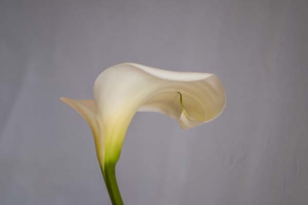
We are going to work on the above image of the lily. It has had basic processing done to it in Adobe Camera Raw before being opened in Photoshop CC (2014).

Cameras and lenses back in the day often didn’t produce super sharp images, so to start off we are going to make a duplicate layer of our image. I do this with the Ctrl+J, keyboard shortcut (Cmd+J on a Mac). There are other ways of doing this, such as; going to the menu at the top and choosing Layer, then clicking on Duplicate Layer, but I find the keyboard shortcut to be the easiest and quickest way.

11-lily-texture-original

10-lily-texture-original

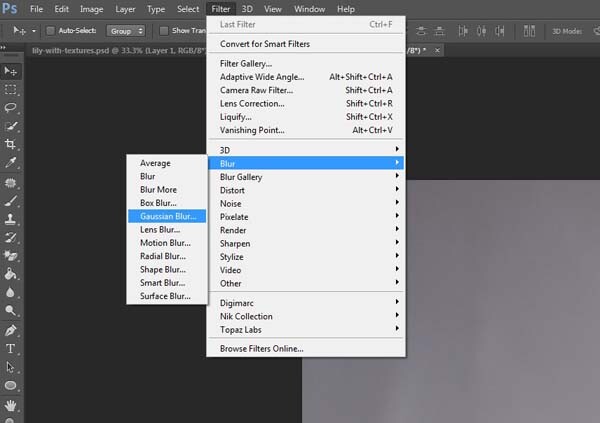
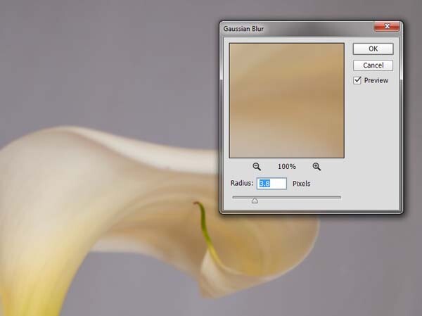
Once you have that duplicate layer then go over to Filters and choose Blur, then Gaussian Blur as in the image above. You don’t want too much blur, or it will look like it is out of focus, and you don’t want too little or it will not be visible or obvious enough. I used 3.8 for the purpose of this image.

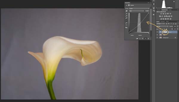
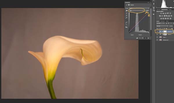
Next, you want to try and separate the flower from the background, you can do this with curves. Open a curves adjustment layer and use it to darken the image overall. Then using the Brush tool (which is located on your tool bar in Photoshop) on the layer mask, remove the adjustment from the flower as follows.

12-lily-texture-original

3-lily-texture-original

Click on the Brush tool, then set your foreground colour to black. It is the one with the two little squares at the bottom of the tool bar – the colour on top is the foreground color, the one on the bottom is the background color. Go to the curves layer you created in your layers panel and click on the white square in that layer (that is the mask), then go to your image and start brushing on the flower. You should see the flower getting lighter.

Add a warmer color to your image

Screen Shot 2015-04-13 at 11.52.55 AMNext you are going to change the colour of the highlights. You don’t have to do this, but it is a nice touch and it helps create a warmer feel to the image.

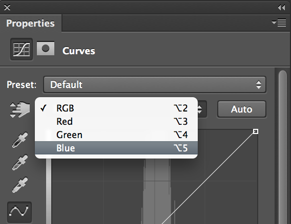
Open another curves adjustment layer. At the top you should see a pull down menu that says RGB, click on that and choose Blue. Go to the curves line and up in the top right corner (the highlights) click on the dot in the corner and pull it down along the side line. Don’t go too far, but you should see the image turning yellow. Remember yellow is the opposite of blue.

4-lily-texture-original

Go back up to the curves window and click on red. You are going to do the same thing, except this time take the dot to the left and across the top. You don’t need to go very far.

Adding the texture overlay

Now it is time to find a texture overlay to put on top of your image. It is always going to be an individual thing and something that you need to work out. Here, I used a texture that I saw on the floor of a building in the city. I liked the cracked look of the floor so I took quite a few photos.

5-lily-texture-original

Open the texture file in Photoshop, then using the move tool (the first one at the top of the tool bar) click on the image and drag it over to the image you want to apply it to. You can copy and paste it as well, or use Place (which will add it as a SmartObject).

If you buy textures, or get free ones off the internet, you will often find they are too small for your image. But don’t worry about it because you are going to be blending it into your image, so it doesn’t really matter.

If you need to change the size of the texture overlay you can do this with the transform tool. You can find the Free Transform tool under the Edit button on the main menu across the top, where you found Layer and Filters. You can also the keyboard shortcut, Ctrl+T (Cmd+T on a Mac).  You will see a little grid go up around the texture so you can drag one of the corners to make it bigger, or smaller, depending on the size you require.  Press enter to apply the transform, or you can double click on it, or click on the move tool and press apply.

Blending the texture into your image

You will need to blend the texture so you can see your image underneath. The layer blend mode options are at the top of the layers panel, it is another drop down menu. The default option is set to Normal, so look for that. There are many options, for this tutorial however, we are going to use Soft Light. Once you change it to that blend mode you should be able to see the texture and the image underneath.

You can also change the opacity of the layer if you like as well. I usually change it slightly so the texture isn’t too strong. You can change the opacity in the window next to the options panel. Just make sure your texture layer is highlighted.

6-lily-texture-original

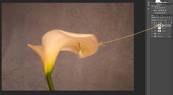
If you go to the bottom of the layers panel you will see a few things across the bottom.  If you click the rectangle one with the round hole in it you will give your layer a mask.  The mask means you can hide some of that layer from your image, like you did with the first curves layer.

Again, get your brush tool, make sure the foreground colour is black and paint over the flower.  You are now making the texture look like it is just on the background.

7-lily-texture-original

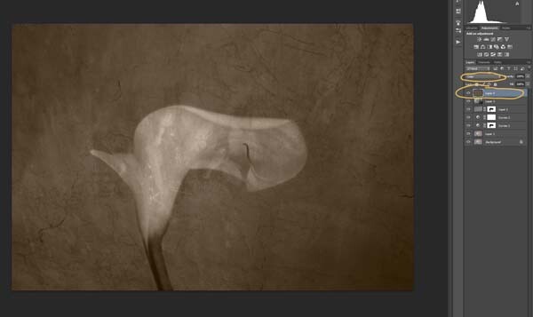
Next we are going to apply a texture to the whole image. This time it is one that will make the image look grungy, and dirty. You can find textures that have marks on them that look like smudges and grease. The one in this tutorial was a polished cement wall outside.

Add the texture to the image the same way you did the previous one. Blend it with the Soft Light Blend mode again. See how you feel about how the image looks, and if you decide it is too strong remember that the opacity can help make it less intense.

Adding a tint to your image

8-lily-texture-original

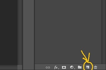
You will need to add a new layer, one that is transparent. At the bottom of the layers panel where you found the layer mask, you should see next to the trash bin a white square with a corner folded over, that is the new layer icon (see below). Click on it.

9-lily-texture-original

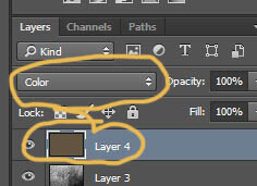
Next go to the tool bar and find the Paint Bucket Tool. Then go to the foreground colour and click on it. A popup window should come up and you can choose a colour to give your image a new tone. I would recommend you choose a grey, for this demonstration a mid tone grey with a hint of orange was chosen.

13-lily-texture-original

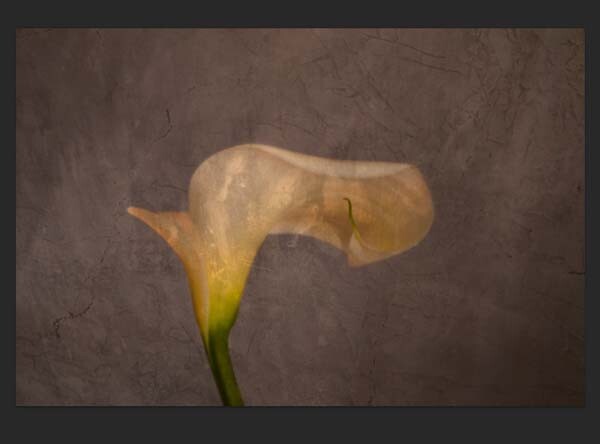
Now go to your image and click on it. The new empty layer should be filled with the colour you chose, and your whole image should look like a solid colour. Go to the blending mode for the new layer and change it to Colour. Your image should be transformed to monochrome. If you change the opacity of that layer then some of the original colour will come through, but that is up to you.

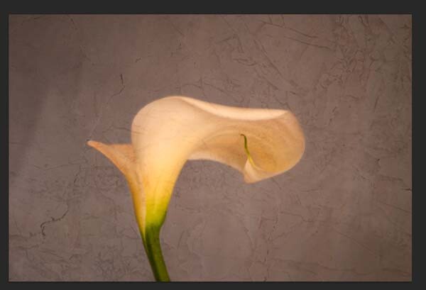
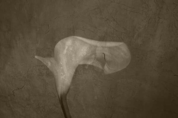
Here is the final image.

lily-with-textures

There are lots of other things you can do, but that might be best left for another tutorial.

If you prefer to watch this demonstrated you can check out the video below as I walk you through the same steps:

Have you tried using textures before? Do you have any favorite textures or sites for finding them? Please share in the comments below.

googletag.cmd.push(function() {
tablet_slots.push( googletag.defineSlot( “/1005424/_dPSv4_tab-all-article-bottom_(300×250)”, [300, 250], “pb-ad-78623” ).addService( googletag.pubads() ) ); } );

googletag.cmd.push(function() {
mobile_slots.push( googletag.defineSlot( “/1005424/_dPSv4_mob-all-article-bottom_(300×250)”, [300, 250], “pb-ad-78158” ).addService( googletag.pubads() ) ); } );

The post Applying a Texture Overlay to Your Images to Create an Antique Look by Leanne Cole appeared first on Digital Photography School.


Digital Photography School

 
Comments Off on Applying a Texture Overlay to Your Images to Create an Antique Look

Posted in Photography


Augmented 3D Printing: Architectural Model Overlay App

21 Jan

[ By WebUrbanist in Conceptual & Futuristic & Technology. ]
augmented 3d reality

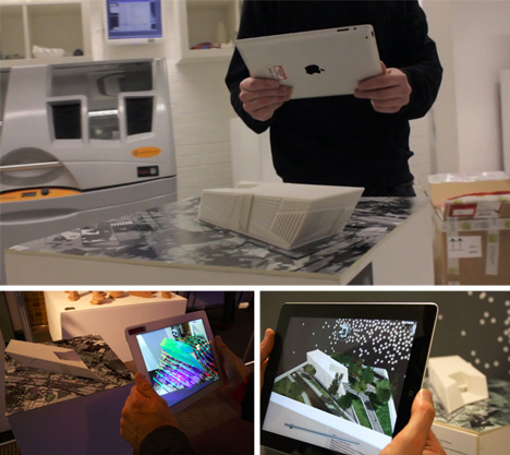
Augmented reality meets architectural modeling in a remarkable best-of-both-worlds hybridization of two essential technologies for architecture designers, builders and (especially) clients. You have to see this video to believe it:

Inition takes a physical (real-world) model, places it on a pattern-mapped background, and presto: point your iPad at the object and all kinds of additional layers of information begin to map themselves onto the object, shifting as you change perspective.

augmented 3d printing architecture

Real-life simulations can thus be applied to the model, including wind and other weather patterns, day versus night views, pedestrians, trees, egress routes and traffic patterns. It helps visualize the kinds of things that are hard to picture purely on the screen, but generally impossible to show in actual space (let alone in context with map underlays and structural reveals).

augmented reality model simulations

From the creators: “The iPad is a fantastic platform for AR, making it easy to deploy and fun to use. Combined with fluid graphics, reliable tracking and the right content, we believe it is a game-changer in this new medium. We create bespoke apps for clients that can be pre-loaded or made available for download on the App Store”

Share on Facebook


[ By WebUrbanist in Conceptual & Futuristic & Technology. ]

[ WebUrbanist | Archives | Galleries | Privacy | TOS ]


WebUrbanist

 
Comments Off on Augmented 3D Printing: Architectural Model Overlay App

Posted in Creativity


LCD Overlay Pack for DSLR Photo/Video

15 Nov

Download your free copy of the LCD Overlay Pack: www.mediafire.com Filmed on the Canon 5D Mark II. Nikkor AIS 80-200 f 4 and 50mm f 1.8. Noise Reduction – Neat Video. Check out our website or follow us on Facebook or Twitter: neumannfilms.com Facebook: www.facebook.com Twitter: twitter.com
Video Rating: 4 / 5

razzi.me www.facebook.com www.PhotographersOnUTube.com https In this video I compare the focal lengths of 35mm 50mm and 85mm lenses to check the distortion in the close up portrait headshot. If you’re doing general portraits then 50mm 1.8 lens would be great as it’s very versatile. 85mm 1.8 is a recommended if you’re doing close up headshots in a studio or outdoors and 35mm is great for general photography. It’s most popular for video and street photography.

 
Comments Off on LCD Overlay Pack for DSLR Photo/Video

Posted in Nikon Videos