The post How to use Monochromatic Color to Convey more Emotion in your Photography appeared first on Digital Photography School. It was authored by Nisha Ramroop.

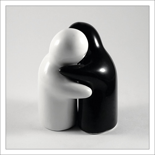
Monochromatic photography is often associated with black and white photography, but it is certainly not limited to just that. As the name implies, monochromatic is about one color. Thus an image that contains tones and variations of a specific color is termed monochromatic.

Why use monochromatic color?
1. Convey Emotion
Both color and the absence of color are viable options to convey emotion. Your choice of which to use depends on the story you are trying to tell. You may prefer black and white imagery for moodier scenes and to convey more intense emotions. Similarly, a single color used throughout your image can enhance or evoke different feelings. For example, red is commonly used to denote passion, love, and even anger, while blues invoke cooler, calmer and more subdued sensibilities.

It is important to note that different tones, tints or shades of a hue/color also change the intended emotion or its intensity, so consider the “feeling” of color. Tints and shades are a result of combining a single color with varying amounts of white (tint) or black (shade).
Sometimes, the use of too many colors simultaneously provokes different feelings and can leave your viewer confused. When faced with such a dilemma, why not try a singular color to see if it achieves a stronger connection?

2. Simplify cluttered scenes
Monochromatic color has the ability to simplify a scene by helping to diminish visual distractions. Again, a familiar thought processes used when processing black and white photography. Absence of color becomes a great way to highlight other compositional elements in the frame, such as texture, shape and form. Thus making monochromatic color another creative choice to explore.
How to achieve monochromatic images?
1. Shoot
In our vibrant world, is it really possible to shoot a monochromatic scene? Interestingly enough, once you start looking for monochromatic color, it presents itself. So yes, it is everywhere around you, especially in urban landscapes, building interiors and even in nature. While the first two examples are more intentional, the latter is also quite common. In nature, look for scenes that embrace tints, shades, and tones of a singular color. Naturally occurring monochromatic scenes have the potential to be strong and interesting images.

If you are just starting out and have not yet grasped working with color harmonies, using the variance of a single color in your frame is a great way to start. The way light interprets and changes a singular color in a scene can be mesmerizing. This calculated option goes a long way in helping you pay closer attention to (and learning about) color.
2. Process
While naturally occurring monochromatic scenes are more realistic, post-processing is often used to achieve this finish. Processing monochromatic images has existed since the days of film and is certainly not a new creative spin. In the earlier eras of photography, both warmer tones (such as sepia) and cooler tones (cyanotype) were due to specific chemicals used while developing the film.

Interesting fact: Sepia processing back then brought more than warmth to a photo. The chemicals involved in that process slowed down the aging of a photograph thereby enhancing its archival quality.
These days, achieving monochromatic color is much easier. The step-by-step process varies depending on the software that you use, but the principles are almost the same. In summary, the easiest way is to tone an image. This loosely translates to converting a color image to black and white/grayscale and then replacing the black with another color (also called tinting).
You can further adjust your contrasts to make your light areas lighter and your dark areas darker for that added punch.

Monochromatic Color evokes a different emotion
Check out this link on several ways to achieve this type of processing in Photoshop and here for doing so in Lightroom.
Conclusion
While black and white is the most obvious type of monochrome photography, monochromatic color is the use of any singular color throughout an image. It lends itself to emotional connections and simplifying your scene. Monochromatic color occurs in the natural world or can be achieved with post-processing. It is often a more minimalist approach that has the potential to create strong images.
Is monochromatic color something that you personally connect with? If yes, share some of your favorites in the comments below.

The post How to use Monochromatic Color to Convey more Emotion in your Photography appeared first on Digital Photography School. It was authored by Nisha Ramroop.


You must be logged in to post a comment.