RSS
 

Posts Tagged ‘Modern’

Composition in Photography: A Complete (and Modern) Guide

16 Mar

The post Composition in Photography: A Complete (and Modern) Guide appeared first on Digital Photography School. It was authored by Ana Mireles.

composition in photography: a complete (and modern) guide

If you’re looking to learn about composition in photography, you’ve come to the right place.

In this article, I’ll cover what composition is, and I’ll explain how to use it to make your images eye-catching and unique.

So whether you’re a beginner photographer learning the basics or a more experienced shooter who wants to improve, read on to find out some of the most effective composition tools, concepts, and guidelines available!

What is composition in photography?

Composition in photography refers to the position of elements inside the frame and how they interact with each other.

Ultimately, composition is about the visual structure of your image.

Why is composition important?

The composition of your photograph impacts the way it’s perceived by others. When you choose what to fit inside the frame and what you leave out, where to position each element and so on, you’re capturing a scene with your unique vision.

That’s why it’s important to carefully compose your photos!

Basic techniques and concepts for composition in photography

We are instinctively attracted to images with a good composition.

Why?

Because we find them harmonious or interesting!

However, we are not as naturally skilled at creating stunning compositions.

That’s why photographers have developed basic compositional guidelines and concepts that can quickly improve photo compositions – without requiring years of experience.

Starting with:

The rule of thirds

You’ve probably heard about the rule of thirds – or at the very least, you’ve seen it. That’s because most cameras, including the one on your smartphone, have a rule of thirds grid overlay.

The rule of thirds grid is formed by four lines – two vertical and two horizontal – placed at an equal distance from each other and the photo edges (so the frame is divided into thirds).

Like this:

rule of thirds

But what actually is the rule of thirds?

It’s a guideline stating that you should position compositional elements along your gridlines – and that the focal point of your composition should sit at one of the gridline intersection points.

You can follow this rule in both portrait and landscape orientation, and it works for all types of photography. For example, if you are doing a full-body portrait, you should often place the subject toward one of the gridlines and not in the center.

And when you’re photographing a landscape, you should put the horizon toward the top or bottom third of the image and never in the middle.

Note that the rule of thirds is a guideline, not a true rule. Once you’ve mastered it, I recommend trying to violate it with other concepts – such as symmetry, or with even more complex techniques such as the golden ratio (discussed below).

Leading lines

Leading lines direct the viewer through the image, like this:

leading lines in photography

When you read a text in English, you automatically start at the top left. Then you continue toward the right until the end of the line.

The same thing happens in photography. When we see an image, we also “read” it. Your eye goes from one element to the next – in order to view details and understand the story that’s being told.

That’s where the leading lines come into play: They guide the eye through the image.

Leading lines can be present or implied, and they can be straight or curved. For example, a leading line can be a curvy road getting lost in the mountains. This will compel viewers to follow the road, pulling them into the image.

Texture

texture of cloth

Texture is often overlooked as an element of the composition. You can use it to create contrast between two elements – one that is smooth and one that is rough, for example.

You can also use texture to create interesting shapes and leading lines, or to add interest to an otherwise dull subject.

To work with textures, you need to consider the type and direction of the light. A hard light that comes from the side will emphasize the texture. A soft light coming from the front flattens the surface.

Color

color wheel

Color is a key consideration for composition in photography. There are so many color harmonies that you have endless possibilities!

You can use complementary colors to create contrast and make your subject stand out. And you can bring together apparently unrelated elements that are united via a color scheme.

A good way to learn and understand color palettes is Adobe Color. You can use this tool even if you don’t have an Adobe subscription.

Simply select a color wheel with different color harmony rules, such as monochromatic, complementary, etc. You can also upload a photograph to extract the color scheme or gradient. And to stay updated, you can browse trends based on Adobe Stock and Behance.

Use color composition in photography

My favorite tool in Adobe Color is Explore, where you can input a concept or a mood and see the colors that represent it (with multiple examples from the visual arts).

Shape

use shapes to compose your photography

As photographers, we’re used to thinking of ways to add depth to a two-dimensional surface.

Because of that, it’s easy to overlook the importance of shapes. Yet when you’re composing your images, you can use shapes to establish a careful arrangement.

Think of a cake being photographed from the top; that’s a circle. If you cut out a slice, then you’re adding a triangle to the composition.

Every shape gives a different feel to our photographs. For example, squares convey stability, while circles make you think of movement and energy.

That’s why posing a group for a corporate portrait usually means forming squares or rectangles, whereas family portraits are often posed in triangles or dynamic shapes.

A good way to practice shape-based composition is by using shadows or shooting silhouettes. That way, you take out any three-dimensionality and focus only on the shape of objects.

Symmetry

Symmetry is defined as something that is exactly the same on both sides, such as a mountain peak or a tree trunk.

And it can work great in art – as long as you use it carefully.

Note that, in art, a scene is rarely 100 percent symmetrical. Instead, you’ll end up with scenes that are almost symmetrical and are well-balanced on both sides.

Like this lake photo:

symmetrical composition in photography

The trees and water aren’t perfectly symmetrical, but they’re close, and the overall scene has a feeling of balance.

Take a portrait as another example. If you photograph a face perfectly centered in the frame, your image will be symmetric. It won’t matter if the subject has a birthmark on one of their cheeks, or that one of their eyes is slightly lower than the other – the symmetry will dominate.

One of the reasons we find symmetry so appealing is because we often find it in nature. And psychologically speaking, symmetry offers a sense of order that makes us feel at ease.

(A great way to play with symmetry in your photography is by shooting reflections or patterns!)

Contrast

fire burning contrast

Another important concept that can enhance your composition is contrast.

Since we are talking about photography, the first thing that comes to mind is contrasting light, such as low key photography. Here, you capture a very dark image where only a small detail is highlighted (which makes for a highly dramatic result).

However, tonal contrast is not the only type of contrast you can use to improve your compositions. You can also use color contrast (as discussed earlier), juxtaposition, and conceptual contrast (which pairs opposite ideas or aesthetics).

Advanced composition in photography

Once you’ve mastered the basics of composition, it’s time to challenge yourself and move on to more advanced techniques.

Here are some of the most popular tools to consider:

The rule of space

The rule of space tells you to leave space in front of the subject, especially if it’s a moving subject. The idea is that the viewer needs enough room to imagine the subject carrying on the action that it’s performing.

For example, if a duck is paddling away, you would put significant space in front, like this:

rule of space

And according to the rule of space, if you photograph a person who’s running to the right, you should place them on the left side of the frame (and vice versa).

rule of space person walking with a cart

But remember that there’s an exception to every rule, especially when it comes to composition. So if you want to add tension or intrigue the viewer, try violating the rule of space!

The complicated thing about composition is that you must choose to apply or break the rules depending on the message you want your image to convey.

The rule of odds

rule of odds

The rule of odds is based on the principle that people find it more interesting to see odd numbers. While even numbers show stability and work well for symmetric compositions, odd numbers allow the eye to flow through the image.

So according to the rule of odds, you should include odd numbers of items in your compositions.

I recommend you use this rule when it fits the situation, much like you would with shapes. If you want a dynamic composition, you use triangles, diagonal lines, and odd numbers. And if you prefer stability, you can choose straight lines, squares, and even numbers.

In any case, the important thing is to use the rules to your advantage and take control of your compositions.

When you’re shooting food or products, it’s often easier to follow the rule of odds.

But following the rule of odds isn’t as easy when you’re photographing a family of four; you can’t just decide to exclude one of them!

(Though when you’re facing this situation, you can arrange the group so the viewer sees one plus three instead of four.)

Triangular composition

In the first part of the article, I talked about using shapes to compose your images.

But did you know that the most popular shape in composition is the triangle?

You can create triangles with poses in portraits, mountains in a landscape, or a church tower on your travels.

However, if you want to up your game a bit more, you can use golden triangles. This composition technique divides the frame first with a line that connects one corner with the opposite one, then adds two smaller lines coming out from each of the remaining corners.

Like this:

triangular composition in photography

Ideally, you would place the most important elements of the composition where the lines intersect. To achieve this, you may have to tilt your camera; this is called a Dutch angle (aka the Dutch tilt, German tilt, or Batman angle).

That’s why it’s not always possible to use the golden triangle guideline (or, at least, it’s not always the best choice!).

The golden ratio

The golden ratio is a mathematical term that was later applied to art and eventually photography. It equates to 1.618, and there are two ways it can be applied to photographic composition:

As a grid or as a spiral.

The golden grid (aka the Phi Grid)

The Phi Grid divides the frame into nine blocks, just like the rules of thirds.

However, this grid doesn’t follow a 1:1:1 ratio – which means the blocks are not the same size. Instead, the grid is 1:0.618:1, so you get smaller blocks toward the center, like this:

Phi grid photography

This composition tends to be more natural, as the golden ratio is also found in nature. It also has a better reputation than the rule of thirds, which many consider to be amateurish – a first step that should be quickly outgrown for more complex techniques.

The golden spiral (aka the Fibonacci spiral)

For this composition tool, you should follow a spiral whose growth factor is the golden ratio.

It looks like this (though note that it can begin at any corner of the frame):

golden spiral composition in photography

This spiral is found in natural structures such as sunflowers, pine cones, seashells, etc. You can also find it in many artworks and buildings because many artists have used it throughout the centuries.

To train your eye, you can print or draw a golden spiral, then use it to study the photographs from Irving Penn or Henri Cartier-Bresson, who both used the golden spiral to achieve astonishing results.

composition in photography tulip center

Composition in photography: conclusion

Now that you know most of the popular composition tools, you can use them to dramatically improve your images!

I know it’s a lot of information, but composition in photography will become more intuitive as you get more practice.

My suggestion is to keep it simple at first and practice the tools one by one.

Once you get comfortable with each composition guideline, you can combine them to achieve a more complex result.

And remember:

These are just guidelines you can use as you see fit to find your own artistic vision.

Now over to you:

Which of these composition techniques is your favorite? Which do you plan to use in the future? Share your thoughts in the comments below!

Composition in photography FAQs

How do I emphasize my subject?

To emphasize an element in your photograph, you need to draw the viewer’s attention to it. You can use composition techniques, such as leading lines, to achieve this.

Is the rule of thirds the most important composition rule in photography?

No, the rules of composition don’t have a hierarchy. Instead, rules work better in different situations, and the best technique for one photograph can be wrong for the next one.

Can I improve my composition by photographing with a smartphone?

Yes, these rules apply to all types of photography, including mobile and video. If you want some help getting started, most camera phones have a grid overlay that follows the rule of thirds. You can enable/disable it in the settings section. Alternatively, you can install a camera app that supports different types of grids (such as A Better Camera).

How can I improve my composition in Lightroom?

You can use Lightroom’s overlays to improve the compositions of your photos. To use these, select the Crop tool from the Develop panel. Make sure that the Overlay is enabled. Then press the “O” key to toggle between all the available overlays.

Can I break the rules of composition?

Absolutely! Even though some of them are called rules, they are only guidelines, tools, and techniques to help you achieve better results. There’s always flexibility to experiment. It’s important to know the rules before you break them, though!

The post Composition in Photography: A Complete (and Modern) Guide appeared first on Digital Photography School. It was authored by Ana Mireles.


Digital Photography School

 
Comments Off on Composition in Photography: A Complete (and Modern) Guide

Posted in Photography


Fujifilm X100V vs. X100F lens shootout: A worthy update to a modern classic

07 Apr

When we reviewed the original Fujifilm ‘Finepix’ X100 back in 2010, we noted that the lens offered excellent sharpness within a normal shooting range, but with noticeable haziness and loss of contrast within a meter or so, and substantial veiling softness in the near-macro range. The ‘soft focus’ effect wasn’t always objectionable, but it was impossible to ignore in close-range portraits, especially of pets and small children, where the temptation is always to position them closer to the camera.

As the resolution of cameras in the X100 series increased (from 12, to 16, to 24MP) these issues in the close focus range became ever more apparent. That 23mm F2 lens, with its 8 elements (including one aspherical) in 6 groups, gave sterling service for several generations, but by the time the X100F came around it was clear that optically, it had hit a limit.

Our testing shows that overall, the new lens in the X100V is much improved over the original design

During the planning process for the X100V, Fujifilm’s optical engineers went back to the drawing board. It might look the same to a casual glance, and it might still accept the same wide and tele converters, but on the inside, the X100V’s has been totally redesigned. Probably the most important change is the addition of a second aspherical element, which Fujifilm claims increases corner sharpness, and greatly improves image quality at close focusing distances at wide apertures. In short, it should address those areas in which the older lens was notably weak.
Our testing shows that overall, the new lens in the X100V is much improved over the original design found in previous X100-series cameras. Read on for our full analysis, which compares the X100V against the X100F at four focus positions: Infinity, ‘Medium’ (~1m) ‘Close’ (~0.5m) and ‘Macro’.

A note on all of the images in this article: Images are JPEGs, converted from Raw in Adobe Camera Raw, with sharpening turned to ‘0’, and an Unsharp Mask (amount: 200, radius: 0,6, threshold: 0) added in Photoshop. Raw files are available for download via the links in most of the widgets below.


Infinity

$ (document).ready(function() { ImageComparisonWidget({“containerId”:”reviewImageComparisonWidget-1762411″,”widgetId”:754,”initialStateId”:null}) })

At infinity, it’s clear that both cameras are capable of delivering very good central sharpness$ (document).ready(function() { $ (“#icl-5055–1786495829”).click(function() { ImageComparisonWidgetLink(5055); }); }), but the X100V is more consistent across the frame$ (document).ready(function() { $ (“#icl-5065–430078908”).click(function() { ImageComparisonWidgetLink(5065); }); }).

And that’s really the story across the two lens’ entire aperture range: The X100V’s lens is not substantially sharper than that of the X100V in the center, but it’s very clear that sharpness and contrast at the extreme edges of the frame$ (document).ready(function() { $ (“#icl-5052-1720704258”).click(function() { ImageComparisonWidgetLink(5052); }); }) is improved compared to the X100F. Even at F5.6$ (document).ready(function() { $ (“#icl-5053–1644791573”).click(function() { ImageComparisonWidgetLink(5053); }); }) and F8$ (document).ready(function() { $ (“#icl-5054–257385516”).click(function() { ImageComparisonWidgetLink(5054); }); }), the X100V has a slight advantage when it comes to definition at the extremes.

It should be noted that focus position has a major part to play in how images from the X100F look, especially at at the widest apertures, at the edges of the frame. This is most likely due to curvature of field. For this comparison, I focused on the green bush$ (document).ready(function() { $ (“#icl-5051–1618134941”).click(function() { ImageComparisonWidgetLink(5051); }); }) roughly in the middle of the scene, and selected the sharpest of three shots, at all apertures, on both cameras.

Verdict:

The X100V’s new lens delivers comparable peak sharpness to that of the X100F, but superior sharpness and contrast towards the edges of the frame. Even at F5.6 and F8 the new lens out-resolves the old design across most of the frame, making the X100V more useful than the X100F for landscapes and cityscapes. For optimal cross-frame sharpness at wide apertures though, both cameras (but especially the X100F) reward some experimentation with exact focus position.


Medium focus (~1m)

The medium focus range is where you’d typically take portraits on a 35mm equivalent lens. We shot this scene at a distance of roughly one meter (39.4″), and my cold war-era globe is about 28cm (11″) in diameter. While ideally we’d be showing you a portrait here (currently impossible due to the quarantine measures) we hope that this scene should serve as a reasonable proxy. The film boxes on the left, and the Nikon S2 on the right are positioned on approximately the same plane as the nearest point of the globe. Focus and framing was set using the yellow tape target in the center of the image.

$ (document).ready(function() { ImageComparisonWidget({“containerId”:”reviewImageComparisonWidget-50835486″,”widgetId”:753,”initialStateId”:5037}) })

Images from this scene are a little hard to interpret, and require some explanation. Depending on where you look, the X100V might appear either sharper, or softer than the X100F. In some areas it actually looks like the zone of focus is shallower on the X100V$ (document).ready(function() { $ (“#icl-5041–1637164982”).click(function() { ImageComparisonWidgetLink(5041); }); }), almost as if its F2 lens is slightly faster than the F2 lens on the older X100F (which we’ve measured, and it isn’t). Something that is consistent, though, is the higher contrast of images from the X100V.

After analyzing the Raw files, we suspect that the X100V’s new lens has been tuned to deliver a different fall-off from in-focus to out-of-focus areas, which has the effect of giving smoother out of focus areas. You can see this here$ (document).ready(function() { $ (“#icl-5038-1407338552”).click(function() { ImageComparisonWidgetLink(5038); }); }) at F2 and here$ (document).ready(function() { $ (“#icl-5040-1407338552”).click(function() { ImageComparisonWidgetLink(5040); }); }) at F2.8. This may explain the (small) apparent decrease in the zone of sharpness$ (document).ready(function() { $ (“#icl-5041-1015591318”).click(function() { ImageComparisonWidgetLink(5041); }); }) compared to the X100F at equivalent wide apertures.

In terms of central detail wide open, the two cameras are hard to tell apart$ (document).ready(function() { $ (“#icl-5042-1848188631”).click(function() { ImageComparisonWidgetLink(5042); }); }).

Verdict:

At a medium focus distance of the sort you might be working at for a typical portrait, the X100V’s lens is a close match to the X100F in terms of resolution at equivalent apertures, but offers higher contrast and slightly smoother out of focus areas. This results in the impression of fractionally less depth of field from the newer lens. In practical use, the biggest challenge to successful wide-aperture portraits on both cameras is focus accuracy.


Close focus (~0.5m)

For this scene, we shot a collection of film boxes from ~0.5m (~20″), shooting downwards using a copy stand. This is the kind of shooting distance from which you might take moderate closeups (food photographs etc.,) or portraits of a pet or young child. A bubble level was placed on the rear LCD to ensure that the cameras were perfectly perpendicular to the arrangement of boxes. There is some difference in the relative ‘height’ of the film boxes, but it’s within 2-3mm (<1/8″).

$ (document).ready(function() { ImageComparisonWidget({“containerId”:”reviewImageComparisonWidget-36125782″,”widgetId”:752,”initialStateId”:null}) })

While central resolution is similar at F2$ (document).ready(function() { $ (“#icl-5045-356385092”).click(function() { ImageComparisonWidgetLink(5045); }); }), the X100V’s lens has a slight edge, if only by virtue of its higher contrast. The difference in detail definition at the edges of the frame is obvious, with the X100V clearly delivering more usable images$ (document).ready(function() { $ (“#icl-5046–297568247”).click(function() { ImageComparisonWidgetLink(5046); }); }), thanks to a relative lack of the X100F’s characteristic haziness.

It is clear that at this focus distance, the X100V’s lens delivers images with significantly higher contrast than those of the X100F, across the entire frame. By F5.6 and beyond, there is little difference between the two lenses in terms of either resolution or contrast in the center$ (document).ready(function() { $ (“#icl-5049-24928001”).click(function() { ImageComparisonWidgetLink(5049); }); }), but the X100V maintains its advantage at the edges$ (document).ready(function() { $ (“#icl-5048–1113632447”).click(function() { ImageComparisonWidgetLink(5048); }); }).

Verdict:

Again, the higher contrast and better edge-to-edge consistency of the X100V’s files makes them more attractive than equivalent images shot on the X100F. While neither camera delivers bitingly sharp images when shot wide open, files from the X100V are more consistent, with little of the ‘haze’ at wide apertures which is characteristic of the original 23mm F2 found in the X100F.


Minimum focus

The X100V and X100F offer an impressively close minimum focus distance of 10cm (~4″). With a 35mm equivalent focal length, that works out to a maximum reproduction ratio of roughly 1:4. Not great, (and a long way off ‘true’ macro) but respectable. This is the kind of distance from which you might shoot a collectible item, a flower or – yes, again – your food. At absolute minimum focus, both cameras become fiendishly difficult to focus accurately, so for this setup, I backed off to around 15cm (6″).

Please note that for the purposes of easy comparison against the X100F in the slider below, the 26MP images from the X100V have been downsampled to 24MP and both examples are shown at ~50%. You can download original files from the links below.

F2

The haziness of the X100F’s lens that is visible at wide apertures at 0.5m (~20″) becomes progressively more severe as you approach minimum focus. Wide open at this focus distance, the X100F’s lens is capable of resolving a fair amount of detail in the middle of the frame, but with such strong haze that images are essentially unusable, except for creative effect.

By comparison, images from the X100V demonstrate slightly less resolution but much greater contrast, minus the haze, and with better consistency across the frame. Despite the lack of critical sharpness really anywhere, images from the X100V are more usable simply by virtue of the lack of haziness compared to the X100F. This holds true through to around F5.6 (essentially duplicating the results of the 0.5m test, above).

Verdict:

Ultimately, we wouldn’t recommend either camera for extreme closeup photography, (neither is really ‘sharp’ anywhere until F4-5.6) but for practical purposes, despite its slightly lower peak resolution, the new lens in the X100V is clearly more capable. There’s little of the haziness which X100-series users have come to expect, which makes images much more usable for everything barring critical applications.

Download originals:

  • X100V @F2
  • X100F @ F2
  • X100V @ F5.6
  • X100F @ F.6

Summing up: is the new lens in the X100V really improved?

On balance, yes. Definitely.

At infinity, the X100V’s lens is not appreciably sharper than that of the X100F at optimal apertures in the center of the frame (which was never a weak point of the older model), but it’s noticeably more consistent edge-to-edge, being sharper and more contrasty at the extremes of the frame at all apertures.

The differences between the two lenses that are visible at infinity become even more apparent at closer focusing distances. If you’re a fan of relatively close-range portraits you can expect higher contrast from the X100V at wide apertures, and somewhat smoother bokeh, too. Meanwhile for copy work (or for taking pictures of your dinner) the superior edge definition from the X100V’s lens at all apertures might make the difference between a shot that you can actually use, versus one that you can’t.

If you’re a fan of relatively close-range portraits you can expect higher contrast from the X100V at wide apertures

In the truly closeup range, neither camera is at its best, but despite delivering slightly lower resolution, the X100V wins again by virtue of the higher contrast and near-total lack of ‘haziness’ compared to the older X100F. This difference is especially noticeable wide open, but holds true until around F5.6.

For those X100F owners considering an upgrade that want to use their WCL and TCL converters on the X100V, our shooting on the wide converter suggests that you can expect better performance than you’re used to, especially towards the edges of the frame. You can see the difference that the new lens makes to image quality at 28mm equiv., in the slider below (which shows a 100% crop from the upper right of the ‘Infinity’ scene, above) and you can see the full thing in a dedicated widget here.

28mm WCL converter (upper right detail)

We don’t have access to a TCL tele converter to check, but given the improvements in image quality in the close focusing range of the X100V’s lens, we would not be surprised if it gives similarly superior results on the newer camera, especially for portraiture. If you have one, and you’ve tried it on the X100V, leave a comment and let us know how it performs.

Articles: Digital Photography Review (dpreview.com)

 
Comments Off on Fujifilm X100V vs. X100F lens shootout: A worthy update to a modern classic

Posted in Uncategorized


Modern marvel: Canon RF 70-200mm F2.8L IS USM sample gallery

22 Nov

$ (document).ready(function() { SampleGalleryV2({“containerId”:”embeddedSampleGallery_8685700048″,”galleryId”:”8685700048″,”isEmbeddedWidget”:true,”selectedImageIndex”:0,”isMobile”:false}) });

We’ve been eager to test out Canon’s impressively compact RF 70-200mm F2.8 ever since the company first made it known, and the day has finally come. Its capabilities combined with its small size make it nothing short of a modern marvel – see for yourself.

See our Canon RF 70-200mm F2.8
sample gallery

Articles: Digital Photography Review (dpreview.com)

 
Comments Off on Modern marvel: Canon RF 70-200mm F2.8L IS USM sample gallery

Posted in Uncategorized


How to Use Lighting and Gels for Modern Portrait Photography [video]

12 Oct

The post How to Use Lighting and Gels for Modern Portrait Photography appeared first on Digital Photography School. It was authored by Caz Nowaczyk.

In this video from Lindsay Adler Photography, Lindsay deconstructs an image that she has lit using colored gels to make it look as though she photographed it in a nightclub or bar.

?

Inspired by a red velvet couch that she has in her studio, Lindsay decided to make her studio look like it was a nightclub or bar. She takes us through the process to teach us exactly how she achieved this look.

When choosing the color of her gels, Lindsay chose red to unify the subject with the color of the couch. She then used color wheel theory and used contrasting/complementary colors, so she went with a color close to green – teal.

Lindsay uses three strobes with fairly basic modifiers – bare bulbs and umbrellas.

Lindsay states that “The shot as lit overhead by a small white umbrella (no gel). The right-hand side of the frame was lit by a large deep umbrella with diffusion and a red gel to wrap around most of the frame. Finally, a bare bulb with a teal/green gel was used to light the shadows on the left of the frame. The colors selected helped create a sense of atmosphere to the otherwise static black environment.”

During the video, you’ll find out why these choices were made to combat particular issues that arose, including the wall being a slightly reflective surface.

You’ll also see some post-production choices that Lindsay makes with the image, as well as discovering why Lindsay chose to have the model posed in this particular way.

But more importantly, you’ll learn how to make a photo like hers!

What did you think of Lindsay’s video? Did you find it helpful? Let me know in the comments!


You may also find the following helpful:

Your Guide to Studio Lighting Equipment

Understanding Broad and Short Lighting in Photography

5 Creative Portrait Lighting Tricks Using Only Phone Light

How to use Off-Camera Flash to Create Dramatic Images with Cross Lighting

5 Lighting Setups You Can Do Using an Octabox

How to do Clamshell Lighting: A Reliable Two Light Setup

The post How to Use Lighting and Gels for Modern Portrait Photography appeared first on Digital Photography School. It was authored by Caz Nowaczyk.


Digital Photography School

 
Comments Off on How to Use Lighting and Gels for Modern Portrait Photography [video]

Posted in Photography


Three Legged Thing launches ‘Ellie,’ a versatile L-bracket for modern camera systems

14 Feb

Tripod manufacturer Three Legged Thing has developed a new L-bracket that’s designed to be adaptable to fit a wider range of cameras, and which will allow users to mount their camera in a variety of ways. Called Ellie, the bracket features sliding bars that allow size adjustment, dual Arca-Swiss mounting platforms and additional threads for attaching accessories such as microphones.

Ellie is made from ‘aerospace grade magnesium alloy’ and uses a pair of stainless steel sliding bars that allow users to tailor the length of the baseplate to suit the size of the camera. Two screw threads on the base offer a choice of mounting positions, while an opening in the construction provides space and access when L-shaped cables need to be connected to ports on the camera body.

As the position of these cable ports varies from one model to the next the bracket allows four mounting configurations to ensure the cut away section will correspond with ports in as many cameras as possible.

The bracket can be dissembled so the base doubles as a quick release plate, and both ends of the vertical standard feature two screw threads that will accept macro arms, flash attachments or audio equipment.

Ellie will be available in anodised copper or metallic slate grey color options in mid-March and will cost £64.99 / $ 69.99.

For more information see the Three Legged Thing website.

  • Horizontal Aspect Length: 95 mm – 128 mm / 3.74 “ – 5.04 “
  • Horizontal Aspect Width: 38 mm / 1.5 “
  • Vertical Aspect Height: 85 mm / 3.35 “
  • Vertical Aspect Width: 38 mm / 1.5 “
  • Weight: 96 g / 0.21 lb
  • Compatibility – Standard Arca-Swiss

Press release

3 Legged Thing Introduces Next Evolution of Universal L-Brackets

The award-winning British tripod maker announces a new Universal L-Bracket with increased compatibility with a wider range of cameras, and advanced functionality.

3 Legged Thing has announced a new evolution of universal L-Bracket. Following on from the huge success of the world’s best-selling L-Bracket 3 Legged Thing’s QR11-L, Ellie brings another dimension of compatibility with a wide range of mirrorless and DSLR cameras, and an unprecedented level of innovation.

L-Brackets are primarily used to switch from landscape to portrait on a tripod, whilst maintaining the focal plane and horizon. They are particularly popular with landscape, architecture, and studio photographers, yet used by photographers across all genres.

3LT Founder & CEO Danny Lenihan commented: “Ellie is the culmination of a year’s development and testing, and is built on the foundations of QR11 and hundreds of comments and emails from customers since the QR11 launched in 2017. It’s been a fantastic challenge for myself and the team, with more than a few hiccups in the process, but I’m delighted to be introducing what we believe is a new chapter in L-Bracket innovation.”

Compatible with standard Arca-Swiss clamps, Ellie’s design features 2 different screw mount slots in the base, allowing users to position the L-Bracket in the optimal position for their camera. The length of the bracket base can be adjusted thanks to two rigid stainless steel sliding bars which are then fixed into position by the user. The rear edge of the base is sloped to better enable screen access.

Ellie’s vertical aspect has an opening in one side, allowing users with L-shaped cable pins to connect accessories to their cameras more easily. Thanks to the dual Arca-Swiss profile and identical mount-ends,this opening can be placed in one of four positions, by inverting or reversing the vertical aspect, which is secured to the base via two adjustable stainless steel rods. A handy mini tool with two sizes of Allen key to adjust the sliding bars, and the vertical aspect, is also supplied with Ellie.

Both ends of the vertical aspect house two 1/4”-20 threads, allowing users to attach accessories, including microphones or mounting arms, to the bracket. The base of the bracket also features a strap attachment slot. Ellie’s base plate is beautifully contoured so that it can also be used separately as a quick release plate without the upright.

Adding a different type of functionality, Ellie’s vertical aspect can also be mounted downwards from the plate, effectively creating a rocker head when used with the tripod head adjusted into the 90 degree position.

Made from aerospace grade magnesium alloy, Ellie will be available in two anodized finishes – Copper(orange) and Metallic Slate Grey. The product is available to pre-order today from 3 Legged Thing’s website, and from local camera stores, with a suggested retail price of £64.99 / $ 69.99. Ellie will be released in mid March 2019. Visitors to The Photography Show 16-19th March at the NEC, Birmingham, UK will be able to see Ellie there on 3 Legged Thing’s stand #E71.

Articles: Digital Photography Review (dpreview.com)

 
Comments Off on Three Legged Thing launches ‘Ellie,’ a versatile L-bracket for modern camera systems

Posted in Uncategorized


Cocktails with Don Draper, Dinner and Drinks at Oakland’s New Mid-Century Modern, Bardo Lounge and Supper Club

03 Dec

Bardo Lounge and Supper Club, Oakland, California

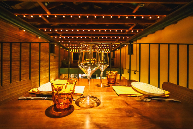
If, like me, you are a fan of all things mid-century modern, then you won’t want to miss Oakland’s newest Lakeshore addition, Bardo Lounge and Supper Club. Like a vintage trip with Don Draper back in time, you’ll enjoy all the little touches that make for a perfect night out for some excellent cocktails along with lounge or supper service to go with them.

With Bardo, owners Seth and Jenni Bregman have transformed the former Michel Bistro space on Lakeshore into a sort of museum of great taste and design from our favorite wayback era — with some seriously good tunes spinning all night long.

Along with the lush 60s feel, Bardo serves up swingin’ cocktails with lounge service downstairs (no reservations required) and supper service upstairs (reservations required). The downstairs lounge features a lounge and bar where you can order “lounge fare” and some of the items off of the larger tasting menu from supper service upstairs.

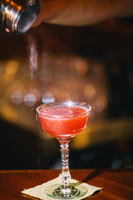
Last night Mrs. TH and I tried the lounge service at the bar. In terms of the booze, I opted for the “Walk in the Orchard” cocktail, a well balanced craft cocktail with High West Double Rye, Cynar 70, Apple Cider, Fresh Lime Juice, White Pepper Thyme Maple and Angostura Bitters. Mrs. TH chose the equally delicious “Pilot Maxine,” Blackberry-Washed Gordon’s Gin, Top Hat East India Tonic, Fresh Lime Juice and Fee Brother’s Rhubarb Bitters.

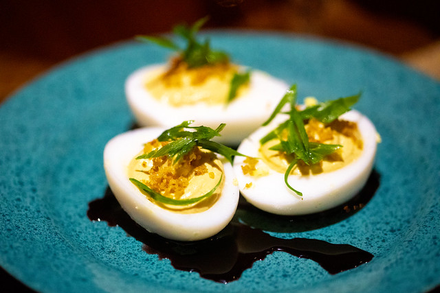
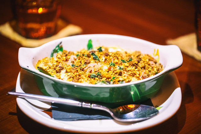
From the menu I’d highlight the devilishly delicious deviled duck eggs, the super rich foie gras cacio e pepe pasta, and most definitely the broccolini casserole — the toasted shallot and almonds on top of the casserole were just perfect. That casserole would win any neighborhood bake off hands down.

Bardo’s Lounge is open from 5pm to Late Wednesday-Sunday and supper is served upstairs 5:30-10pm Thursday-Saturday and 5:30-9:30pm on Sunday. I’d recommend getting there as early as you can for lounge service. We had no problem getting a spot at the bar at 5:30pm last night, but it filled up quickly with a line as it got later. Bonus tip, go catch an epic sunset, with your old school film camera of course, for an early winter sunset over Lake Merritt and just walk on over for dinner afterwards.

More photos here.

3343 Lakeshore Avenue, Oakland, CA 94610

Bardo Lounge and Supper Club, Oakland, California
Bardo’s upstairs supper service

Bardo Lounge and Supper Club, Oakland, California
Walk in the Orchard: fall aromas and flavors in a glass. High West Double Rye, Cynar 70, Apple Cider, Fresh Lime Juice, White Pepper Thyme Maple, Angostura Bitters

Bardo Lounge and Supper Club, Oakland, California
Pilot Maxine: refreshing and light with berry notes. Blackberry-Washed Gordon’s Gin, Top Hat East India Tonic, Fresh Lime Juice, Fee Brother’s Rhubarb Bitters

Bardo Lounge and Supper Club, Oakland, California
Deviled Duck Eggs: Spiced red wine jus, scallions, duck skins

Bardo Lounge and Supper Club, Oakland, California
Kanapachi tartare: persimmon, Calabrian pepper, brussel sprouts, charred vegetable broth, yam chips

Bardo Lounge and Supper Club, Oakland, California
Foie gras cacio e pepe, beemster, duck jerky

Bardo Lounge and Supper Club, Oakland, California
Broccolini Casserole: Brown mustard, gruyere, almond, shallot

Bardo Lounge and Supper Club, Oakland, California
14 oz Dry Aged Prime New York: Bone-in, grilled and loaded baked potato, greens, B1 Sauce

Bardo Lounge and Supper Club, Oakland, California
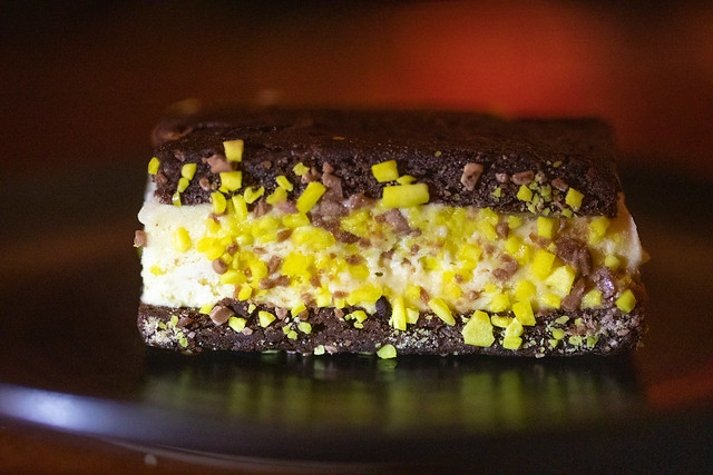
Ice Cream Sandwich: Banana semifreddo, double chocolate cookie.

Bardo Lounge and Supper Club, Oakland, California


Thomas Hawk Digital Connection

 
Comments Off on Cocktails with Don Draper, Dinner and Drinks at Oakland’s New Mid-Century Modern, Bardo Lounge and Supper Club

Posted in Photography


Thingyfy launches Pinhole Pro S: The widest modern professional pinhole lens ever

06 Dec

Thingyfy is back with another Kickstarter campaign, and this time they’re trying to fund the Pinhole Pro S-Series lenses. As with the original Pinhole Pro campaign launched this past summer, the new Pinhole Pro S seeks funding for a modern pinhole lens. Unlike the original, however, the latest campaign is for a model that Thingyfy calls the widest pro-tier pinhole lens in the world.

Pinhole Pro S comes in two varieties: the Pinhole Pro S11, an 11mm lens with a 120 degree FOV, and the Pinhole Pro S37, a 37mm lens with a 60 degree FOV. Both lenses feature a fully aluminum body. The S11 version is designed for mirrorless cameras with Micro Four Thirds, Sony E, and Fuji X mounts; the S37 is designed for SLR/DSLR cameras with Sony A, Nikon F, Canon EF, and Pentax K mounts.

The wide-angle S-Series weighs less while being wider and nine times sharper than the original Pinhole Pro lens, according to Thingyfy. The company explains that its Pinhole Pro lenses offer a very precise pinhole aperture due to the use of a micro-drill that is robotically controlled. The drill produces a “perfectly round” and smooth hole, says Thingyfy, whereas alternatives like chemical etching and laser etching have downsides, such as corroded or burnt, fuzzy edges.

Thingyfy is funding its new Pinhole Pro S lenses on Kickstarter, where an early bird unit of any camera mount is offered for $ 59 CAD / $ 46 USD with an estimated shipping date of April 2018.

Articles: Digital Photography Review (dpreview.com)

 
Comments Off on Thingyfy launches Pinhole Pro S: The widest modern professional pinhole lens ever

Posted in Uncategorized


Unboxing Buildings: Dull Modern Facades Removed to Reveal Historic Decor

24 Oct

[ By WebUrbanist in Architecture & Offices & Commercial. ]

Modernist architects rejected brick, stone and iron ornament in favor of clean metal and brutalist concrete, and in some extreme cases went so far as to cover up old facades with more contemporary cladding. But what was originally an act of erasure can also turn into an unintentional act of preservation, as in the case of this structure built in the 1920s but clad over in the 1960s.

This drab building in San Antonio, Texas was at best unremarkable and at worst a bit of an eyesore. White stripes and vertical strips of red worked with rows of glass to create something simple, Modern and a bit dull. It was also somewhat misleading: many of those apparent windows were covering up walls, not openings. All of this became clear as the surface started to be stripped away and old structure restored.

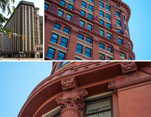
Echoing a similar trend in recent decades of stripping back paint to reveal wooden details in homes, developers and cities have started to realize the potential value in hidden landmark architecture. The Schoenfield Building in Cleveland, for instance (depicted above), was a beautiful structure built of brick but for a time covered in a less glamorous coat. Its underlying facade has since been uncovered.

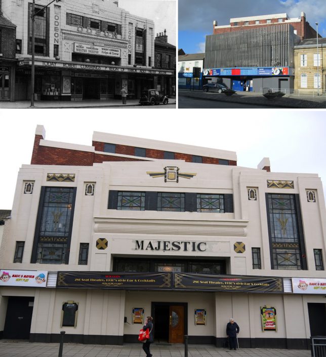
In the case of the Odean theater, it is hard to imagine what ever possessed someone to cover the elaborate facade of the original (upper left) with its decorative details and beautiful windows with an array of vertical metal strips (upper right). Fortunately, though the name has changed, the architecture has since been restored (bottom).

The decision is not always so clear-cut, however. Architectural Observer followed the restoration of a structure in Hays, Kansas where “there was a push to ‘restore’ and ‘revitalize’ the immediate downtown area. The master plan called for the removal of this particular facade.”

“Much history was lost in the redevelopment process; should this facade be counted among the losses?  Or do you feel that the two early 20th-century facades (both needing restoration) which were revealed are the stronger asset?” It is a question that often faces preservationists, especially in places like Europe where long histories can result in many iterative additions and changes over time. In this case, the facade was removed but saved. To see more examples like these and discussion about historic preservation, check out this thread on reddit.

Share on Facebook


[ By WebUrbanist in Architecture & Offices & Commercial. ]

[ WebUrbanist | Archives | Galleries | Privacy | TOS ]


WebUrbanist

 
Comments Off on Unboxing Buildings: Dull Modern Facades Removed to Reveal Historic Decor

Posted in Creativity


Work Smarter: 12 Modern Desks Reinvent the Standard Office Surface

24 Oct

[ By SA Rogers in Design & Furniture & Decor. ]

The typical desk design has remained the same for centuries, but we need these surfaces to do more – like incorporate our gadgets, offer privacy in loud offices, fit into our homes, fold up to take on the go or offer proper space for our cat overlords. Maybe even all of these things at once.  These designs are more than just a flat slab on legs, adapting to 21st century standards in all sorts of different ways.

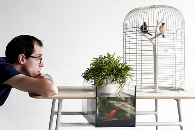
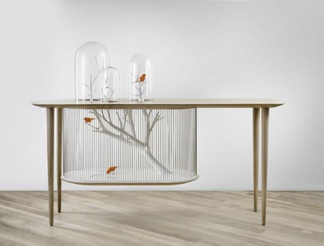
Turia Table by Maxime Mellot Incorporates Nature

“Can we admire nature and put it in a cage?” says Maxime Mellot of his own design, this curious desk inspired by a park in the city of Valencia, Spain. “Turia participates in the debate, and forces the user to divert his attention, from his own person to live animals, requiring care and benevolence. In a society focused on performance and permanent connection to the internet, pure moments of privacy become rare and precious. But how can furniture invite us to take a break, drink a tea or have a snack and help us to enjoy this specific disconnected moment? My project tends to merge the universe of nature and relaxation, by combining iconic items such as bird cage and fish tank in an interactive way.”

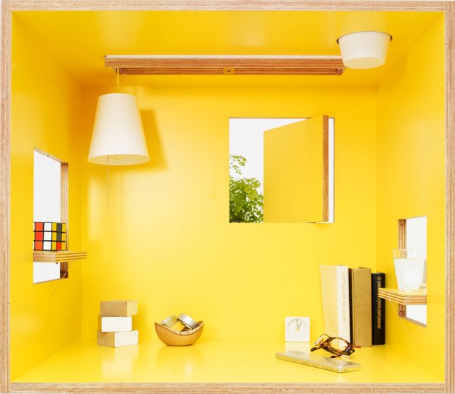
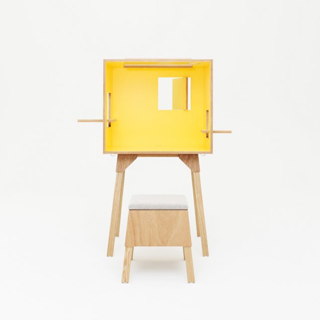
Koloro-Desk by Torafu Architects

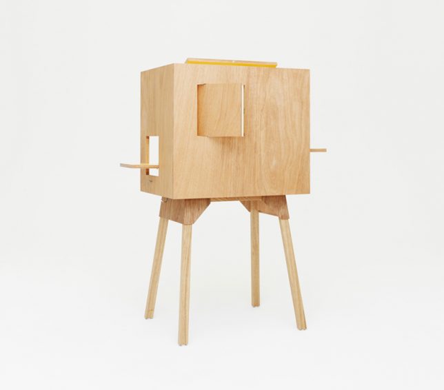
The interior of the Koloro-desk by Torafu Architects is like a cheerful miniature house with its very own operable windows, so you can lean inside to read, work, sketch or nap and feel a sense of disconnection from the world just outside its little walls. The two flip-out windows on either side offer shelves for drinks and other objects, and there’s even a skylight.

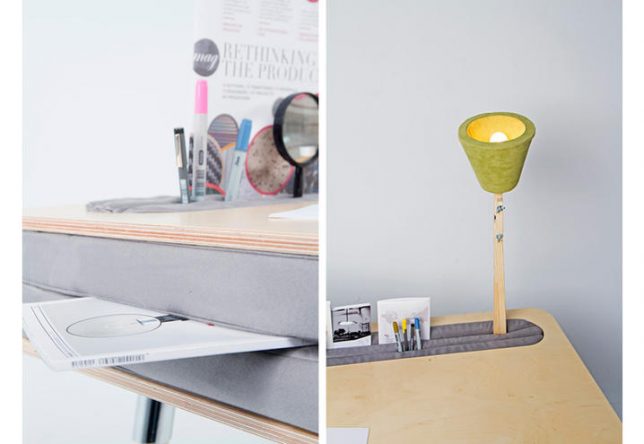
Oxymoron Desk by Anna Lotova

Shove stationery, pens and other item between the two little cushions under the surface of Anna Lotova’s Oxymoron Desk. The name comes from the unlikely pairing of materials. The cushion sandwich even lets you slide a piece of plywood inside to create a side table.

“We have to change our behavior, plan and think of work with a different mindset: no matter where an office is situated, it has to have a space it can call its own, identifiable, alterable, on a human scale, with its own history and objects, an enjoyable environment,” says Lotova.

CATable by Hao Ruan

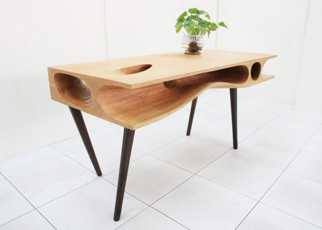
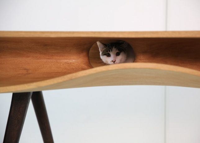
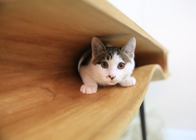
Do you have a persistent feline companion who gets a little jealous of your computer or books when you’re working? This clever table by Hao Ruan of LYCS Architecture doubles as cat furniture, with the underside full of comfy curving hollows and tunnels for your cat friend to hide in.

Next Page – Click Below to Read More:
Work Smarter 12 Modern Desks Reinvent The Standard Surface

Share on Facebook


[ By SA Rogers in Design & Furniture & Decor. ]

[ WebUrbanist | Archives | Galleries | Privacy | TOS ]


WebUrbanist

 
Comments Off on Work Smarter: 12 Modern Desks Reinvent the Standard Office Surface

Posted in Creativity


Not Your Dive Bar’s Pool Table: 13 Modern Game Furniture Designs

12 Oct

[ By SA Rogers in Design & Fixtures & Interiors. ]

Most game furniture looks like it belongs in a musty basement smelling of spilled beer and body odor, but high end tables for billiards, foosball, ping pong, shuffleboard and other popular indoor games are made to fit right into luxury environments, sometimes even complete with plated gold details. Some are even works of art in their own right, doubling as sculpture, while others bring games that haven’t changed much in decades a little more firmly into the current century.

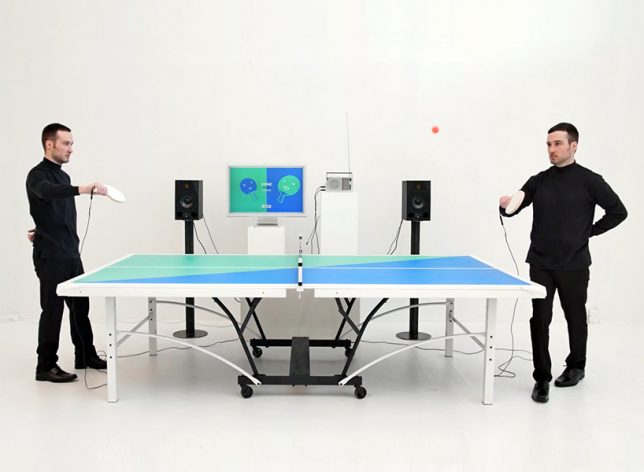
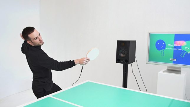
Ping Pong FM Interactive Table Tennis Jukebox

This ‘fun musical take’ on table tennis by English designer Mark Wheeler lets you choose a song to set the tempo of your game, and the song only keeps playing as long as you manage to keep the ball in play. Drop it, and your game is over. “Usually music listening experiences are strictly about being as true to the original recording as possible. But why can’t listening to a record be as playful and interactive as a live performance?” says Wheeler.

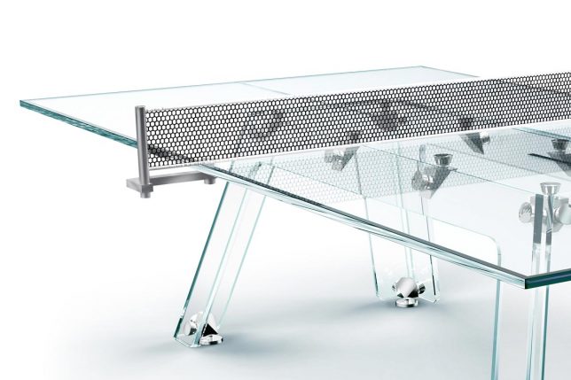
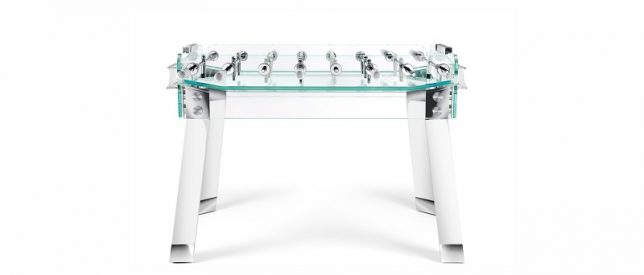
Luxury Game Tables by Adriano Design

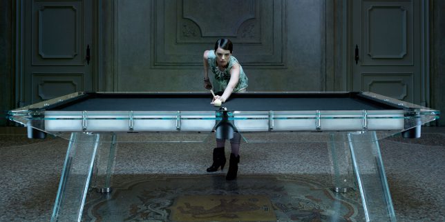
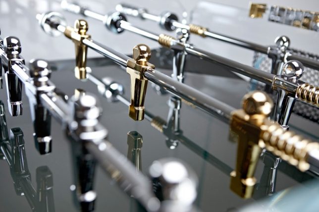
A gold-plated crystalline foosball table is among the ‘luxury’ game options offered by Adriano Design, an Italian-based company operating as both ‘Calma e Gesso’ and ‘TECKELL.’ The Cristallino comes complete with 24-karat-gold plated players – because what else would the owner of a $ 10 million estate put in their game room? Other offerings include the ‘Filotto’ pool table and the Lungolinea ping pong table, all made in the company’s signature crystal-clear glass. They even produce child-sized ‘Angolo’ foosball table models for kids, which spare no stylish details.

Isamu Noguchi Chess Table

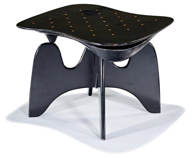
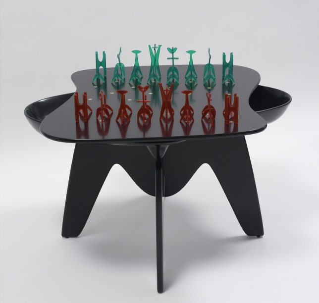
Considered a seminal work of early organic modernism, Isamu Noguchi’s chess table is technically a functional sculpture, presented along with a set of game pieces Noguchi also designed. It debuted at ‘The Imagery of Chess’ in 1944, a show organized by Marcel Duchamp and Max Ernst. The table was put into production in 1947, but only a few dozen examples exist. One was auctioned in Los Angeles in 2016, selling for over $ 100,000.

Woolsey Shuffleboard Table by Sean Woolsey

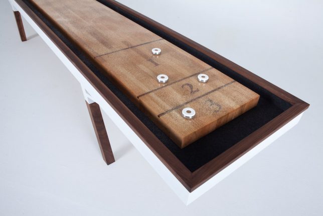
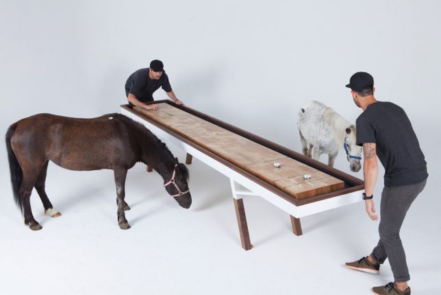
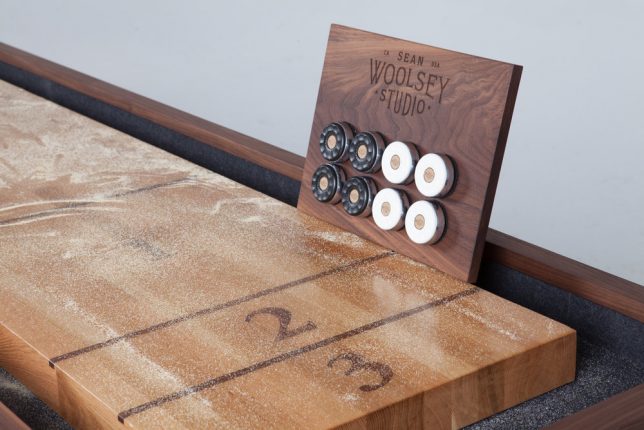
Long, narrow and sleek, the Woolsey Shuffleboard Table by designer Sean Woolsey features a rift-sawn white oak top finished with epoxy resin and solid black walnut legs, which hide leg levelers. The table comes with 4 white and 4 black pucks, lots of shuffleboard salt and a magnetic wall mount for the pucks when not in use. Prices, unsurprisingly, start at $ 10K.

Next Page – Click Below to Read More:
Not Your Dive Bars Pool Table 13 Modern Game Furniture Designs

Share on Facebook


[ By SA Rogers in Design & Fixtures & Interiors. ]

[ WebUrbanist | Archives | Galleries | Privacy | TOS ]


WebUrbanist

 
Comments Off on Not Your Dive Bar’s Pool Table: 13 Modern Game Furniture Designs

Posted in Creativity