RSS
 

Posts Tagged ‘Minimal’

SwitchPod is a ‘minimal’ handheld tripod that switches modes in seconds

31 Jan

A new Kickstarter campaign is seeking funding for SwitchPod, a handheld ‘minimal’ tripod that switches from handheld mode to tripod mode in only a couple seconds. The device requires almost no effort to convert, enabling users to seamlessly transition from recording while holding the device to recording from a flat surface without pausing to adjust the stand.

SwitchPod is compatible with any camera, including smartphones and DSLR models; the company behind it emphasizes high portability, a “nearly indestructible” aluminum alloy design, and support for weights up to 100lbs / 45kg. The tripod features a 1/4-20″ standard screw for directly attaching a camera, as well as support for ball heads and quick release plates.

Two additional 1/4-20″ threads on the tripod’s legs enable users to attach accessories, such as a light and microphone, plus the leg design makes it possible to clip SwitchPod to a bag using a carabiner. Other features include a tightening knob, non-slip feet, two sets of finger grooves for grasping the tripod in different positions, and a circle pad to protect the camera’s base. The tripod weighs 11.1oz / 315g and measures 11in / 28cm long in handheld mode.

The SwitchPod Kickstarter campaign has exceeded its funding goal, but is still open to new pledges. Backers who pledge at least $ 79 USD are offered a single SwitchPod as a reward; shipping is estimated to start in August 2019.


Disclaimer: Remember to do your research with any crowdfunding project. DPReview does its best to share only the projects that look legitimate and come from reliable creators, but as with any crowdfunded campaign, there’s always the risk of the product or service never coming to fruition.

Articles: Digital Photography Review (dpreview.com)

 
Comments Off on SwitchPod is a ‘minimal’ handheld tripod that switches modes in seconds

Posted in Uncategorized


Kodak Digitizing Box service breathes life into old media with minimal effort

14 Oct

There’s no shortage of ways to digitize your old film photos, videos, taps, and audio recordings on mediums long extinct. But Kodak is hoping you’ll eschew other methods in favor of its new Kodak Digitizing Box.

As the name suggests, the Kodak Digitizing Box is a simple solution to bringing analogue content into the digital world through the careful hands of professionals. In Kodaks own words, “The Kodak Digitizing Box brings a modern version of Kodak’s yellow envelope back to customer door steps and aims to make the daunting task of digitizing aging media easy,”

The boxes, which arrived with a pre-paid shipping label for easy returns, are available in four sizes: 3 piece, 10 piece, 20 piece, and 40 piece, and are priced at $ 59.99, $ 169.99, $ 289.99, and $ 559.99, respectively. One “piece” can consist of an audio tape, video tape, roll of film, or 25 photos. The below image details what type of media is able to be digitized.

After the box is shipped off, you will begin to receive email notifications throughout the digitization process. Kodak says to allow up to five to six weeks for everything to be digitized.

Once the digitization is finished, the resulting content — and the original media sent in — is returned on DVDs, a USB thumb drive, or via digital downloads, depending on your preference.

To find out more, head on over to the Kodak Digitizing Box website.

Articles: Digital Photography Review (dpreview.com)

 
Comments Off on Kodak Digitizing Box service breathes life into old media with minimal effort

Posted in Uncategorized


How to Create a Minimal Desktop Background Using Photoshop

03 Dec

Ever seen those flowy, innocuous desktop backgrounds that to show up on default computer screens? That’s the exact image I thought of when I messing around with Photoshop for this tutorial. Though they aren’t exact, these simple gradients and shapes come together to spur on a little nostalgia.

This project is pretty straightforward – but it introduced me to a couple techniques I had never come across before. Photoshop has opened up worlds of image-making technology. But when you boil it all down, the culmination of a photographer’s work is in shades of light dispersed within shapes.

I had a good time putting together this tutorial  – I even tried out a few on my own desktop. It’s a great way to get familiar with Photoshop operations. But it’s just as fun for a pro, with a bit of photographic downtime on their hands. So let’s dig in.

Getting Started

First, open a new document in Photoshop. Change the dimensions of the canvas to the average desktop background size – 1920 pixels by 1080 pixels, as shown below.How to Create Minimal Desktop Background Using Photoshop

Add a Gradient

Select Layer via the Layers tab on the top toolbar and click on New Fill Layer and then Gradient.

How to Create Minimal Desktop Background Using Photoshop

In the pop-up Gradient panel, click on the drop-down arrow and select Simple Gradients.

How to Create Minimal Desktop Background Using Photoshop

Select a color from the swatches in the Simple tab.

How to Create Minimal Desktop Background Using Photoshop

Choose a color that appeals to you most – whichever one you like best!

Click directly on the panel for the gradient color and a new panel will pop up. This will allow you to further customize your color scheme.  Click on the white node below the gradient bar. A color picker will pop up, allowing you to change the white parts of our original gradient to another shade.

At this stage, I would recommend a color similar in shade to your original color. I’m a big fan of pink, so I went with subtle, light shade of pink to complement my overall color scheme. But It’s totally up to you!

How to Create Minimal Desktop Background Using Photoshop

Accept the color of the gradient. Select Radial as the style and the scale as 150.

How to Create Minimal Desktop Background Using Photoshop

How to Create Minimal Desktop Background Using Photoshop

Clicking the Radial setting makes the lighter shade emanate from the center of your image.

Add Another Layer

Next, create a new layer via the layers tab at the top of the screen. Select New in the drop-down menu and select Layer… Click OK at the prompt.

How to Create Minimal Desktop Background Using Photoshop

Add a Shape

Click on the Elliptical Marquee Tool. This may be obscured by the Rectangular Marquee Tool, so click and hold the mouse over the tool for a moment to reveal the other options.

How to Create Minimal Desktop Background Using Photoshop

With the Elliptical Marquee Tool selected, draw a circle that intersects with the top corner of your image. To keep the elliptical tool even on all sides (in other words, a circle), hold down the Shift key as you drag part of the shape over the top corner.

How to Create Minimal Desktop Background Using Photoshop

Open the paintbrush tool and select a nice, soft-edged brush. Set the brush size between 200 to 400 pixels and the hardness level to zero. Select a color in a slightly darker shade. I selected a peachy color.

With the Elliptical Tool still selected, brush around the very outer rim of the quarter-circle with the paintbrush, relying on the softness of the brush to dust the inner rim.

paintbrush - How to Create Minimal Desktop Background Using Photoshop

How to Create Minimal Desktop Background Using Photoshop

Use a slightly different shade to emphasize the edge of the circle you created.

How to Create Minimal Desktop Background Using Photoshop

Duplicate the shape layer as many times as you would like to create an interesting pattern.

Add Dimension

Next, we’ll add a new dimension to the image by using the Rectangular Marquee Tool rather than the Ellipse Tool.

How to Create Minimal Desktop Background Using Photoshop

Create a New Layer and then select the Rectangular Marquee tool from the panel. Stretch the Rectangular Marquee Tool across your image so that about half of it is selected, as shown below.

How to Create Minimal Desktop Background Using Photoshop

Rectangular selection.

With the same technique and color you used on the ellipse, brush along the perimeter of the shape, leaving only the slightest shadow.

How to Create Minimal Desktop Background Using Photoshop

With the rectangle still selected, click on Edit > Transform > Warp.  Slowly drag the different points of the rectangular selection to adjust the whole shape of the layer. Try to make gradual edits at first, to keep the line free of sharp angles.

How to Create Minimal Desktop Background Using Photoshop

Transform the rectangle.

How to Create Minimal Desktop Background Using Photoshop

How to Create Minimal Desktop Backgrounds Using Photoshop

The edge of the rectangle after transforming.

Blend Modes

Now to add a little more depth to the image, you can apply blending modes to bring out highlights in the background. Select a layer and click on Blending Modes usually located above the Layers panel. Select a setting from the list of Blending Modes available. I usually use the Color Burn option, but feel free to experiment!

How to Create Minimal Desktop Backgrounds Using Photoshop

Blend modes.

How to Create Minimal Desktop Backgrounds Using Photoshop

And there you have it! Not bad huh? Amazing what you can do with a few circles and shadows.

Liquify

If you like, try experimenting with the Liquefy tool. It’s found in the Filter tab on the top tools panel.

How to Create Minimal Desktop Backgrounds Using Photoshop

How to Create Minimal Desktop Backgrounds Using Photoshop

Before using the liquify tool on an image I constructed using the steps above.

How to Create Minimal Desktop Backgrounds Using Photoshop

After using the Liquefy tool. You can see that the shapes are now a little more organic.

Over to you!

Here are a few more of my creations. I’d love you see how your desktop background has turned out, please share in the comments below.

How to Create Minimal Desktop Backgrounds Using Photoshop

How to Create Minimal Desktop Backgrounds Using Photoshop

How to Create Minimal Desktop Backgrounds Using Photoshop

How to Create Minimal Desktop Backgrounds Using Photoshop

A minimalist approach created by twisting a rectangular edge with the Warp Tool.

Now it’s your turn! Show me how it went in the comments.

The post How to Create a Minimal Desktop Background Using Photoshop by Megan Kennedy appeared first on Digital Photography School.


Digital Photography School

 
Comments Off on How to Create a Minimal Desktop Background Using Photoshop

Posted in Photography


Minimal Luxury: Monumental Concrete Hotel by Tadao Ando

24 May

[ By SA Rogers in Boutique & Art Hotels & Travel. ]

setouchi aonagi 6

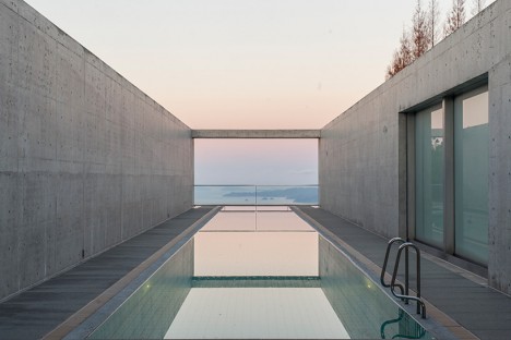
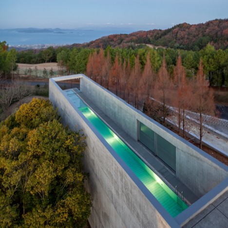
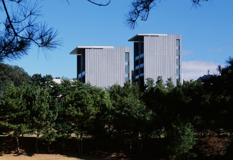
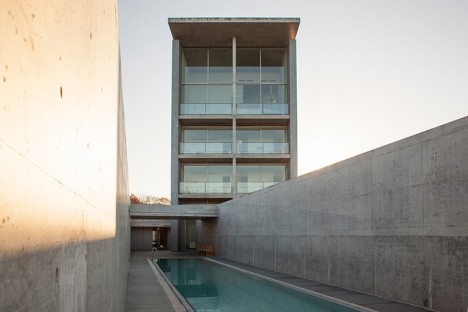
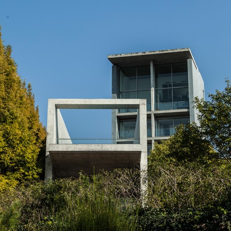
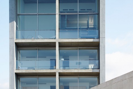
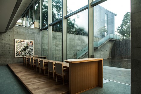
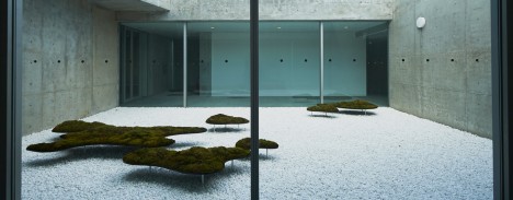
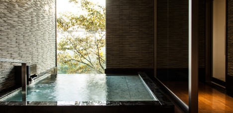
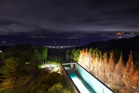
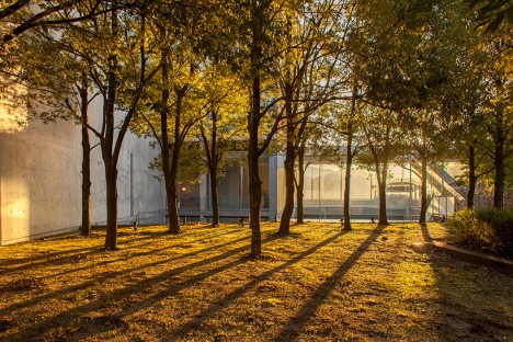
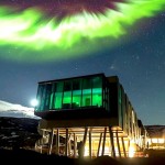
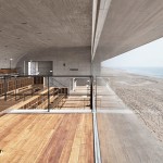
Master of minimalist architecture Tadao Ando has remodeled a small boutique hotel on Japan’s Shikoku island in a refreshingly spare yet luxurious aesthetic, with few distractions to break up his trademark expanses of concrete and glass. The seven-room Setouchi Aonagi perches on a mountain overlook gazing out onto the glassy surface of the Seto Inland Sea, its narrow rooftop swimming pool extending in the opposite direction like a telescope to focus on the distant skyline.

setouchi aonagi 1 setouchi aonagi 2

setouchi aonagi 4

setouchi aonagi 13

In recent years, the Setouchi International Art Festival has brought tourists and press from around the world into this quiet corner of Japan, with the central venues all shining examples of Ando’s work, so it was only natural for the Setouchi Aonagi to ‘join the lineup’ as another architectural masterpiece. The building previously functioned as an art museum and private residence, and was outfitted with interior furnishings the architect deemed unnecessary. His transformation strips away all distractions, giving each spacious suite its own subtle theme.

setouchi aonagi 3

setouchi aonagi 5

setouchi aonagi 7

setouchi aonagi 8

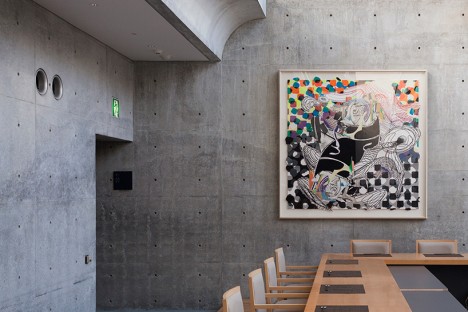
In addition to the cinematic rooftop pool, there’s an indoor pool dubbed ‘The Cave’ that can be reserved for private use. The hotel notes that the ‘luminous light’ that pours into the building, as well as the view of the sea, are art in and of themselves – but that a selection of minimal contemporary art is also on hand, sparingly displayed to keep the focus on the architecture and surroundings. One example is a mossy garden installation by Yutaka Ono, mimicking the look of the islands when seen from afar.

setouchi aonagi 12

setouchi aonagi 11

setouchi aonagi 10

setouchi aonagi 9

The rooms range from about $ 820 per night for the Garden Suite on the bottom floor to $ 1450 for the Aonagi Suite, which might sound a bit steep until you consider the general cost of travel in Japan and the fact that each room sleeps 3 to 5 guests.  Plus, staying in a Tadao Ando creation is a once-in-a-lifetime kind of experience, after all.

Share on Facebook


[ By SA Rogers in Boutique & Art Hotels & Travel. ]

[ WebUrbanist | Archives | Galleries | Privacy | TOS ]


WebUrbanist

 
Comments Off on Minimal Luxury: Monumental Concrete Hotel by Tadao Ando

Posted in Creativity


3 Easy Steps to Photograph Glassware with Minimal Gear

22 Feb

Photographing glass objects is always a complicated task because of the reflective surface, and at the same time translucent nature, of this material. The catalogue images with great glassware perfectly illuminated, are usually done with complicated setups, in studios that allow the control of reflections, and lighting equipment with accessories that are not accessible to most photographers.

In this article I will show you how photograph a glass on both white and black backgrounds, with minimal equipment, and a fairly simple lighting setup.

01

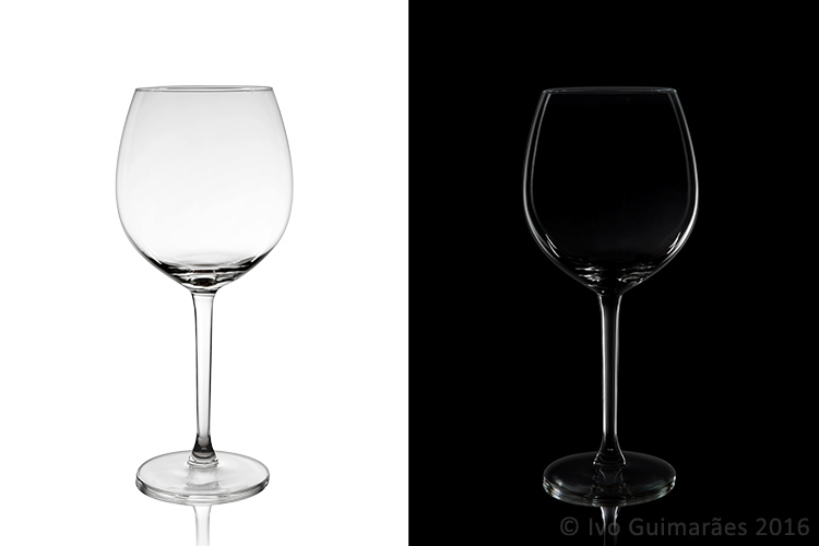
The techniques used here are known as black-line and white-line lighting, and are defined by the way light is shown at the edges of the glass, in contrast to the color of the background. This is usually done with a light placed behind and above the object, with softboxes or diffusion panels to create the transparency in the glass, black and white cardboard to create the edges, and black and white acrylic panels to create the bottom reflection.

Equipment needed

Well, you may not have a studio and lighting equipment with accessories available, but it doesn’t mean you can’t give this kind of photography a try. Here is what you will need:

02

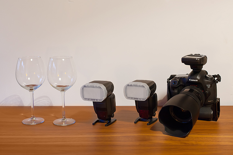
Besides the camera body and the lenses of your choice, you will need two flashes with diffusers, a trigger to fire them, some white cardboard, and two identical glasses (you will see why you need two of them later).

Step one: Clean the glasses

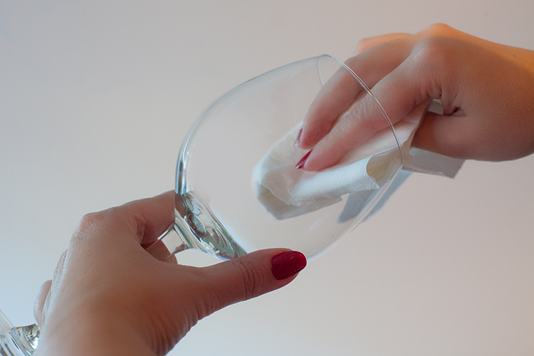
The first step, and a really important one may I add, is to clean the glasses really well, as any dirt in the glass will be visible in the image. Toilet paper and glass cleaning fluid are a good choice to get rid of spots or smudges, and a compressed air can be a good choice to get rid of dust specks.

03

Step two: Prepare your set

In these images, instead of an acrylic panel to create a reflection effect, I decided to use an old school technique to simulate the same effect – with the use of another glass turned upside down, under the main photographed glass. I use this technique a lot, as it allows me to have a pure white or black background, without a horizon line created by the base that holds the object, which can give ghost reflections sometimes, and is hard to keep clean due to electrostatic.

Step three: set up your lights

Even though camera flashes (speedlights) are very low power compared to studio units, they have more than enough power for this kind of setup, and are an accessible and simple solution.

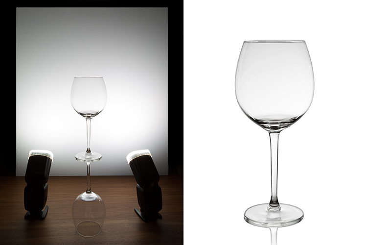
You will need to use the white cardboard as the background, and one flash with a diffuser on each side of the glas, illuminating the background evenly. This simulates the use of a softbox as backlight in a really simple way.
Here is the behind the scenes image showing the setup:

04

Voila, here is a perfect white background glassware image. It’s amazing what you can get straight out of the camera with such a simple setup. The camera settings used were: f/22, 1/200th (flash sync speed), ISO 50. Both flashes were on 1/2 power with a 50mm zoom setting.

It is important to have a large depth of field to get well-defined glass edges (including the back side of the glass), and to use the highest sync speed for your flash/camera combination to avoid the ambient light making a reflection and changing the color temperature of the image.

Bonus step: Black background setup

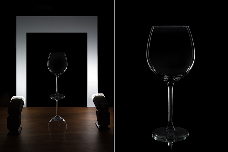
The black background image might seem a lot more complicated, but actually it’s as simple as cutting a hole in your white cardboard, that will function as an open window for the black background. Here is the behind the scenes image for that setup:

05

Here is the black background glass image.

The camera and flash settings are the same, but the white cardboard acts as a reflector, defining the white line around the glass. Just be sure not to have anything behind the cardboard or use some black velvet as the background, which doesn’t reflect light and guarantees you a pure black.

So, there you go, a simple, yet highly effective technique to produce amazing glassware images with white or black background, and bottom reflection effect – without a studio, fancy lighting equipment, or a ton of accessories.

Give it a try, I’m sure you’ll get great results! Please share your images in the comments area below.

googletag.cmd.push(function() {
tablet_slots.push( googletag.defineSlot( “/1005424/_dPSv4_tab-all-article-bottom_(300×250)”, [300, 250], “pb-ad-78623” ).addService( googletag.pubads() ) ); } );

googletag.cmd.push(function() {
mobile_slots.push( googletag.defineSlot( “/1005424/_dPSv4_mob-all-article-bottom_(300×250)”, [300, 250], “pb-ad-78158” ).addService( googletag.pubads() ) ); } );

The post 3 Easy Steps to Photograph Glassware with Minimal Gear by Ivo Guimaraes appeared first on Digital Photography School.


Digital Photography School

 
Comments Off on 3 Easy Steps to Photograph Glassware with Minimal Gear

Posted in Photography


Australien: Minimal und reduziert

07 Jul

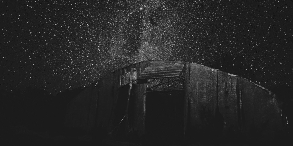
Ein älteres Gebäude vor Sternenhimmel.

Ein Beitrag von: Oliver Koch

Einzigartigkeit. Freiheit. Danach streben viele mit mehr oder weniger Erfolg.? So auch ich. Für vier Jahre lebte und arbeitete ich in Düsseldorf. Eine Stadt, die mir mit ihrer konservativen Oberflächlichkeit vieles verwehrte. Ebenso wie die Branche, in der ich arbeitete.
kwerfeldein – Fotografie Magazin | Fotocommunity

 
Comments Off on Australien: Minimal und reduziert

Posted in Equipment


How to Create Dark Moody Low-Key Portraits with Minimal Gear

14 Jan

To paraphrase Samuel L. Jackson in Jackie Brown, “Grids: when you absolutely, positively got to kill every lumen in the room, accept no substitutes.” Do you have a room or environment that you want to appear black? You don’t even need a black backdrop or the dark cover of night to create a dark, dramatic scene. All you need is a flash, a grid and enough space to allow your subject to be at least 5-10 feet away from any walls. As long as you can keep your strobe light from falling on the ground, background or other objects in the scene, only the subject will be illuminated.

1

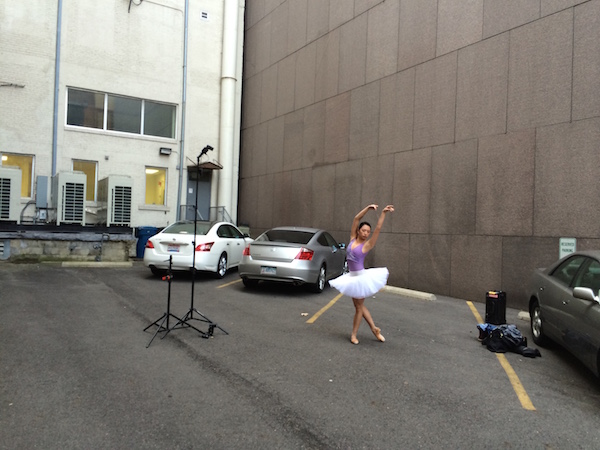
The scene: If you want to black out your environment to create dark moody low-key images, look for shaded areas with enough space to allow at least 5-10 feet between your subject and the background. The darker the background wall is, the better.

2

The raw file: If you look closely, you will see that there is a bit of background detail, which can be easily eliminated in Lightroom.

It was a particularly windy day that I photographed ballerina Kristie Latham. Since I didn’t have an assistant, and sandbags were too heavy to lug around by myself (I was already pulling my case and carrying two light stands), I would have to shoot without light modifiers. Note, if I had added an umbrella to the light stand without it being sandbagged or held by an assistant, it would have blown over onto a nearby car within five seconds. Though an un-modified flash on a light stand can still be blown over by the wind, it’s much less likely to happen. That said, I still made sure that it wasn’t too close to any nearby cars.

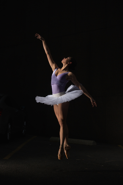
I wanted to highlight her form and the details of her outfit – specifically the tutu – so even though the light was going to be hard without modifiers, it would actually work out to my advantage. I began by setting up the main light. I placed it high – about 8 feet – in order to create dramatic, directional light. After taking a test shot, I saw that the light fell off below her tutu, since it came out about a foot from her body, causing her legs to go into shadow. To remedy this, I added a second light, placing it on the ground, aimed slightly up, to avoid lighting the ground. The second light worked at illuminating the lower half of her body (image above). By zooming the flashes in to a medium setting of 70mm, it allowed just enough light spread to cover her, while not spilling on too much of the environment around her. While a bit of background detail can be seen in the raw file, it can easily be removed in Lightroom in post-production.

3

The final shot: Kristie is now completely isolated in the void. Poetic.

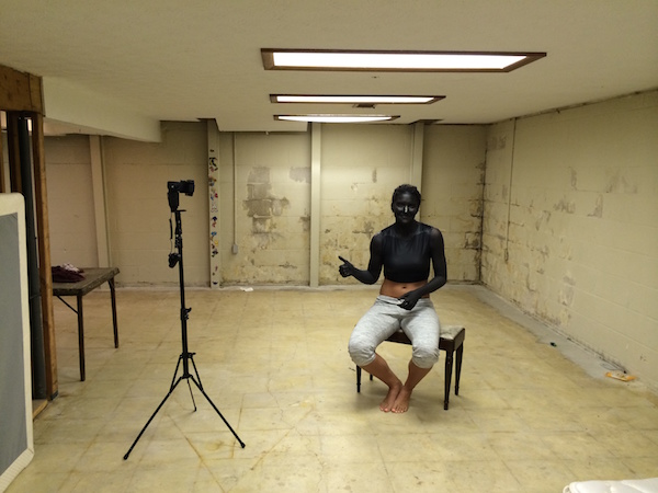
In a slightly different environment, I was doing a shoot with model Dani Dikeman, in a basement. She was in black body paint, wearing all black above the waist. I wanted the whole scene to appear black, save for the highlights on Dani and the textures of her outfit. It was a conceptual portrait shoot, this portion being the Hell portion of a Heaven/Hell-themed shoot. (The as-yet-to-be-shot Heaven scenario will, fittingly, be all white.)

4
The setup: This scenario took place in a basement.

I met Dani at the makeup artist’s house, about an hour after they got started on the makeup, in order to give them a head start on the lengthy application. I knew that the basement was going to be an optimal shooting space because it was not only windowless, but wide open and barren. I quickly set up the sole flash, see above, and then waited while they put the finishing touches on the makeup and hair.

5
The raw file: Though a bit of Dani’s unpainted abdomen and sweatpants are visible in the shot, a quick Lightroom adjustment would have the image ready to go.

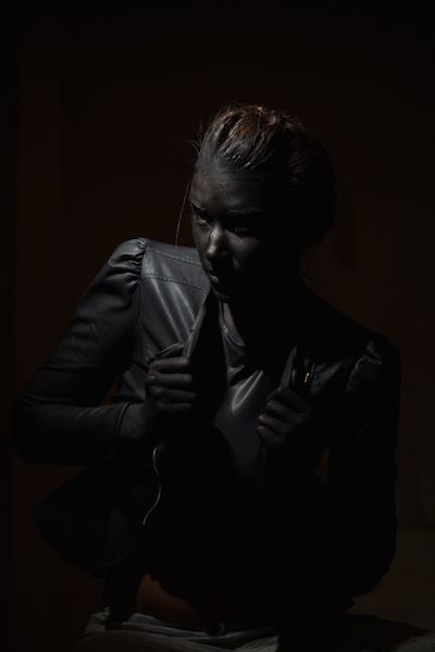
The shoot actually went rather quickly (15 minutes), which is ironic since the makeup application took two hours. Though the basement wasn’t especially large, by using a grid on my light to contain light from spilling on the nearby walls, the environment read pretty close to black in the raw files, as seen above. Although Dani’s unpainted abdomen and sweatpants visible in the shot, this wasn’t too big of an issue. Because the light falloff was so dramatic from her bust to her torso, a quick adjustment in Lightroom, lowering the exposure and it went easily to black.

6
The final shot. All black everything.

Have you done all dark or low key images before? Have any other tips or comments to share?

googletag.cmd.push(function() {
tablet_slots.push( googletag.defineSlot( “/1005424/_dPSv4_tab-all-article-bottom_(300×250)”, [300, 250], “pb-ad-78623” ).addService( googletag.pubads() ) ); } );

googletag.cmd.push(function() {
mobile_slots.push( googletag.defineSlot( “/1005424/_dPSv4_mob-all-article-bottom_(300×250)”, [300, 250], “pb-ad-78158” ).addService( googletag.pubads() ) ); } );

The post How to Create Dark Moody Low-Key Portraits with Minimal Gear by Nick Fancher appeared first on Digital Photography School.


Digital Photography School

 
Comments Off on How to Create Dark Moody Low-Key Portraits with Minimal Gear

Posted in Photography


Beautifully Simple: School Bus Turned Minimal Mobile Home

26 Aug

[ By WebUrbanist in Technology & Vehicles & Mods. ]

bus home finished project

You could make a strong case for this vehicle being barely recognizable as such. The dimensions, fenestration and over spatial configuration give good clues that this space may have once been a school bus, but the finishes, furnishings and built-ins go above and beyond bare-bones adaptive reuse.

bus converted exterior retrofit

Architecture student Hank Butitta was sick of drafting imaginary buildings in studio courses destined never to be built, and sought (with help from his younger brother Vince) to steer his education in a more hands-on direction.

bus conversion program diagram

For his final thesis project at the University of Minnesota, Hank bought a bus for $ 3,000, added $ 6,000 to improve it, and spent fifteen weeks creating this amazing multifunctional mobile home.

bus adjustable seating area

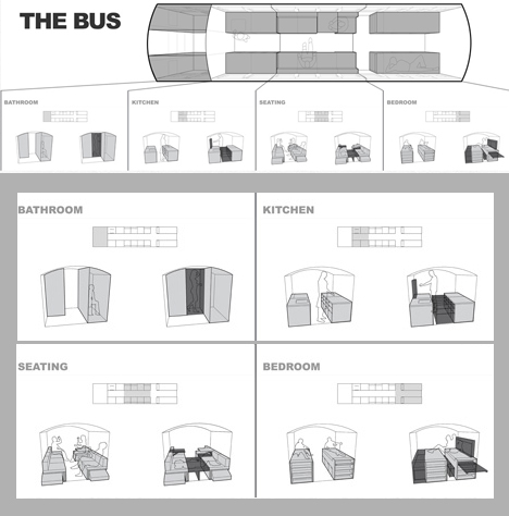
We should start with the evolution of the programmatic diagram, described and illustrated in simple terms: “The even spacing of the window bays allow for the volume to be broken down into modular units of 28 inches square, leaving an aisle that is also 28 inches wide. The modular units are then grouped to create four primary zones: Bathroom, Kitchen, Seating, and Sleeping.”

bus multifunctional sleeping space

From there, a series of rules and strategies evolved, like: keep the space as open as possible, so the 225 square feet available area does not get broken down into cramped compartments.  The result is a limitation of objects built above the bottom edge of each window and an open-feeling floor plan. Hank also “developed a thin wall system integrating structure, insulation, electrical, lighting, and facing, leaving the interior open for occupation. The ceiling is covered in plywood flexed by compression, and the floor is reclaimed gym flooring, complete with 3-point line.”

bus cab storage space

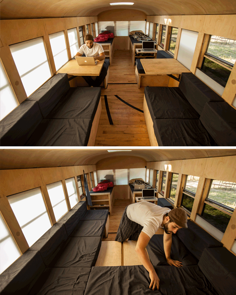
Throughout the project, there are clever and deceptively simple ways to redeploy structure to address different needs on demand, like a bed system that allows for different sleeping configurations, and seats that with secret flip-up and slide-out panels to allow for further lounging or additional overnight guests. Storage is tucked and hidden throughout, integrated into other built-ins wherever spare space was available. The detailing throughout is minimal and consistent, but don’t let that fool you: a great deal of thought and work went into that apparent simplicity.

Share on Facebook


[ By WebUrbanist in Technology & Vehicles & Mods. ]

[ WebUrbanist | Archives | Galleries | Privacy | TOS ]


WebUrbanist

 
Comments Off on Beautifully Simple: School Bus Turned Minimal Mobile Home
Posted in Creativity