[ By WebUrbanist in Design & Fixtures & Interiors. ]

Good home design is not just about a perfect product but about process and context, as illustrated in this case through diagrams, videos and photos of how to make a small space work on multiple levels in Madris, Spain (both physically and proverbially).

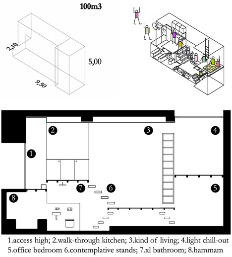
MYCC (images by Elena Almagro) managed to fit in a full bathroom, living room, kitchen, bedroom and office into this curiously-shaped urban shelter, narrow yet also relatively deep and tall (approximately: 2 meters wide, 10 meters long and 5 meters high).

A minimal combination of stairs and ladders connect the different platforms within the resulting studio, set out of the way and rendered partially transparent (staircase sans risers) or set off to the side (ladder along the wall) to help leave open lines of sight between various rooms.


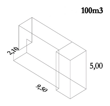
A large skylight directly illuminates the work space, and, indirectly, the rest of the unit as well. The lack of horizontal space limited opportunities for plan-level complexity, but opened up spatial options in section as the dimensional diagram outline shows below.
A quirky animated video takes viewers on a short tour of the conceptual design process, starting with the entry level then splitting off to show how the various floors, nooks and crannies took shape.


[ By WebUrbanist in Design & Fixtures & Interiors. ]
[ WebUrbanist | Archives | Galleries | Privacy | TOS ]

You must be logged in to post a comment.