Are you unable to send photos from your iPhone to an Android device? Do you have the ability to send text messages but not pictures? If you are a photographer or use your phone to take pictures, switching phones can be a nightmare, especially from an iPhone to an Android. Sending edited photos from iPhone to Android can be tedious Continue Reading
Photodoto
Posts Tagged ‘Methods’
How to Send iPhone Photos to Android? Fixes and Methods Explained
2 Methods for Creating Duotones in Photoshop
The post 2 Methods for Creating Duotones in Photoshop appeared first on Digital Photography School. It was authored by Glenn Harper.
This article looks at two methods for creating duotones in Photoshop. But first, what is a duotone?
Think of a duotone and you’ll imagine an image composed of two distinct hues. Easy so far. But a typical printing-press duotone uses black ink and another color, the net result being a photo that is monochrome by many people’s definition. No black appears in the final image unless the initial grayscale image was clipped, which photographers generally try to avoid.

This photo uses two distinct blue-cyan hues laid over the original black (using a gradient map), but it’d qualify as monochrome in most circles.
A sepia image often comes from a duotone process, yet many people think of sepia pictures as monochrome.
Indeed, they are monochrome in the end but try producing a sepia effect in Photoshop using a single brown color. You’ll notice it tends to look flat. You can try some wild curves adjustments, but you really need black or dark gray in there to give contrast.

Using duotone mode to create two sepia photos. The top half is duotone with a mixture of dark gray (near black) and dark brown. The bottom half is what you get with dark brown only – monotone.
For our purposes
We’ll look briefly at the classic black + one color method of creating duotones, not least because that blend tends to create more tasteful results. But I’ll also show you how to produce two-color images in Photoshop CC using two methods: duotone mode and gradient maps.
Method 1: duotone mode
To access Photoshop CC’s duotone mode, you first need an 8-bit grayscale image. But before you convert to grayscale, you might want to do a normal black & white conversion. That way, you can use the color sliders to get the best starting point before shedding data.
The process of creating a classic duotone in this way is described well in another article. Either pick one of the many presets available in Photoshop or choose your own color combo. Then adjust the contrast in the two “inks” as desired using the built-in curves adjustments. Technically, this produces a duotone, even if it’s monochromatic by some definitions.

A two-ink duotone photo that is nevertheless monochromatic in appearance. Only by clipping the original grayscale image can you get true black into the photo.
Tip: in order for your second color (or “ink”) to be the one that imbues the image, you need the first “color” to be neutral (i.e. the default black or dark gray). Otherwise, the two colors blend. To achieve two distinct colors, there’s more to do.
Two distinct colors in Duotone Mode
It is possible to produce a two-color image in Photoshop’s duotone mode. Let’s say you have two colors selected (e.g. black and orange) and you want to make shadows blue. This is what you’d do next:
- Click on “Overprint Colors” to open a dialogue box.
- Click inside the color square next to “1 + 2” to open the color picker.
- Move the picker around and choose a blue, observing its effect on the image in real-time.
- Close “Color Picker” and “Overprint Colors” boxes.
- You’re done! Convert back to RGB for conventional web or printing use.

By clicking on “overprint colors” in duotone mode you can lay a second distinct hue over your darker tones. In this instance, I’ve chosen dark green.
Method 2: gradient maps
Like duotone mode in Photoshop CC, there are many gradient map presets you can try out. Some of these use a single hue or multiple hues, so they might be monochrome, tritone or quadtone in some cases. But a classic two-color gradient map will give you a duotone result with discrete colors.

Using a normal blend mode with a gradient map produces a two-color image without black. There’s a distinct lack of contrast, though this varies depending on the colors chosen.
The method for creating a duotone using gradient maps is here:
- Open a black & white adjustment layer (don’t do anything with it yet).
- Open a gradient map adjustment layer and set a “contrast” blend mode (e.g. overlay, soft light, hard light, etc).
- Click on the gradient to edit its colors.
- Double-click on the lower left and right sliders to open the color picker and select your shadow and highlight colors. A single click on either slider produces a slider in the center, which you can move if you want to alter the transition point between colors.
- Adjust color sliders on the black and white layer if you want to selectively darken or lighten parts of the image.
- Adjust opacity on the gradient map layer to taste.
- Flatten layers.

You’ll bring the contrast of the original image back in by selecting an overlay, soft light, hard light or color blend mode.
When you’re going for a subtle duotone with off-black and off-white colors, you can skip the black and white layer. Just use a gradient map layer with a normal blend mode. Note, however, that this precludes the possibility of reducing opacity (which brings color back in) or selectively adjusting different tones. The extra B&W layer adds versatility.
The normal blend mode also looks pop-arty if you choose bold colors, so it’s good for creating graphic posters or flyer pictures. In this mode, it’s worth bearing in mind when picking colors that a color from low down and one from high up on the picker graph gives more contrast. The nearer the two hues are to each other in terms of “picker height,” the less contrast you’ll have in terms of brightness. Other blend modes add contrast, so this only applies to “normal.”

Another gradient-map duotone using a “normal” blend mode. Blue and orange are complementary colors (approx). Photo: Pixabay
Of course, if your shadows and highlights are so close to black and white that their hues are hard to detect, you’re effectively back to creating monochromes. The semantics don’t matter provided you’re not entering duotone photo competitions with pictures that look mono.
Compressing the tonal range
When using the color picker to select your shadow and highlight colors, any hue you pick above the base or below the top of the graph compresses the tonal range (or dynamic range) of the photo. At least, that is the case if you perform a separate edit or use an adjustment layer with a normal blend mode.
If you’re going for a graphic image with two bold colors, the tonal range is almost immaterial. You can let it fall where it may. But with mono images and subtle duotones, dynamic range is more important. We’re always taught to aim for a full tonal range in our photos so that the data goes end to end on a histogram, but actually compressed data sometimes looks good. It gives online photos more of a print feel in the absence of deep shadows and dazzling highlights. Try it!

The hard left of the color picker goes from pure black to white, bottom to top. The same principle applies to colors. They go from pure black to full saturation. In this instance, I’ve compressed the tonal range of a black and white photo by 5%, lifting shadows slightly and subduing highlights.
Just as you can compress the tonal range of an image using curves or levels, so you can using gradient maps and the color picker. You could do similar in duotone mode by adjusting the endpoints of the built-in curves so that the curve is less steep. Conversely, making curves steeper increases contrast and eventually clips shadows and highlights.

What I did in the above picture using the color picker is the same as doing this in curves. Selecting two duotone colors using a normal blend mode will also compress the tonal range unless you choose the most saturated hue and black. (The baseline of the color picker is always pure black.)
Choosing colors
If you’re looking for colors that go well together, try using the Adobe Color Themes extension in Photoshop CC. You needn’t have an image open to experiment with it. Set your background and foreground colors via the extension in the tools palette, and they’ll automatically transfer over to a gradient map when you open one. Complementary colors are perfect for duotones.

With this photo, I’ve set complementary foreground and background colors in Photoshop CC using the Adobe Color Themes extension. Then I’ve opened a gradient map, which applies the two colors automatically.
There are several websites dedicated to finding colors that work well together, including Adobe Color. These typically include the hex numbers, which you can copy and paste into the Photoshop color picker to reproduce the exact same hues.
Final thought
In times past, a duotone was used as a cheaper alternative to color halftone printing. Today, you could figuratively think of it as a more expensive alternative to black and white. I wouldn’t suggest it’s better (of course it is not), but it’s another way to convey mood. Sometimes you can hint at the color that was in the original photo. Or, you can just make some far-out pop art. There are many possibilities.

The post 2 Methods for Creating Duotones in Photoshop appeared first on Digital Photography School. It was authored by Glenn Harper.
No Filter? No Problem! 3 Simple Methods to Fix Your Sky in Post-Production
The post No Filter? No Problem! 3 Simple Methods to Fix Your Sky in Post-Production appeared first on Digital Photography School. It was authored by Nils Heininger.

What you see is not what you get
Quite often, we look at an amazing scene, take out our camera, make a snap, and become disappointed. We are not able to capture what we saw. Sometimes it depends on the perspective and composition. Other times it is an issue of dynamic range. When we are working under a bright sky, the latter is a problem.
Dynamic range means the range of light, in which we can still see detail. It is everything between pitch-black and dazzling-white. The human eye has a very wide dynamic range. For us, it is not a problem to see all the detail in the sky, while also recognizing every rock on a mountain.
Our camera, however, has to find a compromise. It either gets the detail of the rocks and a blown-out (white) sky in the background, or it gets the detail in the sky, but just the dark silhouette of the mountain. Sometimes you want that effect, and sometimes it is merely disappointing.

If you are really into landscape photography, you might consider getting a graduated neutral-density filter. You can put the filter in front of your lens and darken part of the image while leaving the rest untouched. There are systems for square filters, which you fix on using an adapter in front of your lens. You can also get screw-on filters, which you fix directly onto your lens. Both have advantages and disadvantages, and there are many options for ND-grad filters.
If you are just occasionally shooting landscapes, or you don’t want to invest too much money at the moment, you can fix the images in post-production.
Here are three different ways you can fix your sky in Lightroom or Photoshop.

1. Graduated Filter in Lightroom
Fixing something in post-production does not mean that you can be lazy while shooting. When you take your image, you have to make sure that you get the necessary detail and find a good exposure. I always recommend shooting in RAW format as it saves far more detail than .jpg files do.
Lightroom’s graduated filter changes the exposure of a part of your image. It will never recover lost information. Shoot your image as balanced as possible. Find a compromise of getting some detail in the sky and some in your foreground.
Before you use the graduated filter, you should adjust the image in a way that the darker parts are well exposed, and the sky is blown out. In the example image, I pushed the shadows and the whites, to make the buildings pop. It all depends on your image. Just make everything except your sky look like you want it to be.
Then click on the little rectangle in your toolbox. This is the graduated filter.

Applying the graduated filter is easy. Just left-click somewhere in your image, hold the mouse button, and pull it in the direction you want the graduation to happen.
In landscapes, we usually pull it down, as we want graduation along the horizon.
The tool marks the borders where the filter will affect the image. You can also see the intensity of the filter, by pressing “O.” This marks the area in red to give you a visual of the graduation.
If the selected area of your image somehow gets pitch-black, white, blue, or looks weird in any other way – don’t panic! Just check if the filter adjustments on the right are already active. Reset the filter adjustments by double-clicking on the sliders and the image will look like it did before.

Now you can adjust the sky. Usually, this means that you have to make the highlights darker. Pull the Highlights-slider to the left. I also added a little blue in the white-balance and pushed the whites, to have a little dramatic contrast in the sky. If you are irritated by the filter-marks, press “H” to make them disappear.
Still, there is a big issue with the image. As there is no straight horizon, the graduated filter also affects the buildings. This is not always a problem in landscapes – especially when using images of the sea, where the horizon is straight. If objects are towering above the horizon, there is an easy way to deal with it.

Add the Range Mask
The Range Mask helps us to quickly deal with deselecting some parts of the applied filter. In this case, we click on Range Mask -> Luminance in the filter options on the right. Here we can select which parts of the graduated filter will be affected. It’s a filter in a filter!
Luminance means that we can make the filter affect a certain range of brightness within the selected area. In the example, we want the filter to only affect the brighter parts (i.e., the sky) and not the darker ones (i.e., the skyscrapers). Hence, we will push the left marker of the range-slider to the right until we exclude the buildings from our selection.
That’s it!

Pros and Cons of the graduated filter in Lightroom
The graduated filter in Lightroom basically does the same thing that an ND-grad filter in front of your lens does – it changes a part of the image and leaves the other untouched. In Lightroom, however, you can choose between many different adjustments, while the physical analog ND-graduated filter will just make the image darker. You can also individually set up the area you want to edit and decide about the softness of its edge.
The disadvantage of the digital graduated filter is its limitations. You can’t recreate the information that your sensor did not capture. A filter in front of your lens will influence what your camera captures on its sensor. The digital filter can only work with what you have. You cannot push everything as far as you want and usually, you will lose some detail.
Still, the graduated filter in Lightroom is often a decent way to make your sky pop.

2. Mix different exposures with HDR
HDR is the abbreviation for High-Dynamic-Range. HDR images artificially increase the dynamic range of our camera by summing up the information of different exposures. Hence, you have to plan an HDR-image in advance.
While you are shooting, you have to create different exposures of the same image.
I usually take three images:
- A “well-exposed-compromise-picture” like I would take for applying the graduated filter in Lightroom.
- A darker image (silhouette with great sky-detail), one or two stops below the first.
- A bright one (good detail in the foreground, blown out sky), one or two stops above the first.
Make sure, these shots show the same image, and you don’t move your camera. It’s best if you shoot using a tripod.
If you are not familiar with calculating stops, there is good news – most cameras can do it for you. Your camera will likely call it “bracketing.”
Somewhere in your menu, you can select the bracketing setting. My camera asks me how many different exposures I need and how many stops they should differ from each other. Then I hit the shutter three times and have my three exposures.
Don’t forget to reset the bracketing, because it is more than annoying to have different exposures when you don’t want them.

The next step is quite easy. Upload your three exposures into Lightroom and select them. Right-click on one of them. Choose Photo Merge -> HDR and wait until the calculation is done. This can take a little while, depending on the image size and your computer speed.
A fresh window of photoshop should pop up. I always check the boxes Auto Align and Auto Settings and mostly use medium Deghosting. Deghosting is the process Lightroom uses to deal with small dissimilarities in the three images (e.g., moving people, clouds, waves).
Then you hit the merge button and wait again. Here is your finished HDR-image.
Wasn’t that easy?

Mix methods!
Sometimes, you won’t be happy with the HDR-image. You can still adjust it! Even though the image above looks a little innocent, there is a lot of detail in there. Get it out by applying local adjustments like a grad-filter.
Nonetheless, you have to be careful. HDR is still just a computer calculation, that does not know what you saw on location. If you do hard editing, you will find artifacts on your image. Artifacts are disturbances caused by processing an image.
Look closely at the example below, and you will find a black shade around the top of the highest tower. Artifacts like this often occur around areas of high contrast.

Pros and Cons of HDR
HDR is a quick and effective tool to make your sky pop. While the graduate filter in Lightroom can only work with the available information, HDR increases this information. If you check the file size of the original image, you will also find that the HDR image is often three times as big as each single exposure. If your computer is a little slow in processing images, it will have more issues with HDR images.
Another disadvantage is the preparation involved on location. You will need extra equipment to get a similar composition under different exposures. Movement in the image, as well as high-contrast areas, can also create artifacts.
HDR has often been overused to create an “edgy effect.” Don’t over-do it here. There is an easy rule of thumb – if you see that it’s an HDR, it is too much.

3. Make a composite in Photoshop
Composite means cutting out parts of one image and putting it above another. There have been many debates about this issue in the past and present. Are composites fake?
In our example, I think it is fine to cut out the sky of a good exposure and put it on top of the same scene. At least the sky looked like this some few seconds before. It was there – the camera simply couldn’t capture it.

To make a composite in Photoshop, you should already have adjusted the images in Lightroom. Prepare one image with a great sky and another one with a good foreground. Select both images, right-click, and choose Edit In -> Open as Layers in Photoshop. A Photoshop project with two layers will pop up.
In this example, I chose to treat the image with the blown-out sky as the background and put the blue sky on top of it. That means that we have to arrange the layers accordingly. Photoshop will always display the upper layer of your project. Thus, we need to keep the sky as the upper layer, but make the buildings disappear, so the lower layer is visible.
The best method to do this is to create a Layer Mask. It allows us to hide a part of the lower image without deleting any information. To create a Layer Mask, we select the upper layer and click on the little square-symbol with the circle in it. A white rectangle appears next to your layer.
Every white part of the layer mask will be displayed. The black areas will be invisible, while everything grey will be partly visible. Now, we need to fill the areas we don’t want to see (i.e., the buildings) with black. This process is called masking.

Masking involves skill and experience. A proper guide to masking in photoshop can fill books. In our example, we try the basics. We want to see the sky and hide the buildings. Thus, you have to mark the buildings with the Quick Selection tool (Press “W” on your keyboard). We need to select everything except the sky. For hiding the selection, we choose the layer mask and fill the selected area with black color (Edit -> Fill or press Shift+F5).

Now, you have your first composite. It looks a bit weird and artificial in the example. Usually, you need to make some adjustments after masking. Work on the layer mask for the edges of the building. This can be done manually brushing the parts you do not want to see.
You can also make some adjustments to fit the look of the sky and buildings. By using adjustment layers and pulling the opacity of the sky a little back, you will create a more natural look.

Pros and Cons of Composites
The big advantage of a composite is that you take two independent images and blend them into each other. It does not matter if the clouds or cars in the image move. You can control every part that you want to see. The result is pretty much dependent on your skills.
However, a composite is a lot of work. It takes a while to understand all the options, tools, and shortcuts to edit a layer mask. The amount of works depends on the scene. Editing the horizon of a seascape is easy. A skyline can be challenging. Put a bush in front of it, and it is easy to mess it up. You don’t want your image to look like the one below.

Which technique to use?
There is no right or wrong here. It differs from case to case. How much energy do you want to invest? Are your skills advanced? Did you prepare more than one exposure?
You can also mix methods or even manually create an HDR-image in Photoshop.
One day, I will get myself a bunch of ND-grad filters and work things out on location. Until then, I will continue using HDR or – if possible – get along with the graduated filter in Lightroom. So far, it has worked fine for me.

What do you think?
Is there a method you prefer? Do you work with ND-grad filters, or have another method of dealing with the issues of dynamic range? I would be glad if you share your own experiences and images in the comments below.

The post No Filter? No Problem! 3 Simple Methods to Fix Your Sky in Post-Production appeared first on Digital Photography School. It was authored by Nils Heininger.
Simple Methods for Creating Better Still Life Images
The post Simple Methods for Creating Better Still Life Images appeared first on Digital Photography School. It was authored by Charlie Moss.
Many find shooting still life images a real challenge when they’re just starting out because it can be hard to know where to start. But taking the time to shoot a great still life can be a rewarding and somewhat meditative pastime for photographers.
Still life photography can help you hone your photographic skills at your own pace while still creating work that can go in a portfolio or be printed for your wall. But styling tabletop images doesn’t come naturally to all photographers, so here are some simple things to think about when you’re next shooting still life.

Choose props for color and mood
Now might be a good time to go and brush up on your color knowledge, because you’re really going to need it when it comes to creating still life images! Everything, including the colors, in your still life scene, will be there because you put it there. Nothing has to make it onto your tabletop studio if you don’t want to include it in your shot.
Colors can be a way of introducing either harmony or contrast. If you were photographing something blue, for example, and you used blue and green backgrounds you’d have a very harmonious and potentially calm image. On the other hand, if you added yellows or oranges into the scene, it would create tension and result in a more dynamic overall feeling to the shot.
You can bring color to your still life images in different ways. Backgrounds, fabrics, plates, bowls, vases – all these items are props that you can start collecting to build up a color library of props. Don’t forget natural objects like flowers and foliage too; they can often really bring a shot to life.

Selecting complementary backdrops
Your backdrops will often be the most dominant colors in your scene, so pick wisely (it’s also hard to change it once you’ve started arranging your props). Pick your backdrops according to the feel you’d like to create in your final image.
Backdrops can be anything that works with the scene you’re creating. It might be a marble countertop, a beautiful old farmhouse table, or a complementary piece of fabric. Whatever helps to set the mood for your images.
As well as the color of your backdrop, think about the texture as well. A scuffed up, blackened old baking tray creates a very different feel to draped silk. Think about the way that different backdrops make you feel as you select them for your scenes and decide if that’s correct for the kind of story you’re trying to tell in your photograph.
Over time you will build up a library of different backdrops to use in your shots. Then you can create a whole variety of different styles of images just by switching out the backdrop. Keep your eye open when you’re out and about for potential backdrops to add to your library!

Thinking about texture
I love including texture in my still life photographs, and it has become a part of my style now. Scouring both high street and artists shops for interestingly textured table linens, bowls, and backgrounds for my still life images are favorite pastimes.
Along with all the other elements of a still life image, texture can really help set the mood. Are you shooting something rustic that would have its story helped by the introduction of some beautiful coarse fabric? Or maybe you’re photographing a more modern scene that would benefit from glossy backdrops and slick, shiny props?
It also adds interest and depth to your final image. If you look around the room you’re in I’m sure you’ll see a whole variety of different textures. Perhaps you have a smooth leather chair with a velvet cushion on it, placed next to a distressed wood coffee table. Our lives are a riot of different textures, and these affect our senses both visually and through touch.
Since you can’t touch the objects in a photograph, you need to tell the viewer what they’re like. Texture is the main way to visually convey what something would feel like if you reached into the photograph and touched it. With that in mind, pay attention to what the textures in your shot are telling your viewer.

Create a beginning, middle, and end
Just like a good story, a photograph needs a beginning, middle, and end. Except we usually refer to these things as foreground, middle ground, and background when it comes to visual storytelling. Creating a layered effect in your photographs helps to create depth in what is a two-dimensional object.
Try building your still life scenes intentionally. First of all, place your main object roughly where you think you’d like it to be. It helps if you put your camera on a tripod for this because you can keep the framing and focus consistent.
After you’ve placed your main object try creating some foreground interest. This could be some petals if you were photographing flowers, or perhaps the curled corner of table linen if you were shooting food. Anything that leads the eye into the shot without distracting too much from the main focal point is good. You want something that adds to the story.
Lastly, place a background element in your scene. In the shots above, I’ve added a yellow napkin which both creates interests and adds a contrasting color, but you could be more subtle. Your background itself could also be your background element if it were sufficiently interesting! It should be like a “full stop” to your composition; ending the viewer’s attention the same way that a full stop ends a sentence.
You might find it easier to play with compositional colors and shapes for the foreground and background if you use a shallow depth of field. Rendering these elements as out of focus in your scene helps to keep the viewer’s attention on the main focus of your image.

Finishing an image in post-processing
There’s no rule in creative still life photography that says the colors have to be true to life. Using different colors – or even turning your digital files black and white – can result in a change of mood and story.
Processing your still life images in Adobe Lightroom allows you to create duplicates of images and try out different color treatments while comparing them side by side. It’s great for black and white conversions too. The best thing about Adobe Lightroom is that the editing is completely non-destructive to the original file. This means you can try out everything from wild color treatments to something more conservative and always go back to the original file.
I touched on color grading your still life photographs in a previous article. It can help evoke different moods, bringing different colors to the fore. It can also help to make items really pop off the page if you use color grading in a way that emphasizes your main subject.
Color grading your shots can also help to contribute to a more coherent style in your work. You don’t always have to treat the color in your images the same way, but over time you might notice that you seem to pick up a style the more you shoot. This can help to make your work recognizable which you might find desirable.

Put it all Together
Now that you know the simple ways that you can improve your still life images it’s time for you to have a go. Get some inspiration, shoot some images, and then come back and let us see them in the comments!
Don’t be afraid to work slowly and try new things when you’re shooting still life. The objects in your scene are not going anywhere, and they won’t run out of patience as a portrait subject will! Also remember, you don’t have to show anyone the images if you’re not completely happy with them.

The post Simple Methods for Creating Better Still Life Images appeared first on Digital Photography School. It was authored by Charlie Moss.
6 Methods to Create Dynamic in Your Photography [video]
The post 6 Methods to Create Dynamic in Your Photography appeared first on Digital Photography School. It was authored by Caz Nowaczyk.
In this video from our friends over at Cooph, you’ll learn 6 methods to create dynamic in your photography.
The video covers these 6 tips:
1. Power of Color
Scout a vibrant location, and find your angle.
Look for color blocking opportunities. Look for vivid backgrounds that are perfect for graphic needs.
2. Black and White
Look for things like parking ramps as they provide great contrast and depth. Shoot roofs that cast interesting shadows.
3. Motion Blur
Create dynamic by panning. Pan subjects passing on the street. Rig your tripod up in the back of your vehicle and photograph long exposures for light trails and movement. (Be sure you and your gear are safe and secure here.)
Or frame the cockpit instead!
4. Zoom Blur
Zoom out and expose long for interesting effects.
Define a focal point of interest, shoot and zoom!
Shoot at night using long exposures and zooming effects. Shooting buildings with all their lights can make for great effects!
5. Rectangles

Use places like stairways that have long vanishing points. Here straight lines become dynamic! Coupled with light and shadow, you can get some really interesting shots! Also, look for sharp corners and lines that draw the viewer’s eye throughout your frame.
6. Perspective
Seek high buildings, get down low and angle your camera from a low angle, pointing upward for epic perspective!

Crawl under a grid (if you really want to, and can find one!) and shoot your subject standing on the grid above for a cool urban look.
Find a low, infrequently used tunnel. Get low and create lines in your images.
You may also find the following article helpful:
Get Low and Aim High – How to Use Low-Angle Photography to Great Effect
9 Creative Architecture Photography Techniques for Amazing Photos!
How to do Light Painting Photography Art with Endless Possibilities
5 Photography Hacks to Improve Your Creative Photography
The dPS Top Street Photography Tips of 2018
The post 6 Methods to Create Dynamic in Your Photography appeared first on Digital Photography School. It was authored by Caz Nowaczyk.
Finding Your Strength in Isolation – 3 Methods to Make Your Subject Pop!
The post Finding Your Strength in Isolation – 3 Methods to Make Your Subject Pop! appeared first on Digital Photography School. It was authored by Kevin Landwer-Johan.
Including extraneous details in your photographs dilutes attention. Or they distract the viewer’s attention away from your main subject.
Fill the frame! This was the only composition rule I had drummed into me when I started work in the newspaper photography department. Do not include anything that does not help tell the story better. If it’s irrelevant, remove it.
In this article, I share three of my favorite methods for isolating subjects.

© Kevin Landwer-Johan
The balance of light
Finding a dark background is always pleasing. When your subject has more light on them than the background, you can often expose carefully so the background is very dark or even black. This was a great technique for newspaper photos when we were publishing in black and white. It often works particularly well for portraits.
Train your eye to look for the right situations where you can use this technique. Once you are aware of what to look for you will do it instinctively.

© Kevin Landwer-Johan
Look for large areas of shade where no light is turned on, and no sunlight affects the area directly. In this portrait of the fish vendor at the market, her open storefront is perfect. The room behind her has no windows and only one or two low-powered lights. The light on her is sunshine reflecting off the building opposite her shop. It is diffused and soft and does not affect the interior of her room.
Setting my camera to expose her face correctly means the interior of the room behind her is underexposed. Use a spot meter setting to only read the light from your main subject and not the darker background. If your camera’s meter is set to take a reading from the whole frame and average it, you won’t get a satisfactory result.
The key to this method is the balance of light and shade. If you take your exposure reading from the whole scene, the camera includes all the dark area and wants that to be exposed well too. The resulting image will have an overexposed subject and visible detail in the shadows.

© Kevin Landwer-Johan
You can also use this same method with a background brighter than your subject. Doing this is often more complicated if the light is too strong or coming directly into your lens. The same principle applies when you have more light in the background than you do on your main subject. Make your exposure reading from your subject only, excluding light from the background. Your subject will be well exposed, and your background will be overexposed.

© Kevin Landwer-Johan
I have developed an outdoor daylight portrait studio which incorporates this technique. In this studio, I have good control of the light and the background. Here, I use black and white fabric backdrops which mean I have an even exposure on the background creating a great contrast to my subject.

© Kevin Landwer-Johan
The control of Focus and Depth-of-Field
The most popular methods used to isolate subjects is carefully controlled focus and a shallow depth-of-field. My very first lens was a 50mm f/1.4. So, naturally, I grew to love using the wide aperture capability to help me knock my backgrounds out of focus.
Using a wide aperture setting is central to this method. However, there is more to it than choosing your lowest f-stop number.
Relative distances have a significant impact on how much your background blurs. The closer you are to your subject, with any lens, the more the background will blur. Likewise, the further your subject is from the background, the softer the background appears.
Lens choice influences depth-of-field too. Using a telephoto lens, you can blur a background more with any aperture setting than if you use a wide-angle-lens.

© Kevin Landwer-Johan
Learn to control what you focus on, as well as the other settings that affect depth-of-field. Doing this well means you can include sufficient detail without compromising attention on your main subject. In this portrait of the tricycle taxi rider, I focused on him. I chose to have enough detail in the background, without it being sharp, because the background is relevant to this photo.
Compositional choices to isolate your subject
Point-of-view (the angle you choose to take your photo from), affects what you include and exclude from your frame. Often even just a small change in your camera position can have a significant impact on what’s in your frame and what’s left out.
Move around your subject and watch what happens with the background. Having a tree looking like it’s growing out of someone’s head is going to be distracting. Changing your angle of view a little your left or right eliminates this distraction. Selecting a higher or lower position helps if there’s a strong horizontal line in the background which dissects your subject.

© Kevin Landwer-Johan
Take your time. Pay attention to the background, not just your subject, when you are making your composition. After taking your initial photo, review it on your monitor. Study what’s in the background. Often this reveals distractions. Move around a little. One side or the other, up and down. Concentrate on the relationship between your subject and elements in the background.
Conclusion
Other methods of isolating your subject are many and varied. You can use contrasting colors, interrupted patterns, selective cropping and other techniques to help your chosen subject stand out.

© Kevin Landwer-Johan
Photographs are often stronger when your subject is clearly defined over everything else in the frame.
Experimenting with the methods I have outlined helps you build stronger compositions. Try them out. Try others. Find a few you like and this will help build up your individual photographic style as you begin to use them consistently.
The post Finding Your Strength in Isolation – 3 Methods to Make Your Subject Pop! appeared first on Digital Photography School. It was authored by Kevin Landwer-Johan.
Realize Top rated Ranking With Powerful Linkbuilding Methods
Getting your web site ranked higher by lookup engines can be very tough. It demands search engine optimization to achieve the very best rank which could only be attainable through the use of a stable Search engine optimisation method. Making use of productive link-building tactics is important to accomplish top position in research engines. In this sense, it truly is crucial that you know some productive link building techniques you could hire within your small business.best link building service
1. Speedy Acceptance Directories Getting top quality back links may be the first move in link building. That is definitely why it is actually essential to generate and post posts to short article directories that give speedy acceptance. Nevertheless, right before you’ll be able to get acceptance, you should guarantee that your content is compelling so that you could receive a lot more one-way links and for the same time attract traffic to your website. You should also sign up with several directories while you can so as to see the most effective consequence of link-building methods.2. Running a blog Furnishing a singular and intelligent written content weblog is usually a way to get linked with your target audience and create long lasting interactions. The likelihood of obtaining far more one-way links are perfect when more people preserve viewing your blog site. This could also enhance your possibilities of having in the top rated rank of search engines.
three. Trade inbound links Exchanging inbound links with superior authority websites which have substantial traffic has become the link building approaches that may guide you to the top rank in the search engines. Backlinks may be exchanged from web-sites along with the exact specialized niche in an effort to obtain excellent good quality hyperlinks.
4. Site opinions Posting applicable and insightful blog opinions is important to draw in additional buyers to click on your link. Backlink building approaches for instance commenting on weblogs inside your field has actually been proved by skilled SEO’s to get a successful means of setting up associations and finding to the top ranks of look for engines.
5. Social media marketing Sharing material on well-known social media marketing web pages is yet another system of getting back links and it has been proved by Search engine marketing gurus to generally be a great technique to get indexed by lookup engines. The increasing reputation of websites likeTwitter, Fb and LinkedIn makes social media one among the helpful backlink building strategies.
Connecting with people via social websites is one of the best signifies to have your information throughout and entice site visitors to click on your url. Whatever the backlink building methods used, it’s vital that you observe that it calls for hard work to obtain excellent back links. Bear in mind that the more backlinks acquired, the better it is to accomplish top rated ranking in almost any in the search engines. Implementing the above mentioned talked about backlink building approaches will eventually get you rated bigger in lookup engines.
The post Realize Top rated Ranking With Powerful Linkbuilding Methods appeared first on Photonovice.
How to Swap Colors in Photoshop – Two Methods Explained
Color swapping in Photoshop is both a fun thing to do and a very handy tool for product photographers with clients in need of options. It’s not a hard technique and it only takes a try or two to get it right. This article outlines two methods for how to swap colors in Photoshop.
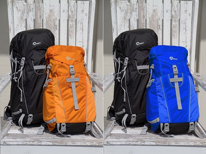
The first is a quick method and the second tends to do a better job. I’ll be using this the image below from my review of the Lowe Pro Photo Sport 100/200 AW bag. This demonstration was created with Photoshop CC 2017.
The Quick Method
This method is a quick color swap that may or may not cover your needs. If your subject has nice, solid colors without very much tonal difference, you can likely use this method by itself. Go ahead and open your file in Photoshop and let’s get started!
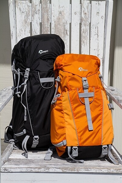
Sample Image
Step #1 Create a Hue/Saturation Adjustment Layer
Click on the “Create New Adjustment Layer” button on the bottom of the Layers panel and choose “Hue/Saturation”.
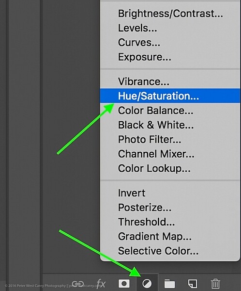
Choose Hue-Saturation
In the Properties window that pops up, there is a little hand with a pointer finger in the upper left side of the box. Click that.
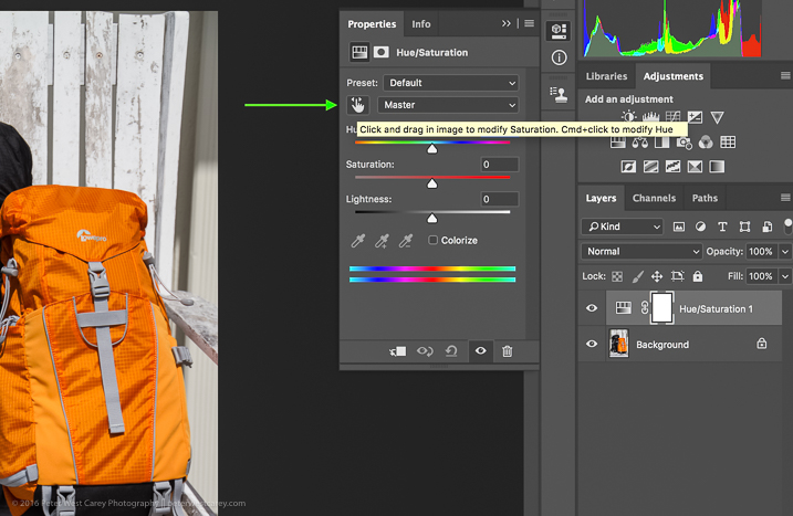
This is where my method deviates from some others. As you can see in the image above, there is an option to hold Cmd/Ctrl as you drag the mouse, and change the Hue straight away.
This is a tempting method, for sure. But it won’t always get you as close to your desired results as if you follow the rest of these instructions. For instance, I used that method to try to change the orange pack to blue and this was the result.
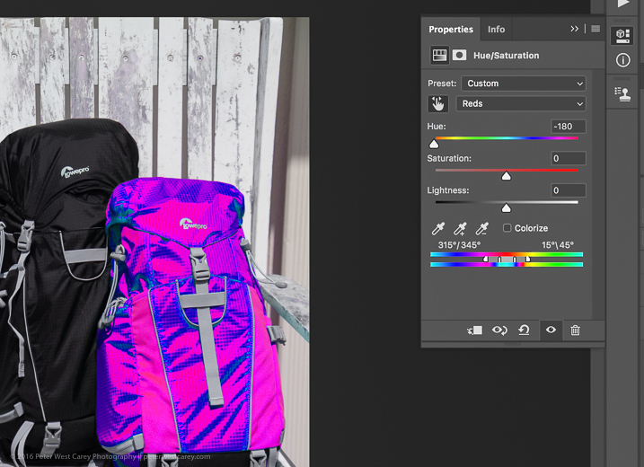
Not what I wanted. So….
Step #2 – Select a color range
After you click that little finger and hover over your source color (the orange bag), click there to select the color. Your screen will change depending on which color you pick, but more or less it will look a little like this.
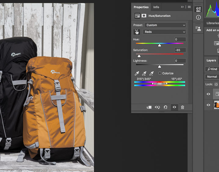
I chose a dark spot so my saturation for all orange dropped and now there is a little slider in the color bands at the bottom of the properties box. You will be using those bands and the saturation slider to refine your selection.
Step #3 – Adjust to get all the color
To know you have the right colors you want to work with, move the Saturation slider all the way down, essentially turning off the source color. If that doesn’t get all the color you want, move the little white bands on the color slider on the bottom until it captures all your source color.
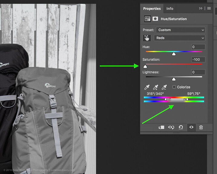
Move Saturation to -100, and adjust the bands (bottom green arrow) left or right, or apart, until there is no more of the selected color showing.
Can you see how that lighter gray box on the sliders at the bottom is larger (they were moved farther apart) in this image compared to the one above? That is to make sure I gobbled up all the orange, including some reds and yellows. Fiddle with this option to capture all your source color.
Step #4 – swap the color for a new one
Now that you know you have the right source color, jack up the Saturation slider then move the Hue slider until you get a color you like.
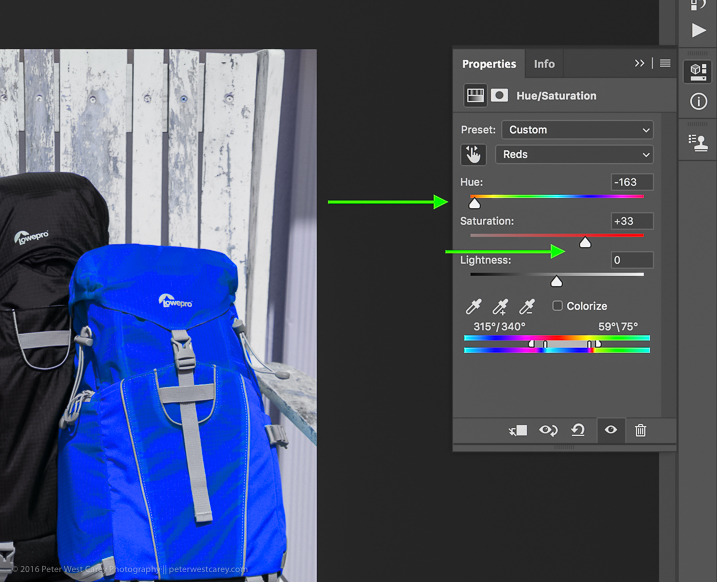
If you’re looking for quick and easy, you are essentially done! Save the file with a new name and you’re good to go.
But wait! Things aren’t as good as they could be with this method. For one thing, there is now a slight tint to the entire image as the mask was applied to the entire image. Let’s clean that up a little.
Method #2 for swapping colors
Method #2 picks up where Method #1 left off and continues:
Step #5 – Apply a layer mask
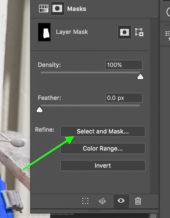
In this step, you want to apply a mask to the Hue/Saturation adjustment layer (seen on the right side of the layer) just to the backpack so it doesn’t tint the whole image. Click on the layer mask and the information panel will change to show mask options.
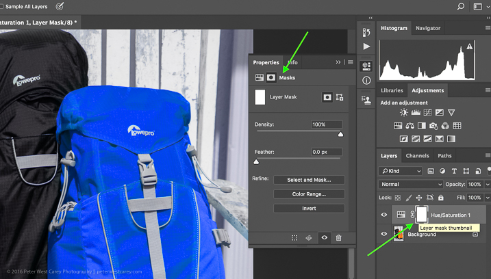
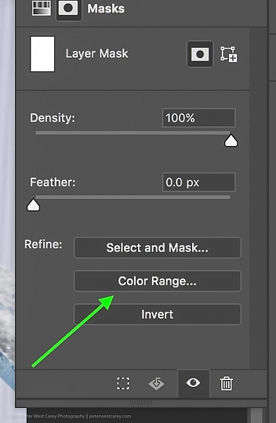
Choose “Color Range…” from the “Refine” options at the bottom.
This should bring up a mask with the color range you have already selected and changed in the steps above. Your mask should show the area of color you are swapping as white, like so:
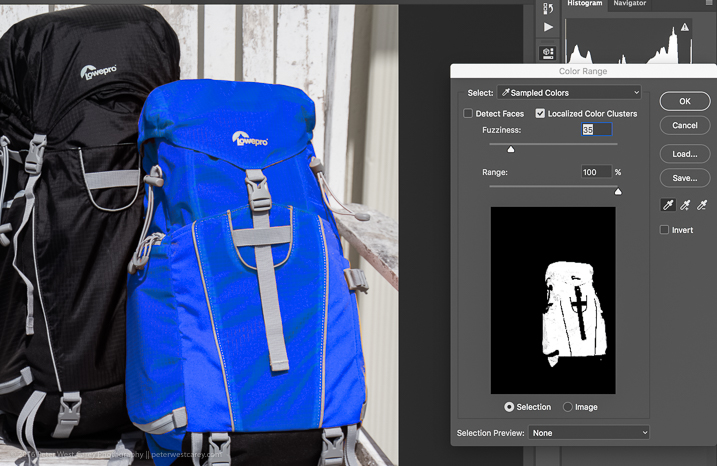
Click OK to apply the layer mask.
Step #6 – Refine the layer mask
Now you need to refine the layer mask just a little as Photoshop is not always perfect. Take a look close in my example and you can see some orange peeking through.
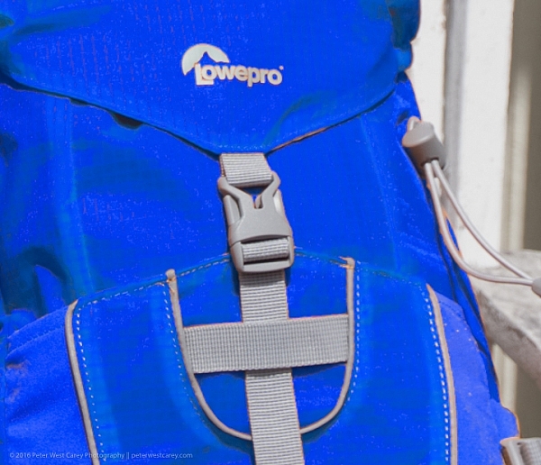
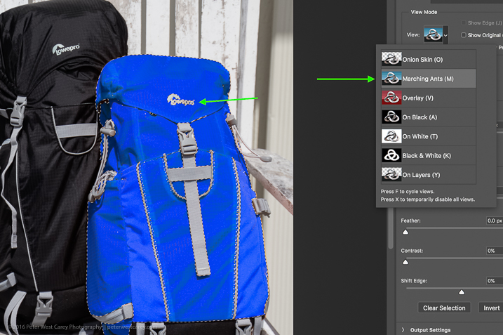
To eliminate this effect, click on “Select and Mask”, once again in the “Refine” options area.
Choose to use the “Marching Ants” View to make it easy to find the missing areas.
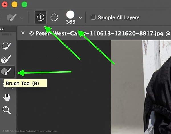
Then in the upper left corner, choose the Brush Tool and make sure the “add” feature (+) is selected. Lastly, choose a radius size to make the selecting easy. In this case, I used 365.
Now paint all over the area you want to change to the new color. It’s okay to go slightly over the edges to ensure all of the color is changed. If you are making drastic changes or if your background color will interfere, you may need to be more careful with your painting.
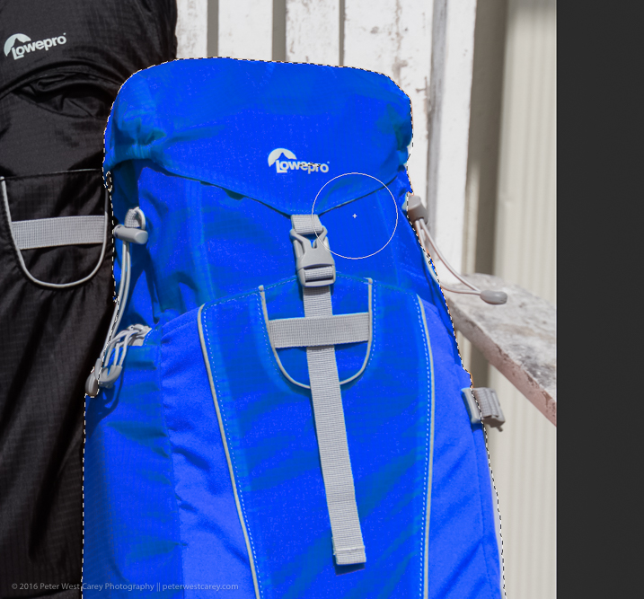
Zooming in, you can see that I missed some edges here and there and overlapped a little too much. Take your time and make it look good.
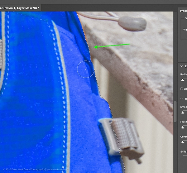
You can also see in the image above that there is still an orange cast on the armrest of the chair. To make the scene complete, I’ll swap that color as well.
Click OK when you are finished painting in the area to swap. You’re just about done!
Step #7 – Layer blend mode
Depending on what you’re swapping and the textures and colors involved, you may be able to get a slightly better result by choosing a different blend mode option for this layer. Click the word “Normal” above your layer and play around with the different layer blend mode choices.
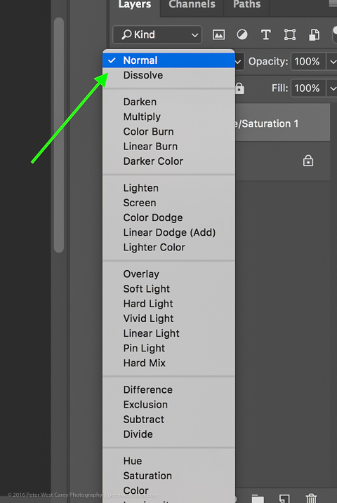
You’re done!
From here, you can fiddle until your heart is content. Try new blending modes and opacities. Refine your masks. Then sit back and enjoy your handy work!

Cautions
- Watch out for white objects when there is a lot of white in the scene. These can be tricky.
- For that matter, watch out for the color you want to swap appearing anywhere else in the image. You’ll need to remove the mask from those areas manually (Step #6 but use the “minus” option).
googletag.cmd.push(function() {
tablet_slots.push( googletag.defineSlot( “/1005424/_dPSv4_tab-all-article-bottom_(300×250)”, [300, 250], “pb-ad-78623” ).addService( googletag.pubads() ) ); } );
googletag.cmd.push(function() {
mobile_slots.push( googletag.defineSlot( “/1005424/_dPSv4_mob-all-article-bottom_(300×250)”, [300, 250], “pb-ad-78158” ).addService( googletag.pubads() ) ); } );
The post How to Swap Colors in Photoshop – Two Methods Explained by Peter West Carey appeared first on Digital Photography School.
2 Simple Methods for Adding Color to Your Images Using Photoshop
Most of us have experienced photographing an incredible sunrise or sunset only to get home and realize that the colors in your images are not nearly as good as the colors you witnessed with your own eyes. There can be many reasons to this, such as camera limitations or mistakes you made in the field. However, that’s not what you will learn about in this article. Correcting the colors, or adding color, isn’t something you need to spend hours working on. In fact, it can be done in just a few minutes using Adobe Photoshop and you don’t need to be a Photoshop expert to do it.
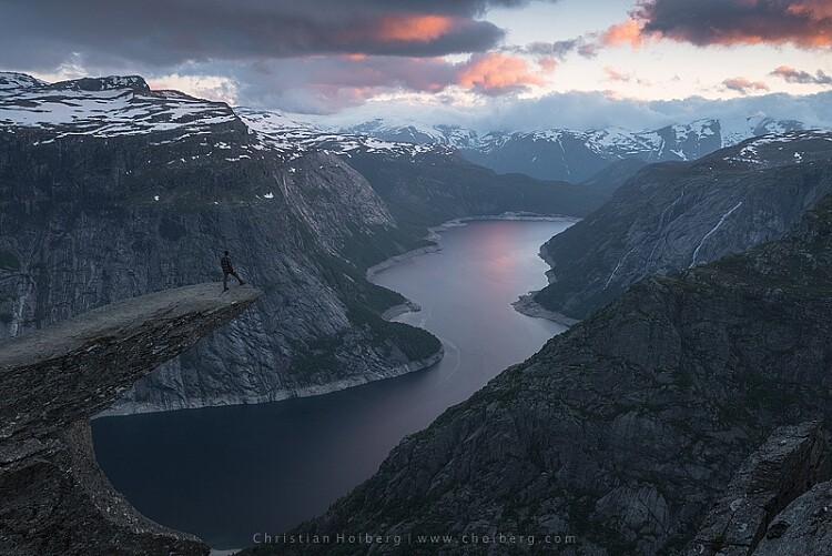
Trolltunga, Norway – We will be adding color to this sky
As we all know there are many ways to get to Rome, there isn’t only one method of adding colors in Photoshop either. It can, as I mentioned above, be done fairly easy but the more detailed adjustments you wish to make, the harder it will become. In this article, we will be looking at two easy methods to add color in Photoshop.
#1 Adding Color with a Photo Filter
The first method we will look at involves the Photoshop tool called Photo Filter. This is an Adjustment Tool which you can find by clicking the Adjustment Tool icon (the half-filled circle located below the layers palette, see screenshot below). This creates a new layer named Photo Filter 1, which we will be working on.
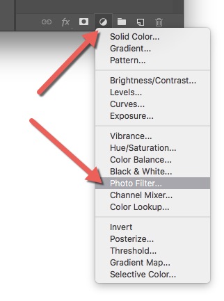
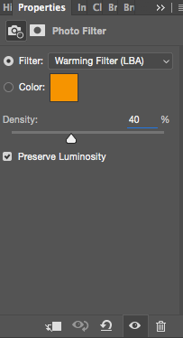 A warming filter is the default setting so, as you might see, the image now has an orange color cast. Personally, I prefer using Warming Filter (LBA) as I find this to have the most natural color that suits my images best (see screenshot on the right). Select this filter by clicking on the Filter dropdown menu. Alternatively, you can select a color manually that might suit your specific image better. If you find the adjustment to be a little too weak you can strengthen its appearance by increasing the Density. I rarely go above 40% Density as the colors then quickly become washed out and results in a look I don’t want.
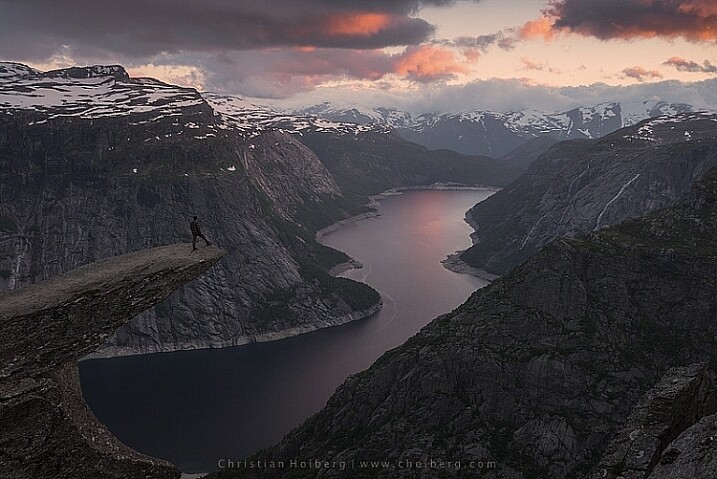
Photo Filter applied to the whole image at 40%
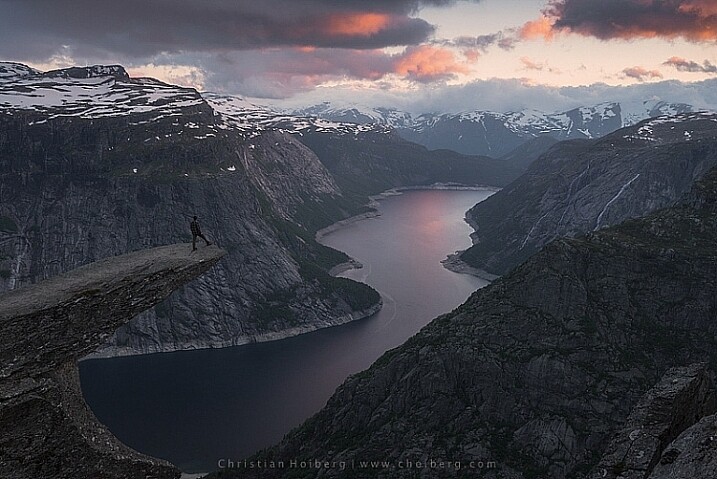
Photo Filter applied to the whole image at the default 25%
By using this filter we have brought back some of the color in the sky. There’s not a huge difference but we’ve managed to keep a natural look in the image while the sky still looks good. However, there’s one problem. We don’t necessarily want to add the extra color to the landscape itself, we only wanted the sky to be affected.
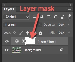 Left of the Photo Filter 1 text there’s a white box. This is the layer mask, basically telling Photoshop what area of the image should be affected by that particular layer. White means that it’s visible and black means that it’s concealed. By default the entire mask is white. To remove the adjustment from the landscape itself follow these steps:
- Select the Layer Mask by clicking on it (it will show square brackets around the mask when it is selected, see screenshot on the right))
- Select a black brush and set Hardness to 0%
- Reduce the opacity of the brush to 80%
- With the Layer Mask still selected, carefully paint on the areas you do not want affected by the filter. You’ll see the adjustment disappear from those places as you paint.
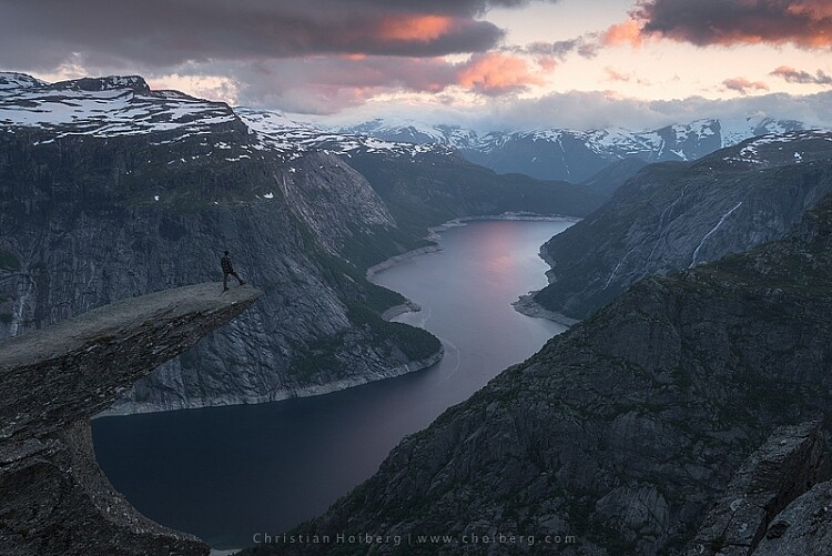
The Photo Filter layer masked to only affect the sky.
This is the easiest way to manually choose where the adjustment will be visible. Unfortunately, it’s also the least accurate. You might see some haloing along the edges or perhaps the color bleeds onto the horizon at certain places. By zooming in on the image and using a smaller brush you’ll be able to reduce the amount of haloing or bleed. Other methods, such as Luminosity Masking, are more accurate but also demand a better understanding of Adobe Photoshop.
#2 Add contrast with Curves Adjustment Layer
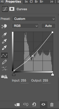 Another easy method to add colors is by using the Curves Adjustment Layer. Unlike Photo Filter, we will be using Curves to add contrast in the sky. Follow these steps to do a Curves adjustment:
Open a Curves Adjustment Layer by clicking on the Adjustment Layer icon again, and selecting Curves this time.
You want to add some contrast and increase the colors slightly by darkening the sky. Do this by clicking in the middle of the line in your Curves layer and pulling it down gently. Make sure that you don’t go too far as that will lead to unwanted grain or color distortions.
That’s it. To remove the adjustment from the landscape create another Layer Mask and follow the same steps as with the previous method above.
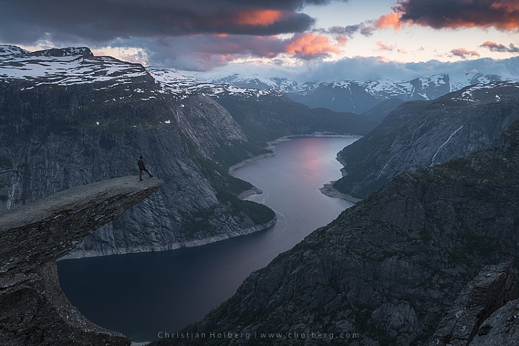
As you might have noticed these are two subtle adjustments. You won’t get a surreal sky by following these methods. Instead, you’ll maintain a natural look and still bring out some of the color you wanted to capture.
googletag.cmd.push(function() {
tablet_slots.push( googletag.defineSlot( “/1005424/_dPSv4_tab-all-article-bottom_(300×250)”, [300, 250], “pb-ad-78623” ).addService( googletag.pubads() ) ); } );
googletag.cmd.push(function() {
mobile_slots.push( googletag.defineSlot( “/1005424/_dPSv4_mob-all-article-bottom_(300×250)”, [300, 250], “pb-ad-78158” ).addService( googletag.pubads() ) ); } );
The post 2 Simple Methods for Adding Color to Your Images Using Photoshop by Christian Hoiberg appeared first on Digital Photography School.
How to Use Bracketing to get Your Best Shot – 3 Different Methods
One of the most difficult and frustrating parts about shooting with film, back before the days of digital photography, was the limited amount of attempts you had to get the photo you wanted. I remember carrying around spare rolls of film in a fanny (waist) pack on a trip to Walt Disney World years ago, and carefully considering each photo, lest I get one setting wrong and blow the entire shot.
Back then you had to wait days, or even weeks, to get your pictures back from a processing lab, and if a picture was too dark, grainy, or out of focus there was nothing you could do about it at that point. Fortunately, digital cameras are far more forgiving than their film-based counterparts, and have many systems in place to make sure you do get the shot you want. But even then, sometimes things still don’t quite work out.
Thanks to a technique called bracketing, you can use the power of your camera, combined with the space available on most memory cards, to make sure you always end up with just the right photo every time.
What is Bracketing?

There’s a classic children’s tale called Goldilocks and the Three Bears, in which a young girl enters the home of the bears and helps herself to their food, furniture, and futons. With each set of items there are three options: two that don’t quite work out and one that is, as the story goes, just right. While the story could be seen as a cautionary tale about the dangers of sneaking into the home of wild animals, and sleeping in their beds uninvited, its lessons can also be applied to photography.
Essentially, Goldilocks demonstrates the concept of bracketing, by giving herself many options so she can make sure to have at least one that is precisely what she is looking for. In photography there are various types of bracketing, but all involve taking multiple photos, so as to ensure you have at least one good picture. Bracketing can also be used to combine different elements of various photos together to get the best of all versions. The three most common versions of bracketing involve exposure, focus, and white balance.
If you have ever struggled to get just the right shot, or want to learn a new technique to improve your photography, this might be just the thing you’ve been looking for.
Exposure Bracketing
Modern digital cameras are pretty good when it comes to evaluating a scene, and giving you just the right exposure. You can even use different metering modes where your camera looks at either the whole scene, just the center, or even a specific part of the photo like the highlights or some faces. If you know precisely how to control your camera to get the shot you want, you can use these various metering modes, in tandem with your camera’s built-in light meter, to get just the right exposure.
However sometimes it pays to take a few extra pictures to make sure you, like Goldilocks, get an image that is just right. This is where exposure bracketing comes in handy since you can take several additional photos, some underexposed and some overexposed, to make sure you go home with the perfect picture.
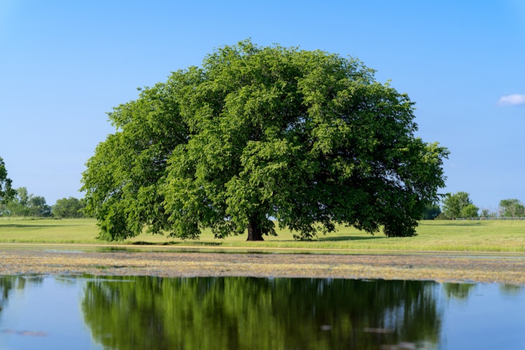
There are several ways to go about using the bracketing technique, and one of the most simple is to put your camera in Program Mode and use your camera’s exposure compensation function.
First, take a picture that appears to be properly exposed. Then use the exposure compensation option to intentionally underexpose your image by one or two stops (-1 or -2). More than two stops is generally unnecessary. You are of course free to do so, but it’s quite rare that your camera’s meter would be off so much as to require more than two stops of exposure compensation to get the picture you want.
Then use exposure compensation to intentionally overexpose your image by one or two stops (+1 or +2), and in the end you will have at least three photos from which to choose: one that your camera thinks is properly exposed, one that is underexposed, and one that is overexposed. This may seem kind of redundant, but it’s a nice insurance policy to make sure you get just the right photo you want. It works especially well if you are shooting landscapes, or other outdoor scenery, as the bright sunlight coming from overhead can sometimes cause your camera to meter a scene improperly, even if you think you have everything set up just right.
Bracketing for HDR
Another benefit of using exposure bracketing, is that it lets you create stunning works of art using a technique known as HDR, or High Dynamic Range. This requires the use of exposure bracketing, a tripod, and often some special software like Photoshop, Lightroom, or Aurora HDR Pro, to combine several photos into one.
To get started with HDR you need at least three images, bracketed in full stops of exposure. Take one image properly exposed, then underexpose by one or two stops, and then overexpose by one or two stops. Some cameras do this bracketing automatically with a built-in bracketing function (AEB) but I often find that I like to control the exposures manually with exposure compensation, or by using manual mode. You can use more than that, but if you are just starting out three bracketed photos should be sufficient.
Once you have your bracketed photos, load them into the software of your choice, and you can instruct it to combine them into a single photo that takes the best parts of all the images and creates a single frame-worthy masterpiece. To see this in action, first look at the following image, which despite having a fairly even exposure overall, still suffers in a few areas.

This is an un-retouched JPEG image straight from my camera. The overall exposure is good, but the sky is bright white and the hallway is a bit too dark.
I used exposure compensation to overexpose the image by two stops, which lost almost everything in the sky, but brought out much more detail and color in the darker areas of the hallway.

The same scene, overexposed by two stops.
Then I took a third image, this time underexposing by two stops, which made the dark parts really dark, but brought out much more color in the sky.

This image was intentionally underexposed by two stops.
Finally, I used Aurora HDR Pro to combine all three bracketed JPEG images into one that contains the best of all worlds. This shows how useful bracketing can be, and might give you some ideas for how to use it in your own photography.

This final image was made using Aurora HDR Pro to combine all three bracketed shots into one, and final edits in LR including correcting the tilting building.
In recent years the image sensors on many cameras have gotten so good, that the use of exposure bracketing is not as critical as it was in days gone by. If you shoot in RAW instead of JPG, a single image will often contain so much information in the highlights and shadows, which you can recover using Lightroom or Photoshop, that you simply don’t need to take separate images and combine them later. One major disadvantage of this is the file sizes, which on some RAW formats can be anywhere from two to 10 times as large as a JPG file. At the end of the day though, exposure bracketing is still a valuable technique that many photographers rely on to get just the right result, and you might enjoy trying it out to see if it works for you.
Focus Bracketing
Another way to apply the bracketing technique is to take several images that are focused at various distances, which is especially critical when doing close-up photos or taking macro shots. On most cameras the autofocus generally works great to make sure things are crystal clear and tack sharp. But, when using very shallow depth of field, or focusing on objects that are extremely close, it’s not always going to produce the most reliable results.
Often when doing this type of photography you will end up with pictures that are just slightly out of focus in one direction or another, either in front of the subject or behind it, and there is no way to fix that in Photoshop, or any other image editor.
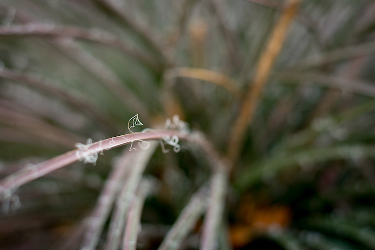
I made this image by slowly adjusting the focus on my lens while I took several shots. Only one had the single strand sharp and in focus, but that one picture was all I needed.
The solution to this problem is to take not one picture, but several, and use manual focus instead of automatic. I start by intentionally focusing not on the subject but slightly behind it, then I slowly turn the focusing ring on my lens as I take several images in a row. I know it can be a bit intimidating to shoot using manual focus, but once you try using this technique, you will probably start to see how useful it can be.
When you have your set of images loaded in Lightroom, or another image editor, you can then pick out the exact one you want, instead of hoping you got one in focus while relying on your camera’s built-in autofocusing algorithm. If you want to get into an even more advanced technique with focus bracketing, you can actually combine all your photos into one super-sharp image using a technique called focus stacking. But if that seems like a bit much for you, it’s still worth your time to try regular focus bracketing, just to make sure your close-up subjects are tack sharp.
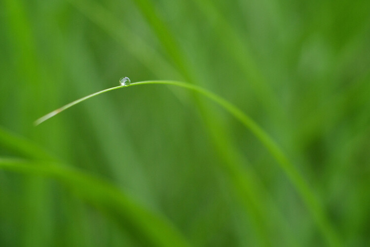
Nailing focus on the water drop was almost impossible. So I took several images while focusing manually, to make absolutely sure I got at least one good image.
White Balance Bracketing
The final technique I want to discuss here is similar to the other two types of bracketing in that it also involves taking several photos of the same scene, while adjusting a single parameter. In this case it’s the white balance, instead of the exposure or focus. Most casual photographers use the Automatic White Balance setting on their cameras, which does a pretty good job most of the time. But every now and then it can leave an image with an ugly green or red tint, or all pale and washed out, because of improper white balance.
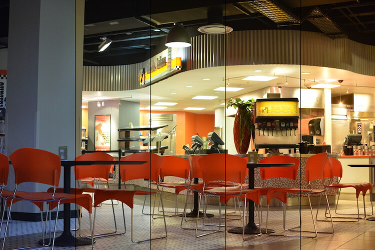
The lighting conditions here wreaked havoc with my camera’s Auto white balance. So, I took five separate exposures, and manually adjusted the white balance each time, in order to make sure I got one good shot.
White balance bracketing can be very useful if you shoot JPG, because your camera’s Auto white balance setting is not always as reliable as you want it to be. However, if you shoot RAW you have complete freedom to alter white balance as much as you want using a program like Lightroom, Photoshop, or almost any other image editor. Because the RAW format does not discard any photo data like JPG does, white balance bracketing is not needed when you are shooting. That gives you far more flexibility for fine-tuning things like white balance, as long as you are willing to take the time to do it.
Do you find bracketing to be useful in your own photography? When have any of these techniques been especially useful to you? Share your thoughts, and any pictures as well, in the comments below.
googletag.cmd.push(function() {
tablet_slots.push( googletag.defineSlot( “/1005424/_dPSv4_tab-all-article-bottom_(300×250)”, [300, 250], “pb-ad-78623” ).addService( googletag.pubads() ) ); } );
googletag.cmd.push(function() {
mobile_slots.push( googletag.defineSlot( “/1005424/_dPSv4_mob-all-article-bottom_(300×250)”, [300, 250], “pb-ad-78158” ).addService( googletag.pubads() ) ); } );
The post How to Use Bracketing to get Your Best Shot – 3 Different Methods by Simon Ringsmuth appeared first on Digital Photography School.
You must be logged in to post a comment.