RSS
 

Posts Tagged ‘Macphun’s’

How to use Macphun’s Luminar for Beginners

31 Oct

If you haven’t used it before, your first question might be what exactly is Luminar? Simply put, it’s photo editing software designed by Macphun (available soon for Windows – download the beta version to try it here).

It might differ a little bit from other photo editing software that you’ve used because it is a photo editor only – it does not include an image cataloging component. It is also a one-time purchase rather than a subscription-based product. Luminar’s workflow focuses on very easy-to-use presets that literally enable you to press one button and completely process your image, ideal for beginners.

Luminar for beginners - white hibiscus

Cropped and edited in Luminar using Mild Image Enhancer Preset at 85 opacity, plus a white balance adjustment.

In this article, I’ll upload some images and take a whirl around the user interface so that you can understand where all the tools are, and what they do. After that, we’ll dive in with some basic editing techniques. In just a few paragraphs, you’ll have some great ideas on how to use Luminar to edit your own photos.

Starting in Luminar Stand-Alone

To start, click on the Luminar icon. The initial screen asks you to Open Image. Click the blue button to open a Finder  (or Explorer) window, navigate to your chosen image, select it, and click open. Your image opens in Luminar.

Luminar for Beginners - Start

Opening in Luminar from Lightroom

If you prefer to start in Lightroom, right-click on your image, select Export > Luminar > Open Original Image. Your image opens in Luminar. Note: you can also select Edit in > Luminar.

Luminar for Beginners - Lightroom

If you made adjustments to your image in Lightroom such as lens corrections, cropping, straightening, spot removal or noise reduction – instead of choosing Open Original Image, choose “Use .TIFF with Lightroom Adjusters”. Or select Edit in > Luminar and choose “Edit a copy with Lightroom adjustments” from the options.

The Top Toolbar

Let’s take a quick look at the top toolbar inside Luminar. We’ll discuss where everything is and what they do but, just in case something doesn’t make sense, and you’re not sure what each icon does, hover your cursor over it. A tiny pop-up will appear and you can confirm that you’re looking at the right tool.

Luminar for Beginners - top toolbar

Luminar’s top toolbar.

Side Panel

Starting in the far right corner of the Top Toolbar is an icon that allows you to open and close the Side Panel, which is where you add Layers and Filters to make adjustments to your image. I prefer to work with the Side Panel open but if you need to see a larger version of your image, click this icon to toggle it off and give yourself a larger workspace. Click it again to toggle it on.

Luminar for Beginners - Side panel open

Here the Luminar workspace has the Side Panel toggled on. Note that if the icon is white, it is toggled off; if an icon is orange, it is toggled on.

Preset Panel

The icon for the Preset Panel is one to the left of the Side Panel one. Again, click the icon to toggle this panel on and off.

Luminar for Beginners - Preset Panel

When activated, the Preset Panel runs along the bottom of the Luminar workspace, giving you a preview of what each will when applied to your image.

Layers and Histogram

The next icon is the Layers panel. It looks like two sheets of paper in a stack. Because the focus of this article is on beginning techniques, we’re not going to talk about layers here. Just make a quick note of where this icon is so that when you’re ready to give it a go, you know how to find it.

To the left of the Layers icon is the Histogram icon.

Luminar for Beginners - histogram icon

The Histogram icon is highlighted here in red, the Layers one is just to the right of it. Currently, Layers are turned off so it is gray.

The Histogram itself has two triangles that can be clicked on and off as well. Solid orange triangles indicate this feature is on. When these alerts are on the triangles indicate if your image has any blown highlights/whites or blocked up shadows/blacks. If it does, they’ll be called out in red or blue respectively on the image.

Luminar for Beginners - highlight alert

The bit of red “paint” on the petal all the way to the left indicates blown-out whites.

History

Click the little clock icon to pull up the history of all the changes you’ve made to your image. If you’re not sure you like what you’ve done, click on any of the previous steps to get back to a point that you do like.

Luminar for Beginners - History Icon

Undo

The curved arrow to the left of the History icon will undo the last step that you’ve made.

Compare

Possibly one of my favorite Luminar features, Compare is the little icon just to the right of the eyeball. Once you activate the comparison frame, you can slide the before/after line back and forth over the image to see how your adjustments are affecting it.

Luminar for beginners - compare icon

Preview

The eyeball icon can be toggled on and off to quickly show you your original versus your edited image.

Luminar for beginners - preview icon

Zooming Icons

There are four zooming icons. You can toggle between 100% and Fit to Screen or make incremental size changes by using the + (plus) and – (minus) icons.

Luminar for beginners - zoom icons

Side Toolbar

Running down the right-hand side is a list of tools that are mostly more advanced so we won’t be addressing them gere. However, the Crop Tool, a scissors icon, is part of almost every workflow.

Luminar for beginners - crop tool

Luminar for beginners - pink hibiscusCropped to a square and processed using Quick and Awesome Workspace in Luminar.

Filters

Now that you know where all the tools are, let’s talk about how to use them to make adjustments to your image.

Luminar calls each set of adjustments a Filter.  For example, the Tone Filter contains sliders that adjust Exposure, Contrast, Whites, Blacks, etc. Some filters, like the Polarizing filter, contain only one adjustment.

Luminar for beginners - filter panel

To add additional Filters to your image, click the + (plus) sign to open the flyout menu, scroll through it, select the filter you need and then adjust the slider.

Luminar for beginners - Filter flyout menu

Note: if you click the name of the filter it will be added and the flyout menu will close. But if you want to add more than one filter just click the little + at the end of the filter name and it will add that filter and keep the menu open so you can add more.

Workspaces

Luminar offers quite a few different Filters and as you are learning the program you may not know which is the best set of Filters to add to your image. One of the ways that Luminar helps you narrow things down is by giving you Workspace options. For example, let’s say your image is monochrome (or you want it to be). You can choose the B&W Workspace as a starting point. If it’s a landscape, choose the Landscape Workspace.

Luminar for Beginners - Landscape workspace

Luminar’s workspaces make it simple to use.

The Filters included in each Workspace have been selected to enhance just the type of image you’re working on. The adjustment of each slider is left to your discretion.

Luminar for beginners - wild horses

Cropped and edited in Luminar using the Landscape Workspace.

If you haven’t used Luminar before (or have, but not successfully), start with the Quick and Awesome Workspace. With some images, applying the Accent-AI Filter is all you may need to do. Activate the Compare feature so that as you adjust this Filter, you can see what it is doing. Add Saturation, Clarity, and Vibrance as needed. How do things look? Do you still need additional adjustments but are not sure which ones to apply? Now is the time to try Presets.

Presets

Presets are similar to Workspaces because in each Preset includes a select group of Filters. However, in Presets Luminar adjusts the sliders (or pre-sets them, get it?) to create a unique look. Usually the name of the Preset will give you a good idea of the look that Preset will create.

Luminar for beginners - preset applied

One of my favorite parts about Luminar Presets is that I can adjust the Opacity of them. In the photo below, the Image Enhancer Preset looks just a tad too strong. Dragging the Opacity Slider to reduce it to 65 was a perfect – and easy – solution.

Luminar for beginners - wild horses

Cropped and edited in Luminar using the Image Enhancer preset at 65 opacity, with no other changes.

Four favorite Presets

If you’re not sure where to start, or which Preset to choose, here are four of my favorites:

  • Happy Memories in the Travel set.
  • Warm Sunset in the Travel set.
  • Bright Day in the Outdoor set.
  • Mild Image Enhancer in the Basic set.

To locate the Presets, click the Preset Menu icon in the lower right corner of the interface then click through the choices in each category. Once you find yourself using the same Presets over and over, add it to Favorites so that you can locate it faster. Just click the star on the preset to add it to your Favorites list.

Luminar for Beginners - preset menu

Applying Presets using Compare

To choose the right Preset for your image, scroll through them with the Compare preview panel turned on. As you click on each one, you’ll see both your original image and how it will look after applying the Preset at 100%. That will help you learn how each Preset affects your image and eventually, you’ll find your own favorites.

Luminar for beginners - bright day preset

Fine-tuning Presets

If the Preset you chose for your image looks good but not perfect, remember they can be used as just a starting point. Once you apply them you can decrease the opacity. You can also adjust individual sliders or add and delete Filters in the Side Panel.

Luminar for Beginners - St Johns NL

Cropped and edited in Luminar using the Bright Day Preset at Opacity 80, Vignette adjusted to -25, Blacks adjusted to +10.

Saving your image

If you started in Luminar, have completed work on your image, and want to create a JPG, Select File > Export to image then select the correct folder and rename the file as appropriate.

If you plan to continue to work on the image, or might want to make changes in the future, select File > Save As to create a native Luminar file, then select the correct folder and rename the file as appropriate. That will retain any Layers if you used that feature as well as the History.

Saving your image to your Lightroom Catalog

If you started in Lightroom, it’s a snap to save your image. After you finish processing your image in Luminar, click the Apply button in the upper left corner of the interface. This saves your image and also catalogs it in Lightroom in the same folder as your original image.

Your Turn

Hopefully, you’ve been following along and processing a few images in Luminar as you were reading. Now take a minute to upload your best image for the dPS community and tell us about how you created it in Luminar. Which are your favorite Luminar presets?

Disclaimer: Macphun is a dPS advertising partner.

The post How to use Macphun’s Luminar for Beginners by Lara Joy Brynildssen appeared first on Digital Photography School.


Digital Photography School

 
Comments Off on How to use Macphun’s Luminar for Beginners

Posted in Photography


Review of Macphun’s Aurora HDR 2018

19 Sep

HDR, or High Dynamic Range, photography is a technique that has been around for decades but really started making waves in the modern digital imaging scene around 2005. It involves combining multiple exposures of a picture, usually taken with a technique known as bracketing, to create one final single image with bright parts that are not overexposed and dark parts that are not underexposed.

Review of Macphun's Aurora HDR 2018

In recent years the software required to do this has gotten more powerful, less expensive, and so much easier to use. With just a few clicks anyone can make beautiful HDR images. Aurora HDR 2018 is the latest arrival in this category, created by Macphun, a developer rooted in photography and digital image manipulation. It’s a program that caters to casual users who want a fun creative outlet while also meeting the demands of professionals who make their living from designing beautiful works of photographic art.

If you want a single program that can handle all your HDR needs no matter your skill level, Aurora HDR 2018 may be just the tool for you.

What is HDR photography?

HDR photography is all about getting the best of both worlds when taking photos, particularly of static subjects like landscapes or architecture. If you’re taking a picture with extraordinary bright spots like a sunrise or sunset, you can expose for the highlights (i.e. the bright spots) which mean the dark parts get really dark and underexposed.

Alternatively, you can expose for the shadows (i.e. the dark spots) which leave the bright parts extra bright and overexposed. HDR photos are created when a photographer takes multiple shots, usually three or more, of the same scene: one underexposed, one properly exposed, and one overexposed. Then software such as Lightroom, Photoshop, Photomatix, and others can be used to combine all the images into a single picture that has detail in both the highlights and the shadows.

Before and after image showing what is possible with HDR.

How Aurora HDR is different

Compared to other offerings on the market, Aurora HDR’s brilliance lies in its simplicity. It’s far easier to use and just as capable as other HDR applications, and also very competitive in terms of its pricing. (Unlike some other apps, it’s available as a one-time purchase instead of with a monthly subscription.) When you open the program you are greeted with one large button that lets you load a single image or multiple exposures of the same image, which is all you need to do to get started. If you dig just a bit deeper you will notice two additional options: Batch Processing and Load Sample Images.

The former is useful if you want to quickly apply specific HDR processes and presets to many images at one time. While this can be useful if you have several images to go through I don’t recommend it for beginning users.

Aurora HDR 2018’s bread and butter is the incredible degree of control it gives you over the entire process of creating a High Dynamic Range image. This is where most people will get the maximum value out of the software.

What’s New in Aurora HDR 2018

Whether you are new to the world of creating HDR images with Aurora or are a longtime user of this software, many of the changes in the 2018 version will bring significant improvements to your workflow. The program has been rewritten from the ground up to focus on things like speed improvements, better RAW image handling, and a more user-friendly interface.

There is now a History panel which lets you see all the edits you have made to an image, and functions very much like the same option in programs such as Lightroom, which many photographers already use. The 2018 version also adds a Lens Corrections Tool and a host of other minor but noticeable tweaks while keeping the bedrock foundation of powerful yet easy-to-use HDR tools for professionals and beginners alike.

The lens correction tool is a welcome addition to the 2018 version.

These types of improvements mean a lot to me as a longtime Aurora HDR user since it sends the message that Macphun is committed to developing its apps. I’ve been burned before by companies that stop iterating on software I have come to rely on, such as Apple’s Aperture editing program, but it’s clear that Macphun is not going to leave photographers high and dry.

They have been making software for over a decade and are now even releasing some of their more popular programs for Windows users as well, including Aurora HDR 2018. It’s nice to see this commitment to continual improvement from developers, and it’s one of the reasons I enjoy using Macphun software so much.

Aurora HDR 2018 is open for pre-ordering now and will be available for purchase September 28th. Get more info here.

Other new features in Aurora HDR 2018 include:

  • A Transform Tool
  • Dodge & Burn Filter
  • Image flip and rotate
  • HDR Details Boost Tool
  • Rewritten tone-map engine to deliver more natural initial results
  • HDR Enhancer
  • Improved HDR Structure
  • Additional Blend modes

Getting started with Aurora HDR

If you are new to HDR processing and don’t know where to begin, click on Load Sample Images and you’re off to the races. The program will show you thumbnail previews of three separate pictures: one underexposed by two stops, one properly exposed, and one overexposed by two stops. When the program combines all three it will essentially give you a stunning HDR photo that you can then tweak and edit to your liking using a myriad of controls, filters, and effects.

Using your own JPEGs instead of the sample images results in a similar process, with Aurora HDR 2018 loading thumbnails of your images before you confirm that you want to proceed with combining them.

While using a tripod is ideal for creating perfect bracketed photos, sometimes horizon lines and other elements within the picture may be slightly misaligned. Click the Alignment button to have the program automatically correct for that. Additional Settings gives you options such as removing chromatic aberration and moving objects that might have changed position between each shot.

Keen dPS readers might be wondering whether Aurora works with RAW files, and thankfully they are fully supported by the program as well. You can work with one properly-exposed RAW file or use multiple bracketed RAW files to get even more room to experiment when creating your HDR images. The 2018 version includes a complete retooling of the RAW handling engine which results in improved color rendition and accuracy, which is a welcome change from previous iterations of the software.

Tools and first impressions

Once you have your pictures loaded into the main interface, creating a stunning HDR image can be as simple or as complex as you’d like. This is another aspect of Aurora HDR that I really enjoy. I have used other programs and workflows to do the same basic task of combining multiple exposures into a single image, none are as simple and yet as powerful as this program.

The interface might seem overwhelming at first but after a few minutes, I felt right at home. The non-destructive nature of the editing meant that I soon felt free to experiment with all sorts of different presets, sliders, and options without ruining anything.


Workflow

From a workflow standpoint, Aurora HDR 2018 is designed to be quick, efficient, flexible, and familiar to those who have used other image editors.

When I edit photos in Lightroom I usually head straight for the sliders on the right-hand side to tweak parameters like white balance, exposure, clarity, and sharpness. Aurora HDR 2018 gives you many of those same options. However, I have found that it is more efficient to start with a preset and then edit from there, much in the same way that Lightroom allows you to click a preset such as Aged Photo, Bleach Bypass, or Antique Black and White.

Using these presets in Lightroom just applies pre-determined values to various sliders like saturation, grain, clarity, and color which you are then free to change as much as you want. Aurora HDR 2018 works in exactly the same way. Choosing a preset like Foggy Morning, Realistic Dreamy, or Sleepy Forest results in nothing more than changing the values of Tools sliders on the right-hand side of the screen which you are then free to alter as desired.

Review of Macphun's Aurora HDR 2017

Some of Aurora HDR presets previewed at the bottom of the screen inside the program.

Aurora plays nicely with most other image editors on the market including Lightroom and Photoshop. You can easily use it as a plug-in which means you can do all your normal work in Lightroom, then quickly send an image over to Aurora HDR for additional editing, and save it right back to Lightroom when you’re done.

Aurora HDR presets

If you have ever used Instagram’s photo filters you will feel right at home in Aurora HDR. In a way, you can think of the program like an extraordinarily powerful version of that rather basic social sharing app.

Once your photos are loaded you can click on a preset (each of which shows a small preview of how your final image will look) and then save your photo with no additional work or hassle required. The presets are even subdivided into categories like Basic, Dramatic, Landscape, and a few that were designed with input from professional photographers like Trey Ratcliff, Captain Kimo, and Serge Ramelli.

I must admit I don’t actually use Instagram filters because I find them to be distracting and unhelpful for my own style of photography, but I rather liked using Aurora HDR’s presets even though some were a bit too over-the-top for my taste.

You can take things one step further if you like, and create your own custom presets which can also be applied to any HDR image. This has come in handy for me on several occasions when I wanted to combine options from a few existing presets, tweak the values of a preset, or just create my own from scratch.

Simple interface

On the right side of the interface is a list of all the various tools used by Aurora HDR to control the parameters of your image. Some of them like Color, Tone Curve, and HSL will feel right at home if you have used Lightroom, Photoshop, or other image editors as these contain the same basic sliders you would expect.

When you click on a preset at the bottom of the screen the name of the tools used by that preset are highlighted in orange, which I found to be highly useful during the editing process. Since I knew immediately which values were being changed I could then use that as a starting point for my own experimentation which often led me down a rabbit hole of creativity that I didn’t expect but always enjoyed.

The only issue I had when experimenting with presets and sliders is that the program does tend to slow down when processing your changes, though this is much less noticeable in the 2018 version. While you still get a preview of what your edits will look like I did encounter several times when the “Image Processing…” alert would show up in the lower-left corner a bit more often than I would have liked.

Before and after mode

As you make changes, whether through presets or changing the values in individual Tools sliders, you can easily see how your work is progressing by using the Before/After view which I found to be handy. Clicking on this option gives you a vertical bar that you can slide back and forth to reveal the original image on one side and your changes on the other. You can also hold the \ key to quickly see the complete original and then release it to return to the current version with your edits.

Before and After slider in action showing how your edits are affecting the image.

It’s this sort of editor-centric workflow design that I really appreciated about Aurora HDR 2018. It makes the whole process of creating and editing an HDR image as straightforward as possible and easy to understand. I have used some programs where I felt hopelessly lost as if I had to change my own mindset and wrap my head around how the program wanted me to function.

With Aurora HDR it feels like the program was designed to meet my needs and my style. I never had one of those all-too-common moments of panic when I couldn’t remember where a critical button or tool was located or figure out how to replicate something I did a week ago.

Professional features and masking

Once you dig deeper into Aurora HDR 2018 you will find tools that appeal to even highly demanding artists who want precision control over their creations. A collection of edits such as applying a preset and then tweaking additional Tools sliders can be saved as a Layer, and then additional Layers can be added on top of it similar to Photoshop.

Masks

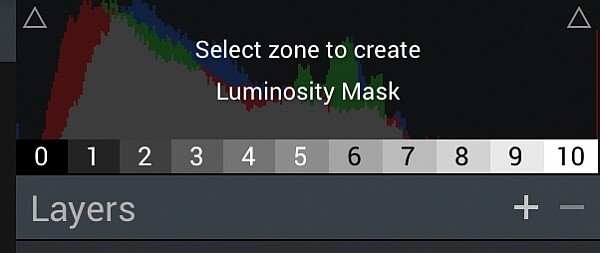
Masks can also be used on layers. You can even apply them with a brush tool which I found extraordinarily useful if there was a preset or set of edits that I just wanted to apply to a single portion of an image. If you want to get really specific with your editing you can even apply masks based on ten discrete levels of luminosity (luminosity mask), which means your adjustments will be implemented only on the brightest or darkest portions of the image instead.

Layer masks can also be applied as radial or linear gradients which can be very useful depending on the type of HDR image you are creating. And just like Photoshop and other image editors, your changes are non-destructive so you can revert back to any editing state any time you choose. You can also return to your edits if you save your file in the native Aurora HDR format before exporting to JPG, TIFF, or another file type.

Review of Macphun's Aurora HDR 2017

Blend modes

New in Aurora HDR 2018 you can also change the layer blend mode. Here it is applied to a layer that is applying selective darkening and lightening to specific areas of the image using the new Dodging and Burning Tool.

The Dodge and Burn Tool has been used to lighten the little cottage and bridge and part of the hill, and to darken the sky and parts of the reflection in the water.

Use the little Eye Icon to turn the effect on and off to see a Before and After.

New in Aurora HDR 2018 – Blend Modes! The default is Normal. Notice with this image the colors have become more saturated after dodging and burning.

By switching to Luminosity Blend Mode the colors are preserved and appear more natural.

Batch processing

One final arrow in Aurora HDR’s rather considerable quiver, which I briefly mentioned earlier, is the ability to quickly apply presets and other defined values to a batch of images. This saves you an enormous amount of time if you have dozens or even hundreds of photos that you want to edit at the same time, using the program’s built-in presets or your own custom ones.

I do wish the Batch Processing option allowed users to specify parameters on a tool-by-tool basis to combine presets with other options like Structure and HDR Denoise, but the workaround is to create your own custom preset and just apply that in Batch mode. Of course, this method doesn’t give you the sort of fine-grain control you would get from editing each HDR image individually, but the trade-off can be worth it in terms of overall time saved if you have a large number of images.

Conclusion and rating

During my time using Aurora HDR I was impressed with the simplicity of its interface as well as the sheer depth of HDR tools at my disposal. Macphun has clearly invested a great deal of time creating and refining Aurora HDR to appeal to demanding professionals and curious hobbyists alike. Having used previous versions of this program I found this iteration to be a welcome refinement in many areas.

In terms of value, it’s a phenomenal piece of software that doesn’t require a subscription and will serve HDR photographers very well. The one quibble I still have with Aurora HDR 2018 is that it’s a bit on the slow side when implementing some presets and manipulating certain sliders. But that was a minor issue with an otherwise stellar program.

Aurora HDR 2018 isn’t for everyone, and unless you specifically work with HDR images you might be frustrated that it doesn’t have features like Dehaze and Red-Eye Removal that you may be accustomed to using in other image editors. But then, it doesn’t claim to be an all-in-one editing program and instead abides by the age-old mantra of, “Do one thing, and do it well.” If HDR photography is what you’re into, then Aurora HDR will serve you very well indeed.

Disclaimer: Macphun is a dPS advertising partner.

The post Review of Macphun’s Aurora HDR 2018 by Simon Ringsmuth appeared first on Digital Photography School.


Digital Photography School

 
Comments Off on Review of Macphun’s Aurora HDR 2018

Posted in Photography


5 Non-HDR Things You Can Do With MacPhun’s Aurora HDR 2017

08 Nov

Yes Aurora HDR was developed for creating HDR photographs. But did you ever think of using it for non-HDR tasks?

You’re in luck because in the next few minutes I’m going to open your eyes to some new ideas. Specifically ideas for using Aurora HDR in your photography workflow without using the term HDR.

What is Aurora HDR?

If you haven’t heard of Aurora HDR, it’s MacPhun’s answer to all the other HDR software out there. Developed in partnership with Trey Ratcliff, Aurora HDR has unique tools which rival even non-HDR software. I look at it as a mix between Photoshop and MacPhun’s Intensify.

But this isn’t about HDR. It’s about anything other than HDR. Before we dig in, know that the software can open a single image just like any other app or plugin. Let’s take a look inside:

scott-wyden-kivowitz_dps_1

Air Force Airmen saluting Air Force One as it takes off.

1. Local Adjustments

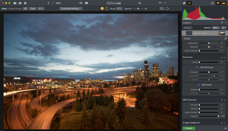
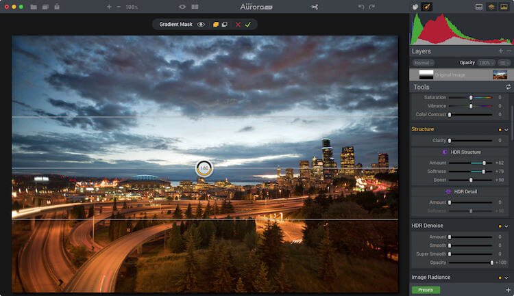
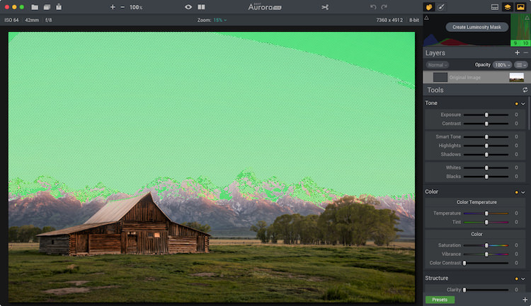
Aurora HDR 2017 includes some local adjustment features which you are used to seeing in non-HDR software, like Lightroom or ON1. It includes things like gradient filters, radial filters, and the new Zone System Luminosity Masking. These are all powerful tools to make unique changes to specific areas of a photograph. The beauty is that any edits made to those local areas do not impact any other region of the image.

One local adjustment feature often overlooked is the Top & Bottom Adjustment module. It’s like the gradient tool but has a few sliders specific to this module. It includes things like exposure, warmth, vibrancy, and contrast. Each of which appears twice; once for the top of the frame and once for the bottom of the frame.

Before

Before

After the Top and Bottom Adjustment.

After the Top and Bottom Adjustment.

What makes this even cooler is the quick slider method of changing the gradient smoothing (blend), X or Y axis location of the tool (shift), and the rotation which makes it vertical or horizontal.

Because the standard gradient tool in Aurora HDR 2017 requires you to make adjustments to the mask, having this module makes quick adjustments to a larger local area really quick.

Local adjustments in Aurora HDR 2017

Local adjustments in Aurora HDR 2017

2. Luminosity Masking

Aurora HDR Pro (pre-2017 version) had Luminosity Masking, but it has been improved in the new version.

Luminosity Masking is popular in portrait processing, but it’s also useful for other kinds of photography. What MacPhun did in the new version is to take a page out of Ansel Adam‘s book, by adding the Zone System into the Luminosity masking tool. Now you can create a mask based on specific zones of light. And they made it so simple.

Aurora HDR 2017's Zone System Luminosity Masking.

Aurora HDR 2017’s Zone System Luminosity Masking.

luminosity-masking-before

With the Luminosity Mask applied.

With the Luminosity Mask applied (masking the sky).

3. Advanced Masking

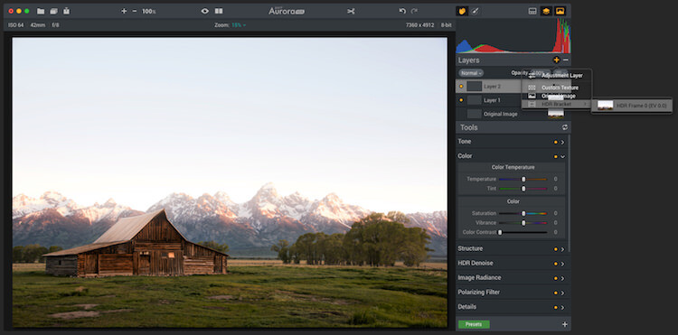
The layers and masking tools in the software are advanced. When you add a layer, you can do it from a single bracket, a blank slate, and other choices. The options enable you to load any amount many brackets you want, and not process them as HDR, but instead do regular masking and editing.

Masking can be implemented using a Wacom Tablet and as a radial or gradient brush, or using the new zone system tool.

adv-masking

This shows both color toning being combined with a brush mask.

4. Color Toning

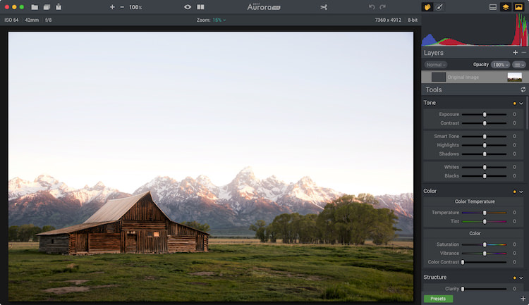
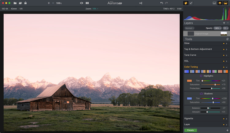
Aurora has heavy duty color toning (split toning) features built into the software. Like Lightroom, users can choose a color to tone the highlights and shadows individually. But Aurora goes beyond that by adding highlight protection of the color. That way you can be more strategic on how much of the highlights are affected by the toning. You also have saturation control of the color for both highlights and shadows.

Like Lightroom, Aurora provides the ability to adjust the balance of the color tone. To add more or less color in either the highlights or shadows. Of course, there is also an amount slider which enables you to reduce the impact of the color on the complete photo.

Color toning applied.

Color toning applied.

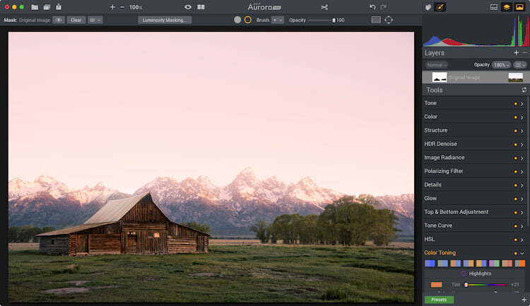
Mask applied to keep the color toning off the roof of the barn and other areas.

Mask applied to keep the color toning off the roof of the barn and other areas.

There are also a variety of preset color toning swatches included, or you can make your own by making an Aurora HDR 2017 preset. When combining color toning with the masking tools you have some incredible color options.

5. Batch Processing

Batch Processing might sound silly to some but think about it for a moment. Imagine you like one of the editing tools in the software, like the color grading tool, and you want to add that to a large volume of photos. With the batch processing tool, you can do that. You would launch the Batch Processor and then choose the preset and settings you want to be used. So if you want color grading, make a preset with it. Simple!

The way MacPhun does it is you can drop a folder of images and pick what preset you want to use on the photos. It will then run through it quickly without you having to do anything.

So Much More

Aurora HDR 2017 is made for HDR photography. I think that’s obvious by its name. But I think it’s important for photographers to understand when a tool can be beneficial, even when it is least expected.

This software has made its way into my regular rotation of post-processing tools. The reason is that when using a tool with a different user experience and features my creativity expands. Doors are opened which were once closed, and I walk away with fun edits of photographs I once didn’t know if I would touch.

scott-wyden-kivowitz_dps_3

Not the end!

If you have made it to the end and wanted one more takeaway, here goes.

My last piece of advice for you is this – go for it and try something new. Even if it’s not this software or the next. If you don’t try, you won’t learn and grow. But really, as a wise green man once said, “Do or do not, there is no try.”

googletag.cmd.push(function() {
tablet_slots.push( googletag.defineSlot( “/1005424/_dPSv4_tab-all-article-bottom_(300×250)”, [300, 250], “pb-ad-78623” ).addService( googletag.pubads() ) ); } );

googletag.cmd.push(function() {
mobile_slots.push( googletag.defineSlot( “/1005424/_dPSv4_mob-all-article-bottom_(300×250)”, [300, 250], “pb-ad-78158” ).addService( googletag.pubads() ) ); } );

The post 5 Non-HDR Things You Can Do With MacPhun’s Aurora HDR 2017 by Scott Wyden Kivowitz appeared first on Digital Photography School.


Digital Photography School

 
Comments Off on 5 Non-HDR Things You Can Do With MacPhun’s Aurora HDR 2017

Posted in Photography


Macphun’s Tonality Pro Versus Lightroom 5 for Black and White Conversion

13 Sep

Tonality Pro vs. Lightroom

MacPhun Software recently released Tonality Pro (use this link to get 20% off, for dPS readers only), a powerful black and white converter for Mac. In this article I’m going to compare it to Lightroom so you can see how the conversion process differs between the two programs.

Windows users please don’t stop reading now – I’ll look at some other black and white plug-ins at the end of the article, all of which are cross-platform.

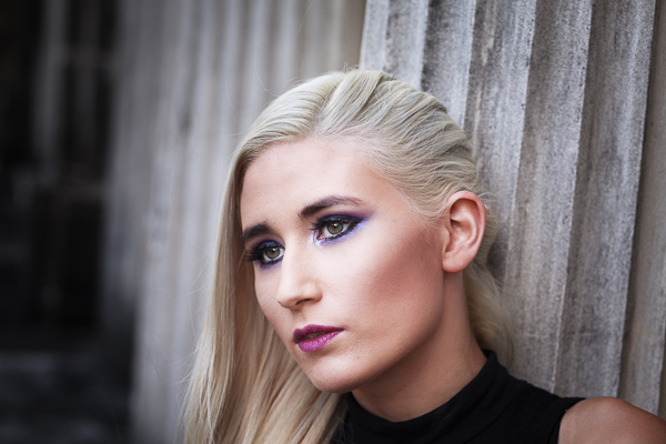
To start, here’s the colour photo that I’m going to convert to black and white.

Tonality Pro vs. Lightroom

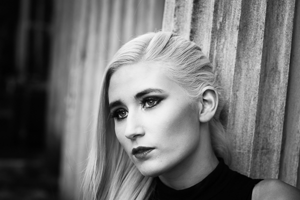
Here’s the black and white version I created in Lightroom.

Tonality Pro vs. Lightroom

It’s a fairly straightforward conversion. I increased Clarity and Contrast, and added a vignette using the Radial Filter. I didn’t touch the Black and White Mix panel, and I didn’t add Split Toning.

All these tools will be familiar to Lightroom users. So, how does Tonality Pro differ? Let’s take a look.

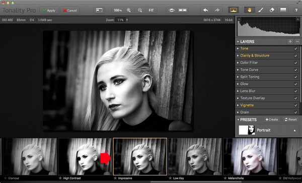
Tonality Pro uses presets

Tonality Pro’s presets give you a variety of ready made black and white conversions. Of course, not all of them will be suitable for your photo, but with over 150 to choose from, you are bound to find at least a few that do good things for your images. If you don’t like using presets, just skip them and go straight to the other panels to do your work.

Tonality Pro’s presets are similar to Lightroom’s Develop Presets. The main difference is that Tonality Pro comes supplied with a full set, while Lightroom only has a limited range of built-in monochrome presets. If you want a decent set of black and white presets for Lightroom, you will have to buy them.

Tonality Pro’s presets have two features that make them a very powerful and versatile feature.

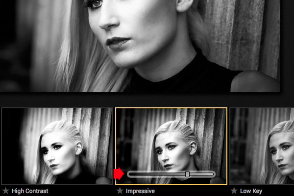
The first is a slider that lets you adjust the strength of the preset. This is useful because the number one problem with presets of any sort is that they can be too strong. A subtle touch is better when it comes to post-processing and many presets are far from subtle. The opacity slider in Tonality Pro helps you deal with that. Let’s say you apply the Impressive preset to your photo. Here’s how it looks.

Tonality Pro vs. Lightroom

Too strong? It’s easy to reduce the strength of the effect until it looks just right.

Tonality Pro vs. Lightroom

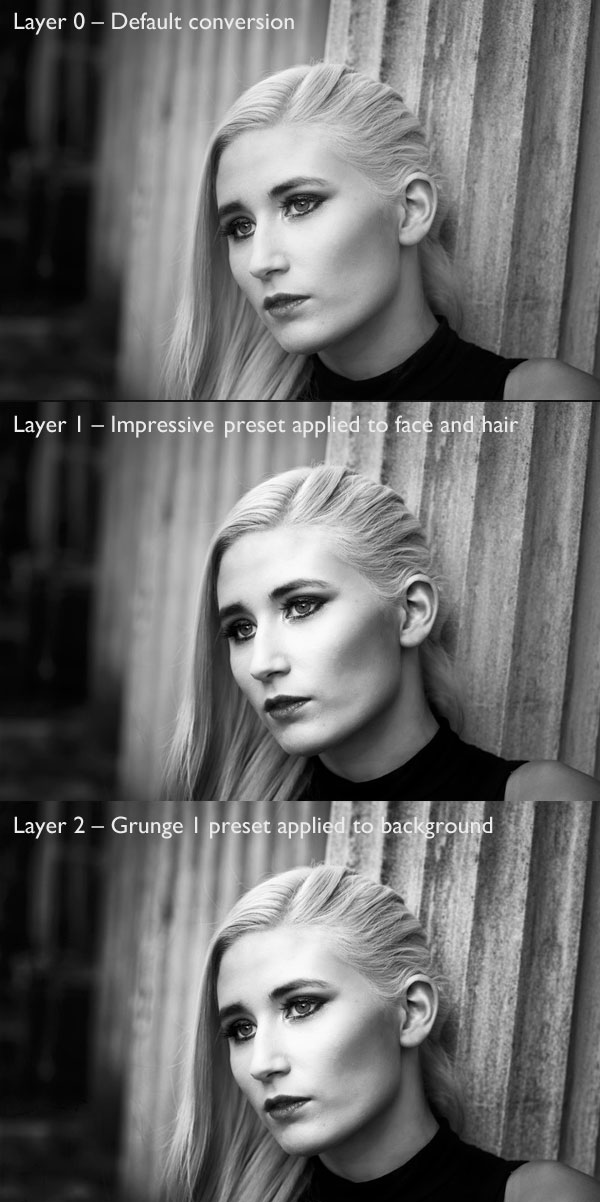
The second feature (I’m really excited about this) is that Tonality Pro has layers. With layers, you can apply a preset on a new layer, then create a mask using Brush mode so that the preset is only applied to part of your image.

Take a moment to think about what that means. For example, you could apply one preset to the subject (in this case the girl in the photo) on one layer, and another to the background on another layer. It’s got the potential to be very powerful, and it’s something that I haven’t seen in any other plug-in.

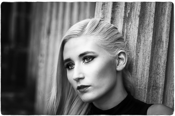
Here’s how it works. In these examples I’ve applied the Impressive preset to the model’s face, and the Grunge 1 preset to the background using layers. I used the opacity sliders to keep the effect subtle. These three images show the result.

Tonality Pro vs. Lightroom

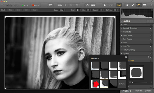
Next I added a frame.

Tonality Pro vs. Lightroom

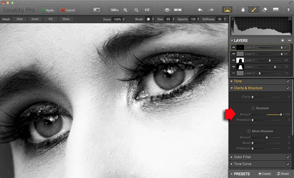
Finally I added some Structure to the eyes, and increased Adaptive Exposure a little to compensate for the way Structure tends to make things darker as well as add detail. You can achieve a similar effect in Lightroom with Clarity, but you will be interested to know that you can adjust Structure in Tonality Pro as well as Clarity (Structure is better than Clarity for bringing out detail).

Tonality Pro vs. Lightroom

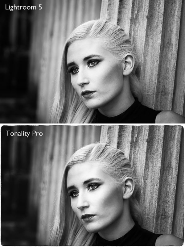
Here’s the final comparison of the two versions of the photo.

Tonality Pro vs. Lightroom

As you can see, apart from the border, most of the differences are subtle. But the way I got there, the editing process itself, was very different.

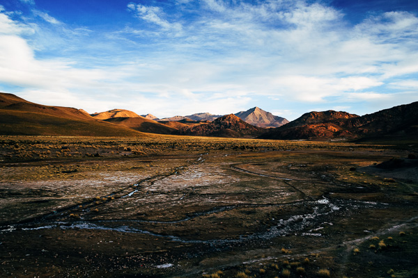
Now I’m going to show you another application of Tonality Pro that you definitely can’t do in Lightroom. Here’s the original colour photo.

Tonality Pro vs. Lightroom

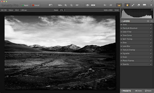
Here’s the initial black and white conversion:

Tonality Pro vs. Lightroom

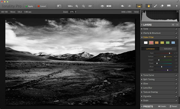
This is the same photo processed in Tonality Pro with a red colour filter applied to darken the sky and add drama to the distant mountains.

Tonality Pro vs. Lightroom

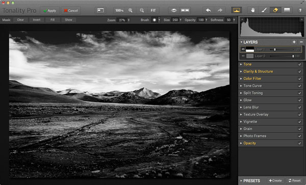
Here I’ve added another layer and applied the El Captain preset, reduced the opacity of the layer to 20 (to keep the effect subtle), and used a mask to apply the preset to the foreground only, not the mountains or sky.

Tonality Pro vs. Lightroom

All this took just a couple of minutes to carry out.

The verdict

This is a simple demonstration but hopefully it’s given you a taste for what Tonality Pro can do, and how it compares to Lightroom.

I’ve only scratched the surface in this article, Tonality Pro has lots more interesting features. Another dPS writer,  Phillip VanNostrand has done a full review here, it covers the software in more depth, so check that out also. In the meantime, if you want to test out Tonality Pro for yourself, or learn more about the program, then you can do so at MacPhun’s website (get 20% off for dPS readers using this link).

How Tonality Pro compares to other plug-ins

Tonality Pro isn’t the only black and white plug-in out there, and you may be interested to know how it compares to some of the others. Don’t forget they all have different features and strengths, and the best one for you depends on what you want to do with your black and white images. You can download trials of all the plug-ins to help you make your mind up. Here’s a brief guide:

Silver Efex Pro 2

Until Tonality Pro came along this was the single best black and white conversion plug-in you could buy. To be honest, I haven’t used Tonality Pro enough yet to say whether it is better than Silver Efex Pro 2. But, there’s no doubt that the layers feature in Tonality Pro means that it is a versatile program that gives Silver Efex Pro 2 a good run for its money.

Silver Efex Pro 2 is more expensive (more than double the price) but it does come as part of the Nik Collection, so you do get the benefit of the other programs within it (Viveza, Color Efex Pro and so on). Silver Efex Pro 2 also has a powerful history function that Tonality Pro lacks.

Alien Skin Exposure 6

One of my favourite plug-ins, Exposure 6 is designed to give your digital photos an analog look. You can use it for both black and white and color photos, and in my opinion it’s stronger on the colour side than monochrome. But it’s still a powerful black and white converter.

It’s more expensive than Tonality Pro, but you get the advantage of being able to use it to process colour photos too. It can be used as stand-alone program as well as a plug-in (as can Tonality Pro).

Topaz Black & White Effects 2

Black & White Effects 2 is a nifty black and white plug-in. Its main benefit is an extensive range of creative presets, including several sets that imitate old processes such as cyanotype, albumen and van dyke brown. It’s also good for emphasizing detail and texture.

Perfect Black & White

onOne Software’s Perfect Photo Suite includes the Perfect Black & White module. Like Silver Efex Pro 2, you get the benefit of the other modules in the suite. But unlike Silver Efex Pro 2, all the modules work together and you can switch seamlessly from one to the other.

One of my favourite modules is Perfect Mask. I use it to blend two versions of landscape photos, one processed for the sky and the other for the foreground. Combined with Perfect Black & White it helps you create powerful and dramatic black and white landscapes. It also works as a stand-alone program.

Discussion time

In my review of MacPhun’s Intensify Pro one reader gave an opinion that photographers who use plug-ins instead of Photoshop are lazy. It’s an interesting topic for discussion, so please let us know what you think in the comments. Do you use plug-ins to process your photos? If you do, which are your favourites and why? Or do you agree with the view that plug-ins are for lazy photographers?


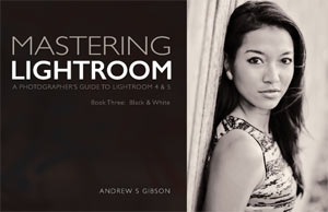
Mastering Lightroom: Book Three – Black & White

Masterlng Lightroom: Book Three – Black & White by Andrew S GibsonMy ebook Mastering Lightroom: Book Three – Black & White goes into the topic of black and white in depth. It explains everything you need to know to make dramatic and beautiful monochrome conversions in Lightroom, including how to use the most popular black and white plug-ins. Click the link to visit my website and learn more.

The post Macphun’s Tonality Pro Versus Lightroom 5 for Black and White Conversion by Andrew S. Gibson appeared first on Digital Photography School.


Digital Photography School

 
Comments Off on Macphun’s Tonality Pro Versus Lightroom 5 for Black and White Conversion

Posted in Photography