RSS
 

Posts Tagged ‘Levels’

How to Take Control of Contrast Using Curves and Levels in Photoshop

07 Aug

Have you ever found your photos flat? The colors are muted and it just looks dull? That’s because it lacks contrast. Sometimes regardless of your best exposure skills, the conditions are not suited to get a wide range of tones. Not to worry though, it can be fixed in post-processing. I’ll show you my workflow for how you can take control of contrast in your images using Curves and Levels in Photoshop.

Of course, there are many ways to adjust the contrast on Photoshop, there’s even a tool called Brightness and Contrast, however, it doesn’t give you much control. What I like to do is to manipulate Curves and Levels. In this article, I’ll explain to you why and how I use these tools to boost contrast.

The issue of low contrast

Low contrast can happen for many different reasons; bad weather for example or photographing through glass. In any case, the resulting image doesn’t show a wide range of tones, in other words, there’s not enough difference between the lights and the darks.

I find this problem occurs especially while traveling, because you can’t go back to the location when the weather is better, or because you are seeing things through a pane of glass. For example, the image I will use for this tutorial was taken through the window while traveling on a tour bus.

How to Take Control of Contrast Using Curves and Levels in Photoshop

How do you know it’s low contrast?

I chose an image where the contrast is clearly low so that you can easily see the effects of every step. However, in some cases, it won’t be as obvious, but you can always review the histogram to know the tonal range of your image.

A typically correct exposure should have a histogram that reaches from black (left) to white (right) evenly spread, with the highest values in the middle. Please note that this can change if you are going for a different effect like low key or high key where you purposely choose a specific range to work with, so I am just talking about the average image here.

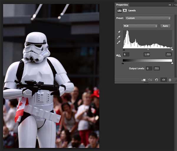
As you can see, in this case, all the information is concentrated in the middle tones, but it doesn’t reach the black or the white side (see histogram below). This is why the image has no contrast.

How to Take Control of Contrast Using Curves and Levels in Photoshop

Using Curves

First, we are going to manipulate the Curves tool. Remember to do it on an adjustment layer and not directly on your original (this is non-destructive editing), that way you won’t loose any information and you can always go back and start again if you don’t like the results. To do this go to the menu then: Layers > New Adjustment Layer > Curves and a new window will pop up.

Curves

You can also get to Curves on the Adjustment panel.

Curves adjustment

Inside that, you’ll find a graph with the histogram on it. The line that crosses the graph controls the contrast; the steeper it is, the greater the contrast.

Curves- How to Take Control of Contrast Using Curves and Levels in Photoshop

You can fix anchor points along the line that you can move up or down to adjust the contrast of the image. Add as many anchor points as you need. The higher right quadrant controls the highlights and on the lower left one, you have the dark tones.

Curves Anchors - How to Take Control of Contrast Using Curves and Levels in Photoshop

If you want to increase contrast, as we do in this case, add one anchor point in the lower left quadrant and slowly pull it down. Watch how it affects the dark areas of the image. Move it until you’re happy with the result. Then add another anchor point in the upper right quadrant and pull it up slowly until the highlights are bright enough for your preference. By making the straight line into more of an s-curve you will add contrast to the image.

Note: if you have an image with too much contrast the opposite can work. Pull down the highlights, and push up the dark areas on the curve to get an inverted s-curve.

After fixing the curves for the overall image, this tool allows you to fine-tune by channel. The step we did before was working on RGB, however, if you click on the drop down menu you can choose each channel to work with separately.

In this case, let’s start with the Blue channel. If you pull up an anchor point from the highlights (the upper right quadrant) you are making the sky, which is the lighter part of the picture bluer. In the left lower quadrant (the shadows) pulling the anchor a little bit down allows you to remove some of the color cast.

Next is green channel so that you can get a wider tonal range out of the forest and nature of the scene. The adjustments are very subtitle because when you are working in such detail the tools become very sensitive. Move around the graph until you are happy with the result.

Remember different light sources have different colors;  a sunset has warmer colors than at noon, artificial light can be more yellow than natural light, etc. Apart from correcting any color bias, it works to add some special effects and get creative. In the next example, you can see what happens when the graph gets completely inverted in the red channel. You can also achieve this by playing with the different presets, in this case, color negative.
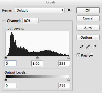
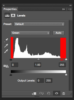
 

Using Levels

Next, you want to manipulate the Levels, also using an adjustment layer. You can do this by going to the menu > Layers > New Adjustment Layer > Levels (or you can find it on the Adjustments panel just to the left of Curves). Again a new window will appear with a different graph, this represents the darkest parts of the picture (0) to the lightest parts (255).

Levels - How to Take Control of Contrast Using Curves and Levels in Photoshop

You can manipulate contrast by dragging the sliders underneath the graph, however, you will have much more control if you use the eyedroppers. This is how to work with them:

First, choose the white eyedropper (bottom one next to the graph) and click on the lightest part of the image that still has information or detail. You’ll notice how your entire image becomes lighter and brighter. Don’t worry about getting it right on the first try, you can click around on the image until you are satisfied with how it looks.

Levels white eyedropper

Levels White - How to Take Control of Contrast Using Curves and Levels in Photoshop

Then pick the black eyedropper and click on the darkest part of the image with detail. Same as the white one, try it until you get it right. You can always do some final adjustments with the sliders as well.

Levels Black - How to Take Control of Contrast Using Curves and Levels in Photoshop

Finally use the gray (mid-tones) eyedropper to set the ambiance or mood of the scene, as it will change depending on where you click. Here some examples:


In Levels, you can also do the selective adjustments by channel if you need.
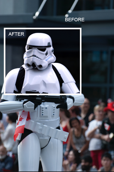
Before and after

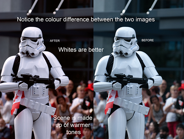
And there you go, when you are satisfied with your results, flatten the image by going to the menu Layers – Flatten Image. See how the histogram has a much wider range now, and the final image has more impact.
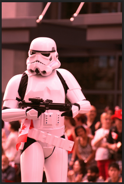
How to Take Control of Contrast Using Curves and Levels in Photoshop

Before image.

Before - How to Take Control of Contrast Using Curves and Levels in Photoshop

Before adjustments for reference.

Histogram After - How to Take Control of Contrast Using Curves and Levels in Photoshop

Histogram after Curves and Levels adjustments.

after - How to Take Control of Contrast Using Curves and Levels in Photoshop

After image.

Handling reflections – example

Remember that when you are photographing through glass there might be reflections, and when you boost the contrast these reflections will be much more noticeable. So think about that before shooting, when you are composing your image.

In order to demonstrate this for you, I made a photo while enjoying a panoramic view from a skyscraper in Milan. It was a 360 degrees glass wall, so I was bound to have a reflection. In order to use it to my advantage, I decided to place my foot strategically so that its reflection would be in between two buildings and entitled the photo “Stepping into Milan”.

Skyscraper Before - How to Take Control of Contrast Using Curves and Levels in Photoshop

Before processing.

Skyscraper After - How to Take Control of Contrast Using Curves and Levels in Photoshop

After processing, notice my foot in the lower left corner?

Dull weather – example

As I mentioned before, it’s not only shooting through glass that can give you low contrast scenes. Here I have another example that had to do with the weather. It was a very cloudy day so there were no shadows, everything looked kind of gray and the light was very flat. This too can be fixed with Curves and Levels following the previous steps.

Canal Before - How to Take Control of Contrast Using Curves and Levels in Photoshop Canal After - How to Take Control of Contrast Using Curves and Levels in Photoshop

Conclusion

Now you know that a low contrast photo doesn’t mean you’ll end up with a flat or dull image, so shoot away! I hope you found this helpful and if you have any doubts or tips about contrast, please share them with us in the comments section below.

The post How to Take Control of Contrast Using Curves and Levels in Photoshop by Ana Mireles appeared first on Digital Photography School.


Digital Photography School

 
Comments Off on How to Take Control of Contrast Using Curves and Levels in Photoshop

Posted in Photography


How to Use the Levels Tool in Photoshop

22 Feb

Photoshop is a pretty daunting program when you’re beginning. So this is the first in a series of articles to bring you up to speed on some of the most useful tools to you as a photographer for editing and correcting your photos. If you’ve been a Lightroom only user, and are a CC subscriber, do follow along to start your journey into Photoshop. In this article, you’ll learn how to use the Levels tool, along with Auto Levels and learn to set up Auto Levels to suit your personal preference for the tool’s response.

You’ll also take your first step with Layers by using a Levels Adjustment Layer right at the end. But first, we’ll talk a little about Histograms.

The Histogram

A Histogram is a graphical representation of the colors and tones in your photo. The bottom axis shows the range of brightness in the image from dark to light. The side axis shows the strength a given tone has at that particular brightness. Typically you’ll hear people say that the bulk of tones should be in the middle, but that’s not exactly right. A night scene of stars will have the bulk of the tones in the dark region, with a spike at the top. Same for a dark product shot on a white background.

How to Use the Levels Tool in Photoshop

How to Use the Levels Tool in Photoshop

Histogram of a high key (light) image.

High Key shots will tend to have more information on the right of the histogram, while low key portraits will have them mostly to the left.

In general, most images will have information throughout the range of tones. When they don’t, but should, that’s where the levels tool comes into play.

Levels

To begin, you can use the keyboard shortcut CNTL/CMD+L, or choose Levels from the Image>Adjustments Menu. This is a destructive version of the tool, so it will throw away pixels. You won’t be saving this file, so it’s okay for now.

How to Use the Levels Tool in Photoshop

I’m using an image that I know is underexposed (you can tell by the histogram below as it doesn’t touch the right-hand side of the graph). Let’s look at what’s in your Levels tool dialog.

How to Use the Levels Tool in Photoshop

Preset:

You can save settings as a preset to reuse again quicker, there are a few default ones that ship with Photoshop. You can choose these presets and see both the effect and what’s been done to get it.

How to Use the Levels Tool in Photoshop

Level presets that come with Photoshop.

Channel

As well as the overall tone channel (RGB), you can select the red, green or blue channels separately. This will change the color balance of the image and you can use it to fix white balance issues or to creatively manipulate the look of the photo. For now, you’ll just be using the RGB channel.

How to Use the Levels Tool in Photoshop

Input Levels

This shows the histogram with three triangles (see above). Each triangle has a number below it (the defaults are set at 0, 1.00 and 255). You can edit these points by dragging the triangle along the histogram. They have names too. The leftmost is the Black Point, which controls the darkest tones in the image. The centre one in the Mid-tone Point, while the top is the White Point, or brightest tone in the image.

If you move the Black Point to the right, all tones to the left of the new position are rendered as pure black pixels. If you move the White Point to the left, this means that any pixel to the right of the new position will be rendered as white. Moving the Midpoint, (also referred to as the Gamma) it will shift the histogram the same direction effectively lightening or darkening the mid-tones. Left will lighten the mid-tone, while moving it to the right will darken. You may also have a perceived change in contrast as some tones at the extremes are compressed.

Output Levels

You can dictate the brightest or darkest point allowable in the image using these sliders. In general, you won’t use these as much as input levels.

Buttons

OK applies the Levels change. Cancel ignores any changes. We’ll look at Auto and Options separately. The Eyedroppers allow you to select the Black, Mid-tone, and White Points by clicking on specific parts of the photo. Preview allows you to see the changes you’re making on the image before applying the effect.

In Practice

Now that you know what the bits do, let’s look at them practically. You can see there’s a huge gap between the ends of the mountain in the histogram below and the White Point slider. By moving the White Point to the left, you can brighten the image and fix the underexposure.

How to Use the Levels Tool in Photoshop

Original histogram – notice the gap between the end of the mountain and the right-side of the chart? This indicates underexposure and is easily fixed.

How to Use the Levels Tool in Photoshop

Here the White Point has been moved to the left to touch the bottom of the mountain. This will give the image brighter tones and pure white.

By holding the Alt/Option key as you slide, you also see a heat map that shows where and clipping (pure white with no detail) occurs. For the White Point, the screen goes black, and the clipped areas show as color. For the Black Point, the image goes white, and again, the clipped areas show as color.

How to Use the Levels Tool in Photoshop

Holding Alt/Option while moving the slider, you can see there are some areas being clipped in the highlights. Move the White Point slider back to the right until they disappear in order to have detail in all areas of your highlights.

Here’s the result:

How to Use the Levels Tool in Photoshop

Fixing overexposure

If your image is overexposed (but without the highlights clipping in important areas), you need to do the opposite. In this case, you bring the Black Point up to fix the issue.

How to Use the Levels Tool in Photoshop

See the different left to right here? There is no black in the image on the left.

Low contrast

Another possibility is the detail is all in the middle of the histogram (low contrast or flat image). In this case, you need to move the sliders in from both ends. Notice the increase in contrast between the two photos.

How to Use the Levels Tool in Photoshop

How to Use the Levels Tool in Photoshop


How to Use the Levels Tool in Photoshop

By moving the Black Point to the right and the White Point to the left the contrast has been increased in this image.

While you’ve seen what changing the black and white points can do, you should also know that moving the midpoint will allow you to brighten (by moving to the left), or darken (by moving to the right) the mid-tones in your photo.

Auto Levels

Auto Levels, as the name suggest, will do this for you automatically. How Auto Levels responds depends on the settings in the Options section. These have changed with time as well, so you may not be aware of this. Press Auto Levels for this to work.

How to Use the Levels Tool in Photoshop

Original image.

How to Use the Levels Tool in Photoshop

After Auto Levels has been applied.

Options

To change the Auto Levels default settings you use the Options button.

Enhance Brightness and Contrast

The default option is Enhance Brightness and Contrast, which uses the external Brightness and Contrast tool to get a good rendition of the file. This is the look in the version of the photo above.

Enhance Monochromatic Contrast

The top option, Enhance Monochromatic Contrast is closer to what you’ve done manually in the previous section. Here’s what it looks like (starting from a fresh version of the file). First the settings in Options.

How to Use the Levels Tool in Photoshop

This results in the following, more dramatic, look.

How to Use the Levels Tool in Photoshop

Auto Levels with the default set to Enhance Monochromatic Contrast.

You can also automatically fix the color by clicking the “Snap Neutral Midtones” checkbox.

You’ll notice that the shadows are more than a little crushed in these images, though. That’s because of the mix of the swatch settings and the clip settings below. Clicking on the swatch gives Photoshop the base color for your blacks, neutrals, and white. In general, these should be black, mid gray, and white, but you could set them to suit tasks like having pure white below 255 to render something when printed, instead of paper white. For now, you should leave these at the defaults.

To prevent pure white and pure blacks being so deep, you need to back off the clipping settings. Put them at 0%.

You’ll notice the reduction in the blacks from this adjustment immediately. If you prefer the drama, leave the black clipping at 0.10%.

You can have your images render this way automatically by ticking the “Save as Defaults” checkbox.

Enhance Per Channel Contrast

This setting emulates you going in and setting each channel separately to get the white and black points to the edge of information for each color channel.

How to Use the Levels Tool in Photoshop

This has the effect of changing both the contrast and the color of your photo as seen below.

How to Use the Levels Tool in Photoshop

Find Light & Dark Colors

This option is used by the Auto Color command. It finds the average lightest and darkest pixels in your photo and uses them to get the best contrast while avoiding clipping.

Each person will have their own preference for which looks best on their photo. So choose the option you prefer the most and save it as the default. Now when you use Auto Levels, it’ll give you a quick fix when you need to get done in a hurry.

Levels Adjustment Layer

Everything you’ve done so far has been destructive editing. You’ve been throwing away pixels, which affects the quality of the photo. Have a look at the histogram in Levels when using the Enhance Monochromatic Contrast option.

See all those gaps? That’s information you’ve thrown away. If you change your mind, you’ve got nowhere to go, you can’t get that information back. There are ways to prevent this of course. You could, for instance, duplicate the layer (CTRL/CMD+J) and work on that. But you have an even better option; the Levels Adjustment Layer.

At the bottom of the Layers panel is the Adjustment Layers option. It’s a circle that’s half black and half white.

Click this to bring up the available Adjustment Layers and choose Levels. (Note: you can also open the Adjustments panel by going to: Window>Adjustments and then find the levels option, it’s the one that looks like a graph right after the sun icon).

The Adjustments panel – Levels is the second one on the top row.

A new layer, called Levels, will appear in your Layers panel. The controls for Levels don’t show as a dialog, they’re now in your Properties panel.

How to Use the Levels Tool in Photoshop

If you can’t see the Layers or Properties panel, you can turn them on in the Window menu. Using the Properties panel, set your Levels. If you’re not happy you can just change the settings as often as you like, without degrading the image like repeated use of the normal Levels tool would.

For the plane photo, I used Auto, which had Enhance Monochromatic Contrast, with 0% clipping, and Snap Neutral Midtones on, as the Default. I then brightened the image using the Midtone, set to 1.15.

Levelled Off

Right folks, so that’s been a look at the Levels tool in Photoshop. It’s one of the most fundamental photo tools in Photoshop. I actually think it’s a shame that Lightroom doesn’t have equivalent options in the Basic panel that emulate the options available in the Auto options (Aperture had buttons for both Monochromatic and Per Channel Auto Levels for example).

Give the tool a try, especially if you’re just starting to come to grips with Photoshop.

googletag.cmd.push(function() {
tablet_slots.push( googletag.defineSlot( “/1005424/_dPSv4_tab-all-article-bottom_(300×250)”, [300, 250], “pb-ad-78623” ).addService( googletag.pubads() ) ); } );

googletag.cmd.push(function() {
mobile_slots.push( googletag.defineSlot( “/1005424/_dPSv4_mob-all-article-bottom_(300×250)”, [300, 250], “pb-ad-78158” ).addService( googletag.pubads() ) ); } );

The post How to Use the Levels Tool in Photoshop by Sean McCormack appeared first on Digital Photography School.


Digital Photography School

 
Comments Off on How to Use the Levels Tool in Photoshop

Posted in Photography


Make-up bracketing and selfie boutiques help shoot Casio to record levels of profit

16 Dec

Casio’s TR series of Exilim compacts has propelled the Japanese company to record profitability this year after the cameras caught a firm grasp of the massive Chinese selfie market. According to a report from Nikkei Asian Review, Casio is on-track to make a $ 403 million profit this year, and a good part of that has come from the sale of its unusually shaped EX-TR compact cameras that the company has designed to appeal to female selfie shooters.

Just after the launch of the first TR – the Exilim TRYX EX-TR100 – in 2011, Casio’s photography business was in such trouble that it pulled distribution in the majority of territories it operated in. At the time Casio concentrated on the ‘cool’ looks of the camera and its ART modes that created HDR and painting-effect images, but since 2013 the TR cameras have proved such a hit with the Chinese that its imaging division expects to make a ¥4.2bn (about $ 34.5 million) operating profit. That comes after four years of losses, up to 2012. 

The secret of the camera’s success has been a combination of a growing fashion-conscious design and the product’s suitability for shooting selfies. With a hinged frame the TR models can support themselves standing upright so are ideal for placing on a table facing the subject. They also have a number of ways to trip the shutter including squeezing the frame, using a ‘selfie pad’ on the side of the body, using a count-down-display self-timer, by the camera detecting the subject putting his/her hand in a certain part of the frame and by touching the 3″ LCD. The 921,600-dot LCD also acts as a digital mirror so the subject can check hair and make-up before the picture is taken – as the camera lens and the LCD face in the same direction. 

It has become common to feature digital retouch shooting modes in compact cameras, but Casio’s Exilim TR models go a step further with make-up modes that offer up to 12 levels of skin smoothness as well as skin tone adjustments to suit the way you want to look. A step beyond that even is make-up mode bracketing that provides three images with smoothness levels either side of the setting you chose yourself. In the latest model, the EX-TR70, make-up mode is now available when shooting movies too. 

For those not sure of their best side, pose bracketing gives you five chances to look good as the camera’s voice guidance counts down three-two-one between pictures so you have the opportunity to ruffle your hair, bend a knee or pout a little bit more. 

All of the EX-TR models use a lens with an angle of view equivalent to a 21mm on a 35mm system. Such a focal length would seem excessively wide for general purpose photography, but when holding a camera at a short-arm’s length it has proved perfect for getting you and your friend in the frame. Instead of a flash the cameras are equipped with an LED light that’s positioned very close to the lens axis to create soft and shadowless lighting – and the LED is round to form an attractive circular catch-light in the eyes. Genius. 

The cameras have proved so popular in China that Casio has opened three stores that sell only TR series models. The stores are designed like make-up boutiques, to set the products apart from other cameras in the market. At up to ¥100,000 (about $ 800) a pop these are not low-cost novelties priced for the mass market, so clearly Casio has been doing something very right indeed. 

For more information on the Casio Exilim TR series see the Casio digital camera website.

Articles: Digital Photography Review (dpreview.com)

 
Comments Off on Make-up bracketing and selfie boutiques help shoot Casio to record levels of profit

Posted in Uncategorized


Using Levels in Photoshop to Image Correct Color and Contrast

03 Dec
Notice the difference some quick adjustments in the Levels tool can make

Notice the difference some quick adjustments using the Levels tool can make

Image editing is an important part of making your good images look spectacular. Photoshop and Lightroom are packed with tools to help you get your images to look great after you have downloaded them on to your computer. While there are many different tools in Photoshop to enhance your image, there are really only a handful of tools that you will use on just about every image; one of those is the levels tool. Photoshop has a levels tool, Lightroom doesn’t unfortunately. Each photographer has a different workflow when editing images, my suggestion is to follow a process that is the same for each image. When you open up an image in Photoshop or Lightroom, the first step is to look at the exposure. Is the image over or underexposed? At this stage of the workflow, you could be looking at a tool like the Shadow and Highlights adjustment, the next one to use would be Levels.

What is the Levels tool?

Levels tool in Photoshop

Levels tool in Photoshop

Levels does two things in one tool, it corrects the tonal range in an image and it corrects the colour balance. Adjustments made using the Levels tool are not only about getting the exposure on your image correct; it also has a second function and that is, it can correct for colour too. Yes, there are other tools within Photoshop that can do this, but the Levels tool can make it really quick and easy.

The Levels tool uses a histogram to show a visual representation of the tonal range in your image. There is a lot to be said about a histogram, but the most important thing to remember is that there is no right or wrong histogram. If you are unsure about how a histogram works, check out: How to read and use Histograms. On the histogram in the Levels tool, you will see a numerical range starting at zero on the left hand side of the graph, and 255 on the right. In the Levels function, zero represents black and if you have pixels that are at zero, that means there is no detail, they are totally black. The right hand side at 255 represents total white. If you have pixels at 255 that means they are totally white, with no detail. If the shape of your histogram is leaning to the left hand side, that means you have a lot of dark pixels in your image and your image is possibly underexposed. If the histogram is more on the right hand side that means you have a lot of bright highlights in your image and it is possibly overexposed. The middle slider is the mid-tone or gamma adjustment. All the pixels that are not highlights or shadows, fall into this category.

How does the Levels tool work?

When you open the Levels tool, very often your first instinct is to push the sliders into a position that makes the image look brighter. That can work, but I suggest that you do the following: Before you make any adjustments, take a look at your image and see if you can pick up a colour cast. This is a tint or colour that affects the whole image, and is often unwanted. For example, if you have a wedding photo of a bride shot on an overcast day and while everything looks okay, there may be a slight blue hue in the image from the overcast light. This means that her dress looks a little blue instead of white. In a case like this, a colour cast is something you want to get rid of. If however you have shot a summer sunset and the whole scene is bathed in warm orange light, this could also be seen as a colour cast, but in that case you would probably not want change it. One way to find colour casts in your images is to look at an area of the image that should be white and see if it has a tint. A colour cast will vary depending on the light you shot under; it could be green, magenta, blue, yellow, orange, or anything in between.

How to use the Levels tool

Make and adjustment layer for Levels

Make and adjustment layer for Levels

You can use the Levels tool on any image that needs the colour or contrast corrected. If you have an image that needs to have the colour cast corrected, like my shot of the Star Wars Stormtrooper does, then do the following:

  1. Open your image in Photoshop.
  2. Click on the adjustment layer icon at the bottom of the Layer panel and create a Levels adjustment layer, or click on the Levels tool icon in the adjustments panel which is directly above the layers panel.

Step 1 – If you need to do colour correction

If your image has a colour cast (the example image does, as there is a slight blue colour because it was overcast weather that day), follow these steps. Not all images need to have the colour corrected, if you are happy with the colour in your image you won’t need to do this. If you do have a colour cast in your image, then do the following:

Bring the white and black sliders to the point where the graph starts moving upwards

Bring the white and black sliders to the point where the graph starts moving upward

Part 1: In the levels tool, click on the drop down box above the histogram that says RGB. This will open up the three channels individually. Click on RED and bring the white slider and black slider in to part of the histogram where it starts to move upwards. Click on the the RGB drop down box again and click on GREEN and do the same, and finally click on BLUE and repeat one more time. This step will only work if there is a colour cast in your image. If there is no colour cast, the histogram will spread to the edges of the graph. In this image, there was a colour cast and this was how the GREEN channel histogram looked.

The red areas in the screenshot above show you where there was no colour information. By sliding the sliders inward to the edge of the graph, you will start to neutralize the colour cast.
Part 2: You will notice that as you make these adjustments, your image may have a very strong colour cast of the channel you are adjusting. Don’t be alarmed, this will all work out once you make the final adjustments.
Part 3: Once you have adjusted for the colour correction in all three colors, you can now adjust the exposure and contrast

Don't be alarmed at the crazy colours you might see during the colour cast adjustments, they will work out in the end.

Don’t be alarmed at the crazy colours you might see during the colour cast adjustments, they will work out in the end.

Step 2 – Adjusting for exposure and contrast

The Levels tool can also adjust your image’s exposure and contrast. In other words, you can use it to make the highlights, shadows and mid-tones brighter or darker – an all-in-one tool. The levels tool is really great to make some quick adjustments to your image, here is how:

Part 1: In the RGB channel, move the white slider in from the right to the edge of the histogram. Do the same for the black slider, adjusting it in to the edge of the histogram on the left. The important tip here is to make sure that you don’t overexpose the highlights and underexpose the shadows. This is called clipping and the best way to see if you are clipping any pixels is to hold down the ALT key when you are adjusting the white and black sliders.
2. Once you have those two sliders adjusted, you can slide the mid tone slider to add some contrast to the scene and this will be the final touch to your levels adjustment.

The final adjustment showing colour correction and contrast correction

The final adjustment showing colour correction and contrast correction

Some final tips to remember

1. Like any tool in Photoshop, if levels is overdone, you will be able to see it in the image. So, be aware of over adjusting your image.
2. Small adjustments always work better than one big adjustment. Make small changes first and see if that works.
3. Use the ALT key to make sure you aren’t losing detail in the shadows and the highlights by clipping your pixels.
4. Add some contrast to your images in levels, that will give your image a bit more pop and will enrich the tones.

The levels tool is a powerful ally to have in your image editing workflow. I use this tool on just about every image I edit. It can really add some contrast and punch to your images so try and use it as often as needed. These techniques take practice, but once you know what to do, the levels tool is quick and easy to use.

Compare the images side by side, there is a subtle but real difference

Compare the images side by side, there is a subtle but real difference

The post Using Levels in Photoshop to Image Correct Color and Contrast by Barry J Brady appeared first on Digital Photography School.


Digital Photography School

 
Comments Off on Using Levels in Photoshop to Image Correct Color and Contrast

Posted in Photography


Herringbone House: Tiny Tokyo Residence Split into 7 Levels

29 Nov

[ By Steph in Architecture & Houses & Residential. ]

tiny house japan 1

Measuring just 280 square feet, this tiny house in Tokyo by architecture firm Flathouse includes a public biscuit shop on the first level and manages to fit a lot of function into an irregularly shaped footprint by taking advantage of vertical space. Built on a system of parallelograms that create a herringbone pattern both inside and out, the home has no interior walls, dividing the rooms with a series of staggered platforms instead.

tiny house japan 2

tiny house ajapan 6

tiny house japan 9

For privacy-obsessed Westerners, this may seem like a strange move, but interior walls aren’t seen as a necessary part of a home in many areas of Japan. In this case, eliminating these dividers keeps a small space open and encourages rapid movement from one area of the home to the next. The shop owner can quickly move from the personal areas of the home to serve a customer on the first floor, and back again.

tiny house japan 3

tiny house japan 4

tiny house japan 8

All levels are connected by a central staircase. The dining room, living area and private rooms are all set on small platforms with barely enough room for the furniture required in each. The shop and bathroom are tucked into a concrete basement level, while the rest of the home is lined in a light and airy larch plywood.

tiny house japan 5

tiny house japan 7

tiny house japan 10

This approach uses the full available height of the property, creating a comfortable space despite the restrictive dimensions of the plot, a common architectural challenge in Tokyo.

Share on Facebook


[ By Steph in Architecture & Houses & Residential. ]

[ WebUrbanist | Archives | Galleries | Privacy | TOS ]


WebUrbanist

 
Comments Off on Herringbone House: Tiny Tokyo Residence Split into 7 Levels

Posted in Creativity


Cheapshooter.com – Quick Levels Contrast Fix in Photoshop

31 Oct

The levels dialog in Adobe Photoshop is a great way to increase contrast and check exposure on a photograph. We show you how. Check out Cheapshooter.com for more photography tips, tricks and tutorials.
Video Rating: 4 / 5

Fixing your horizon in Photoshop.

 
Comments Off on Cheapshooter.com – Quick Levels Contrast Fix in Photoshop

Posted in Retouching in Photoshop


Photoshop Tip: Redoing Levels

20 Oct

Think you lost the last settings you used while using levels? Think again! For more tutorials in HQ, head to: www.tutcast.com Music: Kevin MacLeod


Windows Internet Explorer 9 – Allow Different Zoom Levels and Text Sizes

08 Aug

Internet Explorer 9 keeps your current zoom level and text size when opening up new tabs or windows. If you prefer to have different settings, make this tweak.

To make it easier to read small text or view intricate pictures inside Windows Internet Explorer 9, especially useful for some older users, you can adjust the zoom level and / or text size. For example, pressing Ctrl+Shift++ zooms in (hold down the Ctrl, Shift, and + keys), pressing Ctrl+Shift+- (hold down the Ctrl, Shift, and – keys) zooms out, or Ctrl+Shift+0 (hold down the Ctrl, Shift, and zero) resets to the default zoom (100%).

When you make such a change, Internet Explorer 9 assumes that you want to keep these settings whenever opening a new tab or window. This way if you have difficulty reading web pages and always need Internet Explorer to zoom in, you will not have to do so manually each time. …

Read more at MalekTips.
New Computer and Technology Help and Tips – MalekTips.Com

 
Comments Off on Windows Internet Explorer 9 – Allow Different Zoom Levels and Text Sizes

Posted in Technology


Using Levels in Photoshop

03 Dec

Happy with our training? Donate! tinyurl.com Visit www.PhotoshopTalent.com for more tutorials, contests and more! Using Levels in Photoshop http

Skin Tricks: Fixing Shiny Skin and Blown Red Channel in Photoshop
Video Rating: 5 / 5