RSS
 

Posts Tagged ‘Introduction’

An Introduction to Lightroom Classic’s Newest Tools

15 Dec

The announcement of Lightroom CC has been stealing all the thunder when it comes to Lightroom over the last few weeks. At the same time, however, Adobe made some changes and additions to the Lightroom you and I have been using (now called Lightroom Classic). There aren’t many changes, but they are very significant, so let’s take a look.

An Introduction to Lightroom Classic's Newest Tools

Changes to Lightroom Classic

Before we get into the new tools, you’re likely to notice an overall change to Lightroom. It is faster. Much faster. It imports faster, you can flick through your pictures faster . . . everything just works faster. That is a nice change.

When it comes to making global edits to your pictures –  that is, changes that affect all parts of the picture – Lightroom works exactly the same. There are no changes (except the speed). The bad news is that there are no new features, but the good news is that you will still be comfortable with how everything works.

Making Local Changes in Lightroom

The latest change to Lightroom comes in the local adjustment tools. If you aren’t already familiar with them, Adobe lets you make changes to specific parts of your picture using one of three tools: the Adjustment Brush, the Graduated Filter, and the Radial Filter.

Since the changes to Lightroom work within these tools, it is worth spending a second making sure you are familiar with them.  Here is what they are and how they work:

An Introduction to Lightroom Classic's Newest Tools

  • Adjustment Brush: It is just like it sounds. You select the brush and then paint in where you want to make changes. When you call up the brush, a series of sliders will appear, and the changes you make with these sliders only affect the part of the image you have selected. If you want Lightroom to find an edge for you as you paint, to keep things from spilling over into other areas, be sure you have checked the Auto Mask option at the bottom.
  • Graduated Filter:  You will find this tool gets more useful the more you use it. This is a filter that makes gradual changes to your picture, along a straight line. If you are familiar with a graduated neutral density filter, then you are familiar with this tool. As with the Adjustment Brush, when you call up this tool and create a gradient, you will see sliders appear on your screen. You can then make changes to only the part of the image you chose. Those changes will be softly blended in. You can create multiple gradients to change many discrete parts of your image.
  • Radial Filter: Frankly, this is the one I use the least. It works like the Graduated Filter, but it selects an elliptical area. Once you make your selection, you’ll see the usual sliders for making adjustments to the selected area. I find it is most useful for highlighting the subject or a particular part of your image.

The trouble with these selection tools has always been controlling the selection. Take the Graduated Filter, for example.  How often do you really want to make changes along a straight line across your entire picture?  Probably not often. What you end up doing is just trying to feather your changes in softly enough that you don’t notice changes to things sticking over the line.

Now, however, Adobe has provided additional tools for us to deal with that. It is called the Range Mask feature, and you’ll see it as an option at the bottom of the Adjustment Brush, Graduated Filter, and Radial Filter tools.

Using the Range Mask Feature

What does the Range Mask feature do? Simply put, it allows you to exclude things from a selection based on brightness values or color.

An Introduction to Lightroom Classic's Newest Tools

Here’s how it works. Once you have selected a part of the picture to edit using one of the three tools mentioned above, you’ll see a little option at the bottom of the controls for that tool labeled Range Mask. It will be in the Off position by default, meaning it is doing nothing.

When you click on it, you will see options for Color and Luminance. You pick one and then you can exclude colors or brightness values from the selection.

Color Range Mask

For example, if you choose Color, then you will see an eyedropper tool. Use it to select a color you want to exclude from your selection. If you’re happy with that, you’re done. If it isn’t quite right, there is an amount slider just below so you can fine tune it. You can also click and drag to select all the colors in a particular area, or you can Shift-click with the eyedropper to select multiple colors.

An Introduction to Lightroom Classic's Newest Tools

Luminance Range Mask

Or you can select Luminance instead, which will allow you to exclude pixels of certain brightness values from your picture. You’ll see a Range slider with two points on it. Think of these as your black point (on the left) and the white point (on the right).

When you drag the left/black point up, Lightroom will remove darker pixels from the selection. For example, if you want to make changes to a particularly bright area of your picture, but not affect some dark items sticking into the bright area (trees into the sky, a mountain or building, etc.), then pull up the left point of the Range control.

An Introduction to Lightroom Classic's Newest Tools

The Range Mask Feature in Action

It might be more understandable if you see these tools in action. Let’s take a photo like this one just below, where you want to adjust the sky, but there isn’t a nice clean line to use a graduated filter. I should note that we could try to make an adjustment using the Adjustment Brush, but even using Auto Mask it won’t be able to make a clean selection around all those branches. Our best bet is going to be the new Range Mask feature.

An Introduction to Lightroom Classic's Newest Tools

With the new tools in Lightroom, you can make quick work of this. Just grab the Graduated Filter (or the Adjustment Brush, if you prefer) and make the changes you want to the sky. Don’t worry about how it affects the darker part of the image for now. When you are done making your changes, it might look something like this:

An Introduction to Lightroom Classic's Newest Tools

We can now use the Range Mask feature to clean this up very quickly. Just select Luminance, then pull the left/black point of the Range slider up. That will exclude the dark areas from the selection.

Voila! You now have the exact changes to the sky you want, without any spillover into areas (the cliff and trees) that you don’t want to be affected.

An Introduction to Lightroom Classic's Newest Tools

You can repeat the process in reverse to make changes to the darker portion of the image as well.

Additional Uses of the Range Mask Feature

As you play with this feature, you’ll find additional things you can do with it. The ability to target pixels based on brightness and color values is so powerful and has so many different applications, that I think you’ll end up using it in a variety of different ways. I am just getting started with it (obviously, as it just came out), but I am already seeing uses for it in my night photography.

With this tool, it is a pretty simple matter to target the dark areas of the sky and leave the stars alone. I can create a selection of the entire sky using the Graduated Filter, and then use the Range Mask to remove the stars from the selection. That way I can just darken and apply noise reduction to only the darker areas.

An Introduction to Lightroom Classic's Newest Tools - night sky image

Previously, that required a tedious process of luminance masks in Photoshop. That’s just one little application I found, and you will doubtlessly find your own better applications.

Application to Your Photography

The recent update to Lightroom Classic has only one additional tool, which is the Range Mask feature addressed in this article. While it is only one change, it is a really powerful addition. It makes all the local adjustment tools in Lightroom Classic that much more powerful.

If you have shied away from making local selections in Lightroom, it is now a much more feasible process. If you are someone that routinely takes your photos into Photoshop to make local changes – utilizing the powerful masking features there – this will probably save you a few trips.

Give it a try and I think you’ll like what you find.

The post An Introduction to Lightroom Classic’s Newest Tools by Jim Hamel appeared first on Digital Photography School.


Digital Photography School

 
Comments Off on An Introduction to Lightroom Classic’s Newest Tools

Posted in Photography


Video: a quick introduction to panning photography

16 Jun

Panning is a cool and simple way to photograph moving subjects or objects. And when executed properly, it can make a subject appear to be moving considerably faster than it really is. Panning is also an easy way to deal with a messy or distracting background – simply blur it away. Plus, it’s just plain fun and can result in some really creative outcomes.

In this how-to video, Josh Katz provides useful tips for getting started and improving your pans. If the concept is new to you, this video is a great place to start. All you’ll need is a camera with the ability to set a custom shutter speed and a moving subject.

Articles: Digital Photography Review (dpreview.com)

 
Comments Off on Video: a quick introduction to panning photography

Posted in Uncategorized


Lighting 103: Introduction

13 Jan

Abstract: Our flashes are calibrated to produce white light. But in the real world, white light is a rarity.

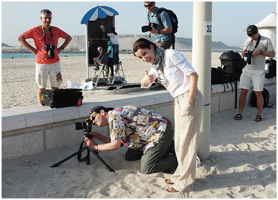
Sara Lando (your mollusk portraitist from Lighting 102) gives a thumbs up while spending a week assisting for photographer Gregory Heisler (seen squinting through camera).

She was assisting Greg for a week of shooting and teaching at Gulf Photo Plus in Dubai. Sara learned a ton of stuff, duly reported on in a three-part series that to this day remains one of the most popular pieces ever written on this site.

Many of the things she learned while following Greg around had little to do with photography: his work ethic, thought process, etc. (Seriously, read the series.) But the week also changed the way Sara thought about light, her most important takeaway being this:

"White light is a lie."
Read more »
Strobist

 
Comments Off on Lighting 103: Introduction

Posted in Photography


Introduction to Taking 360 Degree Photos

14 Dec

The rise of Virtual Reality has brought about an unexpected innovation in the world of photography, the 360° photo. You may have come across a 360-degree photo or video on Facebook, which began accepting the new type of photo early this year. 360-degree photos allow the viewer to interact with the image and explore the entire environment around the camera that captured it.

Anyone can create 360 photos and share them on social media, but to do so you’ll need to invest in a purpose built 360° camera. These cameras have two or three lenses each facing a differing direction; the 360 photos are created by stitching the images captured by each individual lens to create a full 360° image.

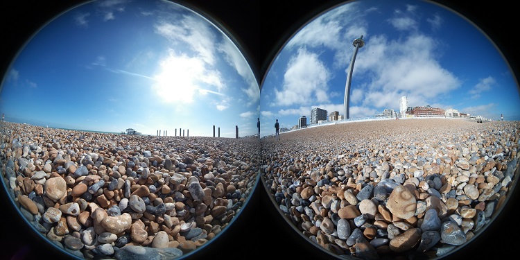
This is what a 360° photo looks like before it is stitched together:

360 degree photo unstitched

Using automatic software, a 360-degree camera can stitch each side of the image together to create a full 360° image that will look like this:

Why would you use 360° photos?

So what is the point of 360-degree photos? Is it just a fad or is the medium here to stay? 360-degree photos present an opportunity for people to capture entire rooms, landscapes, and scenes in a single shot. Imagine the difference between photographing a beach using a normal camera compared to photographing the same beach with a 360-degree camera. A normal camera is limited to capturing the space where you point viewfinder, roughly 90° or so. The 360 camera will capture the whole scene, allow you to look up at the sky, behind at the sand dunes and forward towards the ocean, all in one seamless image.

You’ve probably used google street view to explore different places around the world, a 360 photo can be viewed exactly the same way. In fact, businesses have used 360 photography to create internal immersive tours of their properties for years. If you want you can even upload your 360 photos to google where other people can view them on street view.

So it seems like 360-degree photos are here to stay, with large companies like Facebook, YouTube, and Flickr all adapting their photo sharing services to accept 360 images. New cameras being released all the time, and this new type of photography is at last accessible to the casual photographer.

360° Cameras

You may be wondering if 360 photos require advanced equipment and years of training to produce. A few years ago this may have been the case, but the relentless advance of technology means that taking a 360 photo is just as easy as shooting with a compact camera.

This year has seen the release of several consumer 360 cameras aimed at everyday people who want to take immersive 360 photos. These cameras are user-friendly, priced competitively, and only require a few minutes to learn how to use effectively. Some brand names you might like to note down include the Samsung Gear 360, the LG 360 Cam and the Ricoh Theta S; these are all 360 cameras that have proven popular and they are relatively inexpensive.

In almost all cases you’ll need a smartphone to make the best use of your 360-degree camera, as each one has an accompanying app that allows you to preview the image and control camera settings. The camera and app connect wirelessly and then you simply use your phone screen as you would a normal camera screen.

Tips and tricks for shooting 360 photos

One of the exciting things about 360-degree photos is that they require a new set of skills to shoot successfully. For a start, you need to remember that the camera will capture everything surrounding it, so if you don’t want to be seen you will need to hide out of view and make use of the timer feature.

When setting up a 360 photo, consider the fact that the viewer will be able to explore the whole image, so try and find a location with plenty of interesting features.

A must have accessory, that should be used with every 360-degree camera is a good tripod. It is essential that the camera is stable and still when shooting in 360 degrees, otherwise, the image may become distorted. I recommend using a tripod that has little in the way of gears and levers at the top, or they may be visible in the 360 image. I have found that a studio light stand is very well designed to be a tripod for a 360 camera.

When shooting a 360 photo try and ensure that there are no objects too close to the lens, this makes it much more difficult for the camera to stitch the images together accurately.

Your turn

These basic tips will get you started, but the only way to become a proficient 360-degree photographer is to get out and start shooting yourself. The reward is the opportunity to create truly unique images.

Have you tried this kind of photography before? Please your thoughts, questions and images below.

googletag.cmd.push(function() {
tablet_slots.push( googletag.defineSlot( “/1005424/_dPSv4_tab-all-article-bottom_(300×250)”, [300, 250], “pb-ad-78623” ).addService( googletag.pubads() ) ); } );

googletag.cmd.push(function() {
mobile_slots.push( googletag.defineSlot( “/1005424/_dPSv4_mob-all-article-bottom_(300×250)”, [300, 250], “pb-ad-78158” ).addService( googletag.pubads() ) ); } );

The post Introduction to Taking 360 Degree Photos by Daniel Pharaoh appeared first on Digital Photography School.


Digital Photography School

 
Comments Off on Introduction to Taking 360 Degree Photos

Posted in Photography


An Introduction to Photoshop Layers Possibilities and Properties

21 Oct

When Photoshop was first introduced to the world in 1990 it could only do the most basic of image editing tasks such as clone a selection, crop a picture, and work with some filters such as Blur, High Pass, and Sharpen. However, for its time it was incredibly advanced and the ability to work with digital pictures in this manner was practically unheard of for desktop computers, most of which were still using black and white screens. It wasn’t until late in 1994 when version 3 hit store shelves that the program included a key feature which continues to be the foundation for nearly all image editing programs to this day – layers.

Understanding how layers work is essential for anyone who wants to upgrade from a program like Apple Photos or Microsoft Pain. But learning how to use them with all the hundreds of icons, buttons, and menu options competing for your attention in Photoshop, can seem completely overwhelming. Getting the hang of a few basic concepts will set you on your way to image editing success, and help you figure out many of the other options Photoshop has to offer as well.

photoshop-layers-couple

Basic concept of layers

To wrap your head around the concept of layers, think back to when you were in grade school and your teacher worked out math problems on an overhead projector. She probably started with a sheet of transparent plastic that had equations printed on it and then used a washable marker to perform the required multiplication, division, or other operations to solve it. The bottom layer, the transparency itself, never changed but the teacher was free to alter what students saw on the projector screen by writing on top of the acetate layer.

You could even stack transparencies on top of one another and end up with a background layer and a few plastic sheets stacked on top of it. Each layer could be drawn or written on which would alter the final image shown to the students on the projector screen. But the layers existed separately from one another and could be edited individually without affecting the actual content of the underlying or overlying layers. Layers in Photoshop function in much the same way.

First layer – Background

photoshop-layers-background-only

When you open a picture in Photoshop the first thing you will see in the Layers panel is a background layer with a small thumbnail of your image on it. It’s always given the label “Background” and on the right-hand side of the panel is an image of a padlock. Photoshop uses this icon this to indicate that the image is to be the foundation on which all future edits are built but the picture itself is not to be altered.

It is the transparency sheet that your math teacher would write on; the edits and other operations you can perform on it are stacked one on top of the next, but the bottom layer is sacrosanct and never to be changed. Icons that let you adjust opacity, fill, blending mode, etc., are grayed out so you might be wondering just how to actually edit the picture. One place to start is by right-clicking on the background layer and choosing the “Duplicate Layer” option.

photoshop-layers-background-and-duplicate

Duplicate layers

As soon as you create a copy of the Background layer a whole new world of creative possibility opens up. You now have access to tools like Opacity and Fill, you can change the Blend Mode, add Layer Masks, and hundreds of other options as well. The choices are staggering, and it’s important to remember that there is no one correct way of using layers in Photoshop. Each photographer has his or her own approach, and what works well for you may not be good for someone else. So don’t get caught up thinking you have to use a certain process when working with layers or anything else in Photoshop. The important thing is to find a solution that works for you.

How layers work

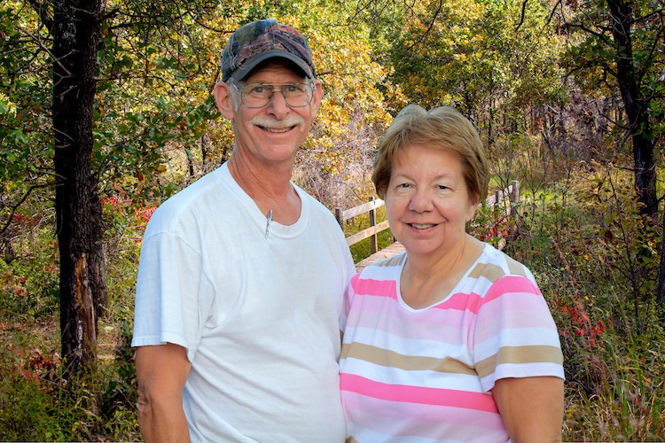
To dive a little deeper into the concept of layers and illustrate how they work, I’m going to start with the image of the husband and wife above. I’ll remove them from the garden in which they were photographed, and insert them into another location (new background). The first issue when doing any type of edit like this is that your computer doesn’t know that the people are separate from the background. It treats everything as one cohesive image but you can use layers in Photoshop to separate, remove, add, and otherwise edit the various parts of the picture.

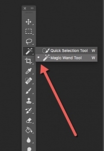
quick-selection-tool-3In the image above, the subjects are clearly distinct from the background with highly contrasting colors so an operation like this is pretty straightforward. But if your subjects blend in a little more with the foreground or background it can get a little tricky. Press the “W” key to access the Magic Wand tool. Then click [shift]+w until you end up with the Quick Selection tool (or you can access it on the toolbar see the screenshot to locate it). Now click and drag the Quick Selection tool around your subjects until they are outlined with a cycling dotted line that looks like black and white ants marching in a loop.

photoshop-layers-couple-selected

Refine the selection

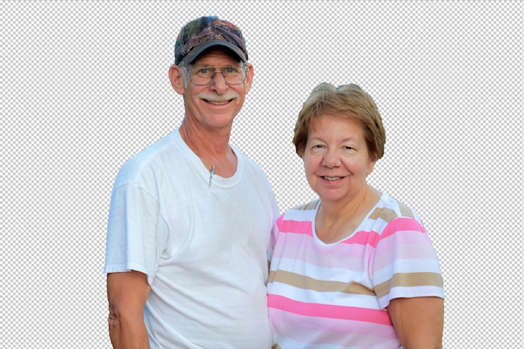
If you try this operation and you aren’t quite getting your subjects selected how you want, you can use the Refine Edge (Select > Refine Edge in older versions, Select > Select and Mask in the newest Photoshop CC 2015.5) option to get your selection precisely how you need it. Once you are satisfied with your selection, choose Layer > New > Layer via Copy (you can also use the keyboard shortcut Cmd/Cntrl+J) and you will now see a third layer on the layer panel consisting of just the subjects and nothing else.

photoshop-layers-couple-no-background

Now the real fun begins! Click the eyeball icon to the left of all the layers except the new one with just your subjects and you will see everything else disappear.

photoshop-layers-couple-blank-background

How Photoshop sees layers

Pause for a moment and consider what is happening here. Your computer now sees the image not as one cohesive whole, with two people in front of a meadow, but as two distinct layers. One is a layer with just the people and the other layer below that is the background (the meadow). Technically there is a third layer, the locked background layer, but we’re ignoring that since we don’t do anything with it.

Add a new image as a new layer

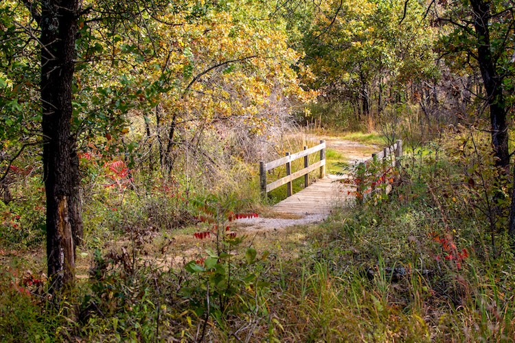
To move the people to a different location all you have to do is insert an image as a new layer and place it below the layer with just the people. For this example, I’m going to put the couple in front of a photo I took with some trees and a bridge crossing a stream.

photoshop-layers-bridge

In Photoshop you can drag and drop images directly into your composition or use the “File > Place” command. When I insert the image of the bridge into the document with the couple I now have a new layer that I can manipulate like all the rest. You can also start to see the vertical structure of layers and how they are mixed together.

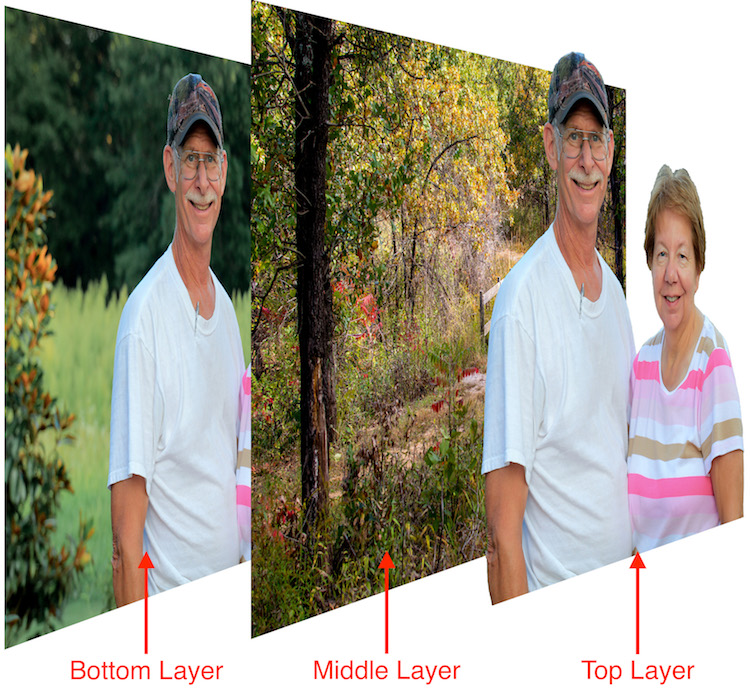
The Layers panel functions from a top-down perspective in that whatever layer is at the top of the panel is literally the top-most layer in the entire composition. Layers below it are arranged in descending order. In this example, it’s essential that the layer with the two people appears as the top-most layer in the Layer panel itself, followed immediately by the new background.

photoshop-layers-couple-bridge

Voila! The couple now appears in an entirely different location, all with just a few mouse clicks in Photoshop. If you are still trying to wrap your head around the concept of layers, here’s an extruded view of what you are seeing in the above image.

photoshop-layers-3d-breakdown

Cover your bases, keep all layers

I could remove the bottom layer entirely but I left it in place because I don’t like to delete any layers when making a composite image like this. You never know when you might need to go fetch an errant strand of hair that you overlooked from the original layer, or use it for a bit of color correction later on down the line. If I want I can add more pieces to this image just by using layers and stacking things on top of each other, and using layer masks to refine and edit things even more.

You can also edit the new background separately from the people such as adding a blur effect or desaturating it slightly. If you convert to a Smart Object any editing you do on that layer can be altered or changed later. But if you apply it directly to the layer it cannot. Make sure to match color balance when combining images for a more realistic look.

layers-photoshop

Additional adjustment layers have been applied to the background to shift the color, blur it in some areas, and darken the edges.

Conclusion

This type of switch-out-the-background edit is just a small taste of what you can do when using layers in Photoshop. Add empty layers by going to “Layer > New > Layer” and then using the Brush or other tools to start creating in them. You can re-order layers by clicking and dragging them up and down in the Layers panel. You can show and hide layers, adjust the opacity of a given layer, choose how one blends with the layers below it, and even create special Adjustment Layers that you can use to edit colors and add effects to other layers.

I have only scratched the surface of what layers are capable of doing. Hopefully this gives you a basic understanding of what this powerful feature is all about. Do you have any tips or tricks for using layers that I missed? Please share them in the comments section below.

googletag.cmd.push(function() {
tablet_slots.push( googletag.defineSlot( “/1005424/_dPSv4_tab-all-article-bottom_(300×250)”, [300, 250], “pb-ad-78623” ).addService( googletag.pubads() ) ); } );

googletag.cmd.push(function() {
mobile_slots.push( googletag.defineSlot( “/1005424/_dPSv4_mob-all-article-bottom_(300×250)”, [300, 250], “pb-ad-78158” ).addService( googletag.pubads() ) ); } );

The post An Introduction to Photoshop Layers Possibilities and Properties by Simon Ringsmuth appeared first on Digital Photography School.


Digital Photography School

 
Comments Off on An Introduction to Photoshop Layers Possibilities and Properties

Posted in Photography


An introduction to our studio test scene

08 Aug

Our test scene is at the core of our camera testing, designed to allow like-for-like comparisons between cameras. Here we explain how the tests are conducted and why we work this way. We will publish a video explaining what we look for in the scene and where we look, in the coming weeks.

Philosophy

Our studio test scene is used to give a consistent and reproducible means of comparing camera output. We have a well-established testing methodology designed to shed light on the performance differences of camera sensors and the results of their JPEG engines. All analyses are cross-checked against our real-world experiences.

To enable comparison between cameras with different pixel counts, we offer a ‘Compare’ mode that re-sizes all the cameras to the largest resolution shared by all the selected cameras.

Lenses and focal lengths

Interchangeable lens cameras are shot using prime lenses that offer around 85mm equivalent field-of-view – a decision that stems from our historical use of each brand’s 50mm lenses on APS-C, which are generally very sharp and consistent across the frame when stopped down a little. The aim is to remove, as much as possible, the impact of the lens. Our testing has shown the use of dedicated own-brand primes to be more reliable than using multiple copies of third-party lenses.

Compact cameras are test-shot across a range of focal lengths and apertures. We then chose the focal length closest to 85mm equivalent that offers sharpness and across-frame consistency that fairly represents the lens performance as a whole. Unlike our ILC tests, any would-be buyer will be forced to use the built-in lens so we aim to include, rather than remove, the lens performance. As such, we do not cherry-pick the best performance if it’s unrepresentative of the rest of the lens’s performance, nor do we rigidly use the 85mm equivalent setting if it’s uncharacteristically poor.

JPEG

JPEG images are exposed assuming that most users will rely either on their camera’s meter or on the histogram and, as such, are shot using whatever shutter speed is required to give correctly exposed middle grey values. White balance is set manually for the daylight scene, and low light is shot using the default Auto White Balance setting, to show the degree to which the camera tries to correct a very orange light source.

Cameras are mounted securely on a macro rail on a heavily weighted-down tripod, to minimize external vibrations. Self timer and any available anti-shock modes are also employed to minimize the impact of shutter shock.

Raw

Raw images are shot using set combinations of shutter speeds and apertures to allow the assessment of sensor performance on a common basis (so at any given ISO, all cameras will receive the same amount of light). At higher ISOs, we reduce the illumination of the scene by up to two stops if a camera doesn’t offer sufficiently fast shutter speeds to allow correct exposure. If this still isn’t sufficient, we then stop down the camera’s aperture, again ensuring that the net effect of illumination, shutter speed and aperture values are consistent across cameras.

These files are processed using the Adobe Camera Raw with noise reduction minimized and with shadows brightened to reveal the difference in shadow performance. All Raw images are white balanced during processing.

How can I check which settings you used?

All relevant shooting settings can be viewed by clicking the [i] icon at the lower right of each comparison window. If the [i] is illuminated in yellow, then some aspect of that particular shot is considered non-standard in such a way that it is not 100% comparable with other images. The cause of this inconsistency should be noted in the information tab if you click on the [i] icon.

Lighting

We offer two lighting conditions, a ‘Daylight’ mode that is illuminated to 10EV using daylight-balanced Kino Flo RF55 lamps, and a low light mode lit by a 25W tungsten incandescent light bulb.

Experimental error

Like all processes there are sources of variation (error), including differences in chart alignment, focus and lens performance over time. While we have done everything possible to minimize the impact of these errors (including using a large, easy-to-align chart, careful manual focusing and selecting copies of lenses that are used only for studio testing), it is impossible to eliminate experimental error altogether.

Our comparison tool makes it possible to identify differences that are within the realms of well-controlled error, so we trust our readers not to read too much into very slight differences in apparent performance.

Consistent comparison

Overall, the aim of the test scene is to provide fair, consistent and comparable images across every camera that comes through our test studio. We endeavor to maintain the highest possible standards and are happy to discuss and investigate any apparent inconsistencies raised by personal message or feedback email.

Articles: Digital Photography Review (dpreview.com)

 
Comments Off on An introduction to our studio test scene

Posted in Uncategorized


Lighting 102: Introduction

03 Aug

Welcome to the all-new, completely revised Lighting 102. If you are here, you should already have read through Lighting 101, and have a good understanding of its concepts.
__________

In lighting 101 you learned the basics of getting your light off camera, how to sync it, and how to position it to reveal form. In Lighting 102 we'll go beyond those basics. You'll learn how to create shape and form while at the same time controlling your light throughout the three-dimensional space in your photo.Read more »
Strobist

 
Comments Off on Lighting 102: Introduction

Posted in Photography


Macro Photography on a Budget: An introduction to Close-up Filters

21 Jun

close-up-filters-flower

Have you ever seen some stunning pictures of insects, where you can clearly see each individual element of their compound eyes, or looked through your Instagram feed marveling at photos of flowers where you can see the tiniest detail on each individual petal? If so, welcome to the wonderful world of macro photography, one in which the little things in life are not only celebrated, but magnified to glorious proportions, and even the most mundane objects around us can take on beautiful otherworldly qualities when examined under near-microscopic detail.

This particular type of photography is not only stunningly beautiful but often prohibitively expensive, at least for the casual hobbyist. A good macro lens can easily set you back several hundred dollars, and that’s not counting the accessories like a good tripod, a ring flash, and other gear that is liable to turn this past-time into a debt-inducing money pit. Thankfully there are several good alternatives like extension tubes and lens-reversing rings to aid you in your quest for beautiful macro photography, but my personal favorite is one of the cheapest options available: close-up filters.

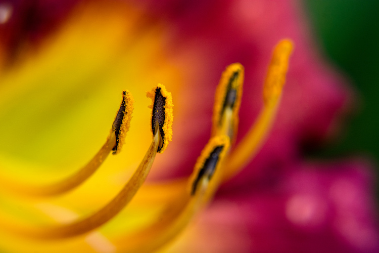
close-up-filters-anthers

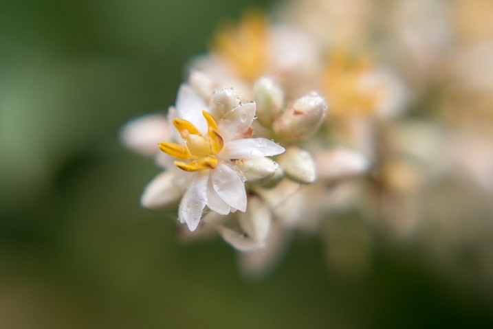
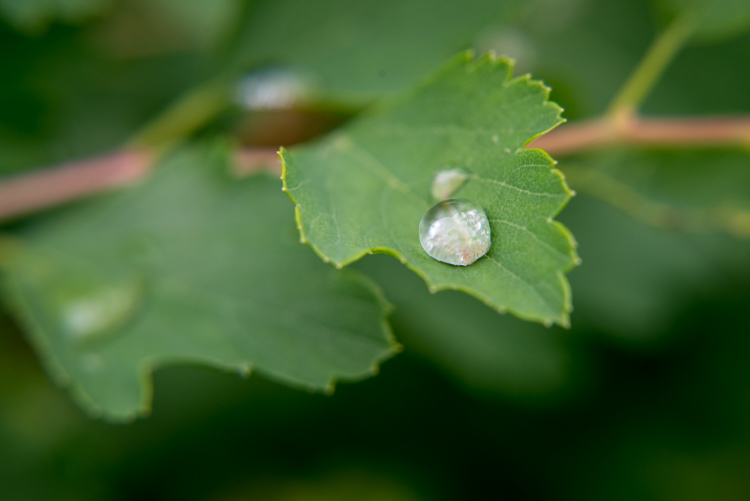
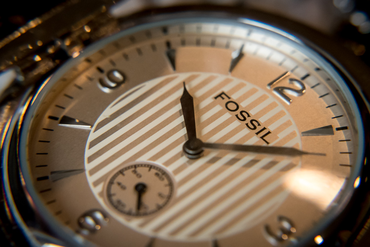
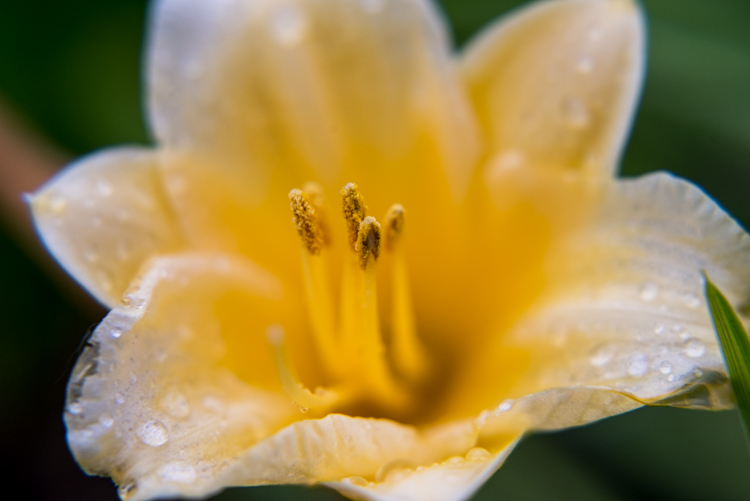
This image, and all the other macro-style shots in this article, were not taken with an expensive macro lens but with a $ 35 set of close-up filters I screwed on to my 50mm lens.

A true macro lens is designed to create true 1:1 (life-size) replications of very small things on the image sensor of your camera. If you have a coin that is 2cm diameter, a high quality macro lens will be able to take a photograph of that coin wherein it is literally the same size on your camera’s image sensor. Taking these types of photographs requires a host of light-bending optical gymnastics on the part of your lens. In the process there are almost always tradeoffs in image sharpness and overall light-gathering ability, which is why macro lenses cost so much money, because they contain special glass elements to minimize any optical imperfections.

Close-up filters rely on a very simple, very old, idea to make it possible for any normal camera lens to focus on objects that are, as their name implies, very close to your lens. All lenses have a minimum focusing distance, which is as close as you can get to an object and still have it be in focus. A +2 filter will make it possible for a lens with a minimum focusing distance of 1 meter to now focus on something .3 meters away. A +10 filter would decrease the minimum focusing distance to .09 meters. The math is slightly complicated, but suffice it to say the higher the number on your filter, the closer your lens will be able to focus.

close-up-filters-leaf-droplet

Close-up filters are also very inexpensive and you can often find a set with three or four filters for under $ 40 that will work with your lens.

A close-up view of close-up filters

So what is a close-up filter? Simply put, it’s basically a magnifying glass that you screw onto the front of your camera lens. Just like their investigative counterparts wielded by famous fictional detectives through the ages, close-up filters rely on a single curved piece of glass that bends light in such a way as to enlarge whatever you are viewing. Don’t let the nomenclature confuse you; nothing is being filtered, but light is being altered before it enters your camera lens, in the same way that a magnifying glass alters light to make objects appear bigger.

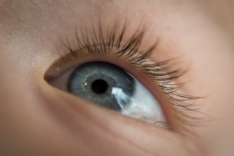
close-up-filters-eye

The set of filters required to take a photo like this costs about the same as a movie and a large popcorn.

Limitations

Using close-up filters is a great way to get started with macro-style photography, but they have some very important limitations that you need to be aware of to start. First of all, they only do one thing, which is shorten the minimum focusing distance of your lens. You can’t use them for normal photography, since all you will see when you attach one to your lens is either a big blob of blur, unless you focus on something very close to your camera. It’s the same phenomenon that happens when you hold a magnifying glass at arm’s length instead of right next to your face, and it severely limits the usefulness of close-up filters.

True macro lenses work for a variety of photographic situations, and due to their high-quality construction are generally much sharper than non-macro lenses, which make options like the Canon 100m f/2.8 or Nikon 105mm f/2.8 so highly praised. Screwing an inexpensive close-up filter on the front of your camera might let you get fun shots of flowers, but it will in no way equal the astounding optical properties of a true macro lens.

Even something as mundane as forks sitting in a dish rack can turn into a work of art when viewed up close.

Even something as mundane as forks sitting in a dish rack, can turn into a work of art when viewed up close.

Another downside of close-up filters is that the images you create with them are not at all the same as what you can get from dedicated macro gear. Photos are generally much softer, will usually exhibit unpleasing artifacts like chromatic aberration, and don’t allow you to have the same pleasing background blur that you would get without the filters attached. Finally, while macro lenses will let you focus on objects that are very close as well as far far away, close-up filters will only let you focus on subjects that are right next to your lens. All these limitations might sound important, but they’re really not that big of a deal. Once you learn to work around them you can get some stunning images from your camera using close-up filters.

Close-up filters are nowhere near as sharp and optically brilliant as a true macro lens, but they can still produce some pretty good results.

Close-up filters are nowhere near as sharp and optically brilliant as a true macro lens, but they can still produce some pretty decent results.

Advantages of close-up filters for macro photography

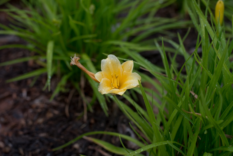
After spending so much time pointing out the flaws with close-up filters you may wondering why you would want to even bother with them in the first place. As I mentioned earlier they are an incredibly inexpensive way to dip your toe into the waters of macro photography, and the results you can get from such a simple piece of glass will likely be far beyond what you ever thought possible shooting with your normal gear. The photo below of a yellow lily was taken with a standard 50mm lens and a +10 close-up filter, which is a fairly standard, inexpensive option. It’s not at all uncommon to find sets that include +1, +2, +4, and +10 filters all in one package that costs $ 40 or less.

An un-cropped image taken with +10 and +2 filters attached to a 50mm lens. Note the severe blue fringing on the edge of the petals, which is the result of using filters instead of a true macro lens.

An un-cropped image taken with +10 and +2 filters attached to a 50mm lens. Note the severe blue fringing on the edge of the petals, which is the result of using filters instead of a true macro lens.

After I shot that picture I took the filters off my lens and took another photo of the same flower as close as my lens would allow. As you can see there is a dramatic difference between the two images and even though the top picture is not as sharp as an image taken with a dedicated macro lens, the results are perfectly fine for someone just looking to dabble in this type of photography, without spending much money.

The exact same flower. Without the filters, this was as close as my lens would focus.

The exact same flower. Without the filters, this was as close as my 50mm  lens would focus.

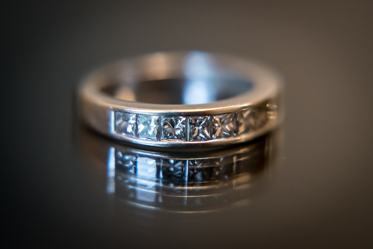
Another fun feature of filters is that most of them can be stacked on top of each other, to get even greater magnification. To make the jewelry images below I used three filters on my 50mm lens: a +10, +4, and +2 all screwed into each other, and attached to the lens itself. I set the ring down on an iPad that was turned off to get a little bit of reflection, and while the result is not something I would use in a catalog or on a billboard, it’s more than enough to suffice for my needs.

close-up-filters-ring

It might look fancy, but the gear required to take this photo was pretty basic and inexpensive.

Unlike other faux-macro solutions, like reversing rings or some of the cheaper extension tubes, close-up filters still allow you to use autofocus. Even so, you might get best results if you focus manually or use focus bracketing to make sure you get just the right shot. Finally, one of my favorite aspects of close-up filters is how small and portable they are. I like to keep a +10 and +4 in my camera bag and if I find myself in a situation that would be good for some macro shots it’s fast and easy to screw one on, take a few shots, and put it back in my bag.

Are pictures taken with close-up filters as sharp and detailed as one would require for them to be printed in a magazine? No, not by a long shot. For truly brilliant close-up photos you need the right gear like a macro lens, but hopefully you can see why close-up filters, despite their limitations, do a decent job of getting you halfway there.

This insect is about the size of a quarter but it appears exquisitely detailed and larger than life when photographed with a close-up filter.

This insect is about the size of a quarter, but it appears exquisitely detailed and larger than life when photographed with a close-up filter.

Choosing the right close-up filters

Since close-up filters do not involve a lot of complicated technology and contain no moving parts, it’s hard to go wrong when looking for a set to buy. However there are a few considerations that you need to keep in mind.

First, look for a set of filters that fit your lens. Check the thread size of your lens by looking for the  symbol for the Greek letter phi  and the numbers immediately before or after it will be the size you need (look inside the back of your lens cap). Common sizes are 52, 55, or 58mm, but depending on your individual lens it could be quite different so make sure to find the size that fits your lens before you buy any filters.

Next it’s a good idea to get filters that are made from metal and glass, not plastic. Filters with a higher build quality are easier to screw on and off, less likely to get scratched, and may even include special anti-reflective coatings. You can sometimes find brand name options made by the big manufacturers like Canon and Nikon, but I get plenty of good results with third-party filters from companies like Hoya or Polaroid, and the results are just fine and they cost a fraction of the price as their officially-branded counterparts.

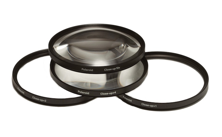
A set of close-up filters filters like this will help you get macro-style images without breaking the bank.

A set of close-up filters filters like this will help you get macro-style images without breaking the bank.

I hope this article has helped you learn a bit more about this inexpensive but quite practical solution for taking macro-style shots. Do you have any experience shooting with close-up filters? Are you the kind of photographer who prefers to shoot with actual macro lenses? I’d be interested in hearing your thoughts in the comments below, and please feel free to share your favorite macro photos.

googletag.cmd.push(function() {
tablet_slots.push( googletag.defineSlot( “/1005424/_dPSv4_tab-all-article-bottom_(300×250)”, [300, 250], “pb-ad-78623” ).addService( googletag.pubads() ) ); } );

googletag.cmd.push(function() {
mobile_slots.push( googletag.defineSlot( “/1005424/_dPSv4_mob-all-article-bottom_(300×250)”, [300, 250], “pb-ad-78158” ).addService( googletag.pubads() ) ); } );

The post Macro Photography on a Budget: An introduction to Close-up Filters by Simon Ringsmuth appeared first on Digital Photography School.


Digital Photography School

 
Comments Off on Macro Photography on a Budget: An introduction to Close-up Filters

Posted in Photography


An Introduction to Street Photography for New Photographers

21 Jan

You may have seen a lot of candid photography all over the Internet and wondered, what is it all about? If you’ve never tried it before, or only have a bit of experience, I am going to lay out a roadmap to help you get started and improve your street photography.
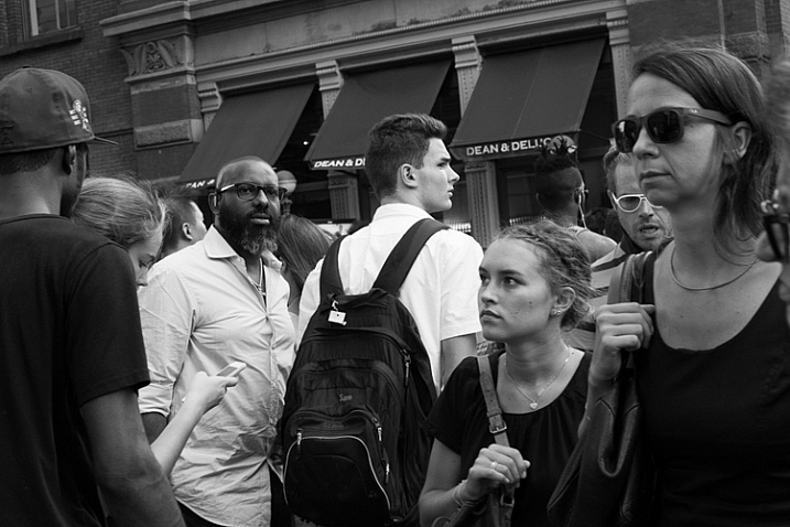
Street Corner, SoHo, NYC.

Street Corner, SoHo, NYC.

Street photography is the art of capturing life, culture, and humanity, in a candid manner. It is fascinating because a small percentage of photographers seem to be naturally drawn to it. Even before hearing about the phrase street photography, which can be a clunky term anyway, there are many photographers who prefer to point their cameras in the direction of culture and people that they’ve never met before, over mountains, sunsets, and landscapes.

However, if you haven’t done it before, street photography can be very intimidating to actually pull off. It’s one thing to admire it from afar, but it’s another to get in there and get your hands dirty. I promise though, that it’s a ton of fun and is a very rewarding art form to practice.

Here is list of my favorite tips to get you off and running.

1. Just do it
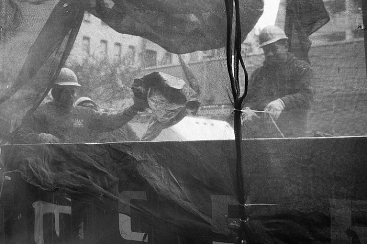
Construction Workers, Lower East Side, NYC.

Construction Workers, Lower East Side, NYC.

You can have all the tips in the world to get started. I can explain all of the techniques that I have learned from others and found so helpful over the years, and I will cover them here, but nothing beats pure, unbridled enjoyment and enthusiasm. No matter how much you learn, nothing beats the experience gained by being out there.

Street photography is one of the most difficult forms of photography, because it is so unplanned. A world of content is out there for you, and it is your job to go find it. You must develop your own visual language, to be able to see interesting moments, then to figure out how to capture them all in a quick, spontaneous instant. This takes regular practice. I’ve been doing street photography for nearly 15 years, and any time I take a month off (usually in the depressing February winter in New York), I feel very rusty when I grab the camera again.

Put in the hours, experience trumps everything. Enjoy the feeling of being out there, because it’s necessary to love it, to be able to put in the time to be successful.

2. Technical skills

Here are a few of the technical skills that are most important for street photography. I try to have my camera set up in a way so that I almost forget it’s there. So, it’s just me, and what I am seeing, and the camera doesn’t get in the way.
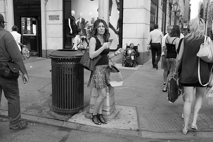
Bergdorf Goodman, 5th Avenue, NYC.

Bergdorf Goodman, 5th Avenue, NYC.

There are many different ways to set up your camera, but I prefer to shoot in Shutter Priority mode with a shutter speed around 1/250th of a second. That is a good minimum, to make sure you can freeze the motion of your subjects. In dimmer light, you can go to 1/160th and even 1/125th and still be okay. In strong sunlight you can go all the way up to 1/400th or 1/500th, but 1/250th is the number to keep in mind (as a good starting point).

Raise your ISO. There is no reason to go below ISO 400 for street photography, and I suggest staying between ISO 800 and 3200 when you’re not in bright sunlight. The reason is because, if you want to shoot at 1/250th, and you also want to use as small an aperture as possible, then something has to give, and that is the ISO.

You might be asking why it’s good to use a small aperture for street photography. That’s a creative choice of course, and sometimes the light is so low that you must shoot with as wide an aperture as possible. There are street photographers that prefer the look of a shallow depth of field for all their work. However, there are a few reasons why I believe a small aperture, and a lot of DOF is preferable. Because of the spontaneity, you never know where your subject is going to be, or if you are going to have multiple subjects at different depths. In addition, if you happen to miss the focus a bit, your subject will still be sharp if you are using a larger DOF. Finally, context is important. You are capturing culture, and surroundings are a part of the story. Do you really want to blur the surroundings away? The environment is a major part of street photography.
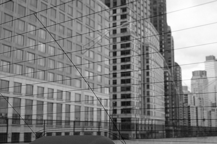
Greene Street, SoHo, NYC.

Greene Street, SoHo, NYC.

While a prime lens is not necessary, it can be very important for street photography, for a few reasons. First of all, zoom lenses are heavy and large. A small, light prime makes your camera a pleasure to carry around, and it looks much less imposing to your subjects. In addition, it can be a big advantage to get used to using a single focal length. You will start to learn how your camera sees, in a faster, and more intuitive way. I can’t overstate the previous sentence. When I wrote about forgetting that the camera is there, a prime lens is very important for this.

I prefer to use wide-angle primes, with 35mm and 50mm being my favorite. I like the wide-angle view because it will make you get closer to your subjects. In addition, the viewpoint will allow your foreground subjects to be more prominent and larger in the frame, while still being able to fit in more of the background, since it will be proportionally smaller. It’s a great look. If you are using a cropped camera, remember that a 35mm lens might not actually be a true 35mm view because of the crop factor, so try one that is the equivalent of a 35mm view.

3. Take photos for yourself

It is certainly important to see other people’s viewpoints and to pay attention to the images that they like, but I want you to focus on photographing for yourself. Capture an image that you love, first and foremost, and don’t worry if other people don’t get it. Street photography is still a niche genre, compared to other photography forms such as landscape, and because of that there are a lot of people that aren’t used to it.

Take weird images, take personal images, take ugly images, and take risks with what you capture. Be creative and have a good time. The more your images become a reflection of your voice and what you like, the better your work will be.
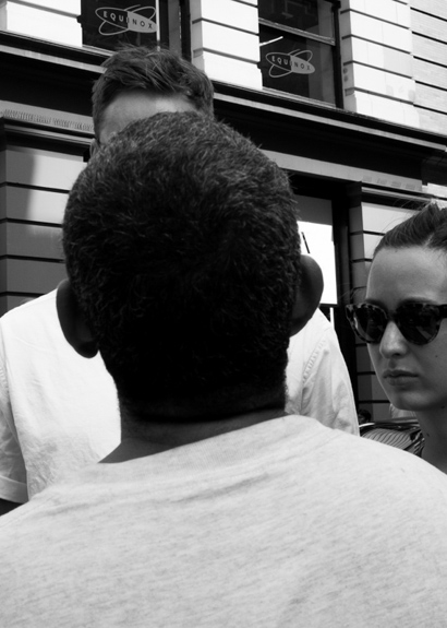
Panhandler, Broadway, NYC.

Panhandler, Broadway, NYC.


4. Shoot in a variety of locations and show us your area

A busy street corner in New York is usually the first place that comes to mind when people think about street photography, as it should be. New York has such a diversity of content, and that’s the reason why it’s one of the great meccas for street photography, but it is also only a very small part of the entire street photography world.

Street photography can, and should, be done anywhere. It can be done indoors, in coffee shops, at events, along country roads, or in small towns – you name it. Street photography is about culture and life. It is an idea, and a feeling. It doesn’t even need to have people in the images, just the hint of people.

The more you are able to capture images in the course of your daily life, the better you will become at it. Your images will be more personal and unique. For this reason, I suggest considering eventually trying a smaller camera, such as a Fuji X100T, a micro 4/3rds or mirrorless camera, or even a mobile phone camera, for the times where you don’t feel like bringing your large SLR. These cameras make it fun to capture images on a daily basis. You might bring one of these smaller cameras on a trip to the corner store, whereas a larger SLR would be more cumbersome for that situations.

5. Pick a location and wait there
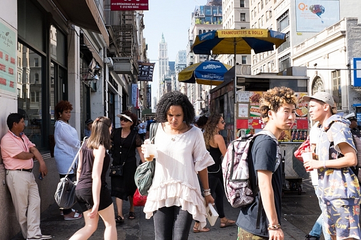
Canal Street, NYC.

Canal Street, NYC.

It can be intimidating to photograph people candidly. I still feel pretty intimidated, depending on the situation. To offset this, one of my favorite techniques is to pick a location, and just hang out there for awhile. Find a spot where you think an interesting moment could happen, and then wait for it to unfold.

By waiting and not walking, you will spend more time looking around and watching, as opposed to moving. Then, when that moment happens, you will already be in position, and ready with your camera to capture it. Also, your subjects will be entering your space, instead of you encroaching on their space. If you are walking down a street and see someone that you want to photograph, it’s much tougher to get in their space, and still take a good candid photograph. By stopping and letting them come to you, not only will you be ready with your camera, but you can make it look like you are just photographing the surrounding area and they happened to enter your scene.

Go back to the same locations, over and over again at different times, and in different light. The more you get used to a location, the more you can anticipate what will happen there, and the more comfortable you will become photographing in the area. Also, people will start to get used to you being there.

Of course you should still walk around, but I prefer to break up long walks, with periods of waiting in good locations.

6. My favorite trick
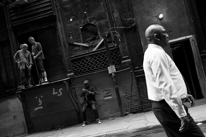
Cortlandt Alley, NYC.

Cortlandt Alley, NYC.

A natural reaction after you take a photo is to immediately take your camera away from your eye briefly. Take a picture and see. This is the number one thing that will tip someone off that you’ve taken their photograph. We don’t want to be too sneaky and creepy, but we also don’t want every person we’ve photographed to know, and stop us to figure out what we’re doing. That’s just tedious.

Whenever I capture an image of someone, I try not to remove the camera from my eye. I leave it there as they walk through the scene, as if I was trying to photograph the background and they got in the way. If you watch other photographers do this, you will see that sometimes the subjects will first think, “Hey did that person take my photo”, they will look back, and when they see the photographer with the camera still at their eye they will likely keep going, thinking that they were just in the way.

The flip side to this is when you are in an empty area, instead of a busy one. It is tougher to do this trick when there are only a couple people around, so what I will do in these situations is to aim up above, or to the side of the person, like I am photographing a building or a nice background. I will pretend to take an image or two, and then at the last second I will move the camera so that they are in the scene, in the right composition. I will quickly take the picture and remove the camera from my eye. When done right, it looks like you photographed the area above or next to them.

7. Don’t be too creepy
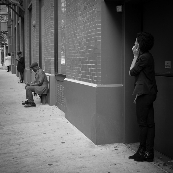
Cellphones, Nolita, NYC.

Cellphones, Nolita, NYC.

When I teach people street photography for the first time, there are inevitably those who will take five or six, or even twelve photos of one person. If you see a scene improving while you are photographing it, of course you should continue to capture the scene, but taking five or six candid photos of a person can get down right uncomfortable.

What we are doing, in my opinion, is a good thing. We are capturing and immortalizing culture and people. We do this because we like people, and unfortunately even when done as respectfully as possible, it is still a little bit creepy. We just have to accept that this is a worthy endeavor that offsets the slight creep factor. However, when you go to full on creep, it just gets uncomfortable for everyone. You don’t need to capture seven photos of a person. You don’t need to point your camera at a person for 30 seconds straight, while still pretending that you are not photographing them. If you want to do that, go up to them and ask for a portrait instead.

Take an image or two, then stop and reassess. If you see the scene developing further, put your camera down for a second. Act like you’re looking around for a way to capture the background, or pretend to play with your camera, and let the scene develop. Then, take another picture or two as it does. Just try not to point your camera at one person for too long.

8. Smile and carry a business card
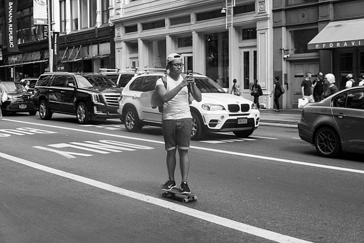
Skateboarder, Broadway, NYC.

Skateboarder, Broadway, NYC.

The more confident you act, the less people will notice you and care. If you look at master street photographers who have done this for a long time, many of them look almost invisible out there. This is not because they are necessarily sneakier, it’s because they carry themselves like they belong. They seem comfortable. When people see someone comfortably photographing in an area, they instinctively think that person belongs there. When they see someone who looks uncomfortable, like they are sneaking around, they will instinctively think they are are up to no good.

Whenever someone stops me and asks if I took their photo, I smile, say yes, and tell them that I’m a photographer doing a cultural project capturing daily life, and I thought they looked fabulous and had to capture them as part of the project (flattery goes a long way). I tell them I didn’t mean to make them uncomfortable, but it was just how I had to go about capturing the images. I carry cards to show them that I am a legitimate photographer and tell them to email me and I will send them the photo. After this, if they still seem very uncomfortable, I will offer to delete it. I’ve only ever had to delete two photos after a couple people asked me nicely. I’ve never had a bad interaction.

Of course, that doesn’t mean that others haven’t. Some photographers have certainly had bad interactions. You should make sure to pick the people that you photograph wisely, perhaps staying away from capturing someone that looks like they had a terrible day, or someone that looks angry or disturbed. Those are the situations where you are more apt to get yourself in trouble. Street smarts are important.

9. Capture images without people
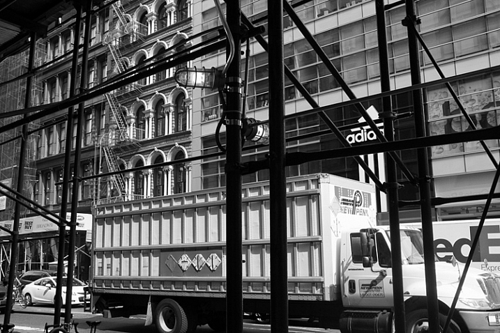
Scaffolding, Broadway, NYC.

Scaffolding, Broadway, NYC.

Usually the first thing that comes to mind when street photography is mentioned, is an image of an interesting looking person, walking down the street. That is a part of street photography, but there is so much more to it.

Capture environmental images in ways that still have the feeling of a traditional street photograph. Show culture and people in ways other than just capturing them directly. Figure out how to show stories, capture ideas, and foster feeling and mood in an image. Photograph in locations where others may not think to take pictures.

10. Capture expressions

One of the skills that all the great photographers have is their ability to capture expressions. This applies as much to street photographers, as it does to portrait ones. Look to capture people’s emotions. Do they look happy, sad, pensive, or angry? I always try to look at my subject’s eyes, and wait for them to give a look that exposes something going on in their head. Usually that look doesn’t come, but when it does, I’m ready for it. This is one of the most difficult things to both notice and capture, and it comes with experience. Try hard to notice it.
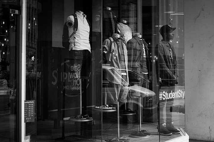
Student, Broadway, NYC.

Student, Broadway, NYC.

11. Edit and sequence your photos

Editing is just as important for your success as a photographer, as going out and shooting. Download and learn Lightroom, and learn to organize your photos well. I mark my best photos with three and five stars, to choose the decent and best photos from the day. Spend a lot of time reviewing, and narrowing down your photos, to the best of the best.

Start grouping your photos together. Learn which images work together, and figure out the reasons why. What are you trying to say and show? Can a sequence of your images create an interesting narrative? Use collections in Lightroom to group images together, without actually moving their location on the computer. Over time, you will start to identify themes, and ideas in your work, and it will help you figure out which images are your best. It will also help you know where you need to improve.

You will find that doing this will quickly help you improve when you are out shooting. The more time you spend organizing and thinking about your work, the more in-tune you will be to notice images that fit in, when you are out shooting. This is a way to help develop your voice in your photography.

12. Look at the work of other photographers

Spend a lot of time exploring the work of other photographers. This will both train your eye, and give you inspiration. It will quickly become a humbling experience. As a photographer, you don’t need to reinvent the wheel. So much has been done before, by photographers who spent decades doing it. What you need to figure out, is how to give your images a personal and modern take.

Look at both modern photographers, and go through lists of the old masters. Look at work done on busy street corners, and in quiet towns. Take it all in, then figure out what you relate to most, and build on that in your work.

13. Perfection is overrated
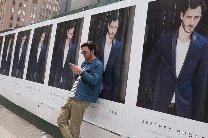
Greene Street, SoHo, NYC.

Greene Street, SoHo, NYC.

As a photographer, you need to become technically proficient with the camera. You need to learn to take sharp photos, that are well composed. You need to learn to see the light well. It is absolutely necessary for your growth. This is similar to a painter learning the fundamentals, before eventually gaining their voice, and going off in their own direction.

Once you have done this, is when you start to see that perfection in an image can sometimes be overrated. Your images don’t all have to be perfectly sharp, or perfectly composed. Sometimes a technical mistake will ruin a photo, but other times it may make it. Each image is completely different, and will work for completely different reasons. It is obvious when an image is ruined technically because a photographer didn’t know what they were doing, whereas it is different when it is just due to the situation presented to the photographer. If you take a look at the work of Garry Winogrand, so many of his images were slightly off-kilter. These days photographers might have decided to straightened them up a bit in Lightroom, but when you look at Winogrand’s work all together, that slight off-kilter look adds a sense of realness and spontaneity, and actually improves many of the images. The lack of perfection seems to make them better.

Have fun. Think of street photography like jazz and go a little off-kilter. Improvise and experiment. Just figure out how to find and capture, interesting and intimate moments.

googletag.cmd.push(function() {
tablet_slots.push( googletag.defineSlot( “/1005424/_dPSv4_tab-all-article-bottom_(300×250)”, [300, 250], “pb-ad-78623” ).addService( googletag.pubads() ) ); } );

googletag.cmd.push(function() {
mobile_slots.push( googletag.defineSlot( “/1005424/_dPSv4_mob-all-article-bottom_(300×250)”, [300, 250], “pb-ad-78158” ).addService( googletag.pubads() ) ); } );

The post An Introduction to Street Photography for New Photographers by James Maher appeared first on Digital Photography School.


Digital Photography School

 
Comments Off on An Introduction to Street Photography for New Photographers

Posted in Photography


A Brief Introduction to Lightroom

25 Sep
A Brief Introduction to Lightroom

Lightroom’s Book module lets you create photo books to publish using Blurb’s print on demand printing service.

Since the first version was released over eight years ago, Lightroom has become the go-to software for many photographers, both hobbyist and professional. But if you’re new to Lightroom you may be wondering exactly what it does, what you would use it for, and how it differs from other well known programs like Photoshop.

What is Lightroom?

Lightroom is part Raw converter, part photo processor (yes, you can edit JPEG and TIFF files in Lightroom too), and part photo organizer. The latter task is often referred to as digital asset management (or DAM for short).

The key thing to understand about Lightroom is that it is a workflow application. It is designed to take care of your photos from the moment you copy them from your camera’s memory card, to your computer’s hard drive. Once in Lightroom you can process photos, add them to a map to show where they were taken, create a photo book or slide show, print them or export them to other programs for further processing.

This is why Lightroom is so useful, and so popular. It becomes the centre of your workflow, and while it is powerful enough to be used independently, it also integrates seamlessly with programs like Photoshop. You can use Lightroom by itself, or in partnership with other programs.

A Brief Introduction to Lightroom

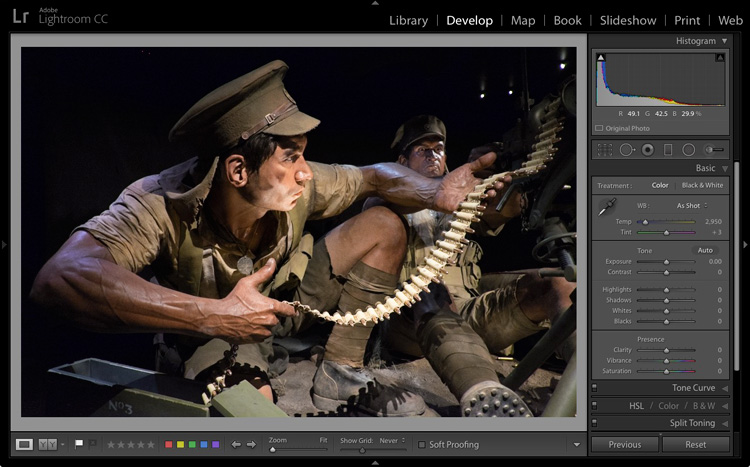
The Lightroom Develop module. This is where you process your JPEG, TIFF or Raw files.

The Lightroom Catalog

At the heart of Lightroom is the Catalog – a database that contains a preview of every photo that you have imported into the program, a record of each photo’s metadata (including processing) plus the location where it is stored on your hard drive.

It is important to note that the Catalog doesn’t contain the photos themselves, just information about them. Your photo files are always saved on a hard drive, even if you use Lightroom CC (Creative Cloud).

A Brief Introduction to Lightroom

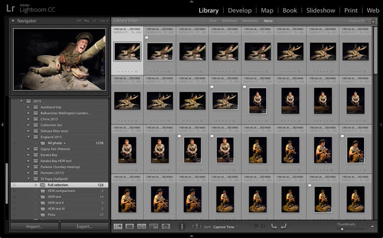
The Lightroom Library module. This is where you view, organize, and search photos. It is the heart of Lightroom and arguably its most important module.

The database advantage

Because Lightroom is a database, it gives you several advantages over programs like Photoshop.

1. It saves you hard drive space

Lots of it. When you process a Raw file in Lightroom, the edits you make are saved in the Lightroom Catalog as a series of text commands which take up very little space.

When you process a Raw file in Photoshop, you have to convert it to a 16 bit TIFF or PSD file first (yes, you can use JPEG instead but the other formats give better image quality). TIFF and PSD (and even JPEG) files take up much more space than the text commands in the Lightroom Catalog do.

The end result is that, over time, you save hundreds of gigabytes of storage space, making it much easier to manage your growing photo collection.

Note that this benefit is diminished if you are in the habit of exporting photos to Photoshop or plug-ins for processing. That shouldn’t stop you from using those applications (although it is good practice to see if you can do something in Lightroom first) nor should it put you off using Lightroom.

2. Lightroom lets you see all your photos in one place

Provided you import all your photos into a single Catalog (it is possible to have multiple Catalogs in Lightroom but this is for advanced users only) you can view any of your photos using Lightroom’s Library module.

3. Lightroom lets you search your photos

Lightroom is a database, which is designed to collect, organize and search information.

Would you like to find all your photos taken with a particular camera or lens? That’s easy in Lightroom. How about all portraits taken with the aperture set to f/2.8? That takes a little more work as it relies on accurate keywording, but it’s entirely possible. Or what about all photos of a specific person taken in 2012? Easy with the face detection tool in Lightroom 6 and Lightroom CC.

A brief introduction to Lightroom

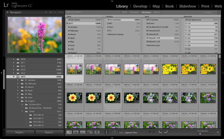
In this example I used Lightroom’s Library module to find all photos taken in 2015 with my Fujinon 35mm lens at an aperture of f/2.8 or greater.

4. Lightroom lets your organize your photos how you want

The problem with storing images in folders is that you can only save a photo in one location. Let’s say you took some photos of a friend called Sarah, in London, in July 2015 (maybe you were at Wimbledon). When you copy those files to your hard drive, you can only save them in one folder (which may be called Sarah, or London, or something entirely different).

Lightroom Collections

One of Lightroom’s key features is Collections. A Collection is like a virtual folder. You can call a Collection whatever you want, add as many photos as you like, and add photos to as many Collections as you need.

Using the above example, once you have imported your photos of Sarah into the Lightroom Catalog, you can add them to multiple Collections. For example, you may have one Collection that contains all your photos of Sarah, another with all your photos of London, and another with all the photos taken in July 2015.

It’s a simplified example, but the advantages of Collections become more apparent the more you use them. In short, they give you the flexibility to organize your images in a way that suits you.

A brief introduction to Lightroom

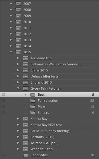
This is how I organize my photos using Collections. There is a separate Collection Set for each year. Each of those contains Collection Sets and Collections organizing photos by topic.

Lightroom versus Photoshop

Does that mean you should use Lightroom exclusively and forget about programs like Photoshop? Not at all. There are plenty of things that you can do in Photoshop (not to mention all the other plug-ins and editing programs that you can buy) that you can’t in Lightroom.

Many photographers use the two in conjunction. This is encouraged by Adobe with its Creative Photography Plan, which includes both Photoshop and Lightroom, along with Lightroom mobile and Lightroom web.

If you are new to Lightroom your first task is to import some photos into it so you can work on them. I’ll show you how to do that in my next article.

If you were unsure about what Lightroom is and what photographers use it for, then I hope this article has helped. Do you have any questions? Please ask in the comments and I’ll do my best to help.


The Mastering Lightroom CollectionMastering Lightroom ebooks

My Mastering Lightroom ebooks will help you get the most out of Lightroom. They cover every aspect of the software from the Library module through to creating beautiful images in the Develop module. Click the link to learn more or buy.

googletag.cmd.push(function() {
tablet_slots.push( googletag.defineSlot( “/1005424/_dPSv4_tab-all-article-bottom_(300×250)”, [300, 250], “pb-ad-78623” ).addService( googletag.pubads() ) ); } );

googletag.cmd.push(function() {
mobile_slots.push( googletag.defineSlot( “/1005424/_dPSv4_mob-all-article-bottom_(300×250)”, [300, 250], “pb-ad-78158” ).addService( googletag.pubads() ) ); } );

The post A Brief Introduction to Lightroom by Andrew S. Gibson appeared first on Digital Photography School.


Digital Photography School

 
Comments Off on A Brief Introduction to Lightroom

Posted in Photography