RSS
 

Posts Tagged ‘Inspired.’

14 Senior Picture Ideas to Get You Inspired

09 Jul

The post 14 Senior Picture Ideas to Get You Inspired appeared first on Digital Photography School. It was authored by Simon Ringsmuth.

14 inspiring senior picture ideas

High school senior portraits are some of the most exciting and rewarding projects for any photographer. Stress levels are low (compared to wedding photography, anyway!), and these young seniors are happy, excited, and looking forward to the future.

You are photographing your subject at a unique point in their lives, and even after doing this for years, it’s still one of my favorite types of photography. If you have never done a high school senior photo session, or you’re a seasoned photographer seeking some inspiration, here are 14 senior picture ideas to jumpstart your creativity and give you some new directions to try.

1. Get the classic headshot

senior looking at the camera
Nikon D750 | 70-200mm f/2.8G ED VR II | 200mm | f/2.8 | 1/250s | ISO 360

Creativity is always good, but I recommend making sure your bases are covered before really cutting loose.

So start your session with some classic headshots. This has several key benefits; first, it puts your client at ease and helps show them you are a serious professional who knows what you’re doing. Additionally, headshots can help break the ice and serve as the jumping-off point for some more fun ideas later on.

Plus, a headshot gives the senior a nice photo to use in the yearbook or as a social media profile picture. Headshots won’t win awards for originality, but they serve a valuable purpose, and no high school senior photo session is complete without a few!

2. Use backlighting to spice up your portraits

backlit senior picture
Nikon D750 | 70-200mm f/2.8G ED VR II | 165mm | f/2.8 | 1/180s | ISO 200

In a studio setting, it’s generally a good idea to position the primary light source, also known as the key light, behind you so that it’s illuminating the face of your subject. However, it’s also nice to have another light source behind your subject to provide a bit of backlighting and create a glowing effect around their head.

When you’re out in nature, you can accomplish this by shooting late in the day and positioning your subject so the sun is behind them. This creates a fun, dynamic look that can really elevate your portraits – and it’s an effect that can’t be easily faked with a social media filter.

3. Involve the senior’s four-legged friends

senior with two dogs
Nikon D750 | 70-200mm f/2.8G ED VR II | 200mm | f/4.8 | 1/180s | ISO 1000

When I’m doing portrait photography, I like to be in control of the situation, so including pets always adds a bit of stress that I don’t really appreciate. However, high school senior pictures aren’t about me – they’re about the clients! And if you can learn to loosen up a bit and let these young students bring their pets along for the shoot, you’ll get some great results.

After all, pets put people at ease, and they also add a fun element of serendipity to the situation. You won’t always get award-winning shots, especially if the pets aren’t cooperating, but you will get pictures your clients will love. Just make sure someone else is with you, such as the senior’s parent or friend, to help corral the animals and then take them home after their part in the photoshoot is over.

4. There’s no place like home

senior in the backyard
Nikon D200 | 50mm f/1.8G | f/1.8 | 1/180s | ISO 200

I almost always do high school senior pictures out on location, but you can also get great results in the senior’s backyard. In fact, you’ll often find some interesting options at their home for sitting, posing, or family member involvement that just don’t materialize at parks or on bridges.

I don’t recommend doing all the pictures at the senior’s home, but you might be surprised at the results you can get if you keep your eyes open. Also, starting the photoshoot at the student’s house helps build a sense of trust and can lead to some great conversations; this can be helpful down the line if you need things to talk about while shooting elsewhere.

5. Bring on the band

girl playing clarinet
Nikon D200 | 50mm f/1.8G | f/1.8 | 1/125s | ISO 200

Many high schoolers play instruments, which can easily be incorporated into a senior photo session. Some of my clients have told me that these shots ended up as their favorites, and I often feel the same.

Therefore, when you sit down with seniors to discuss the session and explain your process, let them know that they are welcome to bring their guitar, clarinet, trumpet, or even a drum set! It might add an unexpected challenge to the session, but the results are worth it, and it’s a great way to build a positive reputation among your clients and their friends.

6. Get formal with a cap and gown

guy with cap and gown
Nikon D7100 | 85mm f/1.8G | f/4 | 1/750s | ISO 200

Much like headshots, cap-and-gown photos won’t win awards for creativity, but they’re classic images your clients will appreciate years down the line.

So ask your client to bring graduation regalia to the photo session and get a variety of shots with them all dressed up. The pictures will look great on invitations and announcements, and parents love to buy prints and hang them on the wall.

7. Show some sibling love

girl with younger sister
Nikon D750 | 70-200mm f/2.8G ED VR II | 125mm | f/4 | 1/180s | ISO 180

Do your high school senior clients have brothers or sisters? If so, ask them to take part in the photoshoot! You probably won’t want them for the whole session, but bring them in at the beginning or the end to add variety.

Get some shots of your subject and their sibling hugging, joking, or just talking; this can add a great deal of levity to what is sometimes a stressful situation, and you might also capture some candids that everyone really likes.

Plus, these sibling shots are always a favorite among parents, which will lead to more business for you down the line when the other children need photos as they grow up.

8. Invite their parents

graduating senior with parent
Nikon D750 | 70-200mm f/2.8G ED VR II | 175mm | f/3.3 | 1/350s | ISO 100

Lots of photographers focus solely on the high school seniors, but if you’re looking for an added element to make memorable pictures, then ask the parents to pose for a few shots, too!

You don’t have to go overboard; just grab a few shots at the beginning or end of the shoot, and parents will love it. After all, the adults in these students’ lives always appreciate the chance to be involved. In a few short months, their babies will be off to college, and these photos will create some powerful memories that will be cherished for years.

Group photos also help build a sense of trust between you and the parents and send the message that you know what you are doing and are serious about your craft. That leads to repeat business and can help generate some powerful word-of-mouth advertising, too.

9. Take a stroll for great shots

senior walking toward the camera
Nikon D750 | 70-200mm f/2.8G ED VR II | 200mm | f/2.8 | 1/500s | ISO 100

If you’ve run out of ideas and aren’t sure what to do with your high school seniors, here’s some simple advice: just have them take a walk!

Find a spot with good lighting – like an alley or covered pedestrian path – and have your subject walk toward you while you capture a series of photos. This technique works great with a telephoto zoom; start by zooming in all the way and then slowly zoom out as your subject closes the gap (you can slowly step backward if you need to).

You’ll end up with a lot of pictures to wade through, but even if you only keep two percent of the walking-style shots, they’ll likely be extremely memorable.

10. Showcase the senior’s talents

senior on a unicycle
Nikon D750 | 70-200mm f/2.8G ED VR II | 175mm | f/2.8 | 1/500s | ISO 200

Many high school seniors have special talents and skills they like to share with others, and these are great to keep in mind for photo sessions.

Invite your client to bring their skateboard, scooter, or unicycle to the shoot. Get some photos of them hitting a golf ball, swinging a tennis racket, or shooting a basketball.

Even if the talent doesn’t involve a lot of physical movement – e.g., writing computer code – you can still find creative and interesting ways to showcase it, and it’ll give the senior some photos they’ll cherish years down the line.

11. Explore the downtown

senior in the city
Nikon D7100 | 85mm f/1.8G | f/2.8 | 1/750s | ISO 200

You might be surprised at how many great shots you can get by wandering through the downtown of any city. From small towns to suburbs to large metropolitan areas, downtowns are rife with brilliant colors, interesting backgrounds, and great lighting conditions (even in broad daylight).

You can usually find a building or an awning that provides plenty of shade; that way, you can shoot photos without your subjects being blown out by harsh sunlight.

12. Visit the classic local spots

guy on picturesque stairs
Nikon D750 | 70-200mm f/2.8G ED VR II | 200mm | f/2.8 | 1/250s | ISO 400

Where I live, there’s a spot that’s always brought up when I’m discussing photo sessions with clients: a set of metal steps next to a certain building downtown. Clients love to get their pictures taken on these steps, but when I first started out, I saw them as a crutch. A cliché. A relic of the past that should be forgotten. Why go to the downtown steps when there are so many other interesting picture locations? Then I got over myself, embraced the idea, and my clients have loved the results.

There’s probably a similar spot where you do senior portrait sessions, too: an overused location that makes you roll your eyes when it comes up in conversation. My advice is to embrace the tradition and just go there anyway, at least for a few shots before heading elsewhere. Even though you might not personally think it’s a great spot for senior photos, your job is to get the best possible photos of your clients.

13. Explore a botanical garden

girl in a botanical garden
Nikon D750 | 70-200mm f/2.8G ED VR II | 160mm | f/2.8 | 1/180s | ISO 360

Most urban areas have some type of public garden, and these always work great for high school senior photos.

Of course, don’t just take the same standing-in-front-of-flowers shots as everyone else. Get off the beaten path a bit and try to find new ways of looking at familiar spots! Search for greens and oranges that will make your client stand out, or work with the seniors beforehand to plan their wardrobe accordingly.

Take a stroll by yourself or with a friend before you do the photo session and look for interesting lighting conditions or hidden locations that people normally ignore.

Finally, look on social media for hashtags commonly used at these locations for fun portrait ideas to try, or – better yet! – so you know the cliché shots to avoid.

14. Above all else, have fun!

guy sitting on the ground
Nikon D750 | 70-200mm f/2.8G ED VR II | 200mm | f/2.8 | 1/180s | ISO 280

When I first started doing high school senior pictures, I was so focused on the images that I left out the element of enjoyment. I was a serious photographer with a serious job to do. I quickly learned to loosen up, laugh a lot, and have fun with my clients. These young students are on the cusp of a very important time in their lives, and as a high school senior photographer, you have the incredible opportunity to catch this critical moment before it slips away.

So enjoy it! Laugh with your clients, talk with them about college or other post-high school plans, and get to know them throughout the session. Your photos will look better, your clients will enjoy their time with you, and you’ll get lots of referral business as a result. Studying techniques, locations, and posing tips is great, but if you and your clients aren’t having fun, then you’re doing something wrong.

Senior picture ideas: final words

These senior picture ideas are a good way to get inspired, but ultimately the success of your photo sessions is up to you. Use this article as a starting point but try your own ideas, find your own style, and do what works for you and your clients.

It also helps to find a friend or family member who can help you practice so you’re better prepared during the actual photo sessions, and this article should give you some good ideas to try!

Now I’d love to hear from you:

What tips have you found that work well when you are photographing high school seniors? What pitfalls or mistakes have you made that you want others to avoid? Share your thoughts in the comments below!

Senior picture FAQs

What should I tell my clients to wear for high school senior pictures?

Don’t get too picky. Solid colors are great, but I have had the best results when my clients are relaxed and enjoying themselves. Instead of colors, think of styles: formal, casual, etc., and have your clients dress appropriately or give them the opportunity to change outfits. And of course, make sure to have them bring their cap and gown if they have it!

How long should my high school senior photo sessions last?

This can depend on many factors, but in general, your photo sessions should be about an hour. That’s almost always enough time to get the photos you’re after, though you can take longer if you need to factor in location changes, different outfits, etc. Just remember that the longer things go, the more likely your clients will become tired or bored, and you risk losing the energy and excitement that happens early in the session.

What time of day should I do high school senior photos?

I like to shoot these types of pictures in the evening when the sun isn’t high overhead. The lighting is usually softer, and you will have an easier time finding locations that are evenly lit.

How can I find new and exciting spots for high school senior photos?

If you’re struggling to find new locations for your photo sessions, just get in your car and drive around. Start with parks or other public spaces. Have you examined them from every angle? Are there new spots in these locations you haven’t considered? I have found some of my favorite photography spots completely by accident (all it took was a little driving around town). Just make sure photography isn’t prohibited, and that you have permission before you start taking pictures!

The post 14 Senior Picture Ideas to Get You Inspired appeared first on Digital Photography School. It was authored by Simon Ringsmuth.


Digital Photography School

 
Comments Off on 14 Senior Picture Ideas to Get You Inspired

Posted in Photography


How to Create a Pep Ventosa Inspired Still Life

06 May

The post How to Create a Pep Ventosa Inspired Still Life appeared first on Digital Photography School. It was authored by Charlie Moss.

pep-ventosa-inspired-still-life

Pep Ventosa is a Catalan artist who creates incredible images that explore the boundaries of photography. Made from multiple layers of similar photographs, they create an abstract and often surreal effect with a painterly feel. Ventosa usually creates pictures outside, but you can borrow his ideas to create a Pep Ventosa inspired still life.

How to Create a Pep Ventosa Inspired Still Life

This is an ideal experiment for someone new to working with layers in Photoshop who wants to try and create a fine art inspired still life. You’ll find that even the most mundane objects can create beautiful, ghostly images.

Shoot your base images

First of all, you’ll need your base images. I started with a simple tabletop set up next to a window so that I could work with natural light. You could also use studio lights or lamps for this technique, and different lighting will produce quite different results!

How to Create a Pep Ventosa Inspired Still Life

Once you have your camera set up and an interesting object in place to photograph, take your first image. Then rotate the object a small amount and shoot another. I like to take at least ten images, which seems to always create a good effect. If you choose to start working with lots more images, you begin to run into Photoshop’s file size limitations quite quickly!

Make sure that you place your camera on a tripod the first time you try this out. This will keep your background consistent and allow you to move the object without worrying about having your camera in the same place each time. Once you’ve mastered the technique, you can experiment with moving the camera as well as the object in a different variation of the Pep Ventosa inspired still life.

Work in Lightroom Classic

You can choose to import the images straight into Photoshop and layer them into a stack manually if that’s your preferred workflow. However, I really like the Lightroom Classic functionality that can do all this for you.

How to Create a Pep Ventosa Inspired Still Life

As you can see, the images are all very similar, but each one is slightly different from the last. I’ve tried not to blow out any highlights or get too much black in the shadows. Having the images quite flat in this respect can be helpful when you start to work with the layer blending modes in Photoshop.

Take this opportunity to also clean up any blemishes or marks on the backdrop. Anything left in now will be harder to tidy up later.

How to Create a Pep Ventosa Inspired Still Life

When you’re ready to start layering your images, select them all in Lightroom Classic and then select the “Open as Layers in Photoshop” option. This will create an image file that has all of your base photographs stacked on Photoshop layers. Now you’re ready to start the fun bit of editing your Pep Ventosa inspired still life.

Work with Photoshop blend modes

Blend modes can be intimidating if you’ve never used them before, but this experimental image can be a great time to play with them. There are 27 different blending modes in total, which gives you lots of options for your Pep Ventosa inspired still life.

How to Create a Pep Ventosa Inspired Still Life

At the top of the layer stack is a drop-down box that is available as long as you have a layer highlighted. This is where the blend modes are hiding. Each option allows the layers underneath to show through according to different computer algorithms.

For the image above, I set each layer to “multiply” blend mode and changed the opacity to between 25% and 50%. This results in an extremely dark image at the end (because the colors multiply together mathematically), so I also added a Curves Layer to bring the exposure back up to something normal.

Spend some time experimenting with different blending modes. In my experience, Soft Light and Overlay also give interesting results. Some of the others might, too depending on your base images.

Finishing your image

Once you’ve finished adjusting your layers, you can save the image, close Photoshop, and open Lightroom Classic back up. Now you can polish the image, adjusting the colors and tone to suit your style.

Once you’ve edited an image in Photoshop and taken it back into Lightroom Classic, you can treat it as you would any other image. That means you can apply any effects, filters, or presets to the image.

How to Create a Pep Ventosa Inspired Still Life

If you’ve never worked with presets in Lightroom Classic before consider buying a large set to get you started. As you experiment with them and use them more and more, you’ll get to know how the settings work, and then you can start building your own.

Changing the colors in Lightroom Classic can change the whole mood of a photo. A dark, shadowy blue image can feel quite melancholy and introspective, while a warmer-toned image can feel more hopeful and even joyous.

When you shoot a still life image, it’s not just the subject that conveys emotion, but the colors too. So while you’re finishing off the colors in Lightroom Classic, make sure that they’re helping to communicate your message.

Consider how you’ll print your image

These kinds of images are really begging to be printed quite large on beautifully textured paper. And there are plenty of labs that will do this for you. A textured paper can really enhance the fine art feel of a Pep Ventosa inspired still life, working sympathetically with the multiple layer effect that you’ve created in Photoshop.

If you don’t intend to print your image, you could try adding textures to your work instead. Open the image (again) in Photoshop and try out different textures until you get an effect that you’re happy with. Remember, textures are always best kept subtle!

How to Create a Pep Ventosa Inspired Still Life

Conclusion

There are so many different ways you could use this technique. You could combine it with other photographic techniques, or different post-processing. And of course, there is an infinite number of different subjects that you could photograph.

Please do try your own Pep Ventosa inspired still life. And don’t forget to post your results in the comments – I’d love to see the different ways that we all interpret this idea!

The post How to Create a Pep Ventosa Inspired Still Life appeared first on Digital Photography School. It was authored by Charlie Moss.


Digital Photography School

 
Comments Off on How to Create a Pep Ventosa Inspired Still Life

Posted in Photography


How to Stay Inspired with your Photography

22 Apr

The post How to Stay Inspired with your Photography appeared first on Digital Photography School. It was authored by Nisha Ramroop.

How do you keep creating when you feel uninspired? This is one of those questions that plagues photographers at all levels, at some point in their lives. Here are a few tried and true tips that have prevented some from giving up.

1. Start a project

At some stage in your shooting life, a photography project is highly recommended. When stuck in a creative rut, setting yourself a clear and defined focus or theme helps. Projects require a commitment out of you and are a great way to push yourself.

Depending on the magnitude of your project you can either set a timeline or forego it. Some timelines are built into a project, for example: a 365 project with a common theme or a 52-week portrait challenge. Other projects can be life long, such as shooting long exposure beaches in different countries or a specific location over a number of years.

The best part is that your project can be as small or big as you want – ranging from strange and faraway places to the comforts of your back yard. There are endless possibilities.

During the course of your project, do not forget to challenge yourself often. If you find your project is getting routine or mundane, this is an indication that your progress/learning has stopped or is slowing down. If this happens you could very well end up back in your previous uninspired state. Make your project challenge you, while keeping it fun and celebrate your skill and knowledge progression.

2. Do something outside your comfort zone/genre

One of the greatest things about photography is that there are so many genres, with different skills to explore. Landscape photographers and studio portrait photographers have distinctive skill sets. Street photography versus macro photography, each comes with their unique challenges.

When you love capturing moments in time, traversing an area outside of your norm can help you see things anew. Even within the same genre, each photo experience can be diverse. In landscape photography, for example, you have sub-categories such as long exposure, astrophotography, nightscapes and seascapes to name a few.

If you have hit a creative wall in your genre, try learning something new to you. Creating new work encompasses shooting outside of your comfort zone or even editing differently.

As a creative, you can even try another artistic avenue other photography! It may sound unrelated, but doing something else like painting or drawing can give you a whole new appreciation for light (or maybe it will just remind you why you shoot and not draw or paint).

3. Consume less, do more

Inspiration is everywhere. Looking at other people’s work in person (exhibitions) or online (photography websites, social media) is a great way to probe yourself. Asking questions like, “how can I do a version of that?” or “what will it take to recreate that lighting?” Save anything that inspires you with purpose. Images that get you excited about creating or planning a future shoot. Browsing other people’s work can be a double-edge sword though.

On the plus side, you can use it to gauge either how far you have come or what is left for you to learn. It can inspire you to try something new and challenge your skill level. The recommendation is to do this in spurts and not too often for too long, as you can start comparing yourself to the point of getting discouraged. Consume enough so that you are inspired, move to the planning stage and execute. More doing/creating is what will actually move you to a better place mentally.

Once inspiration starts to overwhelm you, take a step back. Reference the images that you want to learn from and actually attempt it. In this case, failure is an option as it shows you that you need to read, research and try again until you get the final output that you desire.

Important note: while you can learn from your attempts, do not set yourself up for failure. Too often trying to recreate the entire image can be senseless. A better approach may be to determine what about the image inspires you (lighting, subject, processing). Choose one or two elements you want to experiment with and make it your own.

4. Get constructive feedback

Posting your images on social media might seem like the best place to get feedback – it is not. While it may be a great way to share your image (and boost your ego), it is not the place where you will learn what you can do to improve. If you are feeling uninspired, constructive/positive feedback will do you good. Keep in mind that in order to improve, you have to also be willing to deal with critique.

On most photography forums known for good feedback, you will find that the other members here know how to give feedback in a non-offensive, positive way since they also seek feedback for themselves. Additionally, you can also streamline what you ask for. Is it the lighting? The composition? Exposure techniques? These questions will help your viewers hone in on the area you are having the challenge with.

Conclusion

If you find yourself at a plateau with your creative work, there is no right time to try to come out of it. Make the effort to break out of that uninspired space by committing to do something different. Challenge yourself outside your comfort zone or start a project.

Looking at your peer’s work can definitely be inspirational, but more than that, do something today and get feedback on it. These are great ways to push through the mental blocks.

Share with us something that has worked for you on your photography journey in the comments below.

The post How to Stay Inspired with your Photography appeared first on Digital Photography School. It was authored by Nisha Ramroop.


Digital Photography School

 
Comments Off on How to Stay Inspired with your Photography

Posted in Photography


How Your Childhood Inspired the Future of Your Photography

07 Feb

The post How Your Childhood Inspired the Future of Your Photography appeared first on Digital Photography School. It was authored by Mat Coker.

If you’ve had a camera in your hand since you were a child, stop and consider how that camera helped to shape your future. How did it bring you to where you are today?

There are a few ways that your childhood love of photography may have inspired the future of your photography.

My obsession with photography began when I was just ten years old. I was in Niagara Falls the moment I realized I must get a camera!

Exploration

As a child, you were a natural explorer. There is a lot to explore in this world, and there is a good chance that whatever you loved to explore as a child still inspires you today. Some kids grab a camera and sneak a bunch of candid photos. Others go to where the action is or discover the macro world that is usually invisible to the eye.

You explore, then study your photos, then explore some more. A photograph anchors you in the experience you had as a child and keeps calling you back to continue the adventure.

There was a lot to hold us back as kids. But the joy of growing up is the ability to step out the door and explore the world around us.

As a child, it may not have been that you brought your camera on adventures, but that it was your camera bringing you on an adventure!

As a child, I would photograph anything that grabbed my attention and made me look. Dinosaurs were one of those things!

Seeing

Along with exploration is the ability to see. Seeing doesn’t just mean looking. Seeing means piercing deeper than the surface level scene in front of you. It’s noticing patterns and humor and beauty.

With a camera in your hand, you look at the world in a different way. That deeper ability to see shaped you as you grew up. No doubt, your friends and people you work with are fascinated by the unusual things that you notice.

You don’t just see, you imagine. You bring your imagination to life for all to see through the images (photographs) you make.

“The camera is an instrument that teaches people how to see without a camera.” Dorothea Lange

When I really started to learn about photography I had to be very conscious about getting clean backgrounds. Notice how this dino is framed by the objects around it rather than overlapping with them.

The scariest part of a dinosaur is its teeth. I used a wide angle to bring the viewer right into the jaws!

I share the love of Niagara Falls with my kids. We couldn’t help but imagine the chaos of the dinosaurs coming to life. While riding the Ferris Wheel, I timed this shot to be able to see the T Rex in the background. In black and white who’s to say it isn’t real?

Your own form of magic

Think about this medium that you discovered as a kid. You explore and bring your imagination to life. Through print or a digital medium, you get to show everyone else what you saw. You can make a portrait of your father and pass it on for countless generations. It doesn’t have to be a standard portrait either, but your father as you saw him and knew him.

Through photography, you transfer the image in your mind into the minds of people you may never meet.

When I was a kid, I visited air shows with my dad. The planes always appeared as little specks in my photos. I look back at those photos and remember how inspired I was by those planes. Now that I’m a dad, I share that love with my kids.

I would never have noticed the potential beauty of light and texture as a kid.

Savoring the moment

The heightened attention that you learned as a child makes life meaningful today. Not only did you learn to see but you learned to capture that on film (or pixels). You could sneak into any situation and come away with a little slice of the moment to carry with you.

Even when you don’t have your camera, you can look at a scene and know this is a moment worth capturing. You can stay in the moment, recognizing something special, knowing this is a moment to be savored.

“Taking pictures is savoring life intensely, every hundredth of a second.” Marc Riboud

I loved to take pictures of concerts as a kid. Back then I had no appreciation for angle, backlight or decisive moments. Now, I roam around the audience and time moments for gesture and dramatic backlight.

Recall to adventure

If I could write a letter to my childhood self, I’d thank the little guy for pressing on with photography even when nothing really worked out for him.

Have you lost your sense of exploration and adventure? Is your life consumed with work and monotonous routine? Think back to when you were a kid. What adventure would that camera take you on today? What experience is there around the corner to savor?

Charge your batteries, clean your lenses and fall in love with photography all over again.

Taking pictures is like tiptoeing into the kitchen late at night and stealing Oreo cookies.” Diane Arbus

The post How Your Childhood Inspired the Future of Your Photography appeared first on Digital Photography School. It was authored by Mat Coker.


Digital Photography School

 
Comments Off on How Your Childhood Inspired the Future of Your Photography

Posted in Photography


Leica unveils limited edition Leica Q ‘Snow’ inspired by an Olympic snowboarder

13 Feb

A new, white version of the Leica Q full-frame compact camera has been announced that was inspired by Olympic snowboarder and photographer Iouri Podladtchikov. The ‘Snow’ edition will be limited to only 300 units worldwide, and will cost $ 5,395/£4300.

As with most Leica special editions, on the inside, this camera will be exactly the same as the standard Q. What differentiates it is the special white leather trim and anodized silver top plate, base plate and control dials.

A white leather case and strap complete the ‘Snow’ theme:

$ (document).ready(function() { SampleGalleryV2({“containerId”:”embeddedSampleGallery_1250694278″,”galleryId”:”1250694278″,”isEmbeddedWidget”:true,”selectedImageIndex”:0,”isMobile”:false}) });

Speaking about the special edition camera, Podladtchikov says the white finish doesn’t only reflect the snow he is so closely associated with:

‘White, for me, also means ‘carte blanche’ – it’s up to you. It’s time to get creative’.

The Swiss Olympic gold medalist and world champion is also a keen photographer, and intends to open his own photographic studio. He was due to compete in the current Winter Olympics in Korea, but had to pull out after sustaining an injury at the 2018 X Games.

The Leica Q ‘Snow’ will be available starting in March. For more information, read the full press release below, or visit the Leica website.

Press Release

Leica Q ‘Snow’ by Iouri Podladtchikov

The Swiss Olympic gold medallist and dedicated Leica photographer designs a special edition of the iconic Leica Q

Wetzlar, 12 February 2018 – Leica Camera AG presents a new version of its high- performance compact camera with full-frame sensor and fast prime lens: the Leica Q ‘Snow’ by Iouri Podladtchikov. This limited edition has been created in collaboration with Swiss Olympic gold medallist, World Champion snowboarder (halfpipe) Iouri Podladtchikov, whose own ideas inspired the design of the camera.

The Leica Q ‘Snow’ by Iouri Podladtchikov is based on the coloured version of the Leica Q with a silver anodised top deck and baseplate and controls on the top deck in silver. The design concept also features a new accessory shoe cover made from aluminium. The highlights of the special edition include the pure white trim in premium real leather that gives it its name. The edition is also strictly limited to only 300 pieces for the worldwide market, each of which bears a special serial number.

In the words of the dedicated Leica photographer: “As a brand ambassador, it’s a fascinating feeling to have inspired a special edition of a camera, but I also see it as an enormous responsibility”. Interestingly, his choice of the colour white doesn’t just relate to snow – perhaps the obvious choice for a snowboarder: “White, for me, also means ‘carte blanche’ – it’s up to you. It’s time to get creative” explains, Iouri Podladtchikov, who has already published two books of his photography and will soon be opening his own studio.

The Leica Q ‘Snow’ by Iouri Podladtchikov is presented as a set complete with a case in soft white leather and a colour-matched carrying strap and will be available from March 2018 for £4,300 (including VAT).

The technical specifications of the Leica Q ‘Snow’ by Iouri Podladtchikov are identical to those of standard model of the Leica Q. Thanks to its particularly fast Leica Summilux 28 mm f/1.7 ASPH. lens, the camera is perfect for photography in low light, for street photography, architecture and landscapes. To allow for reliable control of subject composition, the Leica Q also features an integrated viewfinder with a resolution of 3.68 MP. Even the finest details of every exposure are displayed without any perceptible lag as soon as the camera is brought up to the user’s eye.

All functions of the camera are clearly laid out and logically placed to guarantee perfect ergonomics. Its clear and logical menu concept provides rapid access to all essential functions and enables users to programme personalised settings.

The Leica Q also delivers video recordings in full-HD quality. Depending on the scene and subject, users can choose between 30 and 60 full frames per second for video recording in MP4 format. The camera also features an integrated Wi-Fi module for wireless transmission of still pictures and video and remote control by WLAN from a smartphone or a tablet with the Leica Q App.

Articles: Digital Photography Review (dpreview.com)

 
Comments Off on Leica unveils limited edition Leica Q ‘Snow’ inspired by an Olympic snowboarder

Posted in Uncategorized


For the Love of STEM: 20+ Edible Creations Inspired by Math & Science

14 Sep

[ By SA Rogers in Art & Sculpture & Craft. ]

Science, technology, engineering and mathematics rarely get more delicious than this, illustrated and replicated in the form of solid chocolate, sugar crystals, fondant icing, pancakes and even bagels. Wouldn’t you want to take a bite out of an anatomically correct life-sized human skull, a 3D representation of kinetic movement, a Rubik’s cube, a Hubble Telescope photo or gory veterinary surgery in cake form?

Kinetic Tarts & Geometric Cakes

3D-printed molds allow pastry chef Dinara Kasko to make pies, tarts, cakes and other treats with shapes unlike anything you’ve ever seen in a dessert case before. Her latest is a collaboration with artist Jose Margulis, a series of delicious-looking cakes inspired by kinetic waves. They’re made of ingredients like almond sponge cake, yogurt mousse, mascarpone and streusel. Older works include ‘Triangulation,’ a lime-basil cake for SoGood magazine, and ‘The Bubbles,’ which take their inspiration from cells. For the latter, she explains, “I used such geometric constructing principles as triangulation, the Voronoi diagram and biomimicry.” Intrigued? You can buy silicone cake molds from her website and try to recreate these desserts at home.

Geometric Patterns Inside a Cylinder of Chocolate

Geometric patterns hidden within a solid cylinder of chocolate are slowly revealed by a blade on a mill. Studio Wieki Somers teamed up with chocolatier Rafael Mutter to create this installation for Vitra Design Museum, displayed at Art Basel in 2012 for a retrospective of dutch furniture designer and architect Gerrit Rietveld. The patterns continuously change the deeper into the cylinder you go, more complex at times and simpler at others, but always mathematical in nature.

Gory Veterinary Anatomy Cakes

This one’s for the veterinarians out there. One student at the Nottingham Veterinary School created this semi-realistic model of a canine’s superficial head muscles in cake form as part of a fundraiser; another rendered a dog testicle, while a third portrayed a leg amputation in edible form. There’s also equine surgery, and an ‘ascarid impaction colic,’ a procedure to get rid of a severe worm infestation in horses. Looks tasty, huh?

Rubik’s Cube Pastries

French pastry chef Cedric Grolet offers a unique edible spin on the Rubik’s cube in the form of 27 individual pastries. Though he’s spurned the handheld puzzle’s usual primary colors for muted pastels, the object remains recognizable in form. You can purchase one of these cakes at Le Dali, a restaurant inside the Le Meurice Hotel in Paris.

Galaxy Eclairs

Looking like something straight out of NASA’s stunning satellite imagery of space, these cosmic eclairs by Musse Confectionery in Ukraine are truly out of this world. The glaze swirls together hues of blue, purple, pink and white for results so beautiful they’d almost be hard to eat (except that they look delicious.) The chef took inspiration from Hubble Space Telescope photos, offering the eclairs in flavors like raspberry, vanilla, pistachio, salted caramel and chocolate. They’re available in the confectionery’s shop in Kiev.

Next Page – Click Below to Read More:
For The Love Of Stem 20 Edible Creations Inspired By Math Science

Share on Facebook


[ By SA Rogers in Art & Sculpture & Craft. ]

[ WebUrbanist | Archives | Galleries | Privacy | TOS ]


WebUrbanist

 
Comments Off on For the Love of STEM: 20+ Edible Creations Inspired by Math & Science

Posted in Creativity


Out of This World Architecture: 16 Real Buildings Inspired by Science Fiction

20 Jul

[ By SA Rogers in Architecture & Public & Institutional. ]

From a Star Wars-inspired house in South Korea to a blob-shaped ‘friendly alien’ museum in Austria, these structures make no attempts to hide the sci-fi sources of their inspiration. All 16 of these futuristic buildings are completed or in progress – not just concept art – including flying saucers, pavilions that quiver in the wind, spaceship houses and even murals of Neo from the Matrix in a Buddhist temple.

Faraday Future Campus by MAD Architects

MAD Architects has designed a science-fiction inspired campus for Faraday Future, a company in the midst of producing “the world’s fastest-accelerating electric car.” Set on a former Navy base in Northern California, the campus features a reflective ‘user experience center’ tower that rises above the low complex of buildings. A bridge shoots the customers’ cars right out of the warehouse and into the showroom to meet them.

Star Wars House in Korea by Moon Hoon

The Star Wars House in suburban South Korea by Moon Hoon pays tribute to the film series with its blocky concrete proportions and horizontally banded windows. Inside, there’s a secret room hidden within the shelving water on a wall, and the top floor is conceived as “a control room for the future Darth Vader or Jedi.”

2010 UK Pavilion for the World Shanghai Expo by Thomas Heatherwick

When the renders were released for this incredible pavilion by Heatherwick Studio, many people thought it could never be built as it was illustrated. Its strange blurred form seemed difficult to translate into a 3D structure. But the architects managed to pull off the ‘Seed Cathedral,’ which is made of 60,000 slender transparent fiber optic rods that move in the wind. Each one contains embedded seeds as well as built-in lighting

The United States Air Force Academy Cadet Chapel

Designed by architecture firm Skidmore, Owings & Merrill (SOM) and built in 1962, the United States Air Force Academy Cadet Chapel in El Paso, Colorado mimics the speaks of the Rocky Mountains in which it’s set, featuring seventeen rows of 150-foot-high spires. A steel frame of 100 identical tetrahedrons makes up the base of the structure, enclosed with aluminum panels, the gaps between them filled with colored glass.

The Atomium by Andre Waterkeyn & Andre and Jean Polak

Originally built for the 1958 Brussels World’s Fair, the Atomium stands 335 feet tall, with nine 60-foot-diameter stainless steel spheres connected into the shape of a unit cell of an iron crystal. Five of the spheres are habitable, containing exhibition halls and other public spaces, and the top sphere holds a restaurant with panoramic views of the city.

Next Page – Click Below to Read More:
Out Of This World Architecture 16 Real Buildings Inspired By Science Fiction

Share on Facebook


[ By SA Rogers in Architecture & Public & Institutional. ]

[ WebUrbanist | Archives | Galleries | Privacy | TOS ]


WebUrbanist

 
Comments Off on Out of This World Architecture: 16 Real Buildings Inspired by Science Fiction

Posted in Creativity


Vibrant Hybrids: Architect Inspired by Local Traditions & Transformers Movies

10 Mar

[ By WebUrbanist in Architecture & Houses & Residential. ]

extreme designs

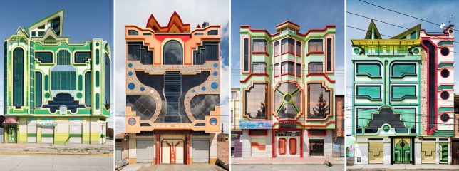
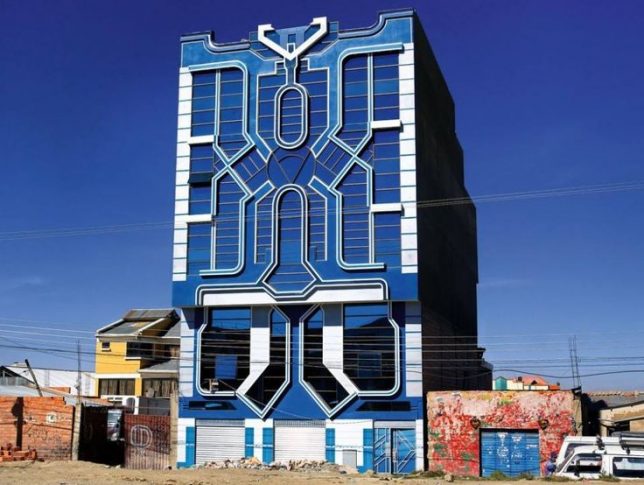
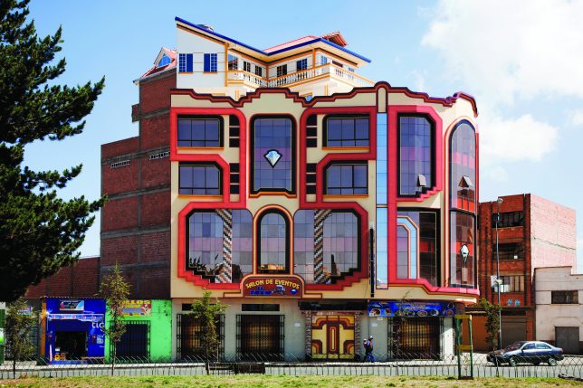
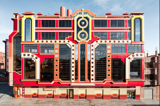
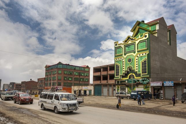
Architects around the world strive to incorporate regional design histories into contemporary work, but Bolivian designer Freddy Mamani Silvestre takes it a step further, blending pop culture inspirations into his fantastically bizarre buildings.

transformer architcture

Mamani is an Aymara, part of a people who were historically conquered and displaced by Incan and Spanish populations.He trained as an engineer, then grew into fame designing mixed-use mansions for the rich (generally: stores on the ground floor, apartments above and a penthouse for owners).

eclectic modern

“Mamani’s architecture incorporates circular motifs from Aymara weaving and ceramics and the neon colors of Aymara dress,” reports the New Yorker, “and it alludes to the staggered planes of Andean temples.” It also is inspired by cyberpunk visions and science fiction films like Transformers.

extreme design

Creative, eccentric, joyful, imaginative are all words that have been used to describe his work, though some see it extreme, superficial, garish or gaudy as well. It can be polarizing, with fans praising his audacity and critics decrying the lack of formal method to the apparent madness.

vibrant traditional

fantastic weird buildings

Silvestre works in unusual ways as well, sketching ideas onto walls or simply describing what he wants to coworkers, leaving them to execute the details. He has completed a number of projects in this way in El Alto, the highest city in the world.

Share on Facebook


[ By WebUrbanist in Architecture & Houses & Residential. ]

[ WebUrbanist | Archives | Galleries | Privacy | TOS ]


WebUrbanist

 
Comments Off on Vibrant Hybrids: Architect Inspired by Local Traditions & Transformers Movies

Posted in Creativity


Clone Wars: How Star Architect Frank Lloyd Wright Inspired the Design of Naboo

26 Jan

[ By WebUrbanist in Architecture & Public & Institutional. ]

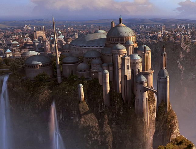
naboo-architecture

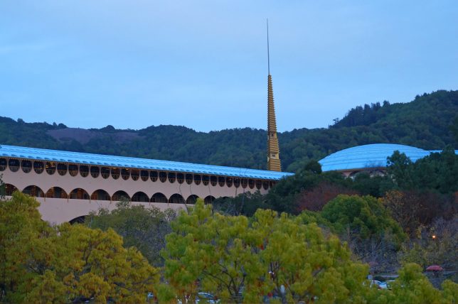
Much of the magic of the Star Wars films derives from the fantastic landscapes and exotic built environments that serve as backdrops for its intergalactic tales of empires and rebellions. But when world-makers like George Lucas create these places, they often draw on real architects and architecture for inspiration, including the last and largest work of starchitect Frank Lloyd Wright.

democratic-design-star-wars

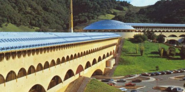
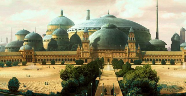
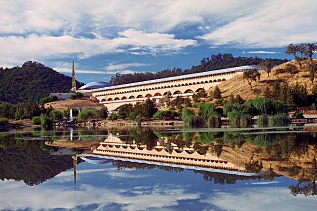
Located north of San Francisco, the Marin County Civic Center consists of a massive rotunda housing a public library, offset by a strong vertical spire and long Hall of Justice (a classic Wright move to emphasize and juxtapose both horizontals and verticals). These same features can be found in the heart of Naboo, a Mid Rim world (near the Outer Rim Territories) featured across a series of Star Wars films.

marin-count-city-civic

royal-palace

As with their cinematic counterparts, Wright’s structures for Marin were designed to relate to the landscape – curved blue roofs pick up on the tones of the sky above while beige/pink walls tie into the earthen surroundings. Arched supports and the voids they create at different scales are also immediately recognizable as similar between the original Terrestrial architecture and its echos in Star Wars scenes.

civic-center-design

views-of-naboo

For Wright as well as Lucas, there is an underlying idea at work in the design: a combining of grandeur worthy of civic architecture but also an aspiration toward something democratic, beautiful but accessible. The settings are also similar: complex and lush landscapes, fitting a similar vision found in both the architect’s and filmmaker’s works: a focus on working architecture into natural settings rather than envisioning dense cities. Lucas has directly acknowledged a debt to Wright for inspiring the architecture found in the Star Wars franchise, but has yet to announce whether he will be working on a sequel story: some of us are still waiting on Starchitecture Wars.

Share on Facebook


[ By WebUrbanist in Architecture & Public & Institutional. ]

[ WebUrbanist | Archives | Galleries | Privacy | TOS ]


WebUrbanist

 
Comments Off on Clone Wars: How Star Architect Frank Lloyd Wright Inspired the Design of Naboo

Posted in Creativity


Waste Not: The Trash Can that Inspired the World’s Tallest Condo Tower

19 Jan

[ By WebUrbanist in Architecture & Houses & Residential. ]

park-avenue-trashscraper

432 Park Avenue in Manhattan has taken criticism for various reasons since well before it was completed, but its source of inspiration makes it almost too easy: the skyscraper was inspired by a garbage bin.

trash-can-skyscraper

Specifically, Rafael Viñoly cited a 1906 trash can designed by Josef Hoffmann of the Vienna Workshops as a pattern basis for the gridded exterior of the supertall tower. The design origins were confirmed by the developer but are also plain to see. The infamous bin itself retails for $ 225, which could be considered cheap for a classic design object … or expensive for something you fill with garbage.

That grid design is intended to mask the fact that the columns of the building need to be wider at the base in order to support its immense height. The thick grid from top to bottom disguises this transition from wider to narrow, covering structural columns toward the top. It is the third-tallest structure in the United States and tallest residential tower on the planet.

trash-tower-design

Aside from aesthetic critiques, the skyscraper has come under fire for supply a relatively handful (just over 100) units at immense sizes to support occupancy but the wealthy elite. Of course, it is not that unusual for industrial design to inspire architecture. Still, the fact that its design was inspired by a waste receptacle only adds fuel to those who see it as an eyesore and sign of urban opulence.

Share on Facebook


[ By WebUrbanist in Architecture & Houses & Residential. ]

[ WebUrbanist | Archives | Galleries | Privacy | TOS ]


WebUrbanist

 
Comments Off on Waste Not: The Trash Can that Inspired the World’s Tallest Condo Tower

Posted in Creativity