[ By Steph in Art & Installation & Sound. ]

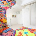
This hotel room is a little bit minimalist, a little bit rock n’ roll, and if you’re too much of the former persuasion, the chaos of the latter half might irritate your less-is-more sensibilities. Seen straight-on, the installation by Kiev artist Pavel Vetrov looks like a Photoshopped illusion, or perhaps a split view of a before-and-after design project. Which side is the before and which the after depends on your aesthetic preferences.


A razor-sharp line divides the two halves of the room, beginning at the top of the back wall, traveling right through the center of the bed and across the floor to the other wall. Everything from the duvet and TV cabinet to the books and a canvas propped against the brick gets the half-painted treatment.


On the minimalist side, nearly everything is colorless, save for a few pops of vibrancy in the wall art. The other side is a creative explosion of paint and prints, with designs scrawled all over nearly every surface.

The installation is inspired by a 2012 project called ‘Panic Room’ by French graffiti artist TILT, who took one half of a monochromatic hotel room and completely obliterated every hint of white. The original state of the room reflects a feeling of calmness, while the other half is utterly chaotic, hence the project’s name.


[ By Steph in Art & Installation & Sound. ]
[ WebUrbanist | Archives | Galleries | Privacy | TOS ]


You must be logged in to post a comment.