RSS
 

Posts Tagged ‘Gorgeous’

New images of Jupiter’s pole show enormous, gorgeous storms

29 May

Enormous cyclones rage on Jupiter’s south pole, in an image created by NASA’s Juno spacecraft.

Credit: NASA/JPL-Caltech/SwRI/MSSS/Betsy Asher Hall/Gervasio Robles

NASA’s ‘Juno’ spacecraft was launched in 2011 and entered Jupiter’s orbit in July 2016. Tasked with studying the gas giant, early data from Juno suggest that among other insights, scientists had underestimated the intensity of Jupiter’s ‘mammoth, lumpy’ magnetic field.

Juno is on a polar orbit around Jupiter, passing close to the surface every 53 days. Each time it makes a pass, it collects data using various instruments, including its ‘Junocam’ camera. It takes around one and a half days to send back 6MB of data. 

Taken in Jovian orbit from a height of 32,000 miles, this image show huge earth-sized storms raging on Jupiter’s south pole. Each storm is made up of cyclones that measure 600 miles in diameter.

And we thought Seattle’s weather was bad…

Read more about the Juno mission at NASA.com

Articles: Digital Photography Review (dpreview.com)

 
Comments Off on New images of Jupiter’s pole show enormous, gorgeous storms

Posted in Uncategorized


The Oberwerth William is a gorgeous, pricey leather camera bag

04 Nov

$ (document).ready(function() { SampleGalleryV2({“containerId”:”embeddedSampleGallery_0446095876″,”galleryId”:”0446095876″,”isEmbeddedWidget”:true,”standalone”:false,”selectedImageIndex”:0,”startInCommentsView”:false,”isMobile”:false}) });

Luxury bag maker Oberwerth has introduced its latest model, the William. Handmade in Germany from tumbled, full-grain cow-hide leather, its camera insert offers enough space for a DSLR, a couple of lenses and accessories, such as a flash and batteries. There is also room for a 13″ laptop and an 11″ tablet in a padded exterior pocket.

The camera insert is covered with water-resistant Cordura fabric and lined with an adjustable padding. When the insert is not needed it can be removed to transform the William into a business or casual bag. The adjustable strap features leather padding and smaller items, such as smartphones or a wallet can be stored in two smaller front pockets. The Oberwerth William is now available in dark brown or black from selected retailers or directly from the Oberwerth website for €599 (approximately $ 665).

Articles: Digital Photography Review (dpreview.com)

 
Comments Off on The Oberwerth William is a gorgeous, pricey leather camera bag

Posted in Uncategorized


How to Create Gorgeous Flower Images using a Flashlight and a Reflector

31 May

1-Light-painting-flowers-orchid

In this tutorial, I’m going to share with you some simple and inexpensive ways to create beautiful flower images. You will learn to add light by using a flashlight and a reflector. If you add in some imagination and patience, you will soon be creating gorgeous flower images of your own.

In addition, you will gain insight about seeing light, and how and recreate it on your own.

The techniques I am going to share are reminiscent of light painting and burning (from film days printing negatives), but in this tutorial we are going to take advantage of the ambient light, combined with light from flashlights to create some great effects.

Setting up

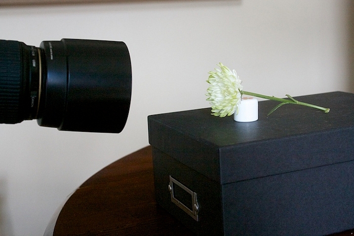
You will need to put your camera on a tripod, and find a nice surface near some window light to photograph your flower. Set up to shoot using a shutter speed slower than 1/15th of a second, and it’s much easier if you use a cable release or use your camera’s self-timer feature.
1s-Light-Painting-Flowers-2016-05-19at13-10-21-behind-scene

Here’s my set up, above. I chose an easy location, perpendicular to a window, providing some nice light. I used a prop to hold the flower up.
2s-Light-Painting-Flowers-2016-05-19at13-30-24

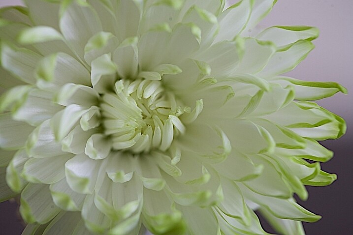
Window light only. Exposure was f/4 at 1/4.

I did a test shot, above, to determine my exposure using just ambient light. I slowed the shutter speed down just a little bit to see what results I would get.
2.s-Light-Painting-Flowers-2016-05-19at13-29-53

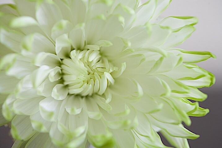
Window light only. Exposure f/4 at 0.40 seconds.

Add a reflector

It’s a little brighter at this exposure, but notice that the shadows are still quite strong.
3s-Light-Painting-Flowers-2016-05-19at13-15-39-behind-scene

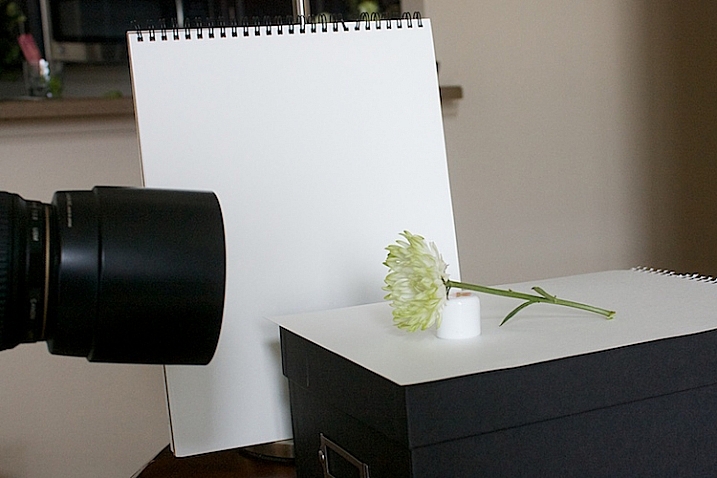
To soften the light, I added a white fill card below, and to the side of the flower. It’s also called a reflector. Almost anything white can be used as a reflector. The idea is to fill in the shadows, and to make the light feel softer.
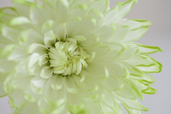
4s-Light-Painting-Flowers-2016-05-19at13-36-59

Window light with fill card. Exposure f/4 at 1/4.

This exposure above was taken with the fill cards in place. Compare it with the two above, and notice that the lightness/darkness is similar to the longer exposure. It’s pretty amazing how much light can be added to a photo just by using reflectors.

More importantly, note the quality of light. By that I mean, notice how the shadows are still present to the left of the center of the flower but are not as prominent. Also be aware of how  nicely the shadows are filled in from the bottom.

Create a feeling that matches your subject

Flowers are soft. They are feminine. When we tell stories about our subject, we want to convey that feeling. One of the ways we convey feelings in photographs is in how we use light. Notice how the feel is different in the photos with the fill card and without. The second exposure feels softer and more feminine, and thus, supports the story of a feminine flower.

Add light from a flashlight for more drama

Now, to add a backlight with a flashlight. Make sure to position the flashlight in such a way that it doesn’t cause lens flare (the light isn’t hitting the lens directly). Make sure the light is pointing entirely at the flower, and not reaching your camera lens.
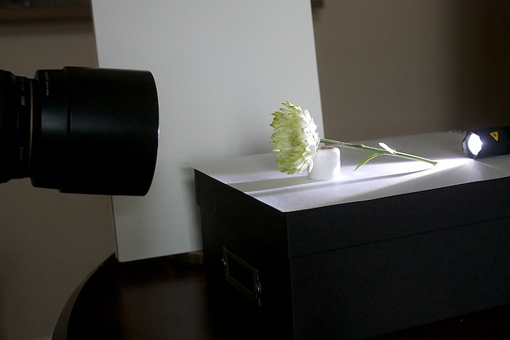
5s-Light-Painting-Flowers-2016-05-19at13-18-08-behind-scene

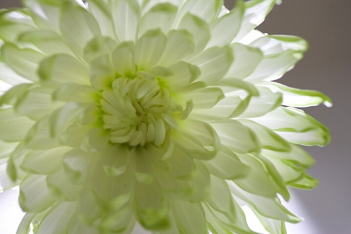
5bs-Light-Painting-Flowers-2016-05-19at13-51-46

Flashlight with backlight, no fill cards or reflectors. Exposure f/4 at 1/4.

This is with a strong backlight. Notice how dark the center of the flower seems.
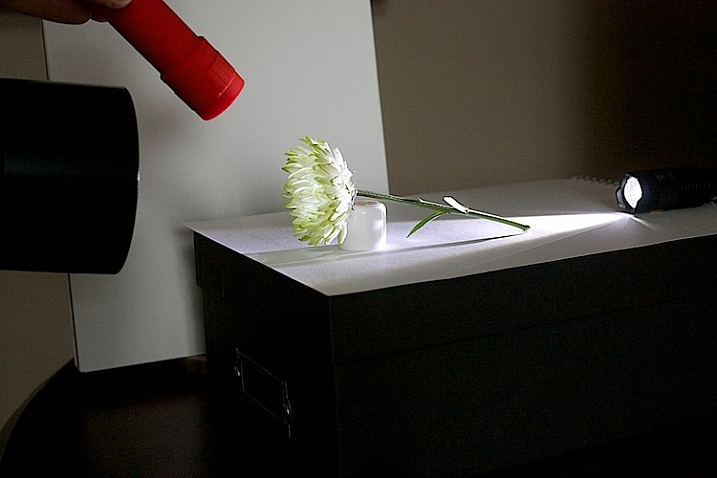
6s-Light-Painting-Flowers-2016-05-19at13-41-23-behind-scene

We can use a second light to fill in the center of the flower. I recommend using a slower shutter speed, 1/15th or less, and moving the flashlight while the exposure is made. If you don’t move the light, it will appear too strong and create harsh shadows.
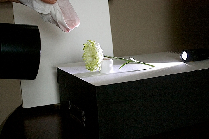
7s-Light-Painting-Flowers-2016-05-19at13-41-03-behind-scene

If the light appears too strong and too direct, use a diffuser over your flashlight. I used a kleenex to soften the light.
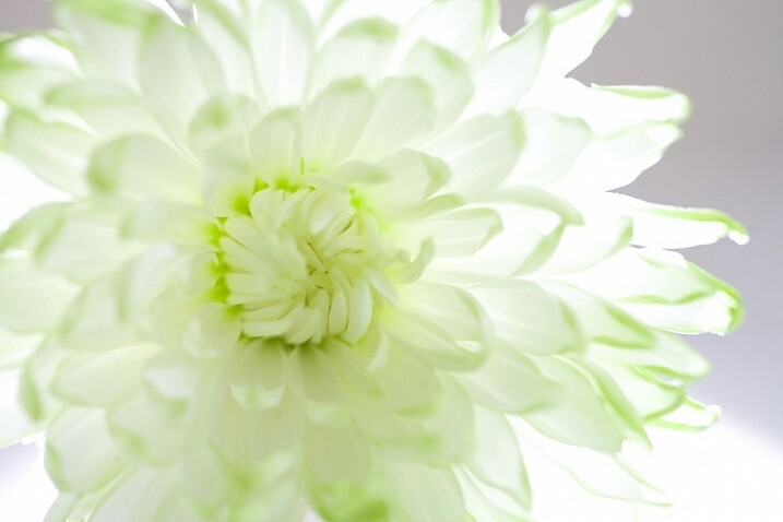
8s-Light-Painting-Flowers-2016-05-19at13-38-27

Flashlight as a backlight, with a second flashlight as a fill light in the front. Exposure f/4 at 1/4.

How does this feel to you now? Notice how I brought the exposure of center of the flower up, just by doing a little light painting. If you ever worked in a darkroom, you will notice this is similar to manipulating an image in an enlarger called, burning, but we are doing it live at the capture stage.
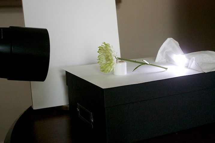
9s-Light-Painting-Flowers-2016-05-19at13-20-12-behind-scene

Let’s see what our flower looks like with a backlight that isn’t as strong. I used a kleenex diffuser on the flashlight in the back.
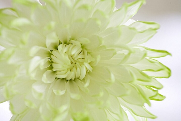
10s-Light-Painting-Flowers-2016-05-19at13-41-36

Using a softer backlight by diffusing with tissue.

Can you see how much softer the backlight is?
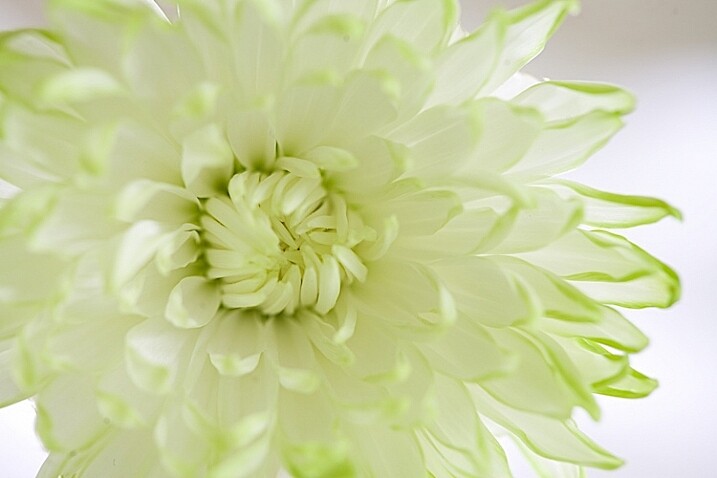
11sLight-Painting-Flowers-2016-05-19at13-42-54

In this image, I added a little bit of fill with a flashlight and kleenex diffuser.

This is very, very subtle. But move your eye back and forth between the two. Can you see the one directly above is a little bit softer? The difference isn’t huge on a computer screen, but makes a big difference in a large print.

Get creative with light and composition
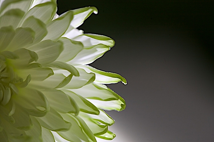
11s-Light-Painting-Flowers-2016-05-19at14-07-29

At this point, it’s time to get creative with your framing and play with light.

In composition, you want to decide what your center of interest is in the photograph, and draw the eye to that point. Notice how dark the center of the flower is in the top image, so let’s add some fill.
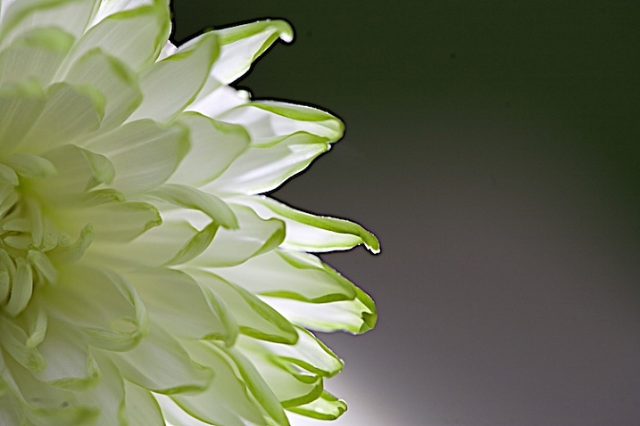
12s-Light-Painting-Flowers-2016-05-19at14-06-32

The center of the flower is lighter now (above). Which image do you like better?
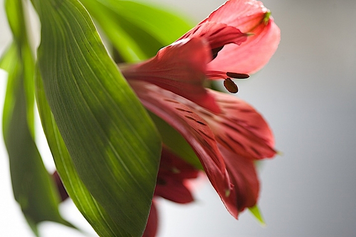
20.s-Light-Painting-Flowers-2016-05-19at16-10-27

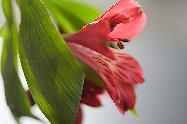
Notice the stamen of the flower above. Can you see it’s just a black blob? What happens when we add just a little bit of fill with a flashlight?
21.s-Light-Painting-Flowers-2016-05-19at16-11-21

The center of interest becomes more pronounced.

Let’s try another one.
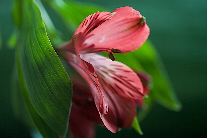
22.s-Light-Painting-Flowers-2016-05-19at16-30-03

Dark stamen.

23.s-Light-Painting-Flowers-2016-05-19at16-29-04

A little bit of fill.

25.s-Light-Painting-Flowers-2016-05-19at16-33-56

A new angle with no fill.

26.s-Light-Painting-Flowers-2016-05-19at16-36-40

A little bit of fill light, highlighting the center of interest.

A few more examples

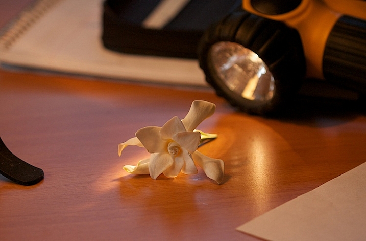
Let’s go back to this simple lighting setup.
2-Light-painting-flowers-gardenia-1

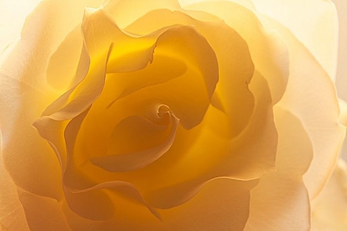
I used this setup on several different kinds of flower and I likde this white rose the best.
3-Light-painting-flowers-White-Rose-no-fill

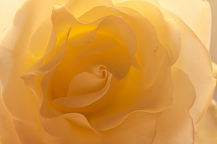
Can you see the beautiful light and how translucent the rose looks?

I like the overall feel to the image, however, there is a lot of contrast between the center of the flower and the outer petals. You want your viewer’s eye to go toward the center of interest, which is the middle of the flower, so I placed a reflector right in front of the flower.
4-Light-painting-flowers-White-Rose-fill

You can see how the light reflects back in, and brightens up center of the flower. I also like this frame better because it feels softer.

This technique can work outdoors, too. Just use your reflector and your flashlight, and see what works.
7-Light-painting-flowers-no-fill-pink-3

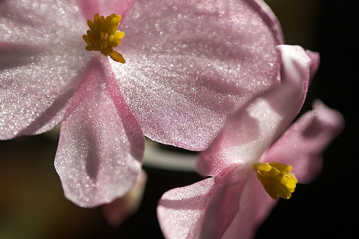
There is no right or wrong when deciding where to put your light, but it’s usually best not to shine your main light from the camera angle. In this photo, the light is to the right and it feels to harsh to me. There are strong shadows on the flower that don’t add to the feel of the photograph. I moved myself in order to move the position of the light source, the sun.
8-Light-painting-flowers-fill-pink-3

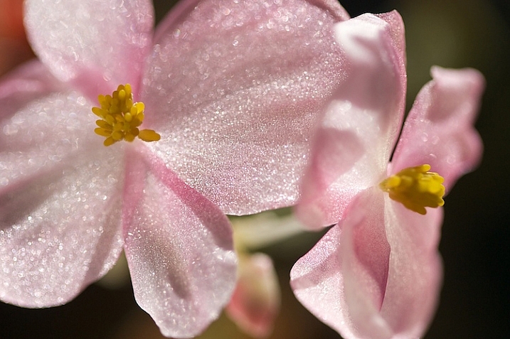
I added a fill card, and see how the stamen starts to stand out. This is much better, but I decided to play with camera angles to see what that would look like.
11-Light-painting-flowers-no-fill-pink-2

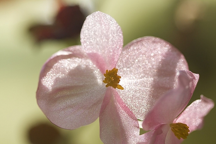
I liked this better, especially how the light created patterns on the petals of the flower, but I wanted my interest in the center of the flower. It still just seemed to dark.
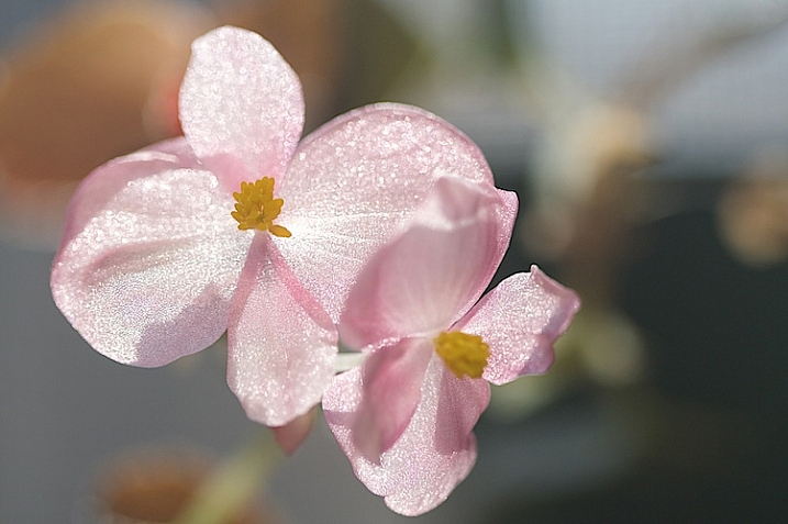
10-Light-painting-flowers-fill-pink-2

In the photo above, I used a reflector to fill in the shadows and used my flashlight to add a little bit of light.
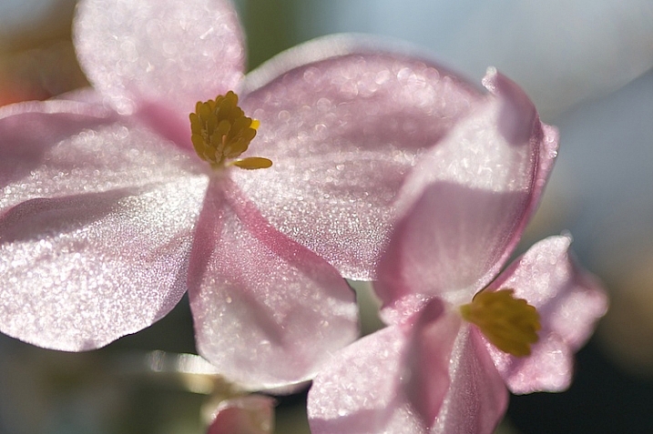
5-Light-painting-flowers-no-fill-pink

Then, I changed the angle just a little bit. This is with no fill (above).
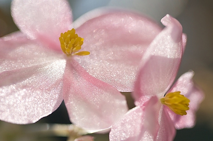
6-Light-painting-flowers-fill-pink

Here is the same flower with a reflector and flashlight filling in the dark areas.

There is no science to this. It’s all about playing to see what works. Here are a few more example that I shot, these images have no corrections. They are straight from the camera to help you see my process better.
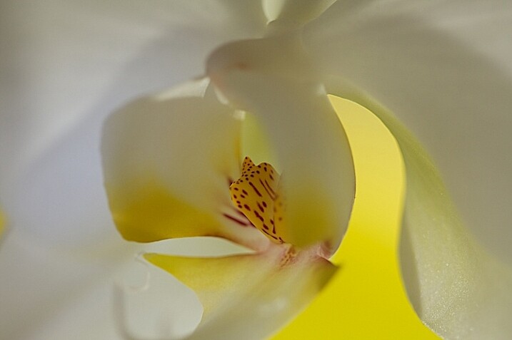
16Light-painting-flowers-no-fill-orchid

Without a fill.

17-Light-painting-flowers-fill-orchid

With a fill.

1-Light-painting-flowers-orchid

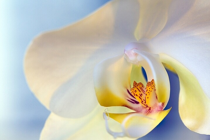
This final photo used several reflectors, as well as using a flashlight in the center of the flower.

Now you have some great tips, and inspiration to create a gorgeous floral photo of your own. You’ve seen how you can use simple fill cards to add light and soften an image. You’ve learned how light impacts the story you are telling, and you’ve learned how a simple flashlight or two, plus a kleenex, can take your photos to a new level.

Let’s see your floral photos, please share in the comments below.

googletag.cmd.push(function() {
tablet_slots.push( googletag.defineSlot( “/1005424/_dPSv4_tab-all-article-bottom_(300×250)”, [300, 250], “pb-ad-78623” ).addService( googletag.pubads() ) ); } );

googletag.cmd.push(function() {
mobile_slots.push( googletag.defineSlot( “/1005424/_dPSv4_mob-all-article-bottom_(300×250)”, [300, 250], “pb-ad-78158” ).addService( googletag.pubads() ) ); } );

The post How to Create Gorgeous Flower Images using a Flashlight and a Reflector by Vickie Lewis appeared first on Digital Photography School.


Digital Photography School

 
Comments Off on How to Create Gorgeous Flower Images using a Flashlight and a Reflector

Posted in Photography


Insanely Creative Tips ForShooting Gorgeous Interiors

03 Sep

Looking for roommates? Putting your place on the market?

Maybe you just wanna show your IG followers your sweet new setup?

Good thing we’ve got a few simple tricks to help you present the best features of your home! You’ll receive compliments from potential roommates, buyers, and followers in no time.

Read on and your house will be the star of the real estate listings!

(…)
Read the rest of Insanely Creative Tips For
Shooting Gorgeous Interiors (532 words)


© Taylor for Photojojo, 2015. |
Permalink |
No comment |
Add to
Shooting Gorgeous Interiors”>del.icio.us

Post tags:


Photojojo

 
Comments Off on Insanely Creative Tips ForShooting Gorgeous Interiors

Posted in Equipment


8 Tips for Gorgeous Fashion Photography

01 Jul

Most young photographers are convinced that fashion photography is an impossible dream. The glamorous international lifestyle, the huge audience, the awe-inspiring photoshoots and the high-paying checks are only some of the reasons why this sought-after profession seems inaccessible. But while there are no easy checklists or sure-fire plans to ensure your success, there are certain small steps to bring you Continue Reading

The post 8 Tips for Gorgeous Fashion Photography appeared first on Photodoto.


Photodoto

 
Comments Off on 8 Tips for Gorgeous Fashion Photography

Posted in Photography


20 Gorgeous “Thank You” Card Ideas for Photographers

14 Nov

Photography business is all about working with clients and making the best impression you can. Shooting people and providing good photography is not quite enough to stay in business today. Competition is too high, and you need to give the best experience to your clients to survive in this red ocean. While delivering images to your clients, why not say Continue Reading

The post 20 Gorgeous “Thank You” Card Ideas for Photographers appeared first on Photodoto.


Photodoto

 
Comments Off on 20 Gorgeous “Thank You” Card Ideas for Photographers

Posted in Photography


Splendid Fall Photography Tips and Tricks to Make The Most Of This Gorgeous Season

06 Sep

Fall is indeed a magical time for everyone. With the air becoming clean and crisp, you get to dust off your overcoats and walking boots. You’ll hear the chopping of the wood that will see everyone though the winter months. But there is nothing more recognizable with the season of autumn than the colors associated with the falling of the Continue Reading

The post Splendid Fall Photography Tips and Tricks to Make The Most Of This Gorgeous Season appeared first on Photodoto.


Photodoto

 
Comments Off on Splendid Fall Photography Tips and Tricks to Make The Most Of This Gorgeous Season

Posted in Photography


Gorgeous color photos of America in the 1930’s and 40’s

18 Aug

color_2.jpg

World War II and Depression-era America was mostly documented in black and white. That’s color photos of the time belonging to the Library of Congress is so engrossing. Shot in color at the same time as more widely recognized black-and-white photos, these images offer a vivid look into American life in 30’s and 40’s. We’ve picked a few favorites of the more than 1500 images total contained within the Library of Congress’ Flickr account. 

News: Digital Photography Review (dpreview.com)

 
Comments Off on Gorgeous color photos of America in the 1930’s and 40’s

Posted in Uncategorized


3 Steps to Gorgeous Landscape Images

01 Aug

A Guest Contribution by Todd Sisson – author of our brand new Landscape Photography eBook (currently 33% off).

During the writing of Digital Photography School’s latest eBook, Living Landscapes, I was forced to do some heavy thinking about how I approach creative landscape composition in the field. At this juncture, it is important to note that I avoid heavy thinking at all costs. Thinking truly is the hardest work, especially when you are attempting to simplify a process that is almost instinctual to you.

However, my fear of hard thinking is eclipsed by my fear of Editorial wrath, so I set aside a day, dusted off a tantric chants CD and retired to my sweat-lodge teepee for some quality time with sub-conscious me. Thirteen hours later I emerged, 12 kg lighter and armed with two revelations, the first; I approach landscape composition as a three step process. The second; my sub-conscious is a freaky place that is best avoided in the future.

Luckily for you, it is the brief overview of the first revelation that I shall share with you here today; the three component steps to creating a successful landscape image:

  • Choose a subject
  • Find the right light
  • Create a composition

NZ NO Pataua South 4 1

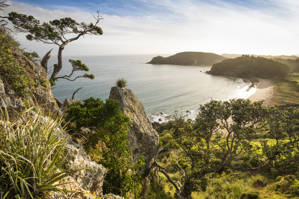
Successful landscape images result from a combination of interesting subject matter, quality light and a strong composition. This particular image nicely illustrates the point that you don’t need towering mountain peaks, blazing sunsets and extraordinary foreground features to make a pleasing image.

Choosing a Great Subject

Not everything in nature is destined to make a great photo. It is our job as a photographer to sort the wheat from the chaff and identify subject matter that will translate beautifully into the two dimensional constraints of the photographic medium.

To my mind, the best landscape subjects convey visual themes such as ‘energy’, ‘grandeur’ and ‘tranquility’ to the viewer. Mountains, bodies of water and coastlines all make happy hunting grounds for photographers because, as viewers, we instinctively know how to interpret these scenes. We sub-consciously know that a snow covered mountain peak must be big, or that a wave crashing on rocks is imparting large amounts of energy, and we know, without thinking, that a reflection on a pond occurs only under calm conditions. In short, we can easily ‘read’ these types of photograph.

NZ WA Lake Wanaka Willow Reflection 01

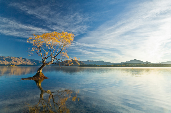
The best photographic subjects communicate multiple visual themes and have a very broad appeal as a result. To me this scene speaks of tranquility (reflections), natural change (Fall color and the building cloud cover) and stoicism (the lone tree clinging to life on the outer limits of it’s natural environment). You may ‘read’ this scene quite differently depending upon your outlook on life – for example, a hardcore environmentalist may see no more than an introduced species of tree clogging a lake that has been flooded by unsustainable farming practices in the lake’s headwaters. Photography, and life for that matter, is a very subjective affair…

You don’t need to travel to Nepal (or New Zealand, for that matter, to find great photographic fodder. Sure, it is lot easier to make interesting landscape images when surrounded by Tolkien-esque mountains but subjects don’t need to be grand in scale to make great images, they just need to be visually interesting. Learn to seek form, patterns or color in a scene and you may well find a subject from which to create a landscape image.

Sisson Wanaka 29

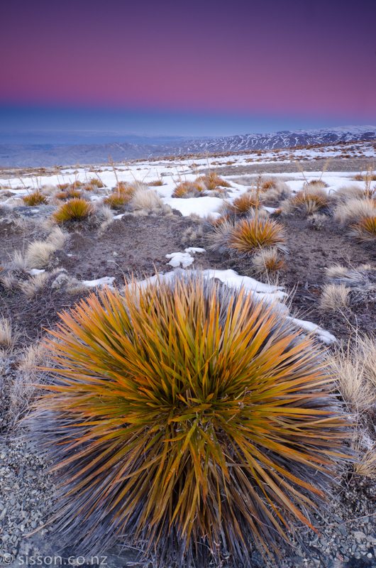
To me, this is a visually interesting image despite the absence of towering mountains, lightning bolts and grazing Unicorns. I was initially drawn by the beautiful evening pastels and the earth shadow (the blue line in the sky near the horizon) but I needed something to ‘anchor’ the shot. The strong geometric pattern and form of the Spaniard grass created a terrific foreground element for the composition. By getting low and getting close an ultrawide lens the grass gains ‘visual weight’ – compare it to the nearly identical grasses a couple of yards back.

Seek the Right Light

I would happily argue that great light is the single most important element in a successful landscape image. In fact, I dedicated a significant number of ePages in Living Landscapes to doing just that. Great light is truly transformative.

Fortunately, seeking great light doesn’t entail shooting only Ferrari-red sunsets. In fact, I will pull out the camera in almost any light if it complements a scene. The skill is learning to judge what constitutes the best possible lighting conditions for a given location – this is where you have to practice the art of observation and pre-visualization to judge how the sun will play out during the course of the day. I use digital tools to assist in this process, namely Focalware, which is a nifty little app that shows the arc of the sun and moon throughout the day with freakish accuracy.

Before after

Great light is transformative. In Living Landscapes I detail the many steps and decisions that led from the scouting shot on the left to several portfolio-grade images of this scene.

Create a Composition

Composition is where it all comes together artistically. You may have lined up an amazing subject and be blessed with a veritable pyrotechnics show in the sky but if you combine these in a dreary, sloppy and uninspiring composition all is wasted.

I personally divide landscape compositions into two broad (and absolutely unscientifically defined) categories;

  • Dynamic landscape compositions
  • Static landscape compositions

Dynamic compositions are the show ponies of the landscape photography world. They employ a suite of visual ploys to imbue an image with an almost 3-D feel and/or impart a sense of dynamic energy. Dynamic compositions used to be difficult to create in ye olde film days but the learning curve is vastly accelerated by the digital workflow and easy access to educational information such as this dPS blog post written by yours truly.

NZ CO cathedral cove 6

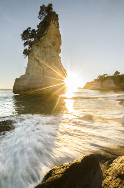
Show pony. Dynamic compositions employ techniques such as leading lines, motion blur and vivid colors to draw the viewer’s attention into the frame.

Static compositions subscribe to a more traditional photographic aesthetic and, I feel, are more faithful to the two-dimensional constraints of the art form – most of Ansel Adams’ images would be considered static as opposed to dynamic compositions. I have a personal preference for beautifully executed static compositions – probably because I am fairly ancient, in internet years at least…

Static compositions rely upon a more subtle repertoire of visual techniques to achieve a sense of drama. Successful static compositions use a combination of layers, contrast, texture, form, localized lighting and color to engage the viewer.

NZ WR Sunset Sheep

No place for show ponies. Static compositions such as this rely upon layers of visual interest, form and spot lighting to succeed.

Mixing it Up

It is important to note that there is no particular order for executing these three steps. I will often stumble across great light (always it seems when driving with a car full of tired & hungry kids ) and then have to find a subject and a composition to capitalize upon the situation. This is, of course, where strong craft and technical skills kick in – readers of Living Landscapes will know that I promote a policy of keeping it simple with regards to camera settings and technical considerations, this allows me to work fast and seek out compositions – even while being bombarded with requests for snacks from the back seat!

Todd & Sarah Sisson are full-time landscape photographers based in Central Otago New Zealand.

Their work can be found as fine art prints & canvas prints at www.sisson.co.nz  They can be found on Facebook, Google Plus and Twitter.

Post originally from: Digital Photography Tips.

Check out our more Photography Tips at Photography Tips for Beginners, Portrait Photography Tips and Wedding Photography Tips.

3 Steps to Gorgeous Landscape Images


Digital Photography School

 
Comments Off on 3 Steps to Gorgeous Landscape Images

Posted in Photography


Gorgeous Tiny Chicken Machine Show – Talk to the Hot Dog Video

23 Jul
You’ve caught yourself singing the song in the car, at home, even at the office. Now watch the wacky animated video! Go go dancing lobster! Get more free original videos: crackle.com tags: cspot comedy gtcms gorgeous tiny chicken machine kim evey japan talk show to the hot dog video song animation carto felicia day the guild
Video Rating: 4 / 5