RSS
 

Posts Tagged ‘Fresh’

X-tra promises a fresh take on the conventional camera battery with its innovative offering

20 Nov

Camera batteries are difficult to get excited about, but they are a critical part of any camera kit. Sure, they come in different shapes and sizes, but they’re basically all functionally identical. A new Kickstarter project hopes to change this by improving upon the conventional camera battery. The X-tra battery promises increased capacity, improved usability, and quite simply, a better user experience for photographers and videographers on the go.

For many photographers, particularly those using mirrorless cameras with smaller batteries and larger power consumption, it’s a foregone conclusion that you need to carry extra batteries. Keeping your charged and empty batteries organized and swapping out batteries is an inconvenience. The X-tra battery aims to reduce the hassle by delivering an increased capacity of 3,700 mAh, including a built-in charge level indicator, reducing the time it takes to swap out batteries and allowing for easy recharging, even while shooting. The 3,700 mAh capacity is about twice that of a Canon LP-E6 battery.

X-tra battery diagram and physical features

To use the X-tra battery, you must remove the battery slot door on your camera, as the X-tra battery is larger than standard batteries. The tradeoff here is that you get an extra area to grip your camera, plus you have access to the X-tra battery’s quick-release system. Of course, it’s possible that the overhanging portion of the battery will impact your ability to use existing tripod plates and other accessories. To remove the X-tra battery, you simply push in and it slides out. To install a new X-tra battery, just pop into place.

To check the capacity of the X-tra battery, you press and hold the button on the bottom of the battery. There are four illuminated indicators, signaling the level of charge remaining in the battery. This is great if you want to check an X-tra battery’s life without inserting it into your camera and check the remaining battery life. If you need to power your camera for an extended period, such as when shooting timelapse video, you can use the X-tra’s included USB-C port.

The X-tra battery includes many features not found in traditional camera batteries.

There is also an included X-tra Charging Case. This case allows you to quickly charge the X-tra battery via USB-C. Further, when you put an X-tra battery inside this case, you can use the battery as a power bank.

Given its design, the X-tra is not universally compatible with all cameras. You can view the full compatibility below. As you can see, the X-tra will work with numerous Sony, Canon and Nikon cameras, including both DSLR and mirrorless cameras. The team will update the final compatibility list before the campaign ends in a little under a month.

Current X-tra compatibility chart. Click to enlarge.

The X-tra has already eclipsed its Kickstarter campaign goals. The product is expected to begin shipping in March 2021. As of writing, you can pledge $ 99 USD to receive an X-tra and the charging case. $ 188 will net you an additional battery and case. Additional combos are also available to backers. The planned MSRP for the X-tra is $ 145 per battery/case combo. For more information and to make your own pledge, visit the X-tra Kickstarter campaign.


Disclaimer: Remember to do your research with any crowdfunding project. DPReview does its best to share only the projects that look legitimate and come from reliable creators, but as with any crowdfunded campaign, there’s always the risk of the product or service never coming to fruition.

Articles: Digital Photography Review (dpreview.com)

 
Comments Off on X-tra promises a fresh take on the conventional camera battery with its innovative offering

Posted in Uncategorized


Nikon D780 gallery updated with fresh samples, Raw conversions

11 Feb

$ (document).ready(function() { SampleGalleryV2({“containerId”:”embeddedSampleGallery_1187058975″,”galleryId”:”1187058975″,”isEmbeddedWidget”:true,”selectedImageIndex”:0,”isMobile”:false}) });

We’ve been busy as heck putting the Nikon D780 to the test, both in our lab and in the field. And the camera’s proving to be a great all-arounder, regardless of our subject matter or lighting conditions. What you’ll find here is an updated gallery with many additional samples as well as a wide selection of Raw conversions.

See our Nikon D780 sample gallery

Articles: Digital Photography Review (dpreview.com)

 
Comments Off on Nikon D780 gallery updated with fresh samples, Raw conversions

Posted in Uncategorized


Some Fresh Ideas For Students

19 Nov

College life can be very hectic and challenging. Once you get into a higher education institution, you get sucked into the whirlpool of lectures, assignments, workshops, conferences, and new acquaintances. At time, you may feel overwhelmed by this new breakneck pace of life and reluctant to go on your education quest. According to PapersOwl, a writing company that handles hundreds Continue Reading

The post Some Fresh Ideas For Students appeared first on Photodoto.


Photodoto

 
Comments Off on Some Fresh Ideas For Students

Posted in Photography


Review of PhotoWorks: a Fresh and Fast Photo Editor for PC

06 Oct

The post Review of PhotoWorks: a Fresh and Fast Photo Editor for PC appeared first on Digital Photography School. It was authored by Glenn Harper.

PhotoWorks is an image editor with a fresh, clean interface and a set of tools that work intelligently to get the best from your photos. It helps you turn drab files into spectacular pictures within a few clicks – sometimes only one! The software’s Portrait Magic technology uses face recognition to add expert retouching edits to your photos. A host of other handy features make the PhotoWorks photo editor for PC an enticing proposition.

PhotoWorks interface

The histogram is a constant when you edit in PhotoWorks. It’s good to see a program that knows its value.

Who’s it for?

Automatic photo editing is the forte of PhotoWorks, but the software doesn’t do everything. It doesn’t offer the huge toolbox that many other programs do, with so much thrown in that you have to rummage endlessly to find what you want. It’s designed for ease of use and speed, which will appeal to beginners and casual photographers but might catch the eye of a few veterans, too.

photoworks-photo-editor-for-pc

The clean, minimalistic interface of PhotoWorks. All edits are memorized by the software, so they’re non-destructive.

In this review, I’ll look at everything PhotoWorks has to offer. I feel like I’ll enjoy it because this photo editing software for PC isn’t an unwieldy monster with innumerable needless features. PhotoWorks seems knowable from the first time you open it. You can jump in without facing a steep learning curve, though there are good tutorials available online if you need help. Let’s see what it can do.

Opening raw files

Raw files are always an obvious place to start when reviewing a photo editor for PC. Can PhotoWorks handle them? It’s not billed as a raw processor, but it does open most proprietary raw files in addition to Adobe’s standard DNG files.

When you open raw files in PhotoWorks, you have the option of applying one of six profiles to them: Default, Auto Enhancement, Landscape, Portrait, Sunny Day or Black & White. With the Default profile, all the settings in PhotoWorks are zeroed when you open the file, whereas the others are Presets with adjusted sliders.

photoworks-photo-editor-for-pc - raw conversion

You’re presented with six starting points when opening raw files. The default conversion opens automatically on the page.

PhotoWorks is really a pixel editor. It converts individual raw files quickly and the quality is okay – good, even – but problems like chromatic aberration (CA) and chroma noise are present if you examine images at 100%. Should you view images at 100%? Only if you’re creating big prints or trying to impress third parties with technical quality. And if you’re doing that, you may not belong to the target market for this software, though PhotoWorks has potentially wide appeal.

chomatic abberation - CA

PhotoWorks does not currently fix chromatic aberration or purple fringing. If you’re the type of photographer who scrutinizes image quality and needs impeccable files, you could run them through a dedicated raw converter first.

By pairing PhotoWorks with a separate raw processor (e.g. RawTherapee, Darktable), “serious” photographers could have the basis of an efficient workflow. That’d be good for, say, wedding photographers, who would also benefit from the software’s intelligent retouching capabilities. We’ll look at those in more detail later, but for now, it suffices to say they’re good.

Saving the PhotoWorks way

Not long after firing up PhotoWorks, you’ll notice there’s no way to close images. This is unusual, to say the least, but it’s another form of streamlining. You can save edited files and move onto the next image. Your edits are stored, even if you move on without saving, and you have the option of resuming them or starting afresh when you go back to the file. This is true even if you close the program. Edits are non-destructive.

Both Save and Fast Export let you export a separate copy of the edited file in the format of your choice, the main difference being that you choose the format beforehand with Fast Export. You can select from JPEG, TIFF (8-bit compressed), PNG and BMP.

Enhancement

The Enhancement tab is where you make changes to color and tone in your image. It includes an Auto Correction feature that aims to transform your photos in a single click, but you can alter its effect if you want. For instance, let’s say you’re already happy with the tonal range but would like more color, you could switch off the dynamic range and add vibrance to Auto Correction. Plus, there’s a slider that adjusts the strength of the auto effect.

PhotoWorks image enhancement

PhotoWorks includes a blue sky enhancement, which makes it easy to deepen the blue of the sky whilst also warming the photo up. Those two edits are normally at odds with each other.

Most of the color and tone sliders you’d expect to find in top-end software are in the Enhancement section of PhotoWorks under the Main tab. They give you as much manual control as you want. The workspace is so tidily laid out that it puts some established photo-editing brands to shame. The design is thoughtful and user-friendly, and it makes you want to linger. You even get to suggest features you’d like to see.

Two more tabs under Enhancement are Colors and Sharpness. The first lets you adjust hue, saturation, lightness (HSL) and color balance. The Sharpen tool is basically an unsharp mask, and there’s a blur section where you could create dreamy soft-focus effects or counteract over-sharpening. It’s all useful stuff, and the confusing terminology is notably left out.

photoworks-photo-editor-for-pc-sharpening-the-blur-tool

A slightly de-sharpened image focuses attention on form rather than detail. That’s where the PhotoWorks Blur tool is useful. It works well with busy compositions.

Tools

Move along to the Tools tab in PhotoWorks and a carefully selected set of powerful tools reveals itself to the right of the screen. There are not a hundred little tool icons as with complex programs. Some of the tools, like Curves or Tone Mapping, offer an alternative and perhaps more advanced way of working with your pictures. Seasoned photographers will be familiar with these features.

Crop

The PhotoWorks crop tool includes a modern set of aspect ratio presets that fit today’s devices or social media pages perfectly. Of course, you can also use the original aspect ratio, choose a different ratio or crop the photo freely. There’s nothing much missing here. You can rotate the picture, which helps get horizons level or to achieve the most effective composition.

AMS Software, the creator of PhotoWorks, also offers a choice of grid overlays to assist you with composition when cropping. For example, you can choose a Rule of Thirds or Golden Ratio grid to help you decide what to include and where. My only slight gripe here is that the grid lines are often a little hard to see: maybe a different color or opacity control would help.

the golden spiral crop composition

The Golden Spiral crop grid in PhotoWorks.

Geometry (correcting perspective and distortion)

You can correct the perspective of architectural photos using the Geometry tools in PhotoWorks. Like in most photo editors for computers, there’s no auto adjustment, so you have to alter the vertical and/or horizontal perspective yourself using the sliders, but this is generally an easy task.

correcting lens distortion

In this pic, you can clearly see the effects of lens distortion on the window frame. In the inset, I’ve corrected it using the distortion slider.

Correcting optical aberrations such as pincushion or barrel distortion is also possible in this section. Some programs will do this for you with the help of lens profiles, but you can do it easily yourself with the assistance of the included grid and distortion slider.

Change background

PhotoWorks makes it easy to change the background of your photo, so if you want to transplant a better sky or create a composite picture, you can. The process of separating the subject from its background is simple. You draw a green line with the object brush, a red line with the background brush, and then you let the software work its magic. Typically, you need to refine the edge a bit using the same brushes, which could become labor-intensive with intricate subjects. For many photos, the process works fine. There’s even a choice of free-to-use pictures you can add as backgrounds, or you can upload your own.

PhotoWorks - change background

The Change Background feature in PhotoWorks separates subjects from their background with ridiculous ease. I’m not sure there’s enough finesse for complex selections (e.g. fur or fine strands of hair), but there’s a lot of fun to be had.

Vignetting

The vignetting tool lets you correct vignetting that occurs naturally with your lens. You can brighten edges and corners for even exposure. It also lets you add a vignette as a creative effect, focusing the viewer’s attention more on the subject of the picture. This photo editor for PC provides all the controls you need to fine-tune this edit.

3D LUT Color Correction

Color LUTs might just as accurately be called “special effects” since they remap the color of your photos to create a different look. PhotoWorks offers a nice built-in selection of them as well as letting you upload your own in the form of cube files. You can’t save your own LUTs within the software, hence you can’t preview them either, but I’m glad to see this feature in PhotoWorks.

PhotoWorks review - color LUTs

This is the “Drama” color LUT. Interestingly, it compresses the tonal range. In doing so, maybe it makes the viewer feel more hemmed in and on edge.

Tone Mapping & Curves

PhotoWorks includes tone mapping and curves tools for controlling color and tone. Tone mapping lets you overlay a color or texture. You could apply a color to a black-and-white image here for a duotone effect. The curves tool adjusts contrast, changes color temperature, and tint and even corrects color if you use the individual RGB curves.

PhotoWorks - tone mapping

A black & white photo turned into a duotone (i.e. a mix of black and blue) using the Tone Mapping tool in PhotoWorks.

Noise Reduction and Grain

There are tools for reducing digital noise or adding film-like grain in PhotoWorks. This photo editing software for PC doesn’t separate color noise from luminance noise, which would be a nice feature for more advanced photographers. But it will smooth and improve the look of high ISO photos.

The film-grain effect is generally better looking than digital noise in photos. You can add that to give your photos an authentic retro look from the days of analog photography.

Retouch

Some of the headlining features of PhotoWorks fall under its Retouch section. The software harnesses the power of face recognition technology to automatically enhance portraits. You can use its Portrait Magic or Face Sculpt technology to retouch faces and show your subjects at their best.

Portrait Magic

A remarkable feature of PhotoWorks is its Portrait Magic feature, which lets you automatically or manually remove blemishes and enhance portraits. Its toolset includes the following:

  • Skin smoothing
  • Control over redness (improve blotchy skin)
  • Skin tone
  • Eyes (sharpness, contrast, remove dark circles)
  • Eyebrows (sharpness, contrast)
  • Lips (sharpness, contrast, hue, saturation, luminance & glare)
  • Teeth (whiteness)
PhotoWorks portrait magic

It may be hard to see the difference here, but Portrait Magic is good at damping down glare on the skin (aka “face shine”). There are many quick fixes to choose from as well as full manual control. (Image: Pexels)

Even if you know how to fix these things already, this technology saves time. It’s easy to imagine it being useful to pro portrait and wedding photographers. The best results are achieved by addressing issues one-by-one, but there’s a set of quick-fix buttons available to speed things up. You have to be careful with it because the software isn’t infallible. For instance, a pair of glasses get in the way of removing dark circles accurately.

Portrait Magic is so good that you could buy this software for that alone. It’s a great photo editor app for pc or laptop.

Face Sculpt

Just when you thought you’d seen amazing things with Portrait Magic, along comes Face Sculpt. Move a slider and watch the software identify and alter a specific part of the face. You can do these things manually in Photoshop using warp tools and the like, but boy is it easy with PhotoWorks: a deft picture editor and retoucher in one.

PhotoWorks - face sculpt

I’ve done nothing to this photo except turn a hint of a smile into a stronger hint. Like Portrait Magic, Face Sculpt is a powerful tool that can totally transform a portrait. The technology behind it is remarkably precise. Subtle edits often work best. (Original image: Pixabay)

Maybe we should all just accept the way we look, but contrary to popular belief, the camera does lie. It’s easy to take an unflattering portrait because of technical reasons, whether it’s an unflattering camera angle, harsh lighting, poor timing or lens distortion. PhotoWorks lets you remedy such problems.

Face Sculpt enables you to reshape or resize eyes, noses, mouths, eyebrows, and the face itself. You can even turn a frown into a smile. Used subtly, it creates different versions of the truth rather than outright lies. And if it helps the subject feel good about themselves, that can’t be a bad thing.

Healing and Cloning Tools

Healing and Cloning tools in PhotoWorks are also first rate. The clone stamp auto-samples from a similar area and gives you the option of changing the sample location. It’s quick and efficient, and no intervention is usually necessary. The Healing Brush is even faster for fixing small blemishes (e.g. dust spots).

Adjustment Brush

There aren’t any layers in PhotoWorks, but you can carry out local edits with the adjustment brush. Users of Lightroom will be familiar with the concept. Color, tone, and sharpness can all be selectively adjusted anywhere on the image. You can also deal with chromatic aberration by brushing neatly over edges and turning Saturation down, though a dedicated tool would be better.

PhotoWorks - adjustment brush

It’s out of fashion, I know, but here’s a quick demo of selective coloring with the Adjustment Brush on PhotoWorks. This Lightroom-style feature offers infinite possibilities without being as daunting to beginners as layers are.

Graduated Filter and Radial Filter

The Graduated Filter and Radial Filter offer alternative ways of making local adjustments to one or more parts of an image. Whether it’s tone, color or sharpness you’re adjusting, these retouching tools make it easy to emphasize your subject. You can also even up your exposures (e.g. the classic dark foreground and bright sky) and bring out shadow detail. Characteristically, these features are neatly designed and easy to use in PhotoWorks.

graduated filters post processing

Two graduated filters are in play here – one to brighten and warm up the lower half of the photo and another to reduce exposure in the sky a little.

Special Effects

With over 150 special effects to choose from, PhotoWorks gives you plenty of ways to interpret each photo. In the Special Effects section of the software, you can add any effect you like and then adapt it to suit your tastes if you want. Hitting the “Apply” button takes you over to the Enhancements area of the software, where you can tweak color, tone, and sharpness.

Image: A quite pleasing special effect to my eye (Faded Photo -1) and one of over 150 special effect...

A quite pleasing special effect to my eye (Faded Photo -1) and one of over 150 special effects available in PhotoWorks.

I personally like adding textures to photos, so it was good to find a few textured effects among the collection. There is also a Quick Enhancements selection, which gives further opportunity for one-click fixing. You can favorite effects so they’re easy to find later on.

A Photographic Films section attempts to replicate the look of various classic films. It’s fun to play around with these effects, which you could find yourself using again and again in some cases.

Captions (add text and stickers)

Whatever you normally do with your photos, there might come a time when you want to add text to them. Maybe you’re making a Christmas card or designing a flyer. You could be creating memes for social media and entertaining your friends. PhotoWorks photo editor app for PC includes a versatile set of tools to help you create the text you want in the font, color, and style of your choice. A sticker collection lets you add cartoon-like captioning for extra fun.

Review of PhotoWorks: a Fresh and Fast Photo Editor for PC

Conclusion

Beneath the minimalistic surface, PhotoWorks offers a powerful set of tools that are easy to use regardless of your level. The way the software exploits face recognition technology is magical, indeed.

There are a few nuts-and-bolts things I would like to see in PhotoWorks, such as chromatic aberration removal, more nuanced noise reduction and an exposure warning to help with histogram adjustments (aka levels). The ability to export 16-bit TIFFs would be nice. At some point, though, if you keep adding stuff, the program ends up complex like many others and loses its streamlined appeal.

Design-wise, PhotoWorks positively gleams. It has a beautifully clean interface, uses simple terminology that everyone can understand, and gets a lot of work done with minimal effort. Whether you use it alone or alongside other photo editors for PC, it’s definitely worth a look.

You can download a free trial version and explore the features of the program yourself. Or use the exclusive coupon for dPS readers to purchase PhotoWorks at a 50% discount now!

Disclaimer: PhotoWorks is a paid dPS partner.


dps-photoworks-photo-editing-for-pc

The post Review of PhotoWorks: a Fresh and Fast Photo Editor for PC appeared first on Digital Photography School. It was authored by Glenn Harper.


Digital Photography School

 
Comments Off on Review of PhotoWorks: a Fresh and Fast Photo Editor for PC

Posted in Photography


A Fresh Look at Learning Photographic Composition

02 Jan

Popular teaching about photographic composition says to learn the rules and then break them. I prefer to encourage the people who join our photography workshops to learn the rules, understand them well and put them into practice so frequently they become second nature.

If you can apply the rules without even consciously thinking about them you will create more dynamic, interesting photographs which convey more feeling.

A Fresh Look at Learning Photographic Composition

Why do we have rules?

Rules are important as they are the underlying structure of composition. Much like scales are to musicians. Much like grammar is to language.

Successful musicians have typically spent long hours going over and over the same scales until they know them so well they do not need to think about them. When we learned our first language, our “mother tongue”, we never consulted the textbooks to study the grammatical structure of the language, we just absorbed it, (most frequently from our mothers.)

A Fresh Look at Learning Photographic Composition

Some people will have more difficulty learning the rules of composition and applying them effectively than others. Very much like some people can learn to play musical instruments or learn new languages easier.

I think it is because we are all creatively gifted in different ways. If you are gifted with a visual creativity you may find it easier to compose photographs than say someone who is gifted with a musical creativity and finds it easy to play the guitar or trumpet for example.

A Fresh Look at Learning Photographic Composition

I do like what the famous American photographer Edward Weston had to say about learning and implementing the rules of composition:

“Now to consult the rules of composition before making a picture is a little like consulting the law of gravity before going for a walk.”

I doubt any of us can recall studying the law of gravity before we learned to walk. But we certainly knew about it.

A Fresh Look at Learning Photographic Composition

Know them at a subconscious level

Knowing the rules is important as they will help guide our creative thinking, but applying these rules rigidly will generally lead towards making rather static and lifeless photographs. As you learn the rules and know them so well you can incorporate them into your photographs intuitively you will find your images may take on a whole new dynamic. Very much like walking and talking, it’s good to be subconsciously aware of the rules and laws as they are there for good reason.

A Fresh Look at Learning Photographic Composition

Practice constantly

Reading about and studying the rules of composition will help you gain a good understanding of them. Practicing them frequently is the most effective means of consistently integrating them into your photographs. Practice them even when you don’t have your camera with you.

Begin to see in the rule of thirds, discover leading lines and strong diagonals, look for frames and how you can use symmetry. One side effect of seeing like this will likely be that you start taking your camera everywhere with you.

Fill the frame

When I first started working in the photography department of a newspaper it was impressed upon me to “fill the frame”. This encouragement has stuck with me and I am aware, consciously or subconsciously, of wanting to effectively achieve this with every photograph I make. This was important in the newspaper in order to convey the story effectively, (and so sub-editors had less flexibility to horribly crop your photos).

A Fresh Look at Learning Photographic Composition

Filling your frame does not mean that in every photo your subject must be pressed out to the edges of your viewfinder. It means however you are choosing to compose your photograph, make sure whatever is within the four corners and edges is relevant to the picture you are making.

A Fresh Look at Learning Photographic Composition

If empty space is relevant and adds to your composition, use it well. If cropping in so tight that part of your subject is cut off makes a stronger image, then crop tight.

However you decide to compose your image, be happy with it. Don’t get hung up on the rules. But do have a solid understanding of them and explore how you like to incorporate them into the creative photographs you are making. And, if you so come up with any new rules, please do let me know!

Here’s a little video talking about this concept of composition.

The post A Fresh Look at Learning Photographic Composition by Kevin Landwer-Johan appeared first on Digital Photography School.


Digital Photography School

 
Comments Off on A Fresh Look at Learning Photographic Composition

Posted in Photography


Revitalizing the L.A. River: 7 Architects Envision Fresh Uses for Old Waterway

26 Jul

[ By WebUrbanist in Architecture & Cities & Urbanism. ]

The Los Angeles river changes dramatically as it snakes into and through the city, and these different design proposals carry that legacy forward while envisioning new, user-friendly, flexible and sustainable nodes of activity. The L.A. River Downtown Design Dialogue celebrates ten years of working to revitalized areas and create connections along the river’s route.

Currently, this often-dry river, encased in concrete, feels about as much like a river as Silver Lake feels like a lake, or anything can feel natural when so artificially contained. Seven architecture firms were given one-mile strips to work with and created a wonderful array of designs featuring lush green parks, bike paths, kayaking zones, climbing walls and more.

Gruen Associates tackled a section near Chinatown, created a series of elevated paths and natural meadows all tied into an existing railroad yard.

WSP placed walkways and terraces along the sides of the river while also offering stepping stones for people wanting to walk across.

CH2M took its zone near the Arts District and added bicycle paths and other amenities around a winding and widened section of river made to look and feel more like a local creek.

AChee Salette took over old railway tracks to create a series of gardens spilling down from the road grade above to the level of the river below.

Curving and wrapping paths and walls create an organic wrapper for the section designed by Mia Lehrer + Associates, creating a space to canoe and kayak.

AECOM’s  playfully integrated climbing walls, basketball courts and other sporting amenities, while adding light and color through mosaics and murals spanning their area.

Tetra Tech designed a new bridge to cross the river as well as a river walk, all taking advantage of the existing sloped sides, reflecting the river’s historic form.

Together, these schemes reflect a rich diversity of design strategies as well as usage possibilities — given how prominent and central the path of the river is, it makes a lot of sense to make it a more accessible and vibrant resource for the city and its citizens.

Share on Facebook


[ By WebUrbanist in Architecture & Cities & Urbanism. ]

[ WebUrbanist | Archives | Galleries | Privacy | TOS ]


WebUrbanist

 
Comments Off on Revitalizing the L.A. River: 7 Architects Envision Fresh Uses for Old Waterway

Posted in Creativity


19 New Beginning Images for a Fresh Start to the Year

11 Jan

Well, a new year is yet again upon us. It’s a time for a new start, fresh beginnings.

That can make many things to different people. Let’s see what new or beginning means to these 19 photographers with their fresh “new” images.

Smilla4

By smilla4

Robert Voors

By robert voors

Darlene Hildebrandt

By Darlene Hildebrandt

Nico Cavallotto

By Nico Cavallotto

Mark Gunn

By Mark Gunn

Christian Siedler

By Christian Siedler

Zeitfaenger.at

By zeitfaenger.at

Incase

By Incase

Oregon Ducatisti

By oregon ducatisti

?eagan

By ?eagan

Brookhaven National Laboratory

By Brookhaven National Laboratory

Margus Kulden

By Margus Kulden

U.S. Geological Survey

By U.S. Geological Survey

Kala Bernier

By Kala Bernier

Mikael T

By Mikael T

MFer Photography

By MFer Photography

Kylie_Jaxxon

By Kylie_Jaxxon

Samuel John

By Samuel John

Johan Neven

By Johan Neven

googletag.cmd.push(function() {
tablet_slots.push( googletag.defineSlot( “/1005424/_dPSv4_tab-all-article-bottom_(300×250)”, [300, 250], “pb-ad-78623” ).addService( googletag.pubads() ) ); } );

googletag.cmd.push(function() {
mobile_slots.push( googletag.defineSlot( “/1005424/_dPSv4_mob-all-article-bottom_(300×250)”, [300, 250], “pb-ad-78158” ).addService( googletag.pubads() ) ); } );

The post 19 New Beginning Images for a Fresh Start to the Year by Darlene Hildebrandt appeared first on Digital Photography School.


Digital Photography School

 
Comments Off on 19 New Beginning Images for a Fresh Start to the Year

Posted in Photography


Fresh out of the box: getting started with your first interchangeable lens camera

25 Dec

Fresh out of the box: Getting started with your first ILC

For the more established and experienced photographers of the internet, I will borrow the dedication page to Mark Z. Danielewski’s “House of Leaves:”

This is not for you.

This article is for your elderly neighbor, your young nephew or niece, or anyone whose photographic journey up to now begins and ends with a smartphone.

If this describes you, then hello. Welcome. You, budding photographer, have decided to embark on a new hobby, or an extension of something you’ve enjoyed on a mobile device, and this holiday season you have purchased (or been gifted) an interchangeable lens camera of your very own. You may not  know why exactly you wanted or needed one – or even that some cameras come with lenses that detach in the first place.

Let’s unravel the basics here, so you can get from the box-opening to the picture-taking as quickly and as free from headaches as possible.

Opening the box

In most interchangeable lens camera kits, you will have the following:

  • Camera body
  • Lens (or two)
  • Charger
  • Battery
  • Neck strap
  • Software CD (how quaint)
  • User manual
  • Warranty registration card

The first thing to do is to remove the charger and set the battery on to charge. No point in being frustrated at not being able to take photos because of a low battery.

The second task is to remove the camera and lens, remove the body cap from the camera and the back-end cap from the lens (it will be on the end with a metal or plastic mount with electrical contacts – the front of the lens will likely have the brand name and some other writing on it), and attach them.

There will be red or white markings denoting where to line the lens up relative to the camera, and normally, you’ll turn it clockwise to lock it in – with Nikon lenses, however, you rotate the lens counter-clockwise to attach it.

Get Strapped

Now is also a great time to attach the included camera strap, because nothing is quite so effective at ruining complicated electronics and optics as an accidental tumble onto cement (it happens to the best of us). Also, very few cameras actually come with memory cards these days, so you’ll want to go pick one up – no need to go crazy, a decent 16GB memory card will be plenty for casual shooters, and should be affordable.

Lastly, instead of throwing out that warranty card, fill it out. Cameras are complicated, and should you encounter any strange issues of yours that aren’t directly your fault, the warranty will help you out there.

You can also add your camera to your homeowners’ (or renters’) insurance policy, which may cover theft, accidental damage, or more.

Let’s take some pictures

Okay, now that you’ve sat staring at your camera for a while and have killed the time by reading a couple more online reviews on it, let’s put the charged battery in and actually turn the thing on.

You’ll be prompted to go through and set the date and time, which is advisable – when you go to put the photos on your phone, computer or the internet, the ‘date taken’ is a common method of keeping your images organized. If you notice any odd (read: buggy) behavior from the camera, go ahead and check the manufacturers’ website to see if there have been any firmware updates – and they’ll have easy instructions for installing them.

Which mode?

Keep the camera in fully ‘Automatic’ mode, which is usually the only option on the mode dial that’s green (the ‘Mode Dial’ will usually have P, A, S, M options among other icons such as a floating head for the ‘portrait’ preset, some small mountains for ‘landscape,’ and so on). On Olympus cameras, there’s a setting called i.Auto on the mode dial, and on Fujifilm cameras, you’ll want to flip the ‘Auto’ switch, or on the lower-end models, go to ‘SP+’ mode.

The half press

Unlike a smartphone, most interchangeable lens cameras provide you with a two-step process for taking a single picture. You’ll want to press the shutter button (it should be logically placed under your index finger while you hold the camera) very lightly – we call this a ‘half-press.’ What this does is signal to the camera that you’re intending to take a picture, at which time it will focus on whatever is in front of you, and it will pick an exposure (it will decide how bright to make the resulting image). Press the shutter down all the way now, and you’ll be greeted with some sort of shutter noise indicating that a photo has been taken. Yeehaw!

Flash

Many interchangeable lens cameras have flashes that you, the user, must pop up yourself if you wish to use them. General rule of thumb? If your photos are coming out too dark, too blurry or too grainy, pop up the flash. The camera should know to use it when it’s popped up and you’re in an automatic mode.

On some cameras, such as Nikon and Canon models, the camera will choose for you whether to pop the flash up or not. They’re often wrong about this, particularly with subjects that are very far away (the flash isn’t that powerful). However, if you are shooting a photograph of a person on a bright day with the sun overhead, the flash pop will fill in some shadows on your subject’s face – this is called ‘Fill Flash,’ and it’s usually a good thing. The flash can also handy if you’re trying to take family photos indoors and are getting blurry or grainy results.

In any case, those flash-happy Canon and Nikon models have a setting right next to the ‘Auto’ setting on the mode dial, that looks like a crossed-out lightning bolt. That’s the same automatic mode as before, but the camera will refrain from popping up the flash at all.

Easy as that

What’s next? Well, start taking pictures. They can be of anything, don’t worry about it. Take photos of things you find pretty, or funny, or just because you like them. Cats! Always take pictures of cats.

Experiment with putting your subject slightly off-center (look up the Rule of Thirds for more on this – though it’s more of a guideline than an actual rule). It’s a common temptation to zoom in to a subject, instead of using your feet to actually get closer – experiment with both. Think about fun places to go in your own town that you can bring your camera to – a friend’s barbecue, or the zoo, a park, a museum (check photography rules beforehand, though). Be sure and keep the front of your lens clean, preferably with a microfiber cloth – you’ll inevitably get fingerprints and dust on it, which is fine, but they can make everything look a bit hazy.

When you get a little more comfortable, start thinking about using lines to lead a viewer’s eye through the scene. Pay attention to contrast between light and shadow, and look out for interesting textures. There’s tons of free resources on the internet to help you out here.

The most important thing you can do with that spiffy new camera, though? Just use it and have fun

Articles: Digital Photography Review (dpreview.com)

 
Comments Off on Fresh out of the box: getting started with your first interchangeable lens camera

Posted in Uncategorized


Future Cities: 13 Fresh New Visions for Residential Towers

13 Dec

[ By SA Rogers in Architecture & Houses & Residential. ]

spire-london-main

The future of urban living (at least for the wealthy) is looking pretty lush, with residential towers finding new and creative ways to incorporate greenery, maximize views and give residents the feel of a spacious suburban backyard hundreds of feet in the air. As unrealistic as some of the renderings have looked, these towers are becoming a reality, with many set to be completed in 2017.

Fake Hills by MAD Architects, Beihai, China

residential-towers-fake-hills

residential-towers-fake-hills

residential-towers-fake-hills-3

residential-towers-fake-hills-4

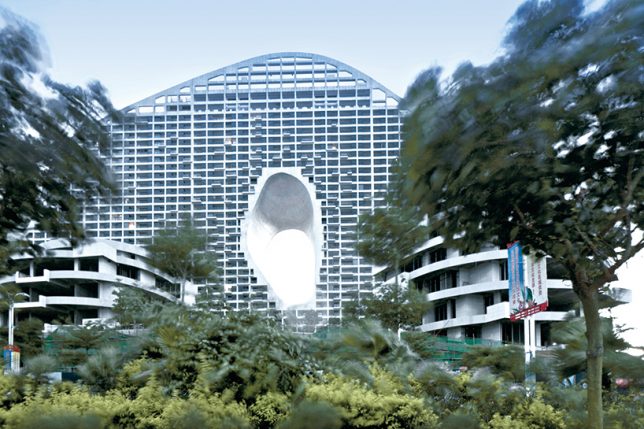
One of those renderings that looked too fantastical to be real, ‘Fake Hills’ by MAD Architects is almost fully complete in the coastal Chinese city of Beihai. The development is part of a planned, built-from-scratch city featuring dense housing in architecturally innovative form along with a lush green landscape. The continuous roof platform running along the top will eventually be planted with gardens, too, and feature tennis courts and swimming pools.

Grove at Grand Bay by BIG, Miami

residential-towers-big-1

residential-towers-big-2

residential-towers-big-3

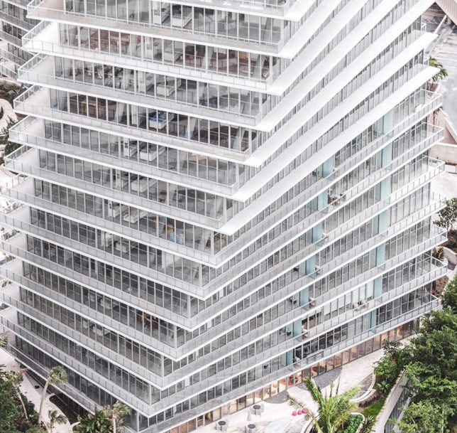
BIG’s recently completed ‘Grove at Grand Bay’ in Miami is true to its renderings, down to the undulating planted areas at the base. The pair of twisting towers is actually a luxury ‘low density’ project featuring 98 units topped with dual level penthouses and containing seven swimming pools, a spa and fitness center, and an on-site art gallery in what could be perceived as stacked mansions for a dense urban setting.

Gridded Residential Tower by C.F. Møller and Brut, Antwerp

residential-tower-gridded-1

residential-tower-gridded-2

residential-tower-gridded-3

residential-tower-gridded-4

This ‘vertical community’ by C.F. Møller is a residential and mixed-use tower that was “developed from the inside out,” placing an emphasis on social qualities, aiming for a suburban quality of life. The 24-story complex contains 116 homes, retail outlets, offices and communal areas, including enclosed winter gardens at each end of the tower and a shared 5th floor facility with a landscaped roof terrace. The envelope of the structure contains balconies enclosed within glass, spacious enough for kids to play.

Farmanieh Residential Tower by ZAAD Studio and Marz Design, Tehran

residential-tower-zaad-1

residential-tower-zaad-2

residential-tower-zaad-3

residential-tower-zaad-4

The form of this residential tower by ZAAD is pretty unusual, featuring a series of modular units wedged between stacked circular platforms to create a patchwork of indoor and outdoor areas. Also set to the scale of a suburban home, the units offer a comfortable living environment and highly varied views of the city intermixed with spacious terraces.

Vertical Forest Tower by Stefano Boeri, Lausanne

residential-tower-vertical-forest

residential-tower-vertical-forest-2

residential-tower-vertical-forest-3

Critics have questioned whether this ‘vertical forest tower’ by Stefano Boeri is an ‘Alice in Renderland’ kind of concept, especially considering that the trees pictured along the peripheral areas of the structure would need a much deeper root system and lots more soil than the design allows. The vision of such large-scale greenery seems pretty unrealistic, especially given the high demand for water and the inevitable strain on the supporting structures. But we’ve been surprised before, and the tower is under construction with a completion date set for 2017, so we’ll soon find out.

Next Page – Click Below to Read More:
Future Cities 313 Fresh New Visions For Residential Towers

Share on Facebook


[ By SA Rogers in Architecture & Houses & Residential. ]

[ WebUrbanist | Archives | Galleries | Privacy | TOS ]


WebUrbanist

 
Comments Off on Future Cities: 13 Fresh New Visions for Residential Towers

Posted in Creativity


A fresh look at Dorothea Lange’s censored photos of Japanese internment

11 Dec

$ (document).ready(function() { SampleGalleryV2({“containerId”:”embeddedSampleGallery_2013785745″,”galleryId”:”2013785745″,”isEmbeddedWidget”:true,”standalone”:false,”selectedImageIndex”:0,”startInCommentsView”:false,”isMobile”:false}) });

Dorothea Lange’s photos of Japanese interment in America are less well-known than her other Farm Security Administration works like ‘Migrant Mother’ – and there’s a reason for that. The unflinching view of the events captured in her photos landed them in the US National Archive, with many labeled ‘impounded,’ where they sat for decades.

Following the attack on Pearl Harbor, the US government announced the mandatory relocation of people of Japanese ancestry, the majority of which were American citizens, to internment camps. Lange was commissioned to photograph the events, both as people were displaced from homes and business, and later as they reported to assembly centers and were ultimately sent to the camps.

Lange’s photos painted a brutally honest picture of every phase of the internment, and were seemingly met with displeasure from the military as they were quietly impounded and archived. A 2006 book put the censored images front and center for the first time. You can see a few of the images here; Anchor Editions has published some information about the images and is offering prints with half of proceeds going to the ACLU. 

Articles: Digital Photography Review (dpreview.com)

 
Comments Off on A fresh look at Dorothea Lange’s censored photos of Japanese internment

Posted in Uncategorized