RSS
 

Posts Tagged ‘Frank’

Influential photographer Robert Frank passes away at 94

11 Sep
This Super 8 footage, shot in 1971, would later be repurposed for The Rolling Stones 1972 album Exile on Main Street.

Legendary Swiss-American photographer, filmmaker and artist Robert Frank, who is best known for his 1958 book The Americans, as well as his behind-the-scenes work with rock band The Rolling Stones, passed away from natural causes on September 9th at the age of 94. His death, which occurred at the Inverness Consolidated Memorial Hospital in Nova Scotia, Canada, was confirmed by his gallerist and longtime friend Peter MacGill.

Frank was born in Switzerland on November 9, 1924. He emigrated to the United States in 1947, after releasing his first hand-made photography book, 40 Fotos, landing in New York City where he secured employment as a fashion photographer for Harper’s Bazaar. He also started hanging out with an eclectic crowd that included Beat Generation poet Allen Ginsberg and On the Road author Jack Kerouac. Kerouac provided the introduction to Frank’s seminal photography book The Americans.

The collection of 83 black-and-white photos, captured on a cross-country road trip that began in 1955, with a Leica 35mm camera, exposed the neglected aspects of American life. In an era that glorified family values, clean-cut figures, and a booming postwar economy, Frank’s dark, grainy imagery was subversive. While The Americans was not well-received initially, its eventual success would present a level of notoriety that made him uncomfortable.

As a result, Frank pivoted to creating experimental short films and autobiographical documentaries. This would lead him to develop a relationship with one of the world’s most notorious rock bands, The Rolling Stones. The group commissioned him to create photos for their 1972 album, Exile on Main Street. Thrilled with his work, they invited him to shoot a documentary about their return to America and supporting 1972 concert tour.

The Rolling Stones were thrilled with Robert Frank’s work for the cover of their 1972 release, Exile on Main Street. However, they would go on to block the widespread release of his documentary Cocksucker Blues.

The resulting work, titled Cocksucker Blues, exposed rampant drug use and escapades including excessive orgies that the band deemed unflattering for their image. A restraining order was put in place to limit where and how often the documentary could be screened. It was ultimately shelved in favor of the documentary Ladies and Gentlemen: The Rolling Stones which consisted of strictly on-stage footage.

Upon hearing of Frank’s passing, The Rolling Stones posted the following statement on their Facebook page: ‘We’re very sad to hear the news that the visionary photographer and filmmaker Robert Frank has died. Robert collaborated with us on a number of projects including the cover design of Exile On Main Street and directed the Cocksucker Blues documentary. He was an incredible artist whose unique style broke the mould. Our thoughts are with his family and friends at this time.’

View this post on Instagram

Robert Frank has passed away at 94. As one of the key figures in postwar American art, Frank has never wanted for recognition. Few works in the history of photography have landed a punch as woozying as that book, “The Americans.” An unconsoling portrait of his adopted country, the 83 photographs in the book are a record of the Swiss-born Frank’s on-the-road travels in 1955 and 1956. It is a country of empty highways and drained faces in barrooms, divided by race and income. Frank’s people seem bereft, beaten. It’s a portrait by an outsider identifying to his fingertips with other outsiders. “In America, they had another tone, the pictures,” Frank told @nytmag in 1994. “One became aware of white cities, black people, no money, no hope. The noise. The violence. How brutal people were. A brutal country. Still is. And I began to be part of it.” Read the 1994 piece at the link in our bio. #RobertFrank photographed by @eugenerichardsphotography

A post shared by The New York Times Magazine (@nytmag) on

In a poignant moment from his first video project, Home Improvements, created in 1985, he films his own reflection through a glass door and reflects on his method with the following quote: ‘I’m always looking outside trying to look inside. Trying to tell something that’s true. But maybe nothing is really true. Except what’s out there, and what’s out there is always different.’

‘I’m always looking outside trying to look inside. Trying to tell something that’s true. But maybe nothing is really true. Except what’s out there, and what’s out there is always different.’

Frank’s lasting impact includes being deemed ‘the father of ‘the snapshot aesthetic.’ His ability to create compelling images on-the-fly inspired influential artists including Jeff Wall, Mary Ellen Mark and Ed Ruscha. Critic Sean O’Hagan, writing for The Guardian in 2014, said The Americans ‘changed the nature of photography, what it could say and how it could say it. [ . . . ] it remains perhaps the most influential photography book of the 20th century.’

Frank experienced personal tragedy in his life. He lost his first daughter, at the age of 20, in a plane crash. Twenty years later, his son Pablo took his own life after suffering from schizophrenia. He is survived by his second wife, June Leaf.

Articles: Digital Photography Review (dpreview.com)
 
Comments Off on Influential photographer Robert Frank passes away at 94

Posted in Uncategorized


The Bizarre, Chaotic Geometry of a Frank Gehry Building in Progress

17 Aug

[ By SA Rogers in Architecture & Public & Institutional. ]

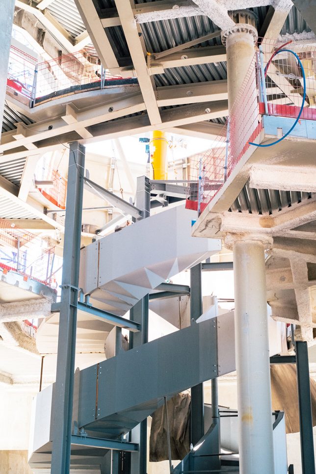
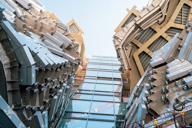
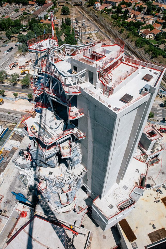
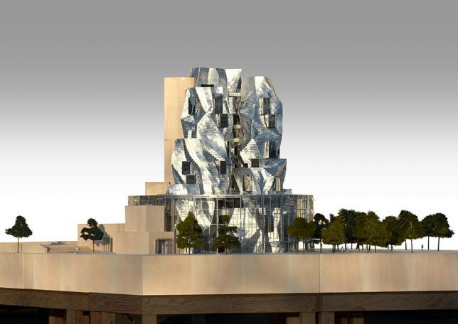
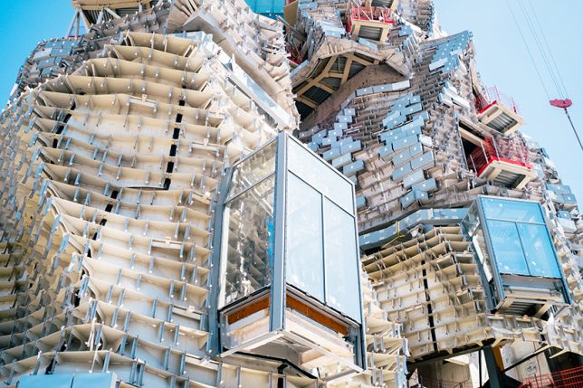
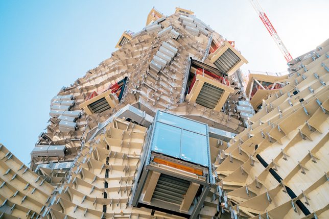
Depending on how you feel about Frank Gehry’s work, this building in progress could either be fascinating, monstrous or a combination of both. But it’s hard to argue with the fact that seeing the bones of such a complex structure is more interesting than the renderings of the finished building, which is another of the architect’s mirrored and faceted standouts. Inspired by the silhouettes of the mountain ranges of its southern France setting, ‘LUMA Arles’ will ultimately tower above an experimental contemporary art center.

Set on a former rail depot turned public park, the building is primarily sponsored by Swiss art collector Maja Hoffmann and is scheduled for completion in 2018. The working title for the tower is ‘Centre for Human Dignity and Ecological Justice,’ and it will host spaces for workshops, art studios, exhibitions, seminars and archives.

“We are creating a place where artists, thinkers, scientists – as well as doers and actors of the economic world – can gather and work together on new scripts for the world,” says Hoffmann of the project.

Photographer Victor Picon captured this series of images showing the intricate arrangements of metal ribs that will ultimately support the reflective cladding. Of course, Gehry’s a bit of a controversial figure in the architecture world, with some hailing his creations as visionary and others finding them garish and structurally unsound, noting that his Strata Center design at MIT has leaked, cracked and developed mold. What’s your stance on Gehry’s work?

Share on Facebook


[ By SA Rogers in Architecture & Public & Institutional. ]

[ WebUrbanist | Archives | Galleries | Privacy | TOS ]


WebUrbanist

 
Comments Off on The Bizarre, Chaotic Geometry of a Frank Gehry Building in Progress

Posted in Creativity


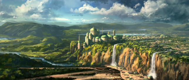
Clone Wars: How Star Architect Frank Lloyd Wright Inspired the Design of Naboo

26 Jan

[ By WebUrbanist in Architecture & Public & Institutional. ]

naboo-architecture

Much of the magic of the Star Wars films derives from the fantastic landscapes and exotic built environments that serve as backdrops for its intergalactic tales of empires and rebellions. But when world-makers like George Lucas create these places, they often draw on real architects and architecture for inspiration, including the last and largest work of starchitect Frank Lloyd Wright.

democratic-design-star-wars

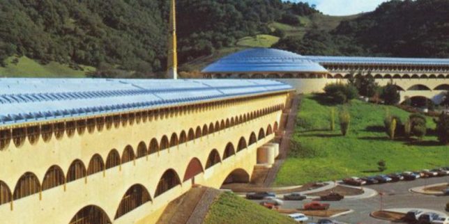
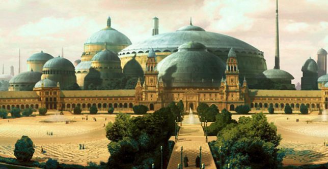
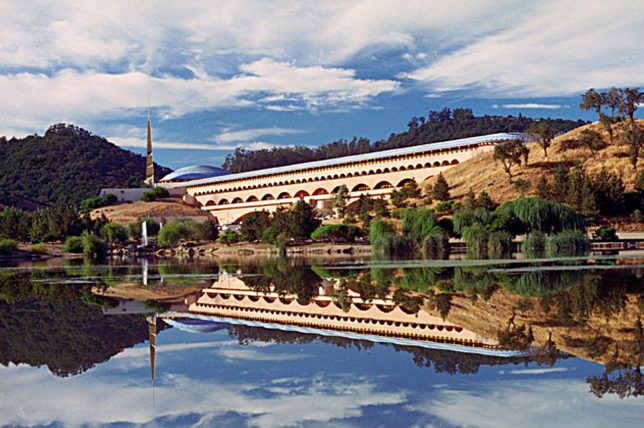
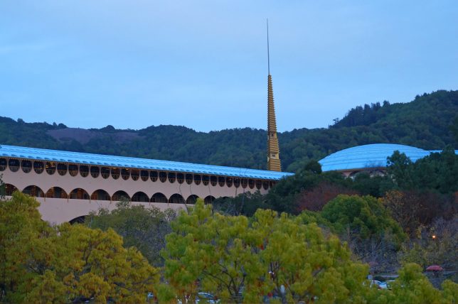
Located north of San Francisco, the Marin County Civic Center consists of a massive rotunda housing a public library, offset by a strong vertical spire and long Hall of Justice (a classic Wright move to emphasize and juxtapose both horizontals and verticals). These same features can be found in the heart of Naboo, a Mid Rim world (near the Outer Rim Territories) featured across a series of Star Wars films.

marin-count-city-civic

royal-palace

As with their cinematic counterparts, Wright’s structures for Marin were designed to relate to the landscape – curved blue roofs pick up on the tones of the sky above while beige/pink walls tie into the earthen surroundings. Arched supports and the voids they create at different scales are also immediately recognizable as similar between the original Terrestrial architecture and its echos in Star Wars scenes.

civic-center-design

views-of-naboo

For Wright as well as Lucas, there is an underlying idea at work in the design: a combining of grandeur worthy of civic architecture but also an aspiration toward something democratic, beautiful but accessible. The settings are also similar: complex and lush landscapes, fitting a similar vision found in both the architect’s and filmmaker’s works: a focus on working architecture into natural settings rather than envisioning dense cities. Lucas has directly acknowledged a debt to Wright for inspiring the architecture found in the Star Wars franchise, but has yet to announce whether he will be working on a sequel story: some of us are still waiting on Starchitecture Wars.

Share on Facebook


[ By WebUrbanist in Architecture & Public & Institutional. ]

[ WebUrbanist | Archives | Galleries | Privacy | TOS ]


WebUrbanist

 
Comments Off on Clone Wars: How Star Architect Frank Lloyd Wright Inspired the Design of Naboo

Posted in Creativity


Rogue FlashBender 2 XL Pro Frank Doorhof Edition features ‘Super Soft Silver’ reflector

16 Jun

Rogue has introduced a new FlashBender 2 XL Pro reflector designed in collaboration with photographer Frank Doorhof. The reflector uses ‘Super Soft Silver’ fabric, a material that produces an effect that falls somewhere between the soft lighting created by white fabric and the harsher, more contrasty reflections of sliver fabric.

The FlashBender 2 XL Pro is the largest FlashBender model at 13in x 16in / 33cm x 41cm; it includes a belt and buckle for attachment to a flash, and an adjustable shape for altering the direction of light.

The Rogue FlashBender 2 XL Pro Super Soft Silver Reflector is available now from Rogue for $ 59.95.


Press release:

ExpoImaging, Inc., creator of the patented FlashBender shapeable light modifiers for off-camera flash photography, today announced availability of the new Rogue FlashBender 2 XL Pro Super Soft Silver Reflector, Frank Doorhof edition.

“Photographers looking for more contrast in their images while shooting flash on location will love this new Super Soft Silver FlashBender 2 XL Pro,” said Erik Sowder, ExpoImaging CEO. “Highly reflective shiny silver fabric is prone to hot spots and is often too bright and too contrasty for portraiture, especially in brighter light. Our custom Super Soft Silver fabric falls between harsh shiny silver and soft white fabrics. It is brighter and more “edgy” than white fabric while producing a softer and more even light than shiny silver fabric.”

Professional photographer and lighting instructor Frank Doorhof is a master of using edgy light and contrast to create remarkable images. “I love more edge in my images,” said Frank, so when he first saw Rogue’s Super Soft Silver fabric, he knew he wanted a version of the Rogue FlashBender 2 XL Pro Reflector incorporating the fabric. Thus, the Rogue FlashBender 2 XL Pro Super Soft Silver Reflector, Frank Doorhof edition was born.

Designed for portability to pack flat in most camera bags or laptop compartments, the 12” x 16” (30.5cm x 40.5cm) FlashBender 2 XL Pro reflector is the largest FlashBender. Building on the success of the popular Rogue FlashBender light modifiers for speedlights, FlashBender 2 reflectors can be shaped to control the direction of light from an accessory flash, and FlashBender 2’s improved belt and buckle design provides a faster and more secure attachment to your flash.
With the control, versatility and portability of all FlashBenders and a Super Soft Silver reflective surface, the Frank Doorhof edition FlashBender 2 XL Pro Reflector represents a unique new photographic tool to create spectacular images.

Pricing and Availability

The Rogue FlashBender 2 XL Pro Super Soft Silver Reflector is available from ExpoImaging’s distribution partners worldwide or online at RogueFlash.com. The Rogue FlashBender 2 XL Pro Super Soft Silver Reflector retails for $ 59.95.

About Rogue Photographic Design

Created by ExpoImaging, Rogue Photographic Design develops innovative lighting equipment for speedlight enthusiasts. Compact, versatile, and durable, patented Rogue light modifiers offer unparalleled lighting control in portable and light weight designs. More information about Rogue Photographic Design is available at RogueFlash.com, or ExpoImaging.com. Rogue FlashBenders are patented: see http://www.ExpoIP.us.

About ExpoImaging, Inc.

ExpoImaging, Inc. markets, designs, manufactures and distributes innovative camera accessories to the photographic market. ExpoImaging is the pioneer in white balance filters and manufactures ExpoDisc White Balance Filters, Rogue FlashBenders, Rogue Diffusion Panels, Rogue Grid, Rogue Flash Gels, and Rogue Safari. ExpoImaging is also the exclusive U.S. distributor of CapBuckle, and Ray Flash: The Ring Light Adapter. These unique products are available at select photography dealers worldwide or online at RogueFlash.com, or http://www.expoimaging.com.

Articles: Digital Photography Review (dpreview.com)
 
Comments Off on Rogue FlashBender 2 XL Pro Frank Doorhof Edition features ‘Super Soft Silver’ reflector

Posted in Uncategorized


New Frank Gehry Building So Ugly it Has to Wear a Paper Bag

09 Feb

[ By WebUrbanist in Architecture & Public & Institutional. ]

frank gehry building exterior

Featuring over 300,000 custom-designed bricks, the latest work of one of the world’s most famous architects is an impressive feat of engineering, but hard not to compare to a crumpled grocery bag. Even Australia’s governor general Peter Cosgrove introduced it as “the most beautiful squashed brown paper bag I’ve ever seen” at its opening ceremony. Gehry himself reportedly does not mind the comparison, but there is not much he could do or say about it even if he did.

frank gehry bag building

paper bag building gehry

Gehry’s first work in Australia, the structure’s inspiration supposedly came from a combination of local sources (Sydney architecture) and a treehouse, with branching supports holdings organic shapes. Its fenestration is designed to reflect views of the surrounding neighborhood – this, at least, is an intriguing idea that has a demonstrable and interactive effect.
 

frank gehry glass walls

dancing house image gehry

While Gehry states that this building will not be replicated elsewhere, it is quite recognizable as his work, and thus raises the question: is it sufficiently different from his other amorphous and sculptural buildings to be deemed truly unique in the first place? The resemblance to one half of The Dancing House (aka Fred and Ginger), a nickname given to the Nationale-Nederlanden building in Prague (shown above), is hard to miss.

frank gehry classroom space

frank gehry abstract room

The complex and chaotic-seeming shapes percolate into the interior as well, showing via details and spatial configurations in the main atrium space, multiple lecture halls and multimedia rooms and a student center above. Ugly or lovely, a grand metallic entry staircase is also reminiscent of other Gehry projects.

frank gehry reflective forms

frank gehry main staircase

frank gehry paper bag

Ultimately, only time seems to tell whether an unusual building can become an icon, but one has to wonder whether something can become iconic if it is not sufficiently different from other work by the same creator. Perhaps one of his few works to still stand out (and stand the test of time) remains his original Santa Monica house remodel – a reconfiguration that shows a learning process that has arguably since stagnated. There is no doubting his influential roll in contemporary deconstructivist architecture, but he has had failures and rejections as well and his projects increasingly look like muddled remixes of one another.

Share on Facebook


[ By WebUrbanist in Architecture & Public & Institutional. ]

[ WebUrbanist | Archives | Galleries | Privacy | TOS ]


WebUrbanist

 
Comments Off on New Frank Gehry Building So Ugly it Has to Wear a Paper Bag

Posted in Creativity


Tiny Frank Lloyd Wright-Inspired House Atop Miner’s Ruins

20 May

[ By Steph in Architecture & Houses & Residential. ]

Frank Lloyd Wright Miner's Shelter 1

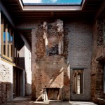
Gleaming glass, oxidized steel and matte black wood contrast with the rough concrete ruins of an old miner’s shelter found in the desert near Scottsdale, Arizona. ‘Miner’s Shelter‘ was designed and built by Dave Frazee of Broken Arrow Workshop as part of the Frank Lloyd Wright School of Architecture’s student shelter program, and is situated to take advantage of the remote natural environment.

Frank Lloyd Wright Miner's Shelter 2

Intended to serve as a rustic shelter for respite and relaxation rather than as a permanent dwelling, the off-grid structure is just large enough to accommodate a bed, sticking to the limited size of the concrete pad discovered there. The existing concrete chimney was incorporated into the design, which frames views of adjacent mountains and the Phoenix Valley.

Frank Lloyd Wright Miner's Shelter 5

The backside of the shelter is covered in oxidized steel panels that help it blend into the warm desert tones of its setting. In the distance are several similar student shelters, some still in use and some in ruins.

Frank Lloyd Wright Miner's Shelter 3

Wright spent every winter of the final two decades of his life camping in a tent-like structure in the desert before starting the tradition of building permanent, modern structures through Taliesin West, the Arizona branch of his architecture school.  The program “demonstrates how climate, building materials, site orientation, and client needs and preferences inform design choices based on the tenets of Wright’s organic architecture.”

Share on Facebook


[ By Steph in Architecture & Houses & Residential. ]

[ WebUrbanist | Archives | Galleries | Privacy | TOS ]


WebUrbanist

 
Comments Off on Tiny Frank Lloyd Wright-Inspired House Atop Miner’s Ruins

Posted in Creativity


Im Gespräch mit Frank Buttenbender

22 Apr

Ein Beitrag von: Frank Buttenbender

Ich verfolge Dich ja jetzt schon eine Weile bei Facebook. Fast jede Woche gibt es dort wieder neue Konzert- und Festivalbilder zu bewundern. Klingt, als hättest Du einen Traumjob. Ist er das?

Das ist tatsächlich ein Traum, allerdings kein Job, denn ich arbeite nur im eigenen Auftrag für mein eigenes kleines Onlinemagazin. Das verschafft mir einerseits die Freiheit, nur die Konzerte zu fotografieren, die mich interessieren, hat teilweise aber auch den Nachteil, nicht alle Künstler vor die Linse zu bekommen. Zumindest nicht die Herrschaften, die noch immer im Internet eine Bedrohung sehen und nur Printmedien akkreditieren.

Mitunter fragen nach meiner eigenen Veröffentlichung auch Printmagazine an und ich gehe darauf ein, aber im Auftrag anderer arbeite ich nur sehr ungern. Noch besser ist die Situation natürlich dann, wenn man einen persönlichen Draht zur Band bzw. deren Management hat.

Dann findet man vor Ort auch ganze andere Bedingungen vor. Aber um zum Ausgangspunkt zurückzukommen; ja, es ist traumhaft, da es mir Gelegenheit gibt, großartige Konzerte zu besuchen und gleichzeitig zumindest einen Teil zum Ganzen beitragen zu können.

noyce TM von Frank Buttenbender

Bekommst Du denn bei der Arbeit überhaupt etwas vom Konzert mit? Die unberechenbaren Lichtsituationen, schnelle Bewegungen der Musiker – das alles erfordert ja eine hohe Konzentration. Kann man dabei die Musik genießen?

Gute Frage. Wenn ich das komplette Konzert fotografieren kann, bekomme ich nicht wirklich viel mit vom Geschehen. Aber das ist nicht die Regel, denn meistens ist ja nach drei Songs Schluss und man kann sich dem Konzert selbst widmen. Allerdings ist auch dann nicht ausgeschlossen, dass man den Lichtsituationen auf der Bühne mehr Beachtung schenkt als der Musik.

Um diese wirklich zu genießen, bin ich ohnehin lieber zuhause und höre in aller Ruhe ein Album auf CD oder Vinyl an. Bevor ich mit der Konzertfotografie begonnen habe, war ich daher auch kaum mal bei einem Konzert dabei. Und ich mag das eigentlich auch gar nicht. Zu viele Menschen auf engem Raum, der Sound ist meist übersteuert, die Luft schlecht… beim Fotografieren kann man das alles ausblenden, aber ohne das würde ich vermutlich nie Konzerte besuchen.

Das Ich von Frank Buttenbender

Interessant, ein Konzertfotograf, der an sich keine Konzerte mag. Muss man denn die Bands kennen und mögen, um gute Bilder zu machen?

Es ist vor allem motivierend, Bands zu fotografieren, die man mag oder vielleicht bislang noch nicht fotografieren konnte. Aber für gute Bilder reicht allein das nicht aus, manche Künstler sind aufgrund ihrer Statur oder ihres extremen Bewegungsdrangs generell schwieriger zu fotografieren und andere mögen keine guten Lichtbedingungen. Da nützt dann mitunter das Wollen auch nicht viel.

Manchmal sind die Ergebnisse aber trotzdem ganz passabel, das darf man dann gern der eigenen Tagesform zuschreiben oder ein paar glücklichen Momenten. Aber selbst bei perfekten Bedingungen, viel Zeit und guter Form wird es immer ein Foto geben, das man nicht gemacht hat. Vielleicht ist das auch der Grund für den bleibenden Antrieb, beim nächsten Mal wiederzukommen.

Die Leute auf der Bühne zu kennen, ist schon ein Vorteil. Es ist gut, wenn man weiß, wer gern auf welcher Seite das Mikro hält, wie groß die Bandmitglieder sind, ob sie dazu neigen, in den Graben oder ins Publikum zu springen und dergleichen mehr. Ein zu viel an Vorbereitung könnte allerdings die nötige Spontaneität ein wenig hemmen, so dass ich mir meistens nicht allzu viele Gedanken mache.

Laibach von Frank Buttenbender

Gibt es da eine Band, bei der es Dir besonders viel Spaß macht?

Derzeit muss ich da unbedingt die Band IAMX nennen, die mir auch musikalisch am meisten bedeutet. Ich habe sie erst einmal fotografiert, aber demnächst erfährt die Zusammenarbeit eine Fortsetzung. Gute Ergebnisse und daher viel Spaß gab es in der Vergangenheit mit den Bands Diorama, Project Pitchfork, Laibach oder Lacrimosa. Von den bekannteren Künstlern ist mir vor allem ein Abend mit Nick Cave in guter Erinnerung. Auf der Wunschliste stehen die Nine Inch Nails ganz oben.

Wie wichtig ist die Technik bei Deiner Arbeit und mit welcher Ausrüstung arbeitest Du?

Wichtig ist sie insofern, als dass sie mich in die Lage versetzt, unter teilweise extremen Bedinungen ordentliche Fotos zu machen. Derzeit benutze ich eine Nikon D700, eine Nikon D200 sowie einige lichtstarke Festbrennweiten. Damit bin ich derzeit zufrieden. Ich würde dennoch sagen, dass ein gutes, schnelles Auge sowie Erfahrung weitaus wichtiger sind als die optimale Ausrüstung.

The sisters of mercy von Frank Buttenbender

Aber ein gutes, schnelles Auge nützt nichts, wenn die Kamera nicht über ISO 400 hinausgeht, oder?

Es ist schon beides wichtig, keine Frage. Komisch sind immer so Äußerungen, wie „Du machst ja bessere Fotos, weil Du die bessere Kamera hast.“ Das ist sehr wirklichkeitsfern, denn ein ambitionierter Fotograf wird eher Wege und Mittel finden, bessere Technik zu verwenden, als neidvoll auf andere zu schielen.

Ich frage mich oft, warum so viele Fans auf Konzerten ihr Handy um Fotos bemühen. Gute Bilder schafft man damit aus der meist doch sehr großer Entfernung nicht, oder?

Die Handy-Knipser und Filmer sind ein ganz anderes Thema. Ich denke mal, denen geht es nicht so sehr um Qualität, sondern um den Beweis der eigenen Teilnahme. Mit Web 2.0 Apps wie Facebook und YouTube ist das Dabeisein und Mitmachen ganz wichtig geworden, wichtiger offenbar, als das pure Konzerterlebnis selbst.

Einige Künstler sprechen sich daher auch gegen die Verwendung von Handyknipsen aus, was ich ihnen hoch anrechne. Aber es gibt nicht nur zu viele Handyknipser, es gibt auch deutlich zu viele Leute, die sich um den Einzug in den Fotograben drängeln. Da ist in den letzten Jahren leider vieles in eine fragwürdige Richtung gelaufen.

Eisbrecher von Frank Buttenbender

Ja, von den Kämpfen im Fotograben hört man selbst als Nicht-Konzertfotograf in der Tat häufig. Woher kommen die ganzen Fotografen auf einmal und wo kann man ansetzen, um das Problem aufzulösen?

Die Zugangsbarierren sind einfach wesentlich niedriger als früher. Digitalfotografie und Internet sind zwei wichtige Gründe dafür, dass es in diese Richtung gegangen ist. Veranstalter sehen sich daher mit weitaus mehr Anfragen konfrontiert und soweit es möglich ist, wird diesen Anfragen auch entsprochen.

Denn im Zweifel sind mehr Vorabwerbung und Nachberichterstattung immer lukrativer als die zwei, drei Lokalmedien, die zur Analogzeit berichtet haben. Da die richtige Auswahl zu treffen, ist sicher nicht einfach und auch mal nein zu sagen leider nicht die Regel.

Wenn man die Zugangsbarierren erhöht, wäre Deine Arbeit nicht auch in Gefahr? Als eigener Auftraggeber für ein Online-Magazin bist Du doch wahrscheinlich einer der vielen neuen Fotografen im Graben, oder?

Das könnte man meinen, allerdings haben sich in den vergangenen Jahren einige gute Kontakte entwickelt, die mich zumindest innerhalb der alternativen Musikszene zuvorkommend behandeln. Das Online-Magazin war aber letztlich immer nur Mittel zum Zweck, denn ich bin dort weit davon entfernt, richtigen Journalismus zu betreiben.

Wesentlich lieber wäre mir daher die nähere Bindung an einzelne Bands, das würde dann auch eher zu einzigartigen, außergewöhnlichen Fotos führen und die beschriebene Situation gar nicht erst entstehen lassen.

fields of the nephilim & lacuna coil von Frank Buttenbender

Möchtest Du als eine Art persönlicher Fotograf Bands für eine Tour oder zumindest ein paar Konzerte begeleiten oder wie kann ich mir das vorstellen?

Für einzelne Konzerte ist das bereits schon so geschehen, eine komplette Tour wäre allerdings eine neue Erfahrung, die ich unter gegebenen Umständen gern machen würde.

Auch wenn bereits zu viele Fotografen im Konzertgraben stehen: Hast Du vielleicht Tipps für angehende Konzertfotografen?

Ein Tipp wäre eventuell, nicht so sehr die anderen Fotografen und ihre Fotos als Vorbild vor Augen zu haben, sondern eher zu versuchen, so früh wie möglich einen eigenen Weg der Bildsprache zu entwickeln. Ich war am Anfang sehr aktiv in der Fotocommunity, was letztlich aber ein Fehler war, denn dort wird eher das Streben nach einem Konsensgeschmack gefördert als die eigene Entwicklung.

Zeromancer von Frank Buttenbender

Passend zur Musik würde ich Deine Bildsprache als düster und kontrastreich beschreiben. Wie würdest Du sie charakterisieren?

Düster und kontrastreich, genau. Das hat wohl mit meiner Persönlichkeit zu tun, die gern schwarz oder weiß malt, aber niemals grau und selten farbig. Farbe gibt es vermehrt dann zu sehn, wenn es mir bei dem Ereignis gut ging, aber im Nachhinein sind das meist die schlechteren Fotos. Persönliche Krisen hingegen haben sich meist positiv auf die fotografischen Ergebnisse ausgewirkt.

Ich finde ja auch Deine wenigen farbigen Bilder schön. Entscheidest Du bereits während des Konzertes, ob die Bilder am Ende schwarzweiß werden? Und wieviel Nachbearbeitung steckt überhaupt in den Bildern?

Das ist zunächst davon abhängig, welche Bedingungen vor Ort herrschen. Im Gegensatz zur oftmals vertretenen Meinung, schwarzweiß sei nur eine Notlösung, ist es bei mir eher umgekehrt: Ich versuche fast immer, die Fotos im Ergebnis schwarzweiß zu bekommen.

Aber manche Farbkonstellationen lassen dies einfach nicht in genügendem Maße zu. Wenn das Ergebnis farbig ausfällt, kann es also nicht nur an der guten Verfassung während des Ereignisses liegen, sondern auch schlichtweg daran, dass die Umwandlung nicht geglückt ist.

Nachbearbeitet werden alle Fotos, zunächst meist im Schnitt, was eine Folge der Festbrennweiten ist. Dann wird nachgeschärft, verkleinert und der Kontrast erhöht. Von Bildmanipulationen halte ich aber nicht so viel. Mir ist der rauhere Charakter sowieso lieber als eine glattgebügelte HDR-Anmutung.

Generell halte ich Farbe für problematisch, weil es den Betrachter viel zu sehr vom Geschehen selbst ablenkt. Ich habe auch manchmal den Gedanken, einfach von vornherein schwarzweiß und analog zu fotografieren. Vielleicht werde ich das demächst wieder versuchen.

Project Pitchfork von Frank Buttenbender

Das klingt für mich nach einer großen Herausvorderung. Was steht denn in nächster Zeit noch an?

Ja, letztlich werde ich aber der Konzertfotografie weiter treu bleiben. Es gibt dann auch immer mal Anfragen der Musiker für gestellte Fotos. Ich habe mich allerdings nie so richtig wohl gefühlt, wenn es darum ging, selbst Regie zu führen, so dass ich das lieber anderen überlasse.

Falls alles klappt, werde ich in der nächsten Zeit Konzerte von IAMX, Rammstein und Dead Can Dance besuchen. Zudem freue ich mich auf verschiedene Open Air Events im Sommer auf einer malerisch gelegenen Festung in der Nähe meiner Heimatstadt, zu denen mich der Veranstalter bereits eingeladen hat.

Dann viel Erfolg dabei! Ich bin gespannt auf die neuen Bilder.


kwerfeldein – Fotografie Magazin

 
Comments Off on Im Gespräch mit Frank Buttenbender

Posted in Equipment


2. Türchen: Frank Kunert

03 Dec

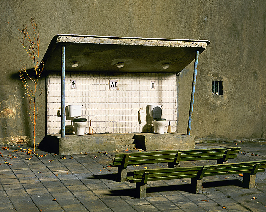
Die kleinen Welten von Frank Kunert haben wir Euch in diesem Frühjahr bereits ausführlich vorgestellt. Er kreiert verblüffend realistische Modellbauten von unmöglichen, lustigen oder um die Ecke gedachten Szenen mit doppeltem Boden.

Als Foto halten sie dem ersten und zweiten Blick stand, bis man entdeckt, dass dort etwas nicht stimmt. Dass es sich um maßstabsgetreue Arbeiten handelt, die gleich auf mehreren Ebenen mit den Erwartungen und Gewohnheiten des Betrachters spielen, die sich einem nach und nach erschließen.


„Geschlossene Gesellschaft“

„Kinder!“


Zu entdecken gibt es unmögliche Räume, absurde Architektur oder sehr oft auch die unübliche Umsetzung von Begriffen und Redewendungen, die wir täglich gebrauchen, ohne auch nur entfernt daran zu denken, wie man sie wortwörtlich auch anders verstehen könnte.

Diese kleinen Welten, deren Erschaffung sich Frank Kunert inzwischen hauptsächlich widmet, gibt es in vielfältigen Formen zum immer wieder Ansehen: Als Postkarten, kleine oder große Fotofachabzüge in teilweise limitierten Auflagen, als Kalender, Buch oder Frühstücksbrettchen.

~

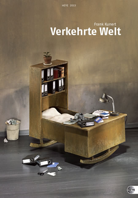
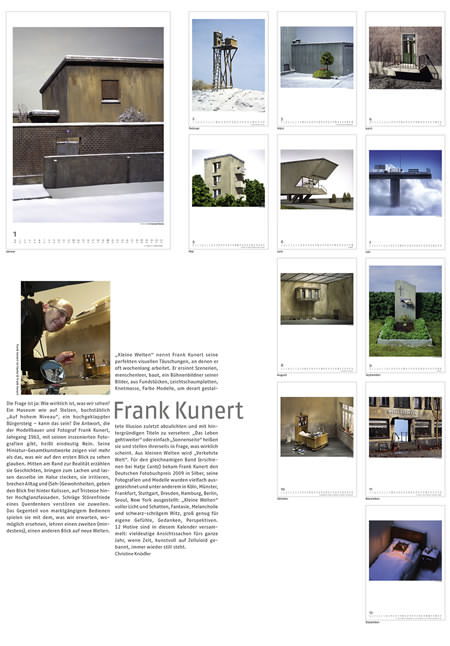
Vom aktuellen Kalender kann man sich durch 2013 begleiten lassen, jeder Monat zeigt eine andere amüsante oder nachdenkliche Szene. Eine schöne Gelegenheit, einzelne Bilder über einen längeren Zeitraum eingehender zu betrachten, die ideenreichen Details zu erkunden.

Der Kalender „Verkehrte Welt“ ist im Heye-Verlag erschienen, mit 37 x 53,5 cm sogar ein gutes Stück größer als A3 und hat einen Wert von 24 €.

~

Frank Kunerts aktuelles Buch „Verkehrte Welt“ zeigt eine Auswahl seiner Arbeiten. Dazu gibt es interessante Einblicke hinter die Kulissen, also auf den Tisch des akribischen Bastlers, wo neben den Modellen schon einmal die Kaffeetasse und eine Tube Ponal stehen.

Das Buch ist im Verlag Hatje Cantz im handlichen Format von 22,4 x 22,4 cm erschienen, hat einen Wert von 14,80 € und wird für den Gewinner vom Künstler signiert.

~

Als Sahnehäubchen enthält das heute zu verlosende Rundum-Glücklich-Paket mit Kalender und Buch auch eine Auswahl der umfangreichen Postkartenedition der kleinen Welten. Zum Grüße schicken, andere zum Schmunzeln bringen oder selbst behalten. Jede Postkarte hat einen Wert von 1,50 €.

Wer bei der Verlosung kein Glück hat, kann all diese und andere Dinge mit den Motiven der kleinen Welten bei Frank Kunert direkt bestellen. Auf Wunsch werden Kalender und Buch auch gern signiert.


„Öffentliche Toilette“

Oder Ihr trefft Frank an seinem Stand auf einem der vorweihnachtlichen Kunsthandwerkermärkte, wo Ihr durch das Buch oder den Kalender blättern, in den Postkartenmotiven stöbern und einmal eines der Modelle „in echt“ betrachten könnt:

1. – 2. Dezember 2012
14. Kunsthandwerkermarkt Kassel
documenta-Halle, Friedrichsplatz 18, 34117 Kassel
Öffnungszeiten: Sa 12 – 19 Uhr, So 10 – 18 Uhr

7. – 9. Dezember 2012
Weihnachtsmarkt im Niederrheinischen Freilichtmuseum Dorenburg
Design – Kunst – Kunsthandwerk
Niederrheinisches Freilichtmuseum, 47929 Grefrath bei Kempen
Öffnungszeiten: Fr 14 – 21 Uhr, Sa + So 11 – 20 Uhr

14. – 16. und 21. – 23. Dezember 2012
Weihnachtsmarkt Schloss Grünewald
Design – Kunst – Kunsthandwerk
Schloss Grünewald, 42653 Solingen-Gräfrath
Öffnungszeiten: Fr 14 – 21 Uhr, Sa + So 11 – 20 Uhr

~

Um Frank Kunerts Rundum-Glücklich-Paket zu gewinnen, schreibe einen Kommentar unter bürgerlichem Namen und gültiger E-Mail-Adresse bis heute um 24 Uhr. Danach verlosen wir es per Zufallsgenerator unter allen Kommentatoren. Die genauen Gewinnspielregeln findest Du hier. Viel Glück!


kwerfeldein – Fotografie Magazin

 
Comments Off on 2. Türchen: Frank Kunert

Posted in Equipment