RSS
 

Posts Tagged ‘Forums’

From the forums: Starry skies time-lapse

08 May

Longtime DPReview member Tanveer, whose username is tsk1979, created this beautiful time-lapse over the past two years, mostly with a Sony a7 mirrorless camera. The video includes the summer Milky Way, the winter Orion, Andromedia in the North and Sagittarius in the South.

So throw on a pair of headphones, dim the lights and take a few minutes out of your day to immerse yourself in the night sky. Also be sure to check out Tanveer’s image galleries and Facebook photography page.

Articles: Digital Photography Review (dpreview.com)

 
Comments Off on From the forums: Starry skies time-lapse

Posted in Uncategorized


Lights on! White theme extended to forums, now default for new visitors

25 Jun

You may have already noticed that following a few weeks of tweaking and bug squashing we’ve extended the new ‘light’ theme to the forums and deployed a new unified header that is shared between both dark and light versions of the site. The beta pop-up has been banished from the site and a new permanent ‘Reading Mode’ switch placed at the top right corner of the site.

Use the ‘Reading mode’ switch (top right of every page) to switch between black and white themes. Your choice is remembered.

White is the new black

As of the today the ‘light’ reading mode will be the default. If you want to switch to black and forget this ever happened, go ahead – your choice will be remembered.

DPR has had the same basic ‘look’ since it launched in 1998, and there’s no doubt that the white-on-black design has always been an instantly recognizable part of our identity – our brand. And we know – because you’ve told us through polls and comments – that many of our regular visitors and forum pros are very happy with the current design and have no appetite for change, hence the decision to offer this as an option, forever.

If you want to switch to black and forget this ever happened, go ahead – your choice will be remembered.

But we also know that a large number of our visitors found the old design visually off-putting and hard to read, and a switch to a more conventional ‘black on white’ design has been the single most requested change seen via our feedback system for at least ten years. So we decided to see if we could, in relatively short order, knock together a quick alternative with the emphasis on readability for those that struggle with white text on a black background. What you see today is the outcome of that experiment. Not a lot has changed – we flipped the colors and made the body font a little larger, but this is a new coat of paint, not a foundation-up rebuild.

White theme forum index White theme post view

We asked, you answered…

For those of you that managed to get this far down the page before scrolling straight to the comment section, I’d like to take this opportunity to thank the thousands of visitors who took the time to give us feedback on the new theme during the beta. I personally read every single feedback email, all the comments on the original news story announcing the beta, and as many forum posts as I could find. 

The feedback (after filtering out all the complaints about the pop-up asking for feedback and those that took the time to tell us they had no opinion) pretty much all fell into one of four buckets: those that loved the new design (most common words: ‘thanks!!’ and ‘finally!!’), those that prefer the old design (most common phrase ‘don’t fix what ain’t broke’), those that didn’t like either and had their own suggestions for background colors, and a few who hadn’t read the story or the pop up and were under the impression that we were going to replace the old design with the new one, which made them angry. Like, really angry.

I’m not complaining – we were really appreciative of ALL the feedback, and it informed many of the decisions we made and will make in future design changes. 

..and the results are in

Overall the feedback was split 63:37 in favor of the lighter theme, though in the last two weeks the gap widened to about 70:30 as we finessed the design and annoyed more people into giving us feedback (thanks Mr Pop-up!).

The most common themes we saw in favor of the darker theme were

  • The original color scheme sets DPR apart from most sites on the internet and is a fundamental part of our identity.
  • The new theme is too bright and is hard to read (quite a few people claimed it ‘burns my eyes’)
  • Photos look better on black and photo apps such as Lightroom have a similar theme.

We agree that generally color images look better on a dark background, so we didn’t re-skin galleries, challenges, slideshows or the expanded image view in forums.

Just to reiterate…we may be defaulting to the white theme… but the dark theme is not going away. Ever.

It’s probably worth mentioning too, that in the month or so that we ran the beta we saw a significant difference between those using the white and black versions of the site, with those opting for the lighter theme spending almost twice as long and reading almost twice as many pages as those who stayed with the black theme. This is not conclusive proof (for reasons too longwinded to go into here), but it did confirm our long-held belief that the old theme was actually putting people off reading our content.

I hope you give the new ‘Reading mode’ a try – especially the forums, which we just launched. Please share your opinion of how we might make it better below.

Desktop users wondering where the switch for the ‘classic’ (yellow on gray) forum skin went – it’s at the bottom of every forum page (below the index of threads). Again, this setting is remembered between sessions (as long as you retain our cookies).

Just to reiterate, we may – for now – be defaulting to the white theme (because based on the feedback and the data it’s the right choice), but the dark theme is not going away. Ever*.

That’s all, folks.

*OK, it’s been pointed out to me that saying the black theme won’t ‘ever’ go away is quite a commitment, and maybe I should say ‘until no one is using it, or until the dying Sun consumes our planet, whichever comes sooner’.

Articles: Digital Photography Review (dpreview.com)

 
Comments Off on Lights on! White theme extended to forums, now default for new visitors

Posted in Uncategorized


New forums! DIY Photo Projects and Underwater Photography

05 Jun

DPRlogo.png

We’re pleased to announce the creation of two new forums. ‘DIY and Photo Experiments’ is the place to show off your photography-related DIY projects, discuss homemade solutions to hardware problems and share photo experiments with other dpreview users. If it’s safe, legal, and you figured it out yourself, this is the place to show it off. Meanwhile, ‘Underwater Photography’ is the place to share and discuss – yes, you guessed it – all things related to taking pictures underwater. Click though for more information

News: Digital Photography Review (dpreview.com)

 
Comments Off on New forums! DIY Photo Projects and Underwater Photography

Posted in Uncategorized


Site update: two new forums

02 Oct

shared:DPRlogo.png

Just a quick update on a couple of new forums we’ve added over the weekend. The first is Feedback and Suggestions, a place for your questions, feedback and suggestions for the DPReview team (both technical and editorial). We hope this will be a more efficient and more effective method than the feedback form / email system we had previously, and will ensure we don’t miss bugs, suggestions and feedback that until now has been spread over dozens of forums. The second new forum is Photographic Science and Technology: a home for those wishing to discuss  advanced technical matters related to imaging science outside the brand-specific forums. It’s also intended to be the place for less technically-minded readers to pose questions of our community’s smartest eggheads.

News: Digital Photography Review (dpreview.com)

 
Comments Off on Site update: two new forums

Posted in Uncategorized


Submitting Your Photos to Online Forums

30 Jun

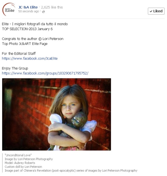
A contribution from Lori Peterson

Every day photographers use Facebook and other photo sharing websites, such as Instagram, for sharing images with their clients and potential customers. This ability to share has made it much easier to get instant feedback from the images that are posted and for photographers to see what their client base is actually looking for.

Facebook has overwhelmingly provided photographers with a unique way of interacting with other photographers. Online photography forums and groups are plenty in the World Wide Web. Photographers can submit images to have them critiqued, they can have them considered for publications, and they can even win awards for their online submissions.

Submitting online forums

While some photographers may think that these forums and groups are a waste of time, there are others who will tell you that you are missing out on a lot of opportunities by not participating. The internet is always opening up new possibilities for people, especially in the world of photography.

Photographers and artists will typically create a Curriculum Vitae instead of a traditional resume. A Curriculum Vitae is basically a summary of your qualifications and will include any exhibits and publications that have showcased your work. There are many juried art and photography forums online. Winning awards can be the jump-start on your Curriculum Vitae for helping you to obtain grants, get into art exhibits, and get your work published. It will also give insights to any exhibit curator as to your creative process and what your specific vision for your art is.

Submitting online forums 2

There are many forums online you can submit to, such as Just Color & Art (JCA), Lemonade and Lenses, Cameraraw, View Bug, or Pixoto.

Once you submit to any of these forums, photographers of all other skill levels will see your work. When you post in the online forums you have to be prepared for the critiques (yes, even the dreaded unsolicited ones!). Those critiques (both asked for and those not asked for) give you a rare opportunity to get insights from other photographers, other eyes, and other artists. Don’t take any negative critiques personally. Remember, art is very subjective. But do read the comments and consider where they are coming from. Could you have increased your shutter speed? Would a higher or lower ISO made for a better shot? Obviously, you can’t go back and change those things, but they are food for thought for future images.

Some businesses have taken to Facebook and it’s availability of online forums to look for photographers who are local to them for product photography, real estate photography, and even headshots for their company. Keeping your work current and out there for people to see can lead you to new ways to make money as a photographer.

Online forums can also spark photographer friendships. Having a photographer friend who is not your local competition can be a wonderful asset. Photographers are generally willing to listen and help out when they can. Friendships between photographers can be helpful when you are learning something new, trying out new ideas, or even when you are feeling overwhelmed or frustrated. Having a like-minded person listen to you and bounce ideas around can really help you to re-focus your time, energy, and mind where it needs to be.

Another boost to submitting to online forums? Increased SEO (Search Engine Optimization) for your photography website or blog. When you post from your photography page you are creating a cross-link between the forum and your page. Using specific keywords and updating your blog posts and website with any awards, recognitions, or honors from online forums can also help increase your SEO. 

There are many benefits to utilizing online photography forums and you will have to decide whether or not it is right for your specific business model. They are a very unique way for photographers to interact and learn from one another. They provide an opportunity for learning, friendships, and in some cases, they can lead to employment opportunities. Utilizing online forums can also help you to get your work seen by potential publishers and grant committees.

Lori Peterson is an award winning photographer based out of the St. Louis Metro Area. Her dynamic work ranges from creative portraits to very unique fine art photography. Lori’s work can be seen at www.loripetersonphotography.com and also on her blog at www.loripetersonphotographyblog.com. You can follow her on Facebook at https://www.facebook.com/LoriPetersonPhotography.

Post originally from: Digital Photography Tips.

Check out our more Photography Tips at Photography Tips for Beginners, Portrait Photography Tips and Wedding Photography Tips.

Submitting Your Photos to Online Forums


Digital Photography School

 
Comments Off on Submitting Your Photos to Online Forums

Posted in Photography


Mobile-friendly forums launched

25 Jan

shared:DPRlogo.png

We’re delighted to be able to announce the introduction of mobile-optimized access to our forums. The mobile forums are one of the benefits that have been made possible by the new forums code we introduced in October 2012. This first release of the mobile forums supports the majority of full forum features, including both flat and threaded views – with the last-used format persisting when you next visit. We’ll be building on the feature set in the coming months.

News: Digital Photography Review (dpreview.com)

 
Comments Off on Mobile-friendly forums launched

Posted in Uncategorized


New image viewing options for forums

05 Jan

shared:DPRlogo.png

We’ve just deployed a smart new viewing system for images embedded in forum posts. It offers easy access to original images (100% view), makes navigating images easier within a post and lets you pixel-peep to your heart’s content with the new loupe tool. We hope you like it – more information after the link.

News: Digital Photography Review (dpreview.com)

 
Comments Off on New image viewing options for forums

Posted in Uncategorized


Just deployed: New dpreview.com forums system

16 Oct

shared:DPRlogo.png

We’ve just deployed the redesigned forum system – the biggest single change we’ve made since our forums were created, over 13 years ago. As discussed in an earlier news post, the new software will closely match the behavior of the existing system but with a range of additional features and with scope for further expansion in the future. We’ve sifted through the feedback from the preview announcement we made last week and have developed a list of requested features that we will start working on. Click here to find out more…

News: Digital Photography Review (dpreview.com)

 
Comments Off on Just deployed: New dpreview.com forums system

Posted in Uncategorized


In with the new: dpreview forums expanded

24 Jul

We’ve just made the biggest changes to our forums since the site was established, 11 years ago. This includes expanding the scope of dpreview forums to include areas dedicated to discussion of photographic techniques and digital video. We’ve also introduced totally new Off-Topic and For Sale/ Wanted forums. You’ll notice a couple of minor name changes and a shuffling of the order of a few of the existing forums too. Check out the details after the link…
News: Digital Photography Review (dpreview.com)

 
Comments Off on In with the new: dpreview forums expanded

Posted in Uncategorized