RSS
 

Posts Tagged ‘Flow’

Lensrentals tears down the Canon EOS R5 and finds interesting sealing and thermal flow

09 Sep
Image credits: Photos published with kind permission from Lensrentals.

Since Canon announced the 8K-capable EOS R5 mirrorless camera, there has been heated discourse online about the thermal flow inside the camera and its propensity to overheat. Curious photographers have been wondering what the inside of the EOS R5 looks like and what sort of design features Canon has implemented into its latest high-resolution full frame camera. Wonder no more as Roger Cicala and Aaron Closz at Lensrentals have disassembled a Canon R5 to see what’s going on inside.

In terms of thermal design, when tearing down the R5, the duo found multiple heat sinks and thermal pads. For a photo camera, there is a lot of heat sink inside the EOS R5. However, compared to a video camera, the R5 features ‘not even a fraction of what’ is seen in a video camera.

Cicala speculates that it’s possible the camera has been designed to allow heat to exit through the top panel of the camera, as the connection of the top panel to the main body does not feature the same level of sealing found in the connections between the body and the bottom and side plates.

You can see some of the sealing along the edges where the side plate attaches to the main body. Image credit: Lensrentals

Speaking of sealing, after having removed the camera’s grip, battery door, bottom plate and side plates, Cicala and Closz found an impressive level of sealing throughout the camera. The battery door has weather resistant gaskets around the edge and the bottom of the battery door compartment itself is a soft gasket material.

Along the bottom plate, Canon placed a ‘soft rubber gasket along the entire mating edge of the pieces.’ This provides a ‘greater seal area’ than what is usually seen in disassembled cameras at Lensrentals headquarters. The same sealing gaskets found here are also present where other body parts are sealed together, such as along the sides of the camera.

Of the weather sealing in the EOS R5, Cicala writes, ‘When we took these pieces apart, you feel the suction when they disengage. That’s not something we’ve seen in other cameras. The thing about weather sealing is it only takes one weak place to leak, but this sealing seems to be a step up from anything we’ve seen before.’ This is certainly a promising find for prospective R5 owners.

While there are gaskets around the I/O ports on the R5, Cicala notes that the HDMI and digital out ports are part of the main printed circuit board (PCB). This means that users should be careful to not damage these ports, as it will result in an expensive repair. On the other hand, the tripod plate and tripod mount itself are both replaceable parts and not soldered anywhere. This is great news for the team at Lensrentals, as they regularly must take apart cameras to make repairs like this before sending them out to new customers.

Moving to the back of the camera, the R5 has more dials than the EOS R but maintains an identical wiring arrangement. There’s a new flex design on the LCD side and you can even see a mark made by a Canon tech in the image below.

On the back of the circuit boards, there is a notable difference between the EOS R5 and the EOS R. The new camera has ‘immensely more intense and dense circuitry.’ In the image below, the green sub-board ‘appears to be about DC power conversion.’ On the left black board, the large white chip is a Wi-Fi chip.

Located beneath the green sub-board is either an aluminum heat sink or an electronic shield. Cicala notes that ‘electronic shields tend to be quite thin, but this is a manly piece of aluminum, 0.98mm thick. I speculate it’s more about heat than electronics. Notice I said ‘speculate.”

When removing the main PCB, Cicala and Closz found a large aluminum heat sink on the underside of the board. There is a layer of insulating tape over the sensor as well. There is also a thermal pad located underneath the CPU, which Cicala speculates means that Canon is directing heat from the four SDRAM chips located around the CPU to one heat sink and the heat from the CPU itself to a different area.

After removing the circuitry, the Lensrentals team was able to inspect the image stabilization system and image sensor arrangement. The sensor assembly is held in place by three screws. To ensure that the image sensor stays perfectly parallel to the lens mount, Canon uses shims to make tiny adjustments. The EOS R used spring tension screws instead. Cicala assumes that ‘the vibration of an IBIS unit could loosen them over time’ and notes that ‘every IBIS camera we’ve opened uses shims.’

Once the circuitry and image sensor/IBIS unit has been removed from the R5’s body, there’s not much left besides the shutter assembly. Lensrentals don’t take apart shutter assemblies as they are incredibly labor-intensive to rebuild and if anything is not lined up perfectly, the shutter timing will be off and only factory software can be used for recalibration.

The sensor is mounted directly to the IBIS plate. Some cameras use screws and plastic tabs to support the sensor, which Lensrentals has seen result in fractures. ‘On all the edges of the Canon unit, the sensor is mounted directly to the IBIS plate; no tabs. That doesn’t mean it can’t break, of course, or glue comes loose. But this seems sturdier to me,’ says Cicala.

Summing up the findings, Cicala writes that the R5 is ‘pretty thoroughly filled up, there are lots of parts and not much air.’ The new weather sealing method found in the lower two-thirds of the camera ‘seems to give a really, really tight seal.’ The IBIS unit ‘is very compact but well-engineered.’

With respect to thermal flow, Cicala believes there are a pair of separate heat sinks. One of them is located under the voltage board and the other between the main PCB and sensor assembly. Both heat sinks include thermal pads to direct heat. There may also be a heat sink in the tripod plate, although it’s unclear. Cicala says, ‘In a small photo camera, there’s not a lot of ventilation/convection current to let the heat out. This camera is better sealed than most; I doubt there’s very much ventilation at all. Somebody should look into that.’

For many more images and details, head to Lensrentals’ full teardown.

Articles: Digital Photography Review (dpreview.com)

 
Comments Off on Lensrentals tears down the Canon EOS R5 and finds interesting sealing and thermal flow

Posted in Uncategorized


Go With The Flow – Using Slow Shutter Speed to Create Motion Blur

22 Jan

The post Go With The Flow – Using Slow Shutter Speed to Create Motion Blur appeared first on Digital Photography School. It was authored by Kevin Landwer-Johan.

Starting out as a photography assistant in a daily newspaper, I had one thing drummed into me. Make sure it’s sharp. This was the cardinal rule. It was appropriate for the situation.

Any kind of unintentional fuzziness, especially when it renders the subject indistinct, looks awful when printed on newsprint.

Adding motion blur, or any other form of blur, in a photograph can work extremely well when circumstances are right.

Merlion Park, Singapore Using a Slow Shutter Speed to a Create Sense of Motion

© Kevin Landwer-Johan. Shutter speed: 8 seconds

Two main techniques for creating motion blur in a photo are subject movement and camera movement.

Times when adding motion blur is the right choice

Deciding to add motion blur is best when:

  • Some parts of the composition remain sharp
  • The light is favorable
  • You find the shutter speed sweet spot
  • You have a means of stabilizing your camera
Poi Sang Long Festival Using a Slow Shutter Speed to a Create Sense of Motion

© Kevin Landwer-Johan. Shutter speed: 1/20th of a second.

Adding some flash can at times truly enhance a photo made with a slow shutter speed. I find this works best when you sync your flash with the rear shutter closing.

Keeping some of it sharp

Using a slow shutter speed to create motion blur, I find it’s best to ensure that some parts of your composition remain sharp. Whether you are moving your camera or your subject is in motion, your results will be stronger when not all the composition is blurred.

Using a slow shutter speed and moving your camera in relation to a moving subject, is known as panning. This will keep your subject sharp and the background will blur. Getting a perfectly sharp subject while panning is challenging because it requires the camera to be moving in sync with how fast the subject is.

Tuktuk Panning Using a Slow Shutter Speed to a Create Sense of Motion

© Kevin Landwer-Johan. Shutter speed: 1/25th of a second.

Having your camera locked down while your subject or the background move you will have a better chance to render your subject sharp.

Getting the exposure when the light is right

Bright sunny days make it challenging to capture motion blur in a photograph. You need to use a slow shutter speed for the effect to happen. Setting your aperture to the smallest opening and your ISO as low is it can go will not always allow you to use a slow enough shutter speed.

Using a neutral density filter in bright sunshine will make a slower shutter speed possible. At times I have coupled a neutral density filter with a polarizing filter to cut the light entering the lens even more.

Market Scene Using a Slow Shutter Speed to a Create Sense of Motion

© Kevin Landwer-Johan. Shutter speed: 1/4th of a second.

In this photo I had my friend stand very still to achieve motion blur in the people walking behind her. Being such a bright sunny day meant that even with my aperture set to the minimum opening of f/11. My ISO was set at one hundred and still did not allow me to use a slow enough shutter speed. I attached a four-stop neutral density filter and a polarizing filter so I could set my shutter speed to 1/4th of a second to capture the motion blur.

At night and in other low light situations achieving a slow enough shutter speed is simple.

Finding the sweet spot for optimal blur

Choosing a shutter speed setting appropriate to the pace of movement in your composition is important. Having too much or not enough motion blur will give you a poor result. This varies greatly depending on your subject and the style of photograph you are creating.

Photographing waterfalls, people walking or traffic at night, all require different shutter speeds for best results. Generally, slower moving elements in your composition need slower shutter speeds. Things moving more quickly need faster shutter speed or there will be too much motion blur. It also depends on how much definition you want to retain in whatever is moving.

Twently Second Waterfall Using a Slow Shutter Speed to a Create Sense of Motion

© Kevin Landwer-Johan. Shutter speed: 20 seconds.

Flowing water, like in this waterfall, can be completely blurred. In fact, waterfall photos usually look best when a shutter speed of more than two seconds is used. I used a twenty-second exposure for this photo and there’s absolutely no definition in the water. It is still obvious what it is though.

On The Sidewalk Using a Slow Shutter Speed to a Create Sense of Motion

© Kevin Landwer-Johan. Shutter speed: 1/10th of a second.

Keeping the motion blur balanced is more important with some subjects. For this photo of people on a sidewalk in Bangkok, I chose a shutter speed of 1/10th of a second. A slower shutter speed would mean more blur and less definition. A fast speed would show less blur and may just look like it was a mistake. I was happy to capture an image where the people walking are blurred yet their feet are reasonably sharp. The young woman modeling for me was very patient as it took quite a while to make a composition with the right number of pedestrians in my frame.

Experimentation is key to finding the sweet spot with your shutter speed. You need to decide how clear or how blurred you want your subject and other elements in your composition.

Camera stability is important

You can use a slow shutter speed even if you do not have a tripod. Learn to hold your camera well and be in control of it. I do not often carry a tripod so am forced to use alternative means of preventing unwanted camera movement. Unintentional camera movement creates ghosting which introduces extra fuzziness to photos.

Flames Using a Slow Shutter Speed to a Create Sense of Motion

© Kevin Landwer-Johan. Shutter speed: 1/20th of a second.

Hand holding a camera while panning can be preferable for some more than using a tripod. Keeping a steady movement along with your subject is what’s most important. If you are panning with a passing vehicle you do not want to be jiggling your camera up and down as you track your subject.

Finding a firm surface to place your camera can be a good substitute when you don’t have a tripod. You may need to place something under the lens so your angle of view is level. I find my mobile phone or wallet often come in handy for this.

Using a tripod does make things more straightforward when using a slow shutter speed. With a tripod, you have more stability and often more control of your angle of view.

Coffee Roasting Using a Slow Shutter Speed to a Create Sense of Motion

© Kevin Landwer-Johan. Shutter speed: 1/4th of a second.

Introducing rear curtain synchronized flash

Many cameras give you an option to synchronize the flash so it fires just before the shutter closes. Doing this combined with a slow shutter speed and movement produces interesting effects.

As the flash is triggered near the end of the exposure it looks like the movement is partially frozen. Using a very slow shutter speed when there’s fast movement your subject may appear semi-transparent.

Tricycle Taxi Using a Slow Shutter Speed to a Create Sense of Motion

© Kevin Landwer-Johan. Shutter speed: 4 seconds.

I used a four-second exposure for this photo of a tricycle taxi in Chiang Mai. You can see the ghosted image of two people just above the handlebars of the cycle. They were riding past on a motorbike just at the end of the exposure as my flash fired.

Conclusion

Photographing movement using long exposures it pays to give yourself plenty of time to experiment and take lots of photos. Varying your shutter speed. Choose a faster or slower speed with the same subject. This can create vastly different looking photos.

Iron Bridge Using a Slow Shutter Speed to a Create Sense of Motion

© Kevin Landwer-Johan. Shutter speed: 1.6 seconds.

If you’ve never often used a slow shutter speed, begin to explore the possibilities. If you’ve had some experience, try some new angle or subject. Please share your photos and comments below.

The post Go With The Flow – Using Slow Shutter Speed to Create Motion Blur appeared first on Digital Photography School. It was authored by Kevin Landwer-Johan.


Digital Photography School

 
Comments Off on Go With The Flow – Using Slow Shutter Speed to Create Motion Blur

Posted in Photography


Visual Flow – How to Get the Most out of Composition

30 Mar

In photography terms, composition can make the difference between a good image and a fantastic one. Yes, you need all the other components; the light has to be dramatic, the subject compelling, and the colours vibrant. All of these will add to the final result. If you have all that, but your composition is not great, the image will fall flat.

Jay Maisel has a quote that goes like this, “As the photographer, you are responsible for every inch of the frame”. This is true, and one of Jay’s other mantras is that he prefers to speak about framing and not cropping. His view is that framing is done at the time of making the image. Cropping is done afterward in post-production. He maintains that cropping changes the original intent of the image. If you frame an image in a particular way and then crop it afterward, it really is a different image.


Visual Flow - How to Get the Most out of Composition

Frame your scene correctly in camera

I don’t think Jay is saying that you shouldn’t crop, but rather that you need to compose with intent and purpose, not simply hope for the best and try and “fix” the image later by cropping. Good composition can really be impactful on your image. Changing your composition is free. You don’t need any special equipment or lenses. There’s no need to wait for a specific type of light. You can shoot at any time of day. Composition is the one thing in photography that is easiest to fix, yet it is most often overlooked.

There are many articles on DPS and other sites about composition and the best techniques for improving composition, so I won’t try to reinvent the wheel. What I want to talk about here is visual flow. This is more about the visual journey you are taking your viewer on than the destination. In this article, we aren’t going to discuss the rule of thirds and powerpoints, but we will discuss how framing, removing distractions, and how light, shape, and texture will all contribute to your composition.

We will look at how someone’s eye will travel through your image. You want the viewers of our images to look at them longer, to find them interesting and to be captivated and inspired by what they see.

Framing not cropping

As the photographer, you need to take responsibility for everything in the frame. That means, you decide what will be in the shot and sometimes more importantly, what will NOT be in the shot. Your subject needs to be in the frame obviously, but what else absolutely needs to be included? Ask yourself if all the elements in the frame are adding to the narrative or story you are trying to tell. If not, get rid of what is not working.

In this case, less is definitely more (and usually better). Be aware of visual clutter in the frame, objects that are distracting or drawing the viewer’s full attention away from the subject. This is really tough to get right and it takes time and practice. But once you become aware of this and work hard on fixing it, it will become much easier.

Visual Flow - How to Get the Most out of Composition

Focus on your subject

Remove distractions

This sounds obvious but is not always easy. There are many things that can cause your viewer to be distracted when they look at your image. Any words in your photograph will automatically draw they eye. Signposts, graffiti, street signs…anything with words or letters will cause the viewer to look at that part of the image. If the wording is not the reason for the image, then try and remove that item from the frame as it may be distracting.

Color can cause the eye to wander. If your scene is full of color, that’s great, but if it is largely monochromatic and there is only one color in the frame, that color will become the focal point. Warm colors like yellow or red will very quickly pull the eye across to them, so be aware of the colors in your image.

The human form will also draw the eye. Again, if the person in the frame is a key part of the image, that’s great, leave them in the shot. But if not, then wait until they leave the scene or reframe the scene without them. As humans, we tend to find the human form in an image very quickly and this will become the main focus of the image.

Visual Flow - How to Get the Most out of Composition

Be aware of distractions, words, powerlines etc

Using light, shape and texture

These three elements (there are more) will greatly help you in your visual flow.

Light is key to making any image. Without light, we cannot do photography. Light also informs so much in your image. You can use side light to emphasize texture in your image. You can use front light to create a silhouette, which will emphasise shape. These three elements are important tools in making sure your image compels people to look at it.

Shapes in your image add a dynamic feel. Get in close and emphasize the shape of an object. If it has a curve, make that curve fill the frame. Shapes can make a great subject too. They are all around you too, you just have to start looking.

Texture is a great way to emphasize your subject. To get great texture images, your light needs to come from the side. Side light enhances texture and each granular detail can be seen if the light is right. Texture will make your images seem three dimensional. Using texture is a great way to communicate more information about your subject.

Visual Flow - How to Get the Most out of Composition

Use side light to emphasize texture.

Get in close

To make sure that you get the most out of the scene, you can do a few things. First, move in closer and fill the frame with your subject. This is especially useful if you are doing abstract or creative images. If you are not going to fill the frame, then decide where to put your subject. Yes, you can use the rule of thirds for this (this would be my last choice), but you can also use the Fibonacci Spiral (Golden Ratio) or any number of other compositional techniques.

The most important part of an effective composition is to make sure that your viewer knows what they are supposed to look at in your image. If your subject (the reason for the image) is unclear, your image will have little impact. You have likely seen this happen. You show someone photos from your last trip and they simply glance at them in passing. Then suddenly, something catches their attention in a particular image and they stop and look intently at the scene. That’s when you know your image has hit the mark.

As I said earlier, all the elements need to come together to make a great image, but if you have good light, great exposure and bad composition, chances are, people will just flip past the image.

Visual Flow - How to Get the Most out of Composition

Fill the viewfinder with your subject.

Conclusion

So, how else can you improve your composition? It is deceptively simple but easily overlooked. Some of the things I do is get inspiration from the top photographers in the genre I want to shoot. If it is street photography, then I am looking at Henri Cartier-Bresson, Jay Maisel, Ernst Haas, and others. If it is landscape photography, then I will be looking at Ansel Adams, Charlie Waite, and Koos van der Lende. I look at photographers who inspire me. I also make a point of visiting art galleries whenever I can.

Photography is not even 200 years old as an art form. Much of the techniques we use as photographers have been learned from the painters and artists of old. Spend time looking at the composition of master painters. Look at how they placed subjects in their scene. See how the light works in their paintings, is it hard light or soft light? Spend time taking note of how they used color and shapes in their images. Then, go out and apply that to your photographs. Over time you will begin to see your eye and your images improve.

Visual Flow - How to Get the Most out of Composition

Work hard at improving your compositional eye.

The post Visual Flow – How to Get the Most out of Composition by Barry J Brady appeared first on Digital Photography School.


Digital Photography School

 
Comments Off on Visual Flow – How to Get the Most out of Composition

Posted in Photography


10 Lightroom Tips for a Smoother Work Flow

22 Sep

If photography has become an integral part of your existence, or is destined to be, chances are fair to good that you will find yourself staring longingly into the eyes of Lightroom like an insatiable lover. That might sound romantic, but in reality it is more like a hypnotic spell which can be difficult to break.

Hypnotic trance

It’s easy to squander away lots of time fumbling your way through Lightroom.

However, when you find yourself in this situation, rest assured that it will hopefully be time well spent as it is an indispensable resource in your photographic arsenal. One of the keys to getting the most out of your Lightroom experience in a reasonable amount of time is to approach it like a dangerous animal – in small, carefully planned steps.

Sure, you can just jump in blindly headfirst, but knowing what lies ahead can save you precious time and unnecessary pain (read=frustration).

In this article, I’m going to lay out some of Lightroom’s features that I like to exploit to achieve my goals in a more direct and timely manner.

1. Apply on Import Settings

You can save time early on in the process when first importing images into Lightroom by utilizing the Apply During Import feature.

When you are in the Library module, the Import button will be live in the lower left corner. Clicking it reveals the Import window which is where you have the Apply During Import dropdown menu in the panel on the right.
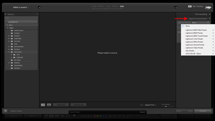
Apply on import screenshot

Applying Develop presets on import is a good way to get a jumpstart on the the editing process.

The Develop Settings dropdown provides access to your Develop module presets. If you haven’t created any, this will only be populated by Lightroom’s built-in preset options.

This is a way to save you some clicks by allowing Lightroom to apply things like sharpening, saturation, color temperature, etc. (any settings savable within a preset) while it imports your new photos to your catalog.

You are also presented with the opportunity to populate the Keywords box and apply common metadata like image location or copyright information. I recommend beginning an unwavering habit of adding keywords on Import and not procrastinating until later to it. You will thank yourself in a few years when you’re looking for a specific picture in your library of 20,000 images.

2.Preview and Selection

Once you have imported your latest batch of soon-to-be masterpieces it’s time to sort through and separate the wheat from the chaff.

There are a number of ways to go about this, but I prefer to start at the beginning, viewing images at full screen (keyboard shortcut F) and using the arrow keys to flip through. When I come across a potential keeper, I mark it by color. You can do this by clicking one of the four colors in the lower tool bar menu (while not in full screen mode) or using keyboard shortcuts 6-9 which correspond to the four colors (while in full screen mode). If the color labels are not visible, click on the arrow on the right side of the lower toolbar and click on Color Label.

I have attached specific meanings to these colors. Red, for example, means that the photo is a potential candidate for editing after closer inspection.
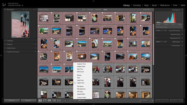
Screenshot of photos grouped by color label

Color labels and flagging are convenient tools for sorting and locating images.

After you sift through a batch of imported photos and have color coded them, you can then sort or filter by label color for quick selection or organizing. To do this, you must be in grid view in the Library module. In the upper Library Filter toolbar, you can click on Attribute and then click the desired color and Lightroom will group all photos with that label color at the top.

If you just want to group together photos with the same color label without hiding all of the other images in that folder, you can click on Sort in the lower toolbar and select Label Color. After you have applied color labels and grouped them together, you now have a convenient way to delete unwanted images by clicking the first one, holding shift, clicking the last one (which will select the whole group) and then hitting delete.

3.Use Keyboard Shortcuts for a Smoother Editing process

As you spend more time using Lightroom, you will find that all of these little tricks which seem to save only trivial amounts of time/effort are compounded quickly.

Keyboard shortcuts are one of those tricks. Don’t be selfish, share the carpal tunnel with your left hand too.

At the very least, learn the keyboard shortcuts for the processes that you use most often.

Although I could list them all here, you really only need to know one: CTRL+/. This will open a pop-up window of some of the keyboard shortcuts for the respective module that is active.
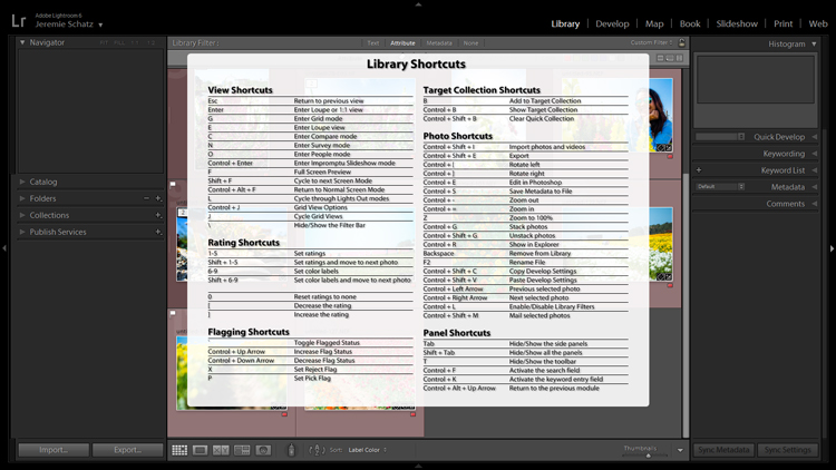
Screenshot of keyboard shortcut cheat sheet

Pressing CTRL+/ brings up the keyboard shortcut cheat sheet for the module you are in.

Another little trick you may not be aware of can be found in the Develop module. Instead of clicking and dragging sliders, you can click on the name of an adjustment (click the word Exposure for example) and then use the (+) and (–) keys to move the slider in incremental amounts.
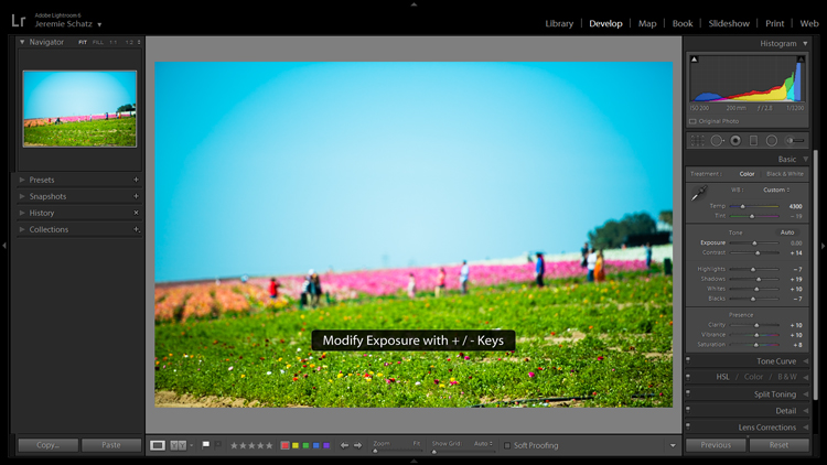
Screenshot for develop adjustments

Clicking on an editing action will activate it and using the + and – keys makes incremental adjustments.

If you’re one who likes to work top to bottom, you can use the (,) and (.) keys to cycle through the adjustments in the active panel.

4.Use the Target Adjustment Tool

You will find this handy little tool in the top left corner of the Tone Curve, HSL and B&W panels. The concept is that once you have clicked on the tool and activated it, click anywhere on your image, drag up or down and Lightroom will make the appropriate adjustments.
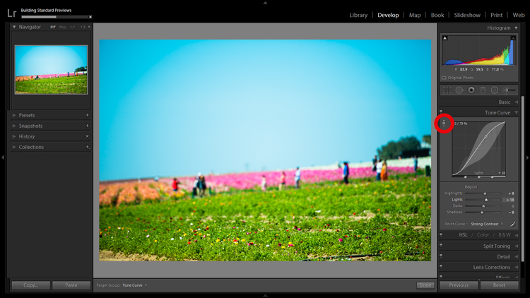
Screenshot of the target adjustment tool

Using the target adjustment tool takes some of the guesswork out of editing.

If used in the Tone Curve panel, the tone you select will fall into one of the four quadrants the tone curve is divided into: highlights, lights, darks, shadows. Within the HSL panel, the tool is a little more intelligent and can be used to tweak combinations of the eight color sliders for hue, saturation and luminance. For example, if you click on some green grass and start dragging, the tool may move both the yellow and green slider to pinpoint the correct hues for adjustment.

The B&W panel does the same as HSL except the adjustments are to the various shades of gray that the image has been converted in to.

5.Create Virtual Copies to Compare Edits

More than likely you are aware of the basic premise which Lightroom uses to edit your images. It’s simple: a tiny little file called a sidecar file (with the .xmp file extension) piggybacks onto your original image and keeps track of all the edits you’ve made to that image.

Lightroom enables you to add some extra info to that .xmp file which allows you to make further edits on the virtual copy while maintaining the edits you’ve made thus far. This can be accomplished by choosing Photo>Create Virtual Copy (keyboard shortcut CTRL+’).

Screenshot of image comparison

Making virtual copies allows you to compare different edits of the same image side by side.

Lightroom also allows boasts the Snapshot feature in the Develop panel on the left of your screen. A Snapshot basically bookmarks a specific spot in your edit history which you can revert the image back to.

One approach can be to work through your editing process, make a virtual copy at some point and go for a different look with the copy. Then you can compare both edited images side-by-side to see which tickles your fancy. Virtual Copies can also be exported in the same way as the original. This is why I use Virtual Copies rather than Snapshots.

6.Create Collections to Group Choice Images

The Collections panel really warrants an entire article to itself as there are many features within it, but let’s discuss its most basic use, which is to create a grouping of images.

There is a plus sign beside the Collections heading and clicking that launches a dropdown menu. The first choice is Create Collection and that’s where you should start. A dialog box will launch and you should name your collection and check the Set as target collection box.
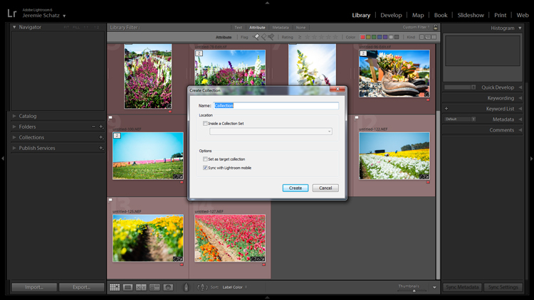
Screenshot of new collection dialog box

Once a new collection is created, pressing B while any photo in your library is selected adds it to the target collection.

Let’s say you embarked on a wild journey across Siberia and have a zillion photos in several folders. You could create a collection called Choice Siberia Pics, then add your favorite images to this collection to show off to friends in a slideshow. To add images to the collection, either right click and select Add to Target Collection or use keyboard shortcut B.

One benefit of using collections is that you add photos easily from anywhere in your library, and Lightroom doesn’t actually make copies so no additional space is taken up on your computer’s memory.

7. Use Camera Calibration Profiles

In the Develop module, the last choice on the right-hand menu is Camera Calibration. If this panel has been shrouded in mystery and, as such, you have pretended it doesn’t exist, it’s time to enter unchartered territory.

What Camera Calibration profiles do is adjust your image to recreate, as closely as possible, whatever various picture profiles your camera may offer. If you are shooting in RAW and reviewing your photos in-camera, you are likely seeing a JPEG preview that the camera whipped up for you. When you import those RAW files, Lightroom ditches that JPEG and you get that unsharp, unprocessed dull-looking image.

In Camera Calibration there is a Profile dropdown menu which offers up the same processing options that you will find in your camera. I shoot with a Nikon so Lightroom gives me the options of:

-Adobe Standard
-Camera Landscape
-Camera Neutral
-Camera Portrait
-Camera Standard
-Camera Vivid
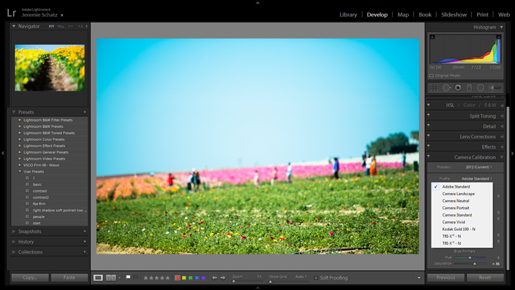
Camera calibration screenshot

Camera calibration profiles offer the same settings found in many cameras.

That first choice is Lightroom’s default. If you find one of these settings appealing and want to make it a default setting, you can hold down the Alt key and click the Set Default button at bottom right.

8.Create Develop Presets for Common Settings

In the Develop module, the first panel item on the left menu is Presets. This is pretty self-explanatory and Lightroom has some loaded in there to get you started.

You can create your own presets for common edits you use. If you want to get started in creating your own presets, click the plus symbol next to Presets and take a peek at all of the attributes Lightroom allows you to save.
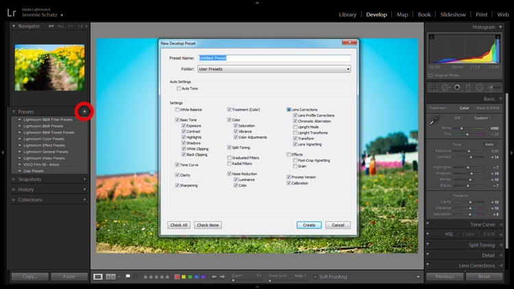
Screenshot of develop presets dialog box

Don’t mess around trying to match edits that you’ve made before – create presets for them along the way.

Remember the Apply on import setting we talked about earlier? Any Develop presets you create can also be chosen to apply on import. Sure, you can always import a batch of photos, hit CNTL+A to select all of them and then choose one of your presets, but that will take some time for Lightroom to process and the idea here is to save yourself time and clicks.

Develop presets are a great way of preserving complex edits or distinct styles which you may want to reproduce again. There is a bottomless well of preset bundles you can purchase online and even some free ones floating around out there on the interwebs if you don’t feel like making your own.

9.Flag and Rate for Easy Sorting

In much the same way you can slap color labels on images in your library for identification and sorting purposes, so too are you able to take it a step farther by flagging and rating them.

Flags (keyboard shortcut P, or U to unflag) show up as a flag which is displayed in the upper left corner of thumbnails when in grid view. I personally use flags as a thumbs which tells me that the photo is final and client-ready, ready for export or printing. There is also the option to use a reject flag (keyboard shortcut X). I don’t use these in my workflow, but you may find them more useful.

Rating images is based on a five-star system. You can use the star system to put a value rating on images which can be used for filtering or whatever significance you place on them.
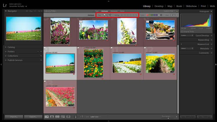
Screenshot showing filter for flagged and rated photos

Flagging and rating are ways you can identify certain images and easily locate them later.

By this point you are probably seeing a clearer picture of Lightroom’s multi-layer system of organizing, archiving and locating images in your catalog. The more identifying markers you have on images in your library, the more specific you can be in narrowing down what you are looking for.

If you are not an old-hand with Lightroom, all of this keywording, color coding and flagging might seem redundant and excessive, but as your library grows to unwieldy proportions you will be forever grateful that you formed these good habits early on.

10.Stack Images for a Tidy Workspace

If you shoot in RAW+JPEG, create virtual copies in Lightroom or use Photoshop or other plugins which make copies of your original images before editing, you may end up with several versions of similar images in your library. Same with you time-lapse shooters who don’t process the video in-camera.

To keep your library looking clean and organized, consider using Lightroom’s stacking feature. Stacking is pretty versatile, allowing you to hide an entire folder behind one image if you wish.
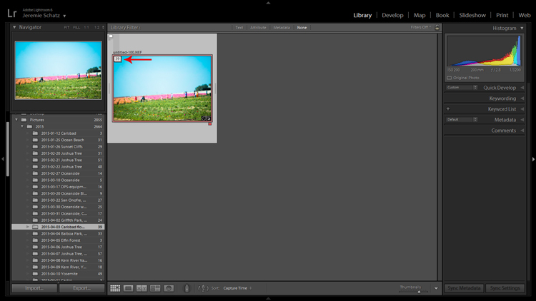
Screenshot of a stacked image folder

Stacking enables you to easily hide groups of photos behind a cover image.

The order which the images were displayed in grid view will be preserved after stacking with the active photo being on top.

Once again, stacking can be used in conjunction with all of the previously mentioned identifying and organizing features.

To stack, select the desired images (CTRL+A to select all, CNTRL+click to select non-contiguous images and CTRL+SHIFT to select a continuous string of images), right click on any of the selected images and hover over Stacking to reveal the sub-menu (keyboard shortcut CTRL+G).

Conclusion

I know there’s a distinct possibility that when you got into photography you didn’t envision spending so much time on your computer cursing Lightroom. However, if you haven’t already, you will have to come to terms with the fact that post-processing is a fact of modern photographic life.

Lightroom and other editing software are tools and like tools for any other purpose, learning the various approaches to using them in the most efficient and productive way is crucial to furthering your craft.

googletag.cmd.push(function() {
tablet_slots.push( googletag.defineSlot( “/1005424/_dPSv4_tab-all-article-bottom_(300×250)”, [300, 250], “pb-ad-78623” ).addService( googletag.pubads() ) ); } );

googletag.cmd.push(function() {
mobile_slots.push( googletag.defineSlot( “/1005424/_dPSv4_mob-all-article-bottom_(300×250)”, [300, 250], “pb-ad-78158” ).addService( googletag.pubads() ) ); } );

The post 10 Lightroom Tips for a Smoother Work Flow by Jeremie Schatz appeared first on Digital Photography School.


Digital Photography School

 
Comments Off on 10 Lightroom Tips for a Smoother Work Flow

Posted in Photography


The Jelly Must Flow

07 Nov

Share on Facebook – on.fb.me Join us on Facebook – fb.me Everything has stopped moving in Jammbo! Everything but Goomo, now he is the only hope to save the planet and his friends. More Jelly Jamm episodes in english: www.youtube.com Discover more Jelly Jamm Music! www.youtube.com Watch the Official Jelly Jamm videoclips! www.youtube.com Subscribe to our YouTube channel to keep up with the latest videos: www.youtube.com www.youtube.com Visit our official Website www.jellyjamm.com Follow us on twitter! http

 
Comments Off on The Jelly Must Flow

Posted in Animation Videos


Lightroom Work Flow Enhancing Eyes

21 Feb

Part 2 of 4 Lightroom Work-flow,enhancing eyes. Photographer Robert Louis Vanelli Model Acknowledgment Dina Pezzimenti Melbourne, Florida Model Mayhem # 1040336
Video Rating: 5 / 5