RSS
 

Posts Tagged ‘Flat’

MIT and UMass researchers develop world’s first flat ultra-wide-angle fisheye lens

21 Sep

Researchers with the University of Massachusetts at Lowell and MIT have developed a new type of fisheye lens that is flat and crafted from a single piece of glass. The lens is round, according to the researchers, and it is capable of capturing sharp 180-degree panoramas. This is the first flat fisheye lens made from a single piece of glass, which measures 1mm thick.

Ordinary spherical fisheye lenses are made from multiple pieces of glass designed to bend the light in such a way that it produces circular wide-angle images. The newly developed flat lens instead captures wide-angle panoramas by utilizing ‘tiny structures’ that scatter light in place of the curved glass elements in more costly spherical fisheye lenses.

The version of the lense introduced by the researchers is made for infrared photography, but the team says that it could be modified for use as a regular visible spectrum lens, as well. The flat design is ultimately more compact and less expensive to produce than spherical multi-element lenses.

The researchers envision a variety of uses for their lens design beyond interchangeable lenses. The thin, flat nature of the design would make it possible to implement the fisheye into smartphones, for example, eliminating the need to use a third-party lens add-on. Similar implementation could be used with laptops, VR headsets and even devices like medical imaging equipment.

MIT associate professor Juejun Hu, one of the researchers on the project, explained:

This design comes as somewhat of a surprise, because some have thought it would be impossible to make a metalens with an ultra-wide-field view. The fact that this can actually realize fisheye images is completely outside expectation. This isn’t just light-bending — it’s mind-bending.

Metalens refers to a flat lens that has tiny structures for focusing light. While wide-angle metalenses aren’t new, the researchers note that a single piece of glass without any extra optics have been limited to 60-degrees. The newly published study details how the team got around these restrictions to develop an ultra-wide-angle lens capable of capturing 180-degree panoramas without extra components.

This 180-degree fisheye metalens features a single piece of transparent glass made from calcium fluoride with a lead telluride film on one side. A pattern of ‘optical structures’ called meta-atoms was carved into the film using lithographic techniques, the result of which were many ‘nanoscale geometries’ used to bend the light in specific, precise ways.

The carved structures can introduce phase delays into the scattering of the light — depending on their shape — to imitate the natural phase delays produced by the curved glass elements in spherical fisheye lenses. The light passes from the carved structures on the back of the lens through an optical aperture on the front of the lens.

Study co-author Mikhail Shalaginov said:

When light comes in through this aperture, it will refract at the first surface of the glass, and then will get angularly dispersed. The light will then hit different parts of the backside, from different and yet continuous angles. As long as you design the back side properly, you can be sure to achieve high-quality imaging across the entire panoramic view.

The study was partially funded by DARPA through its EXTREME program, which tasks experts with developing optical tools ‘to enable new functionality and/or vastly improve size, weight, and power characteristics of traditional optical systems.’ The agency goes on to explain that EXTREME will ‘explore this optical design space and aims to understand the trade-offs, and harness the possibilities, afforded’ by Engineered Optical Materials (EnMats).

Via: MIT

Articles: Digital Photography Review (dpreview.com)

 
Comments Off on MIT and UMass researchers develop world’s first flat ultra-wide-angle fisheye lens

Posted in Uncategorized


Flat Lay Photography – How to Make Yours Stand Out from the Rest

18 Feb

The post Flat Lay Photography – How to Make Yours Stand Out from the Rest appeared first on Digital Photography School. It was authored by Lily Sawyer.

flat-lay-photography

If you’re on social media, you may have come across flat lay photographs. They have become very popular over recent years and can be successful scroll-stoppers on sites such as Instagram when done properly.

What is flat lay photography?

Simply defined, flay lay photography means a photograph where the subject/s are arranged on a flat surface and photographed from above. It is also sometimes called the bird’s eye view.

The surface and the lens are positioned parallel to each other from a vertical distance apart, and therefore, no angles are visible. The surface is flat, and the image shows a singular dimension taken from a parallel position above the surface.

However, this does not mean that your image should look flat. This article will discuss factors that contribute to achieving interesting flat lay photographs without the image looking necessarily flat, especially if that is not your intention.

dps-how-to-do-flatlay-photography-successfully

f/2.8 ISO 1000 SS 1/125

What can you shoot in the flat lay style?

Because flat lay photography is a style or a format, you can shoot just about anything! The only consideration is the size of the subject.

If you had a drone camera, for example, then you can shoot landscapes and mansions in a flat lay fashion, much like aerial photography.

However, drone photography is not only limited to aerial photography. You can use a drone to capture normal objects in flat lay format. What is generally available to us are mobile phones and digital cameras, which are small. So they can limit the size of what we can shoot given the vertical distance requirements.

People

You can photograph people lying down on the grass or on the bed from above, and that would be considered flat lay.

Newborns are easier to photograph from this angle because they are small. You can capture their entire bodies plus a background from a short distance, such as the newborn images below.

dps-how-to-do-flatlay-photography-successfully

f/4 ISO 1000 SS 1/125 Off-camera flash in a strip softbox to the side and a reflector on the opposite side

Objects

You can photograph just about any object in the flat lay style. Smaller objects grouped into a space together is the simplest way of doing this.

The photo below required very little styling, and I photographed it in a bright and evenly-lit space; hence there are no dominant shadows in the photo.

dps-how-to-do-flatlay-photography-successfully

f/1.8 ISO 400 SS 1/160

Food

One of the most common subjects photographed in this style is food. A plateful of food is small enough to snap a picture of so quickly. It often requires minimum styling, especially if you are dining in a restaurant, as often the food is already presented well on the plates.

Instagram is peppered with food photos, both styled and unstyled, and flat lay can add the wow factor without much effort.

The photos below are unstyled and are quick snaps of the food served at a reception. I photographed these indoors with directional on-camera flash as the rooms had little light.

dps-how-to-do-flatlay-photography-successfully

f/4 ISO 2000 SS 1/125

Flowers

I love photographing flowers. They are packed with texture and color and offer limitless styling possibilities. The top photo below, I shot on the floor in a hotel room. I wanted to capture the invitations styled with the flowers and needed more distance, so I used a wide-angle lens 24-70 at around 35mm.

Below is a photo of two bouquets taken from the bird’s eye view. These bouquets are fairly big, so I had to stand up and take the shot with the bouquets on the floor.

When taking flat lay photos using a DSLR and a heavy lens, it is quite difficult to keep all the gear steady while shooting straight down without a tripod. This is the reason why I rarely go below 1/125 sec shutter speed when doing so.

dps-how-to-do-flatlay-photography-successfully

f/2.8 ISO 1000 SS 1/160

Jewelry

Another one of my favorite subjects to use when photographing flat lay style is jewelry. I love juxtaposing jewels and metallic textures next to soft fabrics of various kinds. The layering of textures injects lots of interest in an image.

This brings us to some tips on how to enhance flat lay images, so they don’t look boring and too flat.

dps-how-to-do-flatlay-photography-successfully

f/2.8 ISO 400 SS 1/160

Tips

In my opinion, the handiest and easiest equipment to use when doing flay lay photography is your mobile phone. It’s light, has a versatile lens (which also has a fairly wide-angle), and you don’t even have to set the settings yourself! It’s super easy.

However, some phone cameras are better than others, so you can’t guarantee how good your photos turn out – especially when available light is fairly low.

Lighting

Whatever camera you use, the first, and in my opinion, the most important consideration to take is lighting. Make sure there is ample light, so your subject is well lit. You can opt for a bright and airy look with hardly any shadows, or choose a moodier look using shadows.

I like having directional light that casts some shadows because I feel they add another dimension to an image. The easiest way to check where your dominant light is coming from is to look at where the shadows fall.

On the baby photo below, the room was bright and airy. I positioned the baby on the bed, away from the window. However, the main light comes from a huge window on the left. As you can see, the shadows fall on the right. However, because it is quite a large light source, the shadows are subtle.

dps-how-to-do-flat-lay-photography-successfully

f/4 ISO 800 SS 1/160

I snapped the photos below using natural light coming from a window, but a smaller window this time to achieve a dark moody look.

dps-how-to-do-flatlay-photography-successfully

f/2.8 ISO 400 SS 1/160

If you want to eliminate shadows altogether, you can use a reflector opposite the main light to counteract the shadows. Alternatively, use a lightbox to light the space evenly.

Layers

The photo below is a social media advert for a brand. I shot it with a mobile phone that has a mediocre camera. While I have applied a filter to it, both resulted in rather grainy photos. However, they were clear enough for the brand to be happy with them.

In terms of lighting, ample light came from a side window and a velux window above. However, I wanted more of an impact, so I created layers of color and objects.

There’s the dark blue background as the first bottom layer, the fairy lights and decorations on the table as the second layer, the product as the third layer, and finally, hands as the fourth and top layer.

Layering increases the dynamic in a photo and makes it more interesting.

dps-how-to-do-flatlay-photography-successfully

mobile phone photo

Another way of creating layers is to use a very shallow depth of field. This creates an illusion of infinity for the background.

The below photo is of a rose on a vase with centrally-positioned rings to be the topmost layer of the image. However, you can’t see the surface where the vase sits because of the shallow depth of field and the use of a macro lens. In this case, I used the 60mm and shot at close range, which when using a macro lens, produces background compression and bokeh.

dps-how-to-do-flatlay-photography-successfully

f/7.1 ISO 1000 SS/ 1/125

Composition

Composition is of utmost importance as it can make or break a photo.

Every photo has a certain type of composition used in them, whether intentionally or unintentionally.

Well-executed composition elevates the level of success of a photo because composition plays a significant role in engaging and connecting with the viewer.

The photo below uses the rule of thirds – one of the simplest yet strongest compositional structures there is. Alternatively, the photo below it shows a centered composition.

dps-how-to-do-flatlay-photography-successfully

f/1.8 ISO 400 SS 1/200

It is easier to play around with composition when you have a variety of objects to use. Take the photos below where the labels and invitations were used along with the flowers to create different compositions.

dps-how-to-do-flatlay-photography-successfully

f/2.8 ISO 200 SS 1/250

Color and contrast

The key to creating successful visual images when you are limited to a flat lay dimension is color and contrast.

A darker background creates a strong contrast against lighter or brighter objects, thereby allowing enough separation to give an illusion of multi-dimensionality, as shown in the photos below.

dps-how-to-do-flatlay-photography-successfully

f/4 ISO 1000 SS 1/200

Where color might be too subtle to create a bold pop, utilize contrast with a variety of textures instead.

As shown in the photos below, delicate flowers lay against a weathered wood grain and pastel-colored invites against rough concrete.

dps-how-to-do-flat-lay-photography-successfully

f/2.8 ISO 200 SS 1/200

Style

There are a plethora of styles you can use when photographing flat lay. Illustrated in the photos below are two opposite styles: elegant and minimalist (top two photos) and homely and maximalist (bottom photo).

dps-how-to-do-flatlay-photography-successfully

f/5.6 ISO 800 SS 1/200

dps-how-to-do-flatlay-photography-successfully

f/ 5.6 ISO 2000 SS 1/160

For website purposes, I shot the photos below as a clean branding style against a seamless white background.

dps-how-to-do-flatlay-photography-successfully

f/5.6 ISO 400 SS 1/125 using off camera flashes

Conclusion

I hope this article has given you ideas on the different ways you can capture an image using the flat lay photography style. Flay lay photography is a super-creative medium – the possibilities are endless. You can achieve some high impact photos if done successfully.

Do you have any other flat lay photography tips you’d like to share? Alternatively, do you have some flat lay photographs you’d like to share? If so, please share them with us in the comments section.

The post Flat Lay Photography – How to Make Yours Stand Out from the Rest appeared first on Digital Photography School. It was authored by Lily Sawyer.


Digital Photography School

 
Comments Off on Flat Lay Photography – How to Make Yours Stand Out from the Rest

Posted in Photography


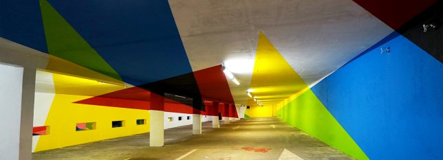
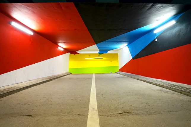
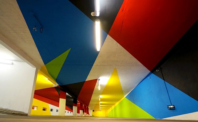
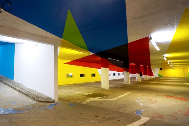
Underground Illusions: Anamorphic Parking Lot Turns Flat Paint into Sculpture

06 Jul

[ By SA Rogers in Art & Installation & Sound. ]

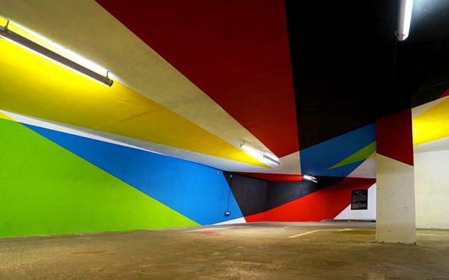
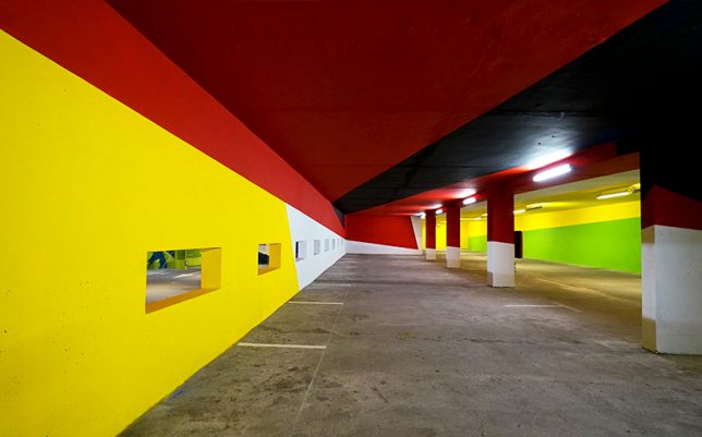
You’re driving through an underground parking garage when suddenly, the colorful geometric shapes splashed all over every surface pop out into three dimensions. Try not to crash your car! When optical illusions line up right, they can be really disorienting, and it’s always cool to see them carried out on a large scale. Argentinian artist Elian Chali got to take over an entire parking lot in the Saint-Gervais Mont Blanc region of France, transforming it into a trompe l’oeil canvas.

“This artwork, which uses basic geometry and primary colors, makes use of the architectural factors where it inhabits,” says Chile. “Each element adopts a new function and the space becomes a huge sculpture. The relationship with the environment is not easy to achieve, therefore not only the walls will be intervene, but the painting will invade everything that you find in your way in order to offer to the users of the parking, the possibility of breathing inside a work of art.”


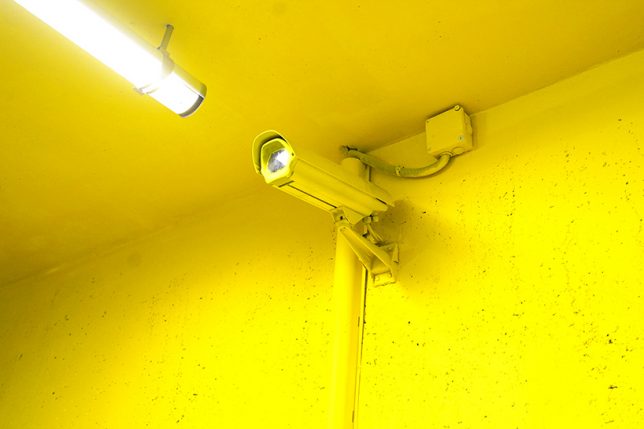
It’s a pretty cool effect, with some triangles stretching dozens of feet and crossing ceilings, support pillars and walls to end on the floor. Presented by 2KM3 Contemporary Art Platform and curated by Hugues Chevallier and Zoer, the piece comes together as an optical illusion when you hit just the right spot while driving through.

Chali is known for applying his signature vivid style to buildings around the world in the form of massive murals, often taking up entire multi-story facades. Each one takes its respective environment into account in its composition, paying homage to the history of the building and its setting, the materials it’s made of, and the ways in which it has aged or weathered. Keep up with his work on Instagram.

Share on Facebook


[ By SA Rogers in Art & Installation & Sound. ]

[ WebUrbanist | Archives | Galleries | Privacy | TOS ]


WebUrbanist

 
Comments Off on Underground Illusions: Anamorphic Parking Lot Turns Flat Paint into Sculpture

Posted in Creativity


Flat metalenses now work with a range of colors

12 Feb

Harvard researchers have made advancements in development of a flat lens known as a metalens – for the first time, it can work with a continuous range of colors rather than one at a time.

Research has been ongoing at the University’s School of Engineering and Applied Sciences, showing last summer that it was possible to create a lens 100,000x thinner than glass that could focus light in the visible spectrum. This metalens uses an array of titanium dioxide nanopillars to direct light, eliminating the need for additional curved glass layers to correct for chromatic aberration caused by traditional lenses. In fact, engineers were even able to design a metalens with reverse chromatic dispersion, showing that such technologies can really break away from the constraints imposed by traditional optical methods.

Varying the shape, size and height of the nanopillars used by the metalens allows it to focus wavelengths from 490nm to 550nm, or from blue to green. This is a promising step toward potentially using flat lens technology in anything from smartphone cameras to VR headsets. 

Articles: Digital Photography Review (dpreview.com)

 
Comments Off on Flat metalenses now work with a range of colors

Posted in Uncategorized


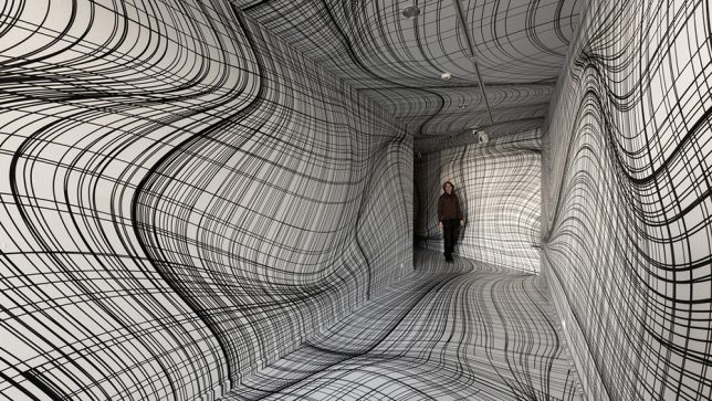
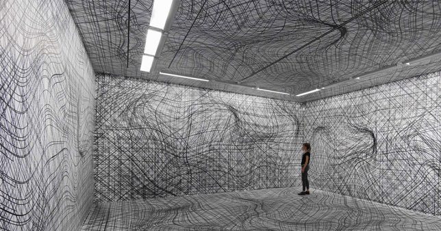
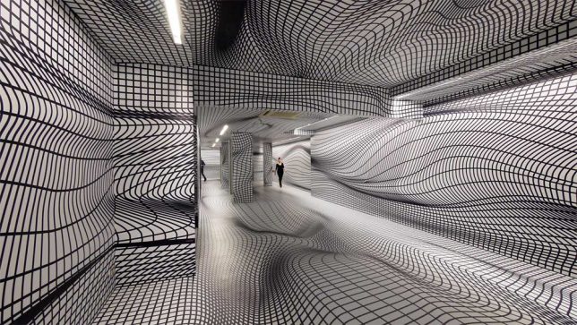
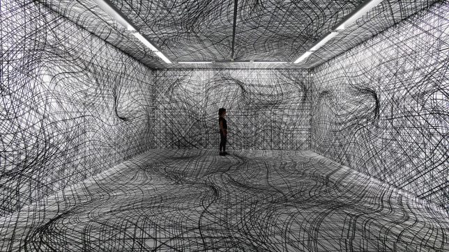
Vertigo Wallpaper: Warped 3D Room Illusions Transform Flat Gallery Surfaces

31 Dec

[ By SA Rogers in Art & Installation & Sound. ]

screen-shot-2016-12-30-at-9-51-20-am

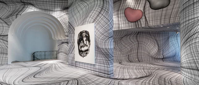
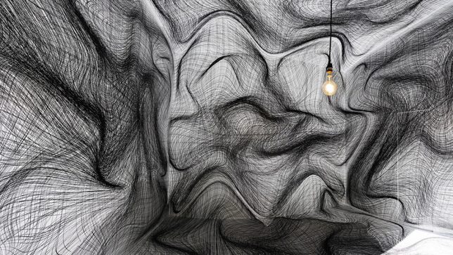
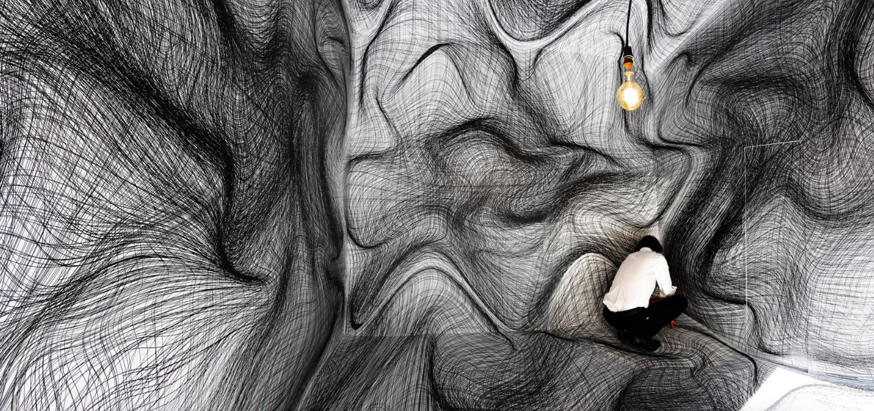
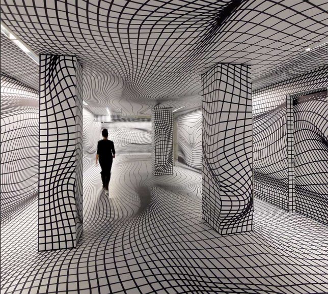
You could be forgiven for cautiously entering one of these rooms full of wavy sketched lines, stepping over obstacles that aren’t really there, uncertain whether parts of the walls are really projecting out toward you. Artist Peter Kogler creates spatial illusions that take over every surface of a gallery, turning it into a ‘virtual maze.’ A master of the large-scale print, he’s spent the last 30 years perfecting his techniques. The ones involving grids of lines pull off the most disorienting effects.

screen-shot-2016-12-30-at-9-50-55-am

vertigo-wallpaper-1

vertigo-wallpaper-2

Pictured here are installations from the last few years, including work displayed at the ING Art Center in Brussels this year, the Sigmund Freud Museum in Vienna in 2015 and the Galerie im Taxiplalais in 2014. His computer-generated works have even adorned the exterior walls of pavilions and museums, and often feature imagery of snakes, ants and pipes.

vertigo-wallpaper-3

vertigo-wallpaper-4

vertigo-wallpaper-6

According to his artist statement, “Kolger has been interested in new, innovative art practices, not only in the field of visual, but also in performative arts, sound and music. He continued his work by shifting the boundaries of artistic expression and developed a very impressive, emotionally and artistically convincing world, whose layered meanings open communication paths to the widest public.”

vertigo-wallpaper-7

vertigo-wallpaper-8

“After several years of research at the beginning of his artistic career, in painting, performance and experimental film, since 1984 Kogler has used computer technology. Heralding the future development of computer-generated art already in the ‘60s, in the spirit of that positivist-optimistic time, Michael Noll wrote: ‘The computer is an active medium the artist can interact with at a new level, liberated from many physical limitations of all former media. The artistic possibilities of this kind of creative medium as the artist’s helping device are truly exciting and challenging.”

Share on Facebook


[ By SA Rogers in Art & Installation & Sound. ]

[ WebUrbanist | Archives | Galleries | Privacy | TOS ]


WebUrbanist

 
Comments Off on Vertigo Wallpaper: Warped 3D Room Illusions Transform Flat Gallery Surfaces

Posted in Creativity


Using a Flat Picture Style for Better Finished Images

13 Aug

During my career in photography, I’ve continued to evolve, both my shooting and editing styles, to achieve the results I wanted. Several years ago, while working with film editors on a cinema project, I came across a concept that I decided to apply to my own photography, and I have to say, it has improved my final images a great deal. Let me explain about using flat picture styles.

Finished-Image

When Hollywood studios film a movie using a digital cinema camera, many times the camera will be set to record what is known as Log Gamma. This is similar to the picture styles that we DSLR and camera users have come to know and love. But while picture styles or picture controls are for the most part intended to provide a finished look, Log Gamma does just the opposite. A video file shot using Log Gamma will be very flat, with little contrast and color saturation. The purpose of shooting video this way, is so that it retains as much information as possible about the range of tones in the image, so the colorists who work on the video later can bring out that detail, and create a visual look to the film. This process is called color grading.

As I began to understand what the colorists were doing, I adjusted my workflow to allow me to take advantage of the same concepts. I find that by using a flat, low contrast, low saturation picture style, when I process the RAW file I can bring out better detail and contrast, and avoid clipping in the highlights and shadows.

Choosing a Flat Picture Style

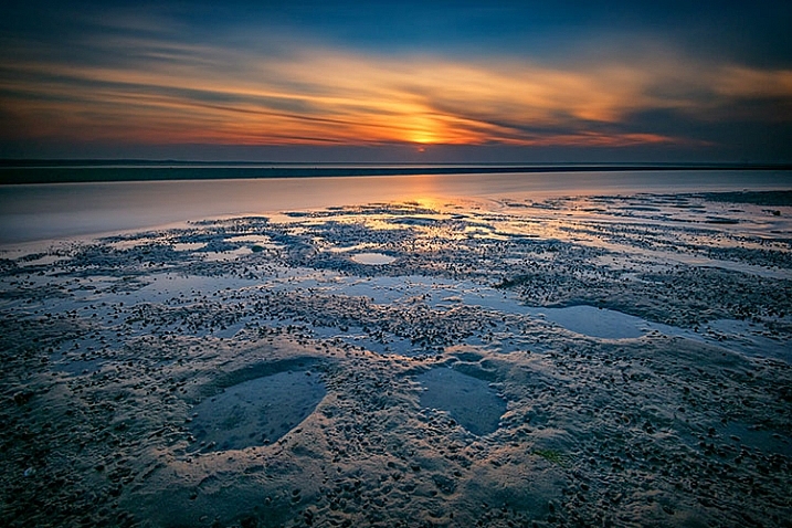
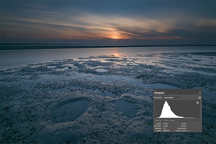
Before Image With Histogram

A flat or neutral picture style will give you an image with the least contrast, maintaining better highlight and shadow detail. This allows you to bring out those details in processing. The histogram on your camera, and later in Photoshop or Lightroom, allows you to see where your highlight and shadow tones fall, to avoid clipping.

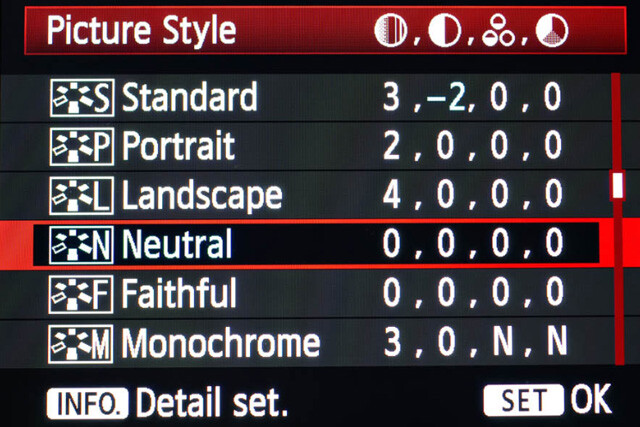
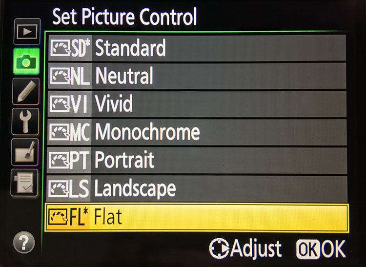
I had been shooting RAW for some time, but have left the Picture Style set to Standard or Landscape, for the most part. Once I saw this technique, I decided to change my picture style on my camera to Neutral (for Canon cameras) or Flat (on newer Nikons).

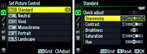
Canon Picture Style

Canon Picture Style

The reason is that the histogram shown on the back of the camera, as well as the image preview, reflect the selected picture style. The result is that if the picture style selected is a more contrasty one, such as Landscape, the histogram will reflect that, and may indicate clipping of highlights or shadows, especially in a contrasty scene.

Clipped Histogram

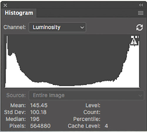
This histogram shows clipped highlights, meaning detail is lost in the brightest areas of the image.

On my Nikon D810, I use the Flat picture control, because it is the best choice for capturing the full range of tones in the scene, and those tones are reflected on the histogram on the back of the camera when I review the shots. This is important because I need an accurate indication of where the highlights and shadows in a scene fall in my histogram.

Nikon 810 Flat Picture Control

Nikon 810 Flat Picture Control

Nikon picture control

Nikon picture control – if you do not have Flat, choose Neutral or Faithful

The histogram on your camera is a graphed indication of where the pixels in your image fall in relation to highlights and shadows. The left edge represents blacks, the mid-left represents shadows, the middle is midtones, the mid-right is highlights, and the far right is whites. While not all cameras have a Flat picture control or style, most have a Neutral or Faithful picture style or control, that works similarly. Also, most cameras give you the ability to edit the picture styles, so you can turn down the contrast if you like, ensuring that you capture more highlight and shadow detail, and reducing the chances of clipping highlights or shadows.

When you clip highlights, objects in the scene that are clipped will show as pure white with no detail. When shadows are clipped, objects in those areas will show as pure black in the scene, also with no detail. When viewing the histogram, if the squiggly lines that make up the graph are pushed up against either the left or the right side, that is called clipping. When that happens, you are losing detail in the shadows if it’s pushed against the left, and in the highlights if the graph is pushed against the right. By reducing the contrast in the picture style, you’ll reduce the chances of losing detail in the scene.

Shooting RAW, and knowing I’ll be making adjustments in post, it doesn’t really matter what picture style I use, because I can change that when processing the RAW file. But it’s essential to be able to see an accurate histogram on my camera, to ensure I’ve captured as much tonal range as possible.

Processing the RAW File

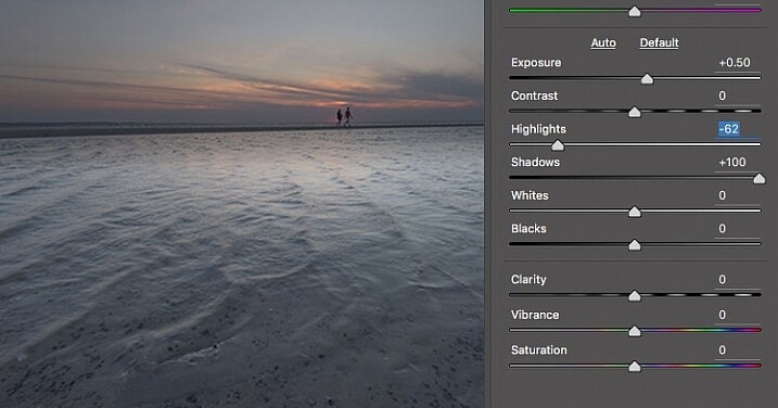
Image photographed using flat picture control

This image was shot using the Flat picture control, and then the highlight and shadow sliders in Adobe Camera RAW were adjusted to further reduce contrast.

Once I begin processing the RAW file, I’ll do even more, if necessary, to flatten the image and compress the range of tones within the histogram. This includes using the Highlights and Shadows sliders in Adobe Camera RAW to bring out details on both ends of the histogram.  You can watch the histogram change in Adobe Camera Raw or Lightroom as you do so, to be sure you don’t go too far. If the highlights begin to look muddy, you’ve gone too far. By the same token, if the shadows start to look washed out, that’s probably too far as well. You want to maintain detail in each, but not lose the depth of tone completely. It’s important to note that this adjustment will vary for different images, depending on where the highlights and shadows fall in the images.

In addition to adjusting the highlights, shadows, and contrast here, I will use the Dehaze slider, Lens Correction, and Spot Removal brush in Adobe Camera RAW. If you prefer, you can use the Vibrance, Saturation, and Adjustment Brush to complete the image in Adobe Camera RAW or Lightroom, but my preference is to work in Photoshop. There I can use a Layers workflow along with masking and Adjustment Layers and with various plugins, to achieve my final image.

Building Up Color and Contrast

Using Adjustment Layers

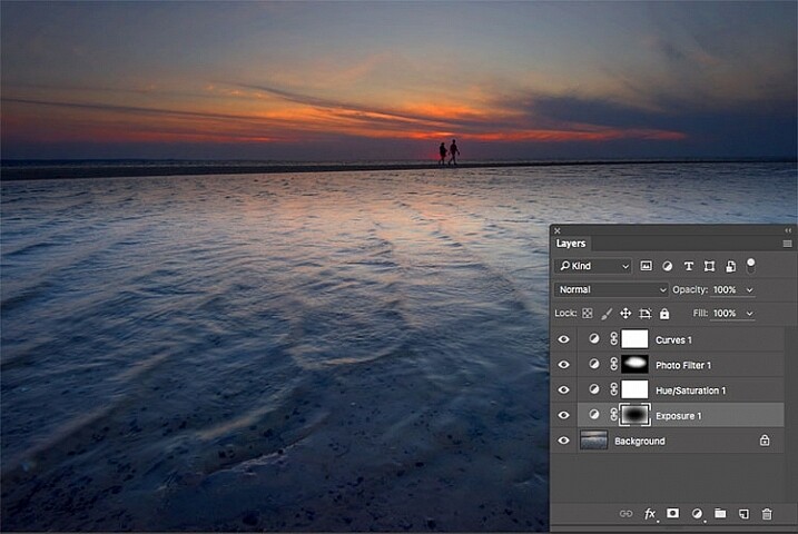
Using Adjustment Layers in Photoshop, I built up the color saturation and contrast to achieve the final image.

Once I have the image at the desired level of flatness, I then go about building up color saturation and contrast, or in Hollywood terms, color grading my image. After bringing the image into Photoshop, there are a number of ways you can go about this. The first is to use adjustment layers so that you can continually adjust each layer as desired, until you flatten the image for your final output. In addition, if you’re making an adjustment that you only want to apply in certain areas, you can use layer masks to hide or reveal it as desired.

Many of these adjustments will be to personal taste. I personally prefer my images to have punchy color and contrast. So a set of adjustment layers I might use would be Vibrance, Exposure, Hue/Saturation, Curves, and Exposure.  The flexibility of using adjustment layers allows me to direct adjustments where I need them, rather than being forced to make them globally.

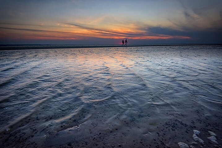
Image processed with Nik Color Efex Pro

This is the same image, but I used Nik Color Efex Pro to achieve the final image instead of adjustment layers.

If adjustment layers aren’t your thing, perhaps using a plugin such as Google’s Nik Efex Pro. It’s now available at no cost, and is a software package I highly recommend. I’ve created several presets in Color Efex Pro, and will also use Viveza and its control points to further adjust my image. For landscapes, in Color Efex I have created a preset using Brilliance/Warmth, Pro Contrast, Skylight Filter, Detail Extractor, and Vignette:Lens, that I find to be pleasing for a majority of my landscape images. Depending on the image, I will tweak these settings to meet my vision.

Summing Up

Before and After

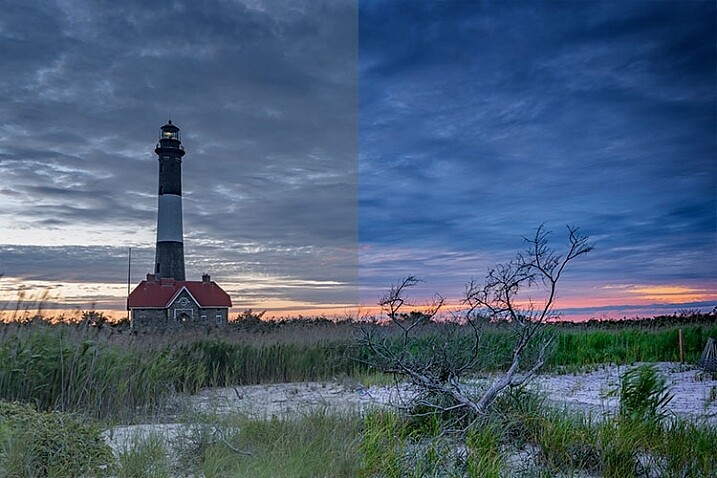
On the left is the image with its tones flattened and desaturated, using a Flat picture control and adjusting highlights and shadows as needed. On the right is the image fully processed building contrast and color saturation.

By starting with a flattened file, you give yourself room in the range of tones to build contrast and saturation, without clipping highlights, shadows, or any of the color channels. While shooting with a more finished picture style may look more pleasing on the camera’s LCD screen, or upon import into Lightroom or Photoshop, the contrast has already been adjusted to give it a pleasing look. Any adjustments to Saturation or color may result in a file that at the very least looks overcooked, and at worst, shows evidence of clipping highlights, shadows, or color channels.

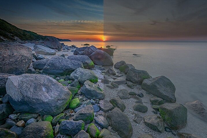
An image showing before and after color grading.

On the right is the image with the flat picture style, while the left has been “color graded” in Photoshop.

Building-contrast-2

googletag.cmd.push(function() {
tablet_slots.push( googletag.defineSlot( “/1005424/_dPSv4_tab-all-article-bottom_(300×250)”, [300, 250], “pb-ad-78623” ).addService( googletag.pubads() ) ); } );

googletag.cmd.push(function() {
mobile_slots.push( googletag.defineSlot( “/1005424/_dPSv4_mob-all-article-bottom_(300×250)”, [300, 250], “pb-ad-78158” ).addService( googletag.pubads() ) ); } );

The post Using a Flat Picture Style for Better Finished Images by Rick Berk appeared first on Digital Photography School.


Digital Photography School

 
Comments Off on Using a Flat Picture Style for Better Finished Images

Posted in Photography


Flat elements developed by Harvard could make camera lenses smaller, lighter and better

11 Mar

A team at Harvard School of Engineering has developed a method for making flat lenses that could dramatically reduce the size and weight of camera lenses in the future. The method employs tiny silicon antennas positioned on flat glass components to redirect light when it reaches the surface of the lens instead of relying on refraction and the thickness of glass to bend light in a particular direction. Learn more
Articles: Digital Photography Review (dpreview.com)
 
Comments Off on Flat elements developed by Harvard could make camera lenses smaller, lighter and better

Posted in Uncategorized


Nikon D5500 adds touchscreen and flat picture profile

06 Jan

Nikon has announced the D5500, an upper-entry-level DSLR and successor to its D5300. It provides a 24.2MP DX-format sensor with no optical low pass filter. Improvements over the previous model include the addition of a touchscreen, which is a fully articulated 3.2-inch 1.37M-dot affair, as in the D5300. A flat picture profile is added as a video mode option, which offers 1080/60p recording like its predecessor. Read more

Articles: Digital Photography Review (dpreview.com)

 
Comments Off on Nikon D5500 adds touchscreen and flat picture profile

Posted in Uncategorized


Secret Engagement: Flat Ring Case Enables Surprise Proposals

10 Nov

[ By WebUrbanist in Design & Products & Packaging. ]

flat pack wedding ring design

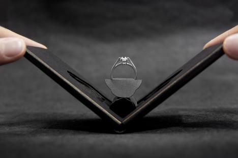
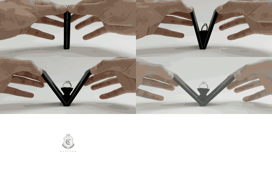
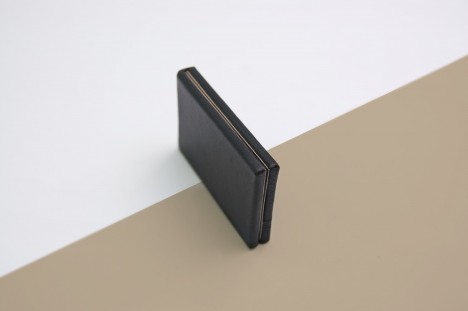
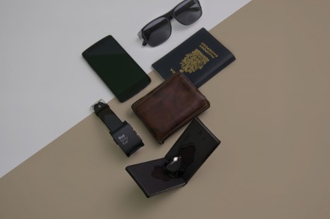
As soon as someone pulls out a ring box the (wedding bell) alarms start sounding, hence this ingeniously slim alternative that packs flat into pockets and still doesn’t reveal its purpose once presented to a significant other.

surprise wedding ring reveal

wedding ring flat case

wedding ring case context

wedding ring case scale

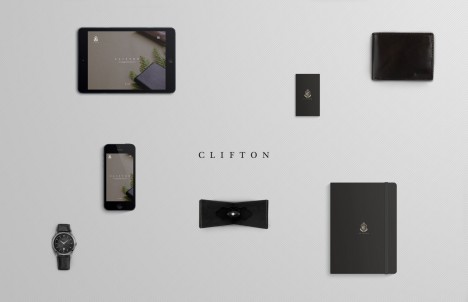
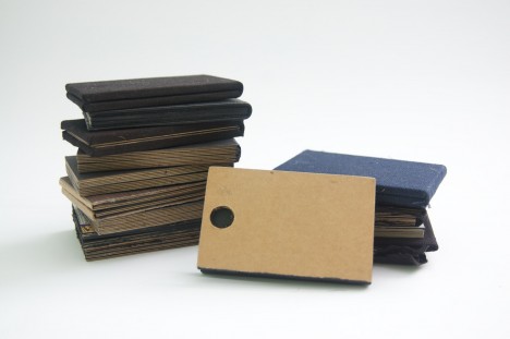
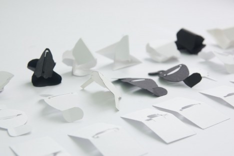
From its creators: “Clifton is a unique engagement ring case that can be easily slipped into the pocket or the wallet. The discreet design allows the case to be easily hidden without showing much profile. At approximately 1 cm thick, Clifton presents the ring with a delightful flower blooming effect when opened, enchanting the moment.”

wedding ring background work

wedding ring creation design

wedding ring process photos

While there are many other ways to surprise someone on this kind of special occasion, this approach seems particularly elegant as a solution. Its creator, Andrew Zo, is a packaging designer who delights in the unboxing process and has won awards and acclaim for this and other work done for both domestic (Canadian) clients and international businesses.

Share on Facebook


[ By WebUrbanist in Design & Products & Packaging. ]

[ WebUrbanist | Archives | Galleries | Privacy | TOS ]


WebUrbanist

 
Comments Off on Secret Engagement: Flat Ring Case Enables Surprise Proposals

Posted in Creativity


Pop-Up Portfolio: Mobile Furniture Folds Flat Between Pages

12 May

[ By WebUrbanist in Design & Furniture & Decor. ]

flat pack furniture set

It is not unusual to see art and design students walking around with portfolios under their arms, but few open up to reveal such creative results as these.

flat pack chair closed

flat pack green chair

Inspired by campus folder cases, origami and pop-up books, Japanese designer Mariko Tsujimoto created this series of unfolding furnishings that deploy into surprisingly solid (if small) functional objects.

flat pack table open

flat pack table closed

Set in vivid colors to distinguish their functionality, the set includes a chair, table, desk and bookshelf, each of which refolds automatically when the end pages are closed.

flat pack shelf closed

flat pack book shelf

flat pack in motion

These quite literal portfolio pieces are just plastic prototypes for now, but rendered in a more solid material they could provide the conceptual groundwork for a full-fledged furnishing set.

Share on Facebook


[ By WebUrbanist in Design & Furniture & Decor. ]

[ WebUrbanist | Archives | Galleries | Privacy | TOS ]


WebUrbanist

 
Comments Off on Pop-Up Portfolio: Mobile Furniture Folds Flat Between Pages

Posted in Creativity