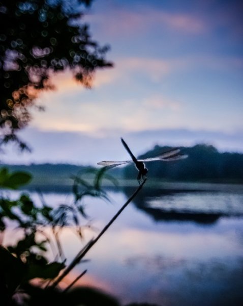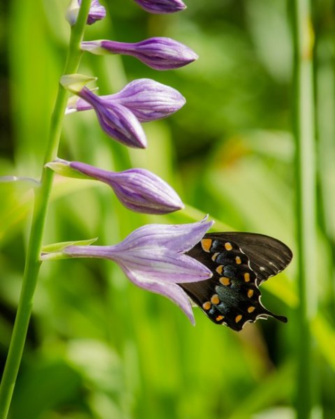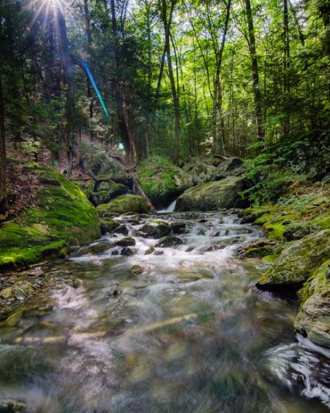
I am an unashamed lover of color. I say this because when I first started out as a photographer, color photography was considered inferior to black and white. This attitude was especially prevalent in the photo-art world.
I found that confusing because to me, color can bring so much expression, feeling, excitement and vitality to an image. Don’t we want that? As my very favorite photographer, Ernst Haas said:
“Color is joy. One does not think joy. One is carried by it.”
I totally agree!

In this article, I’d like to talk to you about how to use color to create more feeling, more depth, and more energy in your images.
After all, if your images are not provoking an impact, a feeling for your viewer, then they will be easy to forget. And don’t we all wish to create memorable and unique images?
“Photography for me is not looking, it’s feeling. If you can’t feel what you’re looking at, then you’re never going to get others to feel anything when they look at your pictures.” – Don McCullin

Colour is a form of expression
“I found I could say things with color and shapes that I couldn’t say any other way – things I had no words for.” – Georgia O’Keeffe
I agree with her! As a really visual person, I find it hard to express the feelings I have about the world with words. I’ve learned how, but it comes much more naturally to me to express my curiosity about the world through taking photographs.
Color evokes a spectrum of feeling, and it that is what we really want to capture in our photography.

Think about how you feel when you see the intense red of a flower, the soft azure blue of the sea, the warm yellows of morning sun in summer, the dark muddy browns of the earth in fall.
That is what I want you to think about today. Not only the photographing of color itself, as an element almost, but how you can use color to bring intense feeling into your photograph. Show the viewer more about how it felt to stand in the place where you were. To infuse your photographs with a feeling of atmosphere.
In this article, I will give you three techniques for using color in your images. They go from simple to pretty hard – but I hope you will try all three.

1. Using color as an element
The simplest way to start working with color in your photography is to use it as a key element within your image. Color can be used to provide contrast, shape, form, and texture.
The simple shape and form of color can be the subject of your photo. It can help you build elements within the photo.
I love to get inspiration for my photography from all kinds of sources. It’s important to me that I am not just stuck in the world of photography and image-making – because there is a stunning and unbelievable world out there for us to draw interesting and exciting ideas from. From philosophers to writers, musicians to scientists – I get ideas for photos from all kinds of places.

I love very simple, bold background for portraits. I’m always keeping my eye out for backgrounds like these.
I love how so many painters use color in big, bold ways to create powerful elements in their work. Painters such as Henri Matisse with his simple shapes and beautiful colors, Mark Rothko with his thick banks of color that seem to suck you into his paintings and Van Gogh with his heavy brush strokes of rich color.
Here is another quote from the painter Georgia O’Keeffe that explains a lot of what I am doing with my photography: drawing attention to things that most people miss
“When you take a flower in your hand and really look at it, it’s your world for the moment. I want to give that world to someone else. Most people in the city rush around so, they have no time to look at a flower. I want them to see it whether they want to or not.” – Georgia O’Keeffe

In this photo, I used the contrasting colors to make a simple and interesting composition with some abandoned chairs. For me turning simple things I find on the street, peeling off walls, at my feet, into something interesting is a favorite thing for me to do in my photography.
2. Using color to evoke a feeling
A more interesting way to use color – and one that takes more practice – is to use it purposely to create a feeling in your image. Color evokes all kinds of different feelings for people.
Painter Wassily Kandinsky developed many theories about art, one being that color created different feelings and states within the viewer.

“The deeper the blue becomes, the more strongly it calls man towards the infinite, awakening in him a desire for the pure and, finally, for the supernatural… The brighter it becomes, the more it loses its sound, until it turns into silent stillness and becomes white.” – Wassily Kandinsky
Kandinsky felt that colors evoked these feelings and states:
- Yellow – warm, exciting, happy
- Blue – deep, peaceful, supernatural
- Green – peace, stillness, nature
- White – harmony, silence, cleanliness
- Black – grief, dark, unknown
- Red – glowing, confidence, alive
- Orange – radiant, healthy, serious

To use color to evoke feeling is a more sophisticated way to incorporate it into your images.
Now, where is a good place to start with this process?
Look at how the color you are seeing affects how you feel. Explore and examine color – almost in that state that toddlers do – with a sense of wonder and freshness. Then you can bring that into your images.
Of course, it doesn’t have to be big bold colors, it can be about the subtle, the evocative colors. I love playing with greys, browns, and blacks – and drawing out the subtlety in their range.

3. Capturing the inherent qualities of your subject using color
This has to be the hardest, most sophisticated technique of the three presented here – but it’s so worth trying it as you will create images with more complexity.
What I mean by capturing the inherent qualities of your subject using color, is to reveal the qualities of your subject using color. Pablo Picasso explained it even better than me when he is said:
“Some painters transform the sun into a yellow spot, others transform a yellow spot into the sun.”
So you are using the color to tell the viewer something of what that subject is. What it feels or looks like, what it is or how it is.
I love this photo below because to me it captures perfectly the browns, yellows, and oranges of autumn. I can feel autumn in this photo.

The colors I am capturing here are not a compositional tool, but about revealing more about the subject itself.
I hope those were some interesting ideas to you. I love to know how you use color in your photography – and if you found some useful tips here that you can apply to your images.
Please let me know by commenting below.
The post How to Capture the Feeling of Color and Create More Compelling Images by Anthony Epes appeared first on Digital Photography School.


 Model is Shay Williamson Peck
You must be logged in to post a comment.