It may at first seem simple. You took the shot a little wide, or a sneaky branch that you didn’t notice found its way into the edge of your photo. In Lightroom (LR) it’s just a quick press of the R key to activate the crop tool, hold down the shift key to constrain the crop so you don’t get a weird aspect ratio, and your task is complete.

The crop tool – simple, yet powerful.
On the contrary, cropping is one of the more powerful tools that you have at your disposal to dial in the composition of your images. Prime lens users will also find that the limited versatility (compared to zoom lenses) can result in the need for cropping more often.
First, let me make the caveat that many aspects of photography are highly subjective. Some of the information and advice offered in this article is my personal opinion, and is the approach I take to create images that fit my style. Personal preference always prevails. Anything called a rule is only so because a common pattern was identified within compositions that are considered especially attractive.
In many respects cropping echoes the fundamental principles of composition. Luckily, if you didn’t get what you wanted the first time around, when you took the photo, you get a second chance, albeit limited, to recompose your images in post-production for maximum impact.
The Basics
The very first thing I look for, and correct, in any photograph that I edit is straight lines. Horizon lines and any vertical lines that are near the edges of the image, should be straight. It absolutely drives me crazy when I see photos with crooked lines.
That being said, lines can be crooked, but it better be obvious that was the intent, otherwise it just looks like careless composition or lazy editing. In the right context a skewed horizon can add drama, and make an image more dynamic.

Crooked horizons can make viewers cringe unless the intent is obvious.
Make this your first step in cropping, because depending on how radically you have to rotate the image you may be forced to crop the edges of the image.
If you have the time when composing the shot, and your camera has a built-in virtual horizon feature for levelling, by all means do so. I have delegated a customizable button on the front of my camera for activating this feature, and I use it all the time.
With the crop tool activated in LR (keyboard shortcut R) there are a few ways to straighten out an image:
- Drag the Angle slider left or right
- Click on the value to the right of the slider and drag left or right (scrubby slider)
- Click on the numerical value and enter whatever you want
- Hold the CTRL key while dragging along a straight horizontal or vertical line (will correct on either axis) and LR will fix it automatically
- Also new in LR6 (LR CC) is the “Auto” feature for the crop tool. Just click it and see how it does – then tweak as necessary.
Elimination
A senior photojournalist at a newspaper I once interned for, gave me a memorable piece of advice while critiquing my photos, he said, “crop until it hurts.” It was his way of telling me that I was leaving too much dead or negative space in my compositions.
To this day his advice always resurfaces in my mind when I’m editing images, especially with portraits or other photos with people in them. Fight the urge to become attached to pixels. Crop out half of the photo if need be. Unimportant areas of a photo are not precious real estate.

You can’t always get as close to the action as you would like (or it is safe to do so) and heavy-handed cropping can make all the difference.
The fact of the matter is that simple is better. We all suffer from attention deficit disorder, and viewers usually don’t want to spend too much precious time analyzing a photo to get the story. Consider the allure of silhouette images. When cropping look for simple compositions and try to distill the scene down to its essence.
Once the image is rotated and you’ve been forced to chop off some of the edges, look for elements that detract, distract or add little to the image. You may not have a choice but to include them, but it’s good practice to be cognizant of them and it may help guide the rest of your editing process or future compositions.
You see many images where the photographer is too conservative when cropping portraits or photos of people. Again, each photo is different, and there is no magic formula, but for example, I find that tight profile shots of people grab my eye more when they are cropped in really close. I am not afraid to cut off the back of the subject’s head, putting their ear in the upper corner of the image, or even cropping the ear out.
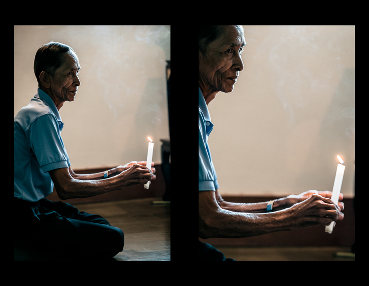
Cropping in very tight can sometimes create a more powerful image.
Negative space can play an important role, especially if shooting for a publication where they need space for text. But, the nice thing about having post-processing options is that you can always revert back to the original. If you compose your images super tight in camera, you can’t get that negative space back.
Leading Lines
Although thoughtfully composing your shots through the viewfinder is one of the more rudimentary skills in photography, there are often distractions. You may find surprises when you pull up the final image on your computer screen.
In photography, as well as painting and other forms of art, you should always be thinking about the arrangement of elements in the image that are going to draw in the viewer’s eye. A compelling subject is just that, but it is your job as photographer to strive to portray that subject in the most powerful, or striking way possible.
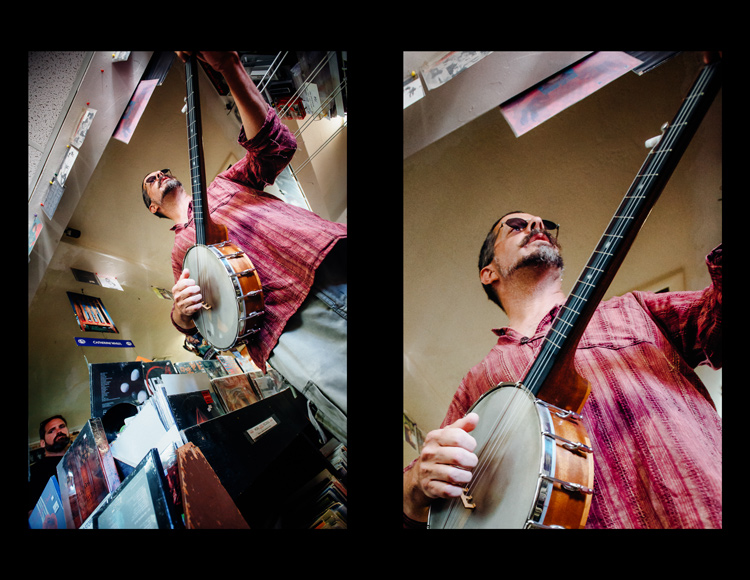
It’s easy to overlook compositional elements while shooting moving subjects. Post -processing cropping reveals additional possibilities for framing your shots like using leading lines to draw in the viewer’s eye.
When we talk about leading lines it’s not always an obvious straight line. Often it is an invisible thread that takes the viewers’ gaze hostage and leads it through the scene. Think of a series of elements that create a pattern.
Diagonal lines which stretch towards the subject are a common, and effective, way to create interest and tension in an image.
Using Crop Overlays as Guidance
In all of its ingenious glory, LR has included several overlays in the Crop tool to help guide your cropping endeavors. There is a basic grid, the Rule of Thirds, the Golden Ratio, the Golden Triangles, diagonals and the Golden Spiral. With the Crop tool active, the keyboard shortcut O cycles through the various overlays and Shift+O rotates the overlay where applicable.
Personally, I find myself using the Rule of Thirds overlay most often. The Rule of Thirds says that when two horizontal and two vertical lines are drawn across the frame to divide it into equal thirds, the subject or elements of interest, should be placed on, or near the intersection of those lines.
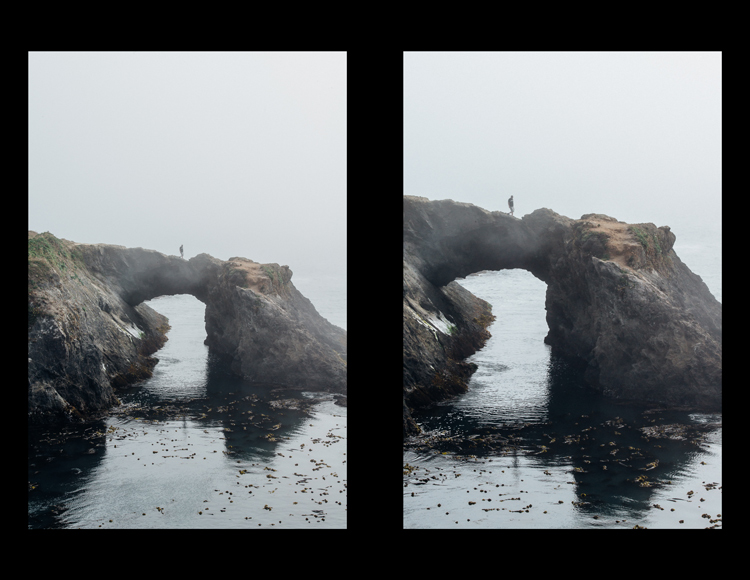
The rule of thirds suggests that the subject be placed at the intersection of lines that separate the image into thirds.
An easy mistake to make is placing the horizon line right in the middle of the frame. This is generally considered a no-no, and is a significant compositional faux pas. The Rule of Thirds overlay gives you those handy horizontal lines for recomposing your photo.
The Golden Ratio and Golden Spiral overlays are closely related. There are a bunch of names for this formula including Phi, the Golden Mean and Fibonacci’s ratio. The Golden Ratio grid employs the same basic concept as the Rule of Thirds. I find that the Golden Spiral really isn’t much different, and is more useful to consider in your original composition, instead of trying to apply it after the fact.
The Golden Triangles overlay shows a diagonal line drawn from one corner to another with two branching lines to the other two corners separating the image into four triangles. This gives you a guide for aligning diagonal leading lines, and a suggested location for the subject at the intersection of the lines.
The diagonal overlay calls for placing elements of interest along 45-degree lines drawn across the image. Although the overlay is meant to fine tune this alignment in post-processing, it has been found that artists tend toward this layout intuitively.
The Moral of the Story
Cropping in post-processing is far more than just a simple tool to tighten up composition. Experimenting with various crops of the same image can help you develop an eye for the hidden compositions in a photo.
After you familiarize yourself with the possibilities, you will likely find yourself looking back through your photo library to revisit old images, in order to give them fresh compositions.
Photography is all about seeing, not just looking, and sometimes instead of taking a step back to see the big picture, you need to take a step forward to discover the small one.
What is your thought process when cropping in post-production?
googletag.cmd.push(function() {
tablet_slots.push( googletag.defineSlot( “/1005424/_dPSv4_tab-all-article-bottom_(300×250)”, [300, 250], “pb-ad-78623” ).addService( googletag.pubads() ) ); } );
googletag.cmd.push(function() {
mobile_slots.push( googletag.defineSlot( “/1005424/_dPSv4_mob-all-article-bottom_(300×250)”, [300, 250], “pb-ad-78158” ).addService( googletag.pubads() ) ); } );
The post Composition After the Fact: Cropping for Maximum Impact by Jeremie Schatz appeared first on Digital Photography School.

Digital Photography School


You must be logged in to post a comment.