RSS
 

Posts Tagged ‘Facade’

Cheap Seats: Sculptural Furniture Showroom Facade Made of 900 Black Chairs

19 Jul

[ By WebUrbanist in Architecture & Offices & Commercial. ]
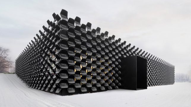
Using cheap and repetitive materials sounds like a recipe for kitsch, but this furniture-oriented facade clad in generic black chairs (at around $ 5.00 USD a piece) manages to pull off an elegant and refined look.
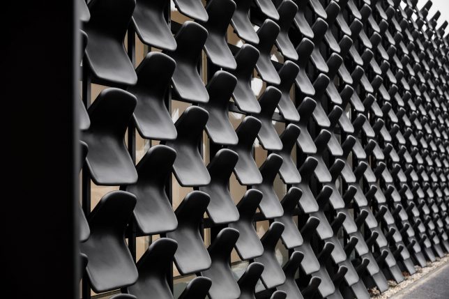
The clients, MY DVA (a furniture company), were looking for something additive, layered onto the existing bland building, but also reflecting their function (to showcase office and school furniture). The ideal solution would promote their wares while also entertaining visitors. It also had to be inexpensive.
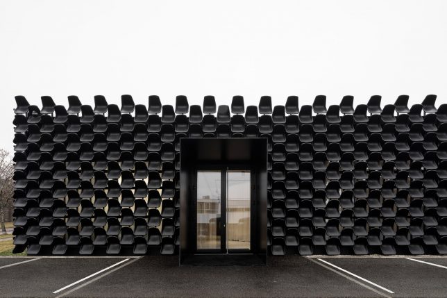
Versed in product and urban design, Ondrej Chybik and Michal Kristof of studio CHYBIK+KRISTOF, took these concerns into account when designing the facade. Tapping into their respective backgrounds, they came up with cladding literally composed of product designs that also fits a neighborhood theme of repetition (filled with identical blocks of flats).
In total, the team used 900 Vicenza seats, a regular offering of the company, to form an undulating black box around the showroom, which functions well with the reduced light provided by these exterior shading elements.
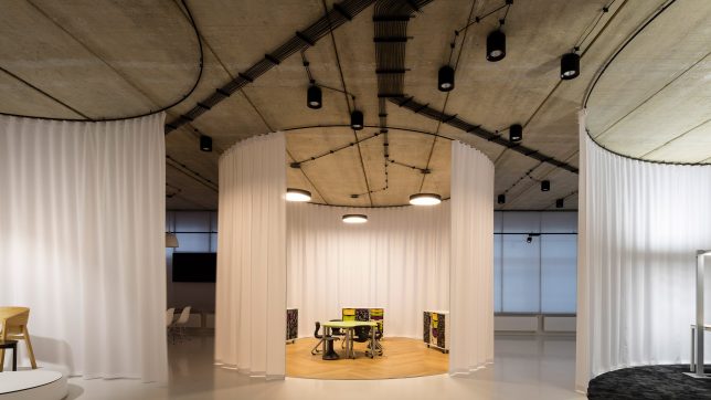
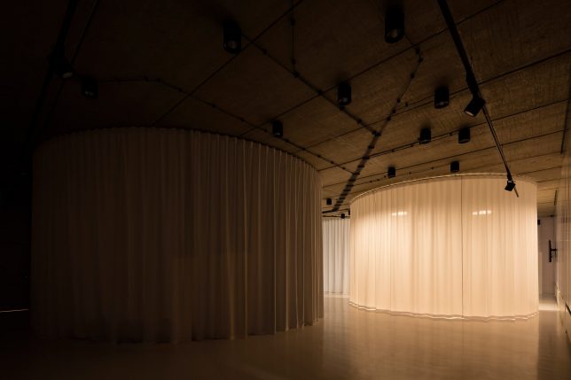
Inside, the space was pared down to expose a raw concrete ceiling, from which suspended curtains hang to create little galleries — adjustable lights in these zones simulate different lighting conditions for furniture client spaces.
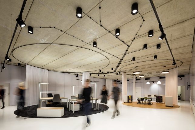
Staff offices are located along the edges, off to the sides and out of the way behind translucent partitions, leaving a large, open, blank-slate showroom for furniture buyers.

Share on Facebook


[ By WebUrbanist in Architecture & Offices & Commercial. ]

[ WebUrbanist | Archives | Galleries | Privacy | TOS ]

WebUrbanist

 
Comments Off on Cheap Seats: Sculptural Furniture Showroom Facade Made of 900 Black Chairs

Posted in Creativity


Behind the Curtain Wall: Theatrical Facade Rotates Around Cultural Center

28 Jun

[ By WebUrbanist in Architecture & Offices & Commercial. ]

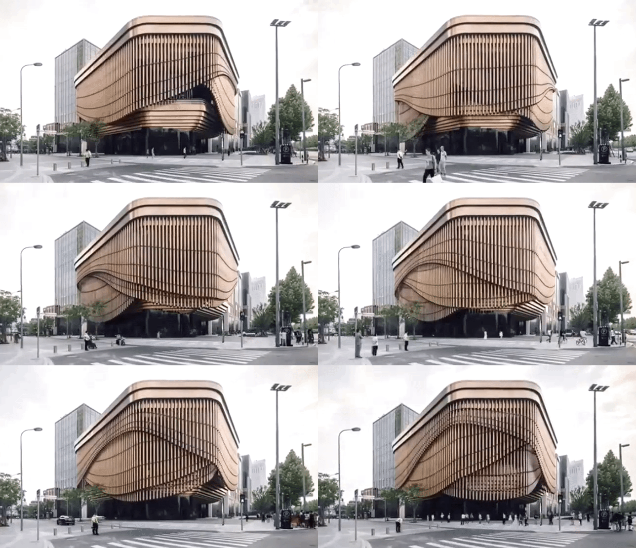
This mesmerizing mobile facade is an aesthetic and engineering marvel, but one has to wonder: could the mechanisms behind it be appropriated for other architectural purposes, like: providing light and shade on demand or on a schedule?

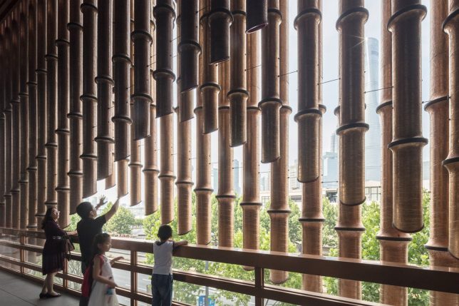
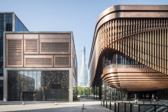
The dynamic design wraps a new cultural center in Shanghai, part of a 190,000-square-meter development by Foster + Partners in collaboration with Heatherwick Studio (images by Laurian Ghinitoiu).

It was inspired by Chinese theaters with bamboo-like bronze tubes set in three layers around the perimeter, constituting what the designers describe as “a moving veil, which adapts to the changing use of the building, and reveals the stage on the balcony and views towards Pudong.” The effect is certainly stunning, but despite the description, it seems to be mostly for show — an novelty experience for visitors and viewers.

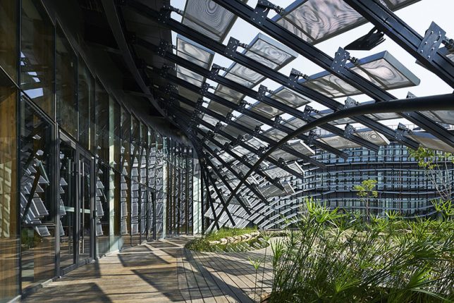
The same kinds of systems, however, could be deployed more strategically, using other kinds of semi-opaque screens, for instance, that could automatically position themselves throughout the day to provide layers of shade. Such an application would have practical benefits, reducing cooling costs inside structures and increasing human comfort.

Alternatively, a similar screen system could be controllable by occupants, allowing building users to block off sections for things like meetings or film screenings requiring different amounts of natural light. For now, it remains a fascinating one-off work, but hopefully architects will consider adding this as a tool in their kit, applying similar technical sophistication to solve other site-specific design problems.

Share on Facebook


[ By WebUrbanist in Architecture & Offices & Commercial. ]

[ WebUrbanist | Archives | Galleries | Privacy | TOS ]

WebUrbanist

 
Comments Off on Behind the Curtain Wall: Theatrical Facade Rotates Around Cultural Center

Posted in Creativity


Pillars of Green: 85,000 Plants on World’s Largest Vertical Garden Facade

23 May

[ By WebUrbanist in Architecture & Houses & Residential. ]

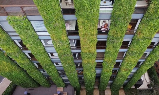
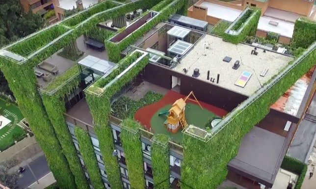
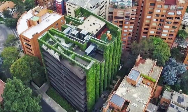
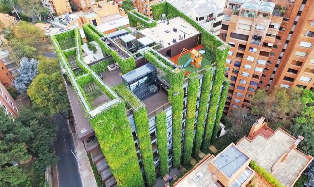
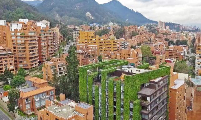
An extensive living facade system in Bogota, Columbia, represents growth in the right direction, away from unrealistic tree-covered skyscrapers toward more sustainable and useful vertical greenery.

The Santalaia building has plants spanning over 30,000 square meters of its surface area, able to produce oxygen for over 3,000 people annually (and filter tons of heavy metals, harmful gases and other airborne particulates). Paisajismo Urbano installed this specific system, developed by Ignacio Solano.

The recent trend (in renderings and to some extent reality) of putting trees onto tall towers is problematic from engineering and ecological standpoints. “Intensive” greenery requires thicker layers of soil and more complex systems for watering, maintenance and structural support. “Extensive” greenery, by contrast, provides many of the same benefits with lower cost and less wasted energy.

Many architects are naturally tempted to place trees on buildings, which do have a few functional advantages (like providing shade and making for nice-looking renderings). Still, building residents as well as the public would be better served in most cases by systems like this one. Even then, it is important to determine in advance what the goals and intended benefits are, since any green installation is complex and requires ongoing support.

Share on Facebook


[ By WebUrbanist in Architecture & Houses & Residential. ]

[ WebUrbanist | Archives | Galleries | Privacy | TOS ]


WebUrbanist

 
Comments Off on Pillars of Green: 85,000 Plants on World’s Largest Vertical Garden Facade

Posted in Creativity


Emoji Facade: Dutch Architects Decorate Brick Building with 22 Smiley Faces

05 May

[ By WebUrbanist in Architecture & Offices & Commercial. ]

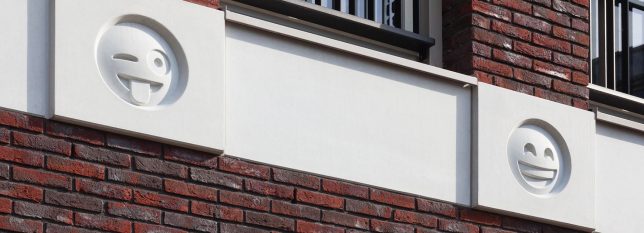
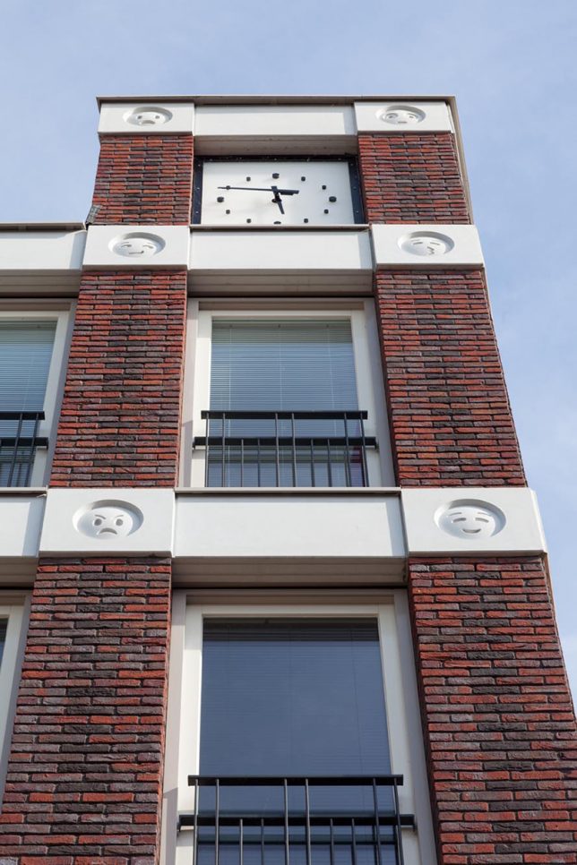
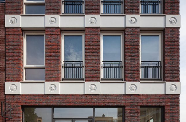
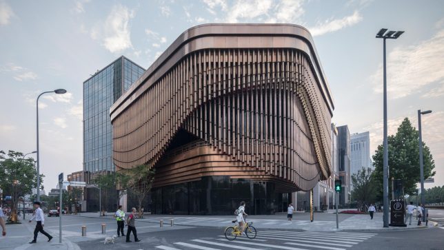
Instead of gargoyles, grotesques or ornate decorative details, this somewhat silly facade expresses an array of emotions through circular icons familiar to anyone with a smartphone or social media account.

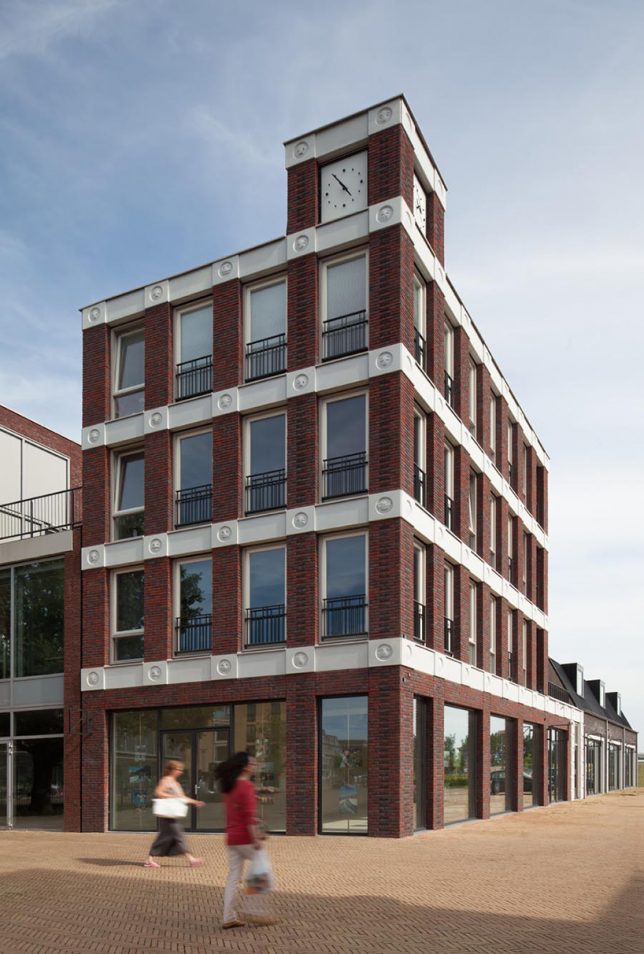
Located in suburban Vathorst near Amersfoort, this design by Attika Architekten (images by Bart van Hoek) looks quite conventional at a glance. At each level, horizontal rows of light concrete break up stacks of dark brick and divide the tops and bottoms of windows.

Upon closer inspection, however, the mixed-use project has a detail that varies from one location to the next — round faces featuring a broad range of emotional states and attitudes.

“In classical architecture they used heads of the king or whatever, and they put that on the façade,” explains the architect. “So we were thinking, what can we use as an ornament so when you look at this building in 10 or 20 years you can say ‘hey this is from that year!’.” If nothing else, they seem to have hit that target.

“The cast concrete characters express a range of familiar emoji emotions, including the classic sad and happy styles, the instantly-recognizable kissing face, and the much-loved heart eyes personality.”

Formally speaking, this decor adds a layer of interstitial detail often found in early Modern architecture urban architecture (derived historically from Gothic influences). It adds an element that spans the fine grain of the brick columns and otherwise featureless and monolithic concrete rows.

Whether or not these emoticons will look funny, cool, creative, unique, dated or all of the above in a few decades remains to be seen. Still, it is certainly is a fun way to think about decor in the post-Postmodern world where rote historicism has become a thing of the past.

Share on Facebook


[ By WebUrbanist in Architecture & Offices & Commercial. ]

[ WebUrbanist | Archives | Galleries | Privacy | TOS ]

WebUrbanist

 
Comments Off on Emoji Facade: Dutch Architects Decorate Brick Building with 22 Smiley Faces

Posted in Creativity


Shadow Graffiti: Typographic Sundial Transforms Building Facade

25 Jun

[ By SA Rogers in Art & Street Art & Graffiti. ]

typographic sundial 1

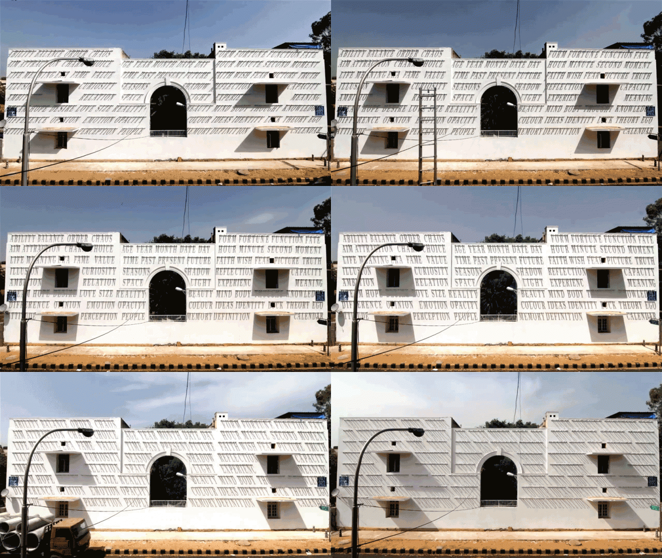
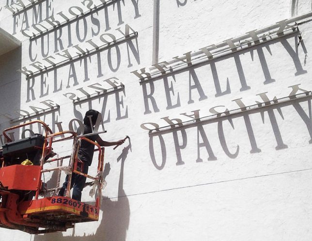
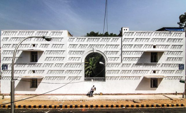
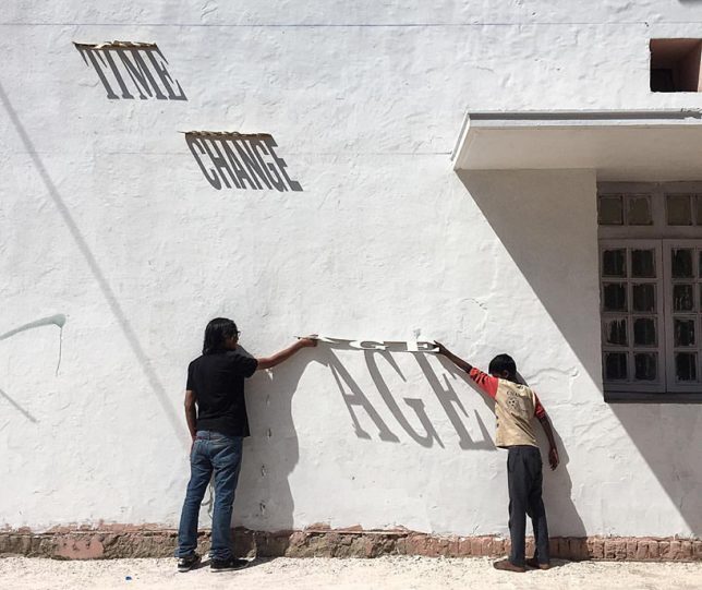
Integrating the shadows cast by everything from stop signs to public benches into street art often requires the luck of seeing the piece in action at just the right time of day, when the shadow is in just the right spot for everything to line up as intended. Catching it in action feels like serendipity and adds a little bit of magic to ordinary urban settings. But in the case of this particular work of shadow art, you could literally stand in front of it all day and just watch it transform before your eyes. The lettering attached to the facade of a building in India’s Lodhi District changes its angle as the sun moves across the sky, acting like a sundial.

typographic sundial 3

typographic sundial 2

‘Time Changes Everything’ by Indian street artist Daku requires the sun’s harsh light in this location and the stark white facade of the building to even be visible to passersby, virtually disappearing on a cloudy day or at night. Get close to the wall and look up, however, and you’ll get a new perspective on the piece, viewing the words upside-down. The theme relates to the passage of time, with words including ‘age,’ ‘illusion,’ ‘season,’ aim’ and ‘memory.’ They start out in italics and then shift into prime legibility at noon before leaning in the other direction.

typographic sundial 4

The installation is part of the first dedicated public art district in India, turning the neighborhood into a gallery that’s available to everyone. ST+ART India invited 25 local and international street artists to contribute to the project, which aims to make art accessible for wider audiences “while having a positive impact on society.” Check out more of Daku’s work on Instagram.

Share on Facebook


[ By SA Rogers in Art & Street Art & Graffiti. ]

[ WebUrbanist | Archives | Galleries | Privacy | TOS ]


WebUrbanist

 
Comments Off on Shadow Graffiti: Typographic Sundial Transforms Building Facade

Posted in Creativity


Not Just a Facade: 15 Dynamic Modern Exterior Treatments

09 Jun

[ By SA Rogers in Architecture & Offices & Commercial. ]

facades fish 3

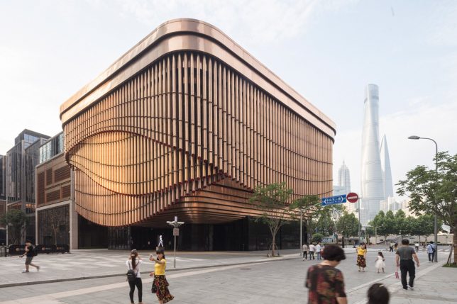
The word ‘facade’ implies illusion, and that can be true even when it’s used to refer to the faces of buildings, as secondary structures wrap around them like veils, obscuring their true form and creating dazzling displays of light and shadow like a distracting sleight of hand. Some facades disguise the original building in a form of low-impact renovation, while others are kinetic, opening and closing or rippling in the wind.

Geometric Planter Facade

facades geometric planter 1

facades geometric planter 2

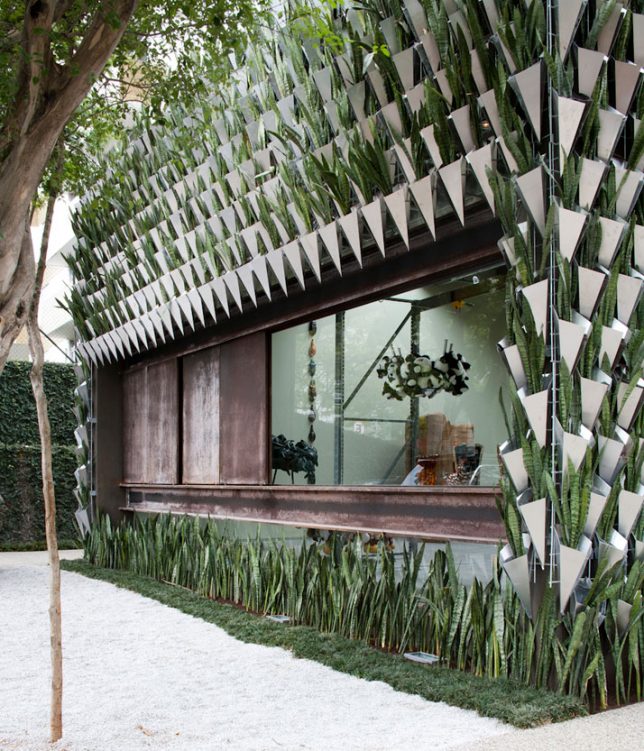
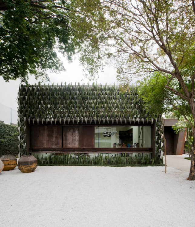
The exterior of the Firma Casa store in São Paulo, Brazil, which promotes young Brazilian furniture designers, gets an appropriately hip and modern look with the addition of a screen of geometric vases. 3,500 individual planters hold 9,000 seedlings and project slightly out from the exterior walls, keeping soil and water away from them for a relatively low-impact and low-budget green wall solution.

Roll-Up Facade Forms Canopy

Facade roll up 1

facade roll up 2

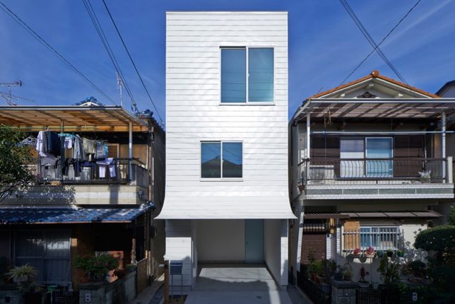
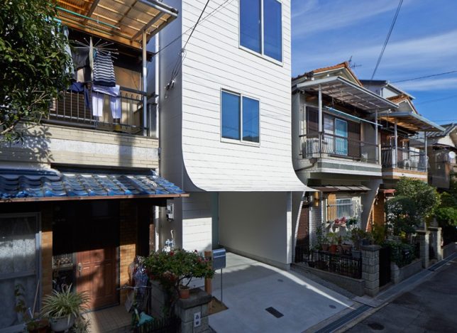
Incredibly simple, yet unusual enough to stop you in your tracks on the street, this facade uses ordinary materials with an unexpected twist. Tokyo-based studio Ninkipen! made this contemporary white home stand out from its neighbors with a peeling facade that rolls up slightly from the ground level to create an awning for the garage.

Undulating Facade of Fins Looks Like Swimming Fish

facades fish 1

facades fish 2

facades fish 3

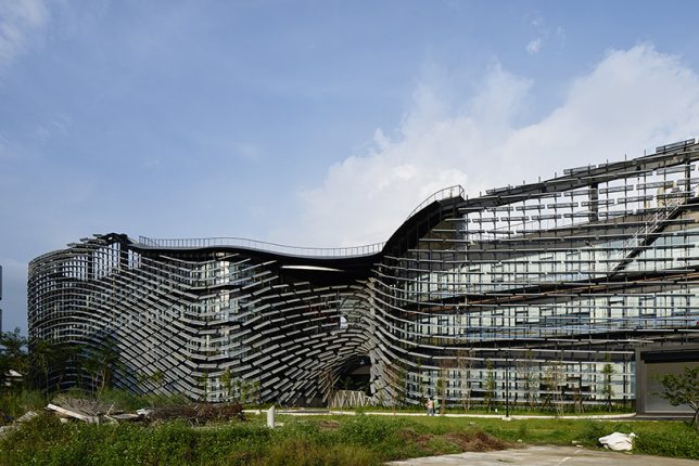
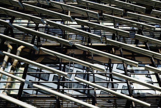
The angled steel fins enveloping the Industrial Technology Research Institute at the Central Taiwan Innovation & Research Park is intended to recall the look of a school of fish swimming in synchronicity. Noiz Architects customized the opacity of the screen according to the function going on inside each particular area of the building, since some research areas, exhibition spaces, greenhouses, cafes and other programs require different degrees of sunlight. This veil-like screen is separate from the building itself, making for easy repairs and additions and occasionally stretching out to create indoor/outdoor spaces.

Kinetic Parking Garage Facade

facades kinetic garage 1

facades kinetic garage 2

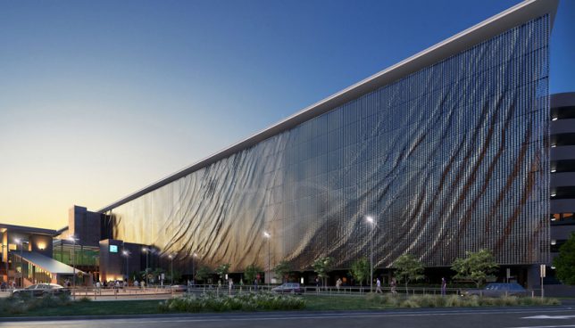
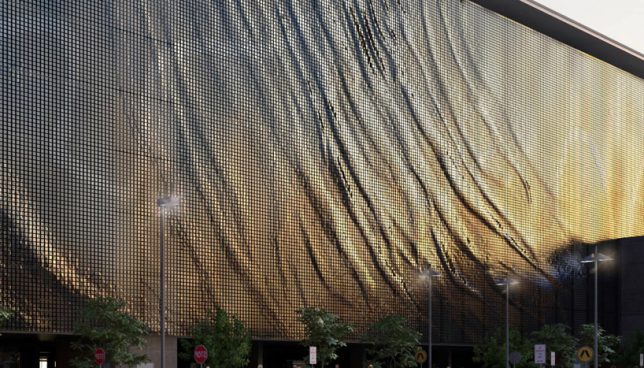
118,000 suspended aluminum panels gently flap in the wind, creating textures reminiscent of flowing textiles and rippling water. Designed by artist Ned Kahn and fixed to the exterior of the Brisbane Airport parking garage in Australia, the kinetic facade reacts to its natural environment, constantly changing as it provides shade and ventilation for the interior.

Perforated Shutters on a Concrete Home

facade perforated 1

facade perforated 2

facade perforated 3

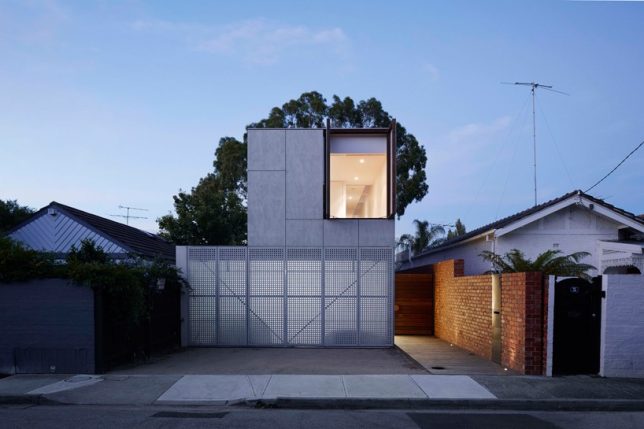
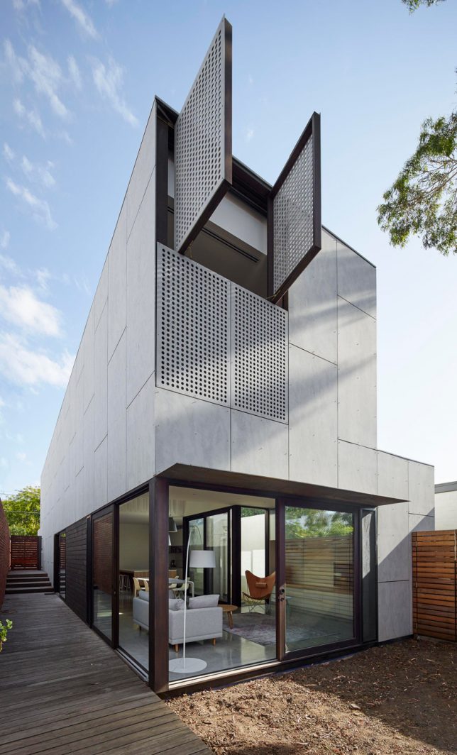
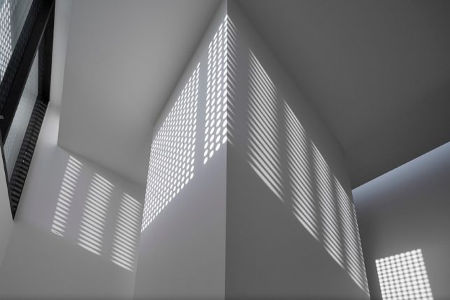
All street-facing and neighbor-visible windows on the ‘May Grove’ residence in Melbourne by Jackson Clements Burrows can be covered with perforated shutters integrated right into the facade, or opened when the inhabitants want a clear view. Not only do they control ventilation and privacy for this low-cost modern home, they create a play of light and shadow throughout the interior during the day.

Next Page – Click Below to Read More:
Not Just A Facade 15 Dynamic Modern Exterior Treatments

Share on Facebook


[ By SA Rogers in Architecture & Offices & Commercial. ]

[ WebUrbanist | Archives | Galleries | Privacy | TOS ]

WebUrbanist

 
Comments Off on Not Just a Facade: 15 Dynamic Modern Exterior Treatments

Posted in Creativity


Stronger than Concrete: New Glass Bricks Support Dutch Facade

22 Apr

[ By WebUrbanist in Architecture & Offices & Commercial. ]

glass brick facade

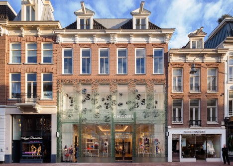
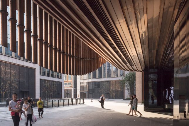
A new type of see-through glass brick used in this Dutch building facade aims to bridge traditional brick with transparency; the assembled bricks have been tested and shown to be as strong as concrete, able to support heavy loads in compression like its opaque competitor.

glass brick assembly

Architecture firm MVRDV applied this new technology to the front of a Chanel shop in Amsterdam that was damaged behind repair, allowing for a see-through storefront that still references local historic brick while using fully-recyclable glass.

glass brick detail

The bricks themselves are held in place with likewise see-through glue and help support the remaining terracotta brickwork on the floor above into which they visually transition. The structurally-sound result stands out against the street, but also lets additional light into the interior of the building.

glass brick details

glass brick in context

This new approach to brick can help mediate between the desire for solidity and openness, providing a cheap alternative to both masonry and glass construction traditions. The construction process was as much a laboratory experiment as an architectural process, involving teams from around the world in different disciplines.

glass brick view

Researchers from Delft University of Technology, engineers at ABT and contractors at Wessels Zeist joined forces to develop and test structural solutions and fabrication techniques, ultimately leading to the development of this new type of brick. The bricks were then cast by a glass company Venice and joined using glue from Delo Industrial Adhesives in Germany. (Photos by Daria Scagliola and Stijn Brakkee).

Share on Facebook


[ By WebUrbanist in Architecture & Offices & Commercial. ]

[ WebUrbanist | Archives | Galleries | Privacy | TOS ]

WebUrbanist

 
Comments Off on Stronger than Concrete: New Glass Bricks Support Dutch Facade

Posted in Creativity


Saving Face: ‘Ghost Facade’ Preservation Worse Than Demolition?

12 Feb

[ By WebUrbanist in Architecture & Cities & Urbanism. ]

ghastly grafted facade example

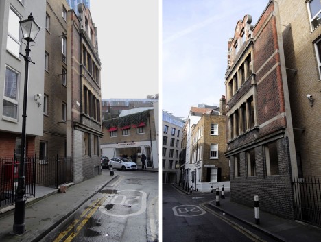
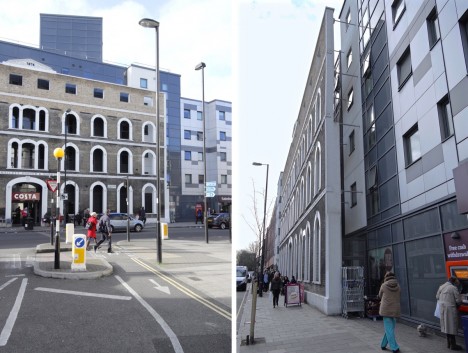
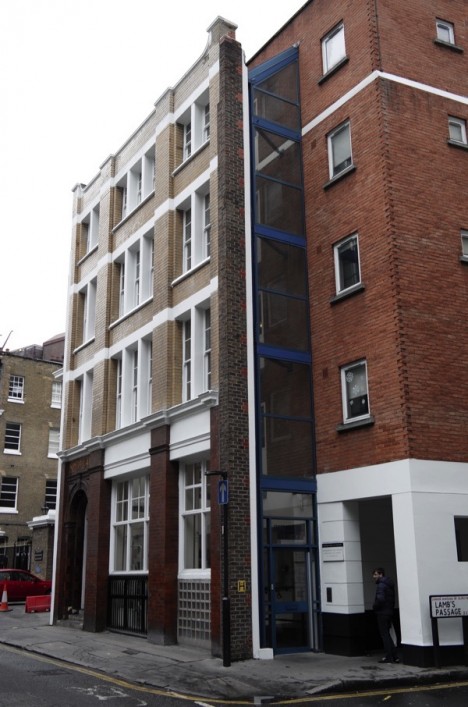
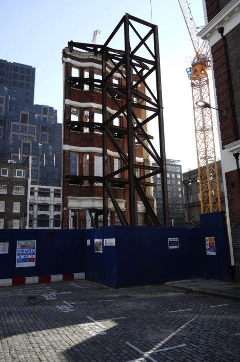
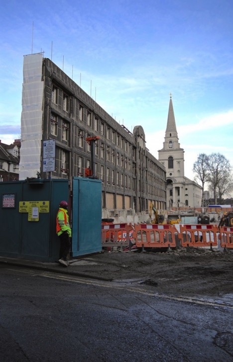
London is filled with grafted facades, nearly two-dimensional artifacts held in place while updated buildings are constructed behind them; many seem to haphazardly half-disguise the boring new structures on which they are grafted. While other cities have done similar, the sheer volume of them in this East End neighborhood is astonishing.

facade combination abomination

The writer behind Spitalfields Life, a web publication, does not mince words in reacting to this partial approach to preservation, which “threatens to turn the city into the back lot of an abandoned movie studio …. As if I were being poked repeatedly in the eye with a blunt stick, I cannot avoid becoming increasingly aware of a painfully cynical trend in London architecture.”

facade ghost grafting

In further criticisms, The Gentle Author bemoans the results as a compromise between “cowed planning authorities” and “architects … humiliated into creating passive-aggressive structures.” Perhaps this gives insufficient credit to architects, some of whom also fall guilty to facadism at times, and have been known to prioritize the exterior over the plan, skin over skeleton, form over function.

facade stabilized new structure

It is dangerous to suppose that preservation is necessarily binary. Compromises are almost inevitably made over time to keep architectural functional, through essential electrical and plumbing retrofits to more debatable code-related upgrades and updates. There is also a case to be made that the streets are a public room of which buildings are the walls, so preserving facades (properly, at least) can maintain the public’s experience of a place.

facadism preservation

Nonetheless, whether you approve of the general approach or cannot see the apologist’s point of view, it is hard to argue against the examples: the executions documented by The Gentle Author range from mediocre to outright terrible. In short: there may be a right way to approach preserving facades as part of new structures, but many architects are doing it wrong.

Share on Facebook


[ By WebUrbanist in Architecture & Cities & Urbanism. ]

[ WebUrbanist | Archives | Galleries | Privacy | TOS ]

WebUrbanist

 
Comments Off on Saving Face: ‘Ghost Facade’ Preservation Worse Than Demolition?

Posted in Creativity


Night House: Artist Cloaks Suburban Home Facade in Starry Skies

02 Dec

[ By WebUrbanist in Art & Installation & Sound. ]

night house suburban intervention

House painting is such time-consuming and meticulous work just to get a single color on a facade; perhaps next time you could clad your home in printed image of the night sky instead.

night house looking up

night house in making

For the Night House, Chicago artist Kate McQuillen covered a suburban house with a contiguous skyscape of nighttime space images digitally printed on weatherproof styrene panels.

night house poster project

The project was funded by sales of a screenprinted poster and created as part of the Terrain Biennial, an Oak Park-based international exhibition of yard, balcony and porch interventions.

night house glowing stars

night house screenprinted wall

Like some kind of suburban camouflage, the covered sections of the home start to disappear against the backdrop of the sky at the right times of early evening and morning. Read also: The Night House, a poem by Billy Collins.

Share on Facebook


[ By WebUrbanist in Art & Installation & Sound. ]

[ WebUrbanist | Archives | Galleries | Privacy | TOS ]

WebUrbanist

 
Comments Off on Night House: Artist Cloaks Suburban Home Facade in Starry Skies

Posted in Creativity


Facade Lift: Abandoned Commercial Building Reborn as Mixed-Use

10 Oct

[ By WebUrbanist in Architecture & Houses & Residential. ]

before and after

Finding new life as a combination of retail and housing space, this stunning structure’s new look works with the existing building envelope and floor plates while breaking down visible divisions between stories.

new building facade

before after side view

Located in Bangkok, Thailand, the refab is now home to four siblings above and their family-run jewelry store on the first floor.

converted store design ground

converted multistory mixed use

Idin Architects (photos by Spaceshift) kept the framework, difficult to remove as it touches adjacent structures, but renovated the interior and added an entirely new facade that seems to defy floors as it wraps up the front.

new facade

converted living room area

Each family occupies two stories of the 7-floor building, with elevators connecting all of the different units in the back and an enclosed rooftop patio above.

converted light well space

converted growing tree

A central lightwell (occupied in part by a slow-growing tree) and other internal features reconnect the different are as well while maintaining separation and privacy for each family unit.

Share on Facebook


[ By WebUrbanist in Architecture & Houses & Residential. ]

[ WebUrbanist | Archives | Galleries | Privacy | TOS ]

WebUrbanist

 
Comments Off on Facade Lift: Abandoned Commercial Building Reborn as Mixed-Use

Posted in Creativity