RSS
 

Posts Tagged ‘Environment’

‘Accurate autofocus on any subject in any environment’: Olympus engineer talks OM-D E-M1 Mark III AF

14 Apr
Olympus’ newly-announced OM-D E-M1 Mark III (left) alongside the OM-D E-M1X.

The recently-launched Olympus OM-D E-M1 Mark III features an advanced 121-point all cross-type autofocus system, and many other capabilities inherited from the flagship OM-D E-M1X including Live ND mode and various multi-shot features.

Modern mirrorless interchangeable lens cameras use one, or a combination of two main types of autofocus: contrast-detection and phase-detection. Contrast-detection autofocus works by driving focus until the contrast of a sampled area on the sensor is at its maximum – the presumed point of sharp focus. Contrast-detection is highly accurate, but can be slow, and relies on a certain amount of ‘trial and error’.

Phase-detection works more like human vision, using dedicated pixels to compare light coming from your subject from two slightly different perspectives at the same time. This allows the camera to judge depth, allowing for faster focus acquisition, without the ‘hunting’ characteristic of many purely contrast-detection autofocus systems.

Traditional phase-detection autofocus systems rely on pixels that are sensitive to vertical lines in a scene. Some, more sophisticated systems use a ‘cross-type’ pixel arrangement, which can detect horizontal or vertical detail, meaning that accurate focus can be achieved even with complex, non-linear subjects.

The 121-point autofocus system in the Olympus OM-D E-M1 Mark III and the E-M1X uses a combination of cross-type phase and contrast-detection, to ensure fast and accurate focus in a range of challenging environments.

In this interview, Tetsuo Kikuchi, manager of Imaging System Development at Olympus Corp explains how the E-M1 Mark III’s autofocus system was developed, and what it means to design a camera for demanding professionals.


What are the user requirements for professional-grade autofocus systems?

The most common requests we receive from professionals are that the camera must focus on their desired subject as quickly and accurately as possible, and it must continue to focus on that subject in any situation.

Professionals often stress the importance of operability, too. Their work requires the ability to quickly and easily adjust autofocus settings as shooting situations and subjects change. We believe that in order to satisfy professionals, we have to be able to meet all of those requirements.

What was the main customer feedback about autofocus in previous models?

After releasing the OM-D E-M1, which was Olympus’ first on-chip PDAF mirrorless camera, we received many requests for more AF points. These requests came from professional photographers and ‘prothusiasts’, especially in the genres of sports, bird, wildlife, and aviation.

We collated performance feedback and took special note of comments regarding focus drift to the background. Then, we set out to develop the 121-point all-cross-type PDAF system to eradicate this issue, delivering highly accurate focusing with all AF points, enabling photographers to keep their subject in focus.

Olympus’ 121-point all-cross-type PDAF system covers the majority of the frame.

What was the main priority when developing autofocus for the E-M1X and E-M1 Mark III?

There were two main goals, actually: ‘Quick focusing on targeted subjects after engaging autofocus’ and ‘stable and highly accurate continuous focusing on targeted subjects in any environment’.

What was the concept behind the 121-point all-cross-type On-chip Phase Detection AF point array?

We developed our on-chip PDAF system to achieve our goal of accurate and continuous autofocus on any subject in any environment.

The AF sensor array layout on the image sensor – which is unique to Olympus – is designed to detect any vertical, horizontal, or diagonal line patterns on subjects, and to find a defocused subject in the foreground. Thanks to our AF sensor layout design, our on-chip PDAF can deliver the high-speed focusing of phase detection and the accurate subject detection of cross-type sensors that DSLR cameras have previously achieved with a dedicated AF sensor. Our system has the added advantage of wider autofocus area coverage.

What makes Olympus autofocus technologies different to or better than competitors?

Our PDAF system can detect vertical and horizontal line patterns equally, allowing the camera to detect and focus on subjects in the foreground. This is a merit of Olympus. Because the PDAF sensors are arrayed not in one high density line but discretely over the entire area of the image sensor, any potential negative effect on image quality is also reduced.

Olympus’ most recent firmware delivers accurate autofocus without the risk of ‘focus drift’ to the background.

OM-D E-M1 Mark III, M.Zuiko Digital ED 300mm F4 IS PRO. F4, 1/250sec, ISO 3200

How difficult is it to implement cross-type on-chip phase-detection autofocus technology?

The most difficult challenge we faced when developing our all cross-type on-chip PDAF system was in determining the optimal layout of the PDAF sensors: one that would achieve the highest level of focusing accuracy with horizontally-arrayed and vertically-arrayed AF sensors simultaneously. In principle, utilizing phase detection AF can cause measurement errors; minimizing such errors is required for highly accurate focusing.

Could you elaborate on the sources of these measurement errors?

The measurement errors are attributed to a combination of factors, but the degree of measurement error is specific to the PDAF sensor layout. Therefore, we needed to build a proprietary in-house method to evaluate the reliability of measured distance data. This was important when we commenced development of the OM-D E-M1 Mark II, which was our first camera model equipped with all cross-type PDAF sensors.

Using pre-production cameras, our R&D members worked closely with professional photographers

Using pre-production cameras, our R&D members worked closely with professional photographers to conduct shooting tests, and these tests were repeated many times to refine our method. As a result, we are able to accurately evaluate our PDAF reliability and deliver exceptional performance.

Measurement errors can also come from the lens. However, our cameras can automatically correct for such errors according to the lens’ known characteristics, thus eliminating any effect.

Concept rendering, showing how cross-type phase-detection autofocus pixels are arrayed on the sensor of Olympus’ OM-D E-M1 Mark III and E-M1X.

Is there an autofocus advantage to a smaller sensor compared to APS-C or full-frame?

In principle, there is no correlation between PDAF performance and sensor size. However, our on-chip PDAF strongly complements our compact system size (which is ideal for photography genres such as bird and wildlife) because this autofocus method allows for a small camera body and fast focusing on moving subjects.

Lens resolution can affect autofocus accuracy though, because high resolution lenses make it possible to more precisely detect focus position.

The OM-D E-M1X is one of Olympus’ OM-D models that utilizes its contrast-detection plus all-cross-type phase-detection AF system.

How will the computational and machine learning based approaches we’ve seen in Olympus cameras evolve?

To ensure our products deliver the highest levels of performance, continuous device evolution must be paired with ever-evolving computational photography technologies. We have been heavily investing our resources to meet this challenge. For example, the E-M1 Mark III boasts our Handheld High Res Shot Mode, a technology that can produce high resolution low noise images, similar to those of full frame cameras, but with a system that’s significantly smaller in size.

We will develop new technologies to enable photographers to capture challenging images which are only possible using an Olympus camera and lens

We have also achieved advanced subject detection AF with AI-based deep learning technology. Features such as these will be continuously improved. Looking to the future, we will develop new technologies to enable photographers to capture challenging images which are only possible using an Olympus camera and lens, negating the need for extra equipment, special shooting skills, or additional post-processing.

The OM-D E-M1X has 121-point contrast-detection plus all-cross-type phase-detection AF. It features Olympus’ Subject Detection AF with AI-based deep learning technology.

OM-D E-M1 Mark III, M.Zuiko Digital ED 300mm F4 IS PRO. F5.6, 1/1600sec, ISO 400

Smartphone cameras today perform dynamic and local adjustments to automatically create a pleasing image. Do you see Olympus cameras also adopting this ‘auto’ approach in the future?

Our goals do not include the development of technology that significantly limits users in their individual creativity and expression. Instead, we develop cameras that facilitate the creative process, helping photographers bring their image concepts to life. While it is important that we enable photographers to utilize their skills and knowledge, we also see value to improving camera features for shooting assistance.

Thus, we will strive to uphold a balance between expression and automation with new technology that can benefit photographers of all skill levels and genres.


Tetsuo Kikuchi is manager of Imaging System Development at Olympus Corp, in Tokyo.

This is sponsored content, created with the support of Olympus. What does this mean?

Articles: Digital Photography Review (dpreview.com)

 
Comments Off on ‘Accurate autofocus on any subject in any environment’: Olympus engineer talks OM-D E-M1 Mark III AF

Posted in Uncategorized


DJI brings its Geospatial Environment Online 2.0 system to airports in 32 European countries

13 Feb

DJI has launched its Geospatial Environment Online (GEO) 2.0 system in 32 European countries, the company has announced. Under this expansion, DJI has brought its more advanced bow tie-shaped runway safety zones as a replacement for its previous circle-based geofences. The drone company has tapped Altitude Angel as its partner for geospatial data on airports, Temporary Flight Restrictions, and other ‘sensitive areas.’

DJI first revealed its updated geofencing system for US airports in October 2018. With this version of the software, DJI’s system enables airports to better protect their runways and other sensitive areas from unwanted drones, helping avoid future incidents like the UK’s holiday airport shutdowns.

As the company previously explained, GEO 2.0 offers 3D safety zones with bow tie shapes, including low, medium, and high risk models that accommodate different security needs. Of the 32 European countries covered by this expansion, 19 weren’t previously included in DJI’s 2016 launch of its original GEO system; the other 13 countries were using its older software.

According to DJI, European countries will start getting access to GEO 2.0 this month. DJI drone owners in these countries will need to update their drone firmware and DJI GO 4 app to accommodate the new geofencing technology.

Articles: Digital Photography Review (dpreview.com)

 
Comments Off on DJI brings its Geospatial Environment Online 2.0 system to airports in 32 European countries

Posted in Uncategorized


How to Mimic Window Light in a Studio Environment

24 Jun

One of the most common reasons you hear from photographers who avoid off-camera flash lighting is that it looks artificial. Yes, studio lighting can look artificial, but sometimes that’s part of the charm. Nobody claims portraits made with a ringlight look natural, but that doesn’t stop the thousands of photographers (myself included) that use them all of the time. But that doesn’t mean that it is impossible to mimic window light in the studio.
In fact, that’s kind of the point most of the time.

How to Mimic Window Light in a Studio Environment - portrait of a lady in the studio

Obtaining natural looking result in a studio is fairly easy with a few basic tools and some know how.

With studio lighting, you can create whatever lighting you want at any time. Providing that you have the right tools (and they are pretty basic), creating natural looking portraits in a studio environment with off-camera flash is exactly as difficult as creating portraits using window light.

Why is window light so wonderful?

b/w window light portrait - How to Mimic Window Light in a Studio Environment

Window light has a lot of wonderful qualities that make it a great choice for photographing people and other subjects.

In a nutshell, windows give you a constant (during daylight hours) and large light source to work with. The light itself is soft, diffused (assuming that direct sunlight is not entering through the window), and lends itself well to virtually all subjects including portraits.

It also tends to be very directional (depends on how you position yourself and the subject in relation to the window), making it easy to work with to shape your subject.

two b/w portraits - How to Mimic Window Light in a Studio Environment

Window light can give a variety of results depending on the time of day and the size and shape of the window. As such, there is no one size fits all solution to mimic window light and recreate it in the studio.

On top of that, we see things lit in window light all day, every day. It is a very natural state of things and it’s how we recognize the world around us. This familiarity makes window light an obvious choice.

Add to that that the master painters created a great many of their portraits in a studio lit by window light. The most obvious point of reference here would be Rembrandt since this style of lighting is one of the most common techniques that photographers use today.

The reasons for unnatural looking light

b/w portrait with ring lighting used - How to Mimic Window Light in a Studio Environment

Some light sources, like the ringlight used here, are by nature very unnatural looking. When trying to recreate natural light, try to stay away from specialist tools like these and tri-flectors.

There are a couple of reasons why studio lighting can look canned and unnatural. These are:

  • Too many lights – When using natural light, you’re usually shooting with only one light source. Perhaps there’s a reflector involved or there might be multiple windows, but for the most part, it’s one light. Going into a studio environment where a single setup can involve a key light, a fill light, a hair light, two rim lights and two background lights can feel both complicated and wrong (unnatural). Fair enough.
  • The modifiers are too small – In most cases, windows are quite big. This means that the light source you are using to light your subject is large. Big light sources give soft, flattering light. Add some mesh curtains to that window and the light gets even softer and more diffused. What does that tell you about the size of modifier you need to use on your studio portraits to get soft light?
  • The lights are too far away – In terms of the softness of the light, it’s the size of the light source in relation to the subject that determines how soft or hard it appears. If you have an 8′ octabox twenty feet from your subject, it will appear quite small comparatively; therefore, the light will be a bit hard. If you have a small pop-up softbox on there, it will be even harder. Bring your lights in as close as you dare to get for the softest light possible. If you have a small modifier, I recommend having it so close you can barely shoot past it without getting the light source in the frame.
  • You’re using an odd light source – Specialist lights, like the ringlight used in the image above, create light that you wouldn’t normally find in natural scenarios. Even if a viewer doesn’t understand the why behind it, people are quite intuitive when things seem weird. If you’re going for a natural look, avoid lights like these.

How to recreate and mimic window light in the studio

Here, you’ll see just how easy it is to mimic natural light in a studio environment. Here’s what you’ll need to get started:

  • An off-camera light source. Strobes, flashguns and continuous lights will all work equally well.
  • A large light modifier. These examples use a 5′ Octabox (or recessed softbox as PixaPro like to call it), but anything will do. If you don’t have any large modifiers yet and are unsure about what to get, consider starting with a large translucent umbrella. They’re big, dirt cheap, fold away easily and produce a nice, soft light.
  • White or silver reflector. This one’s optional, but you should have one anyway. If you’re using a really big modifier, the wraparound of the light may mean you don’t even need it, but they are useful for filling in dark shadows on the unlit side of your subject.

Setting up

behind the scenes studio shots - How to Mimic Window Light in a Studio Environment

A medium sized octabox placed close to an above the subject and a silver reflector was all it took to create these images.

To get started, place your light about three or four feet from your subject. Turn the light so that it’s forty-five degrees (in relation to your subject.) Raise the light up as high as you can (making sure the subject still has catchlights in their eyes). High ceilings are a bonus.

The reason for this is that with window light, the light is often coming from above. The window is shaping the light into the room, but it is still coming down into the room. If you’re using modelling lights or continuous lights, watch the catchlights in your subject’s eyes. Once they are falling towards the top of their eyes, you’re good to go.

Likewise, also watch where the shadows are falling. If the contrast seems too high, introduce a reflector. This does take practice, so don’t worry if you can’t tell just yet. It may help if you squint your eyes tightly. This makes it easier to see the contrast. In these examples, the silver reflector was placed flat and in front of the subject at around waist level.

Now, all that you have to do is to take a light meter reading (or take a test shot), adjust your settings (either in-camera or on the flash) and start taking photos.

portrait of a lady in pink - How to Mimic Window Light in a Studio Environment

To start with, try having your subject turned toward either the light or the camera. Beyond that, there’s not really much else to it.

How to Mimic Window Light in a Studio Environment

Practice makes it simple

If you are completely new to off-camera lighting, this may seem like a lot to get. I promise it’s not. Once you’ve set this up a few times, it becomes so easy that there’s not much more effort involved than placing someone in front of a window.

The advantages here are that you aren’t at the mercy of the weather or the time of day and once you get started with a set-up, the light won’t change unless you tell it to.

Just remember to keep the light both high and close and there isn’t much room to go wrong.

two images of a lady - How to Mimic Window Light in a Studio Environment

Putting it to use

If you’ve had any hesitance to use studio lights for any of the reasons listed in this article, hopefully, you can see that with the right techniques, you needn’t worry at all. Honestly, it’s not as difficult or complicated as it seems. If you’re still unsure, rent a studio for an hour and put it to practice. You may be surprised at what you find out and learn.

The post How to Mimic Window Light in a Studio Environment appeared first on Digital Photography School.


Digital Photography School

 
Comments Off on How to Mimic Window Light in a Studio Environment

Posted in Photography


How to Use Framing in an Urban Environment

20 Nov

Photographers have long developed different classifications to pair with the design and execution of a photograph – lines, shape, texture, light, framing, contrast, just to name a few. For example, leading lines appeal to a viewer’s natural tenancy to trace line into a photograph. Sharp lines are used to grab attention and organic lines create a peaceful atmosphere.

Other composition techniques like the Rule of Thirds require a photographer to mentally break down an image to evaluate balance. Low and high perspective alter the way a viewer sees the world and symmetrical/asymmetrical elements highlights the quirky beauty of life. The technique we’ll have a quick look in this article, demonstrates the power of framing, especially in an urban environment.

How to Use Framing in an Urban Environment

What is framing?

Framing in photography creates a self-contained image, like a photo-within-a-photo effect. As photographers, we are used to seeing the world through the frame of a viewfinder. We constantly evaluate what we’ll keep in an image and what we’ll exclude. We deliberately apply perspective, aim, zoom and positioning techniques to construct our photographs – sometimes without even noticing.

By cradling the subject in a balance of space and line, a frame is created, not dissimilar to the photo frames you’d find on your shelf at home.  Essentially, you are crafting a frame within a frame to deliberately bring focus to a subject, adding narrative and the unique experience of voyeurism that photography affords.

How to Use Framing in an Urban Environment

How do I frame a photograph?

For such an effective technique, framing has plenty to offer. It makes use of strong design skills, adding an extra layer to an image to create more depth.  Framing can also be used to obscure more mundane areas of a scene, boosting the efficacy of a photograph when viewed by others.

Composing an image by making use of framing is fairly straightforward. Start out searching for windows and doors as they are the most abundant frames in an urban environment. You’ll find that windows and doors, when photographed, contain their own little ecosystem within the one image. This is great for capitalizing on both content and narrative, almost like reading a window in a comic strip!

Frame shapes

Square or rectangular frames are probably the first things that leap to mind when someone considers framing. Doorways and windows are a great way for emphasizing a subject or depth, but they are not the only options and framing is not limited to squares or rectangles.

The image below proves how versatile the urban environment can be for artificial framing. The image was taken from the floor of a train station, lens pointed to the floor above. The darkness of the building structure is silhouetted against the blue sky, forming a crescent shape. The frame draws attention to the contrast of the architecture against the sky but also cradles the form of a human passing by.

How to Use Framing in an Urban Environment

How to Use Framing in an Urban Environment

This photo was taken by chance in a late night shopping district. The framing of the man emphasizes his presence but also isolates him from the rest of the landscape.

How to Use Framing in an Urban Environment

For this image, I aimed to align a gap in the cage with the cat’s face. The slight distortion caused by the lens draws the center square closer to the viewer’s eye. Framing isn’t always a split-second discovery, taking the time to assess a situation and respond creatively can be just as effective as shooting from the hip.

How to Use Framing in an Urban Environment

Shattered windows in rundown urban landscapes offer beautifully detailed landscapes complemented by an informed framing technique.

Keep it real

Framing can be really effective for highlighting specific areas of a photograph. However, it’s important to keep in mind that not every photograph needs framing. Some images are much more effective when they stand alone. Like most photography, you need to be versatile and trust your instincts.

While lining up a perfect shot through a fence can be effective, make sure to be aware of your surroundings too. Don’t focus so heavily on framing that you sacrifice other photographic opportunities. You don’t need to force a frame on an image, so don’t overthink it. You want natural images that are enhanced by a frame, not poor images that require a frame to garner interest.

Just stay open to the idea of framing and gather enough experience to recognize a framing opportunity when one presents itself. This way, opportunities tend to reveal themselves rather than you having to force them out of hiding.

How to Use Framing in an Urban Environment

How to Use Framing in an Urban Environment

The branches of these trees act as a natural frame, sectioning up the image to draw attraction to the cute little bunnies within.

The post How to Use Framing in an Urban Environment by Megan Kennedy appeared first on Digital Photography School.


Digital Photography School

 
Comments Off on How to Use Framing in an Urban Environment

Posted in Photography


Tips for Minimalist Photography in an Urban Environment

15 Sep

Minimalism gained traction in America in the 1960s with links to the Japanese traditional culture of Zen Philosophy. As a reaction against the whims of abstract expressionism, artists like Sol LeWitt, Frank Stella, and Mark Rothko experimented with stripped back processes and imagery, exposing the bare bones of visual art.

The history of the minimalist photography movement is not dissimilar to that of their contemporaries. The scientific photography of Bernice Abbott is referred to as a marked pivot towards minimalism. Photographers like Robert Adams and Lewis Baltz also used reductionist techniques to explore composition in the natural and urban landscape.

Tips for Minimalist Photography in an Urban Environment

Like all visual art, minimalism is founded on the basic elements of design; line, shape, color, texture, form, and composition. The scope of interpretation within minimalist art is vast, with its proponents yielding a diversity of results and reasoning. Overall, however, minimalist art can be surmised within a single principle, the old adage of “keep it simple”.

Keeping it simple

Minimalism is about how little you can say without compromising meaning. Minimalist photography is a great opportunity to slow down and reevaluate your photographic process. Before taking a shot, take a breath. Think about your desired outcome. How does your knowledge of composition apply to the subject at hand? How would you like to approach exposure? Minimalism is a very meditative process, sort of like yoga, but for your photography.

Composing minimalist photography in an urban landscape

Often, the utilitarian components that make up an urban landscape are the same that serve as the best minimalist subjects. Minimalist depictions of nature tend to rely on the soft flow of organic structures. However, urban minimalist photography capitalizes on the bold lines of old buildings, fresh apartments, and upturned car parks.

Intermixed with bolts of color, texture, and juxtaposition, minimalist photography can be both subtle and loud at the same time. Photographers of minimalism capitalize on strong, stripped back elements to create both subtle and high-impact imagery. That’s why moving forward in minimalist photography often requires you to steep yourself in the very basics of photographic composition first.

Rule of thirds

The rule of thirds is a trick to help determine the overall composition of a photograph. Mentally divide an image up evenly into thirds both horizontally and vertically. The lines that intersect around the central rectangle indicate the points that capture the majority of a viewer’s attention. By offsetting important points in a photograph from the center rectangle, an image will feel more naturally appealing to your audience.

Minimalist photography relies equally on what has been included and excluded from an image. Composing a visually harmonious photograph with tools like the rule of thirds maximizes the short time a viewer has to engage with a photograph.

Tips for Minimalist Photography in an Urban Environment

This image is sectioned off into 9 even rectangles. The four central intersecting points indicate the focal points of the photograph.

Tips for Minimalist Photography in an Urban Environment

This image is an example of the rule-of-thirds in practice. No single component of the photograph lies directly within the center, guiding the viewer’s eye around the image rather directly to the center.

Color

Color has a language that establishes the atmosphere and emotional range of an image. Where traditional black and white highlights the form of an image, two or three highly contrasting colors can bring the facade of the urban environment to life.

Blocks of color convey vitality and hardness in an image, whereas a gradient is softer and more accommodating. Pastel color schemes depicted by many contemporary minimalist photographers deliver a surreal, dream-like quality to a photograph, while also alluding to childhood, disassociation and new-media aesthetics.

Tips for Minimalist Photography in an Urban Environment - color

Tips for Minimalist Photography in an Urban Environment

Isolated colors can add depth to an image and draw attention to details often overlooked in the urban landscape.

Tips for Minimalist Photography in an Urban Environment

Lines

Strong lines in minimalist photography carry the integrity of an image. Conveying depth and presence, bold lines leading in from the perimeter of an image grab a viewer’s attention and guide their eye through the artwork. Lines delineate the boundaries of different bodies within a space and can denote unrest at sharp angles or quiet emotion with organic ripples.

Horizontal lines are used as a device to indicate the horizon, perspective, or to completely upend a viewer’s sense of space altogether! When composing an image, follow each line through with your eyes. Adjusting the integrity of a line later in post-production can be extremely time-consuming. And the success of a minimalist photograph could (and probably will) count on it being exact.

Tips for Minimalist Photography in an Urban Environment

Leading lines reach the perimeter of the physical photograph and provide the viewer with a visual trail to follow into the interior of the image.

Shape

The compositional elements of line and shape often cross over in a visual plane. For example, the perimeter of a shape can be defined by its outer line, sectioning the interior of the shape off from the background of the image.

Sharp, inorganic shapes create unrest and action in an image, whereas smooth, organic shapes create a scene of peace, nature, and evenness. The urban environment consists of an inexhaustible array of sharp and smooth lines. Trying to bring the two spectra together creates a dynamic juxtaposition of design and emotion.

Tips for Minimalist Photography in an Urban Environment

Pattern and texture

Pattern and texture lift the image from the page. Texture is the physicality of an image, which engages with an audience by appealing to their sense of touch. Pattern, often combined with texture, adds detail to a photograph, revealing beauty the repetition of otherwise unobserved subject matter.

Minimalism and pattern can combine to emphasize size and number, delivering a feeling of sensory overload simply by the repetition of a single design. When limited to concentrated areas in an image, a pattern can serve as a disruption to the remaining landscape or as a contrast to emphasize negative space.

Tips for Minimalist Photography in an Urban Environment - texture

Textural images often depict the wear and tear of the urban environment in delightfully intricate detail.

Negative space

Negative space is what is not there which can be kind of confusing. It lends breathing room to an image. It allows the immediate subject matter to exist with little or no intrusion elsewhere in the frame.

As an example, an image of a single cloud, framed by blue sky neither intrudes nor detracts from the other, but the two exchange meaning nonetheless. The sharp contrast between vacant and overflowing environments means that urban landscapes are great for incorporating negative space into minimalist photography.

Tips for Minimalist Photography in an Urban Environment - negative space

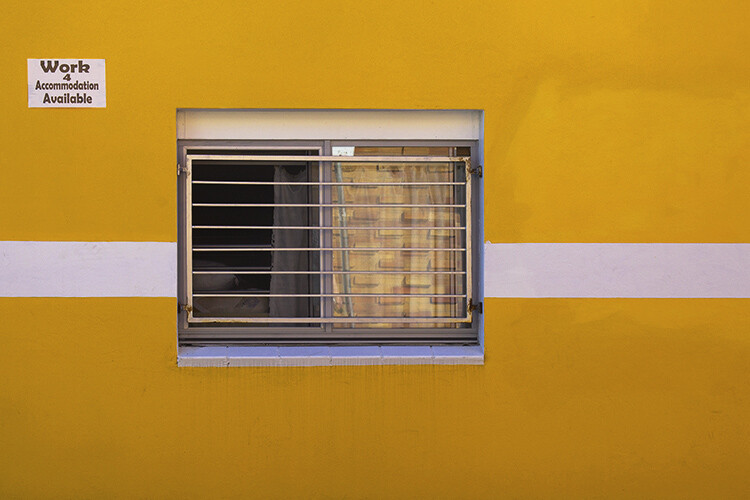
The geometric pattern on the right of this image is offset by the negative space on the left. The relationship balances out the image overall and enhances the bold yellow streak down the middle.

Tips for Minimalist Photography in an Urban Environment

Conclusion

Minimalism has seen a considerable resurgence in recent years, especially in interior design and photography. A wealth of online curatorship means that tags like #minimal and #minimal_perfection unearth fresh, reductionist imagery by the second. Although the overwhelming volume of images may seem contrary to the principals of minimalism itself, the evolution of the modern landscape continues to create a wealth of opportunity for photographic artists looking to branch out or hone their skills in composition.

How do you use minimalist photography with your images? Please share in the comments below.

The post Tips for Minimalist Photography in an Urban Environment by Megan Kennedy appeared first on Digital Photography School.


Digital Photography School

 
Comments Off on Tips for Minimalist Photography in an Urban Environment

Posted in Photography


Where Gods Live: Forest Environment Enhanced by Live Digital Projections

01 Aug

[ By SA Rogers in Art & Installation & Sound. ]

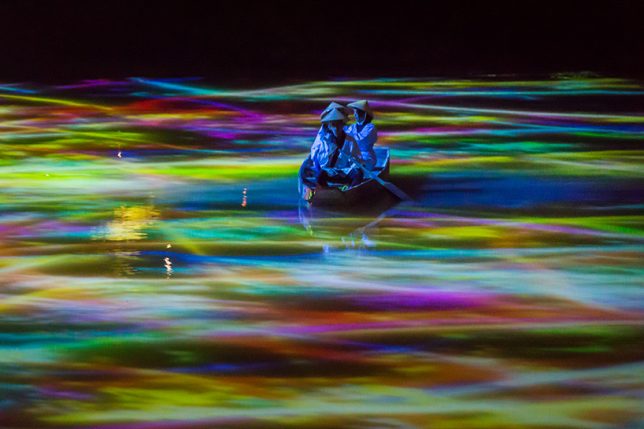
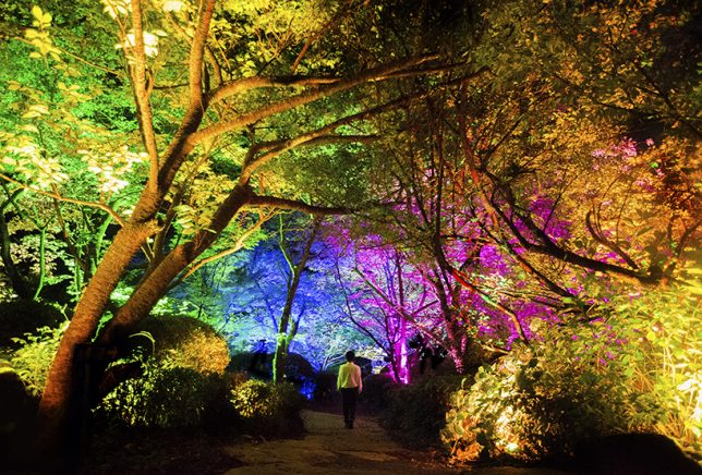
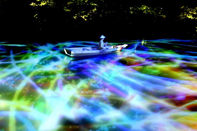
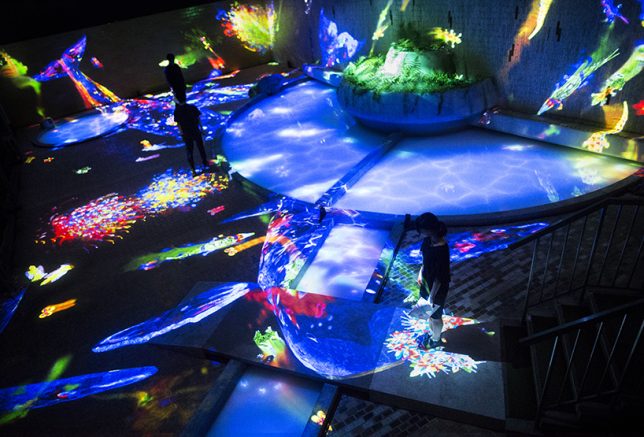
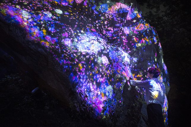
As if forests aren’t magical enough already, the Japanese art/technology collective Teamlab will be live-projecting their signature transforming visuals onto the surfaces of Mifuneyama Rakuen Park, giving visitors the feeling of being on an alien planet. ‘Forest Where Gods Live’ is a collection of individual installations with names like ‘Ever Blossoming Life Rock,’ Drawing on the Water Surface Created by the Dance of Koi and Boats,’ ‘Memory of Continuous Life’ and ‘Resonating Forest.’

“TeamLab is executing an art project called ‘Digitized Nature’ where ‘Nature Becomes Art.’ The concept of the project is that non-material digital art can turn nature into art without harming it. We exist as part of a process of eternal continuity of life and death, a process which has been continuing for an overwhelmingly long time. It is hard for us, however, to sense this in our everyday life. It was when we were wandering through the woods that we realized the shapes of those giant rocks, caves and forests, that have been formed over an infinite amount of time, are the continuous cycle of life itself.”

“By applying digital art to this unique environment, the exhibition celebrates a massive chunk of life that nests on such continuity. In Mifuneyama Rakuen, we got lost in the ambiguous border of garden and forest, and finally, we have come to realize we exist on the borderless continuity between nature and humans.”

Sponsored by Japanese beauty brand Shiseido, the awe-inspiring installation will be in place throughout the 500,000-square-meter garden located in the Saga prefecture July 14th through October 9th, 2017. If you can’t make it out there in person to experience the immersive exhibit firsthand, taking some time to delve into the individual pieces on the teamLab website is well worth it. The collective has produced a number of videos showing their projections in action, with descriptions of their inspiration behind each one.

Share on Facebook


[ By SA Rogers in Art & Installation & Sound. ]

[ WebUrbanist | Archives | Galleries | Privacy | TOS ]


WebUrbanist

 
Comments Off on Where Gods Live: Forest Environment Enhanced by Live Digital Projections

Posted in Creativity


Real Holodeck: 360-Degree Immersive Home Gaming Environment

08 Oct

[ By WebUrbanist in Gaming & Computing & Technology. ]

interactive gaming room design

Using a series of networked camera-and-projector units, this working demonstration turns an entire living room into and interactive gaming environment. Dubbed RoomAlive (a successor to IllumiRoom, featured previously), this augmented reality expansion from Microsoft could transform not just the way we game but ultimately the way to interact with everyday spaces both private and public.

Existing objects and furniture within the space are automatically mapped and integrated into a given game or experience. The constituent procam units are auto-calibrating and can self-localize so long as there is some overlap in their fields of view. The entire array is designed to be simple to install and use – it effectively sets itself up once you put the technology in place.

3d mapped room interior

generated virtual creatures holodeck

The system creates a depth-aware 3D model of the room, identifying vertical and horizontal surfaces, which is plugged into a Unity gaming engine. It then populates the space with whatever the user desires, from passive environments to active games. Virtual characters can navigate along the floor then up along the walls, for instance, but users can also dodge and shoot, interacting as characters themselves. Items in the room can also become props, toys or tools within a programmed scenario.

roomalive live demo illumiroom

virtual character gaming control

This particular demo integrates six Kinect cameras to show various scenes and scenarios – just the tip of the iceberg. These could, of course, also be deployed in other settings to turn public or institutional spaces into fully interactive environments. For now, this is just a demonstration, but as these technologies become less expensive and more accessible it is easy to imagine commercial applications of all kinds.

home living room design

immersive gaming experience design

From from the Microsoft development team: “RoomAlive is a proof-of-concept prototype that transforms any room into an immersive, augmented entertainment experience. Our system enables new interactive projection mapping experiences that dynamically adapts content to any room. Users can touch, shoot, stomp, dodge and steer projected content that seamlessly co-exists with their existing physical environment.”

interactive living room gaming

textured map room holodeck

“The basic building blocks of RoomAlive are projector-depth camera units, which can be combined through a scalable, distributed framework. The projector-depth camera units are individually auto-calibrating, self-localizing, and create a unified model of the room with no user intervention. We investigate the design space of gaming experiences that are possible with RoomAlive and explore methods for dynamically mapping content based on room layout and user position. Finally we showcase four experience prototypes that demonstrate the novel interactive experiences that are possible with RoomAlive and discuss the design challenges of adapting any game to any room.”

Share on Facebook


[ By WebUrbanist in Gaming & Computing & Technology. ]

[ WebUrbanist | Archives | Galleries | Privacy | TOS ]


WebUrbanist

 
Comments Off on Real Holodeck: 360-Degree Immersive Home Gaming Environment

Posted in Creativity


ProPhotoInsights.net “Jaguar XK Photoshop Car Tutorial” Compositing A New Environment

27 Sep

www.prophotoinsights.net In this two part photoshop car tutorial video we show the techniques used to composite a car into a new location. We show how to remove reflections and replace body panel to ensure the composite looks at home in it’s new environment. We look at adding realistic street lighting using the light rendering filter together with texture (bump) maps and much more. Step behind the scenes on pro photo shoots and view our digital photography tutorials and photoshop training videos www.prophotoinsights.net
Video Rating: 4 / 5