The post How to Make Your Photos Pop in Lightroom (With Just 4 Quick Edits!) appeared first on Digital Photography School. It was authored by Jaymes Dempsey.

Are you looking to spice up your photos in Lightroom? Do you want a few quick edits that will really make your photos pop?

That’s what this article is all about.
I’m going to give you four key edits that will absolutely revolutionize your Lightroom post-processing. You’ll come away knowing exactly how to make your photos stand out…
…just by moving a few sliders.
Sound good?
Let’s get started.
1. Boost the overall contrast with the basic panel
If you want to make your photos pop, then you should start with contrast.
Because contrast is the lifeblood of punchy, impactful photography.
Contrast can take a photo looking dull, boring, flat, and lifeless, like this:

And singlehandedly turn it into something worth looking at, like this:

Now, there is such a thing as too much contrast. But most photos need more contrast, not less! So I give you my permission to really crank up that contrast in Lightroom. Even if it feels like your photos already have enough contrast, I recommend you add some and see how it looks. Boosting the contrast can be an eye-opening experience. You may realize that you’ve been depriving your images for years.
There are a few ways you can boost the contrast, and they all start by heading over to the Lightroom Develop module:

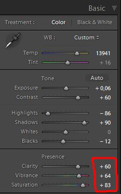
Take a look at the Basic panel on the righthand side:

Then, if you want a quick and dirty way to see how your photo looks with more contrast, just crank up the Contrast slider.

And for a lot of images, this is enough.
But if you want to take things further, you can work with the Tone sliders. In particular, raising the Whites and dropping the Blacks can combine contrast with some much-needed tonal range. In other words, this will make your photo span the entire spectrum of tones, from black to white (which often looks great!).

Bottom line:
A bit (or more than a bit!) of contrast can go a long way.
2. Add Clarity or Texture to give the details some punch
Once you’ve finished working on the overall contrast, it’s time to consider amplifying the details.
And that’s what the Clarity and Texture sliders do really, really well.
Both of these tools sit in the Basic panel, just like the contrast sliders:

Now, Clarity offers a powerful, punchy effect. The slider adds contrast to the mid-tones of your photos, and the result is to make details and edges really stand out. Check out the before (left) and after (right):

Texture, on the other hand, is a bit more refined. This slider basically sharpens the detail in your images, (but leaves the fine details alone). So Texture is a great option for dealing with images that have, well, texture. Rocks, walls, and peeling paint all look good with the Texture adjustment applied.
Here’s the same photo, without Texture (left) and with Texture (right):

Because Lightroom is non-destructive, there’s no harm in trying out both adjustments and seeing which you prefer. Personally, I use Clarity more often than I use Texture, but they both have their place, and they can both make your details stand out.
A word of caution, however:
Clarity and Texture are both pretty easy to overdo. If your photos start to look crunchy, then it’s time to back off. Making details stand out is all well and good, but you don’t want to take things too far!
3. Boost the Vibrance or Saturation for rich colors
Up until now, I’ve talked about the value of contrast to make your photos pop.
But what about making the colors pop?
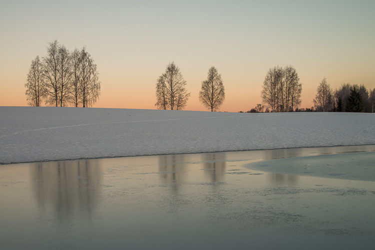
Deep, rich colors can add a lot to your images. Look at the difference between the colors in this photo:

Versus this one (where I’ve applied some basic color edits):

Neat, right? And it doesn’t take much effort at all to pull this off. I regularly punch up my colors using either the Vibrance or Saturation slider in Lightroom. Just push the relevant slider to the right, and you’re done.

But how do you know whether to boost the Vibrance slider or the Saturation slider?
Well, as with Texture and Clarity, there’s no harm in testing out both options. But it’s worth knowing the difference between the two:
The Saturation slider boosts the intensity of your colors all throughout the image, whereas the Vibrance slider is more refined (kind of like a Smart Saturation tool). Vibrance will boost the intensity of colors, but only those colors that are less saturated, as well as skin tones.
So Vibrance is often a better choice when you’re dealing with variations in saturation levels, or when people are featured. Vibrance will keep colors from becoming oversaturated and will keep skin tones looking natural.
4. Add a subtle vignette to focus on your main subject
Here’s the last way you can make your photos pop and stand out:
Vignetting.
A vignette is a darkening effect that is generally placed at the edges of your photos, to keep the viewer focused on the main subject.
Here’s a (too strong) vignette for the sake of demonstration:

In fact, the best vignettes are barely perceptible. Too much vignetting, and your photos will look muddy and unprofessional.
You want a vignette like this, instead:

Do you see what I mean?
Now, here’s how to create a beautiful (but still subtle!) vignette in Lightroom:
Open your photo in the Develop module. Scroll down the panels on the right side until you find Effects:

Then, under Post-Crop Vignetting, drag the Amount slider to all the way to the left. You should notice an immediate vignetting effect on your photo.

Next, if your subject takes up much of the frame, you may want to boost the Midpoint slider a bit, to make sure that your main point of interest stays out of the vignette’s path.
And you’re also free to change the shape of the vignette (with the Roundness slider), as well as the transition strength (with the Feather slider). You can even preserve the highlights by boosting the Highlights slider if you so choose.
Finally, dial your vignette back by boosting the Amount slider…
…until you end up with a vignette that’s so slight that you can hardly even tell it’s there.
And that’s it! Now you’ll have a vignette that will focus your viewers, and they’ll hardly even know it.
How to make your photos pop in Lightroom: Next steps
As it turns out, it’s not difficult to make your photos pop and be much more eye-catching. All it takes is a few quick edits with the Lightroom sliders.
I recommend you go back to photos of yours that you’ve edited previously. Give them a bit of a contrast boost, and punch up the colors with some saturation. See how that makes them look.
You’ll be surprised to find that these simple changes can go a really long way!
Do you have any favorite Lightroom edits that instantly make your photos stand out? Share them in the comments!

The post How to Make Your Photos Pop in Lightroom (With Just 4 Quick Edits!) appeared first on Digital Photography School. It was authored by Jaymes Dempsey.



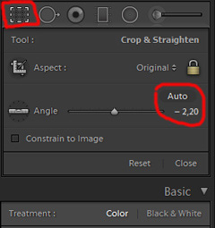 While you edit, you can make simple adjustments to your composition, like levelling the horizon and cropping. By cropping, you can tighten the composition, and to some extent “move” elements, so they align according to the rule of thirds or golden mean.
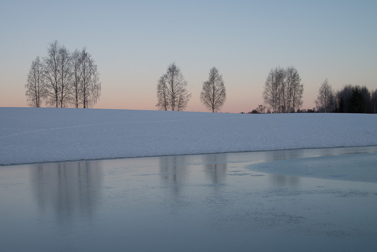
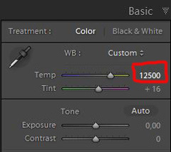 So I decided I wanted my image to have a warmer color tone. I adjusted the White Balance by adding more yellow.
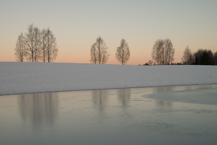
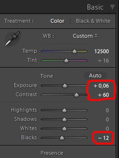 Even with modern digital cameras you don’t always hit spot on with the exposure. If you don’t get it right in-camera, with RAW files you can easily correct the exposure one two stops when post-processing.
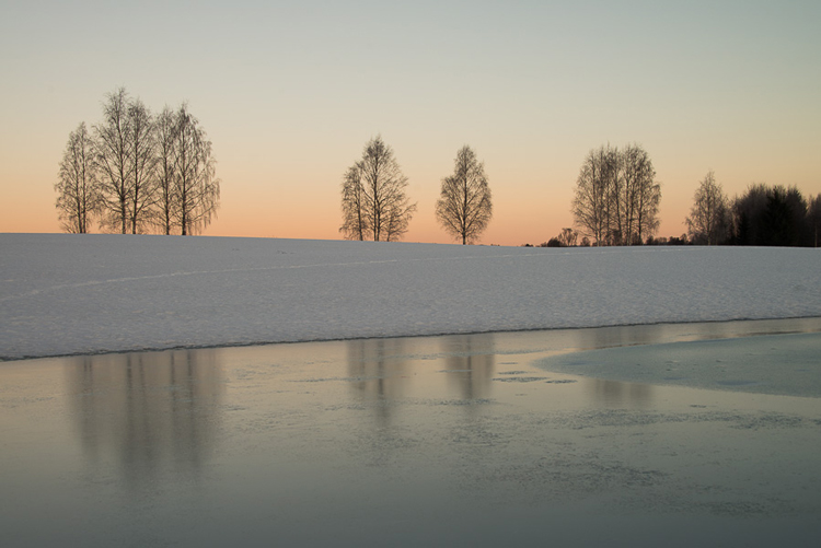
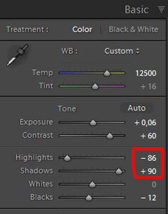 One more thing that bothered me was the black chunk of trees to the far right. The trees have now become too dark with no details in the shadows. I fixed this by increasing the shadows slightly. I also lowered the highlights a little to bring out more of the texture in the ice. In the version below the trees to the right are no longer completely black.


You must be logged in to post a comment.